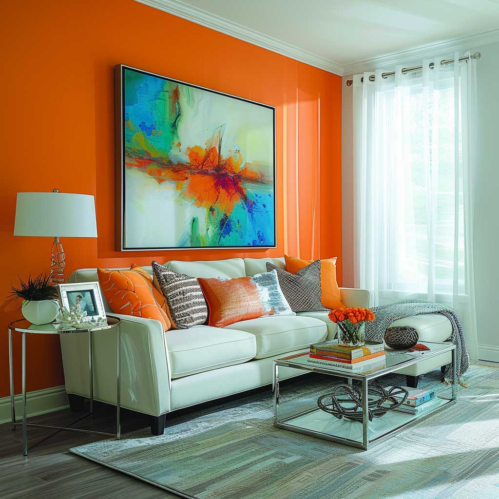
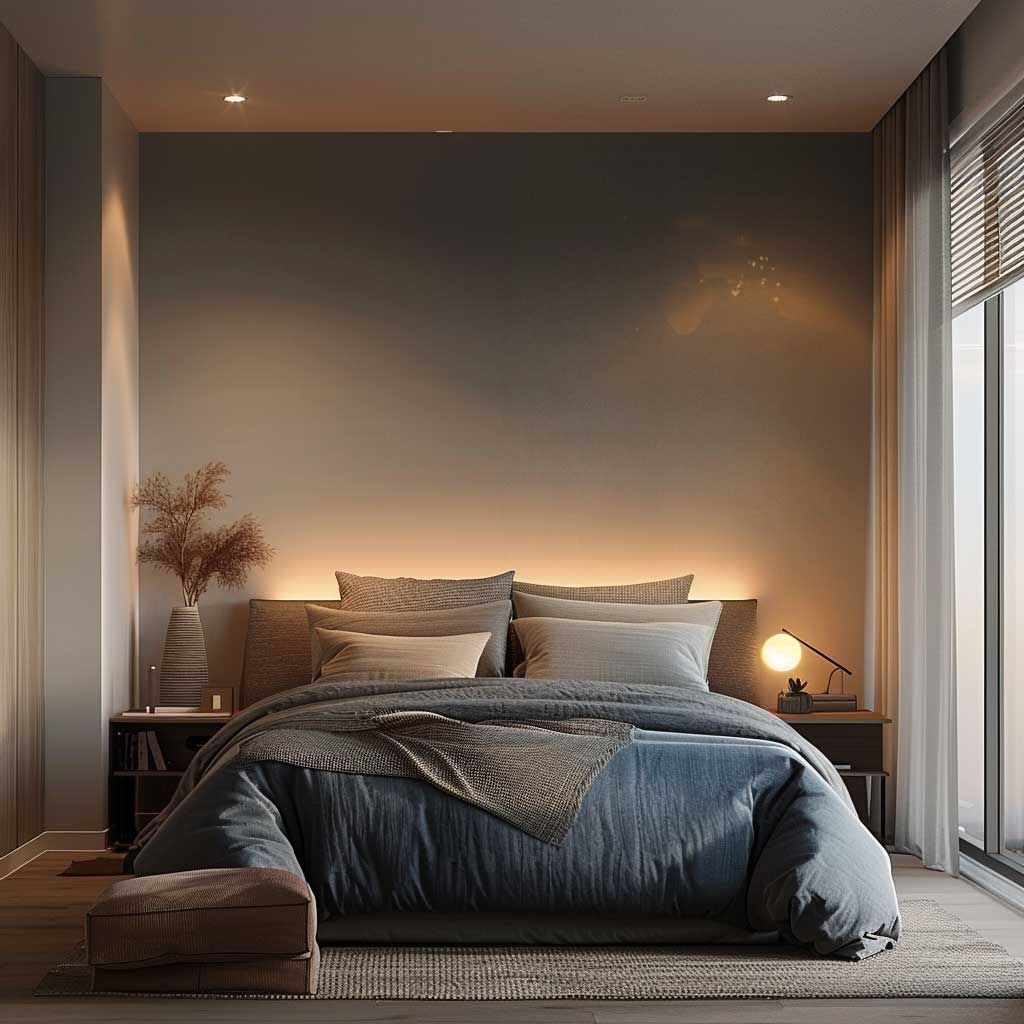
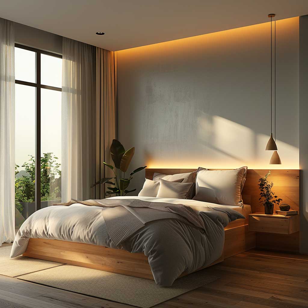
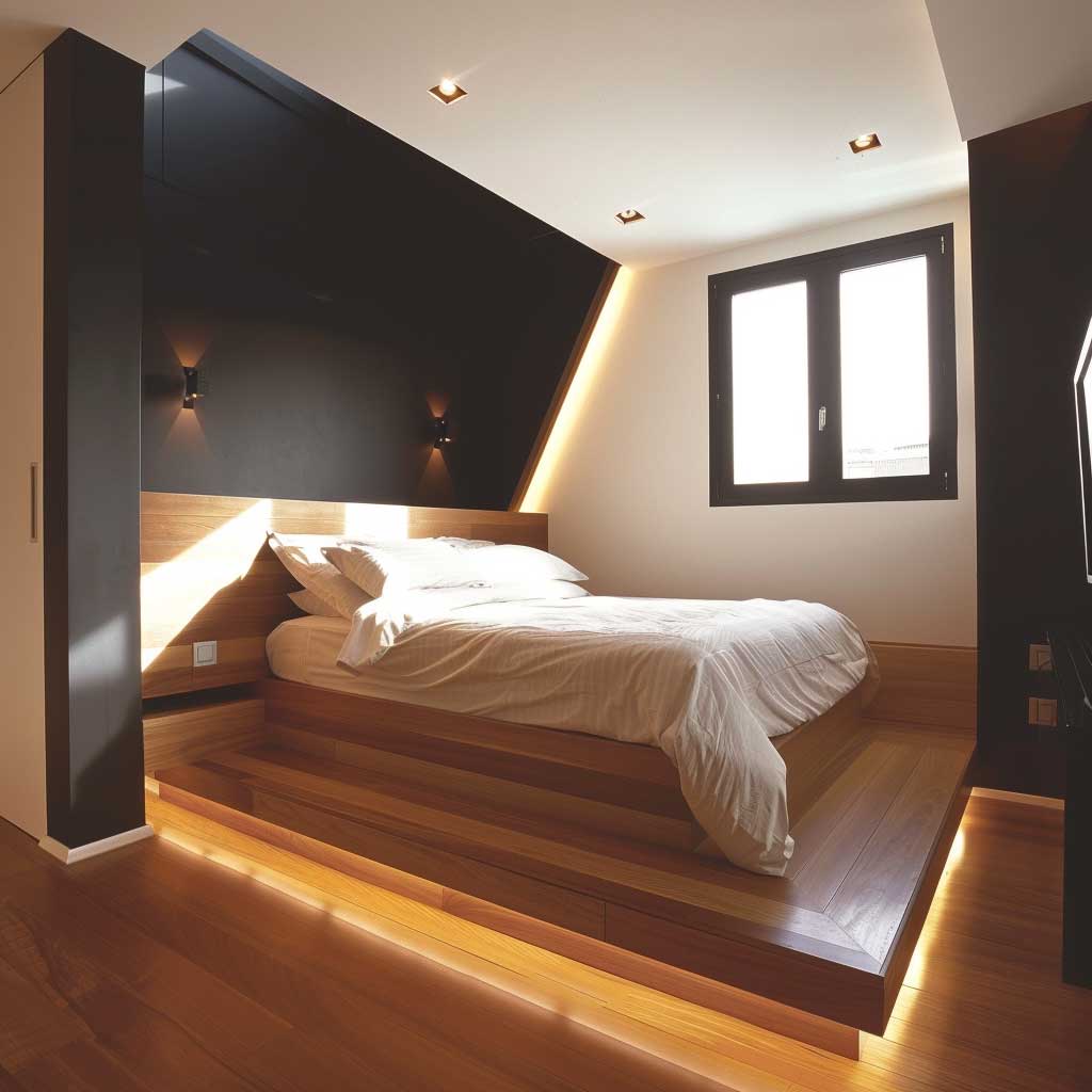
Accent wall paint ideas for small spaces work best when you treat that single wall as a deliberate decision rather than an afterthought. I’ve tested this in a 9×10 ft bedroom: painting the wall behind the bed Benjamin Moore Hale Navy HC-154 ($72/gallon) made the room feel like it had a third dimension it never had before. The wall pulled the eye inward instead of crowding it.
You’ll notice the difference immediately when the accent wall color has clear contrast with the other three walls. The problem most people run into is choosing a color that’s only slightly darker than the rest of the room — that doesn’t read as intentional, it just reads as uneven. A real accent wall needs a 40-60 LRV gap between it and the surrounding walls to register as a focal point rather than a mistake.
My go-to framework for small spaces: pick one wall — always the one your eye lands on first when you walk in — and commit to a color that would stop you in a store. The other three walls stay within two shades of white or a true neutral. That contrast is what creates the illusion of depth, and depth is what makes a small room feel intentional instead of cramped.
- Bold accent wall paint ideas for small spaces work on the focal-wall principle: one statement wall, three neutral walls
- Light accent wall colors (LRV 55+) visually push walls outward — best pick for rooms under 120 sq ft
- Geometric paint patterns on a single wall add depth without requiring any furniture change
- Benjamin Moore Hale Navy, Sherwin-Williams Sage ($67/gallon), and Clare Paint Wanderer ($49/quart) are tested performers in small rooms
- Choosing your accent wall: always the wall opposite the door or the wall your bed is against in a bedroom
- Minimalist accent walls with a single solid color consistently outperform busy patterns in rooms under 150 sq ft
Bright Accent Wall Paint Ideas That Make Small Rooms Feel Alive


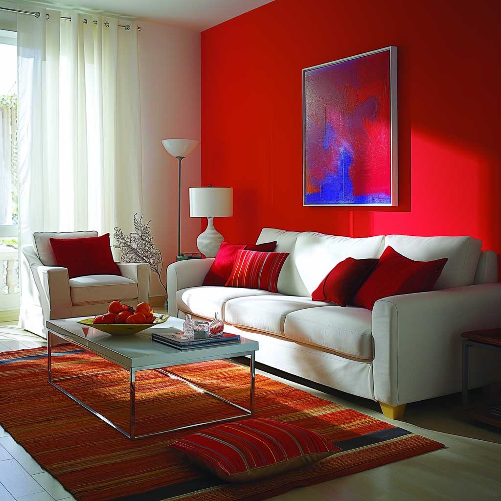
Bright accent wall paint ideas for small rooms function like a window that doesn’t exist — they trick your eye into reading the room as bigger than the tape measure says. I painted a rental bedroom wall Sherwin-Williams Exuberant Pink SW 6847 ($67/gallon) and it went from looking like a storage closet to feeling like a boutique hotel nook. Color that saturated has thermal presence: the wall seems to push back, which paradoxically creates perceived depth.
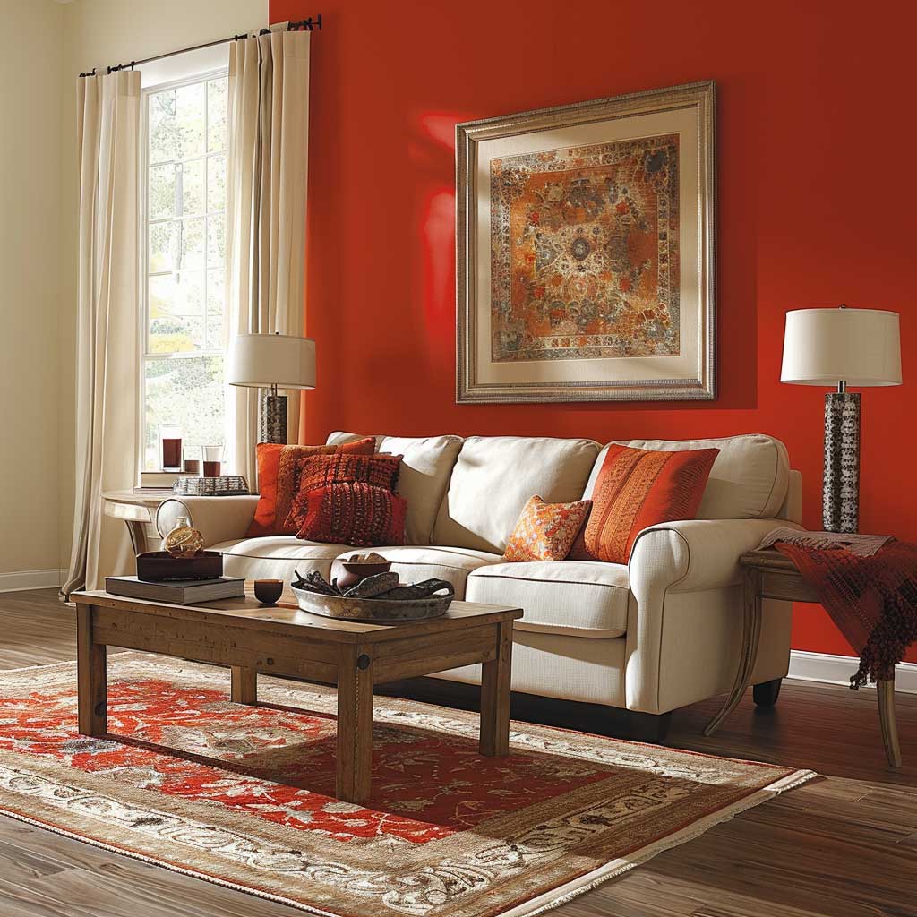
Not every bright color works the same way in a tight space. Warm tones — coral, sunflower yellow, tomato red — pull the wall toward you, so they work best on the wall farthest from the door. Cool brights — electric blue, teal, emerald — visually recede even when saturated, making them safer for any wall. I stole this trick from a Montréal interior designer who uses Benjamin Moore Caribbean Cool 2054-40 ($72/gallon) on side walls specifically because it gives the room a sense of sideways expansion.
What doesn’t work: painting three walls a bright color and leaving one white. That’s not an accent wall — it’s a mistake. You also don’t want to pair a warm-toned bright wall with warm-wood furniture and terracotta textiles, because everything merges into one muddy read. The contrast between the accent wall and the room’s other surfaces is where the drama lives. Keep the remaining walls within two shades of Benjamin Moore Chantilly Lace OC-65 or Simply White OC-17, and let the single color do its job.


Mirrors placed on the wall directly opposite the bright accent wall amplify the effect like a mathematical formula. You get the color twice — once on the wall, once in the reflection — and the room appears to double in depth. I own two 24-inch round mirrors in brass frames ($89 each at Wayfair) that I move between rooms specifically for this trick. A single large mirror on the opposite wall does more for a small room than any furniture rearrangement you’ll attempt.
Lighting changes everything with bright paint. You’ll notice that Caribbean Cool reads as a deep teal under warm LED bulbs (2700K) and almost cobalt under daylight bulbs (5000K). Test your chosen color under the actual lighting conditions of the room — not at the paint store — before committing to a full gallon. Natural light from a north-facing window will make bright colors read cooler and muted; south-facing rooms pull out the full saturation. Does the shade still excite you at 9pm with overhead lighting? If not, go one stop brighter on the swatch strip.
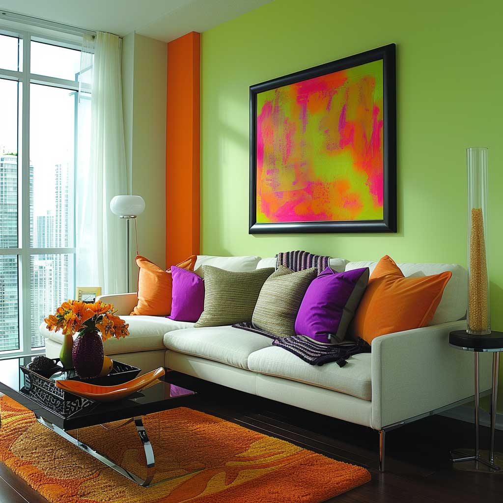
For living room accent wall ideas that go beyond flat color, the same bright-plus-neutral principle applies regardless of how much texture or pattern you layer on. The neutral surround is non-negotiable — it’s the frame that makes the bright wall readable as art instead of accident.
Light Accent Wall Colors That Actually Push Walls Outward
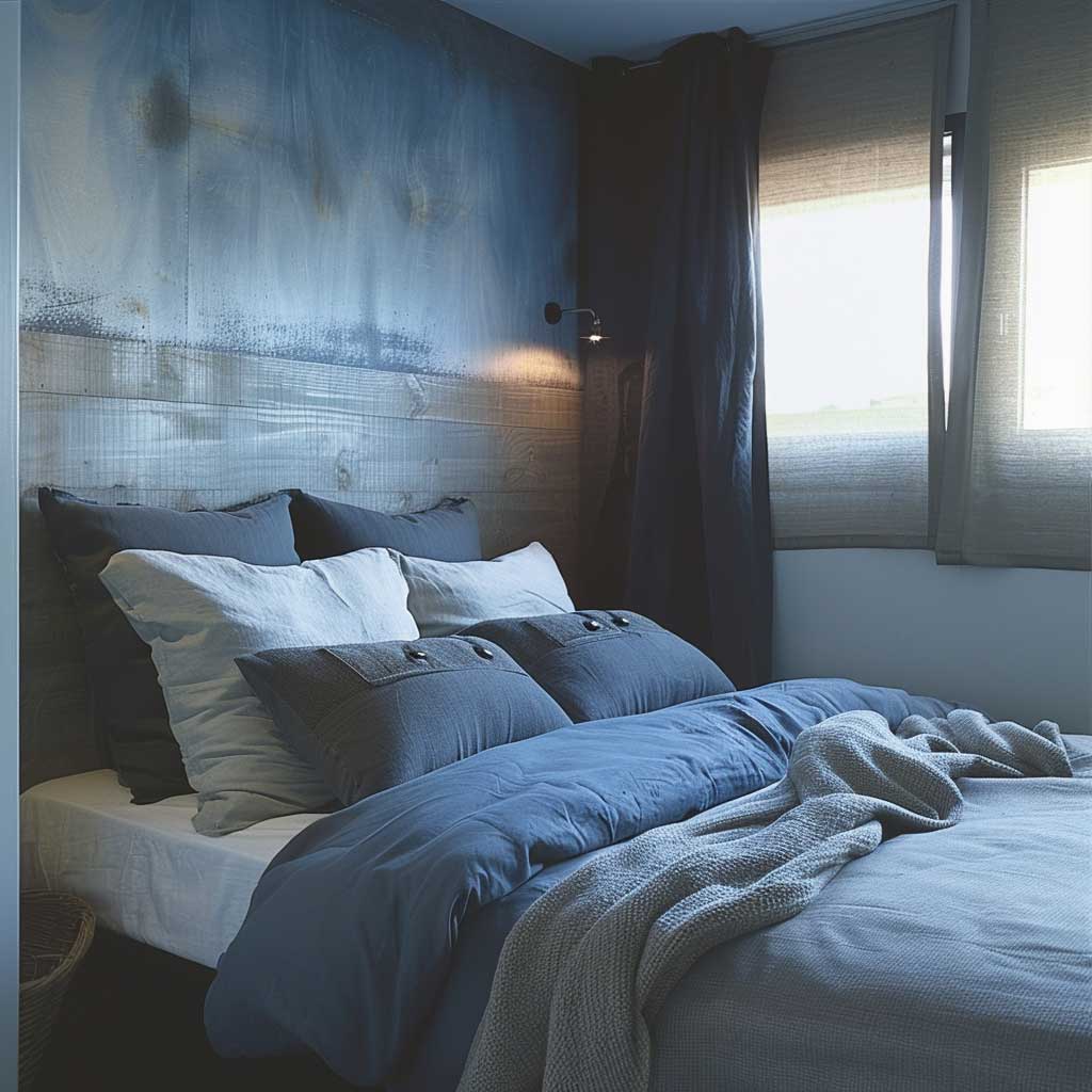

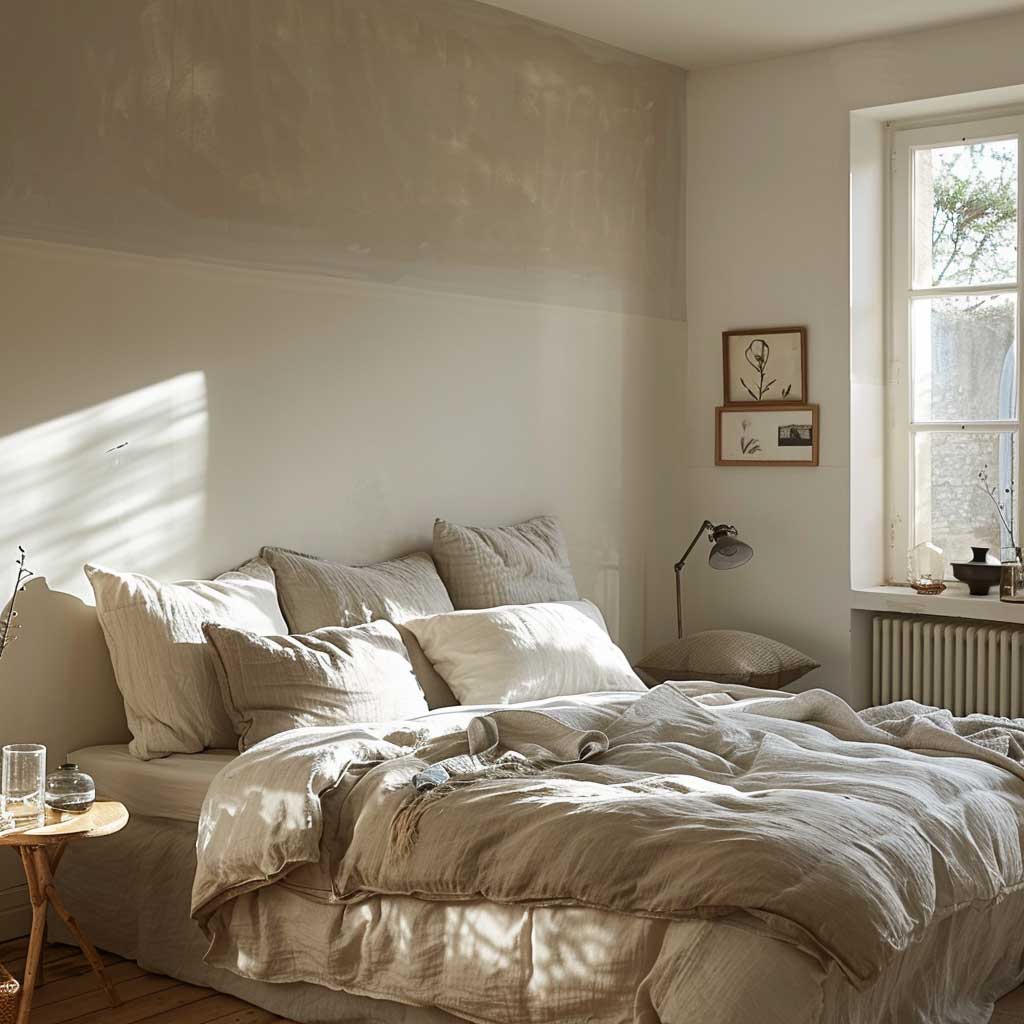
Light accent wall colors work on a completely different mechanism than bold ones — instead of creating drama, they create atmosphere. Benjamin Moore’s Santa Barbara Green 2037-60 (LRV 68, $72/gallon) looks like a breath of fresh air on a wall without being so pale it disappears. I’ve used it in a 10×12 ft guest room and three people independently commented that the room felt bigger than my main bedroom, which is twice the size.
The distinction between a light accent wall and just a light wall is subtle but real. Your light accent wall needs to be at least two full shades deeper than the surrounding walls — not dramatically different, but noticeably intentional. If you’re working with Sherwin-Williams Alabaster SW 7008 on the surrounding walls, your light accent wall should land somewhere around Sage SW 6150 ($67/gallon) or Rainwashed SW 6211. That gap reads as deliberate. Anything smaller just looks like you bought the wrong can.
What kills a light accent wall: adding too much furniture in the same tonal range. If the wall is soft sage and the sofa is olive velvet and the rug is forest green, everything compresses into a flat green blob. You need at least one high-contrast element — a white linen sofa, a cream boucle armchair, black metal shelving — to give the light wall something to read against. Think of it as a theater backdrop: the wall needs performers in front of it.

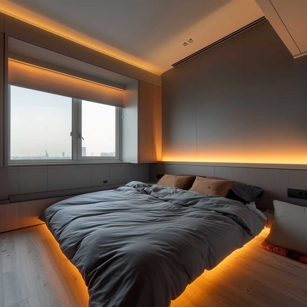
Light accent wall colors interact with natural light in a way bold colors don’t — they shift through the day without losing their identity. Trailing Vines 1505 from Benjamin Moore reads almost white at noon in a south-facing room and settles into a mossy sage by evening. That shift is a feature, not a bug. Small rooms feel more dynamic when the wall color moves with the light rather than sitting flat. Is that predictable? No. Is it interesting to live with? Absolutely.
For a minimalist accent wall approach, light colors on a single wall pair naturally with exposed white trim and unframed artwork. Clare Paint’s Wanderer ($49/quart) is a dusty sage with green-gray undertones that photographs as neutral but reads as color in person — exactly what a minimalist small room needs. It gives you the feel of a curated space without announcing itself at full volume.
- Don’t paint the ceiling the accent color. In a small room, a dark or saturated ceiling compresses the vertical space dramatically. The room will feel like a shoebox lid is closing on you.
- Don’t use flat paint on your accent wall. Flat finish hides imperfections but absorbs so much light it can make a bold color look muddy and dull. Eggshell or satin finish (Sherwin-Williams Emerald Interior Satin, ~$75/gallon) reflects enough light to make the color perform as intended.
- Don’t choose your accent wall color from a tiny paint chip. Colors look 3-4x more saturated on a full wall. Always test a 12×12 inch sample on the actual wall for 48 hours before committing.
- Don’t accent a wall that has a window in the middle of it. The window interrupts the color field and makes the design look accidental. Solid, uninterrupted walls are always the better accent choice.
For simple wall painting designs that complement a light accent wall, the surrounding room’s palette does most of the heavy lifting. The accent wall only needs to be two decisions: the right wall and the right depth of color.
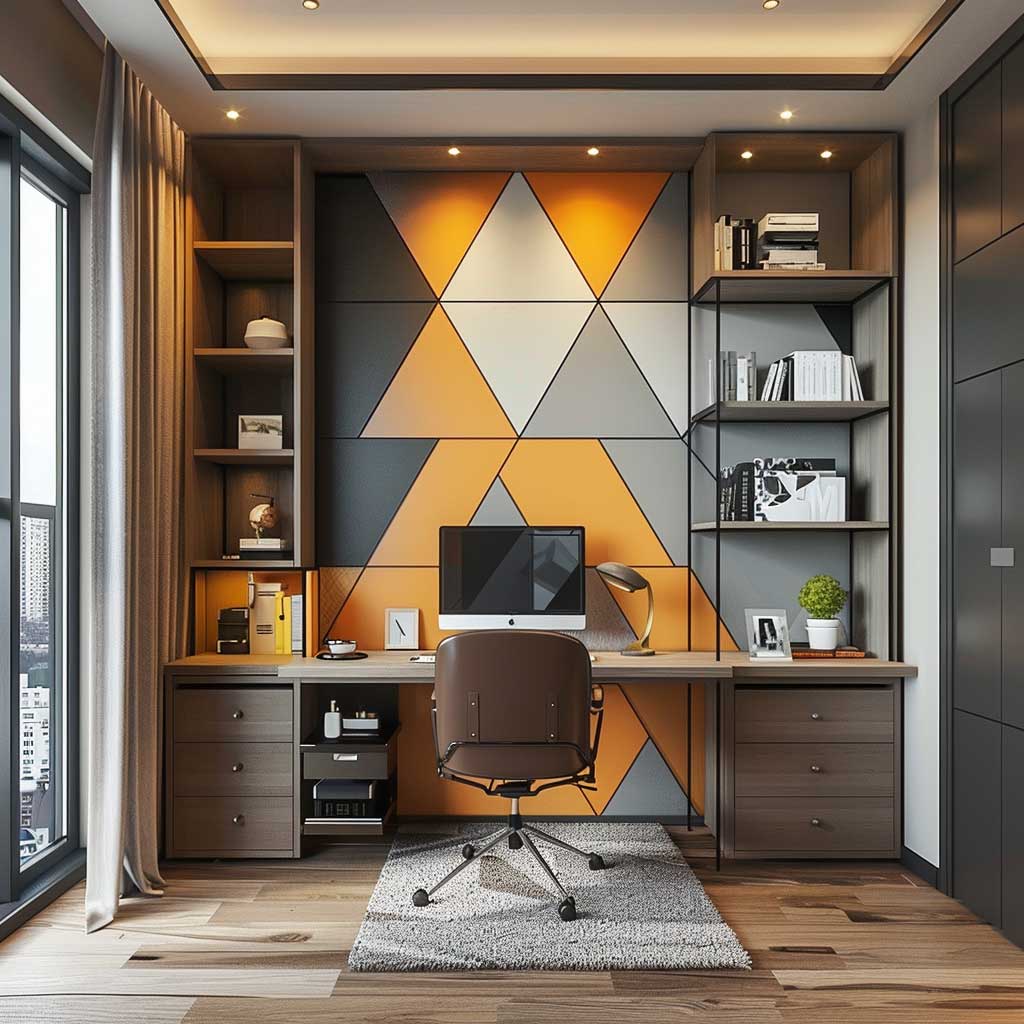
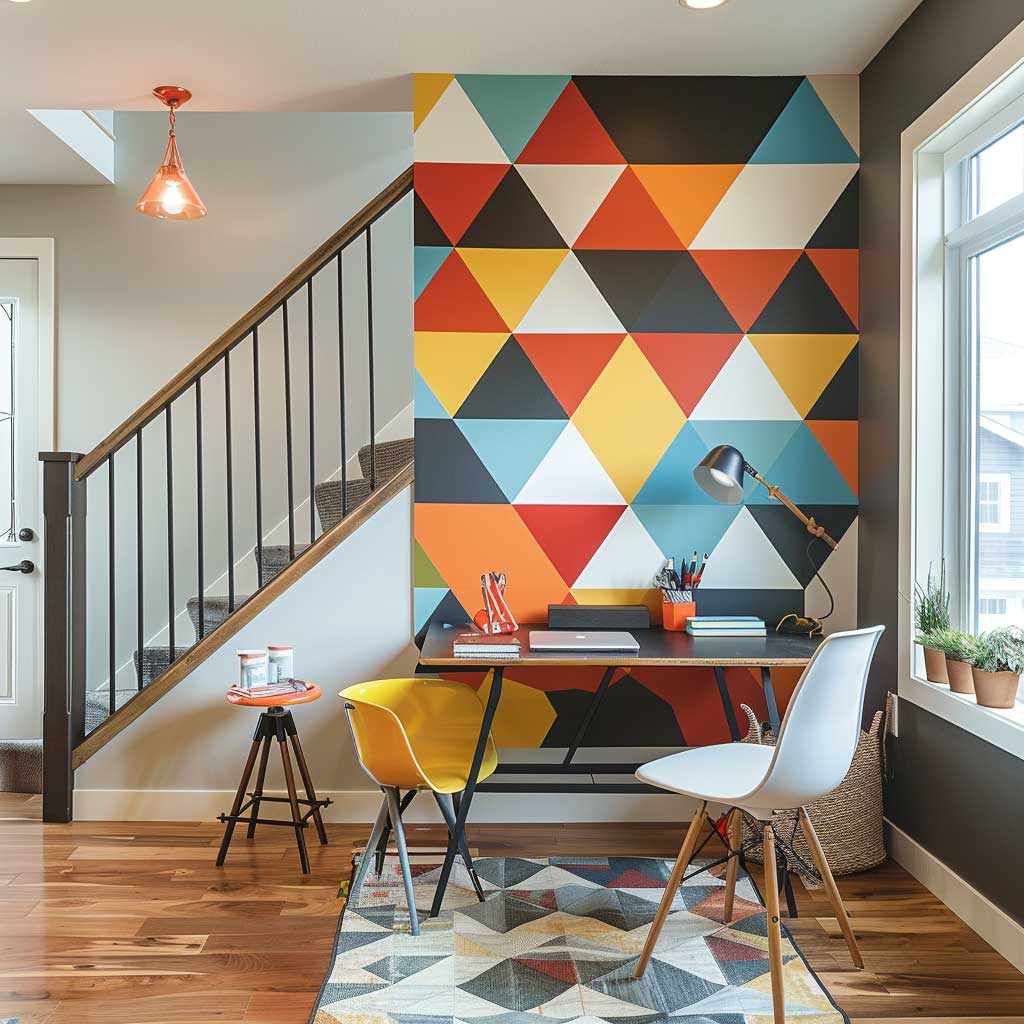
Geometric Accent Wall Paint Patterns for Small Rooms With No Square Footage to Spare


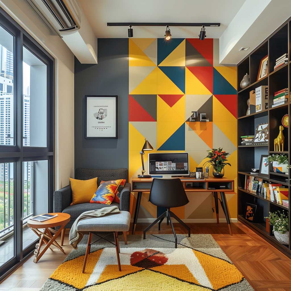

Geometric accent wall paint patterns are the one accent wall idea that adds a dimension solid color can’t — visual movement. A chevron or diamond pattern on a small bedroom wall functions like an optical illusion: the repeating angles fool the eye into reading distance where none exists. I’ve used Frog Tape’s Shape Tape ($12 at Home Depot) to paint a 45-degree diamond grid in two shades of the same Benjamin Moore color and the wall looked like it had been professionally designed, not DIY’d with $30 of paint.
The color selection inside a geometric pattern follows its own logic. A two-tone approach — one color from the wall’s base, one slightly deeper shade — is the cleanest execution for small rooms. Contrast-heavy geometric patterns (think black and white chevron) are visually exhausting in tight spaces; they work in large living rooms where you have physical distance from the wall. You need at least 8 feet of clearance to read a high-contrast geometric pattern comfortably. Closer than that and it becomes visual noise that makes the room feel smaller, not larger.
Vertical stripe patterns are geometrically the most useful tool in a small room with low ceilings. Two 4-inch alternating stripes in Sherwin-Williams Accessible Beige SW 7036 and Worldly Gray SW 7043 (both $67/gallon) can visually add 2-3 feet of ceiling height. The stripe direction matters more than the colors: vertical always reads as height, horizontal always reads as width. Choose based on your room’s specific limitation — low ceilings need vertical stripes, narrow rooms benefit from horizontal.


Painted arch patterns are the geometric accent wall trend that replaced shiplap in 2024 and haven’t slowed down since. A single arch centered on your accent wall — painted in a deeper tone than the surrounding walls — creates a framing device that makes whatever is inside the arch (a bed, a console table, a reading chair) look intentionally placed. The arch costs about $40 in painter’s tape and a quart of paint. It takes three hours and looks like you hired someone.
Lighting interacts with geometric patterns in a way that makes evening dramatically different from morning. Raking light from a side window or floor lamp catches the texture of paint layered at tape edges and creates a subtle shadow line between sections. That shadow line adds depth to a flat surface — it’s the same principle architects use with shadow gaps between wall panels. Place a directional floor lamp at a 45-degree angle to your geometric accent wall and you’ll see the pattern transform into something that looks three-dimensional. An unexpected bonus: geometric walls photograph significantly better than solid-color walls for anyone staging a space for photos.
Bottom Line
The Right Accent Wall Paint Makes 120 Square Feet Feel Like a Considered Room
Bright accent wall paint ideas work for small spaces when the surrounding three walls stay neutral — the contrast is the entire mechanism, and without it you just have four painted walls.
Light accent wall colors (LRV 55-70) are the safest move in rooms under 120 sq ft: Benjamin Moore Santa Barbara Green 2037-60, Clare Paint Wanderer, and Sherwin-Williams Rainwashed SW 6211 all perform well at that range.
Geometric paint patterns add the third dimension a solid color can’t — vertical stripes add ceiling height, painted arches frame furniture, and two-tone diamond grids turn a blank wall into architecture. Save this post.
Related Topics