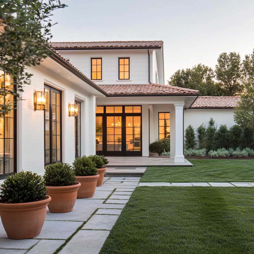
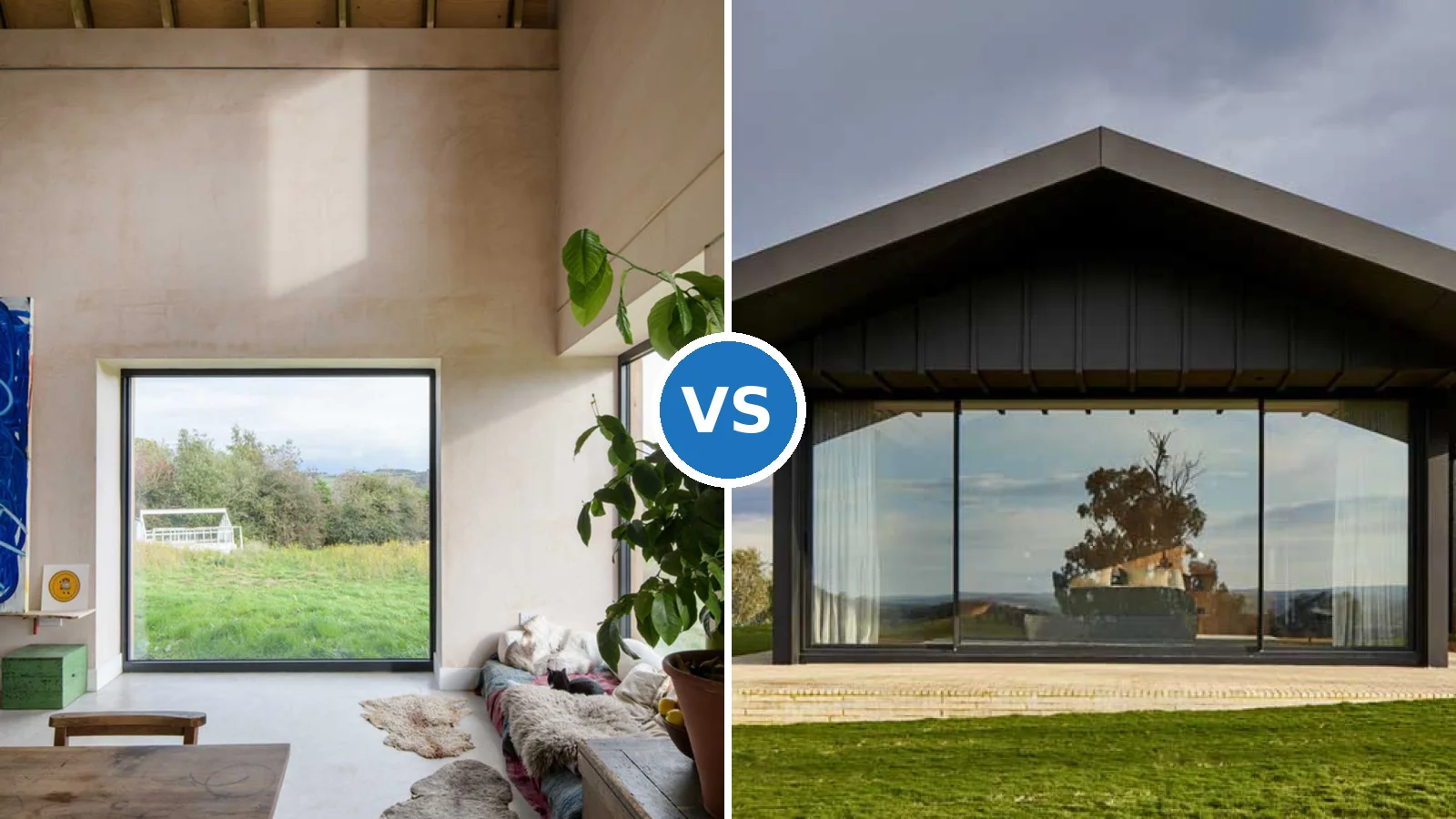
A terracotta and beige house exterior works because both colours draw from the same pigment family — iron oxides, the most UV-stable compounds in exterior paint. That scientific fact explains something aesthetically obvious: this combination looks right on day one and still looks right seven years later when the neighbour’s trendy charcoal is already chalking at the eaves. The warmth is not decorative. It’s structural.
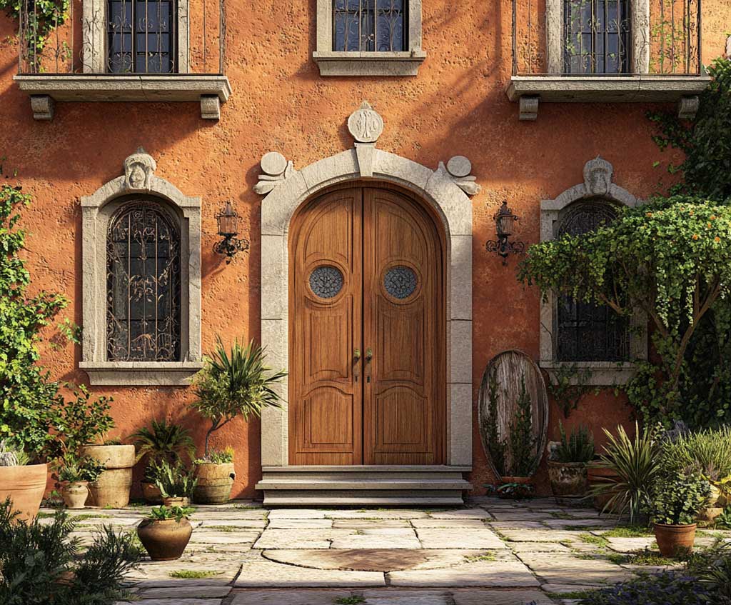
Terracotta sits in the red-orange band of the earth spectrum, deepening under midday sun and going almost amber at dusk. Beige sits in the sandy-neutral zone with a Light Reflectance Value typically between 55 and 72, depending on the specific shade — warm enough to complement clay tones without competing with them. Together they form the colour logic that Mediterranean architects have been running for centuries without a trend cycle to justify it.
Sherwin-Williams named a soft terracotta — Redend Point SW 9081 — its 2023 Color of the Year, which confirmed what facade designers already knew: the hue had moved from regional to universal. The combination explored here goes further, pairing that clay warmth with beige in ratios that determine whether the result reads as classic, contemporary, or somewhere deliberately in between.
- Terracotta and beige both use inorganic iron-oxide pigments — the most UV-resistant class of exterior colour
- Sherwin-Williams Rookwood Terra Cotta SW 2803 and Benjamin Moore Terra Cotta Tile 2090-30 are the two most referenced exterior shades in this family
- SW Emerald Exterior runs $80–$95/gallon; SW Duration Exterior $70–$80/gallon — both are the right tier for a terracotta-beige scheme you want to hold 7–10 years
- Beige trim with an LRV of 60+ keeps the facade bright enough to photograph well from the street without washing out the terracotta body
- The combination works on stucco, brick, and fiber cement — each substrate changes the repaint interval (stucco: 5–6 years; fiber cement: 10–15 years)
- South- and west-facing walls fade faster regardless of colour — plan touch-ups there first
What Happens to a Classic Facade When Terracotta and Beige Are Applied Together
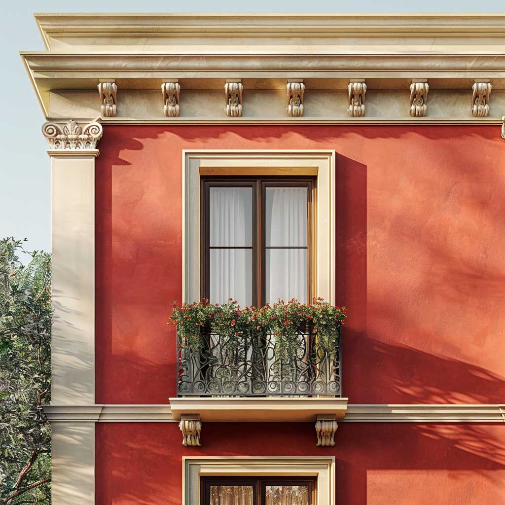
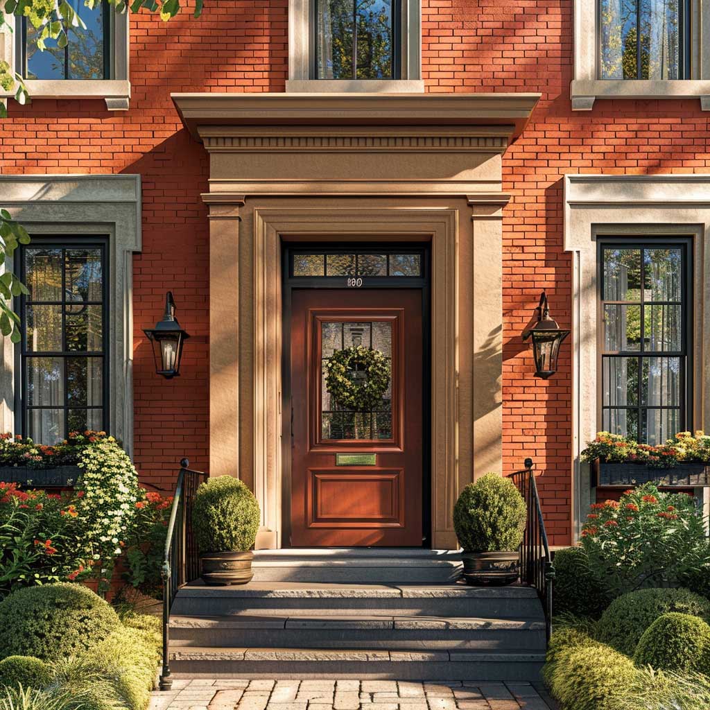
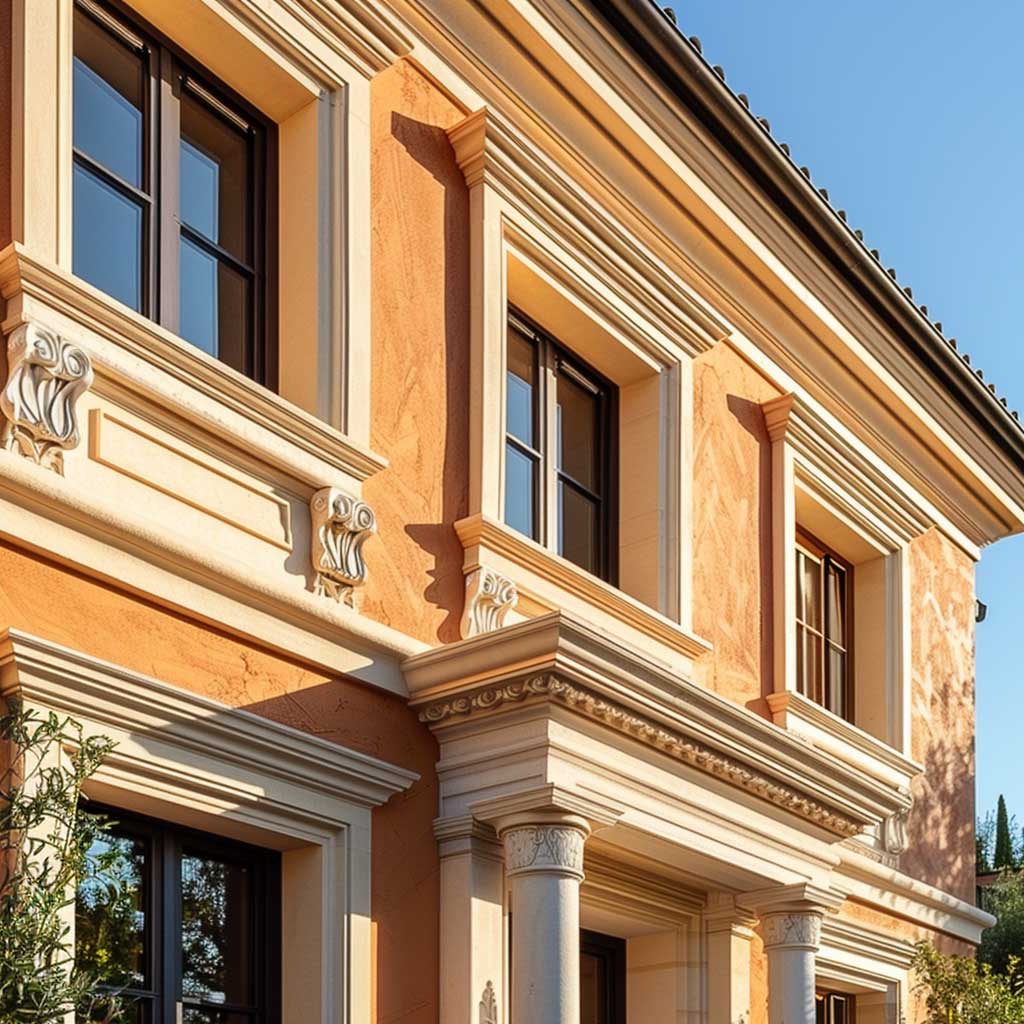

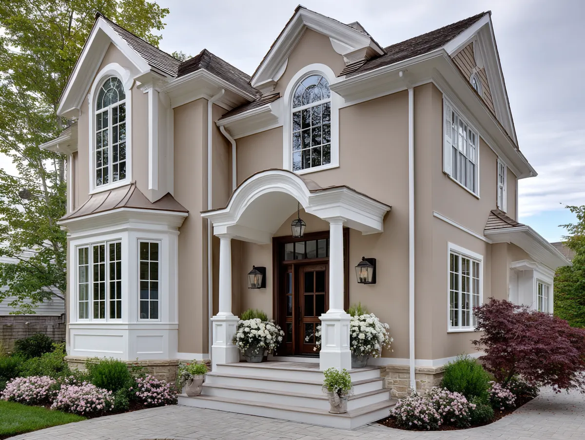
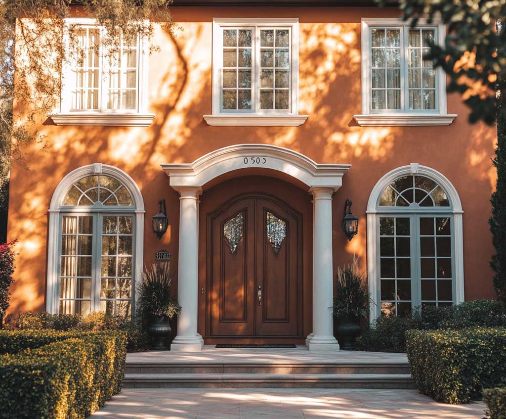
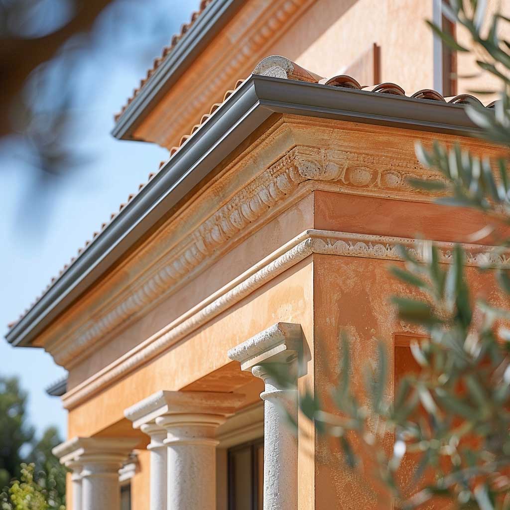
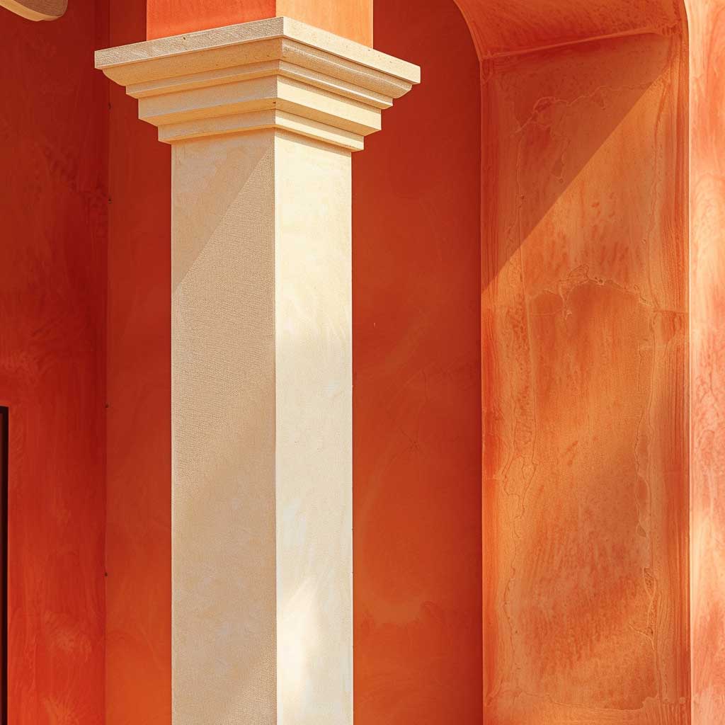
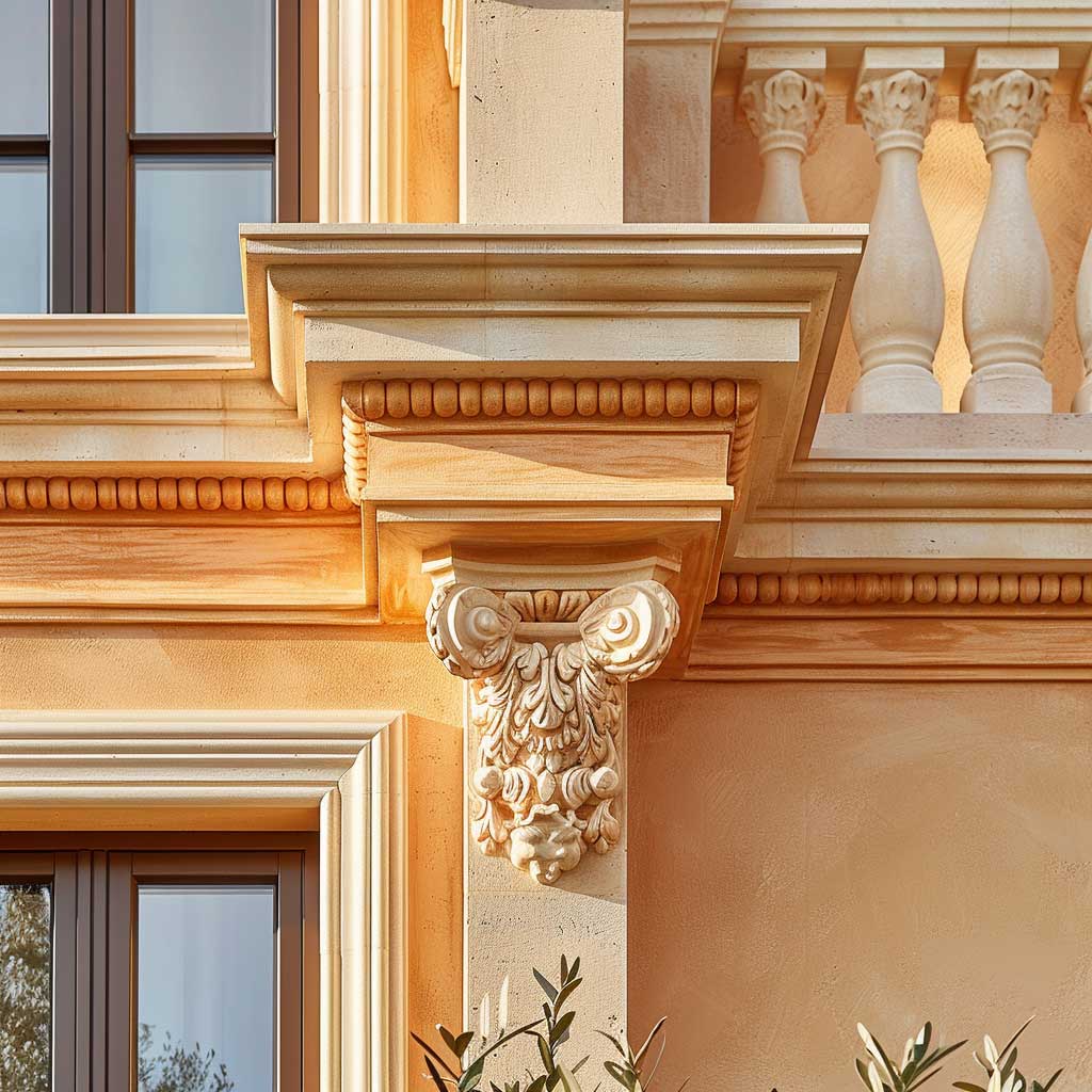
Classic facades — the ones with cornices, column details, and arched openings — already have a built-in rhythm. The job of colour is to follow that rhythm, not override it. Terracotta on the main body does this by reading as an extension of the masonry itself, the way fired brick or clay tile reads before anyone reaches for a paint brush. Beige on the trim details separates each architectural element cleanly without introducing a competing temperature — it stays in the same warm family, just lighter.
Terracotta’s iron-oxide base means the pigment is chemically stable under UV exposure in a way that organic reds and oranges simply are not. Sherwin-Williams’ own pigment guidance notes that inorganic earth tones like brick red, beige, and tan consistently support the longest colour warranties — compared to the organic pigments used in bright fire-red or blaze-orange shades that fade noticeably within two to three years on a south-facing wall. The practical translation: a terracotta facade repainted with quality exterior paint at $80–$95 a gallon for Emerald Exterior should hold its depth for 7 to 10 years on fiber cement or stucco siding. On raw wood, plan to check the finish every 5 to 7 years.
What does the beige actually do structurally? Think of it as the space between notes in a chord — the thing that lets each element of the facade read individually. Decorative moldings painted beige against a terracotta body catch the light differently at different hours, making the depth of the carving visible from the street. Without that contrast, even elaborate cornices flatten into the wall. The mistake most people make is choosing a beige that’s too grey — it reads cold against the terracotta’s warm undertone and the facade looks unresolved, like two separate design decisions happening simultaneously on the same building. Stick to beige shades with LRV 60 or above and a yellow or sandy bias, not a grey one.
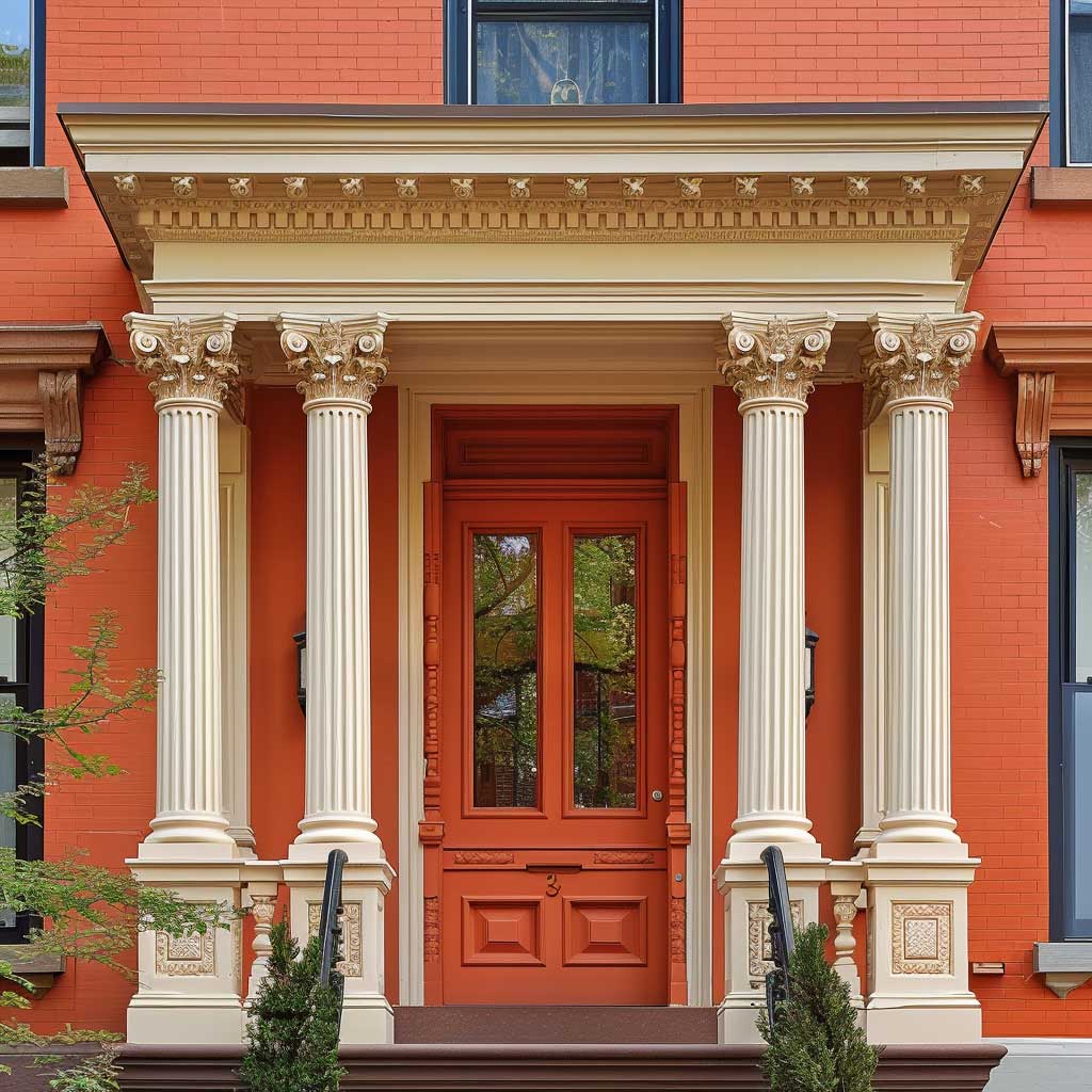
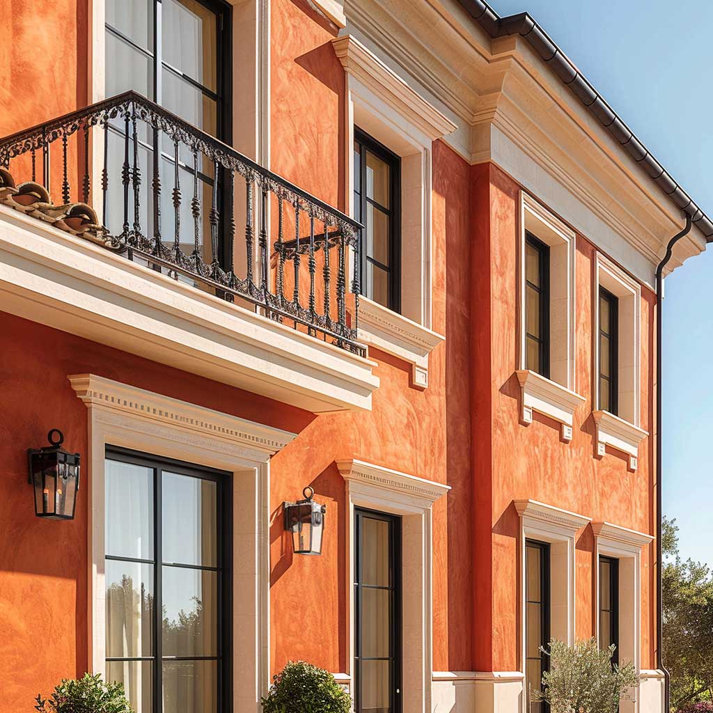
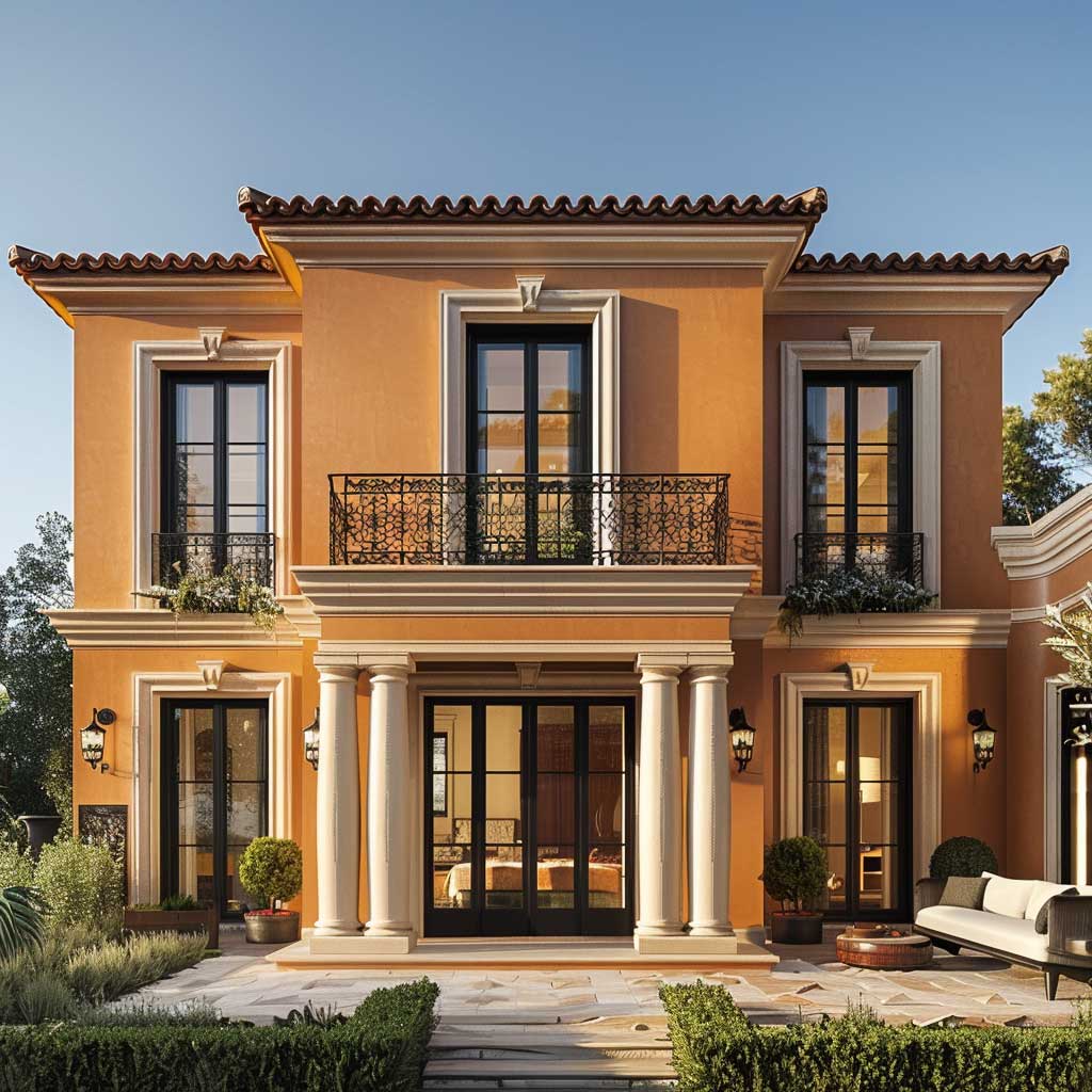
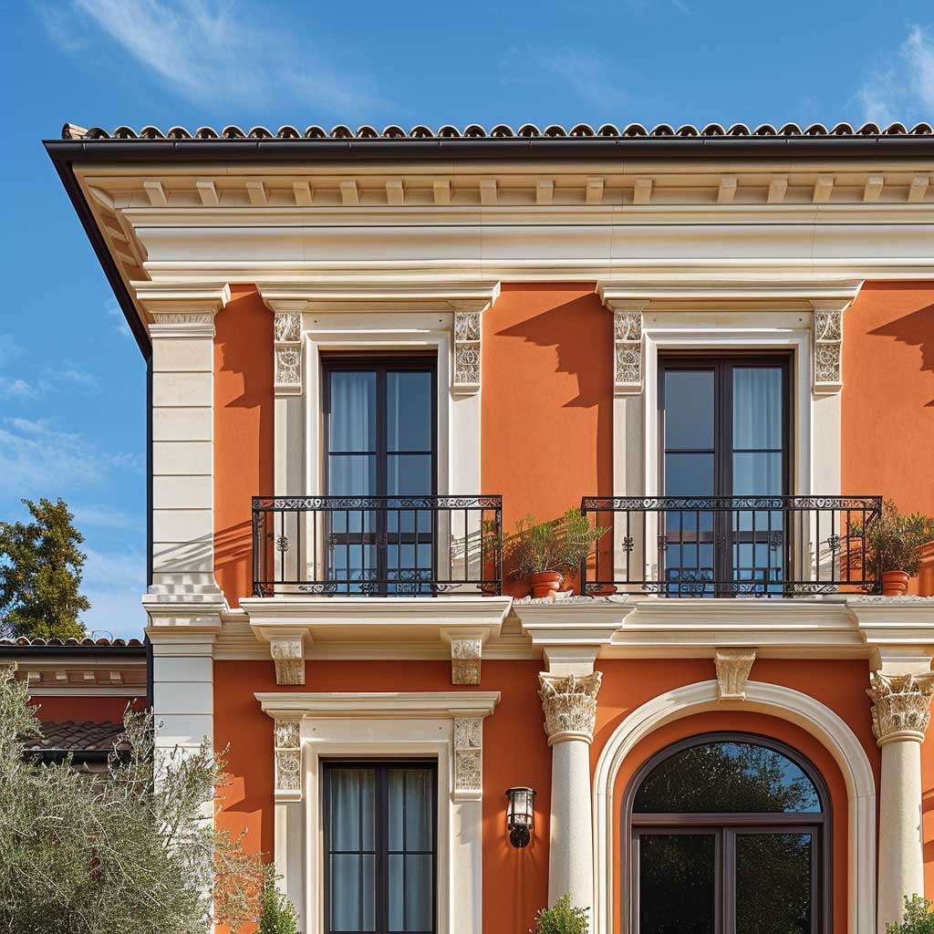
At the pigment level, both colours age in the same direction — gently muting rather than cracking or fading unevenly. After several years of sun exposure, a terracotta wall softens slightly toward a dusty rose-brick, while beige trim shifts toward warm ivory. The combination stays internally consistent as it ages, which is more than can be said for schemes that mix warm and cool hues — those combinations tend to age away from each other. If you want a facade that looks considered in year one and in year eight, the terracotta-beige pairing is structurally the safest choice in the earth-tone family. For a variation of this warm palette that brings sand tones into the mix, terracotta and sand combinations follow the same pigment logic with a slightly lighter overall result.
Don’t pair a grey-toned beige with terracotta. Beige shades that read neutral or cool indoors go visually cold when placed next to terracotta’s warm orange-red outdoors. The result looks like the trim and body came from two different colour schemes — because at the undertone level, they did. Test the beige swatch directly against your terracotta sample in outdoor afternoon light before committing to a full gallon. If the beige looks faintly grey or lavender next to the terracotta, it will fight the body colour across the entire facade. Go warmer: look for sandy yellows, wheat tones, or true cream, not greige.
Cream and Terracotta House Exterior — Where the Ivory Variant Earns Its Keep

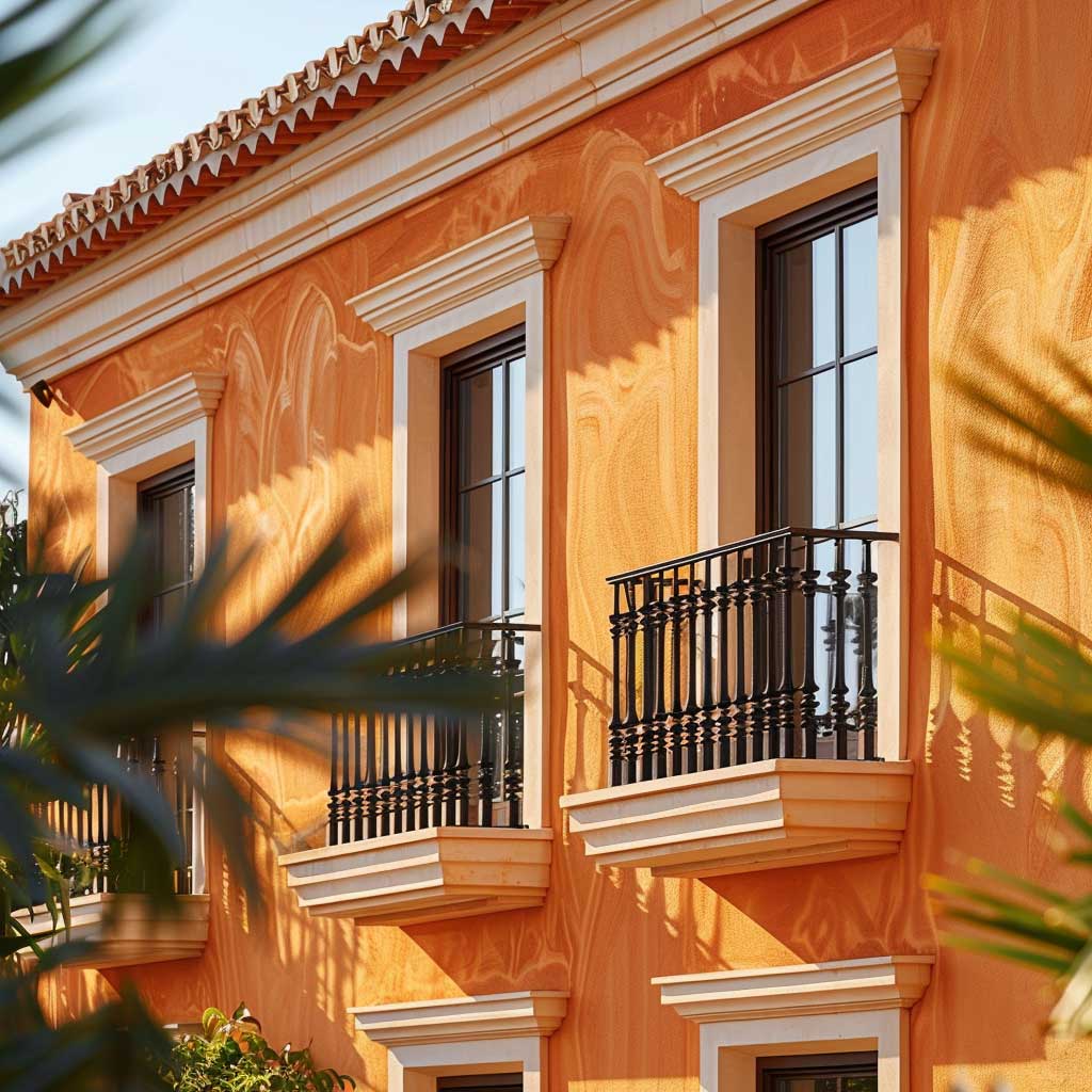
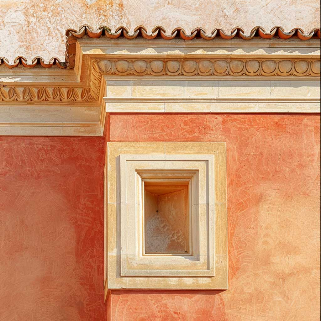
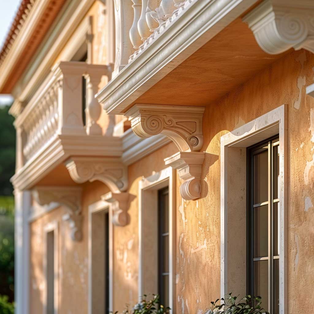
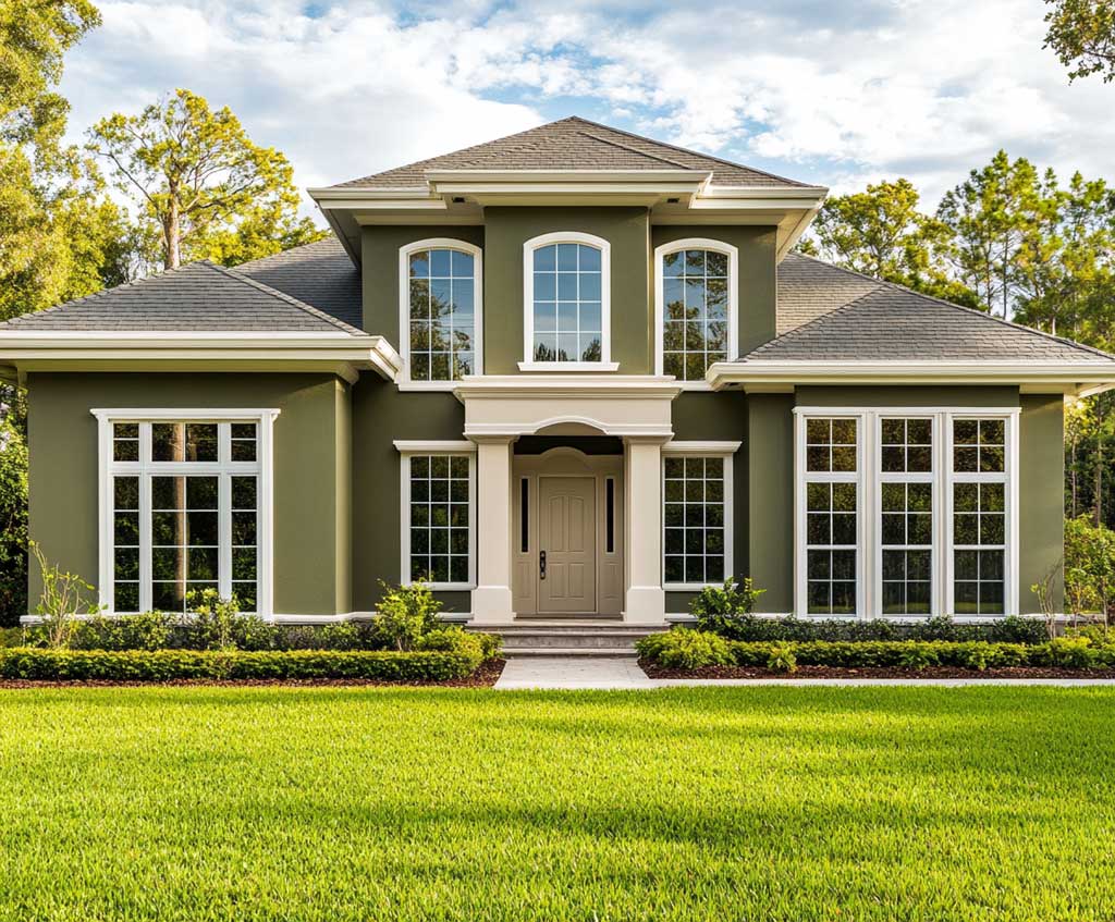
A cream and terracotta house exterior runs the colour ratio in reverse — light body, terracotta accent — and delivers a noticeably different street reading. Cream walls with an LRV around 72 reflect more ambient light, making the facade read brighter at dawn and dusk than an all-terracotta body. The terracotta then appears in shutters, trim, roof tile, or door detail: earthy accents that the eye reads as warmth without the full weight of a terracotta body. This is the version that photographs most consistently across light conditions because the light base handles overcast days gracefully while the terracotta accent keeps the scheme from going flat.
The practical question is which terracotta to use for trim against a cream wall. Sherwin-Williams Rookwood Terra Cotta SW 2803 is a mid-depth option in the historic colour line — warm enough to read against cream without looking orange, grounded enough to avoid the synthetic brightness of cheaper exterior pigments. Benjamin Moore Terra Cotta Tile 2090-30 runs slightly cooler and more brick-red, which pairs better with true ivory walls rather than warm creams. Testing a 12-by-12-inch sample of each against the intended wall colour in outdoor afternoon light will answer the question faster than any digital visualiser.
Does cream work on all architectural styles, or only on Mediterranean forms? Cream as a body colour is surprisingly adaptable — it reads as Colonial on a symmetrical facade with a panelled door, Mediterranean on a stucco volume with a clay tile roof, and quietly contemporary on a flat-front facade with minimal ornament. The terracotta accent does the style signalling. Use it on shutters and roof tile and the result reads warm-European; use it only on the front door threshold and a single planter and it reads urban-minimal. The versatility is a feature, not a liability, as long as the cream undertone stays yellow or pink — not grey. Exterior paint at this price tier ($70–$80 per gallon for SW Duration Exterior) justifies testing before committing, because cream is the category most affected by the colour temperature of surrounding materials like stone, brick, and hardscape.
One underappreciated detail in the cream-and-terracotta combination: gutters and fascia. Bright white gutters against a cream wall create a jarring tone contrast that makes the roofline look unfinished. Stylists recommend painting gutters and fascia in the same cream or a tone slightly lighter to maintain temperature continuity across the entire exterior envelope. It is a roughly $150–$200 correction on a standard two-storey that changes the whole roofline reading from five metres back.
The scheme also connects naturally to a broader family of warm neutral pairings. If the approach of using a white or near-white body against terracotta accents appeals, the reasoning behind that version is detailed thoroughly in the context of white house with terracotta trim — where the same warm-temperature matching rules apply, just with higher contrast between the two elements.
Front Elevation Colour Combination — Reading the Facade from the Street

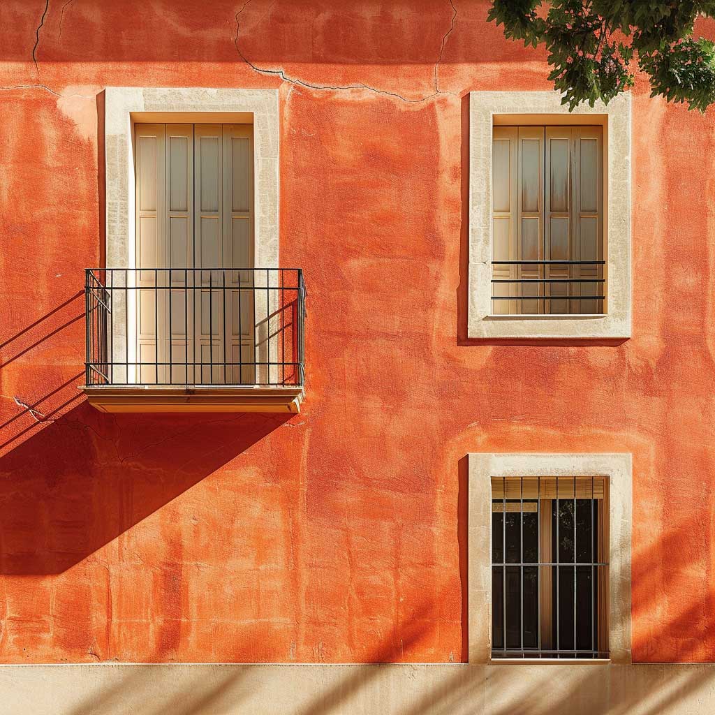
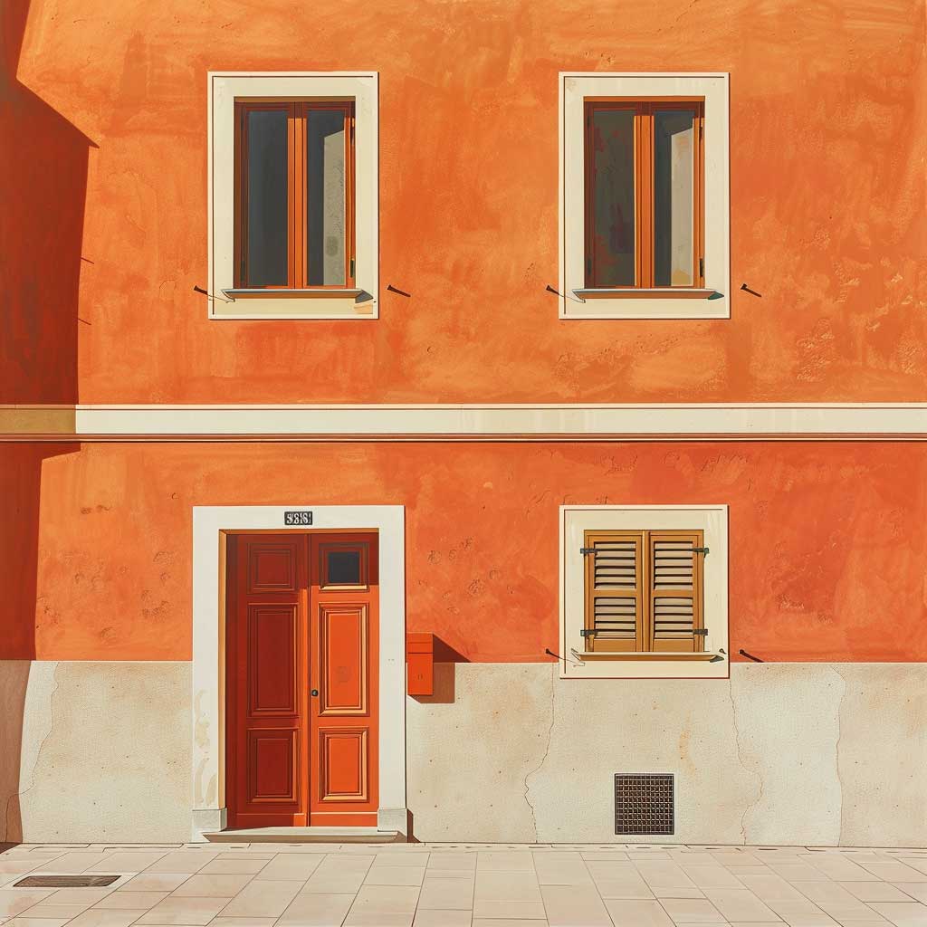
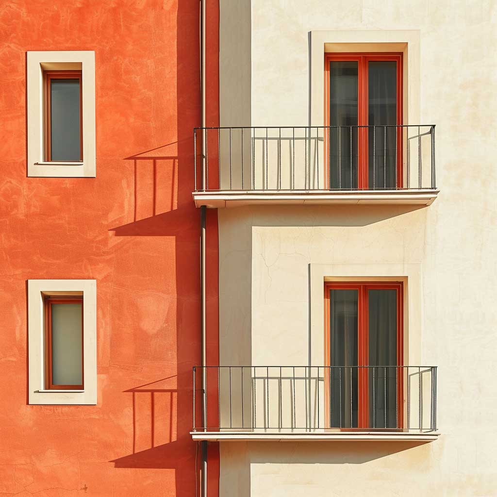
Choosing a front elevation colour combination in terracotta and beige requires thinking in layers rather than in single shades. The street-level read happens in roughly two seconds — the brain categorises value (light versus dark), temperature (warm versus cool), and contrast (high versus low) almost simultaneously. Terracotta and beige score: warm, medium-contrast, and mid-value. That combination reads as approachable rather than dramatic, which is why it works on both modest townhouses and elaborate villas without looking either too restrained or too ostentatious.
The 60-30-10 rule applies directly here: 60% dominant body colour (terracotta or beige, depending on which carries the facade), 30% secondary trim or accent colour, and 10% feature colour for the front door, planters, or threshold tile. That 10% is where the combination gets interesting — a deep forest green door against terracotta walls reads as a Provençal farmhouse, while a dark wrought-iron black door against the same terracotta reads as a formal townhouse. The 60-30 ratio stays fixed; only the 10% changes the cultural register of the whole facade. South- and west-facing elevations receive the most direct UV and tend to show the first signs of fading — particularly chalking on stucco surfaces — so those walls are worth inspecting every year or two between full repaints, regardless of the colour chosen.
What kills a front elevation colour combination that would otherwise work? Mismatched finishes between adjacent surfaces. A terracotta body in satin sheen next to beige trim in flat sheen produces a texture contrast visible from 10 metres back that reads as unfinished, not intentional. Stylists recommend keeping sheen levels consistent across the facade body — satin or low lustre throughout — and reserving semi-gloss exclusively for doors and window frames where durability demands it. Flat or matte sheens on broad terracotta walls also accentuate texture beautifully, but they hold dirt faster in high-humidity climates, which adds a pressure-wash to the maintenance schedule. Sherwin-Williams’s pigment guidance confirms that inorganic earth tones like terracotta and beige carry the best long-term colour stability for outdoor use, making them the most defensible choice when durability and aesthetics need to be the same decision.
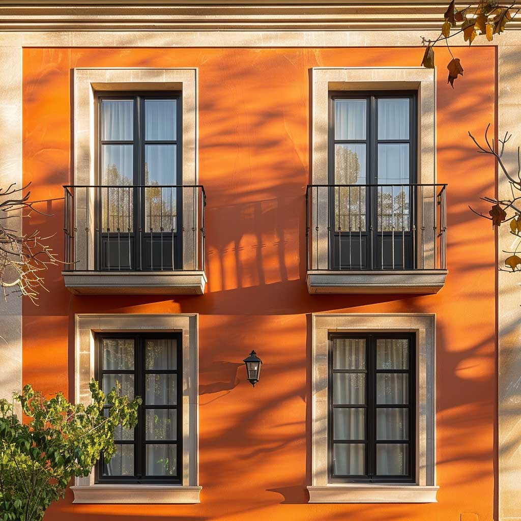


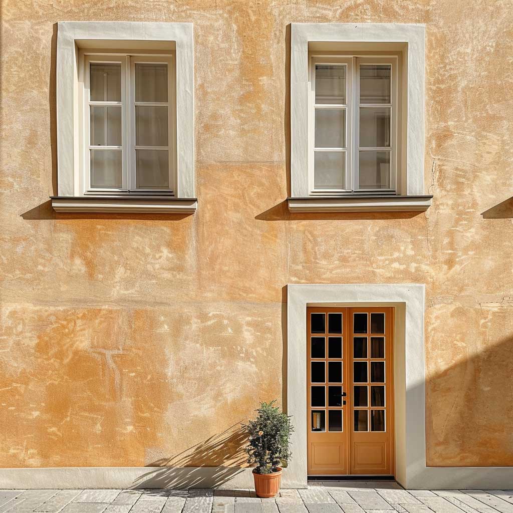
Colour temperature also shifts between morning and afternoon light on a front elevation. Terracotta walls that read rich and saturated at 10 AM can go flat and brick-dusty by 3 PM if the beige trim shade is too close in value. The trick is keeping the beige at least 15 LRV points above the terracotta to maintain enough brightness contrast for the facade to hold its shape in direct overhead sun. At golden hour — that 40-minute window before sunset — terracotta walls that seemed almost red-brown in the afternoon shift to a deep amber and the beige trim goes warm ivory. It is the same principle as a wood floor in a white interior: the warm element amplifies reflected light in a way a cool or neutral element never would. According to Sherwin-Williams’s guidance on selecting exterior colours by pigment durability, inorganic pigments like those in terracotta and beige resist UV degradation more effectively than any organic paint colour — meaning the metamerism that makes a facade look different in different light is a feature to manage, not eliminate.
Terracotta Exterior Paint Colour — Choosing the Shade That Holds Its Depth
Terracotta exterior paint colour spans a wider range than most people realise before they open a colour fan deck. At the lighter end sit dusty rose-terracottas like Sherwin-Williams Redend Point SW 9081 — warm and muted, almost salmon in direct sun — which works on modern flat-front facades where a bolder red-brown would feel too heavy. At the saturated end sits Rookwood Terra Cotta SW 2803, a deep brick-red historically associated with Victorian and Craftsman exteriors. Between those two poles are several dozen options that respond differently to substrate texture, sheen, and surrounding landscape colour.
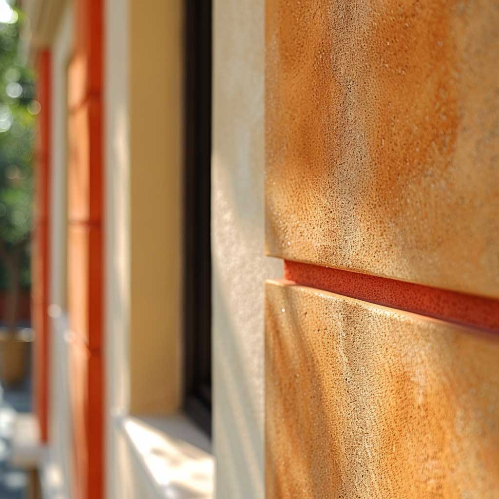
How does terracotta read differently on stucco versus brick? On stucco, the colour sits flat and even — it becomes the texture itself, reading very close to raw clay. On brick, terracotta paint actually competes with the substrate’s natural colour variation, often flattening what would otherwise be an interesting surface. Colour consultants generally recommend leaving exposed brick unpainted if it already has terracotta or red undertones and reserving terracotta paint for render, stucco, or smooth-faced concrete where the pigment can do all the visual work. Painting over brick also shortens the repaint cycle significantly — brick holds paint for 8–17 years when the substrate is properly prepared, but that lifespan drops when the surface traps moisture behind the paint film.
The finish matters more on terracotta than on many other exterior colours. A flat or matte finish accentuates texture and reads deeply earthy — exactly right for Mediterranean or rustic applications. A satin finish on terracotta reads slightly more polished and suburban, without looking glossy. Avoid semi-gloss on terracotta body walls — the sheen amplifies the orange undertone, which can push the colour toward pumpkin in afternoon light. Reserve semi-gloss for the dark front door where durability counts and the colour is dark enough to absorb the sheen. The repaint interval on a well-applied exterior at this price tier ($70–$95 per gallon for quality Sherwin-Williams lines) is 7 to 10 years on stucco or fiber cement — shorter on wood siding, where 5 to 7 years is realistic before the surface starts to check or peel.
| Variant | Best For | Maintenance Interval | Key Risk |
|---|---|---|---|
| Terracotta body + beige trim | Classic, Mediterranean, stucco facades | 7–10 years on stucco/fiber cement | Grey-toned beige reads cold against warm body |
| Cream/ivory body + terracotta accents | Colonial, villa, contemporary flat-front | 7–10 years on stucco; 5–7 years on wood | Bright white gutters create roofline clash |
| Beige body + terracotta door and planters only | Understated suburban, minimal ornament | 7–10 years on fiber cement | Too little terracotta loses the warmth entirely |
- SW Redend Point SW 9081 — Sherwin-Williams 2023 Color of the Year; dusty rose-terracotta, reads lighter and more contemporary
- SW Rookwood Terra Cotta SW 2803 — deeper brick-red terracotta, best on classic and historic facades
- BM Terra Cotta Tile 2090-30 — slightly cooler, more brick-toned; pairs well with true ivory walls
- Both SW and BM offer terracotta in their exterior lines with iron-oxide pigment base — the most UV-stable option available at retail
Final Take
A terracotta and beige house exterior does not need trends to stay relevant — the pigment chemistry does that automatically
Iron-oxide pigments in both colours age in the same direction: slowly muting rather than cracking or fading unevenly. Plan for a quality exterior paint at $70–$95 per gallon and a 7–10 year repaint cycle on stucco or fiber cement.
Keep the beige LRV at least 15 points above the terracotta to hold the facade’s brightness contrast in direct overhead sun. Avoid grey-toned beiges and bright-white gutters — both break the temperature continuity that makes this combination work.
At golden hour, terracotta shifts toward deep amber and beige goes warm ivory. No other exterior colour combination amplifies reflected light the same way. Save this post — you’ll want the paint references when the contractor shows up.