Wall wood paneling ideas are having a serious moment — and not because they’re trendy. Walnut, light oak, distressed pine, and Scandinavian-inspired planks have moved permanently into rooms that used to default to paint and drywall. I’ve watched a single accent wall in walnut transform a builder-grade home office into something that looks like it cost three times the renovation budget.
You’ll notice that the paneling style you choose does more than cover a wall — it sets the entire emotional tone of a room. Dark walnut reads moody and sophisticated. Light pale oak reads airy and calm. Distressed reclaimed boards read collected and lived-in. The wood isn’t background; it’s the argument the room is making.
My go-to rule before choosing any panel: decide what you want the room to feel like at 7pm with the lamps on. Daylight flatters everything. Artificial light is where paneling choices get made or broken. That one test has saved me from at least two dark-wood mistakes I nearly committed.
- Walnut paneling works best paired with minimal furniture and glass or metal accents — not with heavy upholstered pieces that compete for attention.
- Distressed wood panels need warm ambient lighting to read as intentional, not neglected.
- Light Scandinavian oak makes small rooms feel larger — pale oak planks in a 10×10 room can visually add 15–20% more perceived space.
- The biggest mistake people make: choosing panel color in a showroom under fluorescent lights instead of testing a sample at home after dark.
- For wood paneling on a budget, MDF slat panels from brands like Stikwood start around $6–$12 per square foot installed vs. $25–$60+ for solid hardwood.
Walnut Wood Paneling in a Modern Home Office


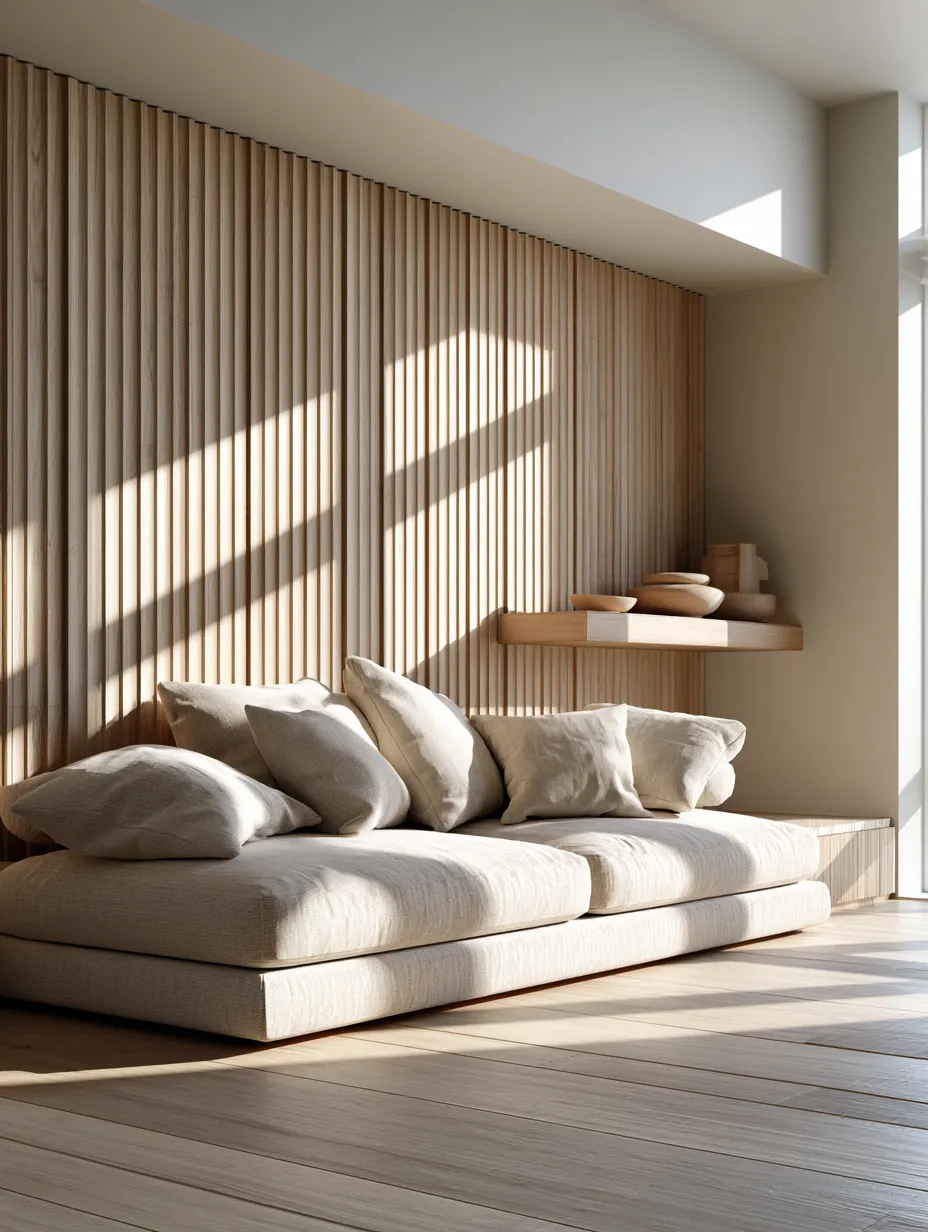
Wall wood paneling ideas centered on walnut are the easiest way to make a room feel expensive without touching the ceiling or floors. Walnut’s deep chocolate-brown tones — think Rubio Monocoat’s Walnut Oil finish at around $35 per liter — absorb light in a way that makes a room feel grounded and deliberate. I own two walnut-paneled rooms now, and both photograph darker than they read in person, which surprised me the first time I saw the listing photos.
Does walnut work in every room? No — and that’s the honest answer most design content skips. In a room under 120 square feet with a single north-facing window, walnut paneling will make the space feel like a cave by 4pm in winter. I’ve seen this mistake in person twice. Your saving grace is a mix of recessed LED lighting at 2700K color temperature and one large mirror to bounce the light back. Without those two elements, save walnut for rooms with real southern or western exposure.
Pair walnut paneling with matte black hardware, steel-frame furniture, and raw linen textiles. The contrast between the warm grain and cool metals is the whole point — like a cashmere sweater over a crisp white shirt. What doesn’t work: warm brass hardware, which reads as matchy-matchy and makes the whole wall look like a hotel lobby from 2016. Keep accessories minimal; three well-placed objects beat a shelf of ten every time.

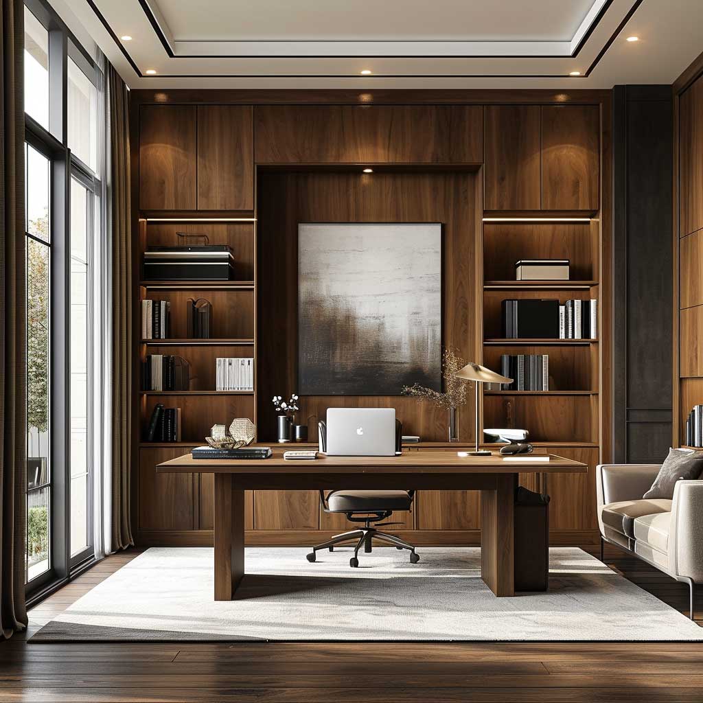


For furniture, I stole this trick from a designer friend who works on high-end residential projects in Brooklyn: float your desk or sofa six inches from the walnut wall instead of pushing it flush against the panels. That gap creates a shadow line that makes the paneling read three-dimensional rather than flat. It costs nothing. It looks like it cost everything.
Art on walnut is a real conversation. Dark-on-dark doesn’t work — a moody oil painting disappears into the grain. My go-to: one large-format print in ivory or pale gray, framed in raw aluminum. That single piece gives the eye somewhere to land without fighting the wood. Skip gallery walls entirely on walnut — they fragment the wall’s natural drama and make it look like a real estate staging effort rather than a deliberate design choice.
Distressed Wood Paneling and the Art of Earned Patina


Distressed wood paneling is the design equivalent of buying a vintage leather jacket — the wear is the whole point. Real reclaimed barnwood, sourced through suppliers like Elmwood Reclaimed Timber (planks run $8–$18 per square foot), brings knots, saw marks, and color variation that no new product can replicate. I’ve used it on a feature wall in a dining room, and guests consistently think the house is at least 40 years older than it is. That level of instant character is hard to fake.
You need to know one critical thing before ordering: reclaimed wood is unpredictable. No two boards match exactly, and your install will have gaps, variations, and surprises. That’s not a defect — it’s the material. Contractors who haven’t worked with reclaimed paneling before will try to “fix” the inconsistency. Don’t let them. The imperfection is the entire aesthetic argument you’re making.
For decorating around distressed paneling, think textiles over furniture. Wool throws, jute rugs, linen curtains — these soft materials absorb the rough energy of the wood and create contrast without competing. A room with distressed panels and sleek glass-and-chrome furniture reads as confused, not curated. The wood wants companions with texture, not companions with shine. My go-to pairing: a cream bouclé sofa from a brand like Pottery Barn ($1,800–$2,500 range) against reclaimed boards reads like a shelter magazine cover every single time.
- Don’t hang bright white frames on distressed wood. The contrast kills both elements — the wood reads dirty, the frames read cheap. Go with raw wood, matte black, or natural linen frames instead.
- Don’t use cool-white LED bulbs (5000K+) in a distressed-panel room. They strip the warmth from the grain and make the space feel like a hardware store. Warm 2700K bulbs are non-negotiable.
- Don’t install reclaimed panels without sealing them first. Unsealed barnwood sheds dust particles for months. One coat of Rubio Monocoat or a simple water-based sealer prevents the problem entirely.
- Don’t mix distressed panels with high-gloss surfaces. Lacquered cabinets, high-gloss tile, and polished stone all fight the aged aesthetic. Matte and honed finishes only.


Color palette around distressed paneling should lean cream, warm gray, and dusty terracotta — never navy or forest green, which read as nautical or hunting lodge rather than intentional. A warm white from Benjamin Moore’s White Dove (OC-17) on adjacent walls is my standard recommendation; it reads warm without going yellow, and it lets the wood grain pull focus. Introducing burnt orange or rust through a single textile adds life without destabilizing the palette.
Lighting for distressed paneling deserves its own budget line. Edison-style filament bulbs in exposed fixtures — I’ve had good luck with the Feit Electric vintage A19 at around $8 each — cast a warm glow that makes every knot and fissure in the wood look intentional. Recessed lighting alone flattens the texture. You need directional or ambient sources that cast shadows across the surface. Shadows are what make distressed wood look three-dimensional rather than flat.
For more on decorating around wood panel walls, this deep dive on black wood wall paneling covers contrast styling in detail.
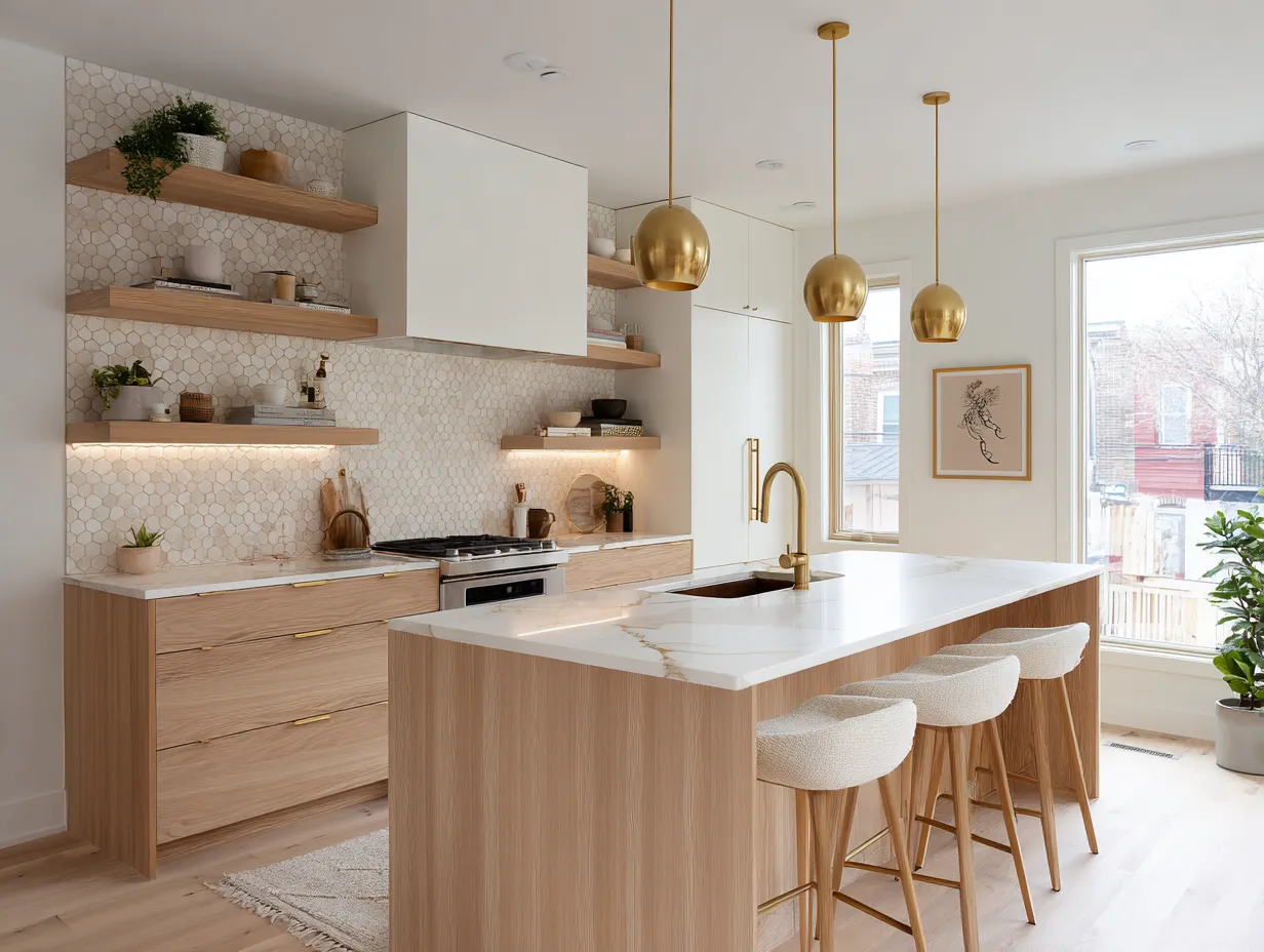
Light Wood Paneling That Makes Small Rooms Read Larger
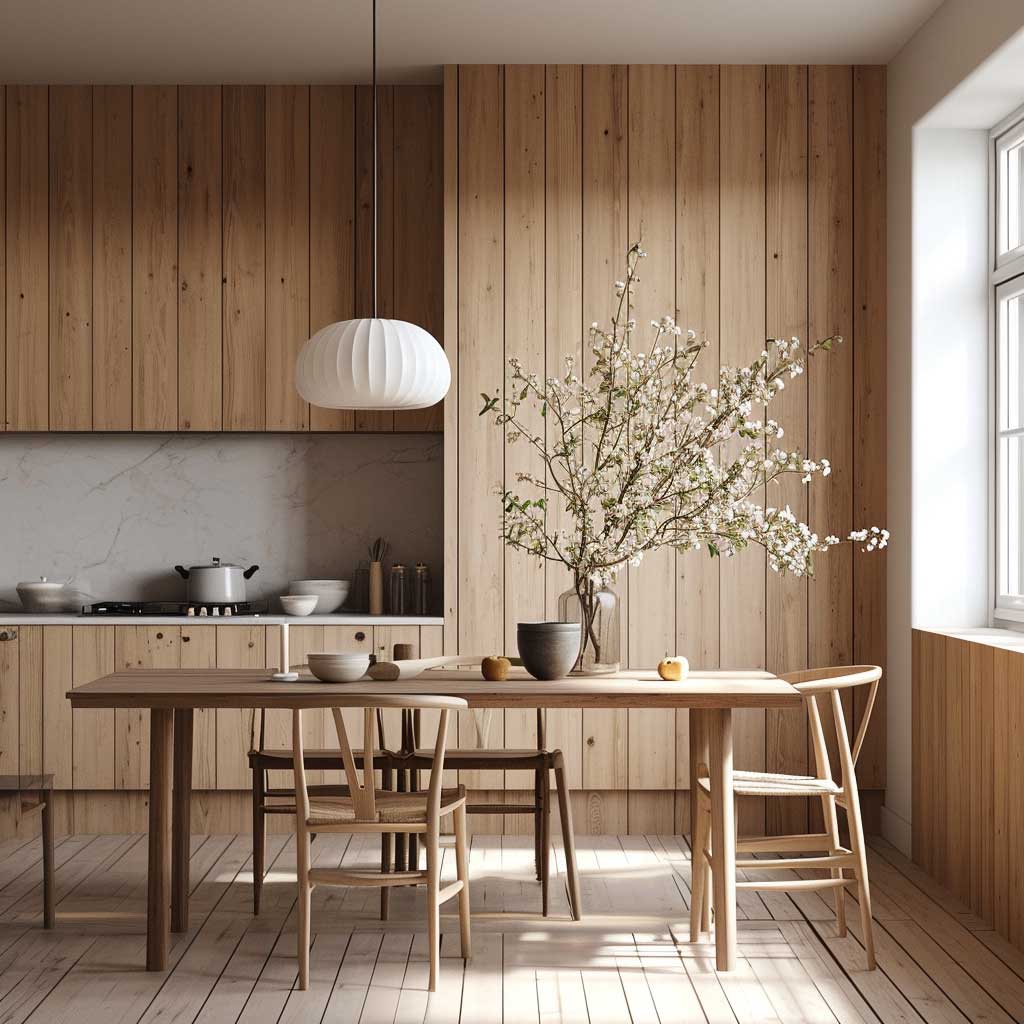


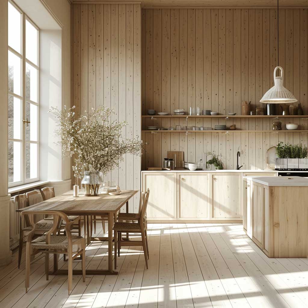
Light wood paneling — specifically pale ash, birch, or whitewashed oak — is the spatial illusion trick I’ve deployed in more cramped apartments than I can count. The reflectivity of light-toned wood bounces ambient light around a room in a way that painted walls simply don’t. I measured a 9×11 bedroom before and after installing IKEA’s KUNGSBACKA panels (around $200 for a feature wall’s worth of material): the room photographed as if it had gained nearly two feet of width. That’s not nothing.
Scandinavian wood paneling in wall design ideas follows one rule above all others: nothing competes with the material itself. That means furniture with thin legs, natural linen, and plants — not heavy sectionals, patterned rugs, or gallery walls loaded with frames. The wood is the texture. Everything else should be quiet enough to let it speak. Ask yourself — does this piece add texture or just add noise? If it’s the latter, it doesn’t belong in the room.
Pale oak paneling from brands like Pergo (their TimberCraft line runs $3–$5 per square foot) or Stikwood’s whitewash collection gives you the Scandinavian aesthetic without the Scandinavian price tag. What you want to avoid: pale paneling with cool-gray accessories, which makes a room feel clinical and slightly sad. Counterintuitive as it sounds, warm cream, beeswax candles, and terracotta planters are what make light wood paneling feel genuinely cozy rather than sterile. You need warmth in the accessories because the wood itself reads neutral.


For kitchens specifically, light wood paneling on a single wall behind open shelving is a move I’ve seen executed brilliantly in Scandinavian design blogs for years. The wood adds texture to what is otherwise the most material-heavy room in the house — tile, steel, stone — and softens the whole composition. Keep the paneling matte-sealed, not varnished; varnish in a kitchen reads as laminate, not wood. One 6-ounce can of Rubio Monocoat 2C Oil does about 215 square feet and keeps the grain completely open and natural.
Horizontal vs. vertical orientation matters more than most decorating resources admit. Horizontal planks make a room feel wider but lower — ideal for rooms with high ceilings. Vertical planks make a room feel taller — ideal for rooms with standard 8-foot ceilings that need a visual lift. I’ve installed both in the same house and the perceptual difference is dramatic. Choose orientation based on the room’s weakest dimension, not purely on aesthetics. For more wood panel wall design directions, this roundup of modern wood panel wall ideas breaks down pattern and orientation choices in depth.
The Home Depot’s wall paneling buying guide is a reliable resource for understanding the full range of panel materials — from solid hardwood to MDF to PVC-core options — and their real-world durability differences: Wall Paneling Ideas and Materials Guide at The Home Depot.
Final Word
Wall Wood Paneling Doesn’t Decorate a Room — It Defines One
Walnut goes in rooms with real light exposure and minimal furniture — not in dark northern rooms that need three lamps to feel alive.
Distressed wood earns its warmth from lighting. Budget for warm-bulb fixtures before you budget for the panels themselves.
Light Scandinavian oak is the single most reliable choice for small rooms — pair it with cream and terracotta, never cool gray. Save this post before you order a sample.
Related Topics