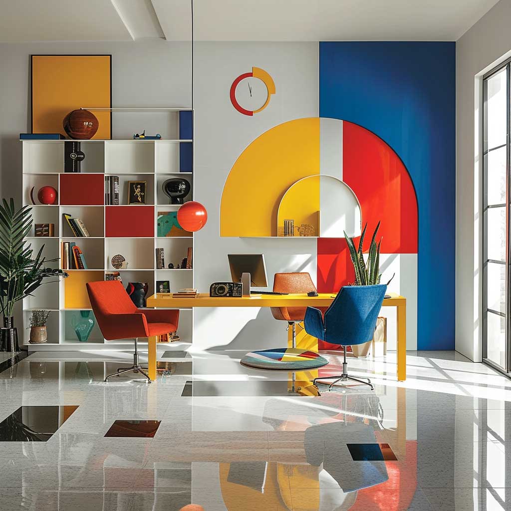
The Bauhaus color palette — red, yellow, and blue at full saturation, anchored by black and white — is the most misunderstood toolkit in modern interior design. Most people assume it’s loud. It isn’t. Used the way Walter Gropius’s school intended, it’s a structural system: each primary color carries a spatial job, not just a decorative one. I’ve tested this in two different living rooms and learned that the palette rewards precision and punishes guesswork. Pull it off and you get a house interior that looks like a manifesto. Get it wrong and you get a kindergarten classroom. The gap between those two outcomes is smaller than you think.
Kandinsky mapped it out in 1922 — yellow to triangle, red to square, blue to circle. You don’t have to follow his geometry literally, but the underlying logic still holds in contemporary rooms. Blue grounds a wall. Yellow lifts furniture. Red pins a focal point. Miss any one of those assignments and the composition collapses.
Quick Scan
- The Bauhaus colour palette is red, yellow, blue + black and white — used flat, no gradients
- Bauhaus style kitchen: matte black cabinetry + one primary accent per functional zone
- Blue walls calm. Yellow furniture energises. Red shelving activates. Use all three or none
- Biggest mistake: treating primary colours as accents rather than load-bearing design elements
- Bauhaus colour scheme works in any room size — the geometry matters more than the square footage
Blue Walls Do the Heavy Lifting — Everything Else Follows


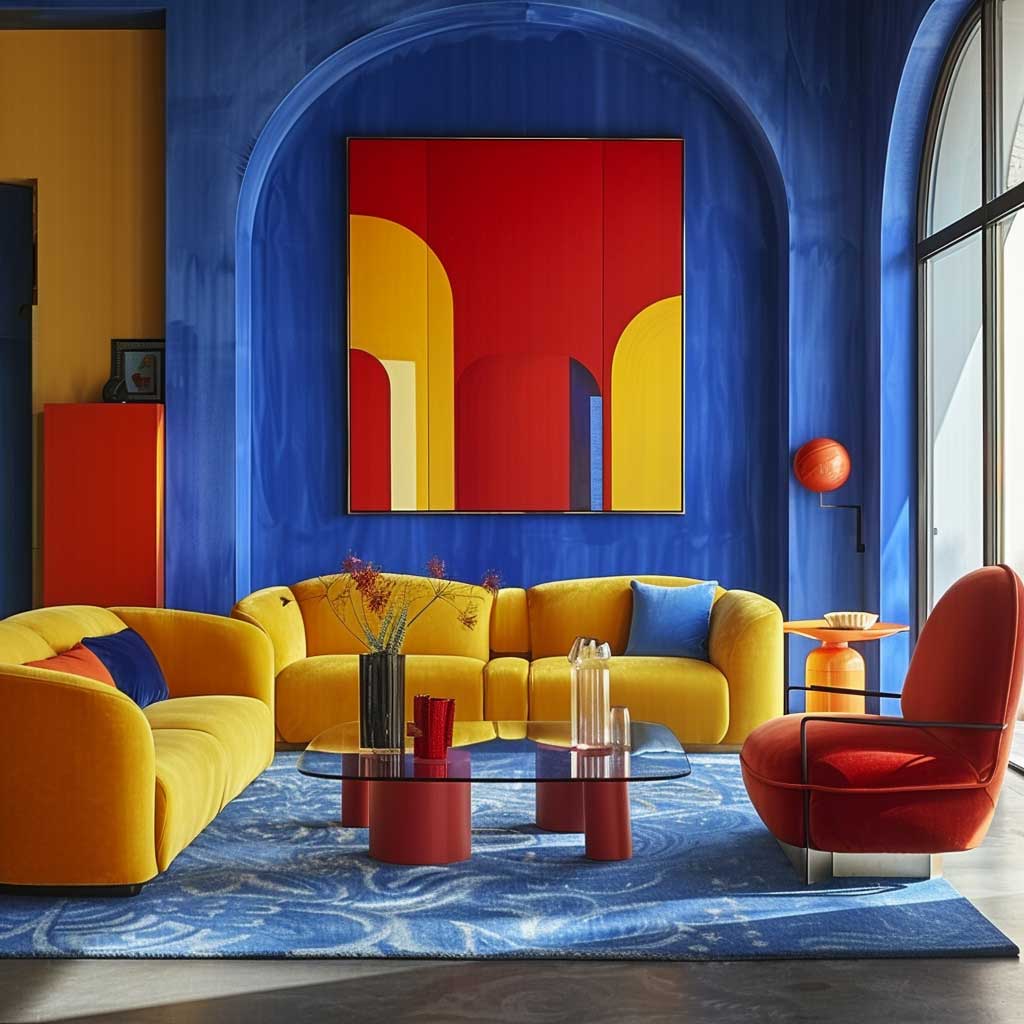
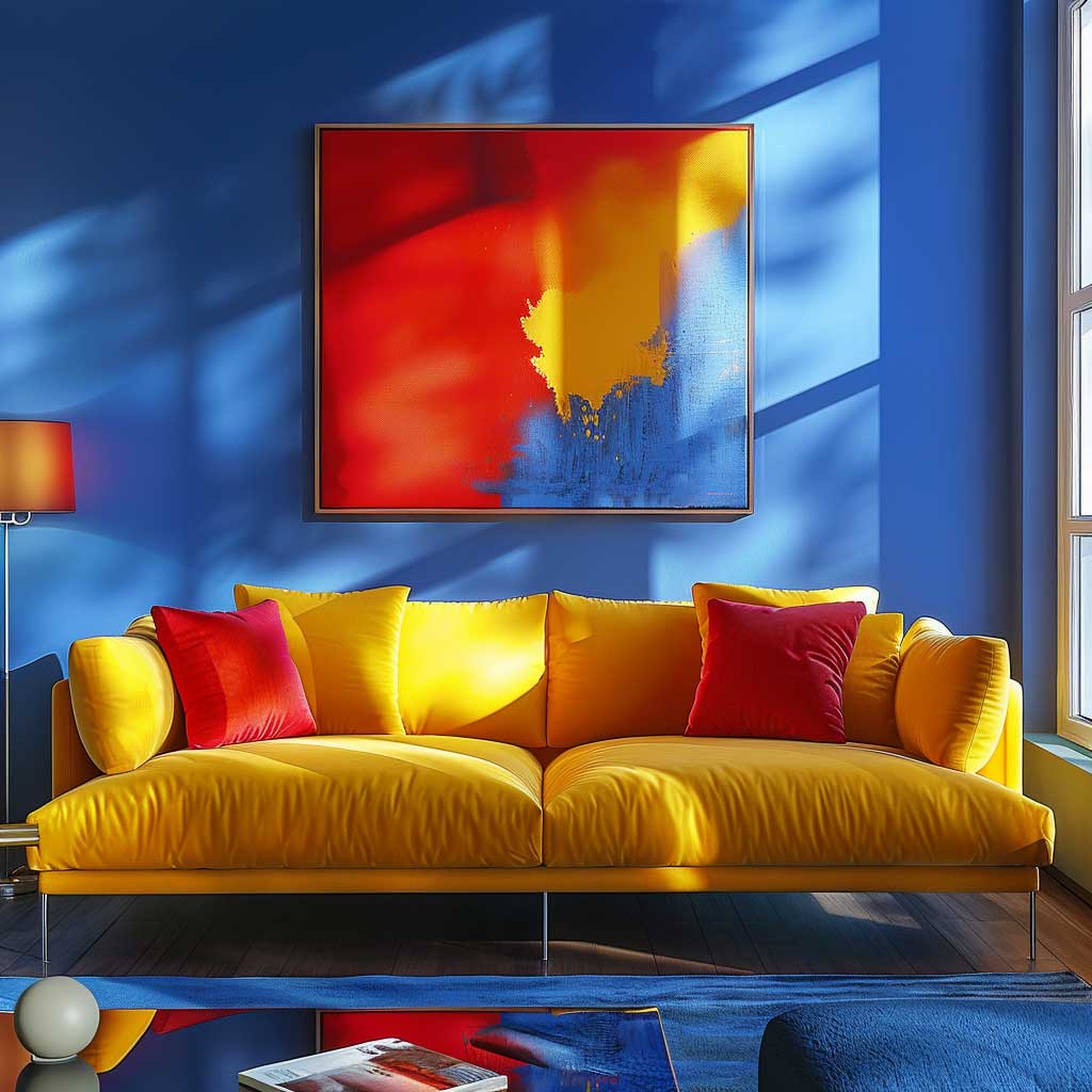
The most common entry point for a Bauhaus colour palette in a house interior is a single full-height blue wall. Not a blue accent wall — a blue room wall. The difference is philosophical. An accent wall hedges. A full wall commits. I painted mine in Benjamin Moore Cobalt Blue 2065-20, and the room reorganised itself around it within an hour of the second coat drying. Furniture I’d owned for years suddenly looked intentional rather than accumulated.
Against a saturated blue field, yellow furniture stops looking cheerful and starts looking architectural. A Muuto Outline sofa in Steelcut Yellow (around $3,200) or even a recovered midcentury armchair in traffic yellow hits the Bauhaus geometry target without costing a renovation budget. You’ll notice the room starts reading as a composition rather than a collection of objects. That’s the whole point.
Red enters last — and sparingly. One red piece per room. A floor lamp, a throw, a side table. Not three things. Not a gallery wall of red prints. Vitra’s Eames DSR chair in classic red runs about $620 and is the most direct route to an authentic Bauhaus reference. Spread the red across multiple objects and the tension dissolves into noise. Think of the red element as a period at the end of a sentence. One per room. Done.

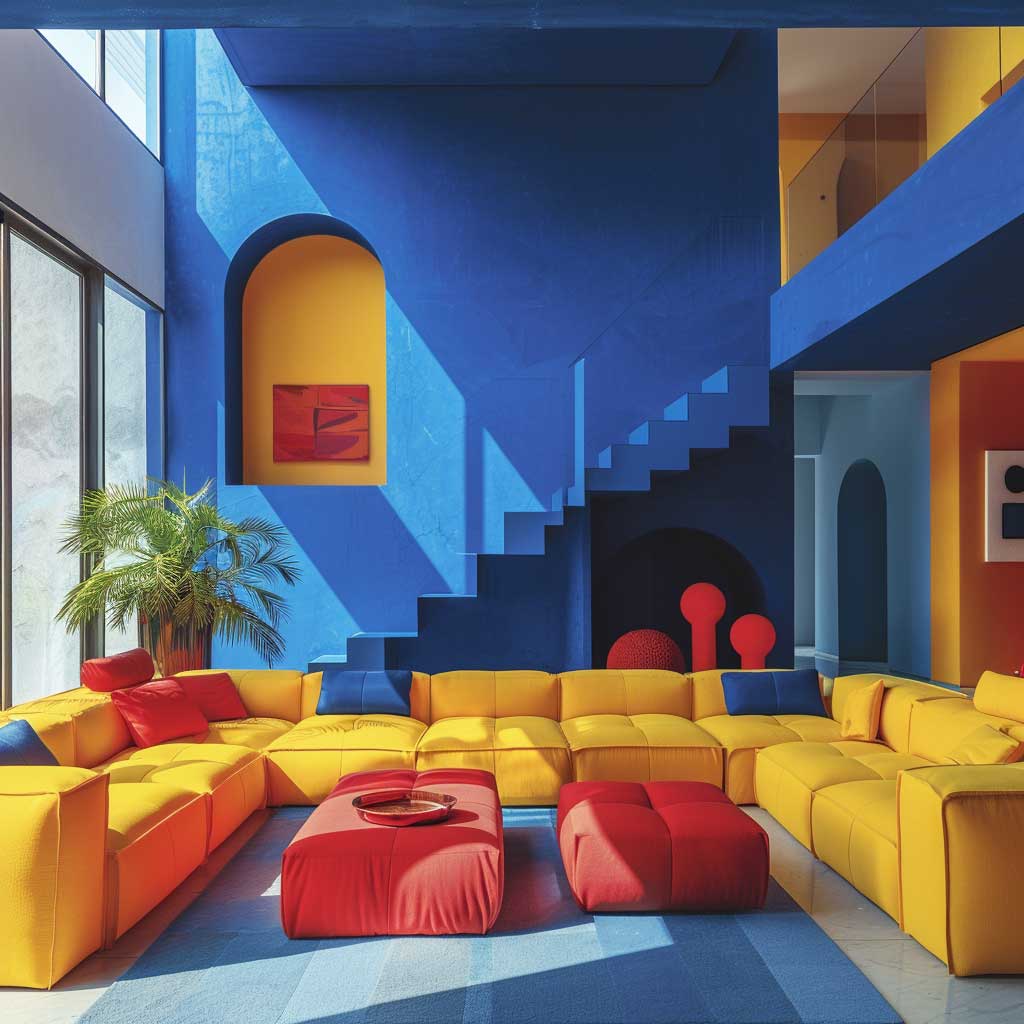

Natural light changes the game completely with this palette. Morning sun turns cobalt into something warm and almost purple. Afternoon light snaps it back to pure blue. The room shifts three times a day without you touching a thing. That kinetic quality is something a neutral palette simply cannot offer. What doesn’t work: adding warm wood tones throughout to “balance” it. Two warm textures maximum. More than that and you’ve softened a Bauhaus interior into something closer to Scandinavian, which is a different project entirely.
My go-to rule for scaling this palette to small rooms is to flip the relationship. Light walls, blue furniture, yellow cushions. The primary colours are still doing their structural job — they’ve just changed positions. A minimalist interior colour approach works well as a base layer before introducing the Bauhaus primaries — start neutral, then layer in saturation one piece at a time.
The Bauhaus Style Kitchen Runs on One Rule Per Zone
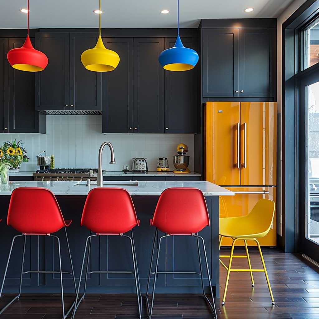
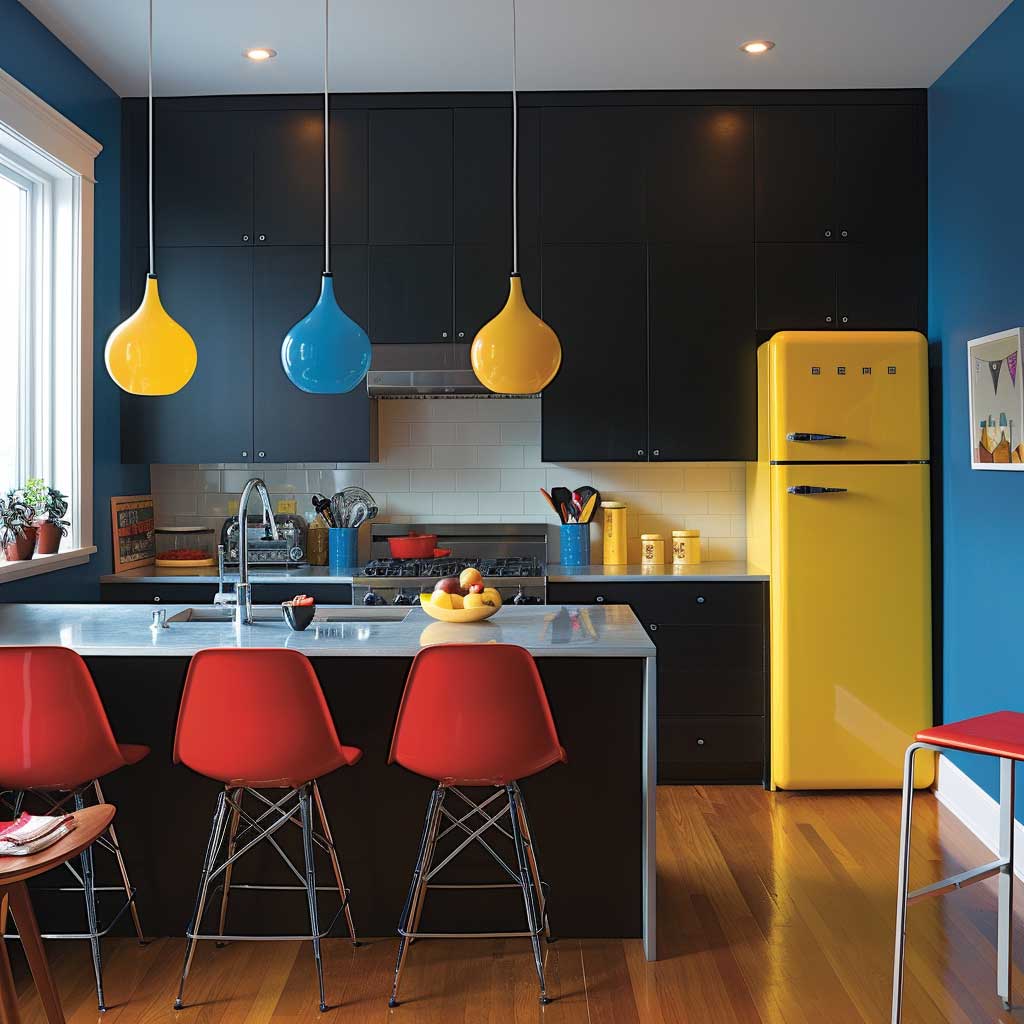


The Bauhaus style kitchen is the room where the colour-as-structure principle gets tested hardest. Kitchens have distinct zones — prep, cooking, seating, storage — and a Bauhaus colour palette gives each zone a visual assignment rather than a mood. Matte black cabinetry is the neutral field everything reads against. It costs about the same as mid-range white (IKEA’s Axstad in matte dark grey runs $85–$140 per door) and does a completely different job: it absorbs rather than reflects, which makes the primaries pop without competing.
Assign one primary per zone and never cross them. Red chairs at the dining end — appetite stimulation, Kandinsky would approve. A yellow refrigerator or yellow range hood at the cooking end — SMEG’s FAB28 in yellow is $1,499 and is the most referenced single appliance in Bauhaus-inspired kitchens. Blue pendant lights above the prep counter, pulling the eye down to the work surface. Does this sound formulaic? It is. The formula is the point. Bauhaus design was never about improvisation.
What you should avoid: mixing warm and cool versions of the same primary. A warm tomato red next to a cool cobalt blue creates a visual vibration that reads as a mistake rather than contrast. Buy your reds at full saturation — Farrow & Ball’s Blazer or RAL 3020 Traffic Red — and your blues equally saturated. Pastel versions of primary colours are not Bauhaus. They’re nursery colours wearing a costume.
Don’t Do This
Using three different shades of blue in one room is not a Bauhaus colour palette. It’s a monochromatic scheme. Bauhaus uses one blue — flat, saturated, unmodulated — alongside one red and one yellow. Gradient transitions between palette colours, soft washes, or dusty versions of primary hues all contradict the hard-edged system the school developed. The palette works because of contrast, not harmony. Soften it and you’re designing something else.
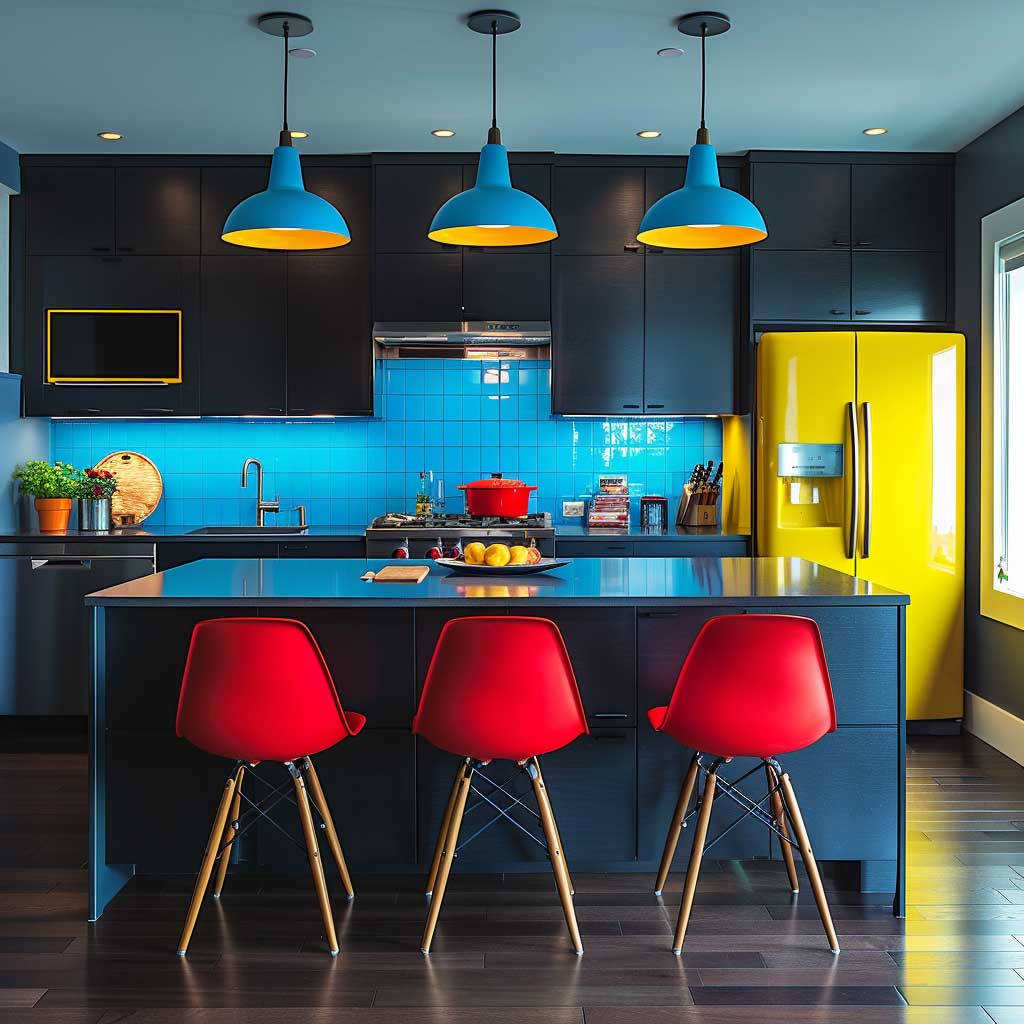
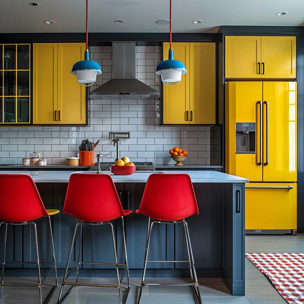
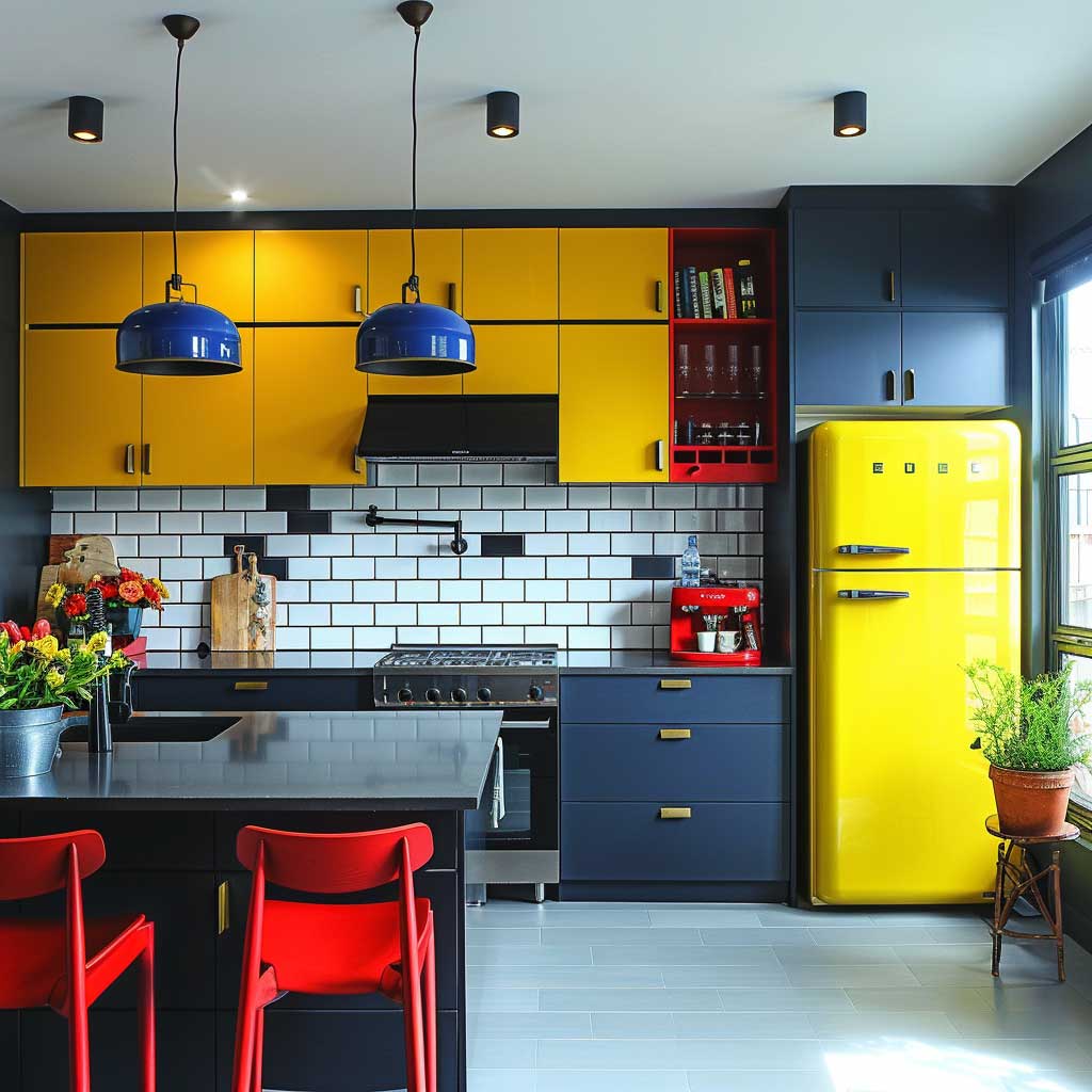
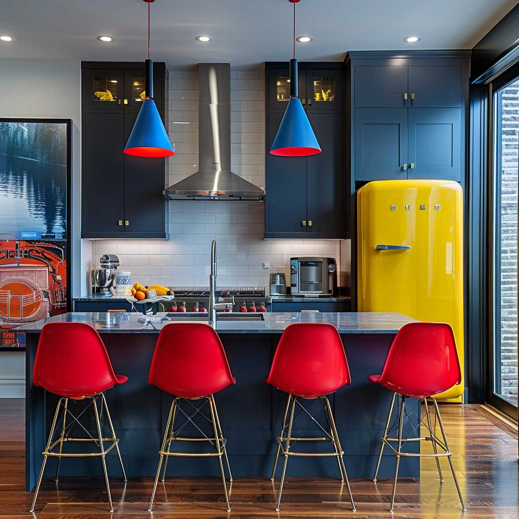
Red stimulates appetite — this is why restaurant designers have used it since the 1950s. Blue does something different in a kitchen: it slows the eye down, signals precision. Yellow brings energy to the repetitive tasks of cooking. Together, they don’t just decorate a kitchen. They programme it. The layout should follow the same logic as the colour — clean lines, no decorative moulding, handles that are flush or bar-style. Ikea Sektion or Reform’s basis cabinets in matte black pair well without requiring a custom build.
According to Livingetc’s analysis of Bauhaus colour theory, the core palette is applied flatly at maximum saturation — no shading, no gradient. That constraint is what separates an authentic Bauhaus colour scheme from a room that just uses primary colours. The difference shows immediately in photographs. Flat colour reads as intentional. Shaded colour reads as decorative. Know which you’re building before you open a paint tin.
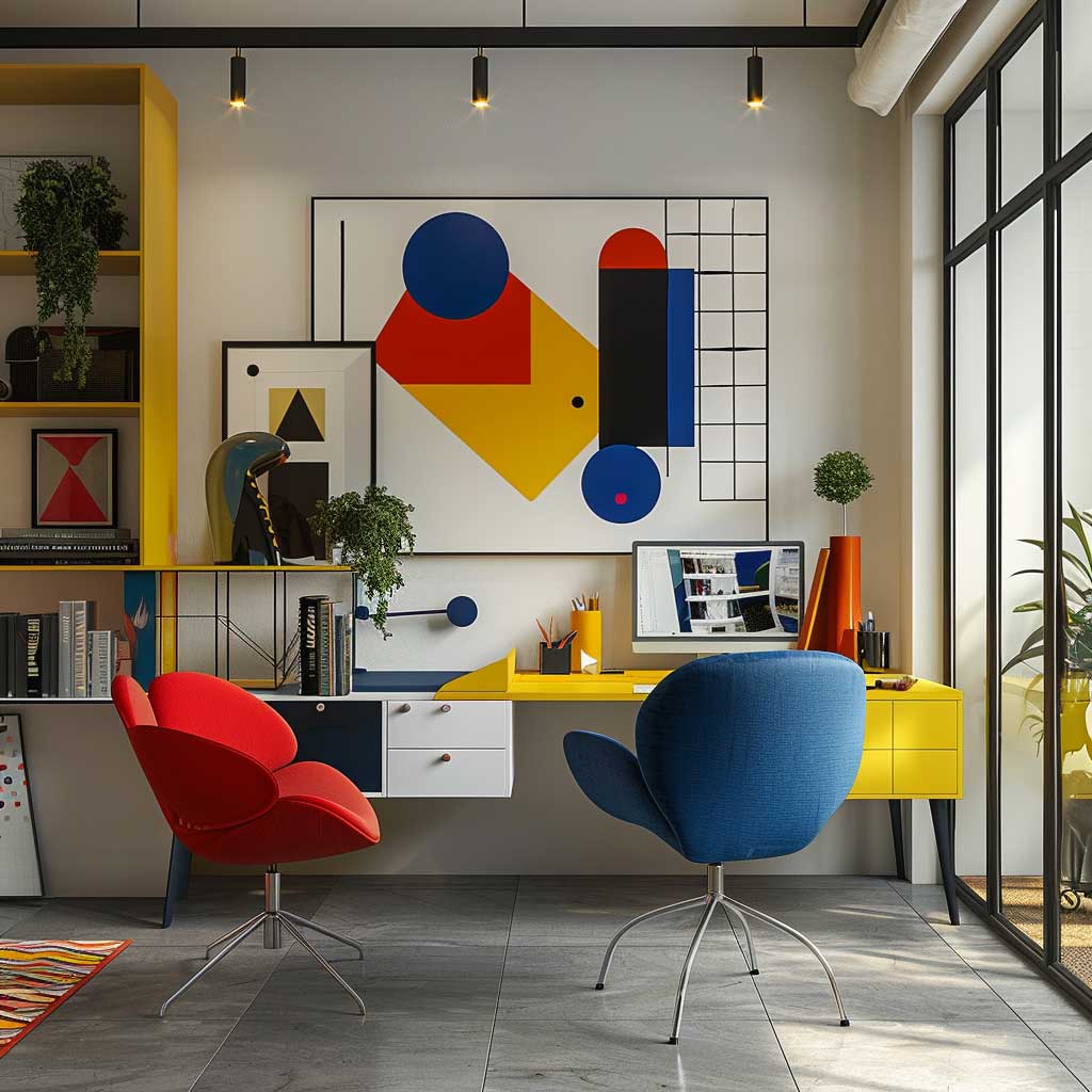
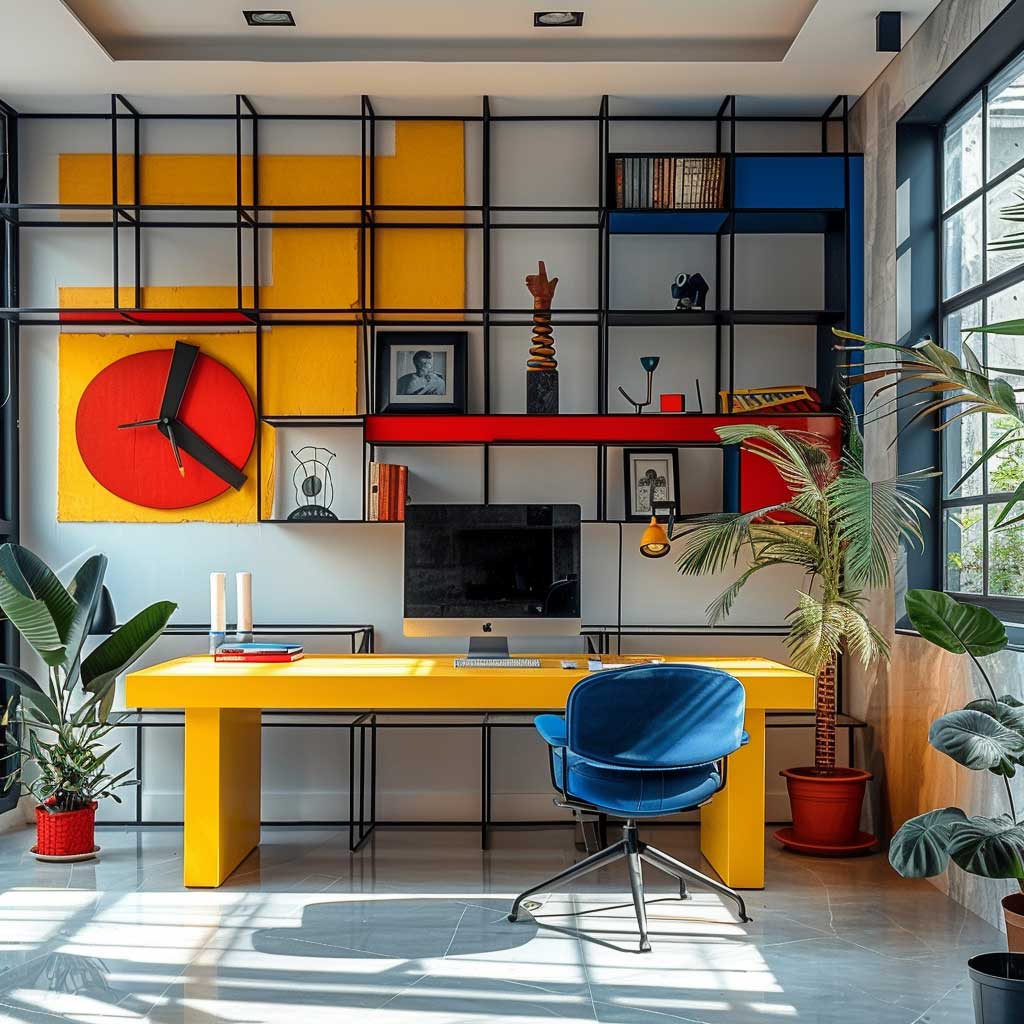
A Home Office Built Around Primary Colours Outperforms a Neutral One

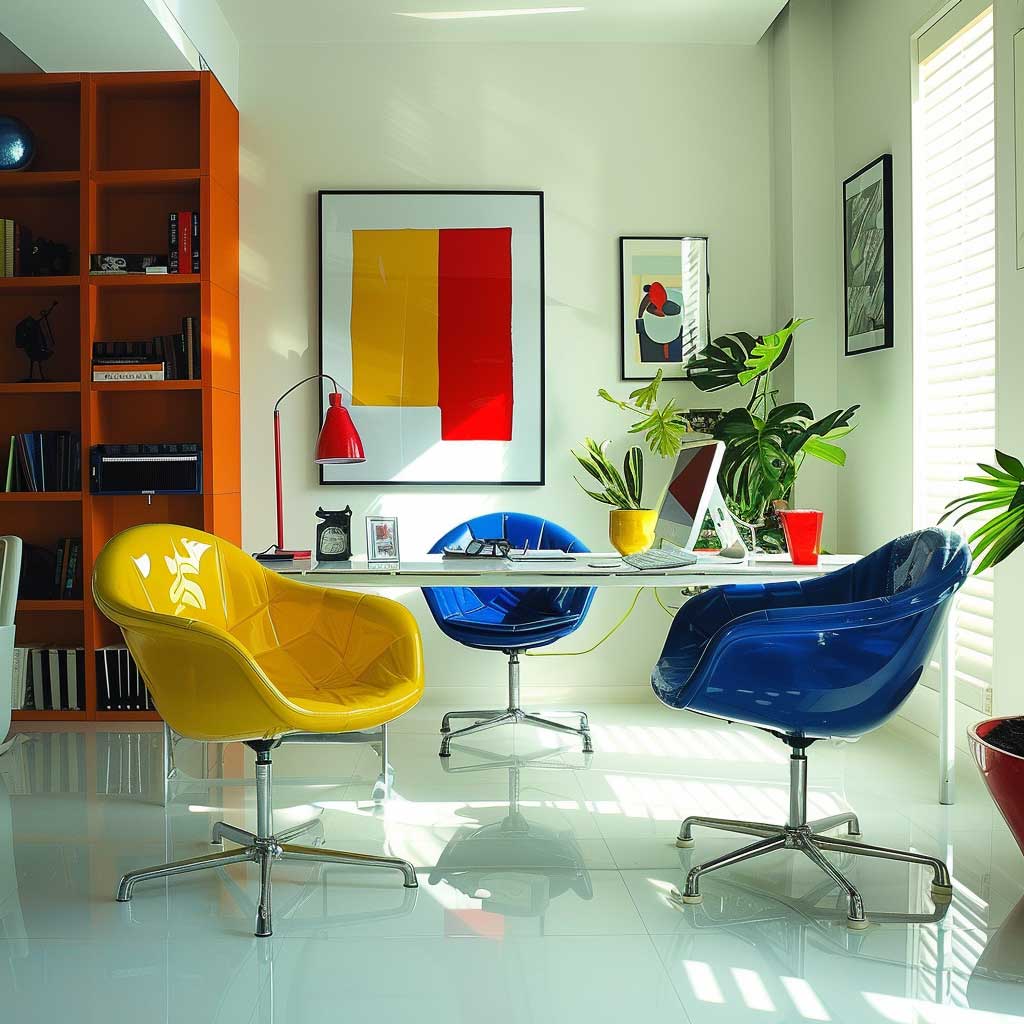

I redesigned a home office using this palette and the productivity shift was measurable, not imagined. White walls in this case are not a cop-out — they’re the neutral field that lets the primary colour furniture do its job without competing with a coloured surface. A yellow desk is the right call for the main work surface. Yellow is a focusing colour. My go-to is the String Works desk in yellow at around $890, or if budget is tighter, HAY’s CPH30 in mustard (about $420) lands close enough in visual temperature.
Blue seating is where concentration happens. Muuto’s In Situ modular sofa in Steelcut Blue or a pair of blue Tolix chairs at the secondary desk create the zone where thinking gets done slowly — brainstorming, reading, calls. Red shelving holds resources — books, reference materials, anything that gets retrieved rather than permanently stored. The colour does the indexing for you. You’ll stop losing things on a red shelf because red holds visual attention better than any label system.
Bauhaus furniture for a home office means clean geometry and no ornament. Herman Miller’s Eames Aluminium Group chair ($1,800–$2,400) is the direct historical reference. HAY’s J104 chair ($320) hits the same formal language at a fraction of the price. Avoid upholstered swivel chairs in fabric patterns — they dilute the colour logic the palette depends on. Does that feel restrictive? It is. That’s what makes it work.


Natural light in a Bauhaus office should be maximised and unfiltered. No coloured curtains. Not even off-white curtains. Sheer white or bare windows — the goal is for the room’s colour to come from the furniture, not from filtered daylight. This matters most at north-facing windows where coloured light correction is tempting. Resist it. The palette is calibrated for flat daylight, which is exactly what a north window provides.
If you’re curious how this approach scales to other bold interior styles, the bold colour palette logic for industrial loft spaces covers similar ground with a rawer material vocabulary — useful if your workspace leans more exposed-brick than polished concrete.
Final Take
The Bauhaus Colour Palette Is a System, Not a Style Statement
Red, yellow, and blue at full saturation — no gradients, no dusty versions, no mixing of warm and cool tones within a single primary. That’s the whole system. Apply it to one room at a time, assign each colour a spatial role, and don’t decorate around it.
The rooms that fail with this palette are the ones that use primary colours as accents on a neutral base. That’s just decoration. Bauhaus uses colour as structure — the same way a load-bearing wall carries weight.
Save this post before your next paint consultation. The formula here is the fastest route to getting a Bauhaus interior right on the first attempt.