A minimalist room design and painting plan lives or dies on three decisions: the undertone of your white, how much contrast you allow between wall and ceiling, and how many materials you let into the room. Get those three right and a 10×12 bedroom photographs like a feature spread. Get them wrong and the same room reads sterile, like a waiting room with better lighting. Most people blame their furniture when a minimalist space feels flat, but the wall color is almost always the actual problem.
This isn’t about owning less. A minimalist room design and painting approach is about choosing fewer, better-matched elements so the eye has somewhere to land instead of bouncing around a cluttered field. Stylists recommend starting with the wall before touching furniture, because the wall color sets the temperature for everything that comes after it — a sofa that looks warm against Benjamin Moore Chantilly Lace can look cold against Sherwin-Williams Pure White, even though both are technically “white.”
What follows covers wall color selection, furniture proportions, texture layering, and lighting choices that hold a minimalist room together instead of letting it collapse into emptiness.
Quick scan:
A true greige like Sherwin-Williams Repose Gray SW 7015 runs about $55 a gallon and is the safest middle-ground tone if pure white feels too stark.
One Behr Premium Plus gallon ($25.98) covers 250 to 400 sq ft, so a standard bedroom usually needs one gallon for two coats.
Cap warm texture at one or two materials per room — three or more starts to look accidental instead of intentional.
Low-VOC or zero-VOC paint matters more than people think: indoor VOC levels run 2 to 5 times higher than outdoor air according to the EPA, and freshly painted rooms can spike far higher for several hours.
Why Soft Neutrals Beat Stark White in a Minimalist Room


A true greige does more work than plain white in most rooms. Sherwin-Williams Repose Gray SW 7015 runs about $55 a gallon and holds steady across morning and afternoon light without sliding into either blue or purple, which is the failure mode of cheaper cool grays. Why does that matter for a minimalist room? Because a minimalist space has nothing else to hide an undertone shift — no busy wallpaper, no gallery wall, just one color carrying the whole room.
Test any candidate color at two different times of day before committing a roller to the wall. Tape a sample sheet next to the window and another on the opposite wall, then check it again after sunset under your actual lamps. A color that looks calm at noon can turn lavender by 4 p.m., and you won’t notice until the gallon is already dry. This single step prevents most of the repaint regret stylists hear about.
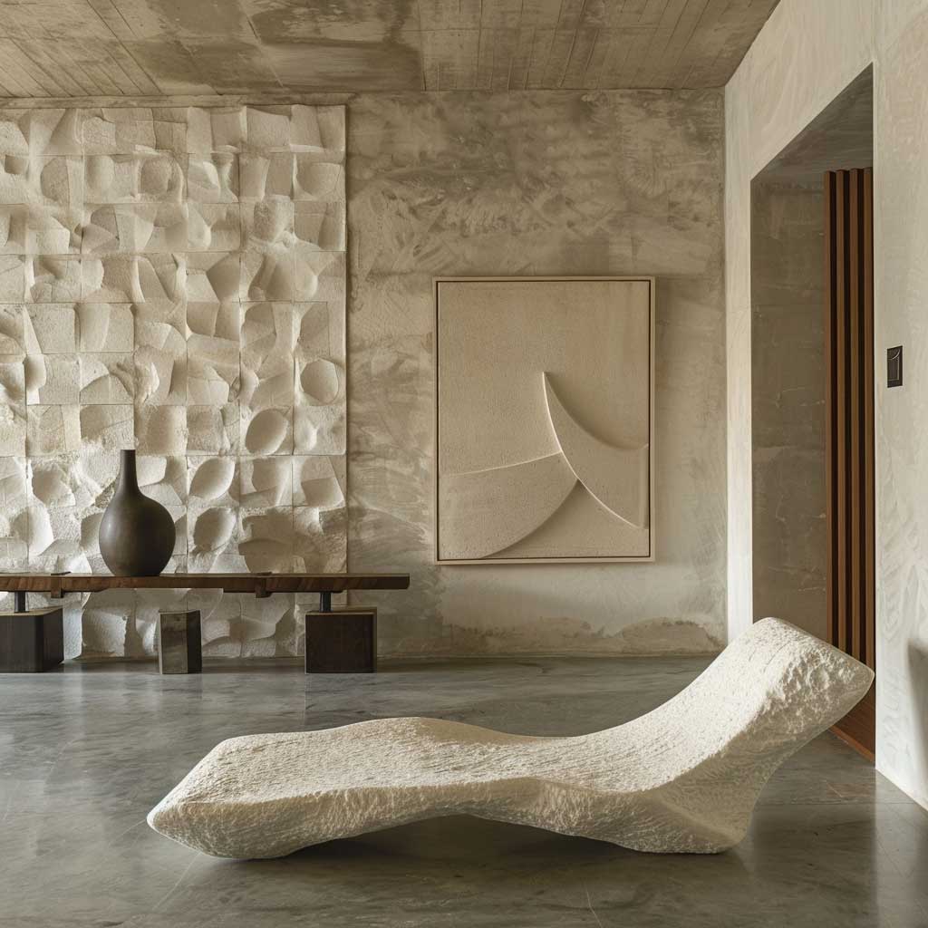
Furniture earns its place by serving double duty, not by looking expensive. A low-profile sofa with a seat height of 16 to 18 inches, instead of the standard 20 to 22 inches, keeps sightlines open and makes a standard 8-foot ceiling read taller without touching paint. Pair that with one warm material — an oak side table or a jute rug — and stop there. Two warm textures look deliberate. Four look like indecision.
Pick Smooth Or Subtle Texture First, Then Choose the Paint Finish


Aesthetic minimalist room work depends on finish as much as color. Eggshell or matte is the standard for walls because satin throws side-light off every roller mark, and a minimalist room has nothing else to distract from that flaw. Save high gloss for trim and doors, where the shine reads intentional instead of accidental. A switch from satin to a true matte is one of the cheapest fixes available if a finished wall already looks streaky.
One gallon of Behr Premium Plus, priced around $25.98 at Home Depot, covers 250 to 400 square feet depending on the surface, which is enough for two coats on a standard bedroom wall set. Ask yourself before buying: is the existing surface already a similar light tone? If so, one coat over a fresh primer may be all that’s needed, cutting the gallon count in half on a small room.
A single statement object — one ceramic vase, one framed print, one sculptural lamp — works the way a single spotlight works on a stage. It doesn’t compete with the room; it directs the eye exactly where you want it. Skip the temptation to add a second focal point on the opposite wall. Two focal points cancel each other out and the room starts to feel like it’s arguing with itself.


Skip painting a room dark charcoal or black expecting instant drama if the room gets fewer than four hours of direct light a day. Dark walls in low-light rooms read murky rather than moody, and the effect only works in spaces with strong natural light to bounce off the surface. That’s the one paint move stylists steer clients away from more than any other in a minimalist room.
Material contrast does more for depth than color contrast in a soft minimalist aesthetic. Polished wood against a woven jute rug, or matte plaster against a linen throw, gives the eye texture to read even when the palette stays within three shades of the same neutral. A room painted in a single flat tone with zero material variation is the version that ends up looking unfinished rather than calm.
Lighting Choices That Make a Minimalist Aesthetic Room Feel Finished


Sleek and minimalist design depends on layered light, not one overhead fixture doing all the work. Stack three light sources at different heights — a floor lamp, a table lamp, and one ambient ceiling source — and keep the bulb temperature under 2700K after sunset so the room doesn’t read clinical at night. A single bright overhead bulb is the fastest way to flatten an otherwise well-painted room.
What’s the actual cost difference between a $25 gallon and a $55 gallon over the life of a room? Cheaper paint in heavy-use rooms typically needs repainting every 3 to 4 years, while a quality line holds color and finish for 5 to 7 years, which usually makes the pricier gallon the better value per year of use, not just the nicer-sounding option in the store.
Architectural features like a window without heavy drapery do more for a soft minimalist aesthetic than another lamp ever will. Letting daylight hit a matte wall at a low angle creates the kind of gentle shadow play no fixture can fully replicate, which is why stylists treat unobstructed windows as a design element rather than just a light source.
Choosing Between a Monochrome, Warm Neutral, or Cool Gray Palette


Three palettes cover almost every minimalist room: monochrome black and white, warm neutral, and cool gray. Each one solves a different problem, so the right pick depends on the room’s light, not personal taste alone. A north-facing room with limited daylight usually needs the warm neutral route, since cool grays in low light read flat and gray rather than sophisticated.
Monochrome black and white works best in rooms that already get strong, even daylight, because the contrast needs that light to read crisp instead of heavy. A black accent wall paired with a white ceiling and trim creates the kind of architectural punch that photographs well but can feel oppressive in a dim basement-level room — match the palette to the room’s actual light, not the inspiration photo’s light.
How do you keep three different palettes from looking like three unrelated rooms in the same house? Stay within 10 LRV points between your wall color and your secondary tone (rug, sofa, drapery). That single number is the difference between a home that flows room to room and one that feels like it was decorated by three different people.


For households with kids, pregnant residents, or anyone with respiratory sensitivities, finish choice matters less than VOC content. Indoor air pollutant levels run 2 to 5 times higher than outdoor levels according to the EPA, and a freshly painted room can spike well above that for several hours after rolling. Choosing a low-VOC or zero-VOC line and cracking a window for the first 48 hours costs nothing extra and removes that risk entirely.
A room built around a sleek minimalist design and painting plan should still feel lived-in by the second week, not staged for a single photo. If a finished room feels too sparse, the fix is almost never more furniture — it’s one more textile layer (a throw, a stack of two books, a single plant) rather than a new piece entirely.
| Palette | Best Light Condition | Repaint Interval | Starting Price/Gal |
|---|---|---|---|
| Warm Neutral | North-facing, low light | 5 to 7 years | ~$26 (Behr Premium Plus) |
| Cool Greige | Mixed daylight, afternoon sun | 5 to 7 years | ~$55 (Repose Gray) |
| Monochrome B&W | Strong, even daylight | 4 to 5 years (white shows wear faster) | ~$26 to $55 |
For wall colors that lean cooler and more graphic than the warm-neutral approach above, the minimalist black and white interior color palette covers how to balance contrast without the room tipping into stark.
To see how these wall and lighting principles play out across full living room layouts rather than single walls, the minimalist living room layout ideas walk through five furniture arrangements built on the same low-clutter logic.
Households painting a nursery, bedroom, or any room with limited ventilation should check VOC content before color, since the EPA’s indoor air quality guidance on VOCs outlines exactly how those levels spike during and after painting.
THE TAKEAWAY
Color undertone and finish do more than any furniture upgrade.
A $25 gallon in the right finish beats a $200 sofa in the wrong wall color every time.
Test swatches at two times of day before committing — afternoon light is the one that exposes a bad undertone.
Save this post so you have the palette and finish notes ready when you’re standing in the paint aisle.
Related Topics