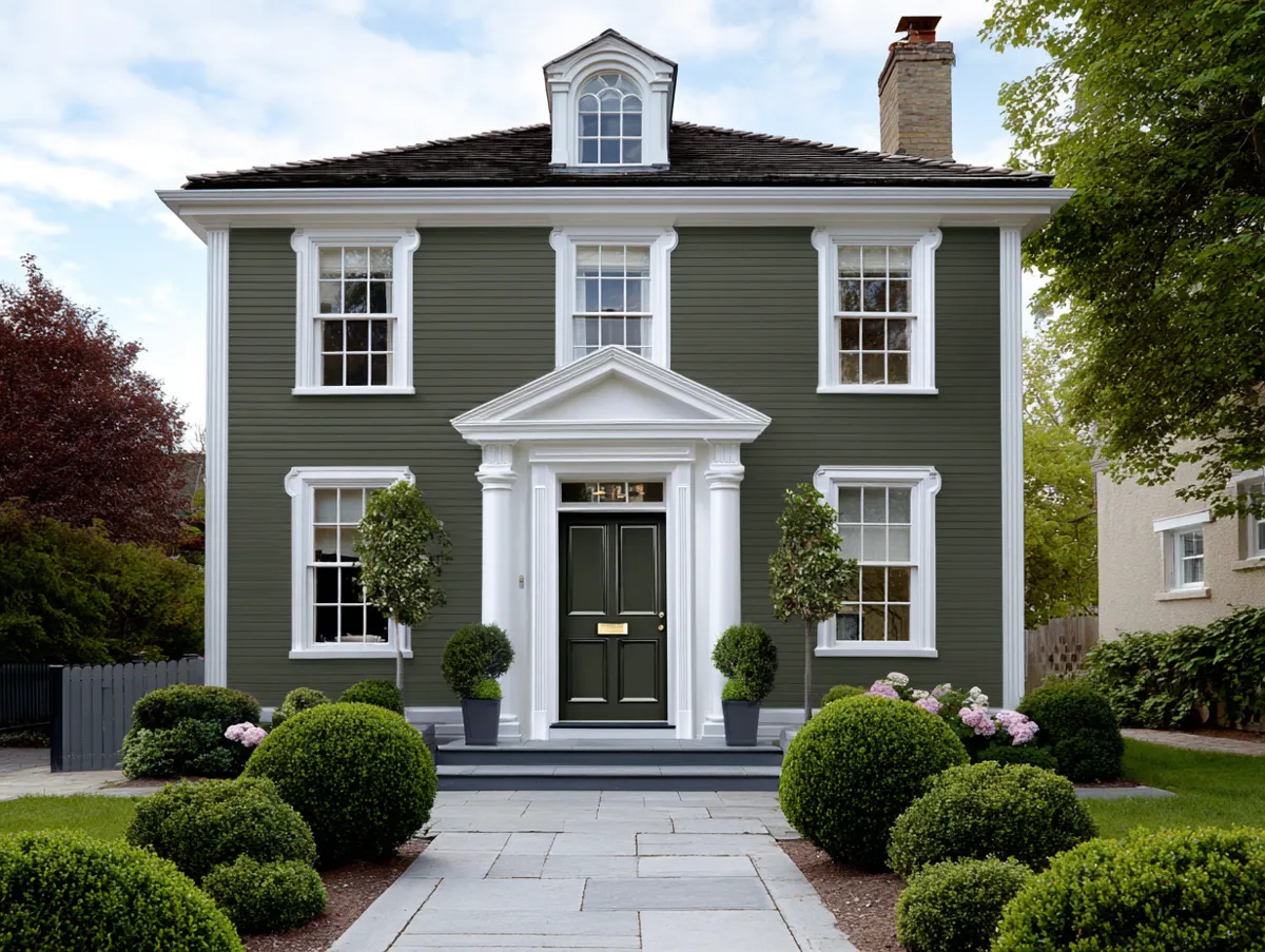
Outside wall colour decides how a house reads from the street before anyone notices the landscaping or the front door. Pick the wrong undertone and even a freshly painted home looks dated within a year. Pick the right one and the same square footage suddenly feels intentional, like the architecture was always meant to look that way.
Most homeowners default to whatever shade looks good on a small paint chip, then get surprised when that same colour reads completely differently across a full facade. Light bounces off large surfaces in ways a 2×2 inch swatch never shows you. The three approaches below — deep green, warm peach, and cool white — each solve a different problem, and each comes with its own failure points.
Quick scan:
Emerald green works with heavy landscaping and natural materials, not bare concrete lots.
Peach exteriors need a contrasting trim color or the house looks washed out and flat.
Cool white shows dirt and water stains fastest of the three, so it demands more upkeep.
Undertones shift dramatically in direct sun versus shade — always test on the actual wall, not a chip.
Green Walls Disappear Into Bad Landscaping
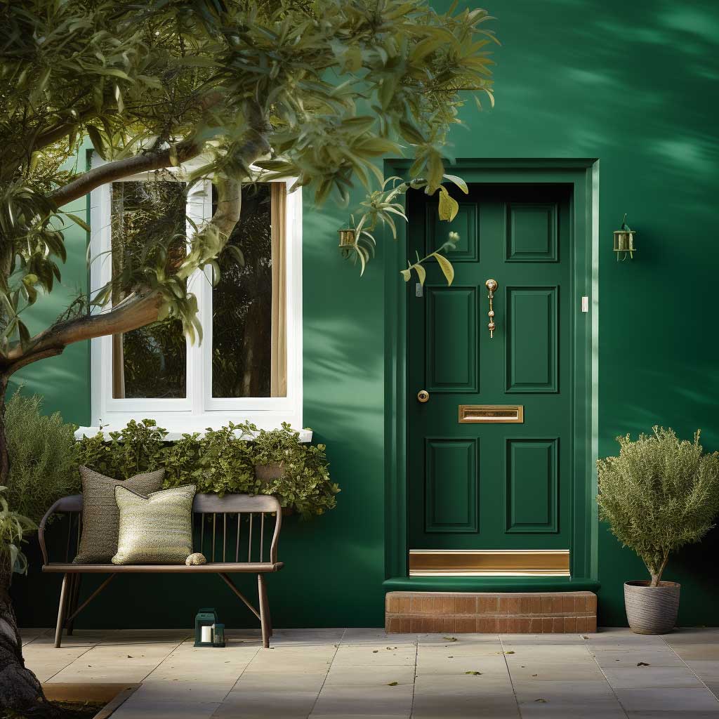

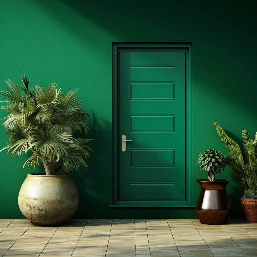
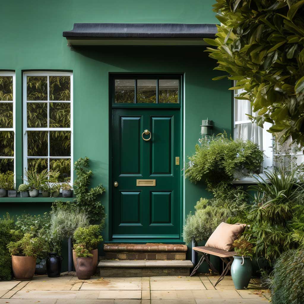
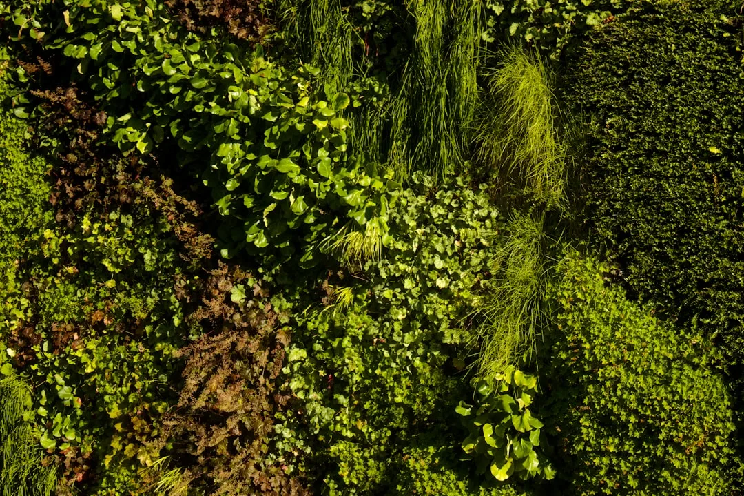
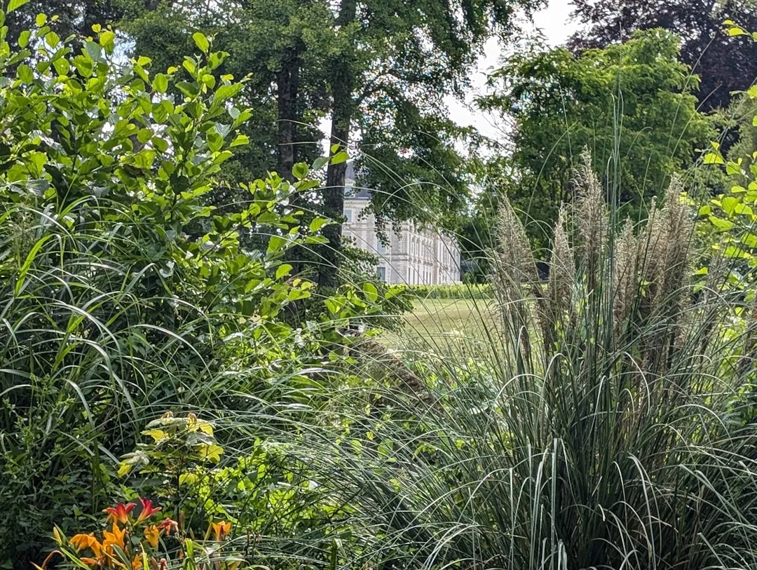
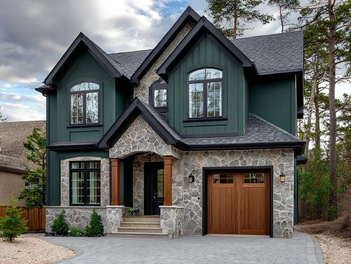
Outside wall colour in a deep emerald tone only works when the property already has mature trees, hedges, or stone elements to play against. Drop that same green onto a bare lot with a concrete driveway and no plantings, and the house reads flat instead of intentional. The colour needs a visual conversation partner — ivy, boxwood, a slate roof — or it just sits there.
Why does green hold up better in shifting light than most bright colours? Because it sits in the middle of the visible spectrum, so it doesn’t blow out under harsh midday sun the way reds and yellows do. Morning light pulls out the blue undertones, afternoon sun warms it toward olive, and at dusk it deepens almost to black-green. That range is the whole appeal, but it also means the colour chip you picked in the store will never match what ends up on the wall.
Don’t pair emerald green with bright white trim everywhere — it creates a stark, almost corporate contrast that fights the natural, organic feeling the colour is supposed to deliver. Cream or soft off-white trim reads warmer and keeps the whole facade cohesive instead of looking like two separate decisions stapled together.
Test the actual paint on a shaded section and a sun-hit section of the wall before committing to gallons. A north-facing wall and a south-facing wall on the same house can show two visibly different greens once the paint cures, and that gap is impossible to predict from a chip alone.
Peach Falls Flat Without the Right Trim
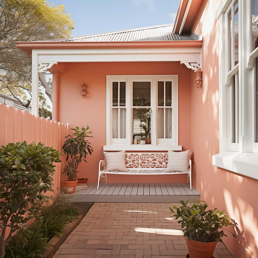
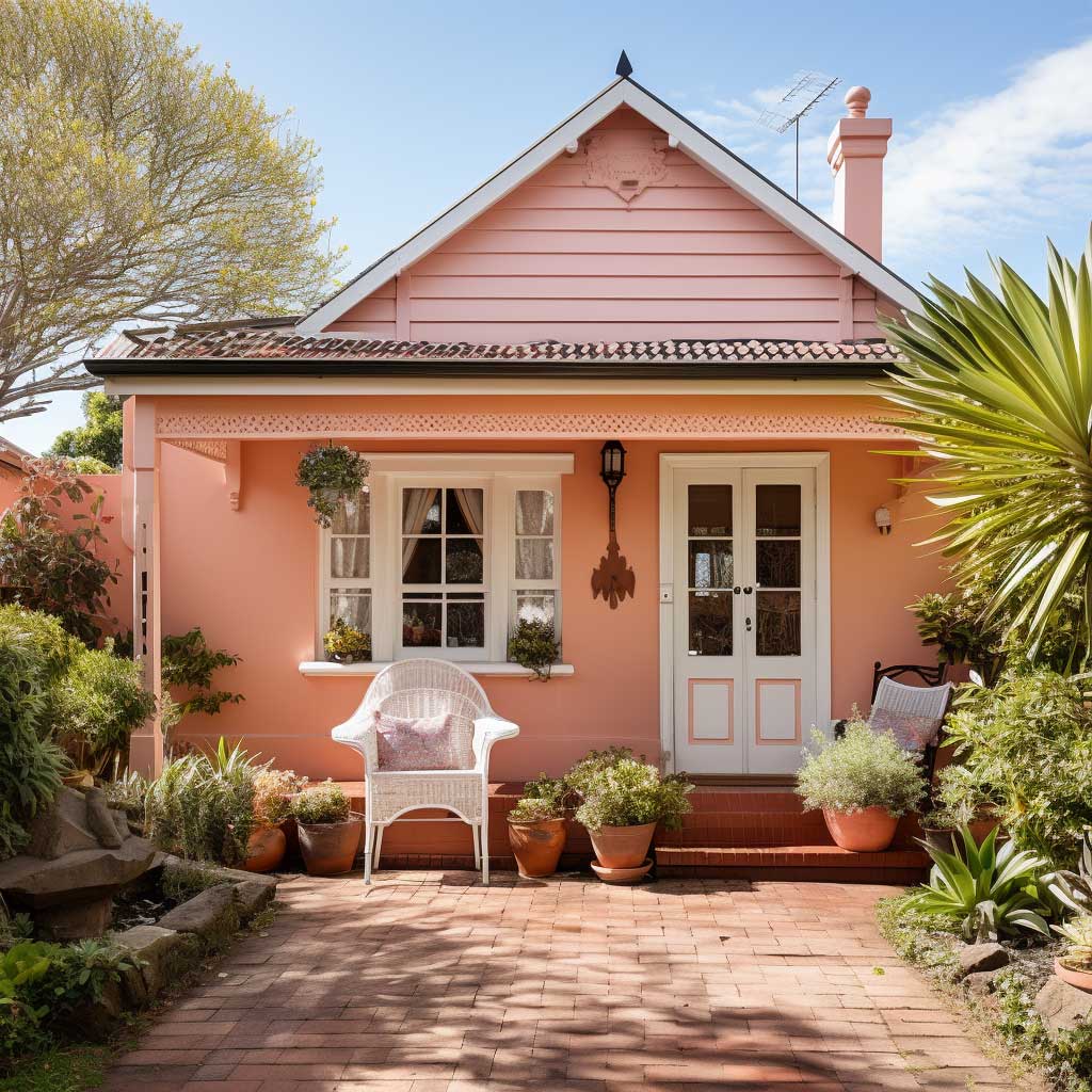
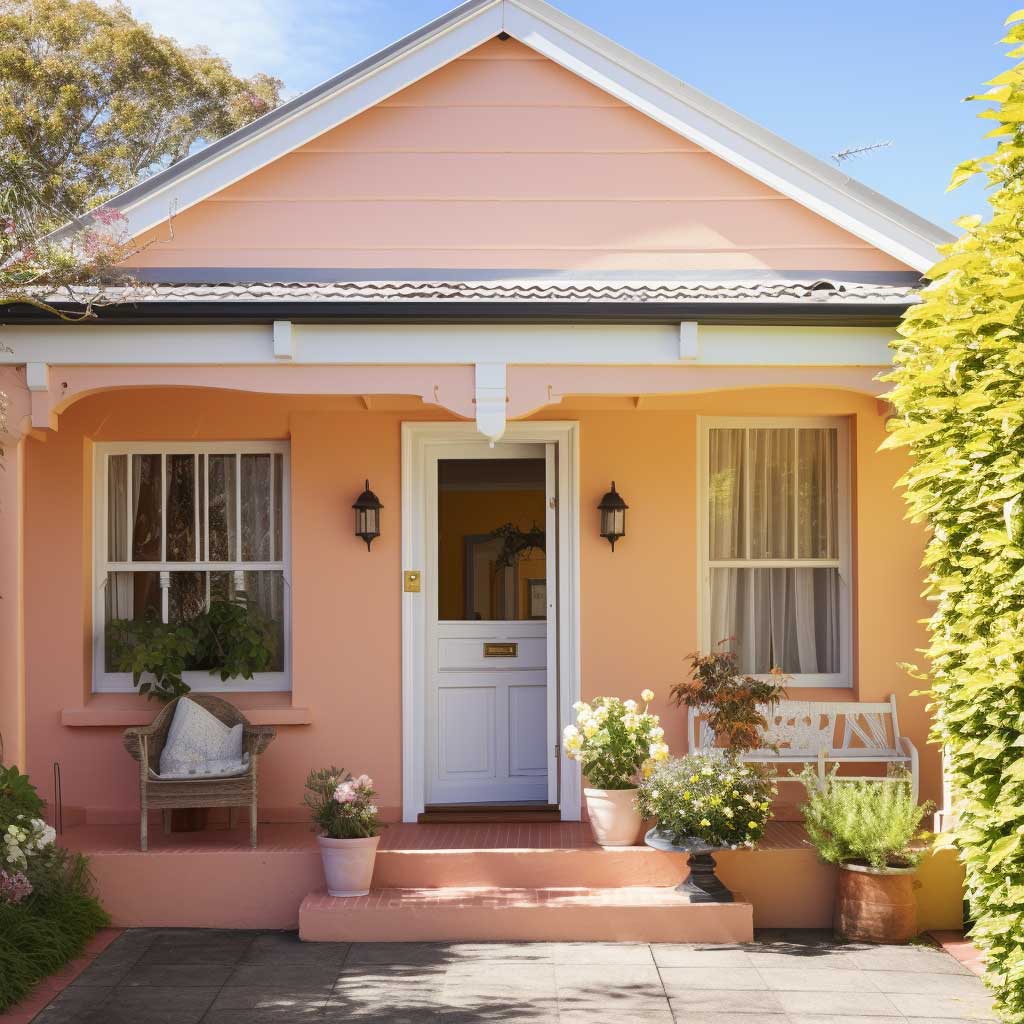
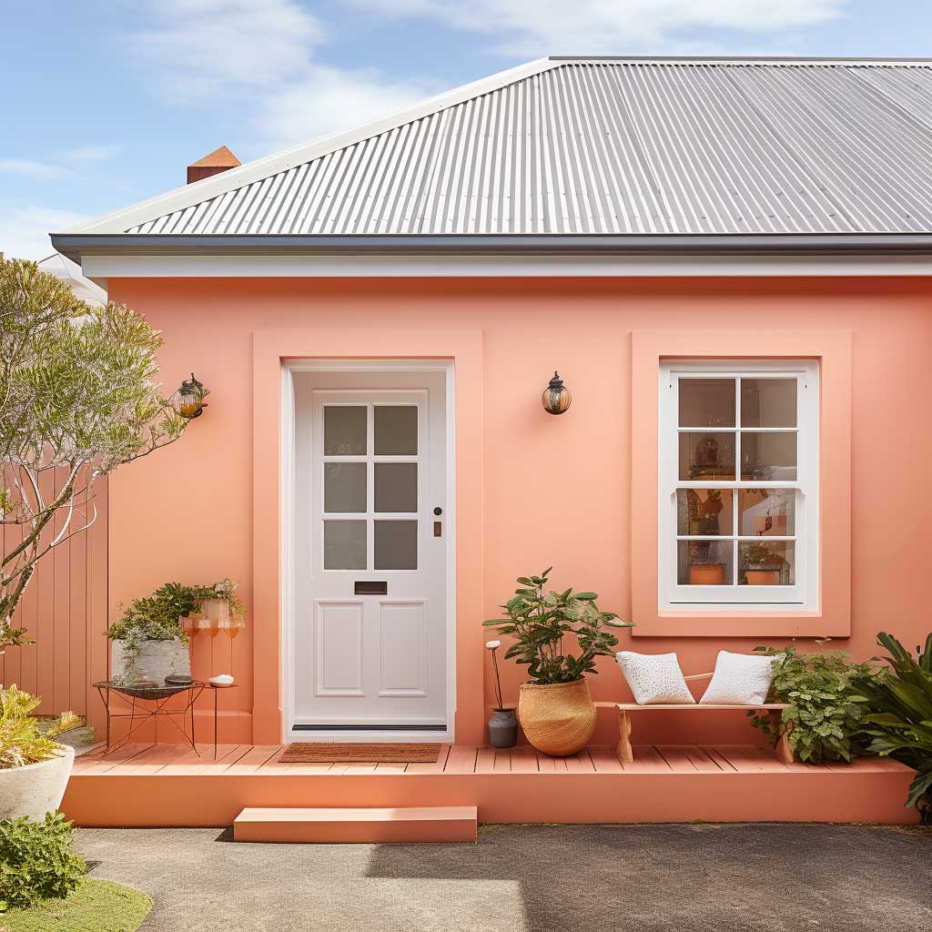
Peach colour house exterior choices live or die on the trim. The same wall painted peach with white window frames looks crisp and cheerful; paint the trim a matching peach-adjacent tone, and the whole house dissolves into one soft blur with no edges. Trim is what gives a peach facade its shape — without contrast, the architecture stops reading from the street.
What makes peach harder to get right than green or white? It’s a tint built on orange, which is the most saturation-sensitive hue on a standard colour wheel — push it five percent warmer and it tips into a dated salmon shade fast. A common approach is to ask for the formula mixed at half-strength of what looks right on the chip, since exterior surfaces amplify saturation once the paint is rolled across a full wall.
This delightful peach colour pairs naturally with white window trims to create the kind of contrast that makes a small cottage look deliberate rather than accidental. Explore more exterior colour pairings on ArtFasad for ideas on which trim tones work best against warm exterior hues.
Don’t paint peach on a house with a red or terracotta roof — the two warm tones compete instead of complementing each other, and the roofline ends up looking like an afterthought. A slate, charcoal, or dark brown roof gives peach walls something cooler to rest against, which is what actually makes the warmth pop.
Cool White Shows Every Stain by Week Three
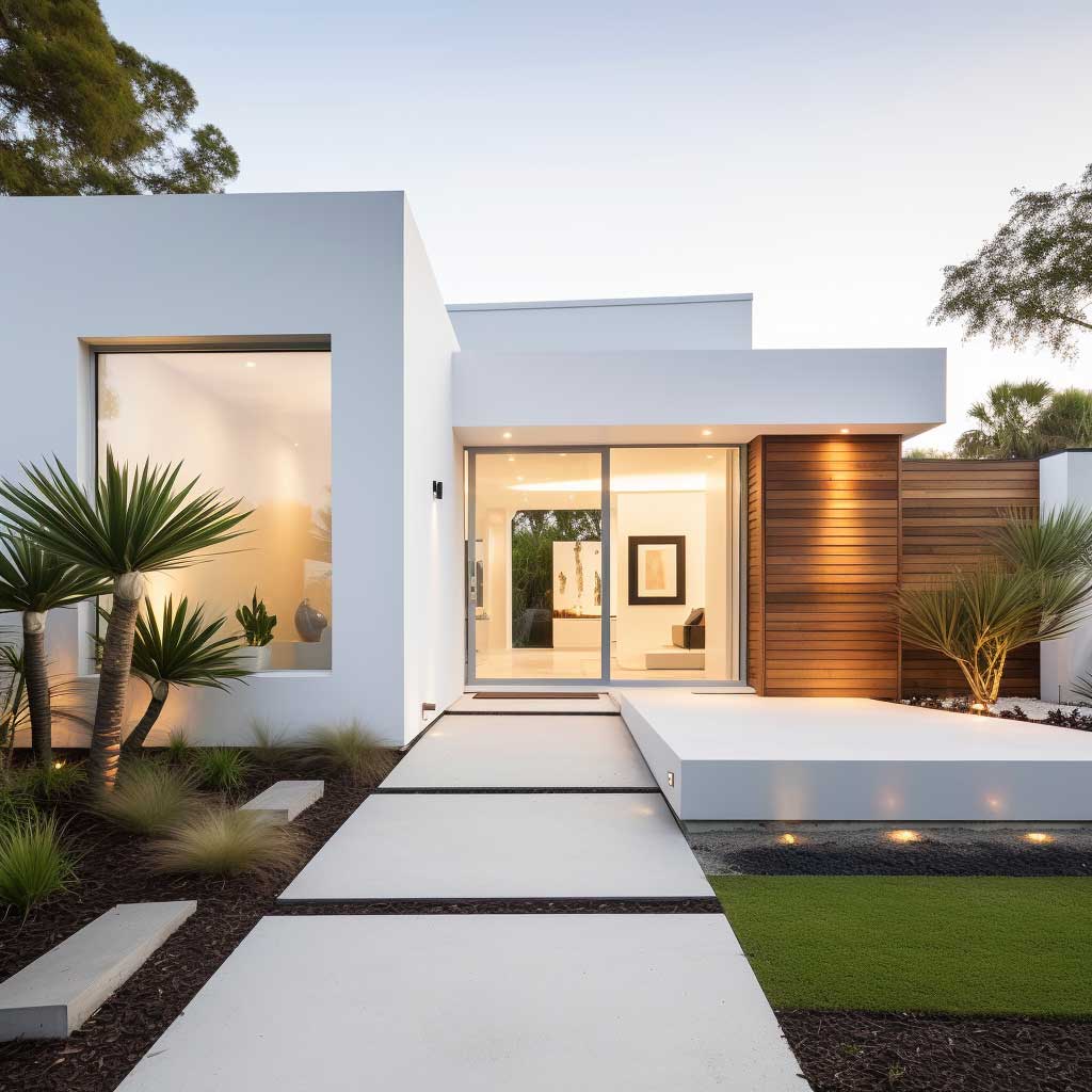
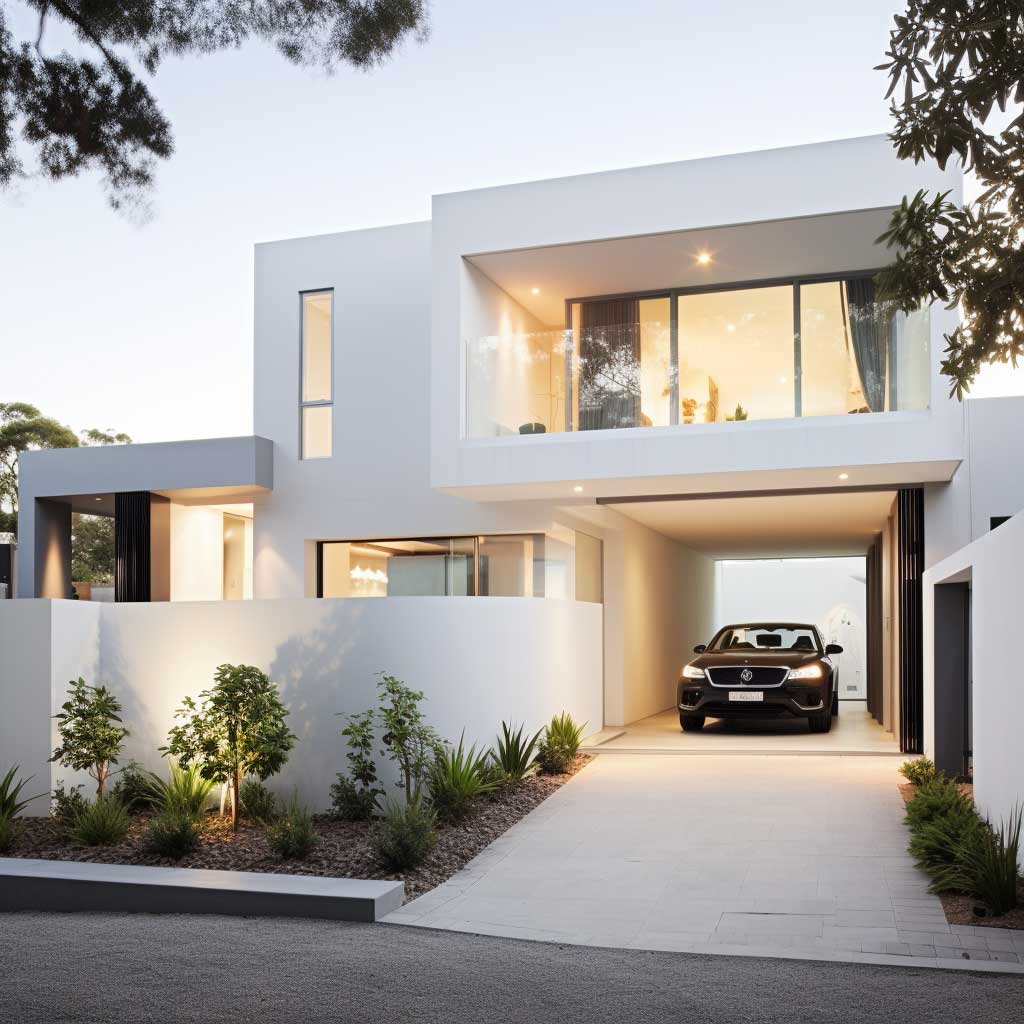
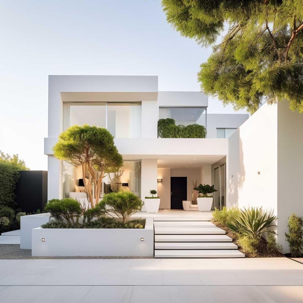

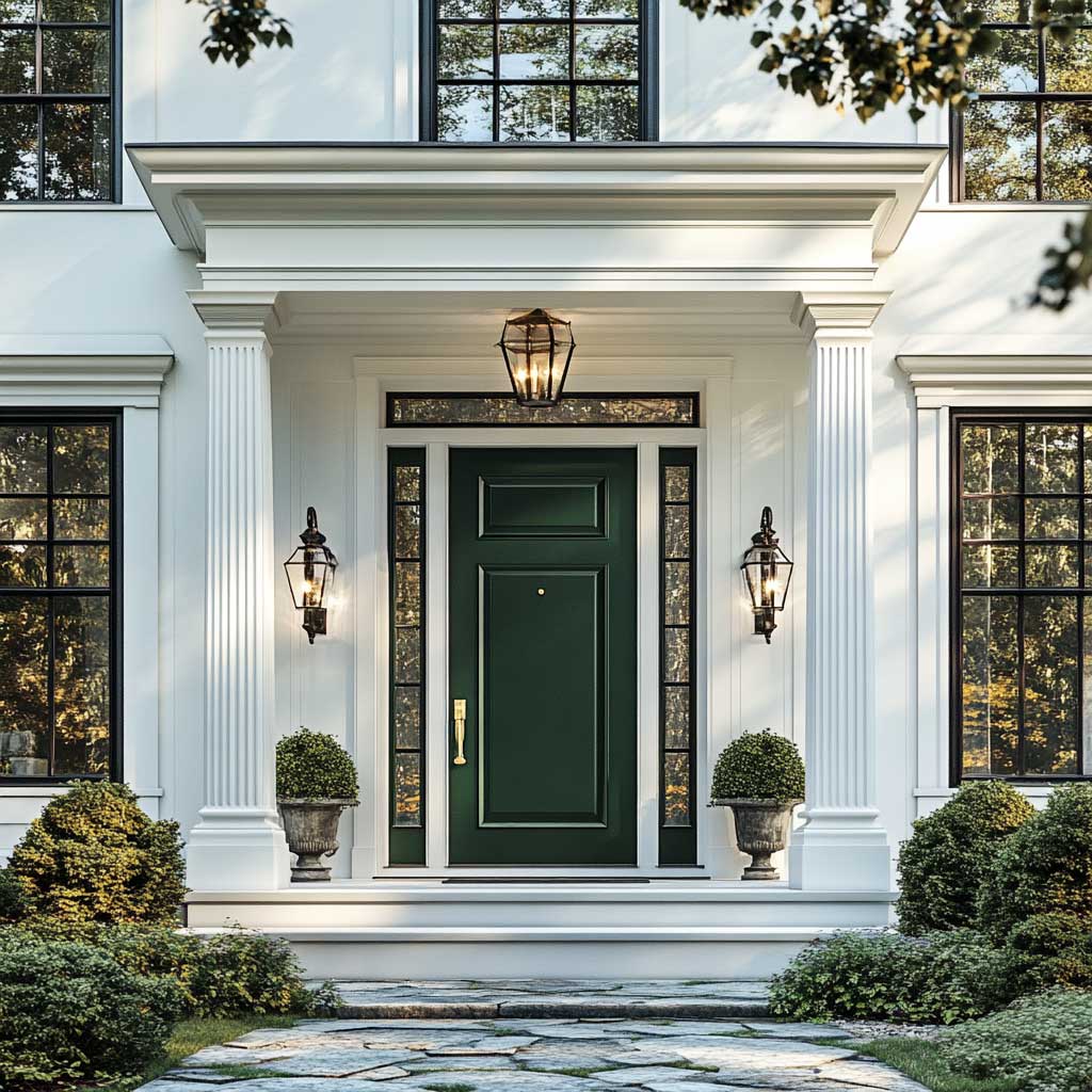
House wall outside colour in cool white delivers the cleanest, most modern look of the three options here — and the highest maintenance. White is the colour that hides the least; every splash mark from a sprinkler, every streak of pollen, every patch of mildew shows up against it the way it never would against a darker exterior wall colour.
Why does white pull attention to architectural details that other colours hide? Because it has no hue to distract the eye, so every shadow line, window reveal, and roof edge becomes the visual focus instead of the wall itself. That’s exactly why minimalist and contemporary builds lean on white so often — the colour gets out of the way and lets the geometry do the talking.
Don’t do this: Skip the exterior-grade primer on a white repaint. Without it, old stains and tannins bleed through within a few months, and you’ll end up repainting the whole wall a second time instead of doing it right once.
A satin or low-sheen exterior finish holds up noticeably better against dirt than a flat white finish, since the slight sheen lets rain rinse debris off the surface instead of letting it sit. The EPA’s renovation safety guidelines are worth a look before any exterior repaint on a home built before 1978, since lead paint disclosure rules apply.
A fresh coat of paint, with the right colour selected for the right setting, changes how a house reads from the curb more than almost any other single renovation. Whether the pull is toward the natural depth of green, the warmth of peach, or the clean lines that cool white sharpens, the choice should match what’s already around the house — not fight it.
Bottom Line
The Wall Colour Only Works If It Matches What’s Already There
Green needs landscaping to lean on. Peach needs contrasting trim. White needs upkeep.
None of these colours fail on their own — they fail when picked without considering the roof, the trim, and the surrounding lot.
Save this post so you can compare the wall against your own house before committing to gallons.