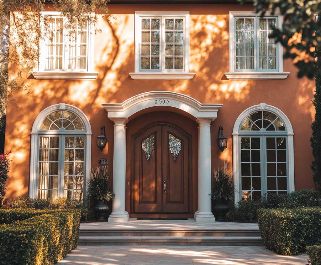
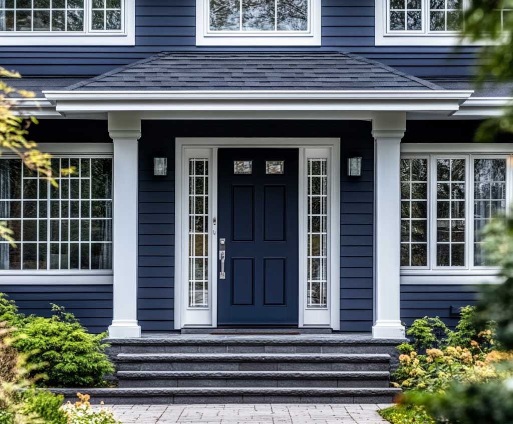
Mocha color house exterior pairings earn their reputation not by playing it neutral but by giving every bold accent color something solid to stand against. Mocha on the walls creates a foundation so grounded that turquoise reads as confident rather than chaotic — and the result is a facade that registers as both composed and alive, which is harder to pull off than it sounds.
This combination works across craftsman bungalows, colonial revivals, and stucco ranch homes because mocha carries enough brown warmth to read as a dominant neutral while turquoise brings enough blue-green energy to create real contrast without clashing. They sit on opposite sides of the color wheel in temperature, which is exactly why the tension between them looks deliberate rather than accidental.
What surprises most people is how dramatically the ratio of turquoise changes the outcome. At door-width, turquoise reads as a confident accent. Spread to full trim coverage and it becomes a graphic statement — a different design commitment that works on some homes and overwhelms others. The sections below break down exactly where that line falls.
- Why mocha works as a dominant exterior wall color — and when it fails
- How to apply turquoise house exterior paint at the right scale (trim, door, full accent)
- Dark turquoise vs. mid-tone turquoise — which fades faster and why
- Specific paint colors from Sherwin-Williams and Benjamin Moore, with confirmed prices
- The one mistake that makes this palette look cheap
- How long exterior paint lasts by color depth and sun exposure
What Painters Call the Mocha Color House Exterior Sweet Spot
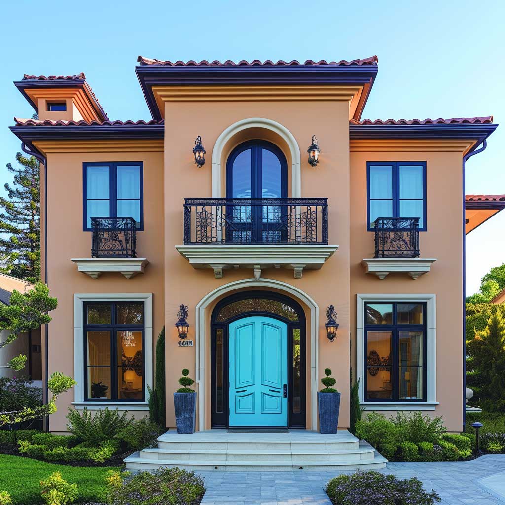
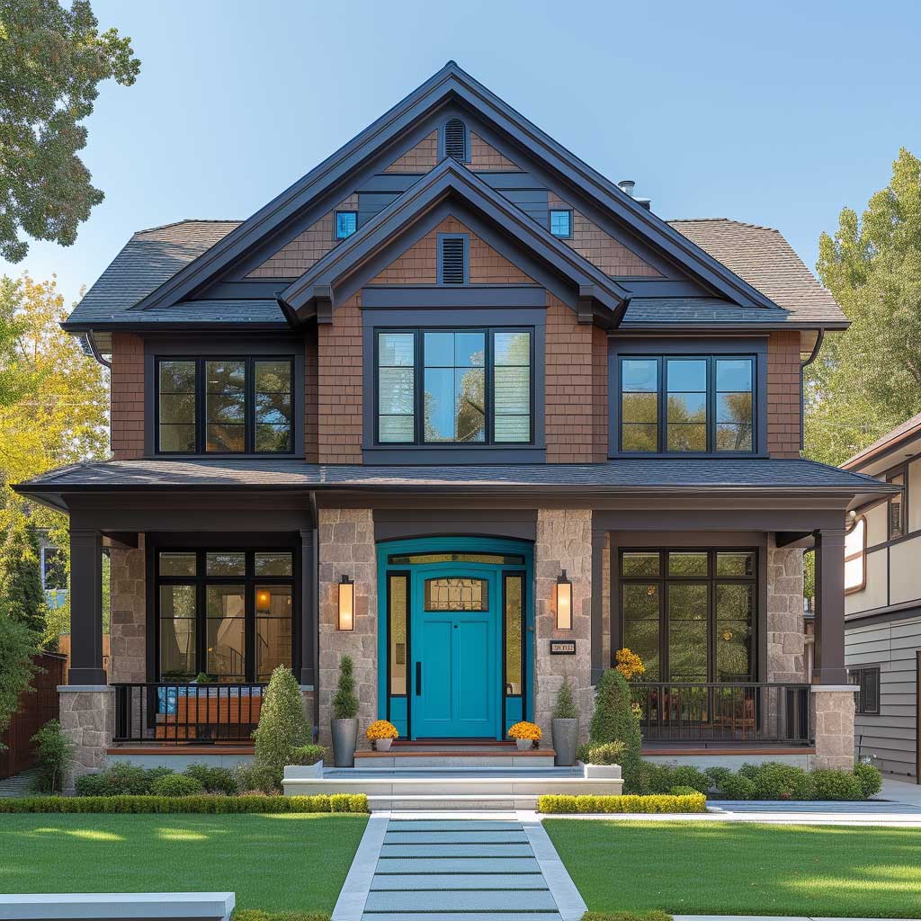

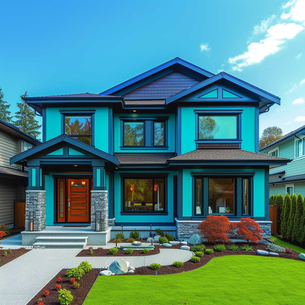
Sherwin-Williams SW 6067 Mocha carries a Light Reflectance Value (LRV) of 21 — firmly in dark territory, which means it absorbs significantly more UV radiation than a light cream or gray. That number directly affects maintenance cycles: professional exterior painters note that premium acrylic paint on a well-prepped surface typically lasts 7–10 years, while dark colors on south-facing walls can show noticeable fade much closer to the 5-year mark. So mocha is both a design choice and a maintenance commitment. The payoff is a facade that deepens in shadow, shifts subtly in raking afternoon light, and makes every architectural detail — board edges, eave lines, window surrounds — more legible from the street.
What doesn’t work is mocha applied over raw or poorly primed wood siding. At LRV 21, the dark pigment telegraphs every lap mark and roller edge before the paint even cures. A standard approach is to use a tinted primer at 50% of the final color concentration — this creates an intermediate layer that reduces the number of topcoats needed and eliminates the streaky undercoat problem. Skipping primer entirely and banking on a third finish coat instead is more expensive and less effective. Sherwin-Williams Duration Exterior at approximately $85.99 per gallon covers 350–400 square feet; for a typical two-story home exterior requiring 14–18 gallons for two coats, that’s $1,200–$1,550 in material before labor. The Emerald Exterior line at roughly $93.99 per gallon adds meaningful UV protection for dark colors and is worth the upgrade on mocha specifically.
Mocha is not universally appropriate. The color has too much warmth for very modern flat-roof homes where cool charcoals and near-blacks dominate, and it can read muddy against red brick if the brick carries an orange undertone — the two warm tones compete rather than layer. The architectural sweet spot is traditional construction: board-and-batten, lap siding, shingle-style exteriors where the color’s richness amplifies surface texture rather than competing with it. Try holding a mocha chip against your siding material in outdoor light before committing to the full gallon — the paint store’s fluorescent ceiling makes everything look more neutral than it is.
You’ll notice mocha shifts register depending on time of day — cooler and more gray-purple in morning shadow, warmer and more copper-red in direct afternoon sun. Both versions need to work for you. A common approach is to test the color at 8am, noon, and 4pm on the actual wall surface before committing. Foundation plantings that support this palette include bronze fennel, copper-leaf alternanthera, and dark-red barberry — plants that mirror mocha’s warmth rather than fighting it. Bright lime or yellow plantings directly against a mocha wall read as a color accident rather than a design decision.


Turquoise House Exterior Paint at the Width That Actually Works
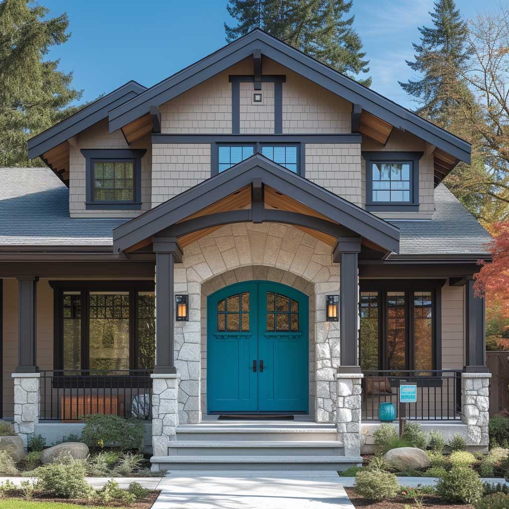
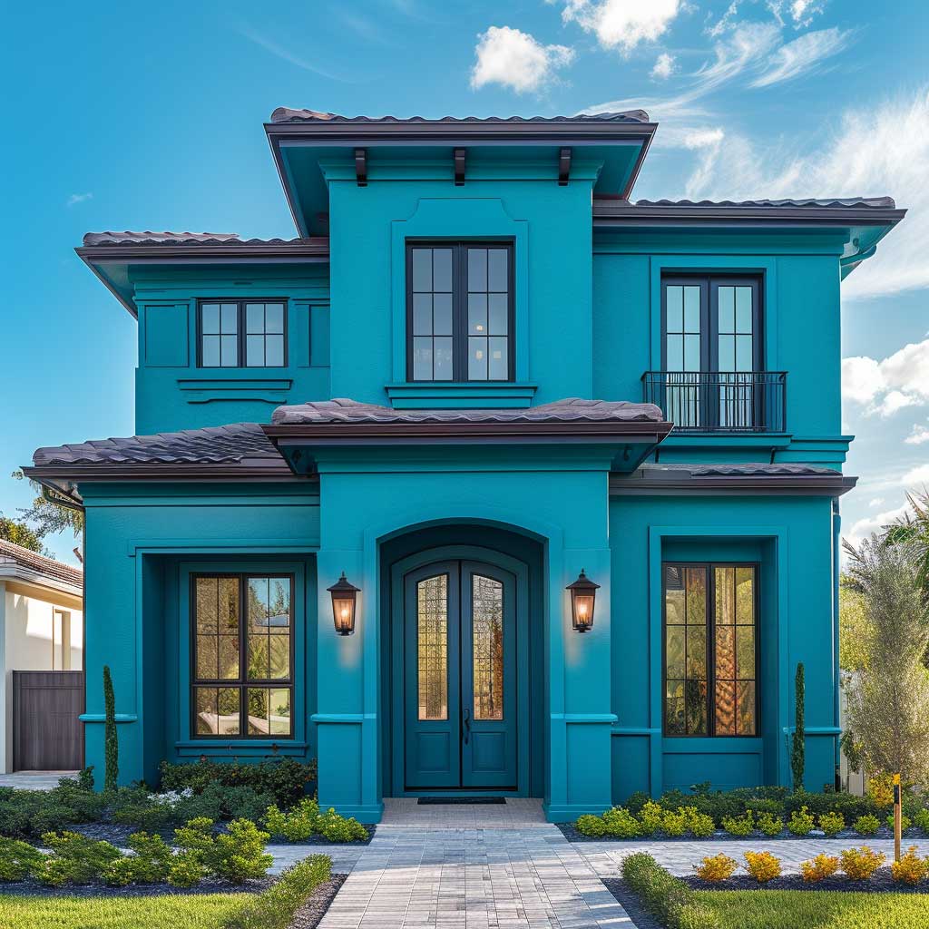
Turquoise exterior house paint applied at trim-width functions the way a statement necklace works on a neutral outfit — it reframes everything around it without replacing it. On a mocha-walled home, turquoise at standard exterior casing width (typically 3.5 to 5 inches) creates enough contrast to read from the street without overwhelming the architecture. Widen it to cover full fascia boards and soffit panels and you’ve crossed from accent into dominant statement — a different commitment that works on larger homes with strong architectural presence and reads as too busy on smaller or simpler facades.

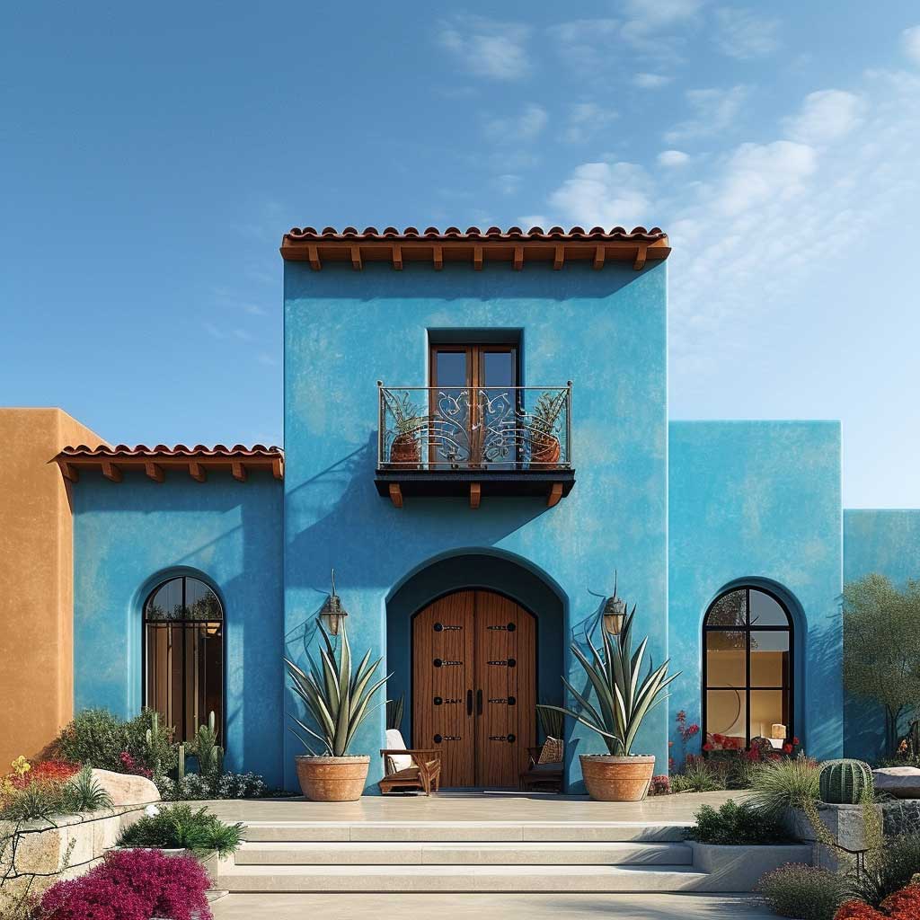
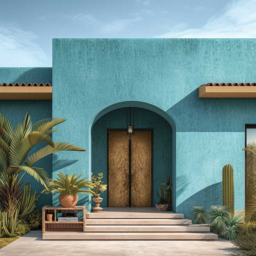
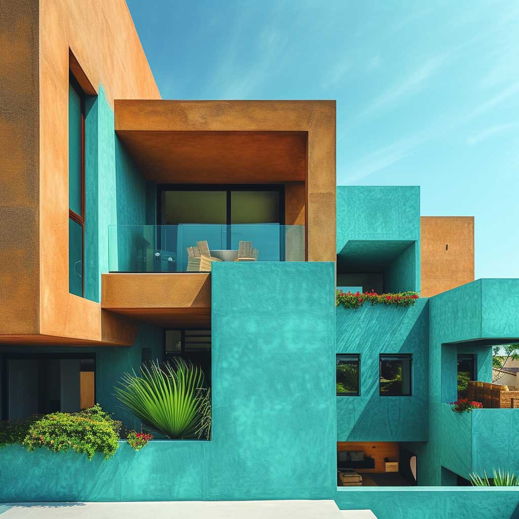
Benjamin Moore Tropical Turquoise 2052-30 is one of the most referenced turquoise shades in residential exterior applications, sitting in a blue-green register with enough saturation to hold its position against a dark mocha wall. For gloss trim — which exterior trim demands for weather resistance and longevity — the Advance Interior/Exterior line in semi-gloss runs approximately $103 per gallon at retail. A porch and front door treatment on a typical home uses 1–2 gallons. Benjamin Moore’s coverage rate is 400 square feet per gallon, meaning a standard front door (around 20 square feet) uses well under a quarter gallon for two coats. Always use a white or light gray primer when applying turquoise over any previously mocha-painted trim — skipping primer and going directly over dark existing paint pulls the turquoise toward greenish-brown rather than clean blue-green.
Sheen is the most underestimated decision in turquoise trim. Flat turquoise looks like an error regardless of how accurate the color is — the surface oxidizes within one season and reads as chalky rather than vibrant. Semi-gloss at minimum on all trim elements, gloss on the front door. That reflective quality is what keeps turquoise looking intentional against the satin or matte mocha wall, and it slows moisture absorption into the substrate, adding years to the paint’s service life. Think of the sheen as the difference between a polished stone and a dry river pebble — same color, completely different presence.
Turquoise responds unusually to directional light, which matters before you commit to the trim throughout. On a north-facing facade, turquoise skews cooler and more gray-blue, losing its warmth and potentially reading as flat against mocha. On south and west exposures, the same color gains intensity and pops cleanly. A $7 sample pot from Benjamin Moore, tested on the actual door and shutter surface at different times of day, costs far less than discovering the wrong register at full-trim scale. Can turquoise trim boost curb appeal on a mocha house? Yes — if the undertone is truly blue-green and the sheen is reflective. If either condition isn’t met, the result looks like an afterthought.
For a closer look at how turquoise exterior accents perform across different house styles and base colors, the turquoise outdoor house color accent approach covers the same proportion principles across colonial, craftsman, and contemporary applications — the core insight about trim-width versus field-width scale holds in every case.
Dark Turquoise Exterior Where the Palette Gets More Serious
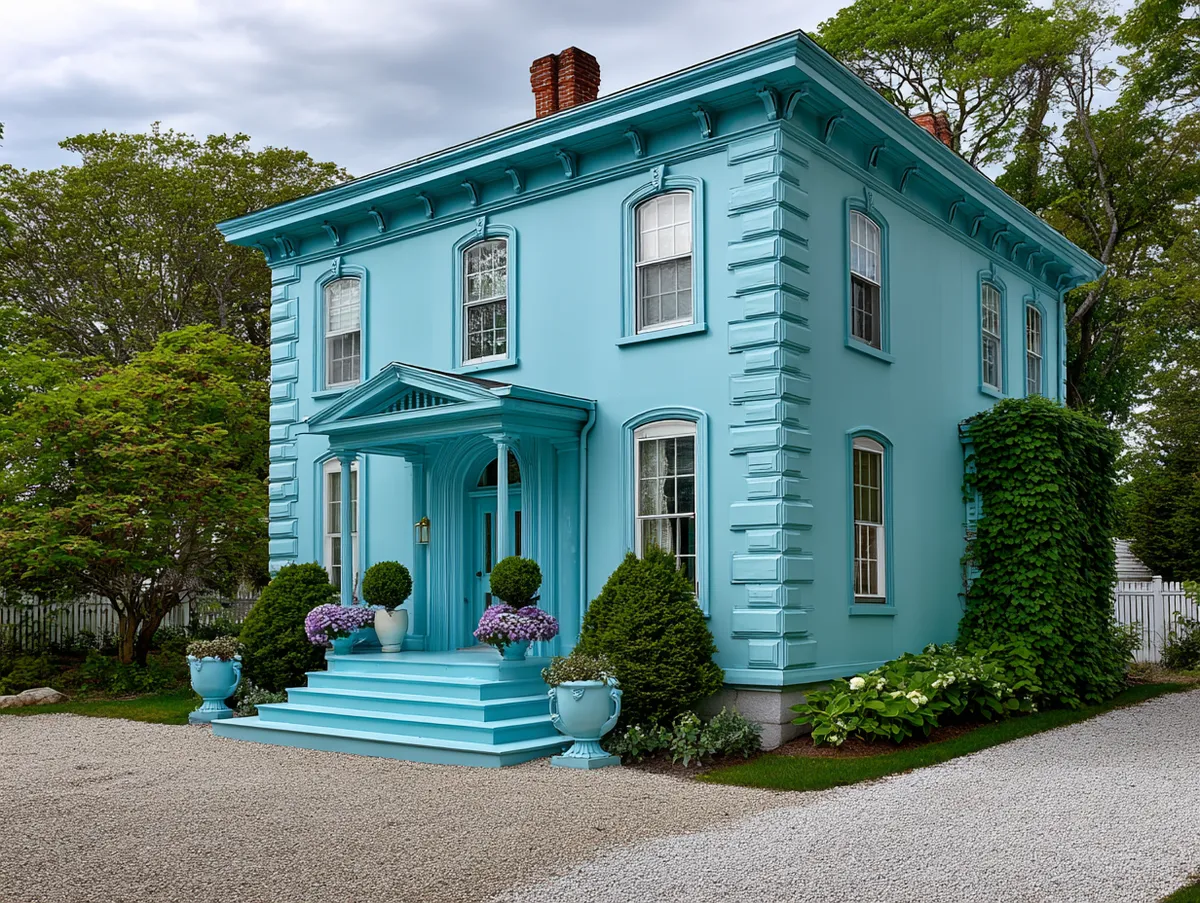
Dark turquoise exterior house paint — those deep teal-adjacent shades that sit closer to midnight ocean than tropical sea — operates on different logic than mid-tone turquoise. Where lighter turquoise creates wide contrast against mocha walls, dark turquoise narrows that contrast, producing a tonally compressed palette where both colors share similar depth. Think less “vacation postcard,” more “European townhouse.” For homeowners who find bright turquoise too playful for their architecture, this is the version they were actually looking for.


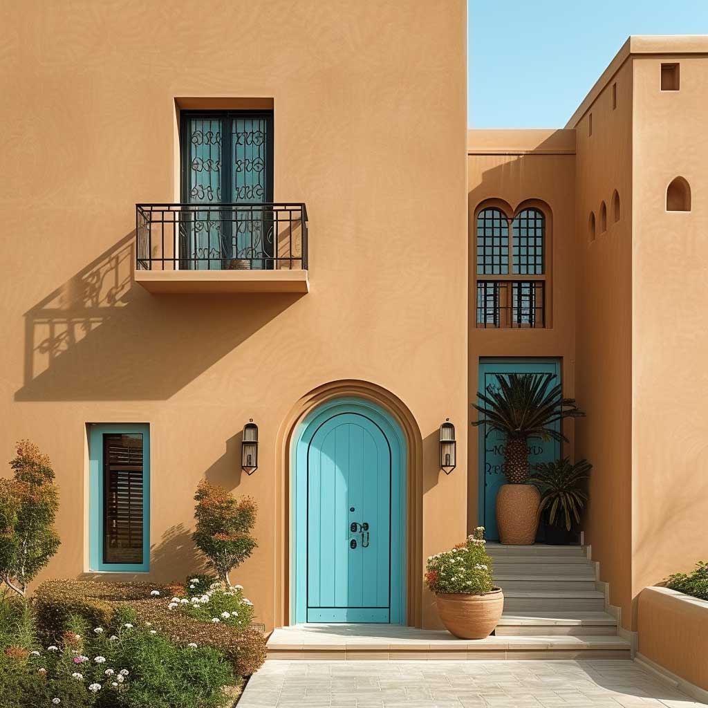

The fade liability deserves planning. Dark pigments in both the brown family and the blue-green family absorb more UV radiation than lighter colors, which accelerates pigment breakdown from the first season. Research from professional exterior painting contractors confirms that dark-colored surfaces on south-facing exposures can show noticeable color shift within 2–3 years under intense sun — well short of the 7–10 year premium acrylic service life that lighter colors achieve. Behr DYNASTY Exterior specifically markets 10-year color fade protection and handles the organic pigment degradation that affects saturated cool tones better than standard acrylic lines. If dark turquoise is your accent color in a high-UV climate, DYNASTY or Sherwin-Williams Emerald Exterior (~$93.99/gallon) is the minimum tier to consider for maintaining the color integrity past the third summer.
Distinguishing dark turquoise from teal or dark green matters for the pairing. True dark turquoise keeps a visible cyan register — held next to pure navy, it reads warmer and more blue-green; held next to forest green, it reads cooler and more blue. The moment a “dark turquoise” loses that blue register and reads primarily as dark green, it shifts from accent color to competing field color against the mocha base. A common approach when evaluating dark shades is to photograph them alongside a mocha chip in outdoor light — the photo’s color balance removes the eye’s compensating adjustment and reveals the true undertone more accurately than prolonged direct viewing.
Homes with strong architectural detail — deep eaves, decorative brackets, board-and-batten panels, corbels — benefit most from dark turquoise in those inset areas. The color doesn’t glow the way mid-tone turquoise does; it deepens, which makes shadow and light play across detail elements far more visible and dramatic. You’ll notice this effect clearly on craftsman and Tudor-influenced exteriors where the palette depth amplifies the three-dimensional quality of the facade. Roof material is the hidden variable: dark turquoise reads cleanly under charcoal asphalt shingle or dark clay tile, but can turn muddy under a weathered tan cedar shake where the three colors all compete in the same warm mid-value territory.


For homes where the roof is warm tan or brown cedar and non-negotiable, the fix is straightforward: shift the turquoise accent lighter toward a mid-tone like Benjamin Moore Bahama Waters 576, which adds reflectivity and re-establishes visible contrast against both the mocha wall and the warm roof. The visual logic is the same as adding a white mat to a photograph — it creates a clean separation between elements that would otherwise bleed together at their edges.
For a comparable approach using earthy two-tone palettes on classic-style exteriors, the forest green and stone gray exterior color combination demonstrates the same proportion strategy applied across the green family — the depth-matching principle that makes dark turquoise work alongside mocha is identical to what makes deep green work alongside stone gray.
| Turquoise Variant | Best Application | Fade Risk on Mocha Exterior | Key Watch-Out |
|---|---|---|---|
| Mid-tone (e.g. Benjamin Moore Tropical Turquoise 2052-30) | Trim, front door, shutters | Moderate — 5–7 years on south exposure | Semi-gloss minimum; blue-green undertone essential |
| Dark turquoise / deep teal | Inset architectural detail, craftsman panels | Higher — may shift gray-green by year 3–5 | Use UV-resistant line (Behr DYNASTY or SW Emerald ~$94/gal); charcoal roof pairs best |
| Light / seafoam (sage-adjacent) | Not recommended against mocha | Lower fade rate, but color fails the pairing | Green undertones mix visually with mocha brown — produces muddy result |
Premium acrylic exterior paint typically holds for 7–10 years on well-prepped surfaces — but that window shortens considerably for dark colors in high-sun climates. Fine Homebuilding’s guidance on exterior paint lifespan notes that substrate choice, particularly fiber-cement over cedar, extends that timeline significantly on any dark palette, and that south-facing exposures reliably show faster fade than other orientations regardless of paint quality.
FINAL CALL
Mocha holds the structure. Turquoise earns the look.
Sherwin-Williams SW 6067 Mocha at LRV 21 gives a facade the kind of depth that makes architecture look more deliberate — it shifts in every light condition and makes surface texture more visible. Turquoise at trim-width in a true blue-green tone provides the contrast that stops the palette from reading as just another dark brown house.
Dark turquoise narrows the value contrast for a more sophisticated, European-influenced reading — but it demands a UV-resistant formula like SW Emerald Exterior (~$93.99/gal) or Behr DYNASTY to maintain color integrity past the third summer on south-facing exposures.
Save this post — the ratio of mocha wall to turquoise accent is the single decision that determines whether this palette looks considered or chaotic.
Related Topics
FAQ
What is mocha exterior house paint?
What color is mocha on a house?
What is the best turquoise exterior house paint?
Does dark turquoise exterior house paint fade faster?
What vibrant house colors work well with mocha?
How much does a mocha color house exterior paint job cost?
Complete guide
Blue Home Color Ideas for Every Room and Style
Navy, sky blue, slate, teal — interiors, exteriors, kitchens, bedrooms — all in one place