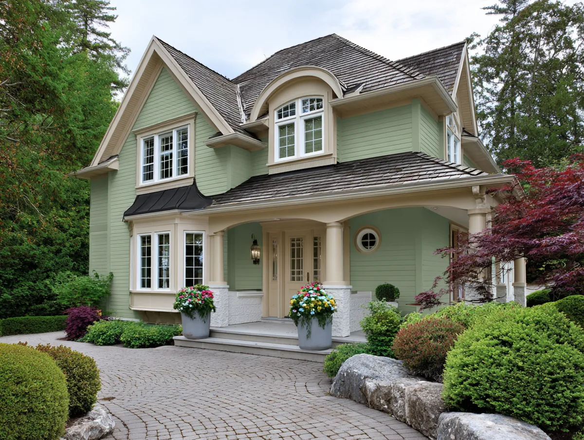
Explore the enchanting world of pastel color schemes for homes exterior, a design choice that can transform any street into a picturesque canvas. This guide delves into the subtleties of using soft hues to give a home’s facade a modern yet classic look. Discover how these gentle colors can harmonize with your surroundings, creating a soothing and inviting atmosphere.
Lavender and Cream Palette Color Schemes for Homes Exterior


Its soft mix of lavender and cream in the home exteriors allows a visual resting place, echoing a thoughtful urban design approach. This color combination, mostly associated with serenity and softness, gives an aesthetic that somehow does not raise the property itself but rather the whole neighborhood together with it. It has great potential for a home’s facade when used with soft lavender paired with creamy hues to portray a fragile piece of art that becomes a standout feature in the home’s overall curb appeal.
This color scheme is suitable for home exteriors when a home is observed from a close distance, and all the details of the architecture, such as doors and windows of the house, are seen and appreciated. The lavender gives a touch of low-key elegance, while the cream attains warmth to deliver a welcoming contrast that would invite onlookers to enjoy the accord between the building and its environment. Therefore, such a palette of colors can be used precisely for the outside part of the house and appeal to those who would love to open the place to tranquility and peacefulness.


The incorporation of such colors would require some balance that could be obtained without letting the aesthetic importance take away from the structural features of a house. These are colors that most architects and interior designers advise to preferably come in matte finishes, enabling a better visual softness, whereby the textures contribute highly to the total effect. For example, such a lavender stucco combined with cream trim would offer a tactile quality adding depth and character to the home.
In addition, the topography of the surrounding area around the house contributes largely to complementing this color scheme. Soft greens and even subtle florals can add interest to the visual appeal, literally tying the natural with the built environment. The resulting living spaces would be environments that feel integrated and thoughtfully edited as a whole: this approach, from the design of furniture to the consideration of the interior, is integral to the designed environment.
Mint and Sky Blue Blend Color Schemes for Homes Exterior


You can also add mint and sky blue to your outside to completely revamp your home. Your home will take on a new, fresh, vibrant look. The combination of these colors would evoke a brilliant sky and a crisp, cool morning—perfect for those homeowners who desire to project a bright, airy feel. Combination of two colors speaks for modern classic design, which bases on clean lines and bright space.
Mint offers a fresh take on traditional, muted tints that adorn most home exteriors. Sky blue might deepen the saturation or even provide a complementary color with which mint can contrast. When these colors land on the facade of a home, they look bright yet balanced. It’s just the balance of the colors that bring one to another and to the forefront but don’t overpower the presence of the other color.


This palette is widely used by designers. However, it is the perfect use of mint, considering the color is focal on larger areas, e.g., walls, and accents of the sky around trims, doors, and shutters, so each color assumes its place without overshadowing others. Furthermore, using these colors, they may turn out to be very active in places where natural light displays them at full brightness, hence making the home appear vibrant with color at various hours of the day.
More so, the materials used need to perfectly integrate with those colors on the exterior home. For instance, wood materials painted with matte help the colors pop, while giving metal fixtures a little glossiness makes the appearance somehow classy. Generally, the entire project is aimed to create an environment that would reflect the style of the home, bearing all the features of the aesthetic standards of the community.
Peach and Yellow Harmony Color Schemes for Homes Exterior


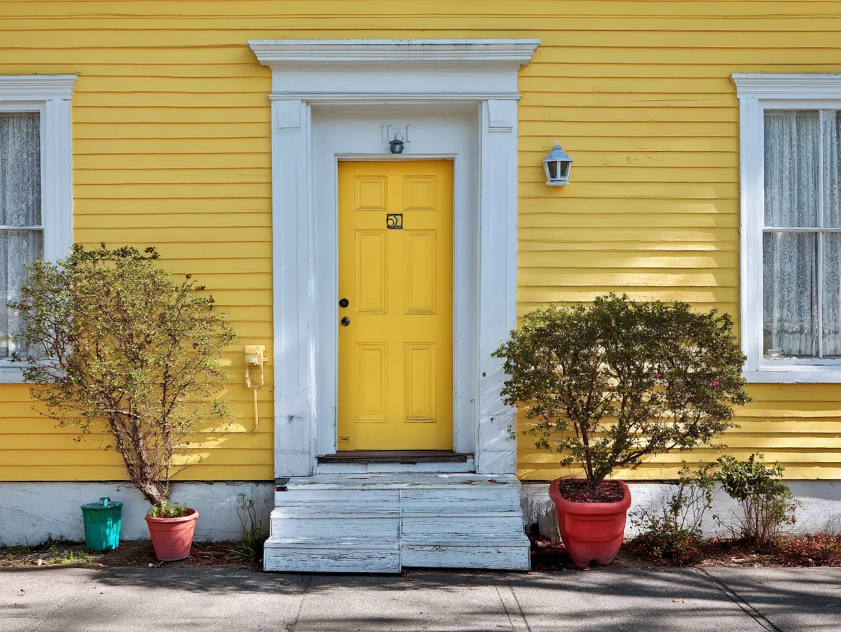
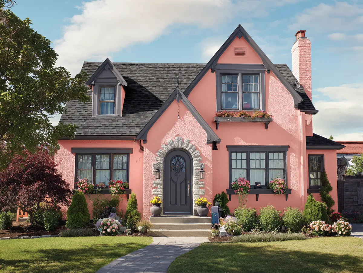
Peachy and light yellow shades: If happy and inviting are your taste, then some of the best warm shades to grace the exterior of any home are those of peach and light, pale yellow. This color scheme brings forth an inviting and friendly feel that is very applicable to a family home that would like to portray an environment full of friendliness and openness. The peachy softens and adds a lush quality to the exterior of the building while the pale-yellow infuses sunny, sunshiny sunshine, reminiscence reminiscent of a sunny day.
Well, this actually works for homes that have lots of outdoor space, in which the colors will help draw attention to features such as gardens or landscaped yards. Nature, in a prime way, will play its own colors and natural light against the brilliance of the yellow to bring out the richness of the peach. This provides for a spectacular visual display, changing at every nuance in the shifting sunlight all through the day.
Architectural style will also give some guidance to how much of these colors to apply. In classic designs, yellow may take a much more dominant role as an accent hue. These are used to highlight architectural features such as frames around windows and doorways. In more modern structures, the bold blocks of yellow can break up the softness of the peach to give a contemporary twist speaking of innovative design trends.


In addition, they are creative in the colors for creativity in landscaping and outdoor decorations. For example, dark green shrubbery would be enough to provide good contrast and make the peach and yellow really pop.
Likewise, if it’s the rustic wood or wrought iron, all is to be included to ground the element the house is set into its environment so that the joyous palette takes center stage. In all these cases, the color schemes selected for the home exteriors contribute to beautifying the property and further contribute to a pleasant, cohesive community atmosphere. Homeowners can assure that their dwelling stands not only distinctive but contributes harmoniously to the architectural fabric of the neighborhood through careful choice and application of these colors.
This exploration of pastel color schemes for the exterior of homes reveals their potential to significantly beautify residential facades. By integrating these soft, calming tones, homeowners can achieve a stylish, timeless appearance that stands out while perfectly blending with their environment.
Related Topics
