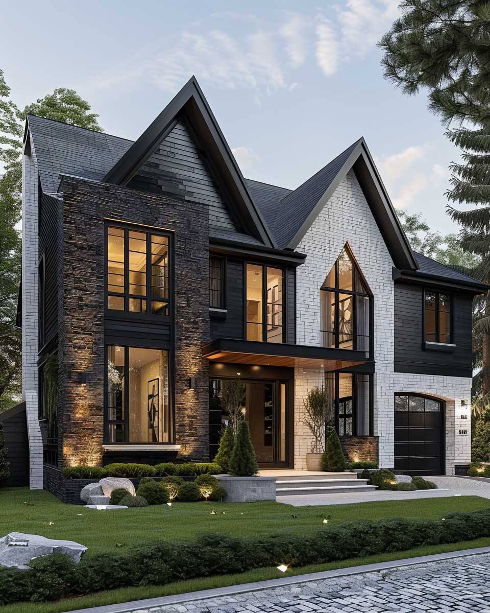
High-contrast color schemes are a dynamic choice for home exteriors, offering a bold statement that stands out in any neighborhood. These color combinations not only enhance the architectural features of a house but also reflect the homeowner’s style and personality. By incorporating modern classic aesthetics, these schemes can transform the ordinary into the extraordinary, ensuring that homes are not only beautiful but also timeless.
Timeless Color Schemes for Homes Exterior: Black and White Elegance
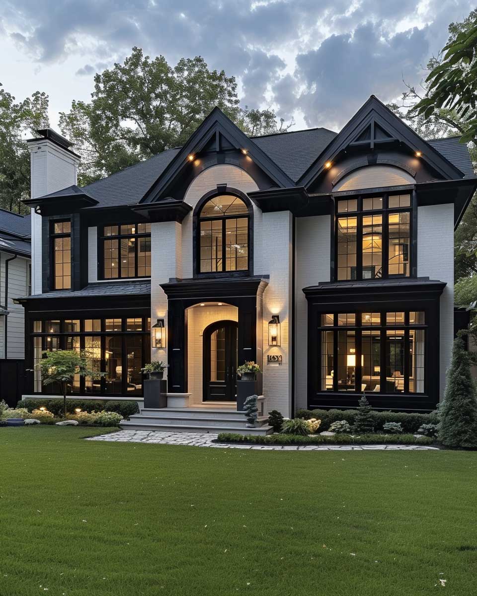


The effect of black and white on a home’s facade is close to dramatic and timeless. In the world of color schemes for the house’s exterior, the black and white palette is so reigning, more so than its boldness and clear visual contrast. This is so simple to an extent of implying a choice in design, but yet so elegant to an extent it can’t be mistaken for anything else. It frames your home’s architectural in almost complete contrast, bringing attention from symmetry of windows to boldness of doors.
This has more effect when viewed from close angles. In this way, the front lawn serves as the green canvas, allowing for the definition of the crispness of the architectural lines. Each of the windows, with a beautiful view framed by white trim, do have a contrasting appeal from the darkness. The front door will perhaps be in glossy black or a deep charcoal hue, calling one in for timeless style.


Also, different surfaces and materials may be used in that combination of colors. For instance, a black siding might be matted and will work well with the shiny, lacquered door and window frames to create dimension and interest. Add wrought iron or metal pieces in the form of railings or light fixtures in black or white to give the finishing an added luxury and precision.
Vibrant Color Schemes for Homes Exterior: Deep Blue and Crisp White Contrasts


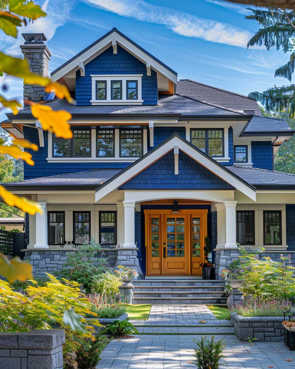
Going for a deep blue with white trimming, it really introduces a vibrant yet serene ambiance of a home’s exterior. Not only does this color scheme for homes’ exteriors look striking, but it also evokes a calming and stable atmosphere. This deep blue color can change from rich colorations of a midnight sky to bright shades of a coastal retreat, both bringing a whole new feeling and flair. Paired with the crisp white trim, it features the architectural details of the home, such as eaves and window frames, providing greater visibility so they become more prominent to the eye.
It is from closer to the surface that the contrast of deep blue and white becomes a focus drawing attention. This completes nature around, whether the blue is a reflection of the sky or a contrast to the verdure landscaping around the property. For instance, it could be the front door in light blue or white against richer and darker walls.


This scheme of color can be made more effective in its choice of materials. It could be a great idea to add a glossy paint finish that could make the color look alive and vibrant by reflecting light, adding to the vibrancy of the entire exterior. Adding a white picket fence and even some decorative rocks around the place will further integrate the home with its surroundings and hence make it more than just a house but a cornerstone of the locale.
Sophisticated Color Schemes for Homes Exterior: Dark Gray and Pure White Classics


Sophisticated, ultimately refined, and communicating a sense of refinement and understated elegance: palettes of dark gray paired with pure white trim seem to purport this. This color scheme is a perennial one for homes exteriors; it could bring up the appearance of any architectural style from modern minimalist to classic Victorian. The dark grey gives a mighty, solid basis and an implication of strength, whereas the white accent trims it with clean, bright contrast to bring out fully the home’s dimensional features.
The human eye can see the interplay of shadows and light from the different house surfaces a meter away. The gray can even take on an almost silvery quality under the full brightness of the sun, giving it a little bit of a shimmer on the facade. The windows, framed in white, look like glistening, white-framed portals that add to the home’s beckoning ambiance. The solid wood front door, stained to match the gray of the house or painted white like the trim, but most importantly, inviting and serviceable, swings wide open to classic beauty.


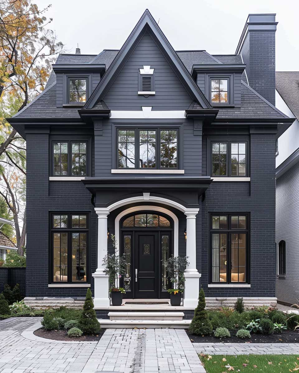

The colour palette also performs very well with different materials. For instance, dark, grey stone or stucco can be coupled with smooth white siding to harness different textures that come in the same spirit of layering. Elongated by adding details like door handles in silver or having a doorstep made of white marble at the entrance, they are designed to enhance the feeling of luxury, so the house becomes not only a place of living but rather a statement of taste and finesse.
High-contrast color schemes are an excellent way to make a lasting impression with a home’s exterior. These color choices offer a timeless elegance while providing a striking visual impact that elevates the property’s curb appeal. Whether opting for the stark simplicity of black and white or the dramatic depth of blue against white, these schemes promise to turn any home into a visual landmark.
You Might Also Like

Related Topics