Victorian style bedroom design gets the color wrong more often than any other room type — and the reason is always the same. People reach for a single dominant jewel tone, paint four walls in it, then wonder why the space looks like a hotel bar instead of the layered, moody sanctuary they saw in a reference image. A real Victorian color palette for interior design never worked as a single wall color. It operated in layers: a deep base, a contrasting mid-tone textile, and metallic or natural-material accents that caught the light differently at different hours. I’ve redesigned three bedrooms using this logic and the difference between getting it right and getting it theatrical is razor-thin.
The three Victorian color schemes covered here — deep reds and golds, sage greens and earthy browns, midnight blues and lavender — each have a specific logic that goes beyond aesthetics. You’ll notice the schemes aren’t interchangeable. Each one suits a different room orientation, natural light situation, and furniture mass. Pick the wrong one and even the most expensive velvet curtain will flatten the space. Pick the right one and a $300 Wayfair headboard looks like it came from an estate sale in the best possible way.
At a glance — what’s covered in this post:
- Deep reds and golds: the Victorian drawing room logic and where it actually works in a bedroom
- Sage greens and earthy browns: the conservatory palette and why it’s the safest starting point for smaller rooms
- Midnight blues and lavender: the most misunderstood of the three, and how proportion changes everything
- Which Victorian color scheme suits which light condition
- The one mistake that kills every Victorian bedroom revival before it starts
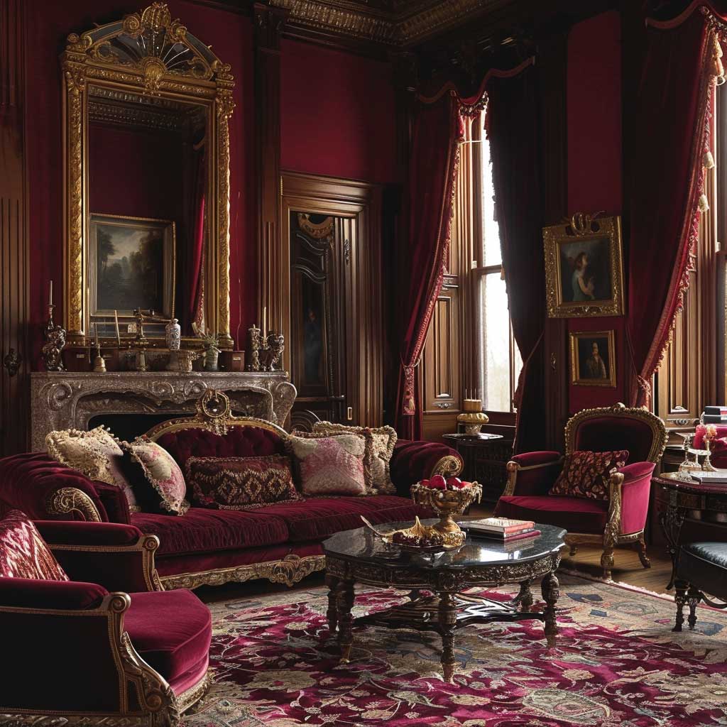
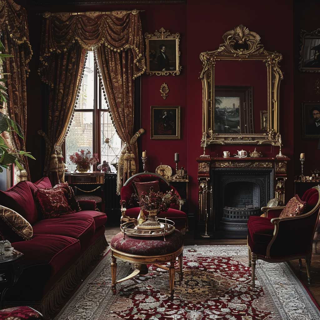
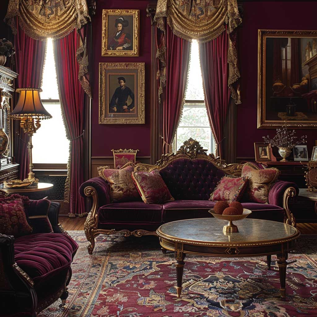
Deep Reds and Golds Pull Their Weight Only Below the Dado Rail
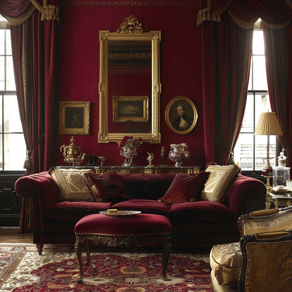


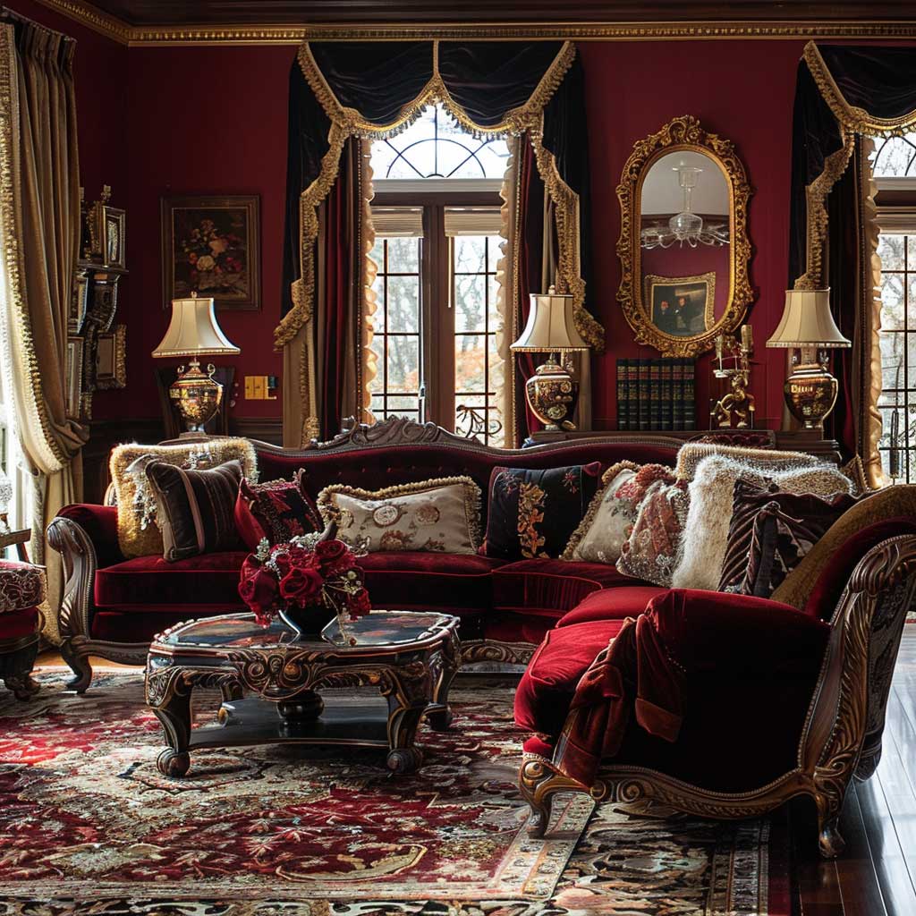
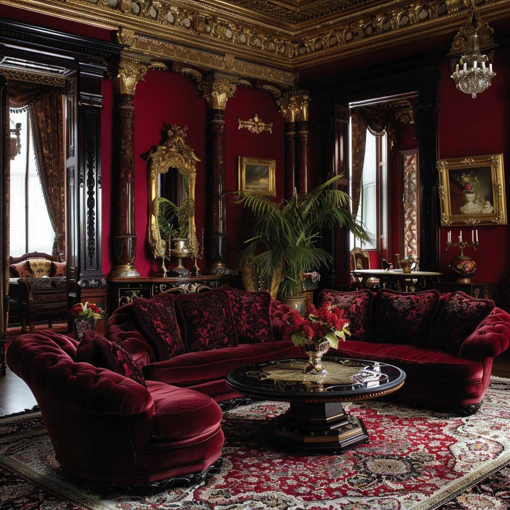
Deep red and gold is the Victorian color palette most people attempt and most people ruin. The mistake is always scale. Farrow & Ball “Incarnadine” or Benjamin Moore “Caliente” in full saturation on all four walls of a bedroom does not read as Victorian grandeur — it reads as a room with no exit strategy. I’ve bought into this mistake myself. A single accent wall in deep crimson looked rich for about two weeks until the novelty wore off and the room started feeling like an error in judgment.
What actually works is the dado-rail split the Victorians themselves used. Below the rail — typically 36 inches from the floor — you run the deep red, in flat or eggshell finish. Farrow & Ball “Rectory Red” at roughly $115 per 2.5L tin is the closest modern equivalent to the original pigments. Above the dado, use a warm cream or aged ivory. The gold enters through accessories: picture rails at $40–80 per linear meter, gilt-frame mirrors, and brass hardware on furniture. This distribution keeps the drama without letting the color consume the oxygen in the room.
Velvet is non-negotiable in this scheme. A pair of floor-length burgundy curtains from Anthropologie’s Genevieve line (around $248 each panel) or custom-made from Robert Allen “Plush Velvet” fabric does the heavy lifting that paint alone cannot. The texture absorbs light differently than a flat wall, which is exactly what creates the depth you see in reference photos. Skip the velvet and you’ll get a red room, not a Victorian red room. You need both.
Persian or Turkish rugs in the $300–900 range from Ruggable or eSaleRugs anchor the whole composition. Their intricate patterns in burgundy, rust, and ochre act like the visual equivalent of a bass note — everything else sits on top of them. Without a rug with pattern complexity, the deep red scheme floats and looks unfinished. Don’t underestimate what’s on the floor.
Don’t do this with red and gold Victorian schemes:
Avoid mixing red and gold with chrome or brushed nickel hardware — it reads as a decorating collision, not a contrast. Every metal in a Victorian-inspired bedroom should be brass or antique gold. I swapped out the brushed nickel bedside lamps in my first attempt and the room immediately looked intentional rather than assembled from clearance purchases. Also skip anything with a glossy lacquer finish on the furniture — high-sheen surfaces kill the warmth this palette depends on. Flat, oiled, or wax-finished dark woods only.
For anyone drawn to Victorian opulence but not ready for four-wall commitment, the furniture approach in a modern Victorian room gives you the richness without repainting every surface. A tufted velvet bed frame in jewel burgundy against pale plaster walls still reads as Victorian — and costs a fraction of a full redecoration.
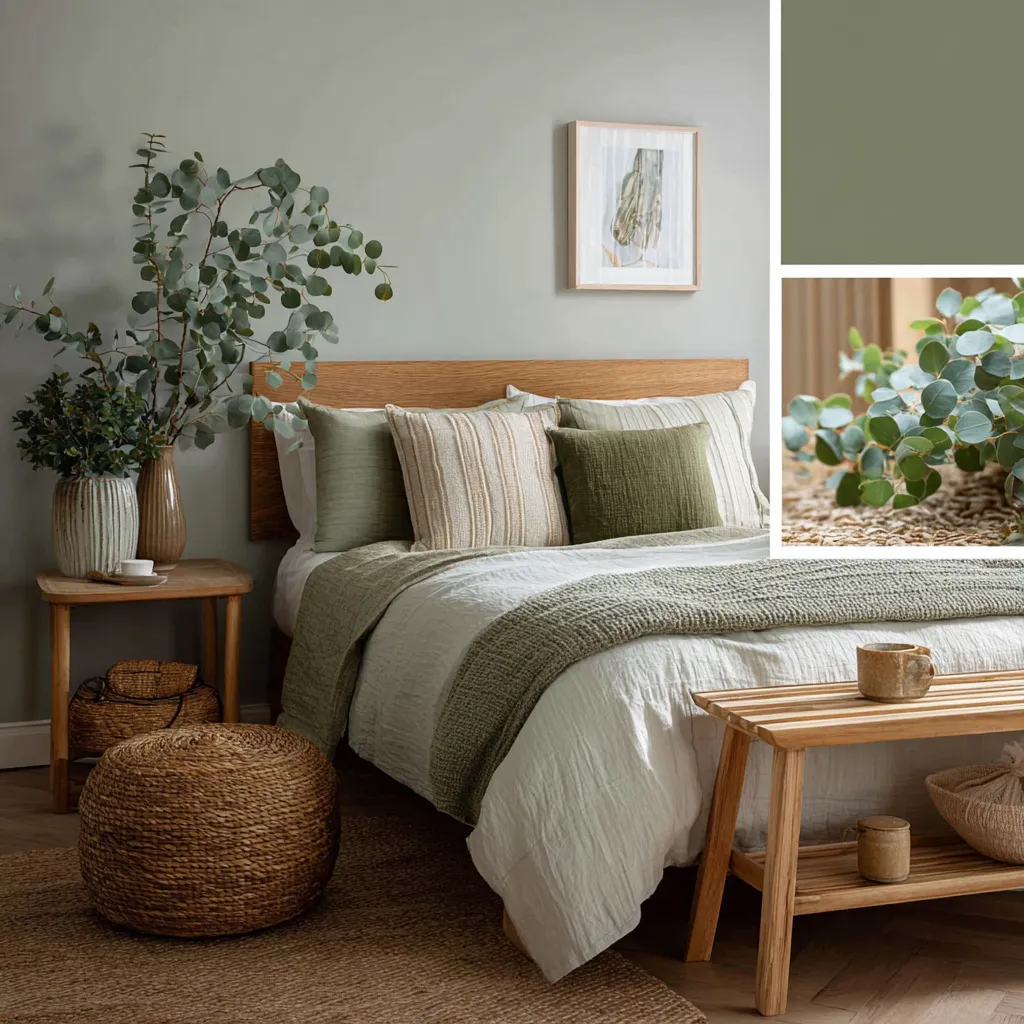
Sage Green and Earthy Brown Work Hardest in North-Facing Rooms

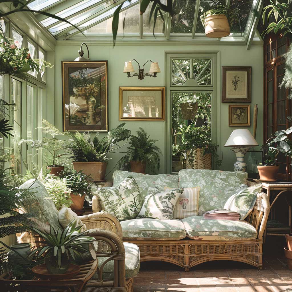


Sage green is having a cultural moment right now — but the Victorian version of it is not the Instagram sage you’ve been seeing everywhere. The original conservatory greens were greyer, more muted, slightly dusty. Think Farrow & Ball “Mizzle” ($115/2.5L) or Little Greene “Sage Derby” ($90/2.5L), not the bright mint-adjacent tones that read as contemporary Scandinavian. Get the shade wrong and you lose the entire historical register of the palette. One degree too yellow and it reads as 2019 farmhouse kitchen.
Why does this palette suit north-facing rooms specifically? Cool northern light tends to strip warmth from bold jewel tones — deep reds go flat, saturated blues turn cold. Sage green with earthy brown accents leans into the cool light rather than fighting it. The muted grey-green reads as intentional and rich in cooler light, where it might look washed out in a south-facing room flooded with warm afternoon sun. My go-to test is to paint a large sample board and move it around the room at different times of day before committing.
Brown is the underestimated element in this scheme. Mahogany furniture in the $400–1,200 range from auction houses like Sotheby’s Home or through Chairish typically delivers the right depth. Wicker side tables and rattan baskets work too — the Victorians used them constantly in conservatory spaces. Terracotta pots with ferns, palms, and trailing ivy complete the conservatory feeling without tipping into greenhouse territory. Three to five plants, maximum. More than that and you’ve built a terrarium, not a bedroom.
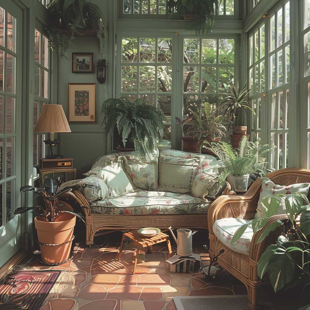


Lighting in this palette rewards specificity. Wall sconces with amber Edison bulbs at 2200K color temperature replicate the soft, diffused quality of Victorian gaslight far better than recessed LED. You’ll notice the room transforms between 4pm and 8pm as the light shifts from natural to artificial — sage green walls move through at least three completely different tonal registers in that window, each one more interesting than the last. That’s a feature. Design around it.
Brass accents are the only metal that works here. Oil-rubbed bronze gets close. Anything silver-toned disconnects from the warmth the scheme depends on. I stole this rule from a Victorian interiors book and have broken it exactly once — with a silver-framed botanical print that I convinced myself was “cool contrast.” It wasn’t. Brass frame, same print, looked immediately correct.
For a deeper look at how Victorian design logic plays out across an entire living space — including furniture selection and proportion rules — the steampunk interior design approach covers the Victorian material palette in a different but instructive context. The color logic transfers directly.
Midnight Blue and Lavender Collapse Into Each Other When the Proportions Are Off
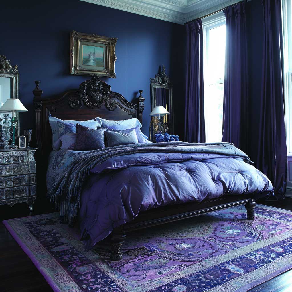


Midnight blue and lavender is the most misread Victorian bedroom palette — and the one that fails fastest when the ratio is wrong. You need to think about it as 70/20/10: 70% deep midnight blue (walls, upholstered headboard, curtains), 20% lavender (bedding, cushions, one upholstered chair), 10% silver or pewter accents. Flip those ratios and the room tips into a purple wedding venue rather than a Victorian master bedroom. You’d notice it instantly. I’ve seen this done wrong in three separate rooms I’ve styled for friends.
The wall color needs to be genuinely dark. Farrow & Ball “Hague Blue” ($115/2.5L) or Benjamin Moore “Gentleman’s Gray” (around $75/gallon) are the reference points. Anything lighter than a proper midnight reads as navy and loses the depth that makes the scheme work. The Victorians weren’t shy about dark rooms — they understood that darkness in the right context reads as luxury, not gloom. That instinct was correct.
Lavender’s role here is not decorative — it’s structural. Without the lavender counterpoint, the midnight blue scheme flatters no one sleeping in it. The pale purple introduces a warmth and softness that keeps the room from becoming oppressive. A duvet cover from Anthropologie’s “Annalise” range or similar lavender linen at $180–220 does the job. What doesn’t work is baby-shower lavender — it reads too sweet against the depth of midnight blue. You want aged, dusty lavender: closer to dried flowers than fresh ones.
Silver-framed mirrors and art amplify the scheme in a way that gold cannot. This is the one Victorian bedroom palette where silver hardware outperforms brass — the cooler metal complements the blue tones rather than fighting them. Ornate silver frames from estate sales at $40–150 or reproduction frames from Pier 1’s archive collections work perfectly. A full-length silver mirror on the wall opposite the window multiplies the lavender light at dusk in a way that’s genuinely theatrical. Worth the wall real estate.
Area rugs in plum, dusty mauve, or dark indigo patterns — the kind you find at Turkish import shops for $150–400 — ground the scheme and add the textural layer that a hard floor removes. Skip the rug and the room floats. Plush pile over $300 makes the difference between a room that photographs well and one that actually feels inhabitable. Do not put a pale grey rug under a midnight blue bedroom: the contrast doesn’t read as sophisticated, it reads as unresolved. Dark or patterned only.


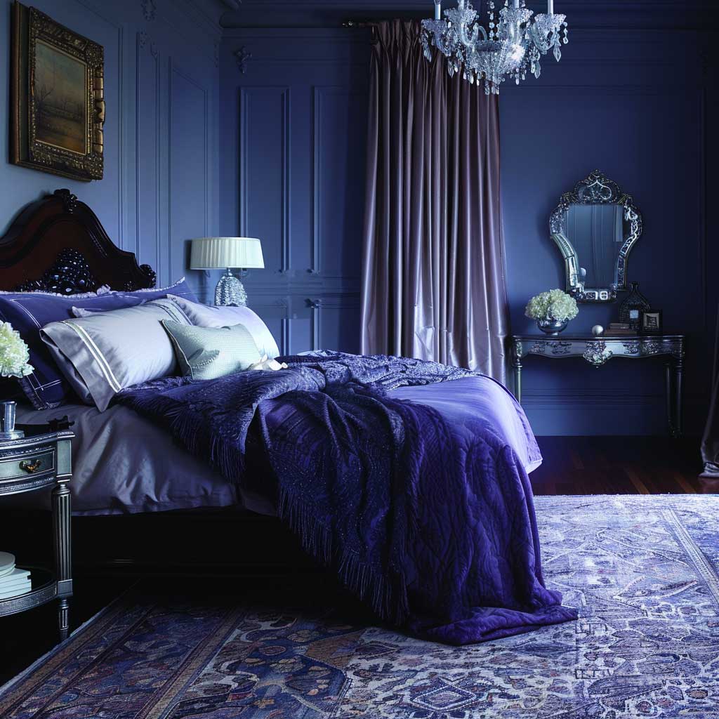
Lighting in the midnight blue scheme needs to stay soft and warm — 2700K maximum. Recessed LED at 4000K or above turns the walls into a cold, flat backdrop with zero depth. Ornate table lamps with fabric shades in amber or ivory, positioned at bedside height, recreate the quality of Victorian oil lamp light: directional, warm, and low. That’s the difference between a room that reads as atmospheric and one that reads as painted in the wrong color. Soft light is not optional here. It’s structural.
For a broader grounding in how Victorian color logic works across different material palettes and room types, the Victorian interior design guide from Chairish covers furniture selection, pattern mixing, and period-accurate color evolution in a level of detail that complements what you’re building here.
Final thought
The Victorian bedroom palette you choose is less about personal taste and more about which room you’re working with.
Deep reds and golds need height and dark furniture mass to anchor them. Sage greens and earthy browns reward cool light and smaller footprints. Midnight blues with lavender require commitment — half measures produce rooms that look neither Victorian nor contemporary.
Match the palette to the architecture, not to your Pinterest board. The architecture always wins.
Save this post before you pick up a paint chip.
Related Topics