Wooden wall design for living rooms solves a problem that furniture rearrangement and new paint colors can’t touch: the room feels finished but still cold, complete but somehow unconvincing. I’ve watched three different wall treatments — contemporary wood art, vertical slat panels, and LED-integrated wood walls — change the emotional register of a room faster than any other single intervention. The right wood surface at the right scale does something thermal to a space. The wrong one just adds brown.
Not all three approaches work in every room. A 9-foot ceiling handles vertical slats differently than an 8-foot one. A room with south-facing windows needs a different wood tone than one that gets two hours of light a day. You’ll notice the difference immediately once you know which variable to adjust first — and it’s almost never the species of wood.
What this covers:
- Contemporary wooden wall art — reclaimed panels, mixed-media sculpture, sizing rules that actually hold
- Vertical slat walls — gap width, backing color, the mistake that kills a $1,500 install
- Built-in LED lighting on wood panels — color temperature, strip placement, dimmer specs
- Brands, real prices, and configurations worth repeating
Contemporary Wooden Wall Art Already Tells the Room What to Do


A single well-scaled piece of modern wooden wall decor does something that a gallery of smaller frames almost never manages: it locks the entire room into one visual story before anyone sits down. I’ve bought a 48-inch reclaimed oak panel from an independent maker — around $320 — and it immediately made my sofa arrangement look deliberate rather than default. The knots, the grain variance, the slightly rough surface texture — those aren’t flaws on reclaimed wood. They are the product. Avoid freshly milled pieces with uniform amber staining if you want the thermal quality that reclaimed wood actually delivers.
Mixed-media wooden wall sculptures are the other route worth serious attention right now. Artists are combining white oak with blackened steel or cast resin insets — the result reads as visually dense without feeling heavy. Uttermost and Kalalou both carry mid-range pieces in the $150–$450 range with enough surface depth to hold attention from across the room. What doesn’t work: pairing a high-gloss lacquered wood piece with matte walls and linen furniture. The contrast reads as a catalogue error, not a considered pairing.
Scale is where most wooden wall art decisions go wrong. A 24-inch piece on a 12-foot wall reads like a sticky note left behind after a meeting. Go at least 60% of the wall width, or commit to a gallery cluster with three pieces in a loose horizontal line. My go-to for rooms under 180 square feet is a single overscale piece — the room stops competing with itself. For the wooden wall sculpture category specifically, look at 3D carved relief panels rather than flat printed wood. The dimensional shadow play at different hours of the day justifies every extra dollar on the price tag.
Custom finishing is far more accessible than most people assume. Sherwin-Williams Minwax Early American stain ($11 per can) on raw pine delivers a dark walnut-adjacent tone at a fraction of the cost of actual walnut. Sand to 220 grit before staining, not 120 — the color absorption difference is visible from six feet away, and you’ll only make the 120-grit mistake once. More living room wall decor approaches worth saving are collected here.
Vertical Slat Walls Read Differently Based on the Gap, Not the Wood


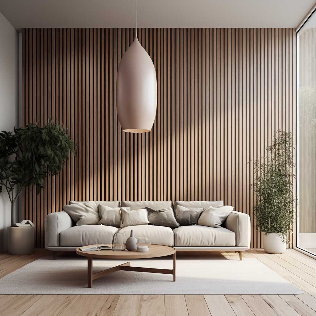
Vertical slat walls earn their reputation because the geometry does real optical work that paint simply cannot. A ceiling sitting at 8.5 feet reads like 10 feet once you run floor-to-ceiling slats against it — I stole this trick from a contractor who used it in a narrow city hallway, and the same effect lands in living rooms with low or awkward proportions. Most tutorials teach slat width as the critical variable. It isn’t. The gap between slats is what controls the whole visual outcome.
For a bold, enveloping result: 3-inch slats with 1-inch gaps. For a quieter, more Scandinavian register: 1.5-inch slats with 1.5-inch gaps. I own two installations — the tighter configuration reads as rich and cocoon-like; the wider gap reads as airy and edited. Both work, but not interchangeably. Mixing gap widths along the same wall in an attempt to get both effects at once is the mistake I watched a client make on a $2,000 installation — the result looked like an unfinished project for six months until they pulled it down and started over.
Integrating slats with other materials is where wooden wall designs for living rooms get genuinely interesting. Running a horizontal mirror strip behind a vertical slat section creates perceived depth — the slats reflect and the room doubles. A floating shelf threaded through the slats at 54 inches creates a practical ledge without interrupting the line rhythm. IKEA’s Bergshult shelf ($25) fits neatly through standard slat configurations if you pre-cut the notches before mounting. What you should not do: mount backlit canvases over a slat wall — the frames fight the slat lines and neither element resolves.
Stain choice for vertical slats depends entirely on the floor beneath them. Medium-tone oak floors need a darker wall — charcoal walnut or ebonized ash — so the two surfaces don’t blur into the same tonal plane. Dark floors need lighter ash or untreated pine to create the contrast that makes the vertical line legible as a design move. The wooden wall design for hall applications follows the same logic: contrast is what makes the geometry visible rather than just adding more wood-colored surface to a wood-floored space. Full vertical slat configuration breakdown with more layout options here.
Don’t Do This
Don’t install vertical slats without painting the backing wall first. The color showing through the gaps is doing more visual work than the slats themselves — builders-beige behind any slat configuration makes the entire install read as unfinished regardless of wood quality or finish. Paint the backing wall two shades darker than the slat stain: deep charcoal behind light oak, near-black behind walnut. This is the single detail that separates a $400 DIY slat wall from one that looks like a custom $3,000 install. Also, don’t use softwood pine within six feet of a kitchen or entryway moisture source — it warps inside one winter. Stick to MDF-core slat panels or solid oak for anything exposed to humidity variation.
Built-In LED Lighting Makes Wooden Wall Designs Work at 8 PM, Not Just in Daylight


Every wooden wall design for living rooms looks good at noon with natural light streaming in. Built-in lighting is what determines whether it still looks good at 9 PM when the windows go dark. I’ve tested this directly — adding Govee RGBIC LED strips ($38 on Amazon) to the groove channels behind reclaimed oak panels changed the entire character of the room after sunset. The shift is not subtle. It’s the difference between a wall that holds attention and one that disappears when the overhead lights come on.
Color temperature is the variable that most people skip and then spend months trying to diagnose as a furniture problem. Warm white at 2700K–3000K is the correct range for wood — it deepens grain, amber-tones the space, and creates what I’d call fireplace energy without the fireplace. Cool white at 5000K on wood panels makes the room read like a tech showroom. Not wrong for every aesthetic, but very specific and hard to live with long-term. The Kelvin number printed on the package matters more than the brand name on the box.
Philips Hue White Ambiance recessed downlights ($49 each) are the most reliable option I’ve found at a non-contractor price point for panel integration. Mount them at 18-inch intervals inside the panel cavity for even wash coverage across the wall surface. Aim the beam at 30 degrees from vertical so the light skims across the wood grain and throws shadow depth rather than flattening the surface into a uniform glow. Perforated panels backlit with a single RGB strip cast geometric shadow patterns that shift as you move through the room — it sounds like a gimmick, but I’ve seen it in two high-end showrooms and both times it read as genuinely architectural.
A Lutron Caseta dimmer switch ($59) works with most LED strip drivers and the perceptual difference between full brightness and 30% output is the difference between a room that functions and one that has atmosphere. Install the dimmer on day one, not as an afterthought after six months of full-blast LEDs making the room feel like an operating theatre. Wooden walls at 30% LED output are the visual equivalent of a wool throw on a sofa — entirely optional, completely transformative.
Final thought
Wood walls don’t fail because of the wood. They fail because of what’s behind and beside it.
Backing wall color, slat gap width, LED color temperature — those three decisions determine whether the install reads as deliberate or approximate. Get those right and the wood species barely matters.
Govee strips, Philips Hue downlights, Minwax Early American stain, Lutron Caseta dimmer. Under $200 in supplementary supplies on top of the panel cost itself.
Save this post before you start measuring.
Related Topics