Modern living room decor fails not because of bad furniture — it fails because of missing contrast. I’ve walked into rooms with $8,000 sofas that still felt unfinished, and I’ve seen $900 IKEA setups that looked editorial. The difference is always in the layering: how textures fight each other, how plants interrupt hard surfaces, how one piece of art anchors the whole wall. This article breaks down exactly how to build those layers so your space doesn’t look like a furniture showroom.
You’ll notice most living room decorating advice stops at “add a throw pillow.” That’s not enough. Real modern living room decor ideas work because they create visual tension — not harmony. Keep reading.
Quick Scan
- Modern Elegance — neutral base + brass + one statement material
- Indoor Plants — fiddle leaf fig or monstera as focal anchor, $35–$120 at most nurseries
- Minimalist Approach — edit to 7 objects max per surface, then stop
- Art Placement — center of artwork at 57 inches from floor, always
- Texture Layering — minimum 4 surface types in one room: soft, hard, natural, metallic
- Contemporary Accents — sculptural objects over decorative ones, Hay and Menu are the right price point
Modern Elegance Starts With One Material You Commit To


Pick marble, or pick brass, or pick fluted oak. Not all three. My go-to move when starting a modern living room decor project is to anchor the whole room to one premium material — then let everything else be neutral and cheap. The CB2 Arched Floor Lamp in brass runs about $399 and does more work than a $1,200 accent chair in the wrong finish. You’ll notice the room reads as intentional instead of assembled.
Furniture selection in a modern elegant space should follow one rule: clean silhouette, rich material. A sofa in oatmeal boucle from Article (the Sven, around $1,499) reads elegant next to a walnut media console. That same sofa next to a glossy white TV stand looks like a staging mistake. The material pairing is the decision — not the sofa itself.
Color palette for contemporary living room decor works best when you treat warm neutrals as your base and layer in one chromatic note. Warm white walls, greige linen, then one object in forest green or dusty rose. Don’t do four accent colors. I’ve tried it. It reads like a mood board that never edited itself down. The restraint is the whole point.
What doesn’t work: mixing gold, chrome, and black metal in the same room. Pick one metal finish and repeat it in at least three places — lamp base, cabinet handles, picture frame edge. That repetition is what makes a room feel designed rather than decorated. Home decor editors call it “echo,” and it’s the fastest fix for a room that feels random.
Don’t Do This
Don’t buy a “statement” sofa in a bold color thinking the rest of the room can stay neutral. A cobalt blue sofa doesn’t blend — it demands. Every other object in the room now has to respond to it, and most rooms aren’t built for that conversation. Start with a neutral sofa, then introduce color through objects you can swap out for $40. I made the cobalt mistake in 2021. The sofa is in storage.
Indoor Plants Interrupt Hard Surfaces in the Right Way
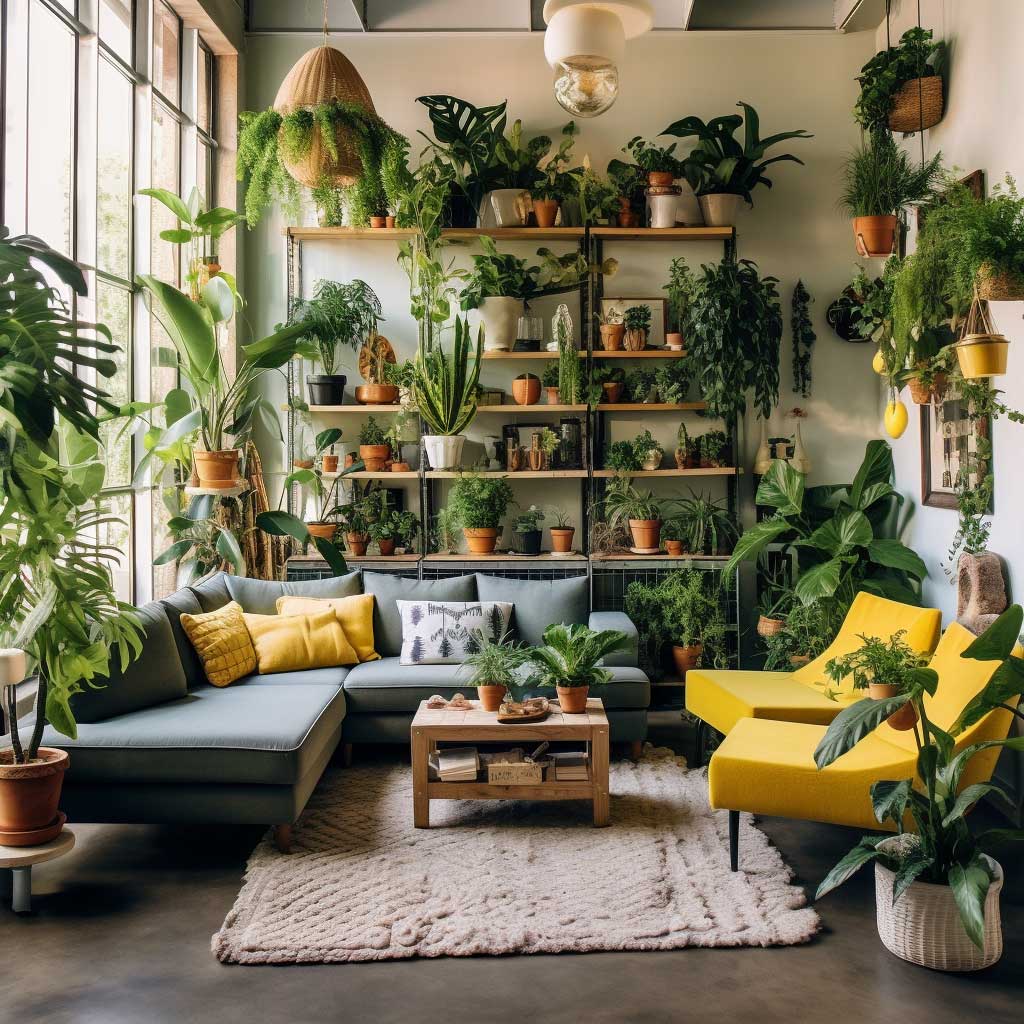


A room full of hard edges — sofa frame, coffee table corners, TV console lines — needs something organic to keep it from feeling like a waiting room. Plants do that. Not because they’re “on trend,” but because the eye physically relaxes when it hits a curved, irregular form after processing a grid of right angles. I keep a 6-foot fiddle leaf fig in the corner of my living room purely for this reason. It cost $85 at a local nursery in 2022 and has grown another two feet since.
What plant for which space? Snake plants (Sansevieria) handle low light and neglect, $15–$30 at most garden centers. Pothos trails from shelves and needs watering roughly never. Monstera deliciosa makes a statement in rooms over 300 square feet — anything smaller and it takes over. Fiddle leaf figs need bright indirect light, so place them within 6 feet of a window or they’ll sulk and drop leaves. I’ve killed two by ignoring that rule.
Planters matter as much as the plant. A beautiful monstera in a plastic nursery pot reads unfinished. Terracotta works in warm-toned rooms. White ceramic works in minimalist and Scandinavian-leaning spaces. Woven seagrass baskets work almost everywhere and cost $18–$45 at World Market. The planter is furniture. Treat it that way.
Grouping three plants of different heights — floor, shelf, tabletop — creates depth that a single plant can’t achieve alone. Think of it like a skyline: variation in height makes the composition readable. Avoid lining up plants of the same size in a row. That’s a greenhouse, not a living room.
Minimalism Needs a Hard Object Limit, Not a Philosophy


Minimalist living room decor isn’t a feeling — it’s a number. Seven objects maximum on any horizontal surface. Count them: coffee table books, candle, remote, plant, decorative bowl, sculpture, tray. That’s seven. Anything over that reads as clutter regardless of how expensive each item is. I stole this trick from a stylist I watched prep a shoot for a Westin hotel suite. She removed two-thirds of the objects the interior designer had placed and the room immediately looked like a magazine spread.
Multi-functional furniture is non-negotiable in minimalist living. Storage ottomans from IKEA’s KALLAX line run $80–$150 and replace both a coffee table and a storage unit. The West Elm Andes sofa comes with a built-in chaise that eliminates the need for an accent chair. Every piece that does double duty removes one object from the visual field. Less to look at means more room for the pieces that remain to breathe.
Is a neutral color palette boring? Only if you don’t understand proportion. Seventy percent of the room in warm white or greige. Twenty percent in a mid-tone — taupe, sand, soft gray. Ten percent in a dark anchor — charcoal cushion, black picture frame, dark wood tray. That 70/20/10 split is what makes minimalist rooms feel calm instead of empty. Rooms that skip the dark anchor look washed out and unfinished.
One thing that reliably fails in minimalist living room decorating: exposed media equipment. A TV on a sleek low console surrounded by visible HDMI cables and a cable box kills the whole effect. Route cables through the wall (a $35 cable management kit from Amazon works fine) or use a closed media cabinet. The discipline of minimalism lives in the details nobody’s supposed to notice.
For more practical approaches to achieving a clean, edited look, minimalist bedroom ideas on Artfasad show how the same editing principles translate across rooms — the object limit works in bedrooms just as well as living spaces.
Art Placement Changes What the Furniture Does
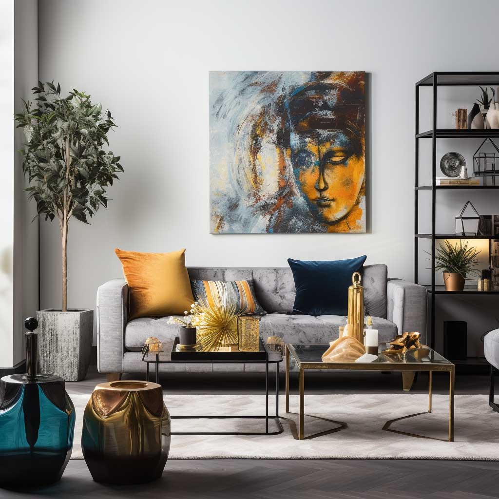

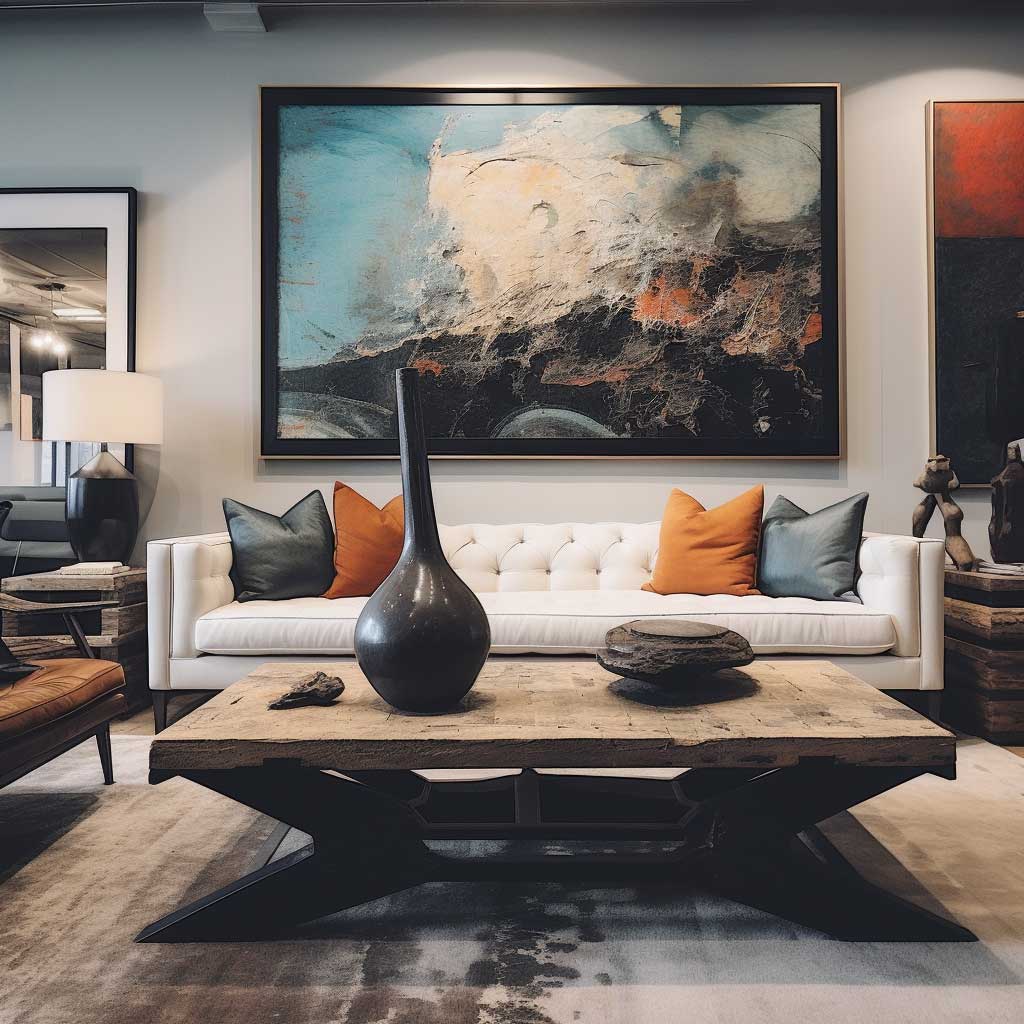
Hang art at 57 inches from the floor to the center of the piece. Every major museum uses this measurement. It aligns with average eye level and makes the art feel integrated into the room instead of floating near the ceiling. You’ll notice most DIY living room setups hang art too high — the sofa sits at 30 inches and the painting center lands at 72 inches, creating a visual disconnect that no amount of throw pillows can fix.
For modern living room decor ideas, consider DIY art-making sets like a paint-by-number kit as a legitimate source for wall pieces. The result reads as original art because it is — your color choices, your finish, your framing. Paintvibe’s larger format kits (24×32 inches) produce work that holds its own next to purchased gallery pieces. I own two of these and neither guest has ever asked if they came from a kit.
Size matters more than subject matter. A small print above a large sofa looks timid. The art should span at least two-thirds the width of the furniture it hangs above — a 90-inch sofa wants a piece at minimum 60 inches wide, or a gallery arrangement that reads as a single unit at that width. Undersized art is the most common mistake in modern living room decorating, and it’s completely fixable without buying new furniture.
Sculptures and ceramics on shelves or coffee tables function as three-dimensional art. Hay and Menu both produce sculptural objects in the $40–$180 range that read as considered rather than decorative. The difference between a decorative object and an art object is specificity — a ceramic form that references nothing looks like a knick-knack; a ceramic form with a clear silhouette and quality glaze reads as intentional. Buy fewer objects, but buy the right ones.
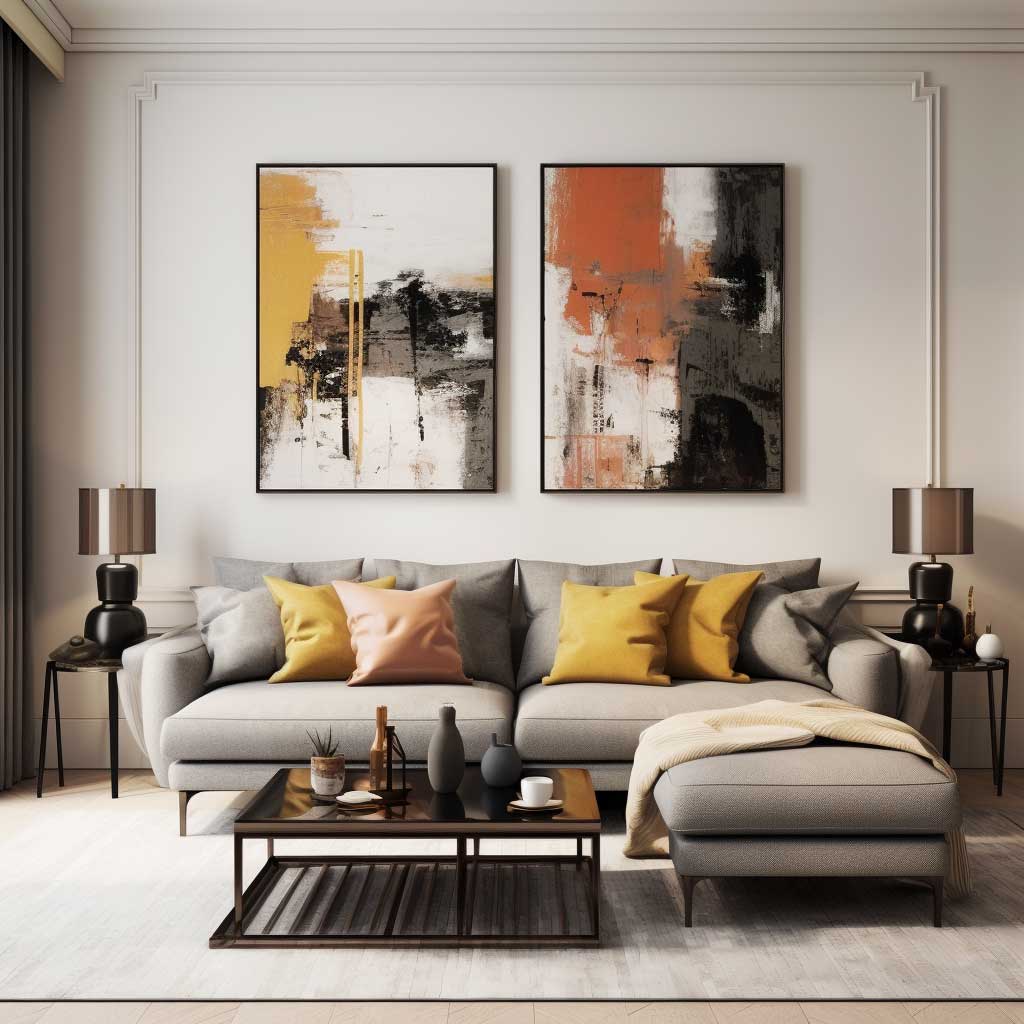
Four Surface Types in One Room — the Texture Formula That Holds


The texture formula I use: one soft (fabric or rug), one hard (stone, glass, or lacquer), one natural (wood, rattan, or terracotta), one metallic (brass, chrome, or blackened steel). Hit all four and the room reads as complete. Miss one and something feels off — you just can’t usually identify which one. Rooms that feel “cold” are almost always missing natural texture. Rooms that feel “cheap” are usually missing metallic.
Rugs deserve a separate mention because they’re both texture and scale anchor. An 8×10 rug under a standard sofa-plus-coffee-table setup costs $200–$600 at Rugs USA or Wayfair. Going smaller to save money is the wrong trade — a rug that doesn’t extend under the front legs of the sofa makes the whole seating area float. The furniture looks unrelated to the room. Buy the bigger rug. Skip the accent pillows if you have to choose.
Natural textures — wood grain, woven fiber, raw clay — bring warmth that painted surfaces and upholstered pieces can’t replicate. A rattan side table from World Market ($89) reads as a living material in a way that a lacquered wood table doesn’t. Mixing a smooth marble coffee table with a rough jute rug and a linen sofa is exactly the kind of opposition that makes modern living room decor feel layered rather than showroom-flat.
Pattern counts as visual texture. Geometric patterns on cushions or rugs add a modern edge; organic patterns like watercolor or botanical prints soften a room that’s gone too clinical. Don’t mix more than two patterns in one room — one geometric, one organic works. Two geometrics compete. Two organics disappear into each other. Pick the pairing carefully and stick with it.
For wall-level texture ideas that complement living room layering, the wall decor ideas section on Artfasad covers textured wall panels, limewash paint, and plaster finishes — all of which bring the fifth texture layer that most rooms forget entirely.
Final Word
Modern Living Room Decor Isn’t About Buying More — It’s About Stopping at the Right Moment
The rooms that look finished share one trait: someone made a decision to stop adding. Not because they ran out of budget, but because they recognized the room was complete.
Commit to one premium material, layer in four surface textures, hang art at 57 inches, and edit every surface down to seven objects. That’s the whole formula.
Save this post before you buy anything else for your living room — use it as a checklist first.
Related Topics