Most people won’t touch purple paint for an exterior. Fair enough. Pick the wrong shade and your house looks like a day care or a haunted attraction. No middle ground.
But the right purple — muted lavender, smoky plum, dusty lilac — reads completely different on a facade than it does on a swatch. I’ve seen a $240,000 Victorian go from forgettable beige to the most photographed house on the block after a lavender repaint. The Sherwin-Williams swatch was called “Potentially Purple” or something equally vague. Didn’t matter. The result looked like old money.
Below: real houses in three distinct purple families — lavender for period homes, plum for modern builds, and lilac for country cottages. Each section covers what trim to pair, which landscaping colors clash, and the one shade mistake that turns regal into garish.
Quick Summary
Three purple shade families for house exteriors: lavender (Victorian), plum (modern), lilac (cottage)
Best lavender picks: Sherwin-Williams Potentially Purple, Benjamin Moore Lavender Mist
Best plum pick: Benjamin Moore Black Raspberry (2072-20) — dark, no pink creep
Best lilac pick: Farrow & Ball Calluna (No. 270) — fades gracefully
Trim pairing rule: white or soft gray for lavender/lilac, black or charcoal for plum
Repainting cycle: every 4–6 years — purple fades faster than most exterior colors
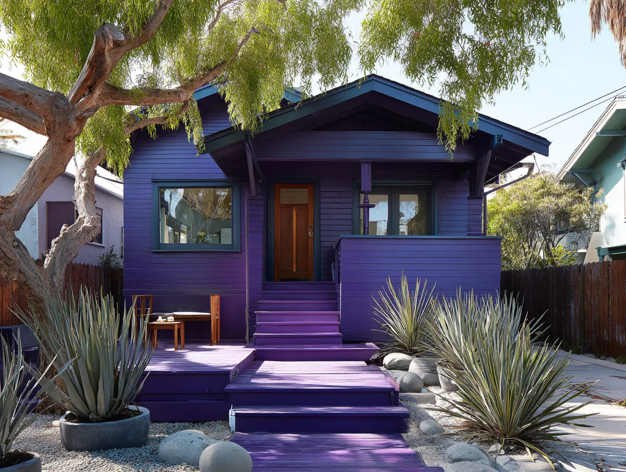
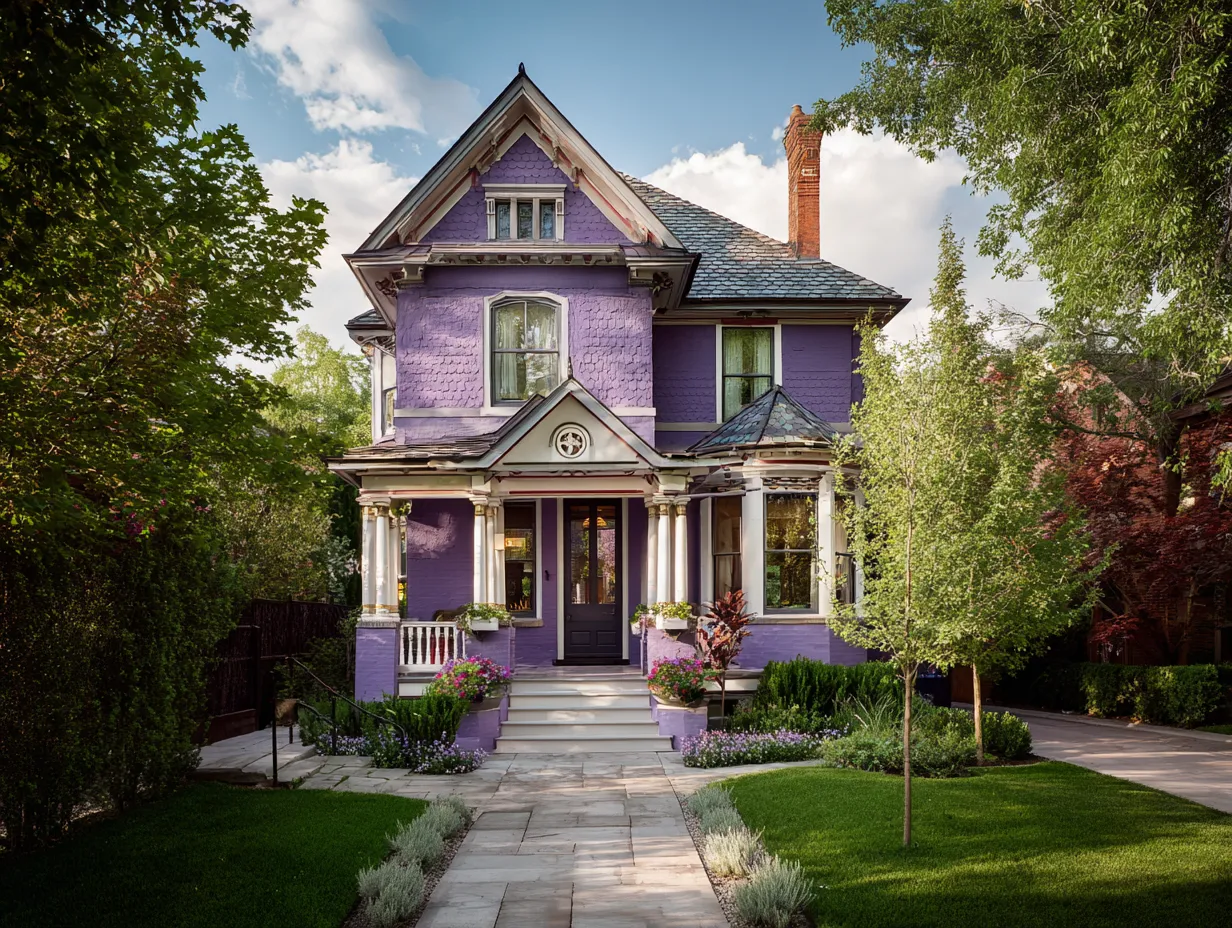
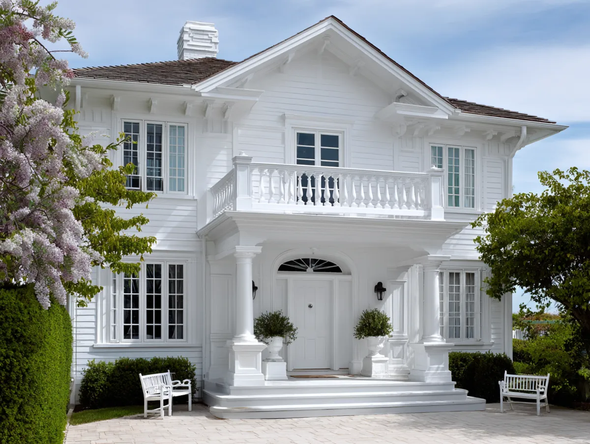
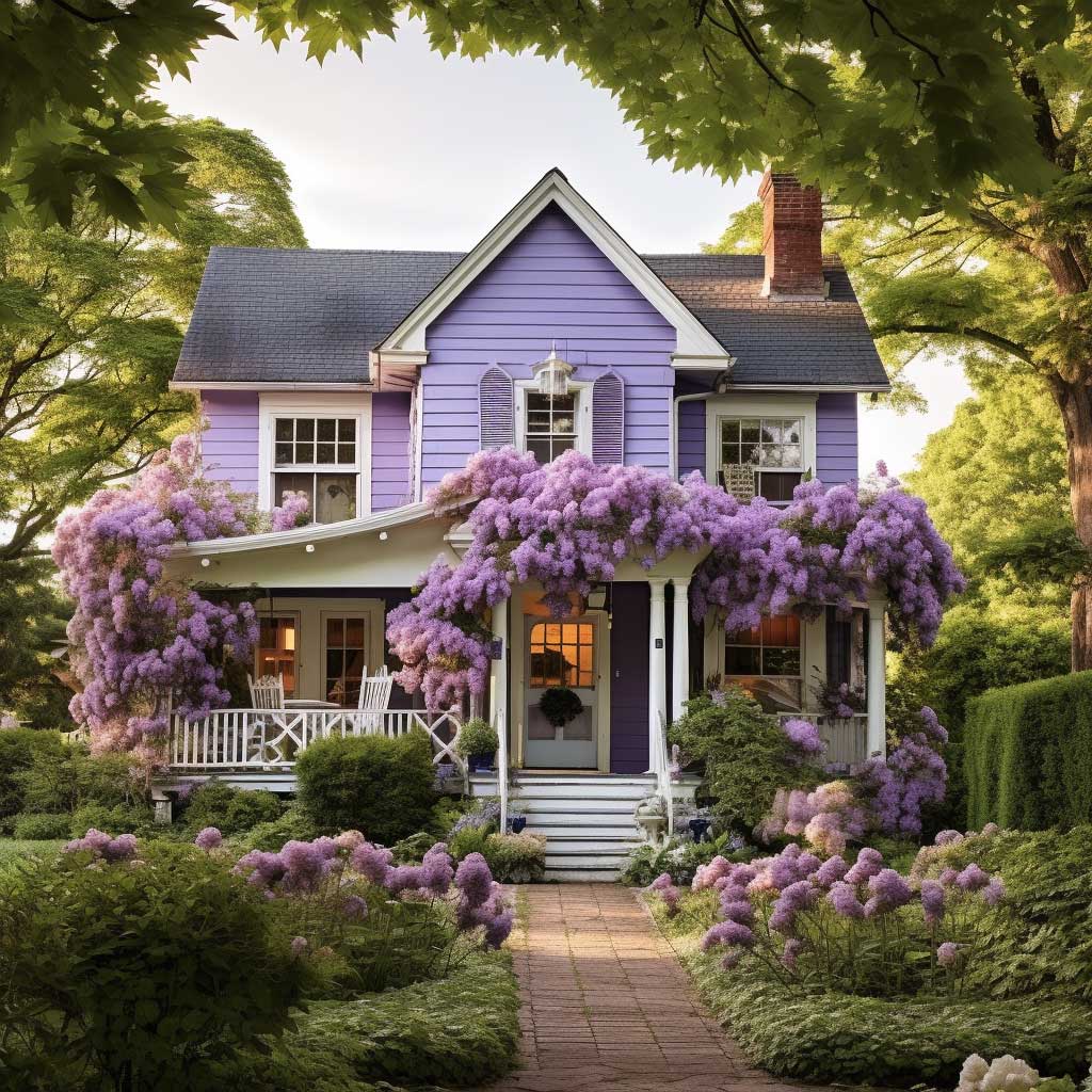
Lavender Purple on a Victorian Home: Trim, Details, and What to Avoid
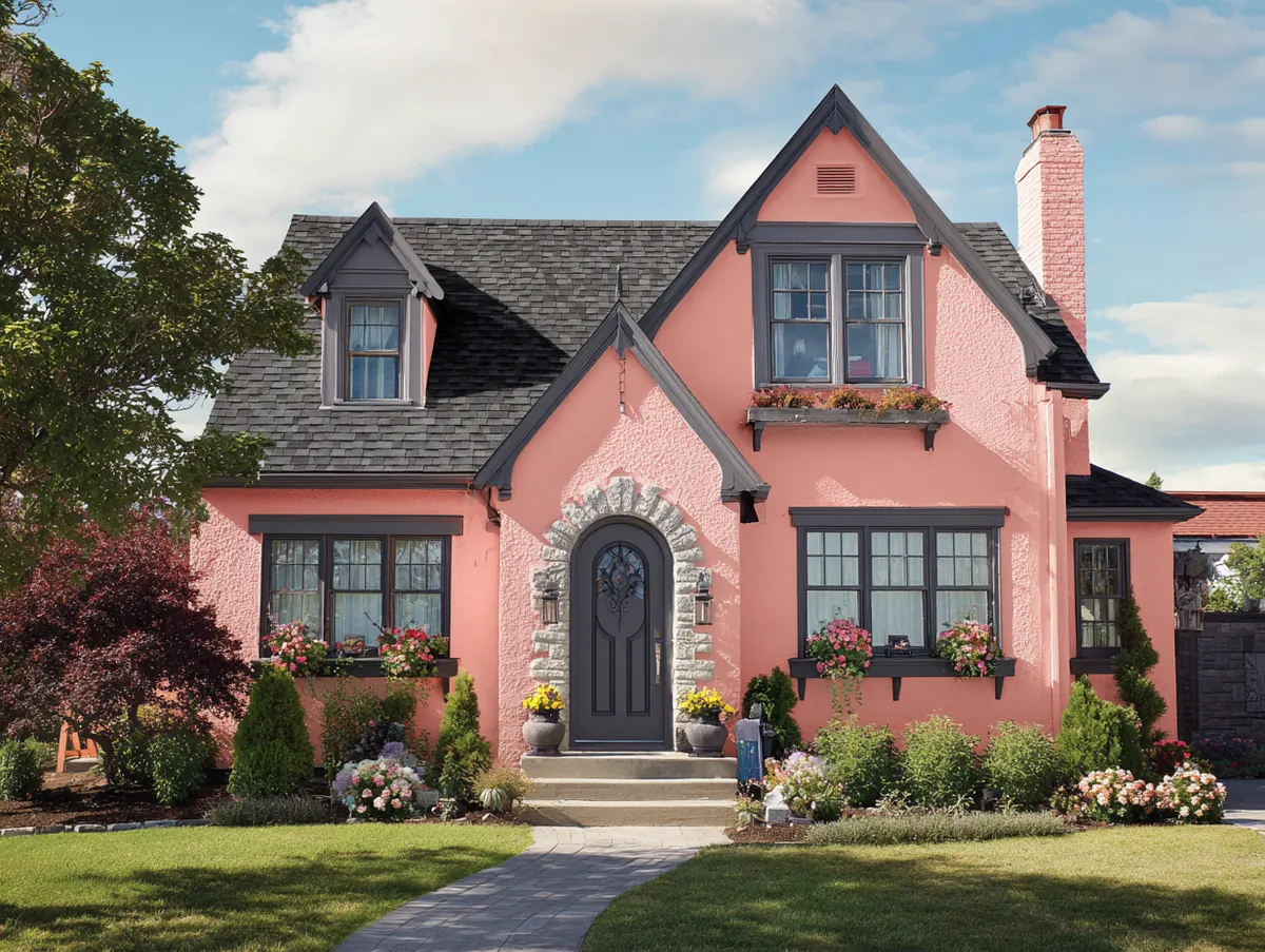
This image showcases a Victorian-era house painted in a delicate lavender purple color. This particular shade exudes an elegance and charm that is both welcoming and mesmerizing, providing an aesthetically pleasing visual display for passersby. The choice of lavender adds a unique touch to the property, enhancing its Victorian architecture and character while paying homage to the period’s love for rich, ornate hues. If you’re considering other bold exterior house color combinations, purple sits comfortably alongside greens, navies, and deep reds as a historically informed choice. This soft purple color not only serves as a captivating visual element but also beautifully complements the detailed ornamentation characteristic of Victorian style houses.
The enchanting lavender color serves to highlight and accentuate the intricate architectural details of the Victorian design. From the elaborate trims to the decorated eaves and corbels, each element is brought to the fore, given more prominence and visibility due to the captivating backdrop. The purple color also works harmoniously with the dark, ornate detailing around the windows and doorways, offering a stunning contrast that emphasizes these features even more.
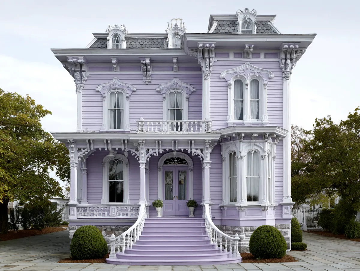

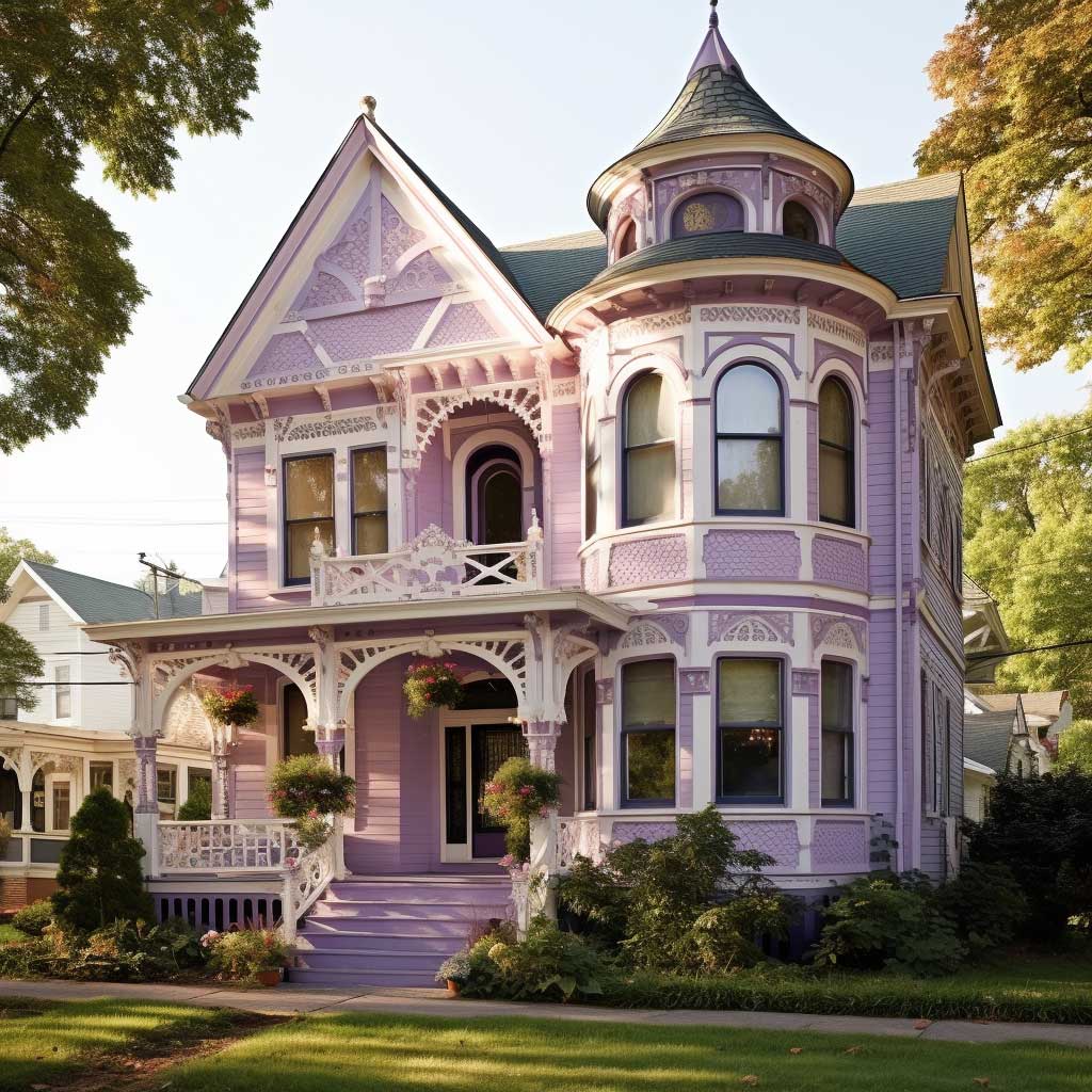

In this photograph, the house stands majestically against a backdrop of lush greenery and a clear, blue sky. The lavender color works in harmony with this natural backdrop, creating a visually pleasing palette that blends man-made structures and nature seamlessly. The bright daylight enhances the lavender, making it pop against the greens and blues, further accentuating the house’s unique charm and appeal.
Moreover, the lavender color is not just a beautiful choice; it’s also a practical one. Light shades of purple like lavender can help to reflect sunlight rather than absorb it, which can help to keep the house cooler during the summer months. This is especially advantageous in areas with warmer climates, offering a functional benefit to go alongside its aesthetic appeal. According to Bob Vila’s exterior paint guide, purple works particularly well on historical homes when you choose a shade with gray undertones.
The image also demonstrates how well the lavender exterior pairs with the home’s white trim. The crisp white windows, doors, and railings stand out against the soft purple backdrop, creating a delightful contrast that further accentuates the home’s architectural design and adds an additional layer of visual interest. The white trim gives the home a fresh, clean look that balances out the rich lavender exterior.
Sherwin-Williams Potentially Purple (SW 6821) and Benjamin Moore Lavender Mist (2070-60) are the two I keep seeing on restored Victorians. Both run about $55 to $70 per gallon for exterior-grade. Don’t grab the interior version by accident — I watched a neighbor do exactly that and repaint six months later.
The trim color matters more than the wall. Crisp white works, but cream-white is safer if your lavender leans warm. I’d skip bright white like SW Extra White on a warm lavender — it creates a clinical contrast that makes the purple look cheaper. Benjamin Moore Simply White (OC-117) sits in a better spot. Soft. Not glaring.
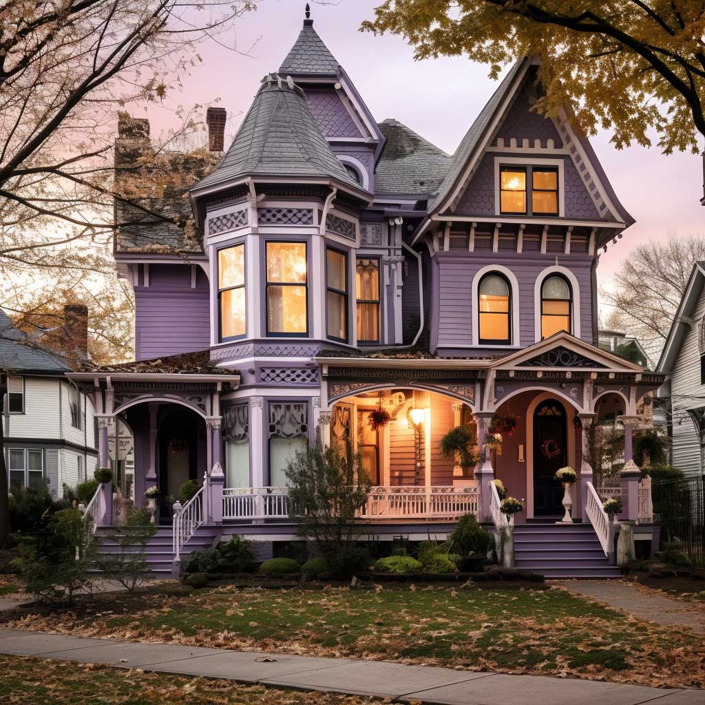
One thing nobody tells you: lavender fades faster than darker purples. South-facing walls will look washed out within three years unless you use a fade-resistant formula. Sherwin-Williams Duration or Benjamin Moore Aura Exterior are built for this. Regular SuperPaint won’t cut it on a color this light.
In conclusion, this lavender Victorian house is a splendid example of how a bold and unconventional color choice can breathe life into a home’s exterior, creating a stunning visual spectacle that enhances the property’s original features. This particular shade of purple is not just visually pleasing; it adds depth, showcases the home’s Victorian design, and seamlessly integrates with the surrounding landscape, resulting in a home exterior that is both beautiful and unique.
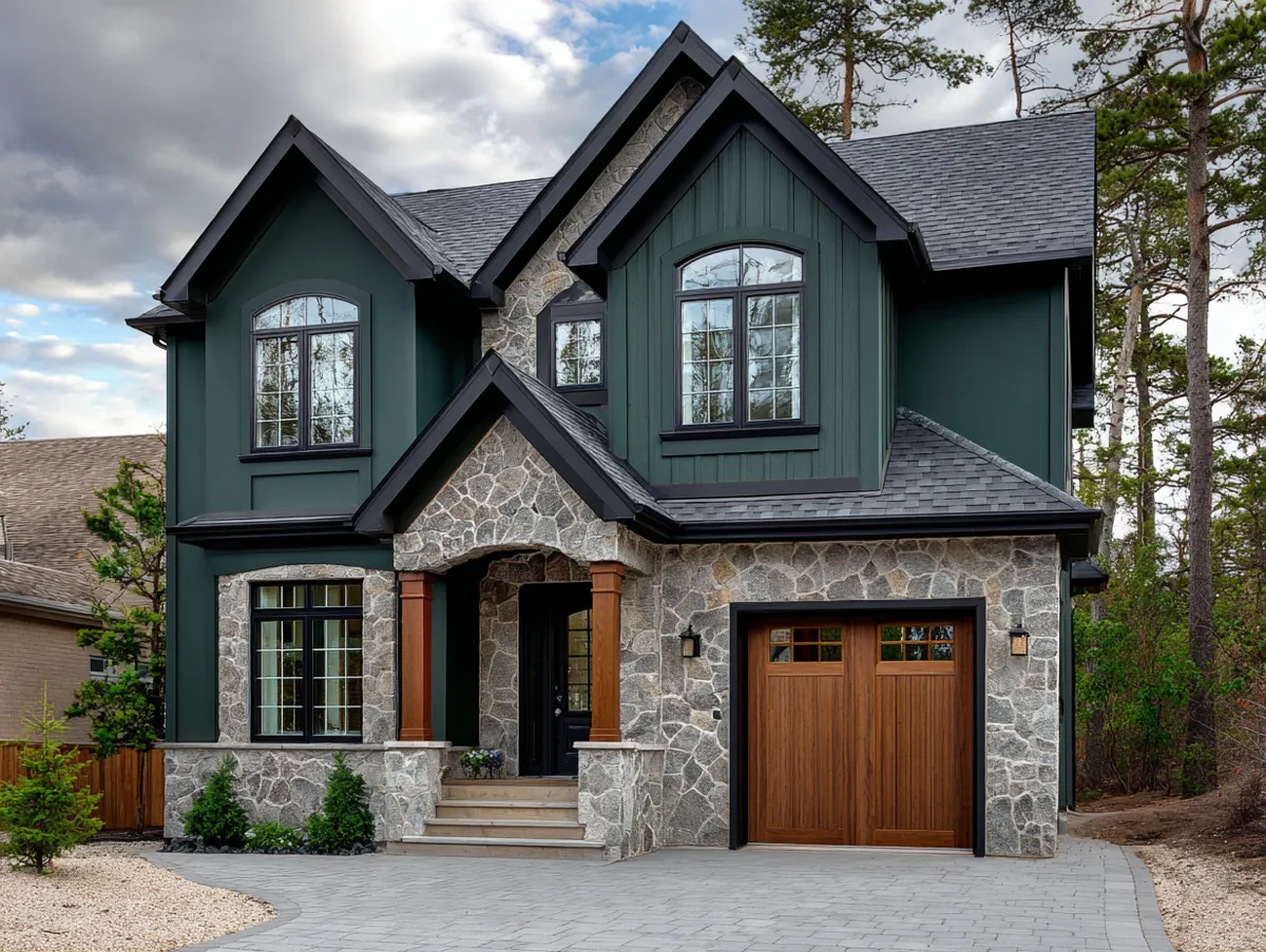
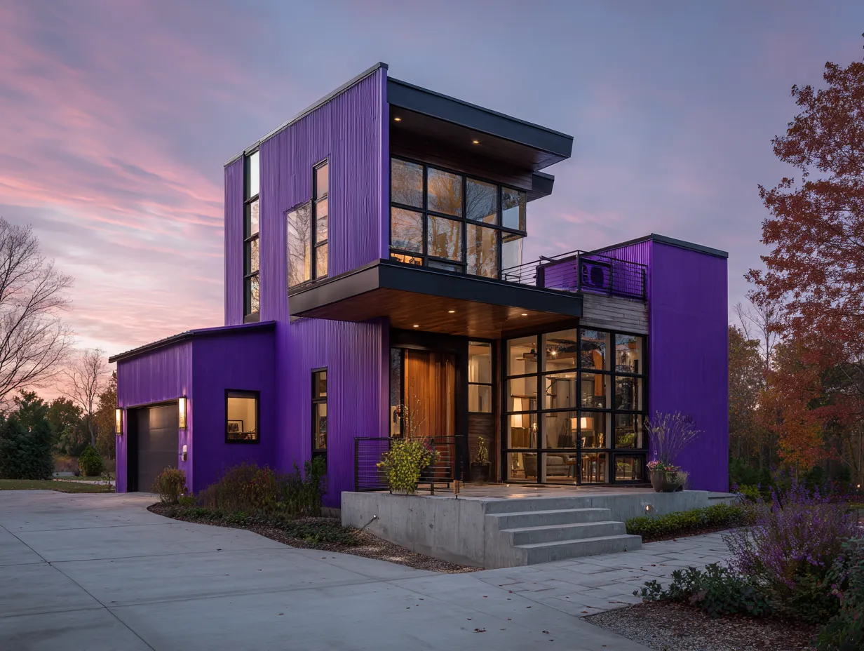
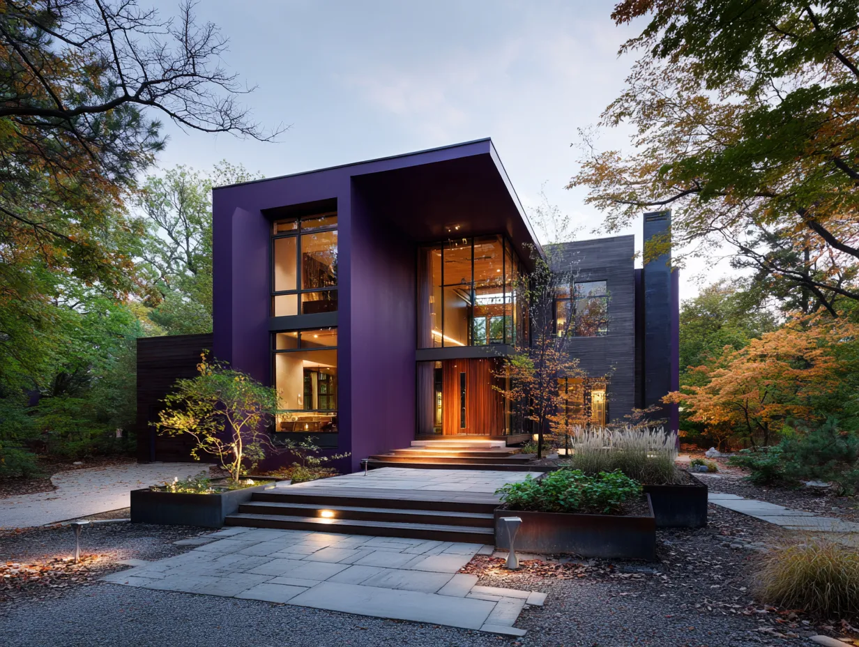
Plum Purple Exterior for Modern Homes: Bold, Dark, and Worth the Risk
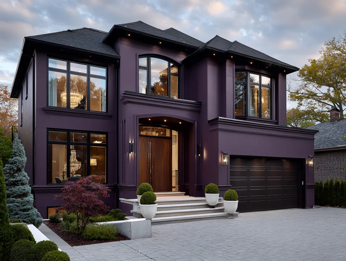
This image features a modern house that makes a bold statement with its rich plum purple exterior. The deep purple color, unusual for house exteriors, gives the property a distinct and luxurious look that sets it apart from traditional home designs. The plum shade perfectly embodies the idea of modern luxury, offering a mix of sophistication and uniqueness that is truly mesmerizing. As This Old House recommends, establishing a clear color hierarchy on your facade — body, trim, and accent — is what makes bold choices like plum look intentional rather than random.
The plum purple color works wonderfully with the clean lines and geometric shapes characteristic of modern architecture. The deep, rich hue serves as a dramatic backdrop that highlights these features, making them even more striking. Furthermore, the purple color gives depth to the building’s exterior, emphasizing the different planes and angles of the modern design and adding a sense of three-dimensionality. The same principle applies to other exterior wall color combinations — a single bold shade can define an entire facade when paired with clean architectural lines.
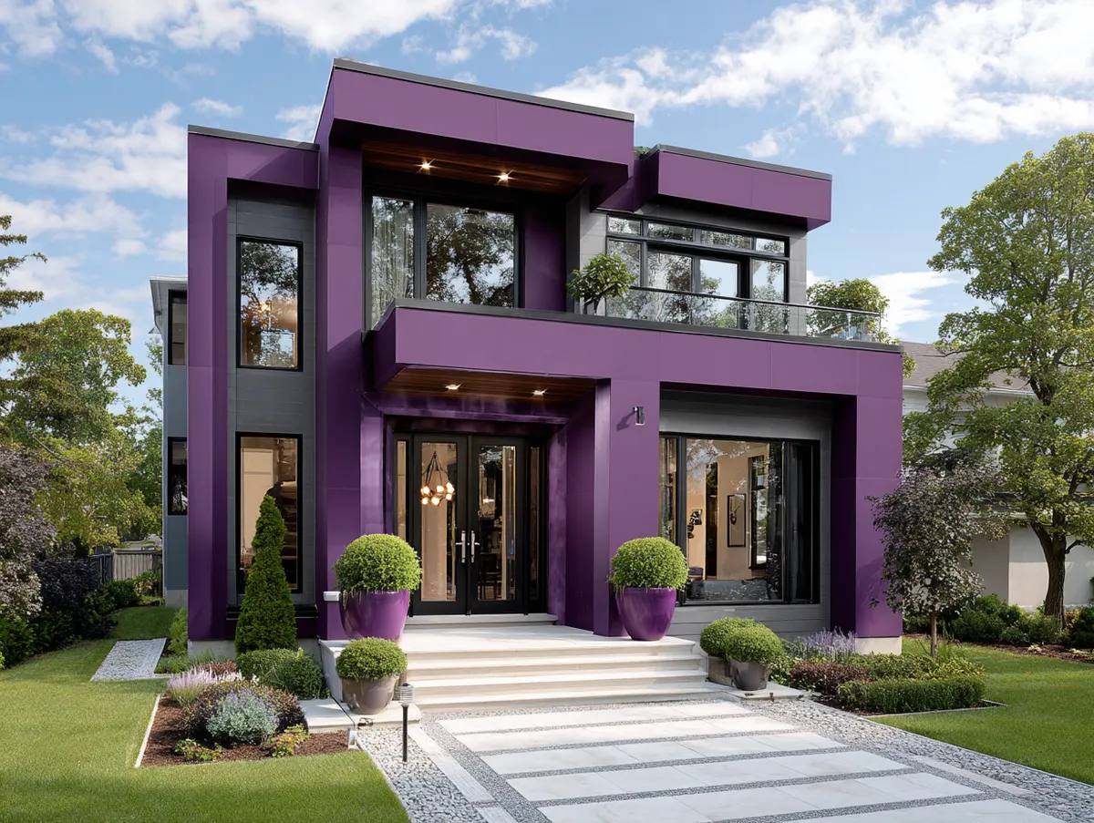
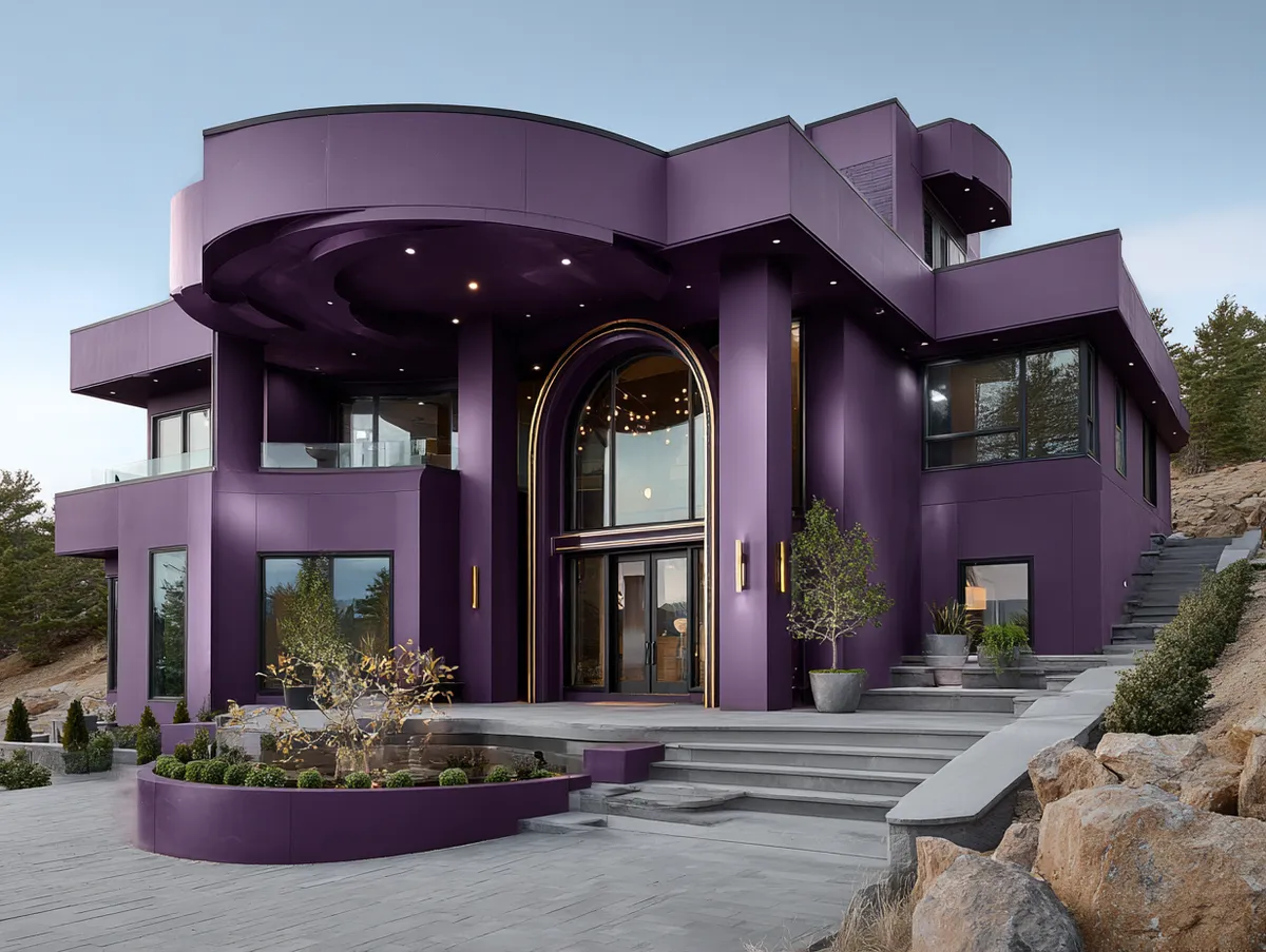


The property is surrounded by a landscape of varying green shades, from the lush lawn to the dense trees. The plum purple exterior contrasts brilliantly with these natural elements, creating a beautiful juxtaposition between the organic greens and the rich, man-made purple. This striking contrast not only enhances the home’s visual appeal but also creates a stunning, vibrant color palette that is sure to catch the eye of any passerby.
The house also features large, floor-to-ceiling windows that break up the expanses of the plum purple exterior. These windows reflect the surrounding environment, further adding to the dynamic interplay between the building and the landscape. Additionally, they allow natural light to flood the interior, providing a pleasing contrast to the darker exterior.
At night, the plum purple exterior takes on a new level of elegance. The house’s exterior and landscape lighting cast a warm glow on the deep purple facade, adding another dimension of richness and depth to the color. This transformation from day to night shows the versatility of the plum purple color and how it can bring a unique and dramatic aesthetic to a home’s exterior, regardless of the time of day.
Here’s the trade-off nobody mentions. Plum absorbs heat. A dark purple wall on the west side of your house in Phoenix or Dallas will be noticeably hotter to the touch by 3 PM. Not a disaster — just plan for it. Use light-reflective roofing and keep the interior insulation solid.
Benjamin Moore Black Raspberry (2072-20) is the shade I’d start with for a modern plum exterior. It’s dark enough to read as serious, purple enough to not look black at dusk. Sherwin-Williams Plum Brown (SW 6272) leans more brown and works better if you’re nervous about going too loud. Both cost around $65 to $80 a gallon for exterior.
Skip any plum shade with visible pink undertones. On a small swatch it looks fine. On a 2,000-square-foot facade it reads as berry, not plum. I’ve seen two houses in my area go with Behr Vintage Merlot and both owners repainted within a year. That pink creep in direct sunlight was the problem.
In conclusion, the plum purple modern house in this image is a perfect example of how daring and unconventional exterior color choices can transform a home into a stunning architectural piece. This rich, bold color, combined with the modern design of the house, creates an aesthetic that exudes luxury and sophistication. It is a testament to the power of color in enhancing architectural design, creating visual interest, and establishing a distinct identity.
Lilac Purple on a Country Cottage: Soft Color, Strong Curb Appeal
This image features a quaint country house painted in a charming shade of lilac purple. This color, with its soft and soothing qualities, brings a whimsical, fairy-tale-like charm to the house that is hard to overlook. The lilac exterior, paired with the home’s country-style architecture, creates a homey, welcoming aesthetic that is truly enchanting.
The lilac purple paint beautifully complements the rustic design elements of the country-style house. The color adds a touch of whimsy to the traditional design, giving it a fresh, modern twist while still maintaining its classic charm. The lilac hue also works wonderfully with the wooden features of the house, such as the doors and window frames, creating a harmonious and pleasing color palette.
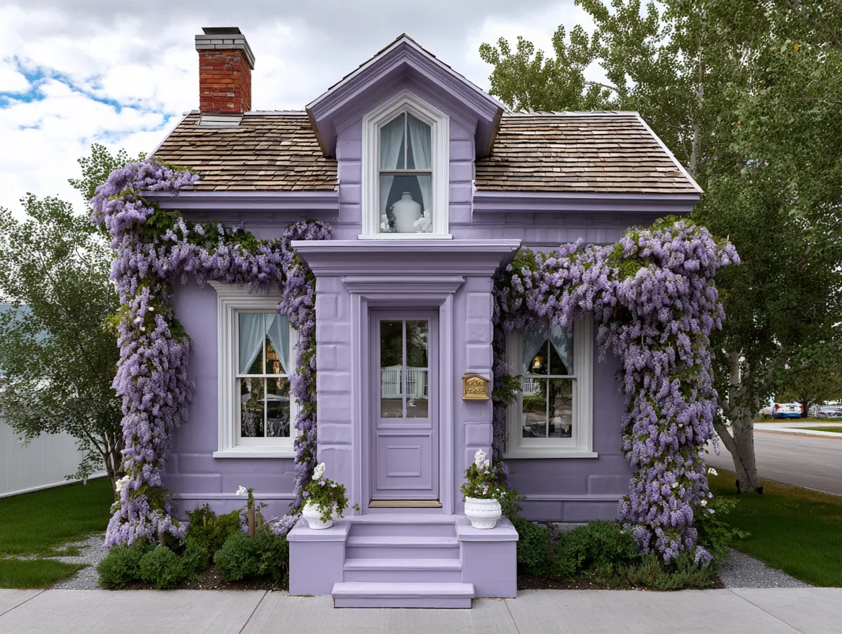
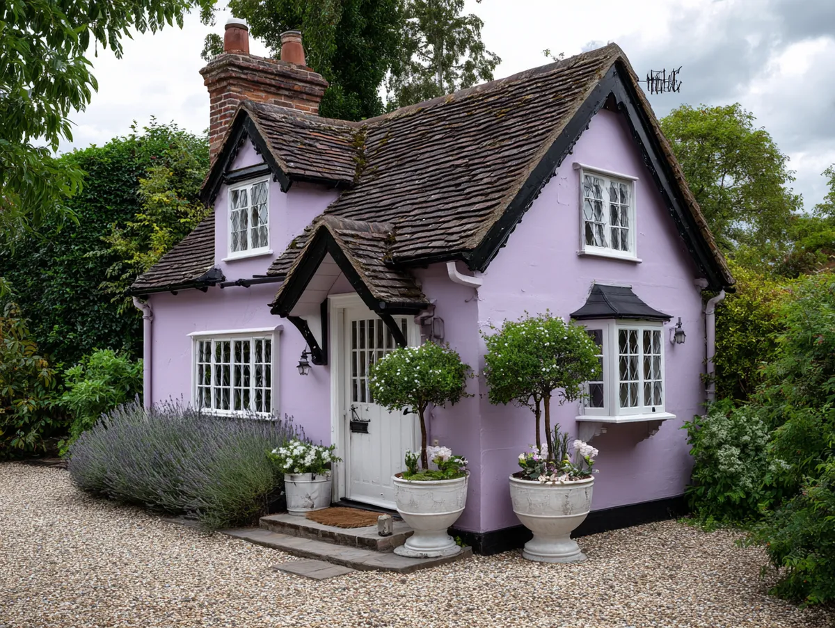


Nestled amidst a verdant landscape, the lilac house stands out as a charming feature in the countryside setting. The soft purple shade contrasts beautifully with the surrounding greenery, creating a picturesque scene that is soothing to the eyes. The lilac color seems to change subtly with the varying light conditions throughout the day, at times appearing more vibrant under bright sunlight and taking on a softer hue during the dusk, adding an element of dynamism to the house’s exterior.
The house also features white trim along the windows, doors, and roof, which provide a crisp contrast to the lilac exterior. This combination of lilac and white gives the house a clean, fresh look that enhances its charm and appeal. The white trim also helps to define the architectural details of the house, making them stand out against the purple backdrop. For more ideas on how different color combinations work on house exteriors, matching the trim intensity to the wall shade is the single most important decision.
In this image, we can also see how the house’s lilac color is mirrored in the flowering plants surrounding the property. This repetition of color helps to further integrate the house into its environment and creates a harmonious visual experience.
Lilac has a shelf life on exterior walls. Roughly four to five years before it fades to a grayish nothing. You’ll need to commit to repainting on a cycle or choose a shade with enough gray already baked in that fading isn’t dramatic. Farrow & Ball’s Calluna (No. 270) does this well — it’s lilac with a gray backbone, so even when it fades it just looks more muted, not dead.
The landscaping trick that sells lilac: plant lavender bushes, Russian sage, or catmint along the front. The purple from the plants echoes the wall color without matching it exactly. Dead-on matching looks staged. A slight mismatch — warm-toned flowers against a cool-toned wall — looks like someone who knows what they’re doing.
Don’t pair lilac with bright yellow trim. I see this on Pinterest constantly. In photos with golden-hour lighting and heavy filters, it looks whimsical. In real life at noon it looks like an Easter egg. Stick with white, soft gray, or natural wood tones.
Lavender vs Plum vs Lilac: Which Purple Shade Fits Your Home?
| Feature | Lavender | Plum | Lilac |
|---|---|---|---|
| Best for | Victorian, Colonial, Queen Anne | Modern, minimalist, flat-roof | Cottage, farmhouse, country |
| Trim pairing | Crisp white or cream-white | Black, charcoal, dark gray | Soft white, natural wood |
| Heat absorption | Low — reflects sunlight | High — absorbs heat | Low to medium |
| Fade rate | Fast — 3 to 4 years on south walls | Moderate — 5 to 6 years | Fast — 4 to 5 years |
| Recommended paint | SW Potentially Purple (6821) | BM Black Raspberry (2072-20) | F&B Calluna (No. 270) |
| Price per gallon | $55 – $70 | $65 – $80 | $95 – $110 (Farrow & Ball) |
| Biggest mistake | Using bright white trim on warm lavender | Choosing a shade with pink undertones | Pairing with bright yellow accents |
Which Purple Shade Should You Actually Use?
Lavender for anything built before 1940 — it reads as historically informed, not eccentric. Plum for flat-roofed, clean-lined modern builds where the dark color adds weight and drama. Lilac for small cottages surrounded by greenery, where the softness of the shade does the heavy lifting.
Every purple fades faster than grays, blues, or greens. Budget for repainting every four to six years or invest in fade-resistant paint from the start. South- and west-facing walls take the worst hit.
Test your shade on a 2-by-3-foot board, not a 2-inch swatch. Tape it to the wall. Look at it at 7 AM, noon, and dusk. Purple shifts more than any other color family under changing light — and the shift isn’t subtle.
How to Choose the Right Purple Paint for Your Home Exterior
A step-by-step process for picking, testing, and applying purple exterior paint that actually looks good on your house — not just on the swatch.
Tools & materials:
- Paint sample boards (2×3 ft plywood or foam board)
- Painter’s tape
- Fade-resistant exterior paint (Duration, Aura, or equivalent)
- Exterior primer (tinted to match)
- Trim paint (white, cream, or charcoal depending on shade)
Match the shade family to your architectural style
Lavender for Victorian or Colonial homes. Plum for modern, flat-roof, or minimalist builds. Lilac for cottages and country-style houses. Wrong match kills the whole look — a plum Victorian reads goth, not regal.
Buy sample pints and paint 2×3 ft boards
Never trust a 2-inch swatch. Paint large boards with two coats. Tape them to different walls of your house — north, south, east, west. Purple shifts more under changing light than any neutral.
Check the sample at three different times of day
Morning, noon, dusk. Lavender can look pink at sunset. Plum can look black in shade. If you don’t like what you see at any point, pick another shade — you’ll see it every day.
Choose trim color and test it against the purple
Paint a trim swatch next to the wall swatch. White trim on lavender, charcoal on plum, soft gray or wood on lilac. The trim makes or breaks the facade — a bad pairing makes even good purple look cheap.
Prime with tinted primer and apply two coats of fade-resistant paint
Tinted primer saves you a coat and prevents bleed-through from the old color. Use Sherwin-Williams Duration or Benjamin Moore Aura Exterior for maximum UV resistance. Two full coats minimum — purple coverage is notoriously uneven with just one.
Related Topics