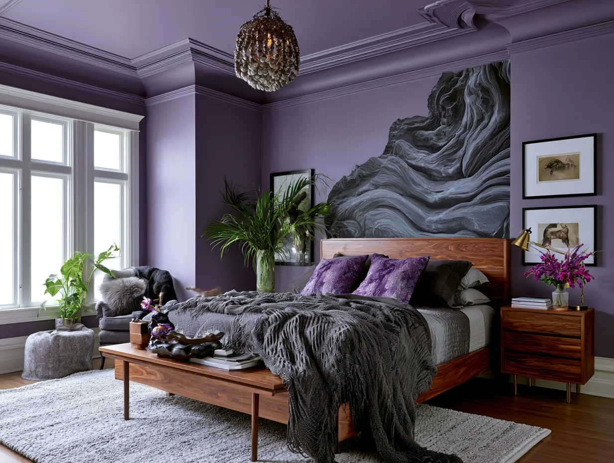
Wall painting design for bedroom spaces is one of the few decisions that rewires how a room feels before you move a single piece of furniture. I’ve repainted four bedrooms in seven years, and every time I skipped this step and went straight to new bedding or a rug, the room still felt flat. The walls are the bones. Get them wrong and nothing else lands. Get them right and even an Ikea bed frame reads expensive.
Most people pick a color from a tiny chip under fluorescent store lighting and wonder why it looks nothing like the photo on Pinterest. That’s the first mistake. The second is playing it too safe — a pale greige that disappears into itself instead of doing what a wall is actually capable of. This post covers three specific approaches — textured charcoal, geometric pattern work, and deep midnight blue — that consistently deliver results in real rooms, not just staged shoots.
Quick Scan
- Textured charcoal — depth and tactile dimension; works with industrial and minimalist styles
- Geometric patterns — the one wall treatment that makes a room look designed, not just decorated
- Midnight blue — richer than navy, calmer than black, pairs with gold and white equally well
- DIY-friendly options — sponge painting, rag rolling, and painter’s tape geometry all covered
- Lighting note — every dark wall in here changes character completely under warm vs. cool bulbs
- Price range — from $30 DIY sponge finish to $400+ Venetian plaster; all three approaches included
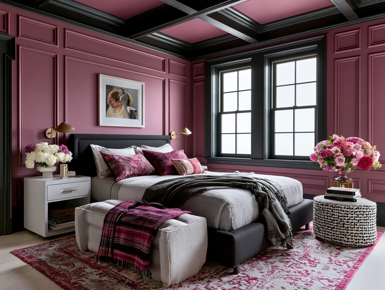
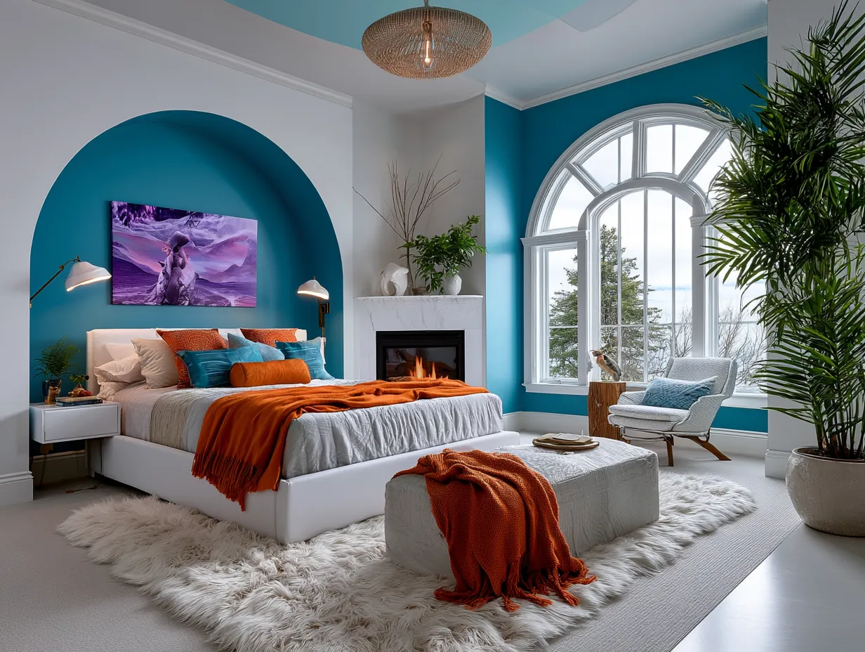
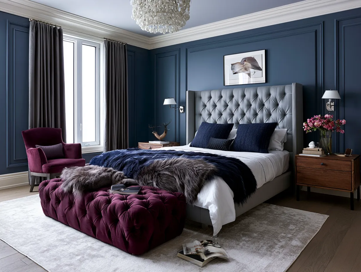
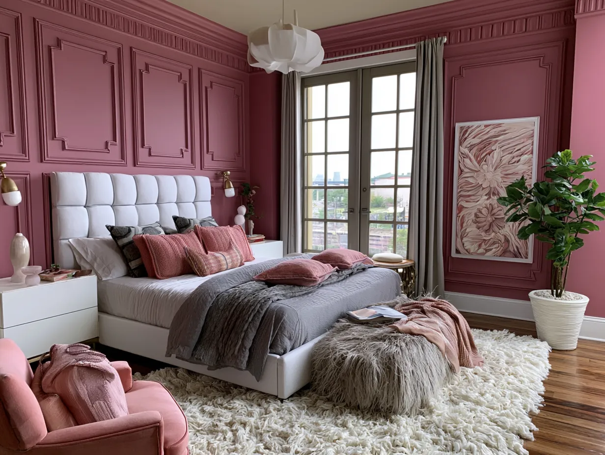
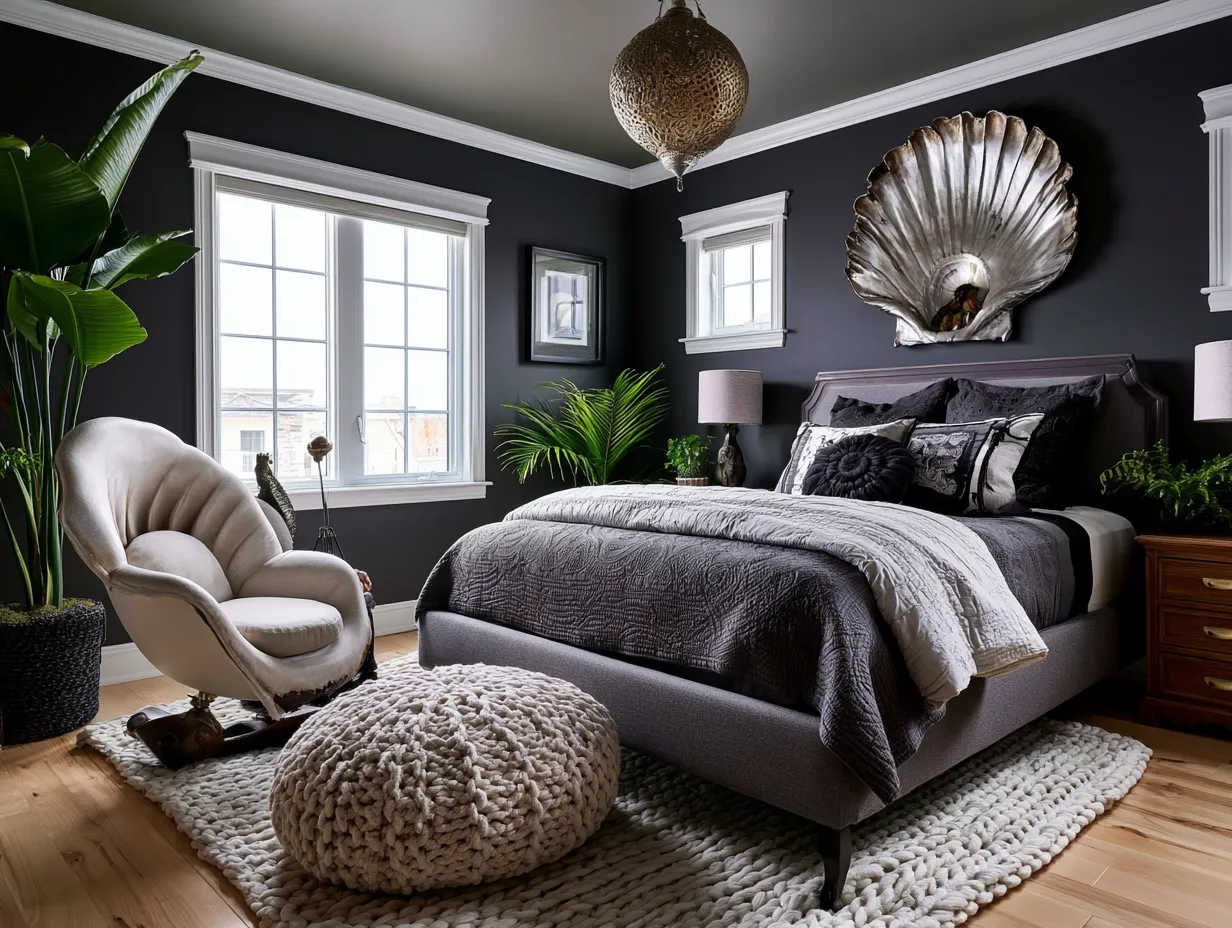
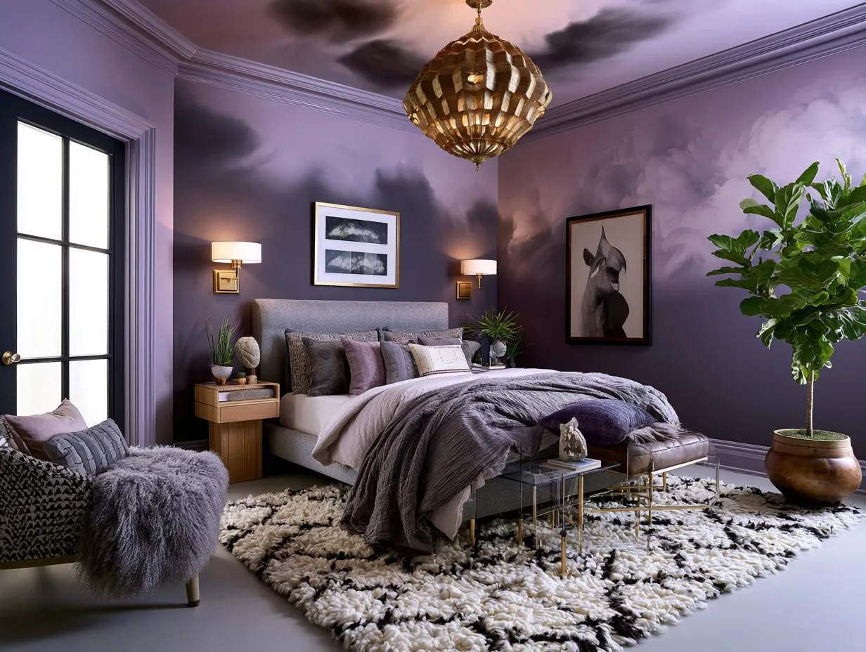
Textured Charcoal Delivers What Flat Paint Never Can
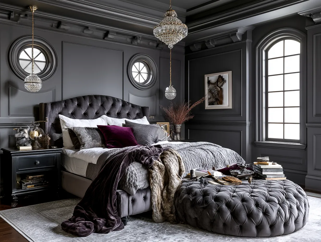
Charcoal is not gray. I made that mistake with my first attempt — grabbed a mid-tone gray, painted two coats, stepped back, and got a hospital corridor. True charcoal sits closer to off-black, rich enough to absorb light rather than reflect it, and that absorption is exactly what creates the moody depth everyone is chasing in bedroom wall painting design. Benjamin Moore’s Black Panther (2125-10) or Sherwin-Williams Caviar (SW 6990) are both solid starting points around $70–$80 per gallon. Don’t cheap out on the base coat here; this is not the moment for store-brand paint.
The texture layer is what separates a dramatic wall from a paint job. Rag rolling costs you $0 extra — you already own rags. Apply a slightly lighter charcoal glaze in sections and drag a crumpled cloth through it before it dries. The result looks like old leather or a cloudy sky depending on your pressure. Sponge painting runs about $15 for a natural sea sponge at any craft store. Both techniques add movement that flat paint physically cannot replicate, and they’re forgiving enough to touch up without visible seams.
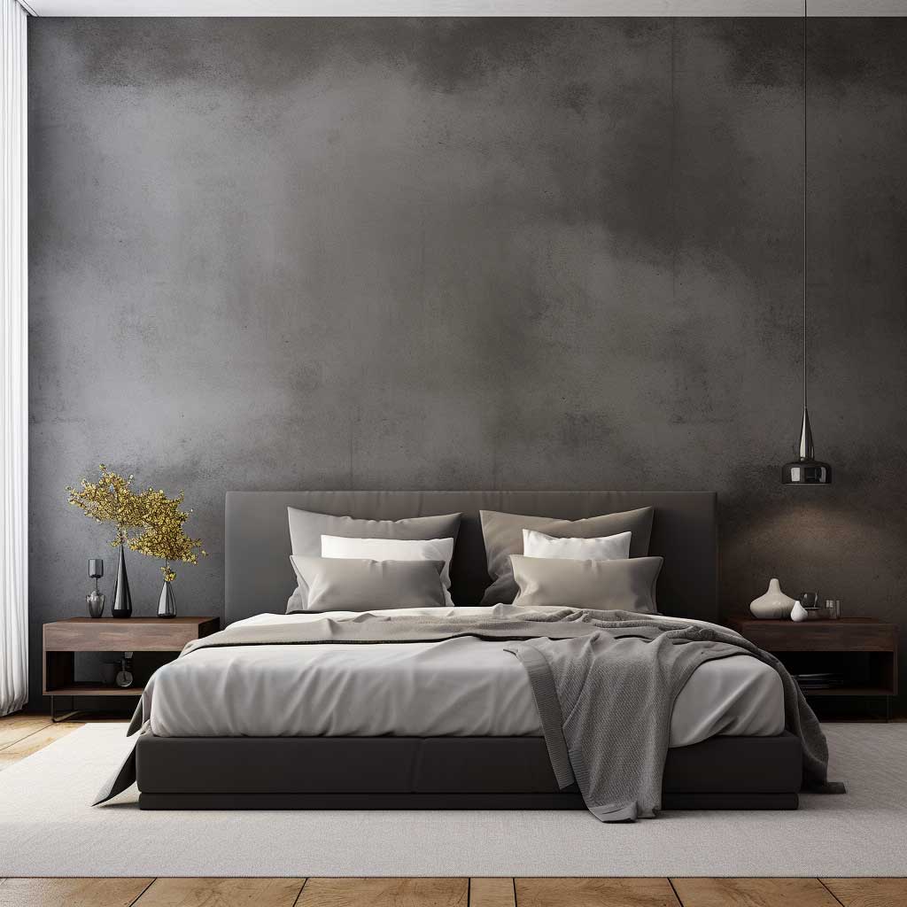
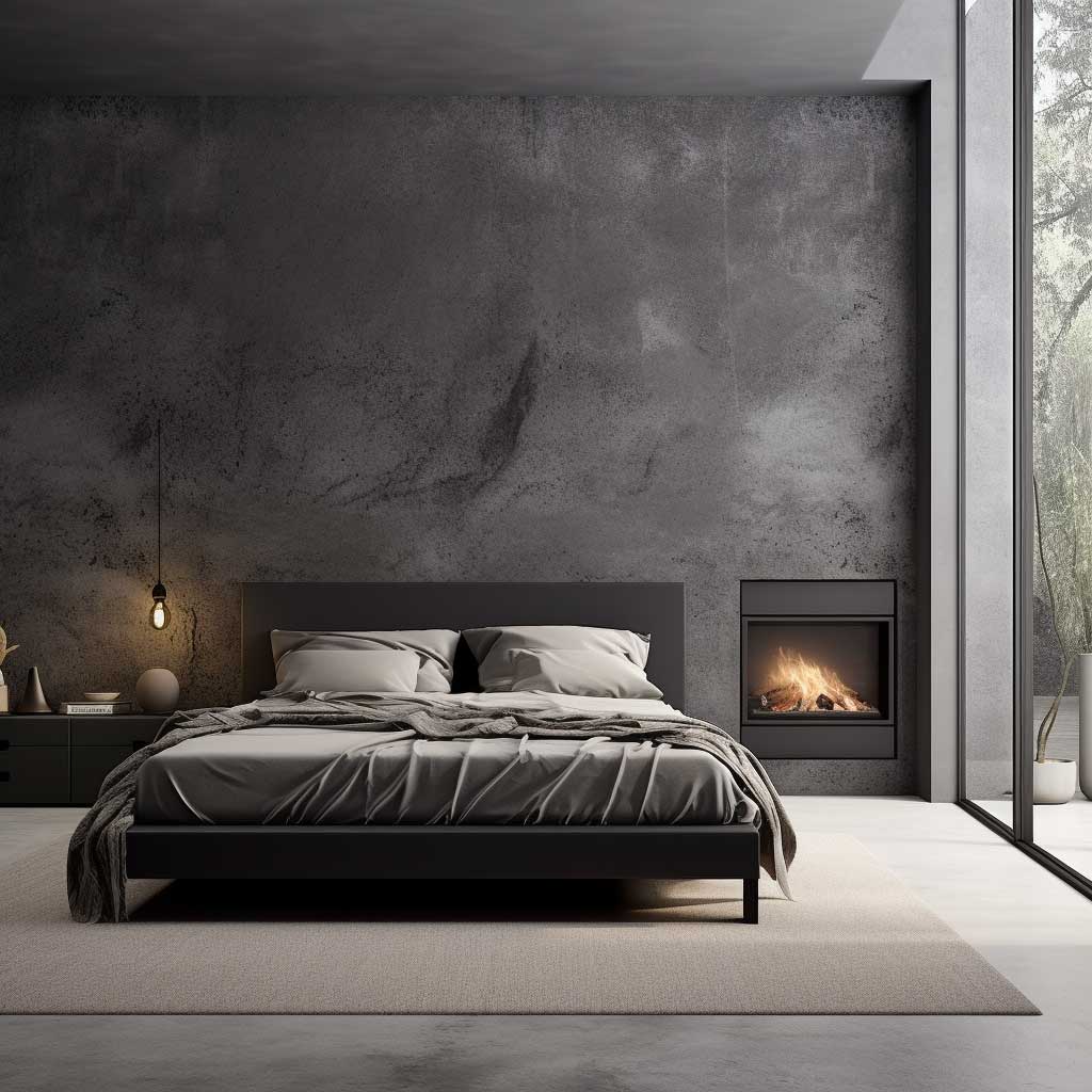
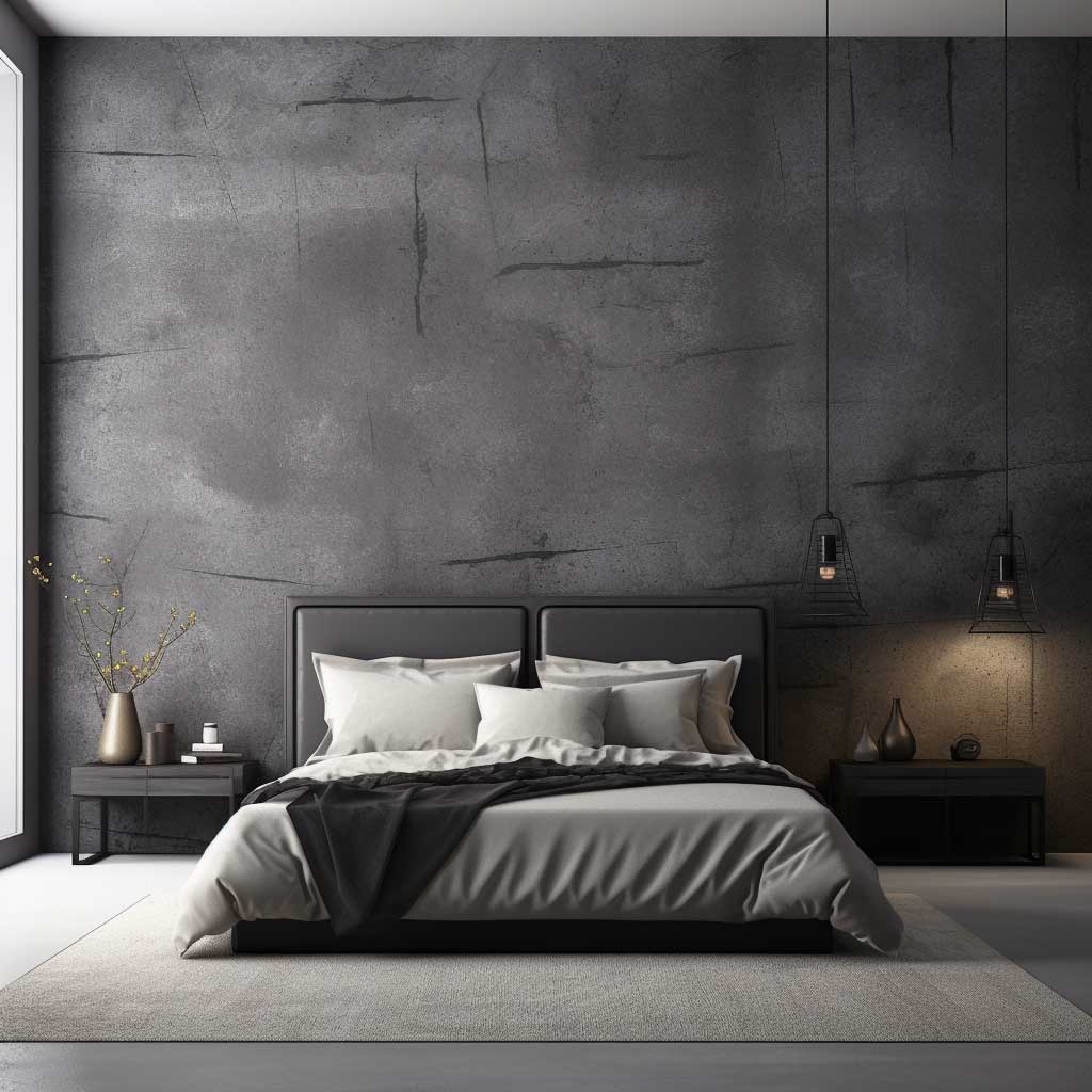

What doesn’t work: skip the textured layer and just paint charcoal flat, and you’ll have a wall that feels oppressive rather than dramatic. Flat charcoal with no texture variation reads like a cave, especially if the room has low ceilings. Matte finish helps, but it still needs something dimensional. I tried this once in a room under 9 feet and spent $200 on a rug I didn’t need because I thought the rug was the problem. The wall was the problem.
Lighting transforms this finish more than any other on this list. Point a warm-white LED (2700K, not 4000K — that’s important) downward at 45 degrees from a wall sconce and the texture suddenly casts micro-shadows that make the whole surface come alive. Cool-white light flattens it completely. My go-to is the Philips Hue White Ambiance wall light at around $60; you can dial the color temperature precisely and test both without committing to a fixture type.
Furniture pairing is simpler than it looks. Light-colored linen or oak against charcoal creates contrast that photographs extremely well. Avoid dark wood — walnut and charcoal together look like a log cabin in the worst possible way. Copper or brushed brass hardware on nightstands around $80–$120 adds warmth without competing. You need the contrast; a bedroom where everything is equally dark just feels heavy, not luxurious.
Geometric Patterns on Bedroom Walls Separate Intentional Design from Accident
Geometric wall painting is the most technique-dependent finish on this list — and the easiest to ruin with one impatient move. The pattern itself is less important than the tape edge. Pull painter’s tape at the wrong angle, or peel it before the second color dries, and you get bleeds that look like a craft project rather than an intentional design. I stole this trick from a painter on a renovation job: use Frog Tape Delicate Surface (around $12 a roll) over any existing paint, seal the edge with a thin layer of the base color first, then apply your accent color on top. No bleeds. Every time.
Scale matters more than pattern complexity. A room under 200 square feet reads best with geometric shapes at least 18–24 inches across — anything smaller turns into visual noise from the doorway. For larger master bedrooms, diamond grids or oversized triangles behind the headboard can go up to 36 inches without overwhelming. What angle should those shapes be? Forty-five degrees is the default because it photographs cleanly and reads as deliberate. Avoid highly acute angles — anything under 20 degrees looks like a mistake from three feet away.
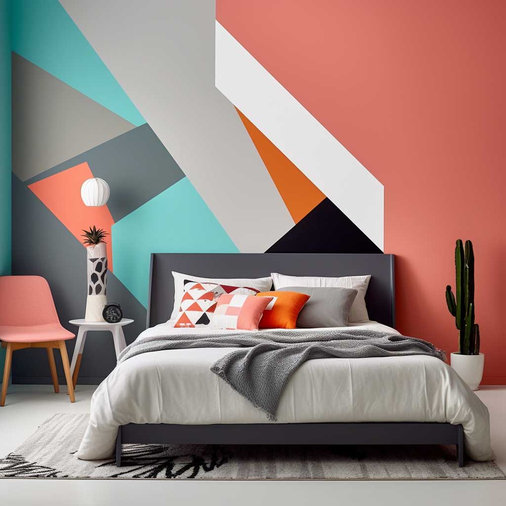
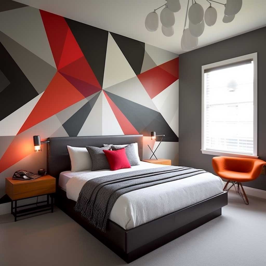
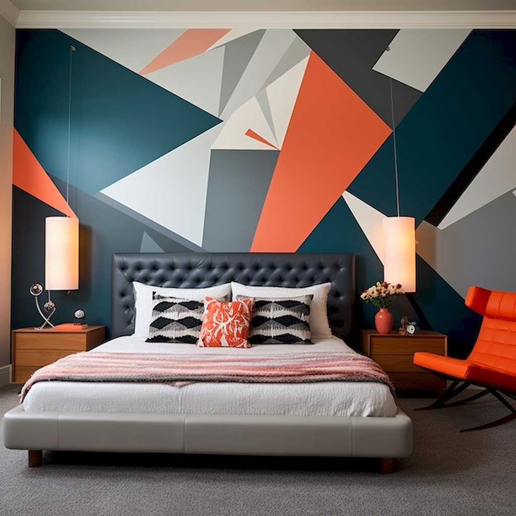
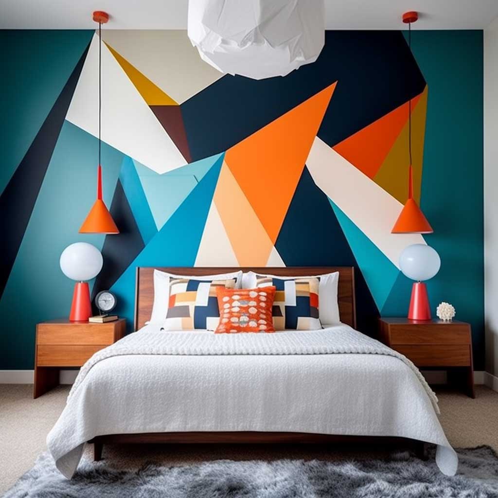
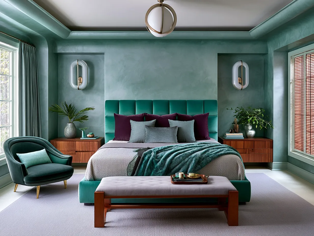
Color pairing within geometric patterns is where most DIY attempts go sideways. Two colors from the same paint strip, three to four shades apart, is the formula that works every time. I’ve seen people grab complementary opposites — orange and teal, for instance — and the result is a migraine on a wall. If you want drama, stay in the same family: deep navy against steel blue, charcoal against warm white, forest green against sage. The wall paint color combinations that read as sophisticated are almost always tonal, not complementary.
What format works for a bedroom specifically? The headboard wall is the right target. Full-room geometric painting is exhausting to live with — you’ll want to redecorate within 18 months. Limit the pattern to the wall directly behind the bed, keep the remaining three walls in the lighter of your two chosen shades, and the room instantly gains a focal point without becoming a sensory overload. That single decision is the difference between a room that photographs well and one that also feels comfortable to sleep in.
Don’t Do This
Geometric patterns on all four walls is the most common regret I hear from people who tried this. It felt bold on day one and suffocating by week two. One accent wall — specifically the one behind the bed — is the right scope. Also avoid using more than two colors in the same geometric pattern unless you have a very clear design reference point to work from; three-color geometric walls almost always look chaotic in person even when they look fine on a mood board. And don’t tape a pattern over textured walls without sanding first — the tape won’t seal and you’ll spend twice as long touching up bleeds.
Stencils are a valid shortcut if freehand tape layouts feel intimidating. Royal Design Studio sells geometric stencil packs starting around $30; their Moroccan trellis is my go-to recommendation for bedrooms because the repeat is forgiving at seams. Apply with a foam roller at low pressure — if you’re pressing hard, you’ll get bleed-under no matter what stencil you use. Keep a damp cloth close. Stenciling a full headboard wall takes about four hours for an average-size room, not the eight-plus hours you’d spend taping a custom grid from scratch.
Midnight Blue Accent Walls Earn Their Keep in a Master Bedroom
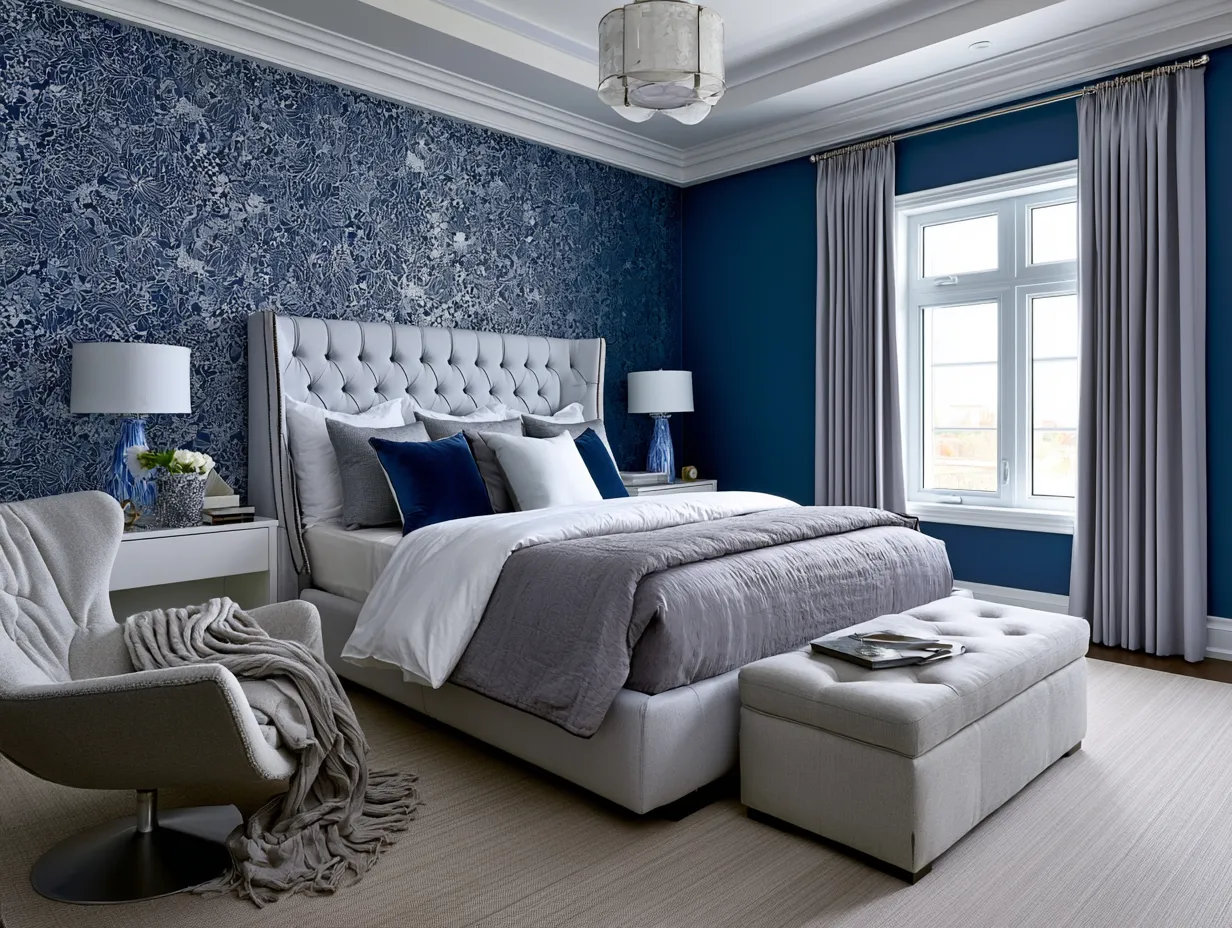
Midnight blue sits in a narrower band than most people realize. Too warm and it becomes navy, which reads nautical. Too cool and it tips into slate, which reads corporate. The shade you want — the one that actually photographs the way those Instagram bedrooms look — is around Benjamin Moore Hale Navy (HC-154) or Farrow & Ball’s Hague Blue (No.30). Hague Blue runs about $130 per liter, which is a lot for paint, but the pigment density means two coats instead of three. Farrow & Ball’s formulation also has a depth that cheaper paints simply can’t match at any price.
The reason midnight blue works so well in master bedrooms specifically comes down to how the color handles at night. Under warm lamplight, it shifts toward indigo — richer and warmer than it looks in daylight. Most bold colors do the opposite: they get harsh under artificial light. That’s why so many bold color experiments fail in bedrooms — people chose the color in morning light and lived with a completely different wall at 10 PM. Midnight blue is one of the rare shades that actually improves after dark, which is exactly what you want in a space you use most at night.
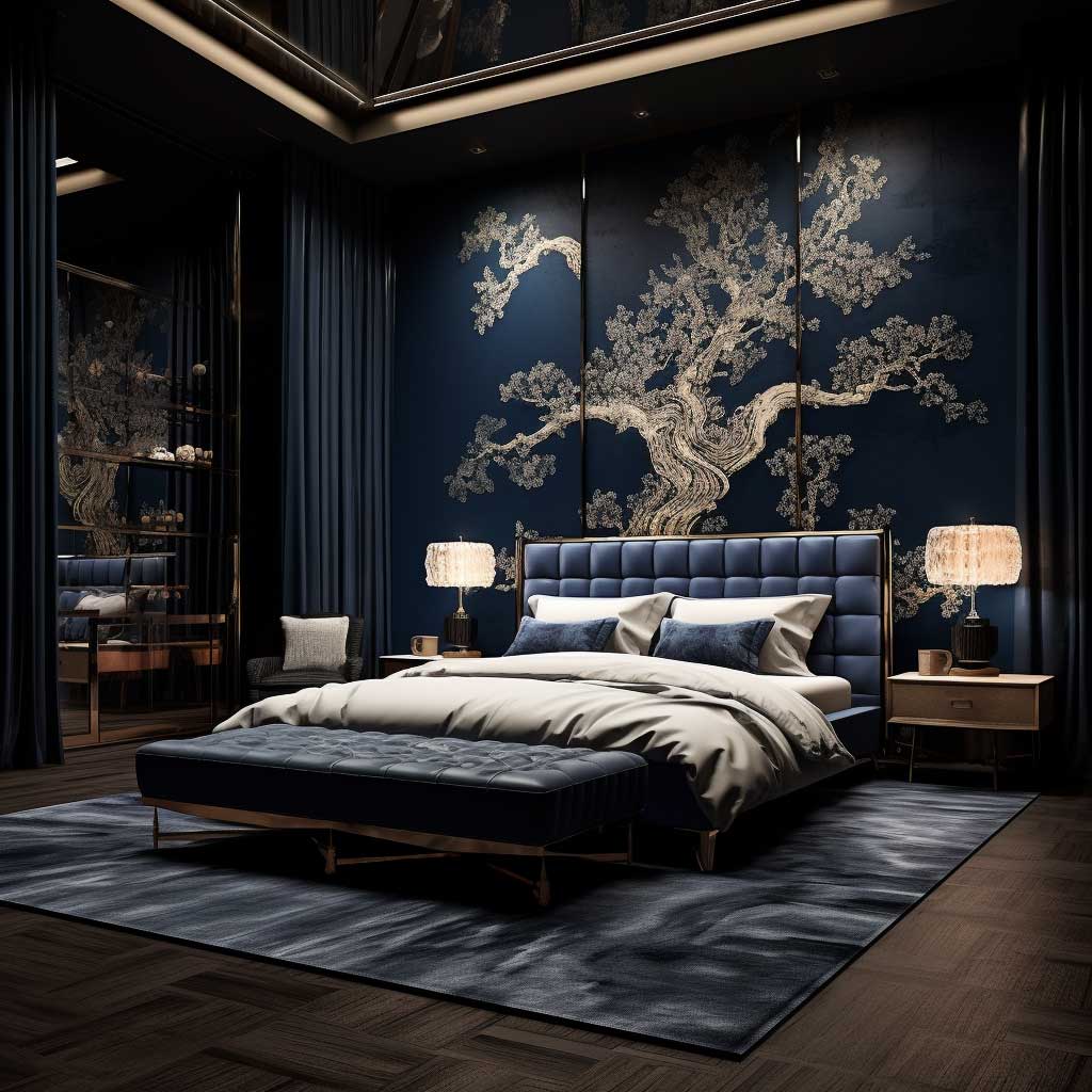
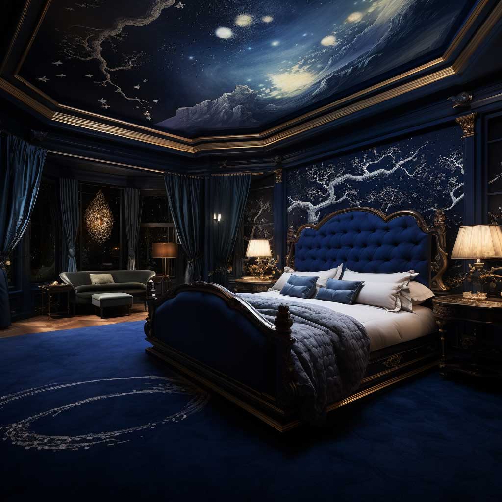
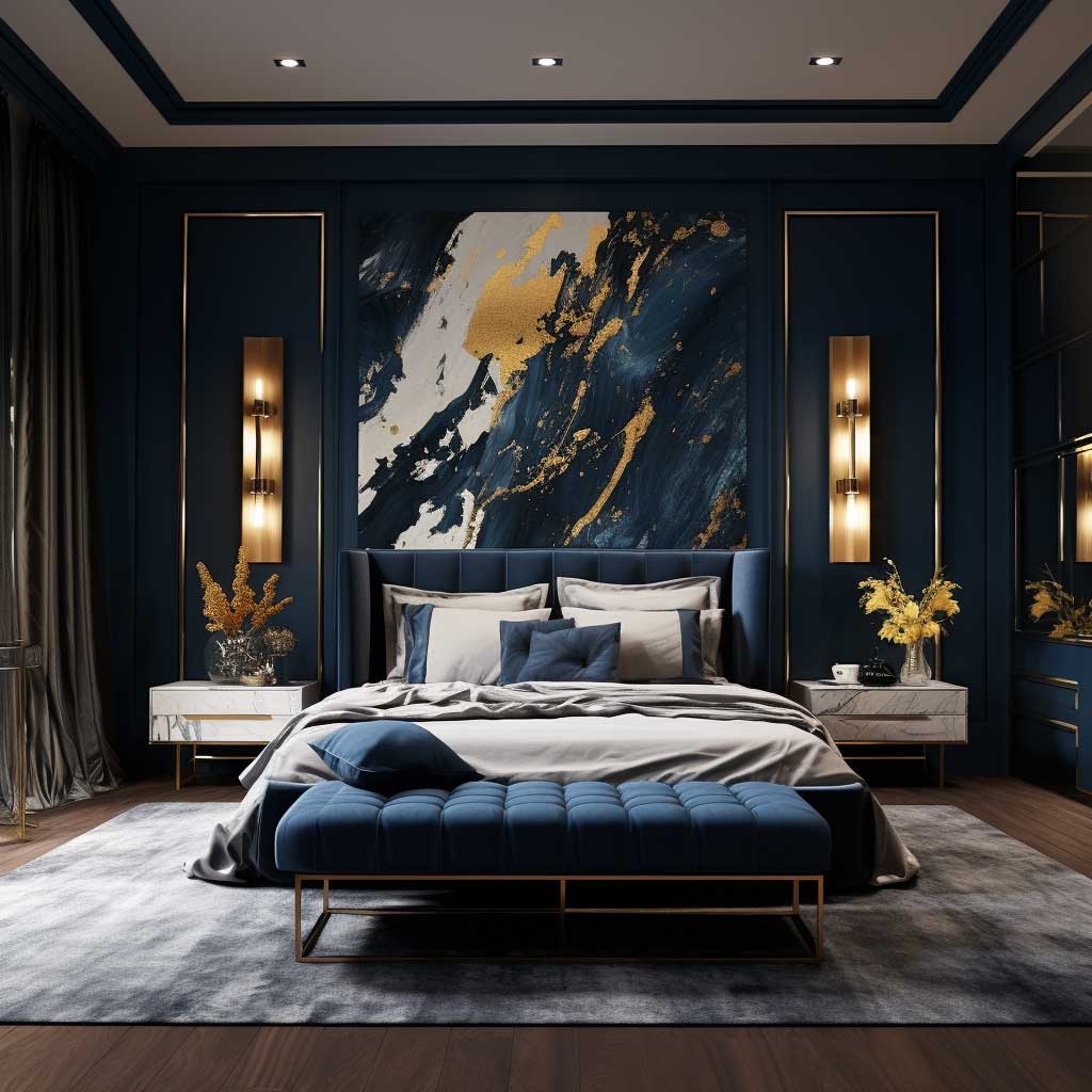
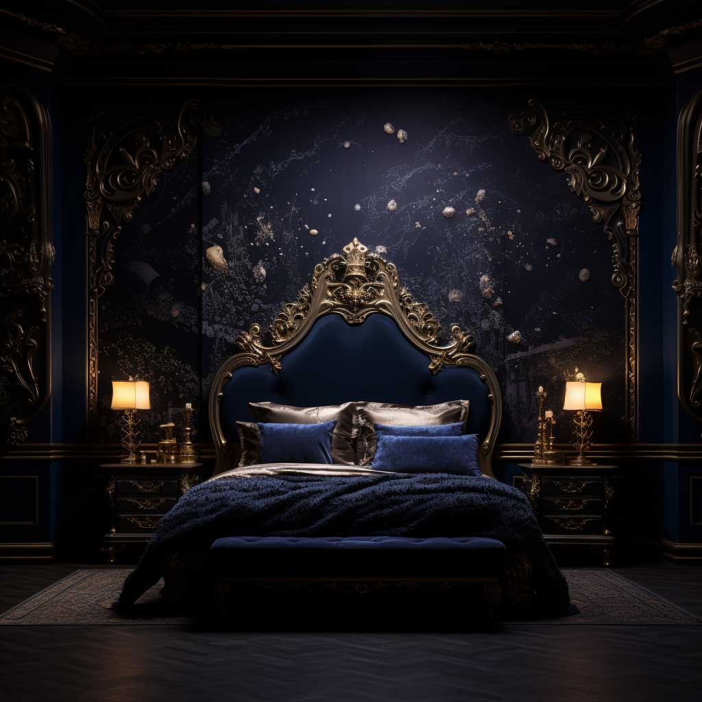
Pair it with brass or antique gold — not polished chrome. Chrome against deep blue looks clinical. Brass around $50–$80 for nightstand hardware sits warm against the cool of the wall and reads expensive. White linen bedding is the other non-negotiable; you need a high-contrast element to stop the room from feeling like a cave. I own two sets of Brooklinen Classic Percale sheets in white specifically because I have a dark accent wall, and the crisp contrast is what makes the room look intentional rather than gloomy.
Plants do something unusual against midnight blue. The green and the deep blue create a contrast that looks styled without any effort — it’s the same reason botanical prints became popular in dark-walled rooms. A pothos or a fiddle leaf fig on a light wood stand near a midnight blue wall costs maybe $40 for the plant and $25 for the stand, and it does more visual work than a $200 piece of wall art. That said, avoid yellow-green plants like certain succulents — they clash rather than contrast against blue.
What to avoid: don’t paint all four walls midnight blue in a room smaller than 200 square feet. The walls will close in fast. One wall — always the headboard wall — is the scope that works in most standard bedrooms. Also skip the satin finish; it shows every roller mark and brush stroke on a dark color. Eggshell is the right call. You get just enough sheen to look polished without the surface revealing every imperfection from across the room. For more on how deep blue pairs with metallic accents across different finishes, that breakdown is worth reading before you commit to a hardware finish.
HGTV’s decorating team notes that deep blue shades like this have a spatial trick built in: the dark color makes walls appear to recede, creating the perception of a larger room rather than a smaller one. That’s counterintuitive — most people assume dark means claustrophobic — but it’s the reason designers reach for deep blue in smaller primary suites rather than avoiding it.
Final Word
The wall is the one thing you can’t accessorize your way out of. Fix it first.
Texture, pattern, or deep color — any of the three approaches here will outperform a default beige in a bedroom. The only wrong move is a flat mid-tone that has no opinion. Your walls should have an opinion.
Budget realistically: $60–$90 for quality paint, another $20–$30 for tape and tools if you’re going geometric, and $0 for the rag-rolling if you already own rags. That’s a full accent wall transformation for under $120 in most cases.
Save this post before you head to the paint store — color chips look nothing like a full wall, and you’ll want the brand names in here when you’re standing in the aisle.
FAQ
What is the best wall painting design for a small bedroom?
How do I paint a bedroom accent wall without bleeding under the tape?
What color goes well with a midnight blue bedroom wall?
How much does it cost to do a textured wall paint finish in a bedroom?
Can I paint geometric designs on bedroom walls myself?
What paint finish should I use on a dark bedroom accent wall?
Complete guide
Bedroom Design Ideas That Actually Change How You Sleep, Feel and Live
Styles, colors, furniture, walls, layouts — 300+ ideas in one place