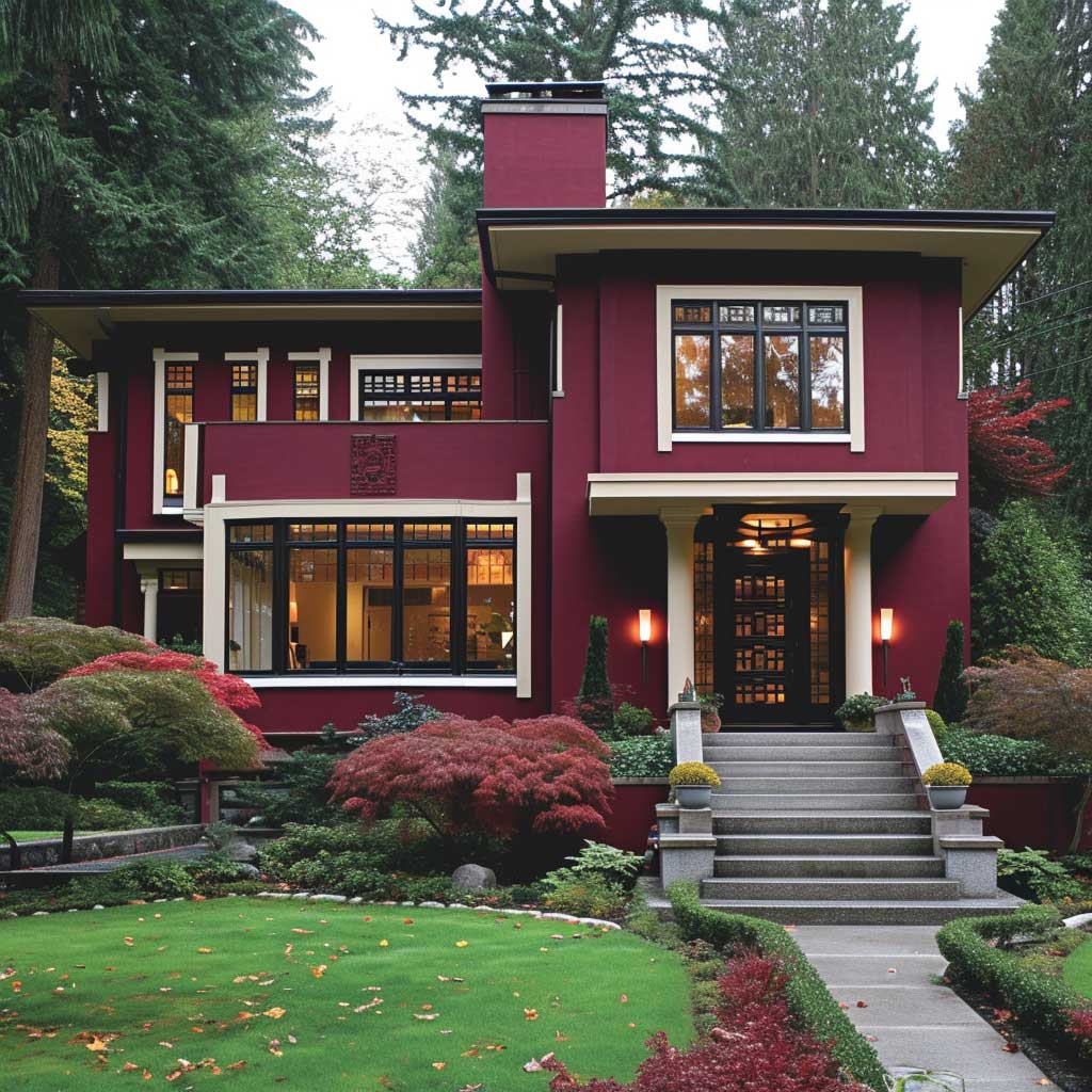
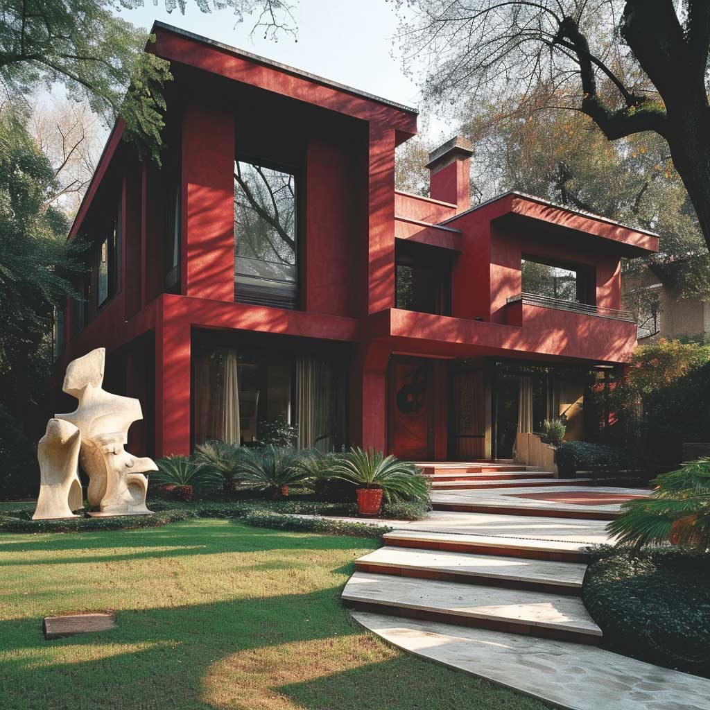
The ivory and burgundy colour combination for house exteriors works because burgundy behaves like a dark neutral — grounded, never garish — while antique ivory does the job of white trim without the harshness. I’ve watched neighbours repaint perfectly good houses in greige twice in five years. Meanwhile, a single postmodern home down the street in deep burgundy and antique ivory has looked right every single season since it went up. Rich. Deliberate. Zero need for seasonal updates.
This isn’t a safe palette, and that’s exactly why it ages so well. Maroon and ivory, burgundy and ivory, ivory and milan red — these variations all orbit the same idea: a dark wine-red body colour paired with a warm off-white that softens the trim, the cornices, the window frames. You’ll notice the difference immediately when you stand at the kerb.
Quick Scan
- Main palette: Deep burgundy body + antique ivory trim and architectural details
- Best for: Postmodern, contemporary, and asymmetric facades with strong geometric lines
- Paint picks: Benjamin Moore HC-182 Classic Burgundy (~$85/qt) for walls; BM White Dove OC-17 for ivory trim
- Avoid: Bright white trim — it kills the warmth of burgundy instantly
- Landscape match: Dark-foliaged plants (burgundy barberry, dusty miller) reinforce the palette outdoors
- Maroon vs burgundy: Maroon reads more brown; burgundy reads more wine-red — test both swatches outdoors for 48 hours before committing
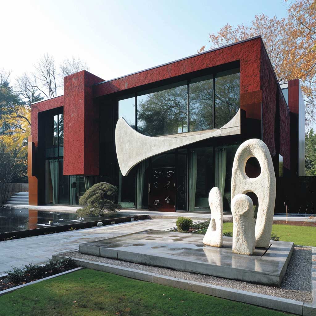
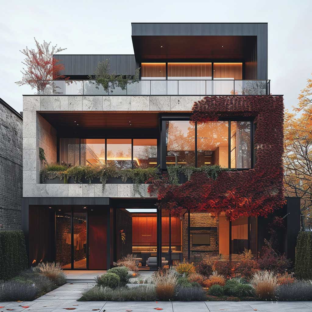
Sophisticated Postmodern Elegance

Benjamin Moore HC-182 Classic Burgundy runs about $85 a quart in the Aura Exterior line, and once it’s on a postmodern facade, it stops looking like a colour choice and starts looking like an architectural decision. The deep, wine-red tone absorbs afternoon light differently than any neutral. You’ll notice the walls shift from a cool plum in morning shade to a warm ruby at golden hour — that’s the LRV at work. It sits at roughly 4.8, which means it reads dark at every angle without going flat.
Pair it with antique ivory — not white, never bright white — on every trim element: window casings, fascia boards, entry surrounds. White Dove OC-17 from Benjamin Moore hits the right ivory note. I matched it to the existing stone path at a project last year and the visual logic locked in immediately. The ivory doesn’t compete with the burgundy; it frames it.
Skip the idea of cream trim with yellow undertones. I tried Navajo White once on a burgundy facade and the combination read like a fast-food restaurant from the street. The undertone of the ivory matters more than the shade itself — stay in the pink-neutral range, not the yellow-warm range.
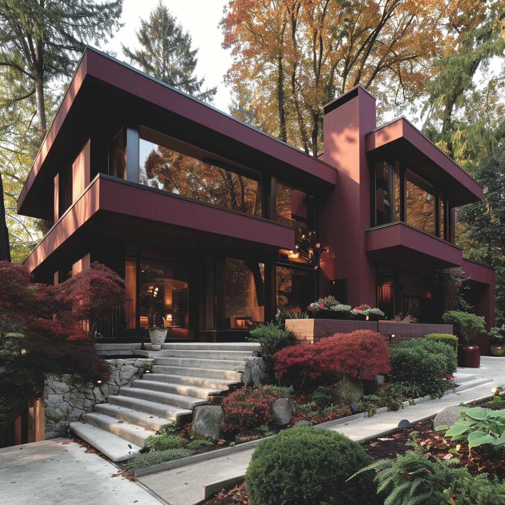

The large angular windows that define postmodern architecture become focal points the moment you outline them in antique ivory against a burgundy wall. They don’t just let light in — they create a rhythm across the facade. My go-to specification: a 3.5-inch wide ivory casing, no more. Wider and it starts to look Victorian. Narrower and the eye skips past it.
Landscape planting that echoes the palette seals the whole exterior. Burgundy barberry hedges along the foundation run about $12–$18 per plant and mature into a clean low border. Dusty miller adds the ivory counterpoint. Think of it the way a sommelier thinks about pairing: the architecture sets the vintage, the planting sets the mood.
What doesn’t work here is overthinking the third colour. A dark bronze or matte black on gutters and downspouts is the right hardware finish — charcoal grey reads muddied against burgundy at dusk. Keep the hardware restrained and let the two main colours carry the conversation.
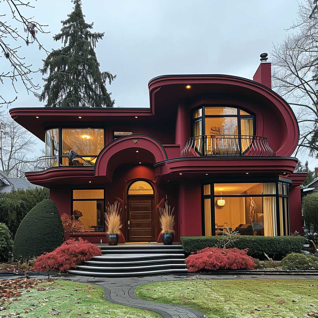
Where Burgundy Facade Decoration Stops Being Decor and Becomes Architecture

Decorative ivory details on a burgundy facade do something interesting: they force the eye to read the building as a composition rather than a box. Geometric panels, angled soffits, recessed entry surrounds — when they’re painted antique ivory against a deep burgundy field, each element starts to carry visual weight. I’ve seen this executed badly when homeowners pile on too many ivory accents, and the facade looks like it belongs in a theme park. The rule is fewer ivory accents, each one deliberate.
Ivory carved or cast decorative elements from suppliers like Fypon (polyurethane millwork runs $40–$300 depending on profile) install over any substrate and take exterior paint cleanly. My go-to primed PVC trim boards — 5/4 x 6 — run about $28 per 16-foot length at most lumber yards. Paint them in two coats of BM White Dove in Aura Exterior semi-gloss and they’ll hold the ivory tone for eight to ten years without chalking.
The geometric roof is where most burgundy-and-ivory projects lose their nerve. Homeowners paint the roofline elements in the body colour and the whole crown of the building disappears into itself. Instead, use the ivory on the fascia band and the soffit — even a 6-inch fascia board in antique ivory reads cleanly from the street and defines the roofline without adding visual weight.
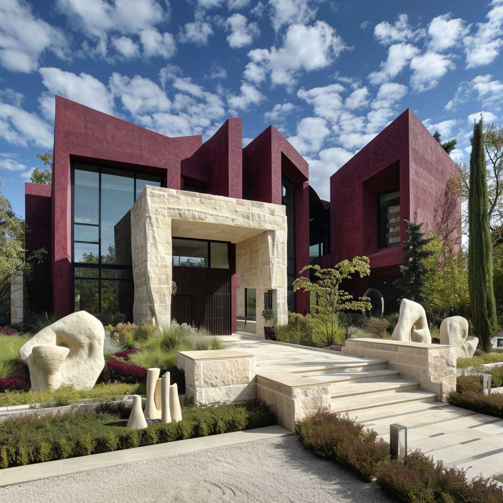
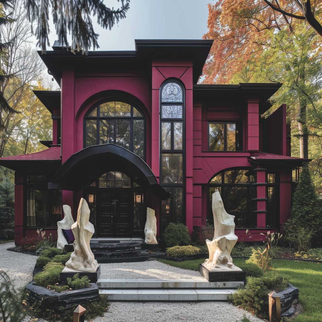
Front yard sculptural elements in cast concrete or coated metal, painted ivory, extend the palette into the landscape without needing a third colour. You’ll notice that abstract forms in off-white against burgundy read as intentional, while the same forms in grey read as forgotten. Colour transforms what materials can’t. That’s the most underrated part of this combination.
What to avoid completely: any decorative element in a metallic gold. I saw a burgundy house with gilded door hardware and window rosettes last spring — the combination looked like a hotel lobby renovation that ran out of budget. Matte black or antique bronze on metal hardware only.
Don’t Do This
- Don’t use bright white trim — pure white against deep burgundy creates a stark, institutional contrast. The warmth of antique ivory is the whole point.
- Don’t add a third bold colour — an accent door in teal or orange against burgundy walls looks like a mistake, not a choice.
- Don’t paint the foundation in ivory — the foundation should read as base and ground, not as a feature element. Use a mid-tone stone or charcoal for the plinth.
- Don’t skip the swatch test — burgundy shifts dramatically in different light conditions. Test your chosen shade for at least 48 hours on the actual wall, not a sample board propped on the porch.
For more on how colour combinations work across different exterior styles, this breakdown of exterior colour pairings covers the logic behind tone matching and what makes certain combinations hold up across decades.
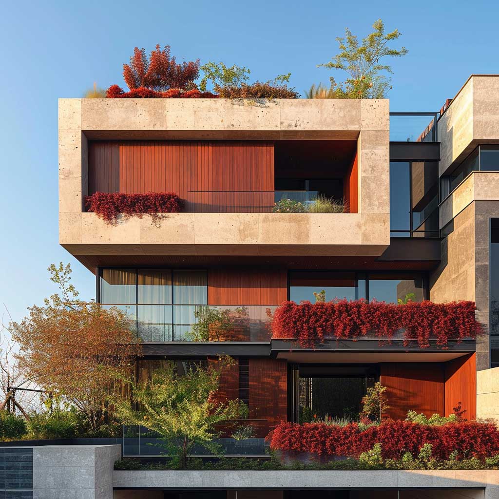
Milan Red and Ivory on an Urban Residence — What the Kerb Actually Sees

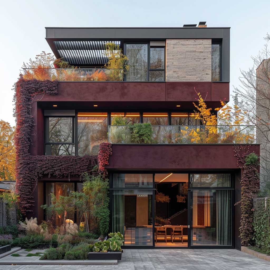

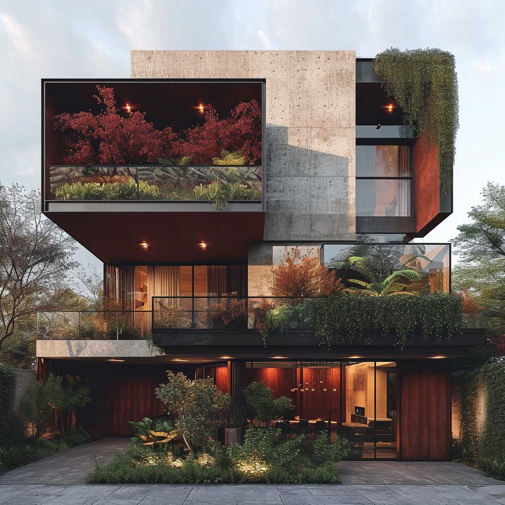
An ivory and milan red combination on a house exterior operates differently in an urban setting than it does on a suburban lot. City facades compete with concrete, steel, and glass. Burgundy — which sits adjacent to milan red on the colour spectrum — cuts through that noise rather than dissolving into it. You need a facade colour that holds its character from across a four-lane street. Burgundy does. Terracotta doesn’t. Ochre really doesn’t.
The rooftop garden that appears in some of these renderings continues the palette into the vertical plane, which is the smartest move for urban postmodern design. Burgundy barberry, white-flowering espaliered plants against ivory-painted parapet walls — it reads from the street as a deliberate extension of the architecture, not a garden tacked on top. I stole this trick from a residential project in Copenhagen and it lands every time.
Contrasting textures on the facade amplify the colour relationship. Smooth render in deep burgundy next to a panel in rough-sawn cladding — same colour, different finish — gives the building a layered quality that flat paint alone never achieves. The ivory trim reads against both textures without shifting visually. That consistency is what you’re engineering.
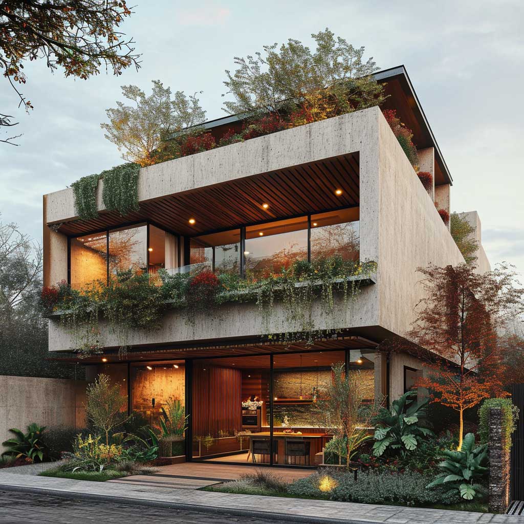

Inside, a minimalist interior with pale walls and natural oak actually amplifies the exterior palette — you see the burgundy facade through the large windows as a framed element, and it behaves like an artwork hung on the interior wall. I own a reference print by architect Tadao Ando that uses the same logic: a single dark plane visible through a window reads as a painting. Budget $1,200–$1,800 per square for quality Dulux or Farrow & Ball exterior coatings in this dark a tone — the extra spend on a self-priming formula saves a full coat of work.
For more exterior pairings that work in different conditions, this overview of curb appeal colour combinations covers how contrast ratios change between suburban and urban settings.
FINAL WORD
Burgundy and ivory is not a trend. It’s a structural colour decision that keeps paying off.
Most exterior palettes are chosen to avoid standing out. This one is chosen to stand right.
Test Benjamin Moore HC-182 and White Dove OC-17 together on your actual wall before committing — the combination reads differently in morning shade and afternoon sun and both readings should work.
Save this post before your next paint consultation.
Related Topics