Orange and cream colour combination works as a high-contrast exterior pair that delivers warmth without overwhelming architectural lines. The cream base softens light and expands visual space while tangerine or soft orange accents on trim, shutters or doors create focal points that read clearly from the street. This pairing suits modern classic, townhouse and suburban forms equally well when the ratio stays roughly 70 percent cream to 30 percent orange.
On sunlit elevations the cream reflects enough daylight to keep the facade bright, and the orange injects energy that pure neutrals lack. The result feels inviting rather than aggressive, provided the orange stays in the mid-value range and never covers large unbroken wall planes. Use the combination on body-and-accent schemes rather than full-wall orange to avoid visual fatigue.
Most homeowners who choose this palette report stronger curb appeal within the first season, especially when the orange is limited to doors, window frames and porch details. The same logic extends indoors: cream walls with orange textiles or cabinetry accents keep the space lively yet calm.
- Cream body + tangerine accents deliver the strongest street presence
- Keep orange under 30 percent of the facade surface
- LRV around 50–55 for mid-tone orange keeps light balanced
- Exterior repaint averages $1.50–$4.50 per sq ft of wall area
- Symmetrical classic forms gain the most from this contrast
- Garden plantings in matching tones complete the look
Modern Classic Facades Gain Energy from Tangerine Accents


Orange and cream colour combination on a modern classic shell starts with a calm cream body that lets the architecture speak. The cream acts like a quiet canvas, reflecting daylight so the house never feels heavy. Tangerine accents then appear on frames, doors or decorative bands, creating a controlled spark of energy that stops the eye without shouting.
Why does this work better than full orange walls? Saturated orange on large planes can dominate and age poorly under UV. Limiting it to 20–30 percent of the surface keeps the look fresh for years. Think of the orange as the citrus zest that brightens a neutral dish rather than the main ingredient.
Do not flood every window with the same bright tone. Vary the intensity slightly between ground and upper floors so the facade gains depth. A professional exterior job for a typical two-story home runs $3,000–$8,000 depending on surface area and prep, according to current contractor averages.


Large windows framed in tangerine become the natural focal points. The contrast draws the gaze while the cream walls stay restful. Pair the scheme with a simple garden of orange and cream blooms so the landscape echoes the architecture rather than fighting it.
Avoid cool blue-gray trims next to this warm palette. They create a visual clash that makes the orange look synthetic. Stick to warm whites or soft creams for secondary trim to keep the temperature consistent.
Two-Story Homes Find Balance in Cream and Orange Harmony


Cream and orange colour combination on a symmetrical two-story form turns proportion into an advantage. The cream body softens the vertical mass while tangerine shutters and door create a rhythmic pattern that the eye follows easily. The result feels ordered yet lively, like a well-tailored jacket with a bright pocket square.
How much orange is enough? On a typical facade the shutters and door together rarely exceed 15 percent of the painted surface. That limited dose still registers strongly against the cream and avoids the carnival effect that full orange walls can produce. Sample the orange on actual siding in afternoon light before committing; digital chips often read brighter than reality.
A manicured lawn and cream pathway leading to the orange door reinforce the sequence. The pathway acts as a visual runway that prepares the visitor for the color pop at the entrance. Skip black hardware; warm brass or bronze finishes support the temperature of both hues.


Do not paint the entire upper story orange and leave the lower cream. The split creates an awkward horizontal cut that fights the vertical lines of most classic designs. Keep the body continuous and let the accents do the work of contrast.
For deeper inspiration on related warm exterior schemes, explore terracotta and beige house exterior pairings that share the same warm logic.
Urban Townhouses Use Bold Hues for Street Presence
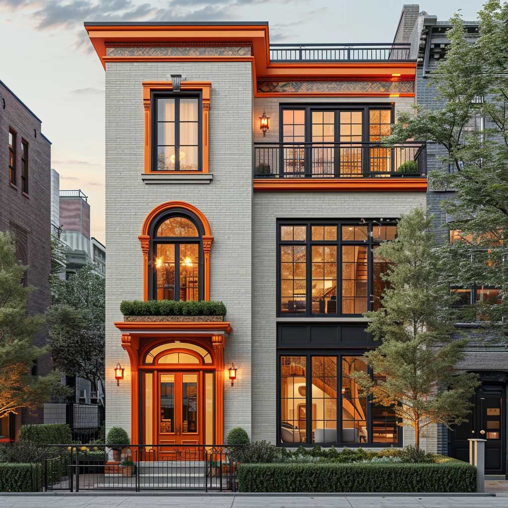


Orange and cream colour combination in a dense urban setting turns a narrow townhouse into a recognizable address. Cream brick or rendered walls provide a clean base that reflects limited city light, while tangerine window frames and balcony railings cut through the visual noise of neighboring buildings. The contrast functions like a well-placed street sign: clear, memorable, never cluttered.
Is full orange feasible on a townhouse? Rarely. The narrow frontage already competes for attention; flooding it with saturated color risks looking temporary. Restrict the orange to frames, doors and metalwork so the cream still reads as the dominant field. Mid-value tangerine with an LRV near 50–55 holds up better under mixed street lighting than ultra-bright shades.
A small balcony with orange railings becomes the outdoor living moment. The color draws the eye upward and signals that the house is lived-in rather than corporate. Keep the remaining metalwork in the same family to avoid competing accents.


Avoid pairing this scheme with cool gray neighboring houses without a buffer. The temperature clash can make the orange look isolated. A simple evergreen hedge or cream-painted boundary wall softens the transition.
For more exterior ideas that share the same energetic approach, see vibrant house colour design ideas for outdoor facades.
Living Spaces Extend the Orange and Cream Logic Indoors
Orange and cream colour combination travels indoors with the same rules: cream as the dominant field, orange as the controlled accent. On living-room walls a soft cream keeps the space open while tangerine cushions, a single armchair or a painted fireplace surround supply the lift. The 60-30-10 ratio still applies—60 percent cream, 30 percent secondary neutral, 10 percent orange.
What happens if the orange takes over the walls? The room can feel smaller and warmer than intended, especially on north-facing elevations. Keep large surfaces in the cream family and let textiles or one feature element carry the tangerine. Average professional interior paint costs sit lower than exterior work, yet the visual impact remains high when the ratio is respected.
Natural wood floors and warm metal lighting support both hues without introducing new temperature conflicts. Skip cool gray sofas; they mute the orange and leave the cream looking flat. A single strong orange object—like a ceramic lamp or a woven throw—acts as the punctuation mark that finishes the sentence.
Don’t do this: Paint an entire exterior wall in high-chroma tangerine and leave the trim pure white. The contrast becomes harsh under midday sun and the orange fades unevenly, leaving a patchy result within two seasons.
Practical Choices for Long-Lasting Results
Selecting the right orange and cream colour combination starts with sample boards left outdoors for at least three days. Morning, noon and late-afternoon light all shift the perceived value. Creams with a slight yellow or peach undertone pair more cleanly with tangerine than cool, blue-leaning off-whites.
Exterior paint quality matters more than the exact brand. Mid-to-premium lines with UV inhibitors protect the orange from rapid chalking. Expect to repaint high-sun elevations every 7–10 years under normal conditions; shaded walls often last longer. Current material-and-labor averages for exterior work fall between $1.50 and $4.50 per square foot of paintable surface.
For verified two-colour guidance that includes this pairing, manufacturers such as Nerolac’s orange and cream recommendations offer useful starting ratios and complementary neutrals.
Why This Palette Continues to Work
Orange and cream colour combination succeeds because it balances energy with calm. The cream expands light and softens mass; the orange supplies personality without demanding constant attention. When the ratio stays disciplined, the facade reads as intentional rather than trendy.
Apply the same logic to gardens, hardware and even interior accents. Consistency across those layers turns a simple paint choice into a coherent outdoor and indoor experience. The houses that look strongest five years later are the ones that treated orange as an accent, not a takeover.
Test both colors on the actual surface under real light. Adjust the orange intensity if the site receives intense southern exposure. Keep the cream warm enough to support the orange rather than fight it. That small discipline delivers the lasting curb appeal this pairing is known for.