When it comes to creating a relaxing sanctuary in your home, the role of color in bedroom design is paramount. Selecting the right color scheme is not just about aesthetics; it’s about crafting an environment that promotes tranquility and restfulness. Expert advice on bedroom designing color schemes for relaxation often focuses on choosing hues that evoke a sense of calm, balance, and serenity. This article delves into the nuances of color psychology and design principles to help you transform your bedroom into a peaceful retreat.
| Color | Psychological Effect | Best Shade for Bedroom |
|---|---|---|
| Blue | Lowers heart rate, reduces anxiety | Soft sky blue, slate blue |
| Green | Reduces stress, promotes renewal | Sage, eucalyptus, soft olive |
| Warm Neutral | Evokes warmth, comfort, groundedness | Warm beige, cream, greige |
| Lavender | Calms nervous system | Pale lavender, dusty mauve |
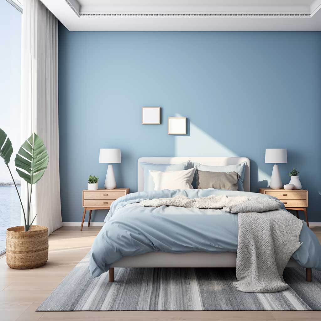
Blue Bedroom Color Schemes for Relaxation
The art of designing a bedroom that emanates calmness and serenity often begins with the selection of the right colour palette. Among the spectrum of hues available for interior decoration, shades of blue have emerged as a popular choice in bedroom designing colour schemes. Known for their soothing properties, blues have the unique ability to transform a bedroom into a tranquil sanctuary.
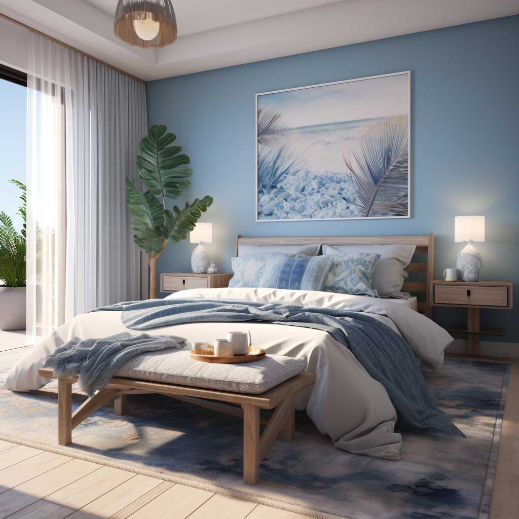


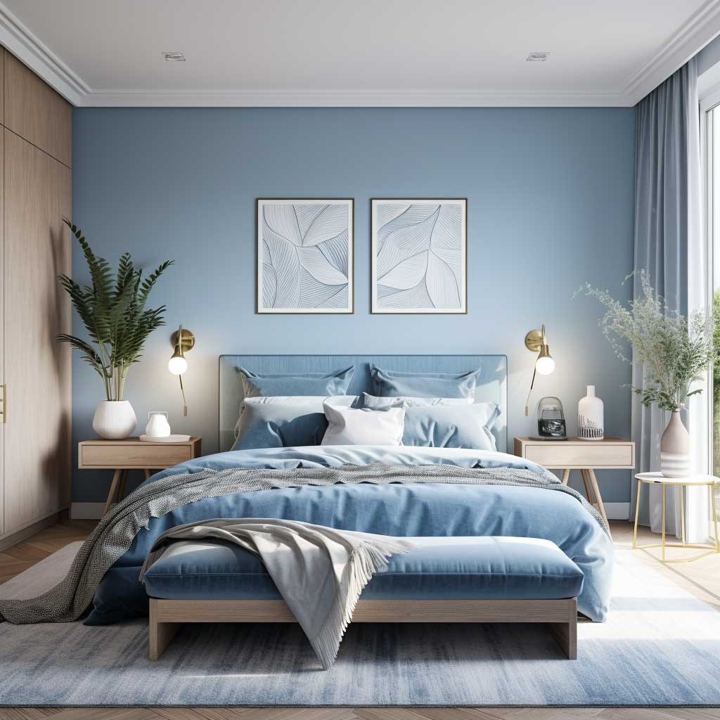
Blue Bedroom Bedding
Blue, in its various shades, embodies a sense of peace and tranquility. Lighter blues, reminiscent of the sky on a clear day or the gentle wash of ocean waves, bring a fresh and airy feel to the bedroom. These hues are particularly effective in creating a relaxed and serene atmosphere, conducive to unwinding and resting. On the other hand, darker shades of blue, such as navy or midnight blue, evoke richness and depth, adding a layer of sophistication and tranquility to the bedroom space.
The versatility of blue allows it to be easily combined with a variety of other colours and design elements. When paired with crisp white linens and furniture, blue creates a classic, nautical-themed bedroom that feels like a peaceful retreat. For a more contemporary look, combining blue with grey tones can result in a modern, chic space that still maintains a calm and soothing ambiance.
Beyond aesthetics, the choice of blue in bedroom designing plays a significant role in influencing one’s mood and sleep quality. Research in colour psychology suggests that blue hues can have a calming effect on the mind, promoting relaxation and reducing feelings of anxiety. This psychological impact makes blue an ideal colour choice for bedrooms, spaces dedicated to rest and rejuvenation.

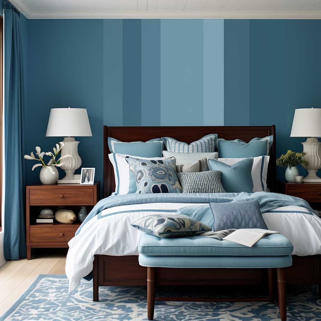

Incorporating blue into the bedroom doesn’t require a complete overhaul. It can be as simple as introducing blue accents through throw pillows, curtains, or artwork. For those who prefer a more immersive experience, painting a feature wall in a shade of blue can dramatically change the room’s look and feel. The key is to balance the colour with the rest of the room’s decor to create a cohesive and calming environment.
Lighting also plays a crucial role in how blue is perceived in the bedroom. Natural light can bring out the brightness and freshness of lighter blues, while soft, warm artificial lighting can enhance the coziness of darker blues. The interplay of light and colour can significantly affect the mood and atmosphere of the bedroom, making it an important consideration in bedroom designing.
In conclusion, the use of blue in bedroom designing colour schemes offers a timeless and versatile approach to creating a peaceful and serene sleeping environment. Whether through subtle accents or bold statements, blue can transform a bedroom into a restful haven, conducive to relaxation and well-being. By understanding the psychological effects of blue and integrating it thoughtfully into the bedroom design, one can craft a space that is not only visually appealing but also a true sanctuary for the mind and body.
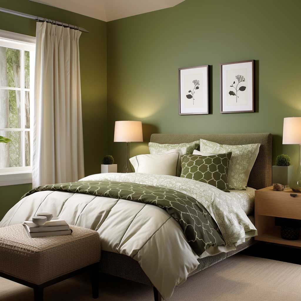
Green Bedroom Color Schemes for a Restful Space
The choice of color in bedroom design plays a pivotal role in creating an ambiance that fosters relaxation and serenity. Among the hues that are gaining popularity for their calming effect, shades of green stand out as particularly effective in designing bedrooms that serve as tranquil retreats. This essay delves into the use of green as a bedroom designing colour, exploring its potential to transform a sleeping space into a restful oasis.


Green Bedroom Bedding
Green, often associated with nature, tranquility, and renewal, offers a refreshing and soothing presence in bedroom interiors. Its connection with the natural world brings a sense of calm and balance, making it a perfect choice for a space dedicated to relaxation and rejuvenation. From the soft whisper of sage to the deep, lush tones of emerald, the spectrum of greens available provides a wide range of options to suit various design preferences.
Incorporating green into a bedroom can be approached in numerous ways. A subtle introduction of this colour can be achieved through accessories such as cushions, throws, or a piece of art that features green tones. For a more immersive experience, painting walls in a shade of green can create a significant impact. The choice of shade should be guided by the desired atmosphere – lighter greens can make the space feel airy and fresh, while darker shades can lend a feeling of cozy sophistication.
The psychological effects of green are substantial, particularly in a bedroom setting. Studies in color psychology suggest that green has a calming effect on the mind, reducing stress and aiding in relaxation. This makes it an excellent choice for bedrooms, where the primary focus is on rest and recuperation. The restful qualities of green can help create an environment conducive to a good night’s sleep, which is essential for overall health and well-being.

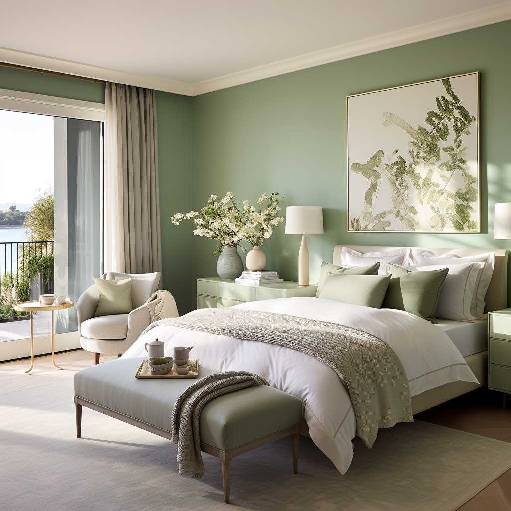

In terms of design, green is a versatile colour that pairs well with a variety of other hues and materials. It works harmoniously with natural elements like wood and stone, enhancing the organic feel of the space. When combined with neutral tones such as whites or beiges, green stands out and brings a vibrant yet calming energy to the bedroom. For a more dynamic and contemporary look, pairing green with bolder colors like yellows or blues can add a playful yet serene element to the room.
Lighting plays an essential role in how green is perceived in the bedroom. Natural light can enhance the liveliness of green, making the space feel more connected to the outdoors. In the evening, artificial lighting can be used to highlight the depth and richness of darker greens, or the softness and subtlety of lighter shades, creating a warm and inviting atmosphere.
In conclusion, the use of green in bedroom designing colour schemes offers a refreshing and soothing approach to creating a restful bedroom environment. Whether through small accents or bold statements, green can transform a bedroom into a space that not only looks beautiful but also promotes relaxation and well-being. By understanding the psychological benefits of green and incorporating it thoughtfully into bedroom design, one can craft a space that is a true haven for rest and rejuvenation.
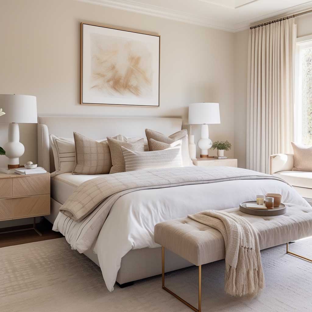
Warm Neutral Bedroom Color Ideas
In the realm of interior design, the use of color is instrumental in creating an atmosphere within a space. In bedroom design, where comfort and tranquility are paramount, the choice of color takes on an even greater significance. Among the various color schemes that promote relaxation and serenity, warm neutral tones have emerged as a popular trend. These colors, with their subtle and soothing qualities, are particularly effective in crafting a bedroom space that is both inviting and calming.


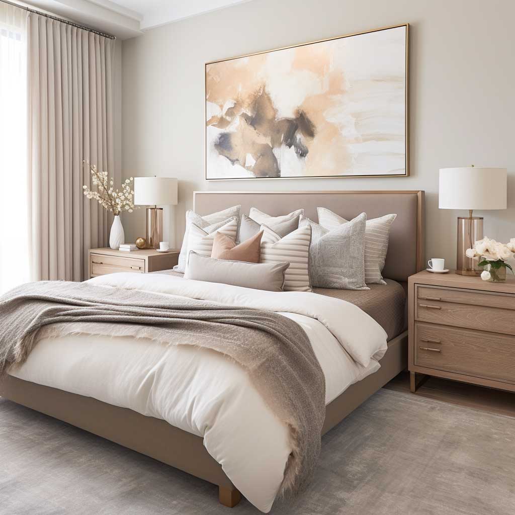

Warm Neutrals Bedroom Bedding
Warm neutrals encompass a range of colors including beiges, soft browns, creams, and muted golds. These hues draw inspiration from natural elements like sand, stone, and wood, bringing an earthy and grounded feel to the bedroom. Unlike cooler tones, which can sometimes create a stark or impersonal atmosphere, warm neutrals offer a sense of comfort and coziness. They create a backdrop that is both understated and elegant, allowing other design elements in the room to shine.
Integrating warm neutrals into a bedroom can be achieved in various ways. Wall colors are a primary method of introducing these tones into the space. Choosing a paint color like a rich beige or a soft cream can instantly transform the room, giving it a warm and inviting ambiance. These colors work well in both well-lit spaces, where they can create a bright and airy feel, and in rooms with limited natural light, where they can add warmth and depth.
The versatility of warm neutrals lies in their ability to complement a wide range of design styles and elements. These colors can serve as a foundation for both minimalist and maximalist design approaches. In minimalist bedrooms, warm neutrals can be used to create a clean, serene space that is free from clutter and distraction. In more ornate or eclectic bedrooms, they can provide a calming balance to bold patterns and textures.


The psychological impact of warm neutral colors in bedroom design should not be underestimated. These hues are known for their calming effect on the mind, promoting a sense of relaxation and well-being. This is particularly beneficial in a bedroom, where creating a restful environment is key to a good night’s sleep and overall health. Warm neutrals can help to create a space that is conducive to unwinding and detaching from the stresses of daily life.
In addition to wall color, warm neutrals can be introduced through textiles and accessories. Bed linens, curtains, rugs, and cushions in these tones can add layers of texture and warmth to the bedroom. The use of natural materials like linen, cotton, and wool in these colors enhances the sense of comfort and relaxation.
Lighting plays a crucial role in how warm neutrals are perceived in the bedroom. Natural light can bring out the subtlety and depth of these colors, while in the evening, warm artificial lighting can enhance their coziness and warmth. The right lighting can create a soft, inviting glow that complements the warm neutral tones, reinforcing the tranquil atmosphere of the space.
In conclusion, the use of warm neutrals in bedroom designing color schemes offers a timeless and versatile approach to creating a peaceful and inviting bedroom. These colors provide a perfect backdrop for a range of design styles and personal tastes. By understanding the psychological effects of warm neutrals and integrating them thoughtfully into bedroom design, one can create a space that is not only aesthetically pleasing but also a comforting and serene retreat from the world.
Designing a bedroom that serves as a personal haven requires careful consideration of color. The right color scheme can significantly influence your mood and quality of sleep. Incorporating calming hues like blues, greens, and warm neutrals can transform your bedroom into a serene escape from the hustle and bustle of everyday life. By understanding the psychological effects of color and applying expert design principles, you can create a space that not only reflects your personal style but also promotes relaxation and wellbeing.
Related Topics