Warm living room decor works when three things align: the right earthy tones on your walls, layered textures you can actually feel, and lighting that doesn’t kill the mood after sundown. Miss one of those and the room ends up looking like a hotel lobby nobody asked for. I’ve repainted the same wall four times chasing that cozy modern living room feel — and each time it came down to one overlooked detail, not the whole scheme. You’ll notice that pattern too once you see it.
Warm cozy living rooms aren’t about filling space. They’re about editing it. The rooms that actually feel warm tend to have fewer pieces than you’d expect, each one earning its place by contributing weight, texture, or glow to the overall atmosphere.
Quick Scan
- Rustic wood and stone materials anchor a warm modern living room without making it feel dated
- Velvet and chunky-knit layering adds tactile warmth — no renovation needed
- Warm tones like terracotta, amber, and mocha work across minimalist and eclectic styles
- Soft lighting below eye level does more for cozy atmosphere than any wall color
- Neutral anchors (cream, greige) prevent warm tones from reading as loud or chaotic
Raw Wood and Stone Pull a Modern Living Room Back to Earth
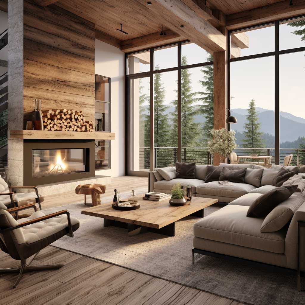


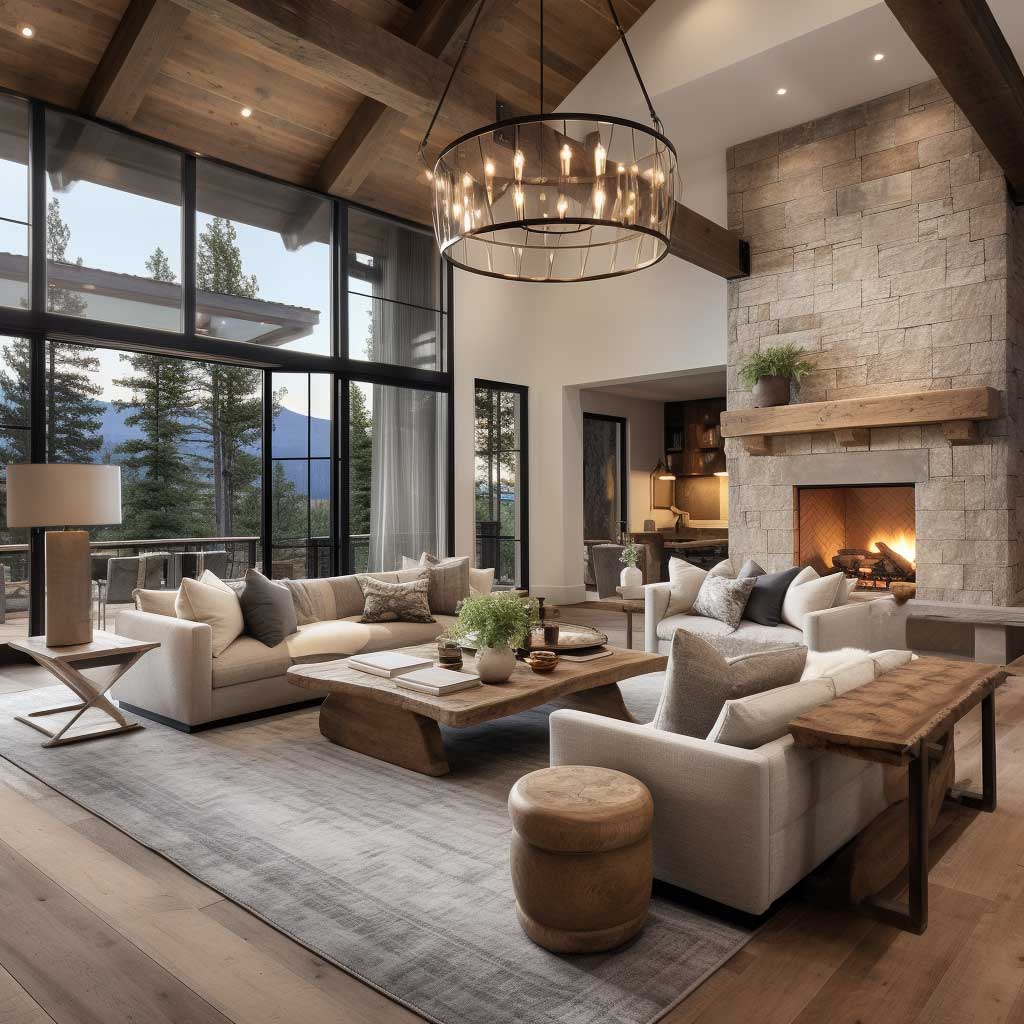
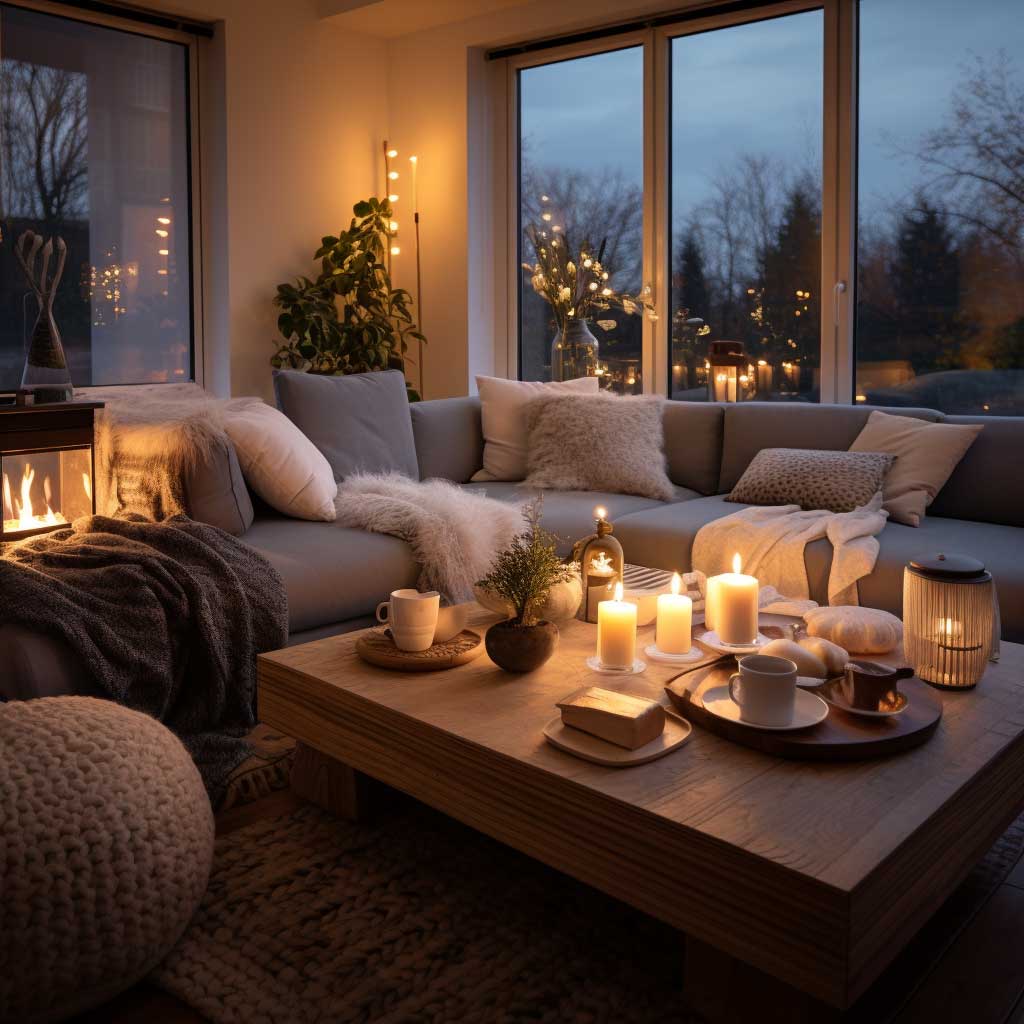
Exposed oak beams, rough stone walls, and hand-scraped hardwood floors do something no paint can replicate — they bring physical weight into the room. My go-to combination is a stone accent wall behind the sofa paired with white oak floors, and I’ve watched it transform every room it’s landed in. The natural imperfections in those materials — knots in the wood, grain shifts in the stone — create more visual interest per square foot than any gallery arrangement. Think of it like soil in a garden: it’s already a neutral, and everything you put on top of it just works.
Pairing these rustic elements with clean-lined modern furniture is where most people get the ratio wrong. You need enough contemporary geometry to keep the room from reading as a mountain cabin, but not so much sleek metal that the natural materials look apologetic. I stole this trick from a Restoration Hardware catalog circa 2019: use one leather piece — a $1,200–$1,800 cognac armchair works perfectly — and let every other seating choice be softer and more relaxed. The leather becomes the anchor, not the aesthetic.
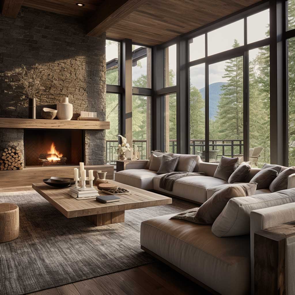
Color in this section of the room should read earthy rather than warm-warm. Browns, muted greens, and raw linen beiges prevent the space from tipping into the orange-and-red territory that screams early 2000s. Add a single pop — a deep slate blue throw or a dusty terracotta pillow — and you’ll get vibrancy without sacrifice. Don’t reach for burgundy here. It overpowers stone and wood every time, turning the whole wall into a dark mass that shrinks the room by 30%.
Furniture placement matters as much as the pieces themselves. Floating the sofa away from the wall — even 10 inches — instantly makes a warm modern living room feel curated rather than staged. You’ll notice the room starts to breathe. Pair that with a jute or wool rug underneath the entire seating arrangement and the grounded, cozy quality locks in fast.
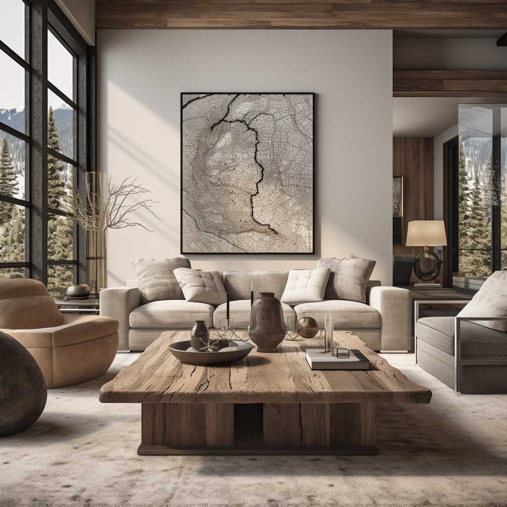
The rustic elements you choose don’t need to be expensive to read as intentional. A reclaimed wood console from a salvage yard — typically $200–$400 — does the same work as a designer piece three times the price, especially when the rest of the room is clean-lined and modern. Scale is where most rooms fail. A single oversized oak coffee table (70 inches or longer) anchors a large seating zone better than two smaller tables ever will. And honestly, that’s the piece worth splurging on.
Don’t Do This
Mixing too many natural materials in one room — wood, stone, rattan, jute, brick — makes the space look like a showroom accident, not a warm cozy living room. Pick two dominant materials and use the others as accents only. Also skip the matching wood-tone trap: coffee table, floors, side table, and TV console all in the same stain reads flat and lifeless. Vary the finish (matte vs. oiled, light vs. dark) or the room loses every dimension you worked to create.
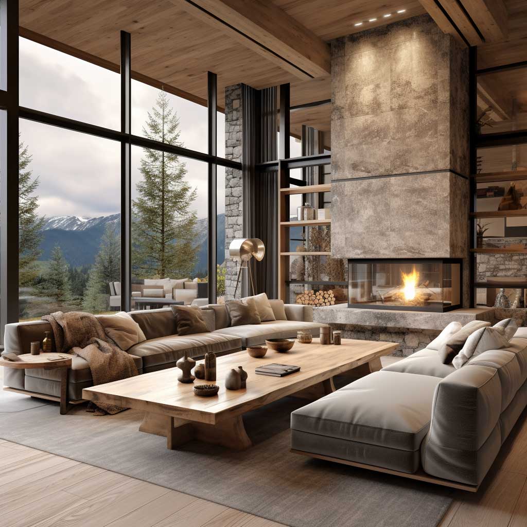
Velvet, Chunky Knit, and the Lighting Decision Nobody Talks About
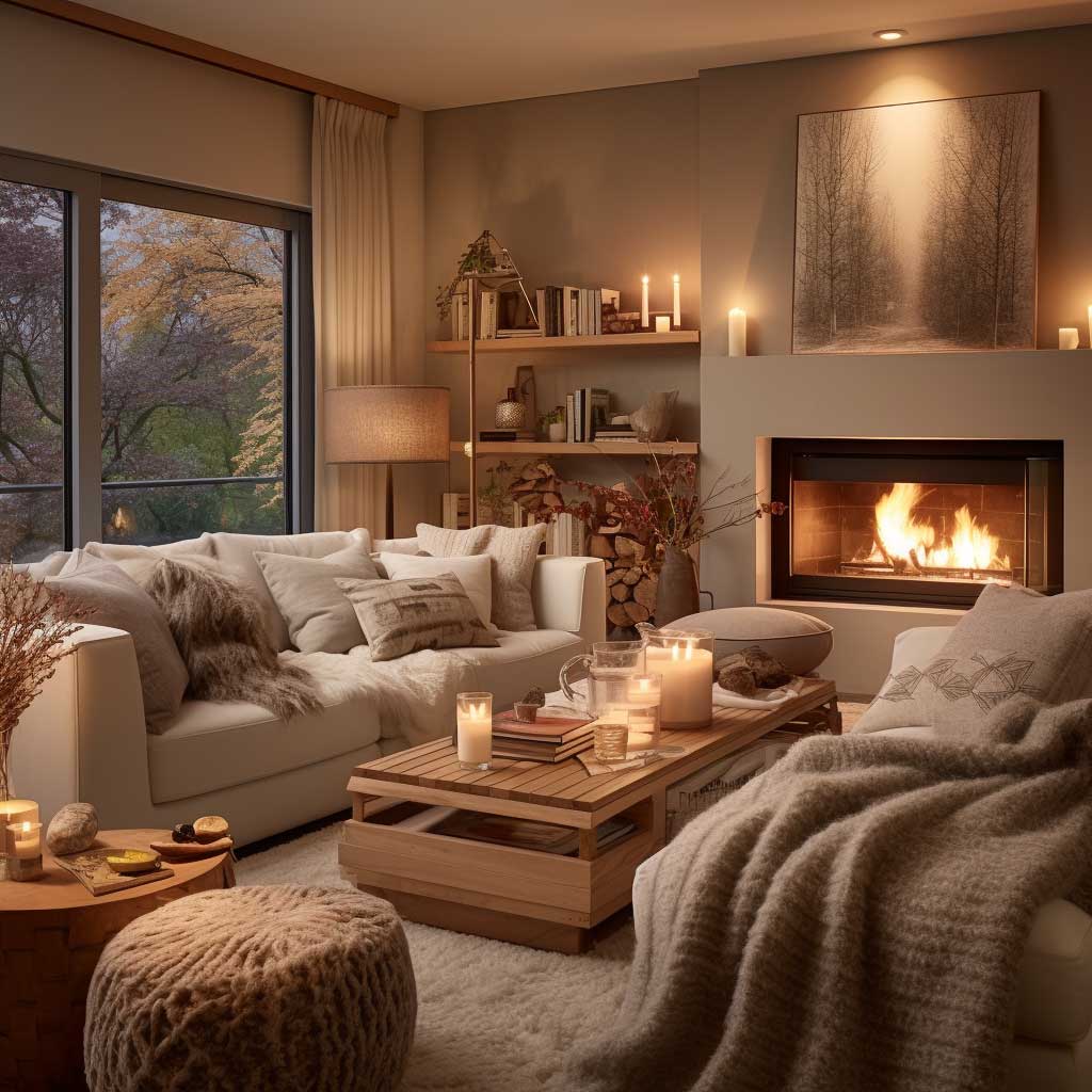
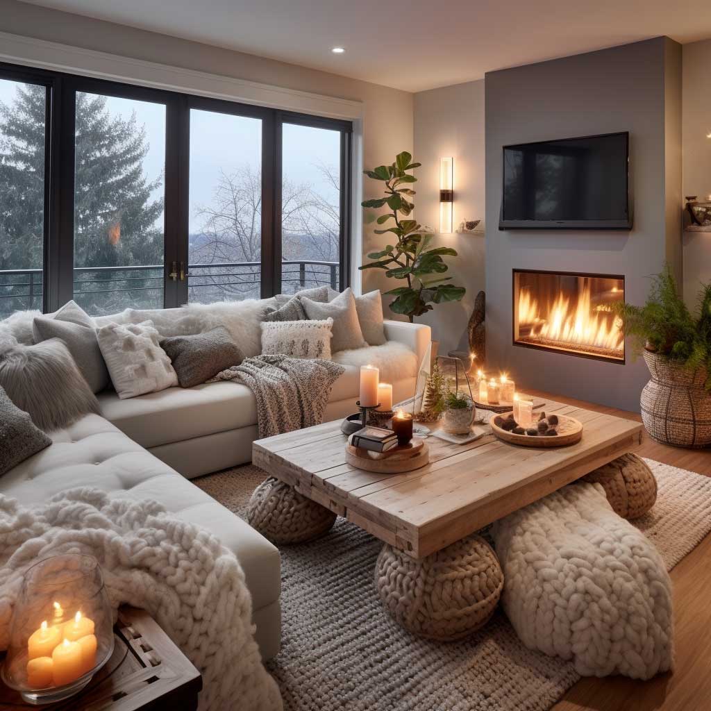
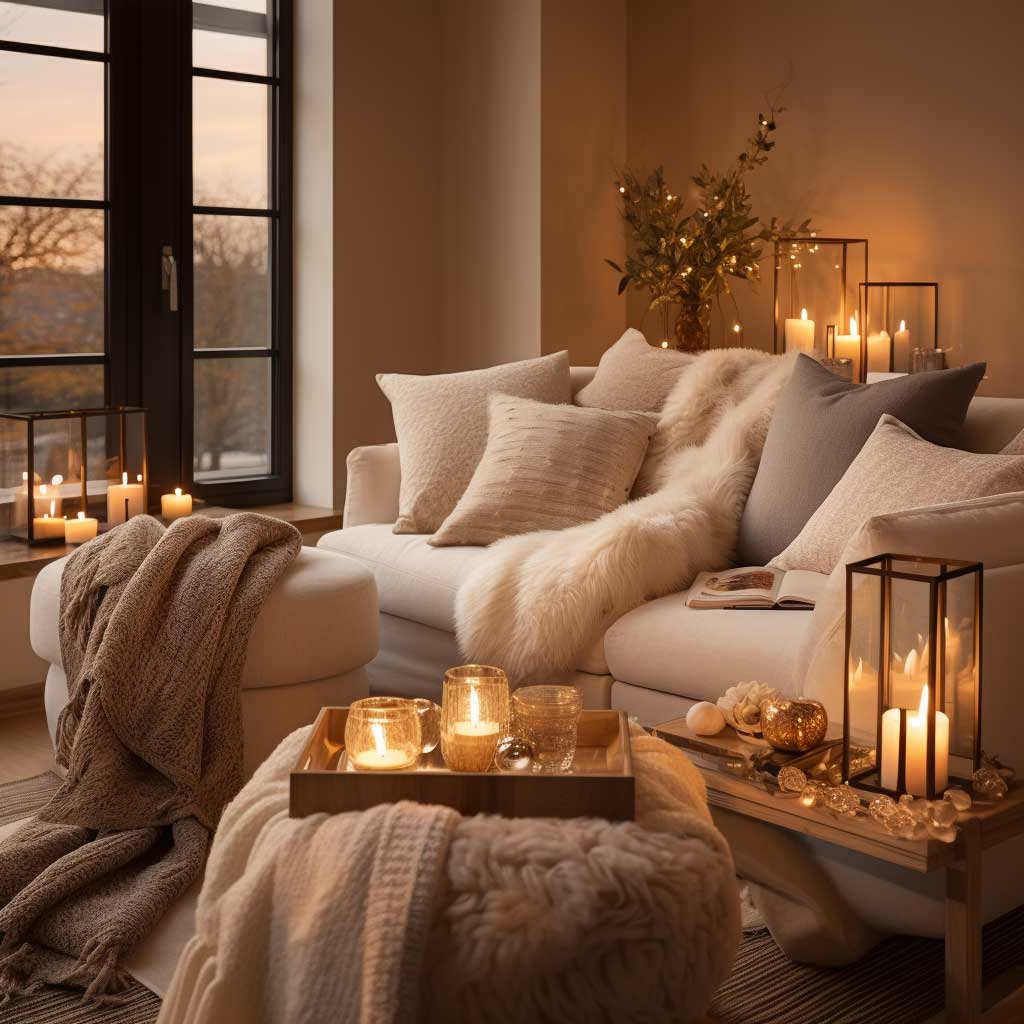
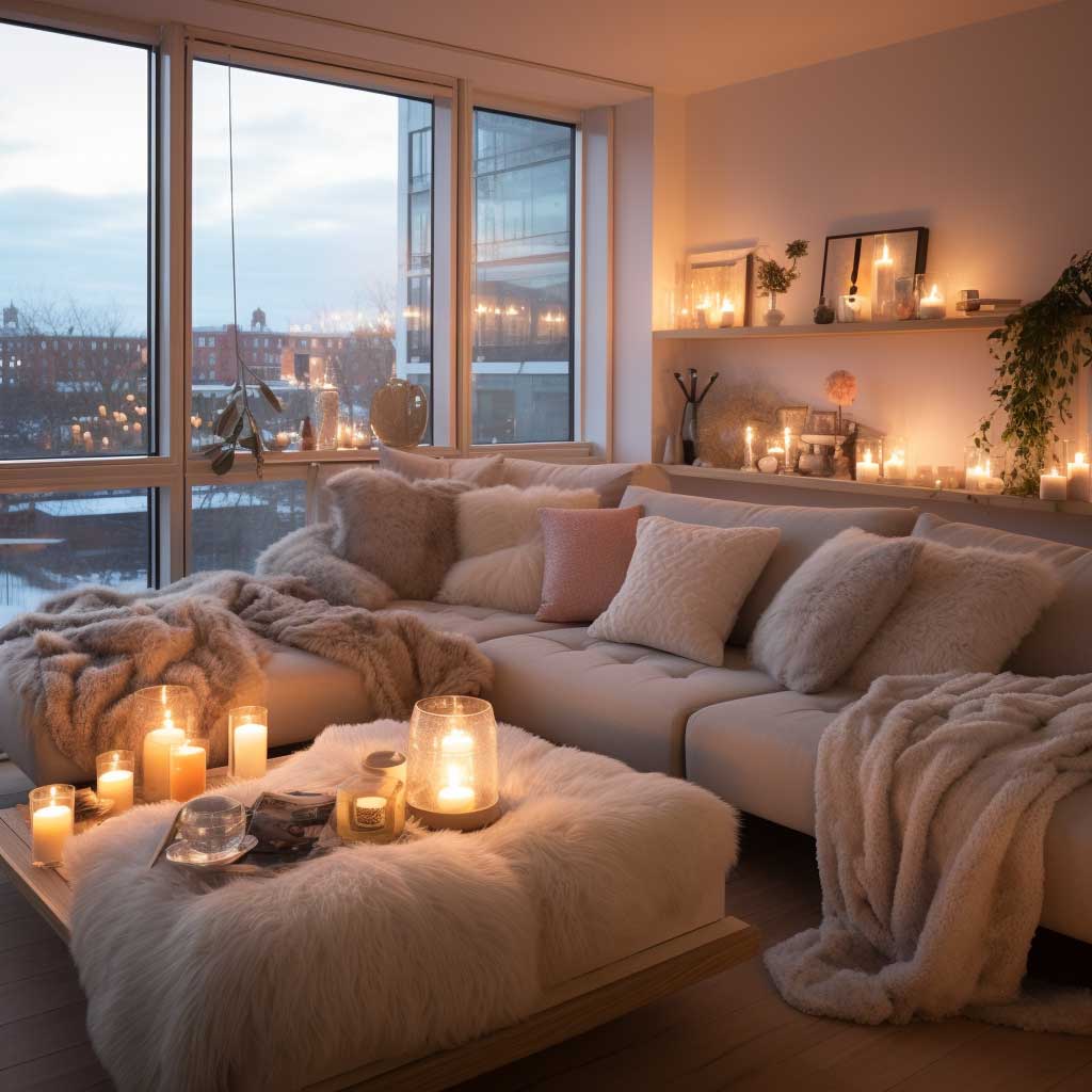
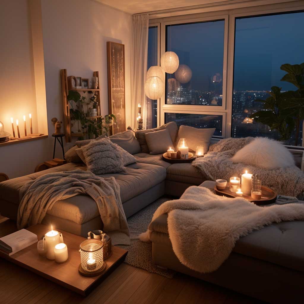
Texture is the shortcut nobody uses correctly. I own two of these — the IKEA Sanela velvet cushion covers at $18 each and the Pottery Barn cable-knit throw at around $89 — and together they do more for a warm cozy living room than a full furniture refresh. Velvet’s nap catches light differently at every angle, creating a soft visual shimmer that reads as warmth even before you touch it. Pile a velvet sofa with a mix of smooth silk, nubby wool, and matte linen cushions and you’ve got a tactile story the room tells on its own.
The chunky-knit throw is a cliché for a reason. It works. But you need to hang it deliberately — draped over one armrest in a specific asymmetric fall, not folded in a square on the seat. That square fold is what makes living rooms look like a furniture showroom at 2 p.m. on a Tuesday. Does that sound specific? It is, and it matters. A wicker basket on the floor holding two rolled throws adds the same warmth with zero staging effort.
Lighting below eye level is the non-negotiable. Overhead lighting — even a dimmed pendant — still hits the room from above and flattens texture. Table lamps and floor lamps positioned at seated eye level (around 48–52 inches to the bulb) create pools of warm light that make every texture pop. I’ve bought three different floor lamps for the same corner of my living room before landing on the right scale: too short and the light disappears into the sofa; too tall and it reads as a task lamp, not atmosphere.
Candles, real or LED, do something electrical light can’t. The flicker creates micro-movement in the room, which the eye reads as life and warmth. Flameless LED candles from brands like Luminara (around $30–$60 each) are indistinguishable from real flame at three feet and don’t require you to remember to blow them out. Group three pillar candles at different heights on a tray — this is the move I stole from every boutique hotel I’ve ever admired.
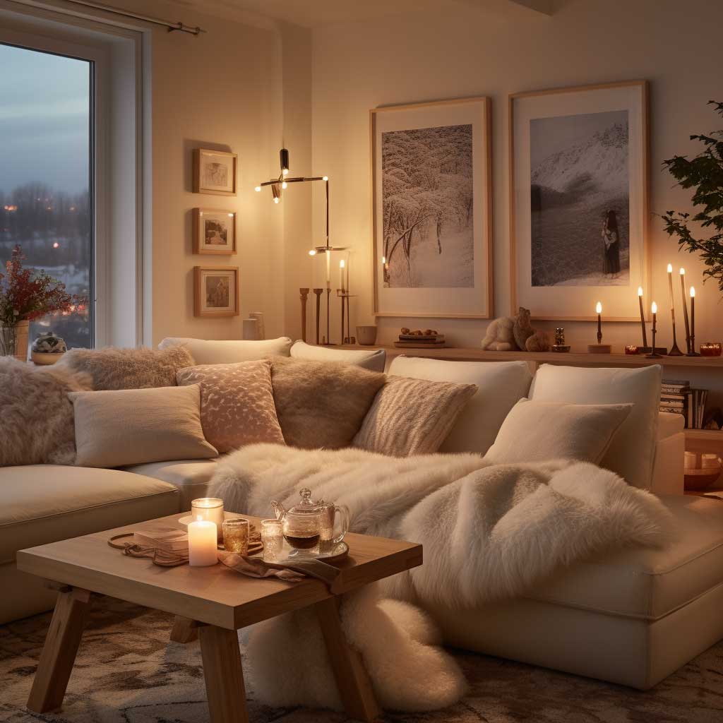
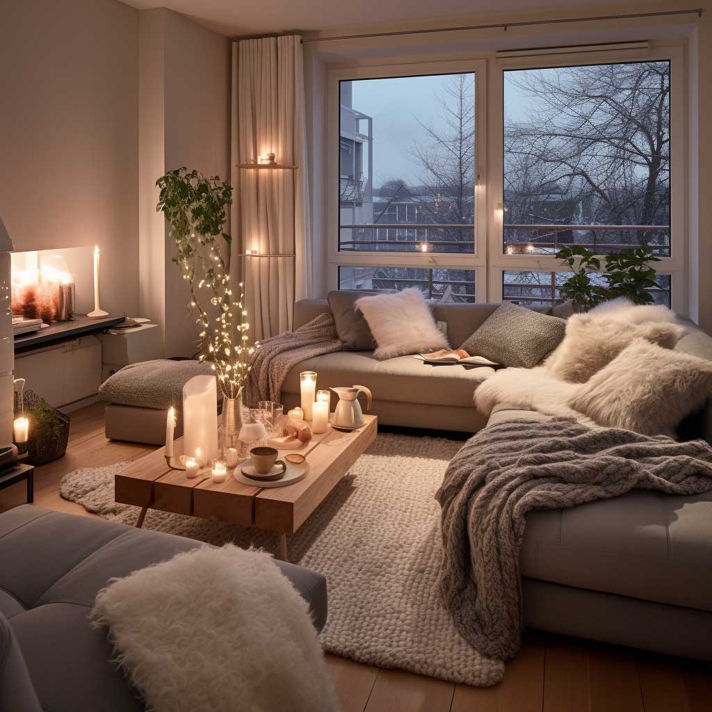
Color in this section answers the same question textures raise: are you warm or cold? Earth tones — brick red, camel, burnt orange, dusty sage — reinforce everything the fabrics are doing. You don’t need all of them. Pick one dominant warm hue and let the others appear as 10% accents. Avoid the mistake of centering the palette on terracotta walls plus terracotta cushions plus terracotta throw — all one tone with no contrast reads as exhausting rather than cozy. Cream is your relief valve. Use it liberally.
Furniture in this section earns its place by being comfortable first. A sofa that looks right but feels like a park bench is an enemy of the warm cozy living room. The cozy minimalist approach proves this: fewer pieces with deeper cushions and softer upholstery beats a room full of aesthetically correct furniture you don’t want to sit in. You need deep seat depth — 22 to 24 inches — and cushions that don’t pop back immediately when you stand up.
Terracotta to Mocha — How Warm Tones Actually Function as a Color System


Warm tones aren’t a vibe — they’re a system. Terracotta, amber, rich caramel, and mocha all share the same undertone family (red-orange-yellow), which means they talk to each other even when they don’t match. That’s why you can layer a terracotta wall against a caramel leather sofa against an amber-toned rug and the room reads as intentional rather than accidental. I’ve bought every version of Benjamin Moore’s “Pale Oak” and “Spice” line hunting for the specific depth I wanted, and the answer was always to start with the rug, not the wall.
Warm living rooms fail when the palette skips balance. You need the cool counterweight — a cream, greige, or soft white — to prevent the space from feeling like you’re inside a pumpkin. The ratio I keep coming back to is 60% warm tones, 30% neutral, 10% contrast (usually a deep charcoal or forest green). Neutral doesn’t mean boring. Cream linen drapes at floor length do more for a warm living room than any accent pillow you’ve ever bought at HomeGoods.
What is the actual difference between terracotta and burnt orange in practice? More than you’d think. Terracotta reads dusty and matte — it absorbs light and makes walls feel like they’ve been there for decades. Burnt orange reads saturated and energetic — it bounces light and works in rooms with strong natural sun exposure. Get them switched and the whole room goes wrong. My go-to for terracotta is Farrow & Ball “Red Earth” No.64 at around $120 per gallon; for something closer to amber, Sherwin-Williams “Spiced Cider” SW6340 at $75 per gallon.
Plants are the variable most people underuse in a warm color scheme. A fiddle leaf fig or a large monstera in a matte terracotta pot brings in the one color that cools a warm palette without disrupting it — forest green. The green contrasts beautifully against amber and caramel without reading as cold or clinical. Avoid shiny plastic pots here; the reflective surface fights the matte warmth of every other material in the room and looks exactly as wrong as it sounds.


Lighting amplifies warm tones in ways daylight and overhead fixtures can’t replicate. Soft, diffused table lamps bring out the richness of amber and caramel; harsh recessed lighting bleaches them into beige. Choosing bulbs at 2700K color temperature is the single most impactful $15 swap you can make in any warm interior. During the day, natural light bouncing off warm walls creates a different room every hour — I find mid-morning light hits terracotta best, turning it a shade richer than it looks in a paint chip. For inspiration on how peach and cinnamon warm palettes translate across room types, the approach scales predictably from living rooms into kitchens and bedrooms without losing coherence.
The current furniture trend data from Houzz confirms that warm neutrals and natural materials have remained dominant across living room design for several consecutive seasons — not because they’re trendy, but because they genuinely create rooms people want to stay in. That’s the cleanest definition of warm cozy living room decor I’ve found anywhere.
Warm Living Room
Earthy tones, layered textures, and light below eye level — that’s the whole formula.
Forget the big renovation. The rooms that actually feel warm usually just have better lighting decisions and one more textile layer than you’d expect.
Start with the rug. Add the lamp. Then fix the wall color last — not first.
Save this post before you repaint anything.
Related Topics