The exterior of your home is the first impression it makes, so it’s essential to get it right. Using color and texture in your exterior paint design can significantly enhance your home’s curb appeal, making it stand out in the neighborhood. This guide will walk you through the process of using color and texture to create an attractive, inviting exterior for your home.
Balancing Colors in Exterior Paint Design


Creating a home spray finish is both easy and hard to get right. There is an amazing number of colors to choose from in choosing the correct color for your home apinting project.
There are several things to consider when deciding how to balance colors in your exterior paint design.
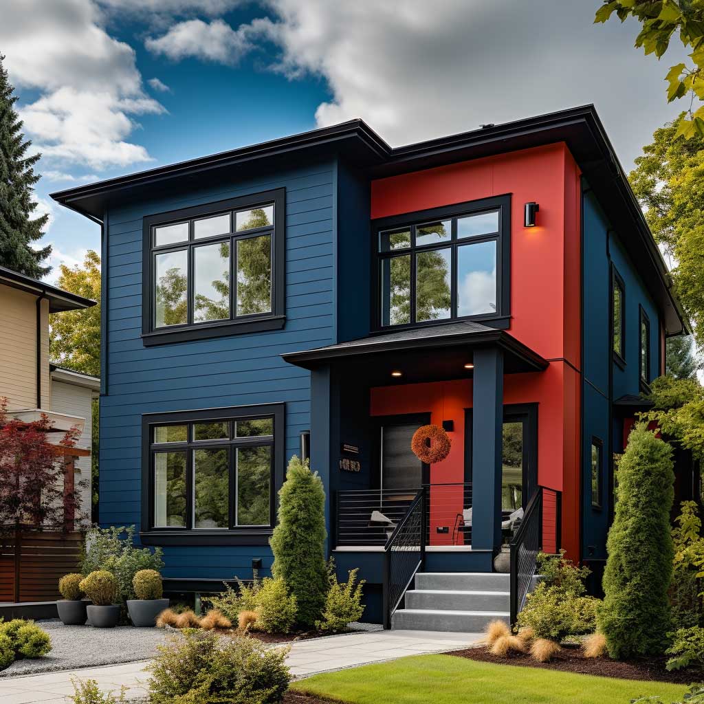
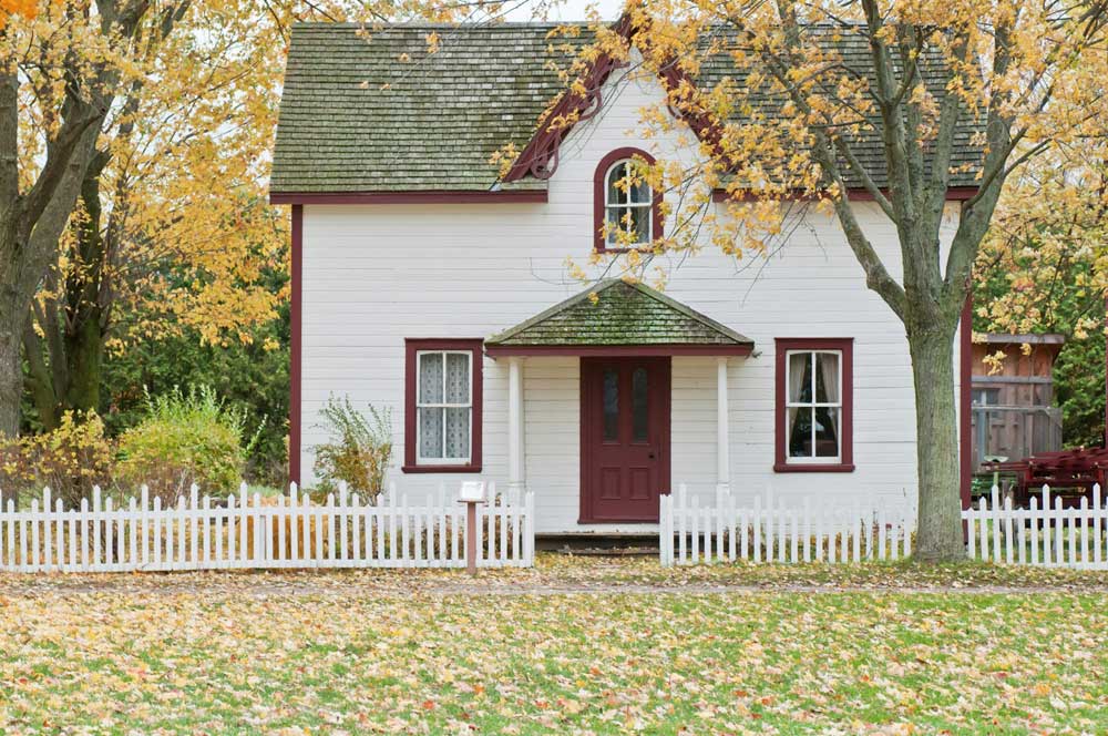
First, consider your home’s architectural style and time period. Different architectural styles naturally suggest certain color schemes: earth tones for a craftman style home, bright and bold colors for mid-century modern designs. When planning the how with exterior painting, you should keep this principle in mind. Nevertheless, it is essential that you research your house’s architectural style and typical color schemes of the period when planning exterior paint designs (see “How Earth Tones” sidebar). If you have a natural setting, you may want to choose colors that match itstopography: greens, browns and other earthy tones.
If your home is in an urban environment, however, brighter colors might be appropriate for exterior painting of your house.
When choosing colors, keep in mind the size of your home. Light colors can make a house look bigger; dark colors can give the impression that it is smaller and more substantial. This is an important contributing factor to the overall design of your exterior paint scheme.
Finally, decide before you start which parts of your home can’t be changed– such as the color of the roof, bricks or stonework. These should determine your selection of colors and ensure that they are compatible with each other.
Utilizing Texture in Exterior Paint Design
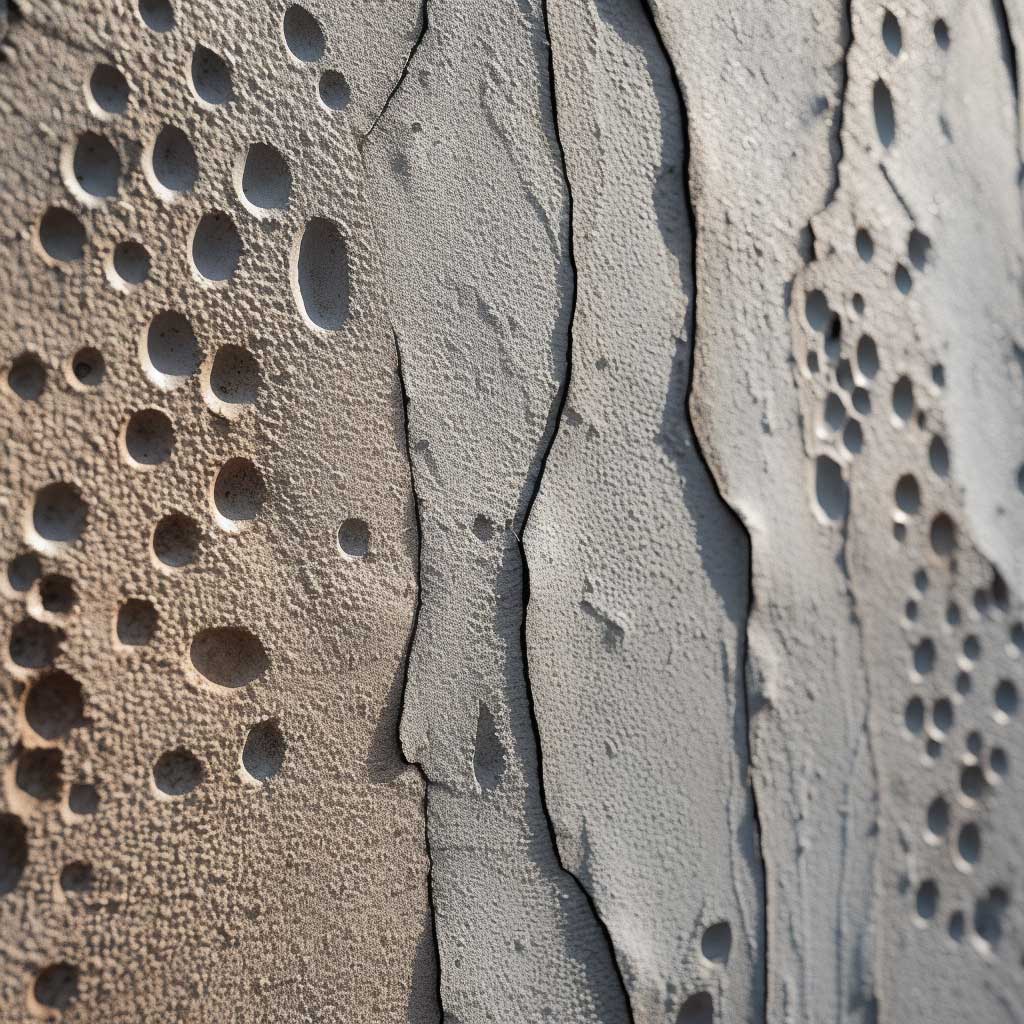
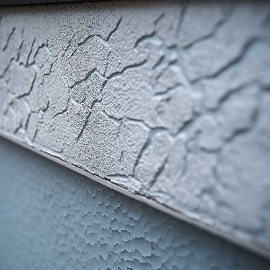
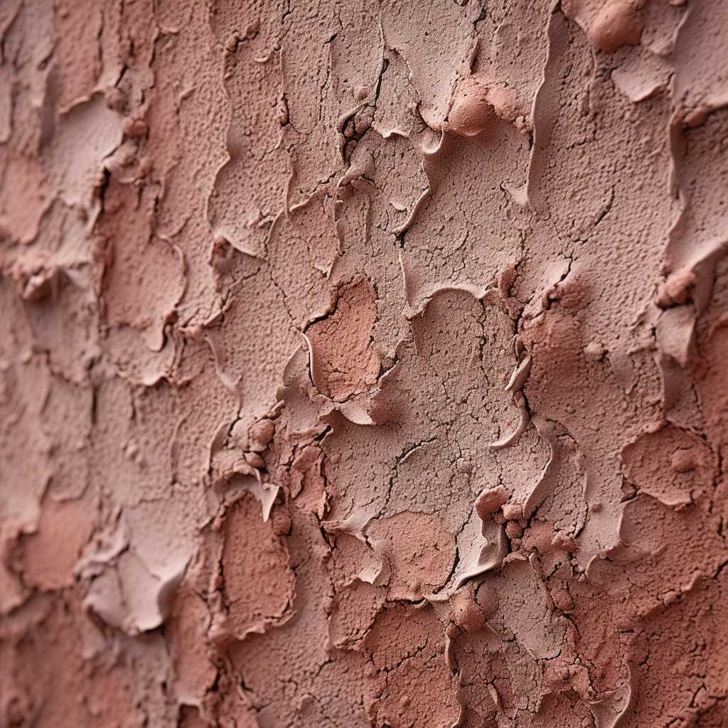

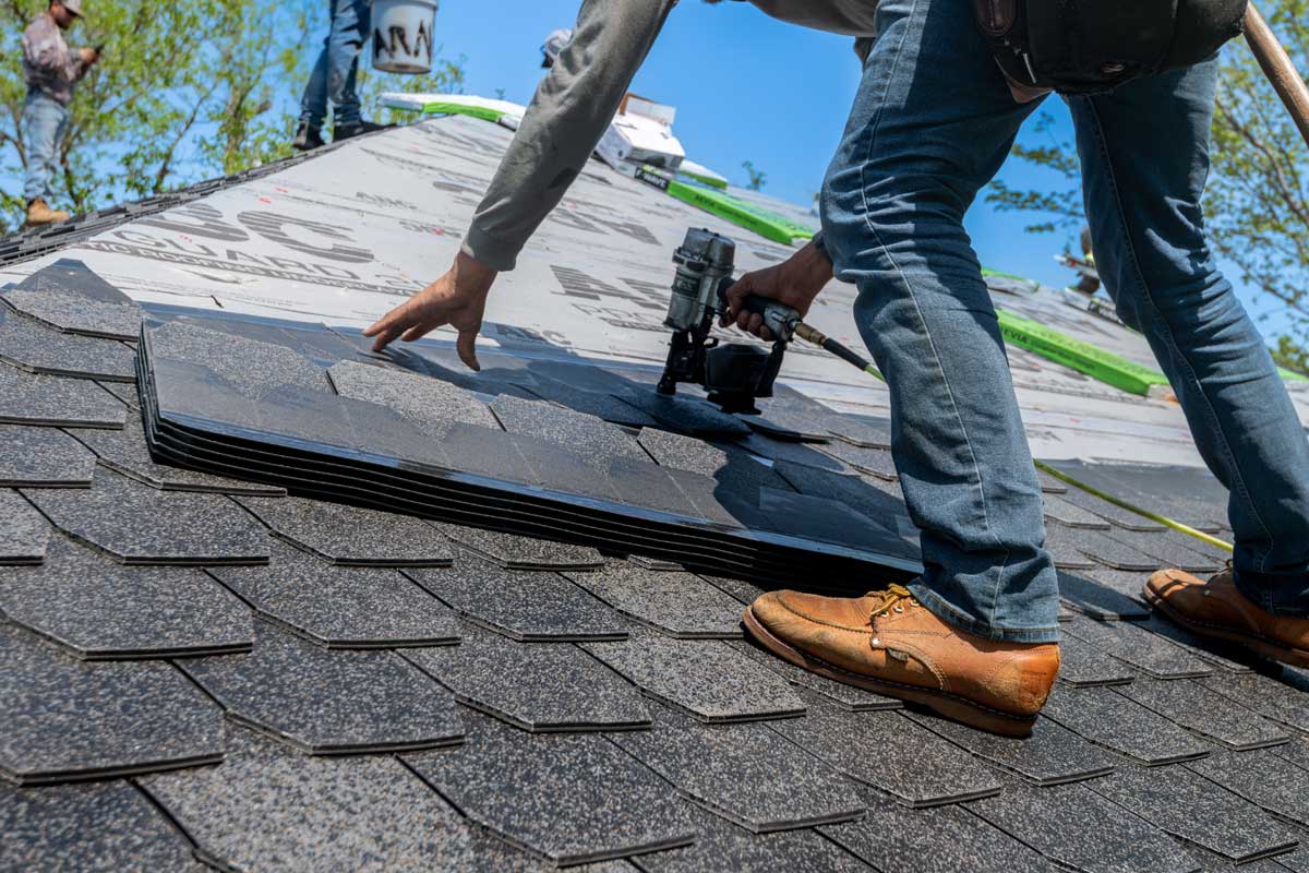
Texture is a must – have element in what works best for exterior painting. Texture in an exterior paint design can add depth, interest, and personality to a home
There are many ways to bring texture into your exterior paint design. One way is to use textured paint, such as sand texture paint, popcorn texture paint or knockdown texture paint. The paint will give your home a pleasant texture and an interesting surface to look at from a distance.
Another way is to use different paint sheens. Gloss paint mixed with flat and semi-gloss can produce low-key, subtle layers of texture that enrich your exterior paint design: A trimwork of gloss or semi-gloss paint will stand out against siding painted flat.
Items to consider for this aspect of the exterior paint design are the natural textures of your home. Each building material has its own texture: brick is rough, stucco is smooth, wooden shingles and lap siding are all surfaces from the forest. According to what you want, reinforce these textures or play them down by paint application.
Combining Color and Texture for a Unique Exterior Paint Design


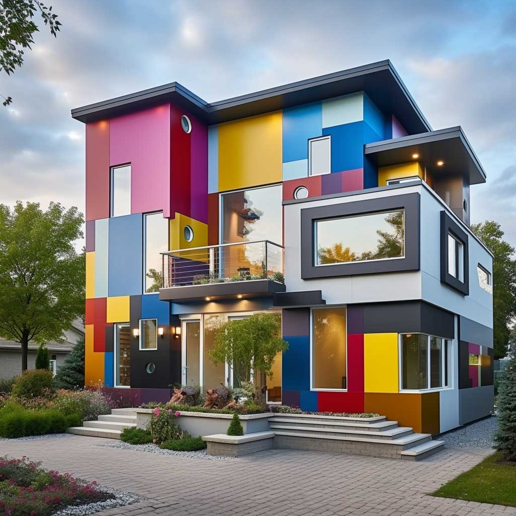
When it comes to creating a unique exterior paint design, combining color and texture can have a powerful impact. Together, these two elements can express your personal style, enhance your home’s architectural features, and increase its curb appeal in bold and imaginative ways.
Rather than playing it safe with predictable hues, consider clashing tones and textures that collide in stimulating contrast. A rough-hewn crimson siding paired with a slick onyx trim, for example, would cause eyes to linger and prompt questions. The friction could make even mundane designs mystifying.
Alternatively, subtly blending related shades and finishes ensures a home’s facade flows harmoniously. Gradual tints of teal distressed wood and sea foam-colored panels, for instance, may soothe with their smooth coherence. Subtle complexity replaces abrupt contrast.
With colors and tactile surfaces, you shape a narrative visible to all who pass. Will it be a story that startles or a tale that comforts? How boldly will you express yourself through walls normally seen merely as barriers? There are no wrong answers—only degrees of daring. Take risks and let imagination, not rules, guide your vision.
Whether opting for attention or anonymity, consider texture alongside hue. One lends depth; together, they transform a house into a canvas on which personality shines through. Intricately designing with these tools ensures onlookers see not just your walls but a window into your world.

Related Topics