Color in architecture affects not only the appearance of the object, and the environment, but also primarily how the room and the architectural space are perceived by man. This is proven by research. The color palette of the interior and facade of the building affects mood, psychological state, emotions, and feelings.
COLOR IN MODERN ARCHITECTURE & DESIGN
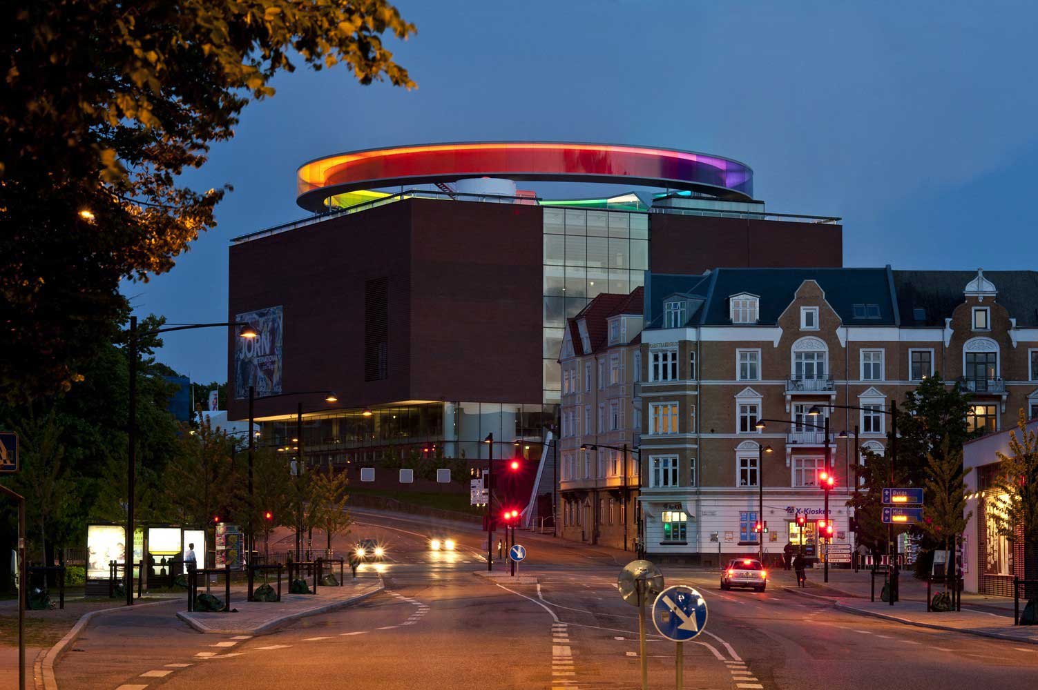
Some colors help to relax and calm down, others help to concentrate, activate brain activity, and others help to improve mood and increase appetite. Consider the popular colors in architecture and interior design – their impact on the human condition.


The red color in architecture
The red color in architecture and design has an exciting effect. It helps to stay active and energetic. Saturated red in large quantities can cause excitement and anxiety. Sometimes it is associated with fear and danger, but at the same time it awakens activity – in this regard, it is not suitable for everyone. People with an unstable psyche, and impressionable personalities should give up the red interior.

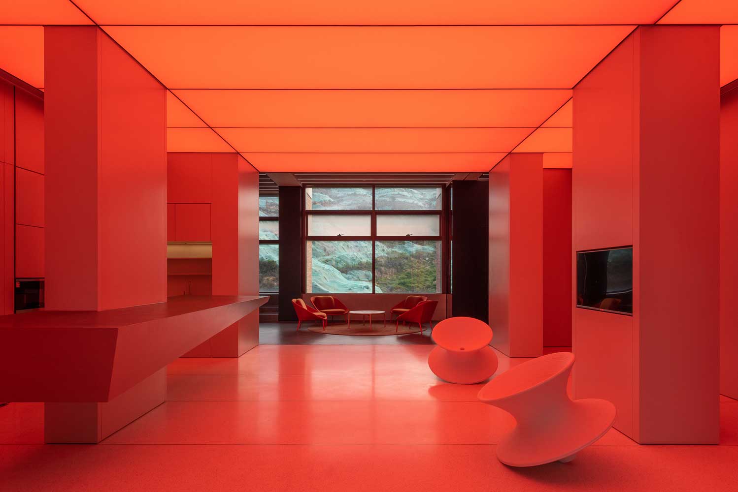
It is suitable for those who are full of vital energy and want to splash it out, create, act, are not afraid of difficulties, and are ready to go through difficulties to achieve their goals. The burgundy shade in architecture has a seductive effect, and light red – is more friendly and calm. Oversaturation with red can cause energy absorption and cause depression. Therefore, use it sparingly.


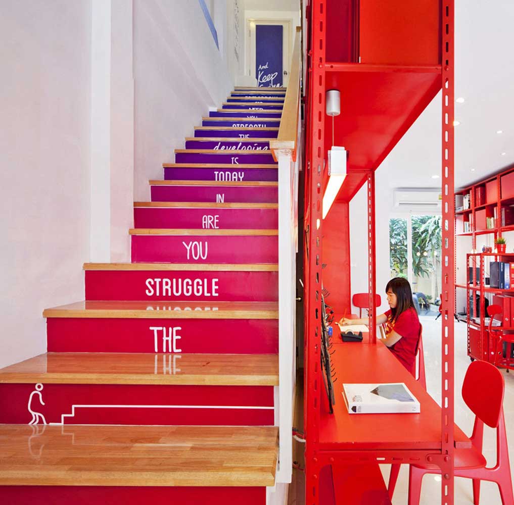

Orange color in architecture
The orange color in architecture and interior creates the effect of cheerfulness and awakens positive emotions. This setting is suitable for a fun pastime, and outdoor activities. In contrast to red, this color, on the contrary, relieves stress and tension.
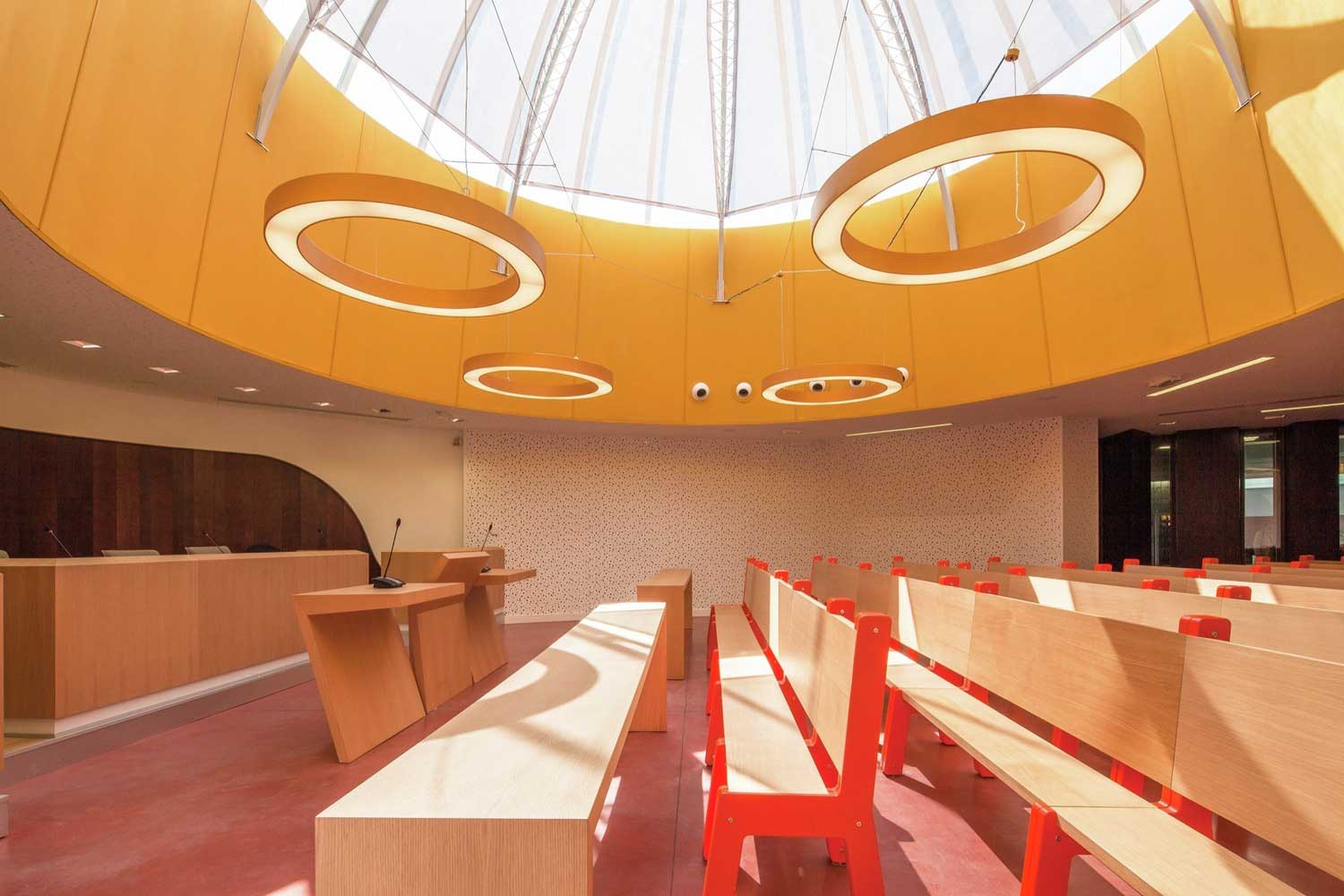
The orange interior has a positive effect on appetite. No wonder it is often used in catering establishments. In this regard, orange shades are suitable for the kitchen. For this color in architecture to have the right effect, and for the room, designed in it, to look bright and friendly, it should be well-lit. This is a pleasant color that does not cause aggression and does not burden the mind, so it can be used in children’s rooms.


Yellow color in architecture
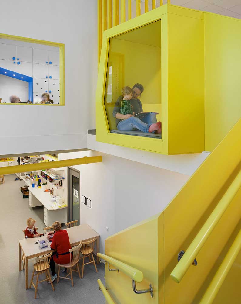
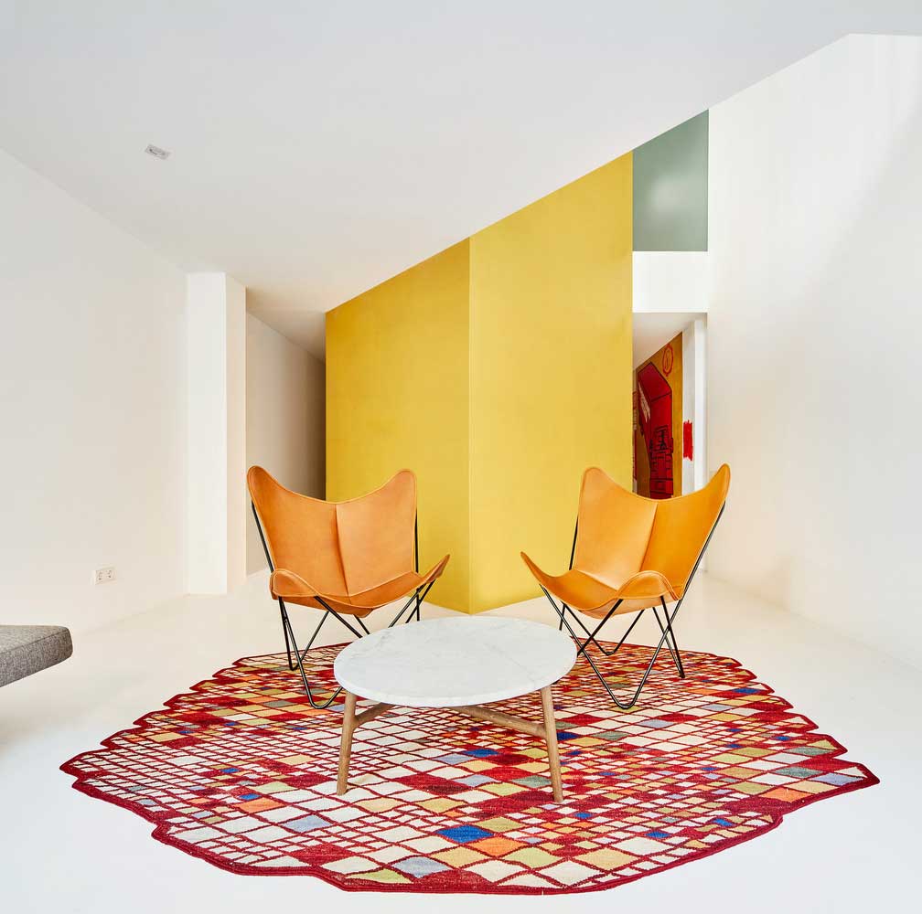
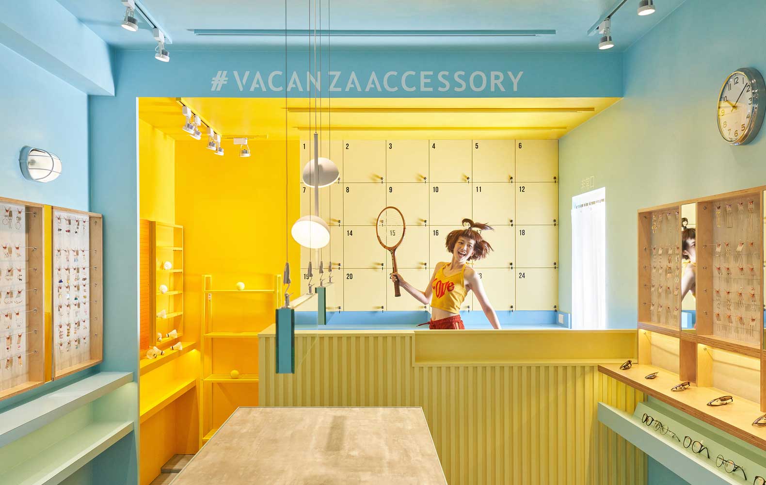
Yellow color in architecture and interior design carries positive, joyful emotions. It promotes fun, activity, and communication. Due to the light and at the same time bright design, the yellow color can be used for accents in architecture and interior. It helps to visually expand the space, and add an element of positivity.
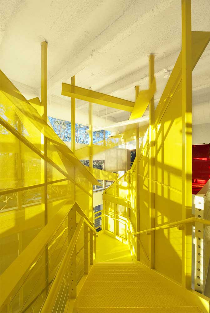
A glut of yellow can affect fatigue, so it should be used in moderation. It improves memory and has a positive effect on vision. When used on the facade, yellow will highlight the building among the gray mass. In the interior, it can be used everywhere – from the kitchen and living room to the children’s room. Yellow can become the main design or an additional accent shade for the interior.


The green color in architecture
The green color in architecture is an element of concentration and tranquility. It helps to balance the mental state, therefore it is especially relevant for impressionable people. This is one of the main colors in wildlife, therefore, subconsciously, it is symbolized by the absence of problems, comfort, and peace.

Green tones improve concentration and help to gather thoughts. This is a friendly color that also brings together, and has a positive effect on communication, establishing contact between people. Green should be used in rooms where you want to relax, relax or chat. It is suitable for living rooms, and bedrooms.

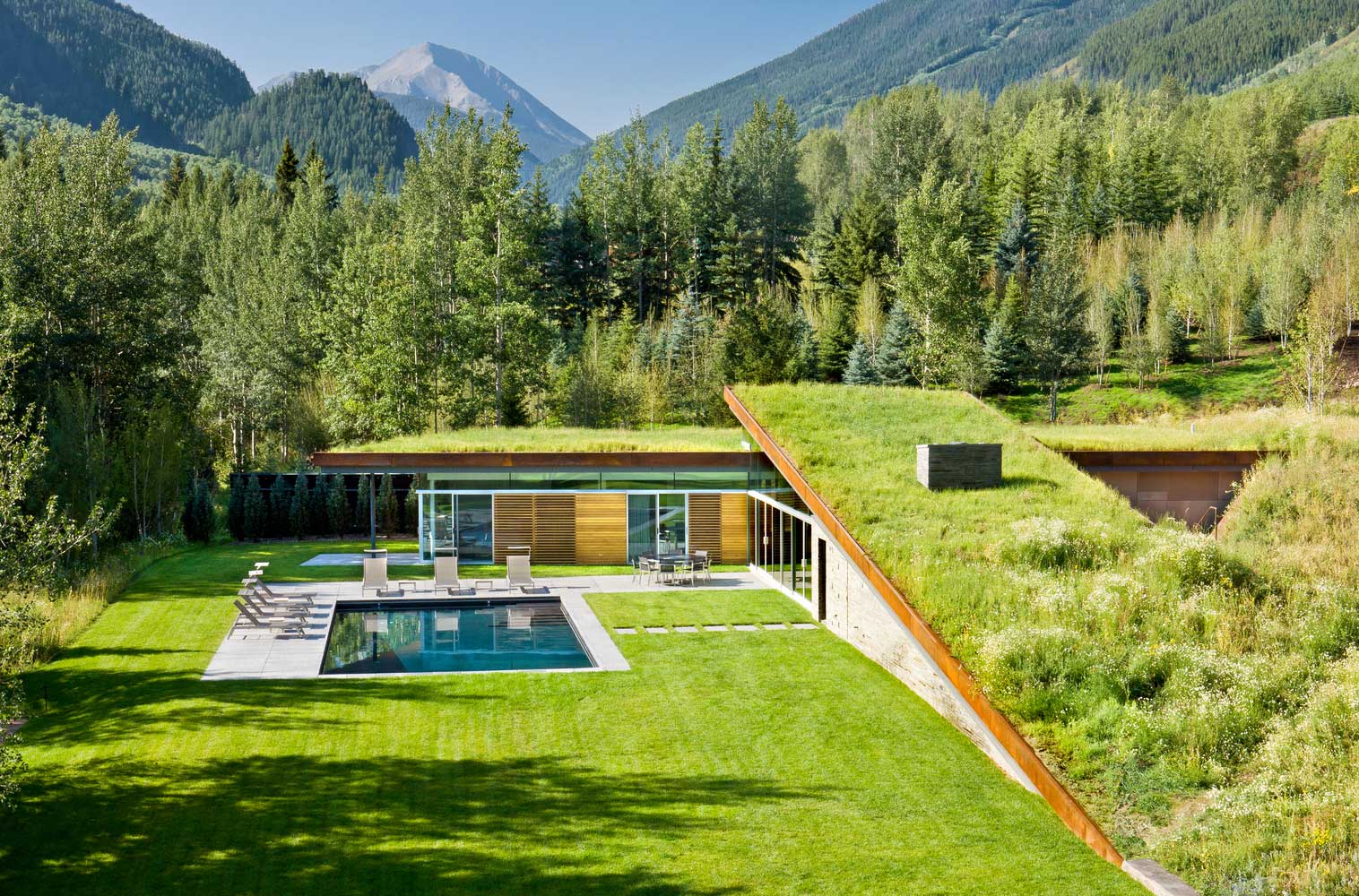
The use of green on facades and roofs emphasizes the reliability and safety of the building. As in the interior, in this context, it calms, concentrates, and relaxes.


The blue color in architecture
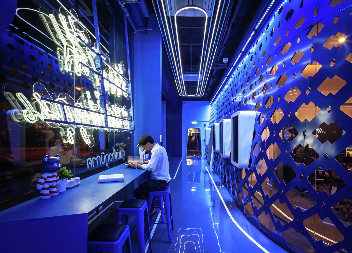
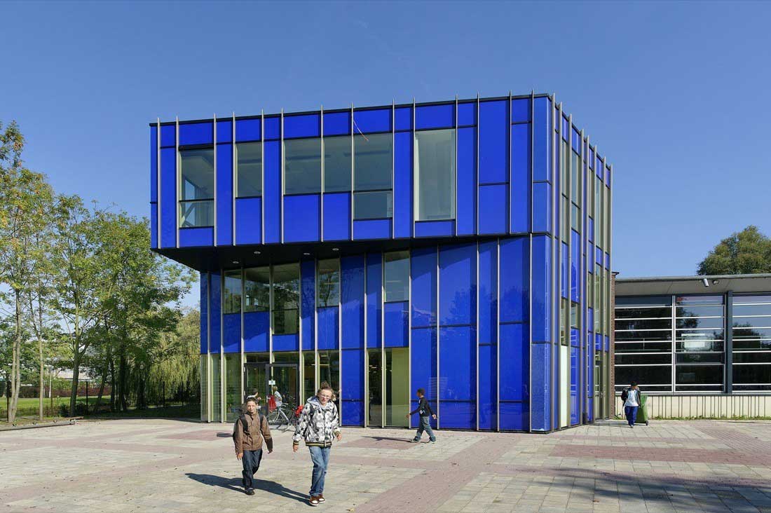
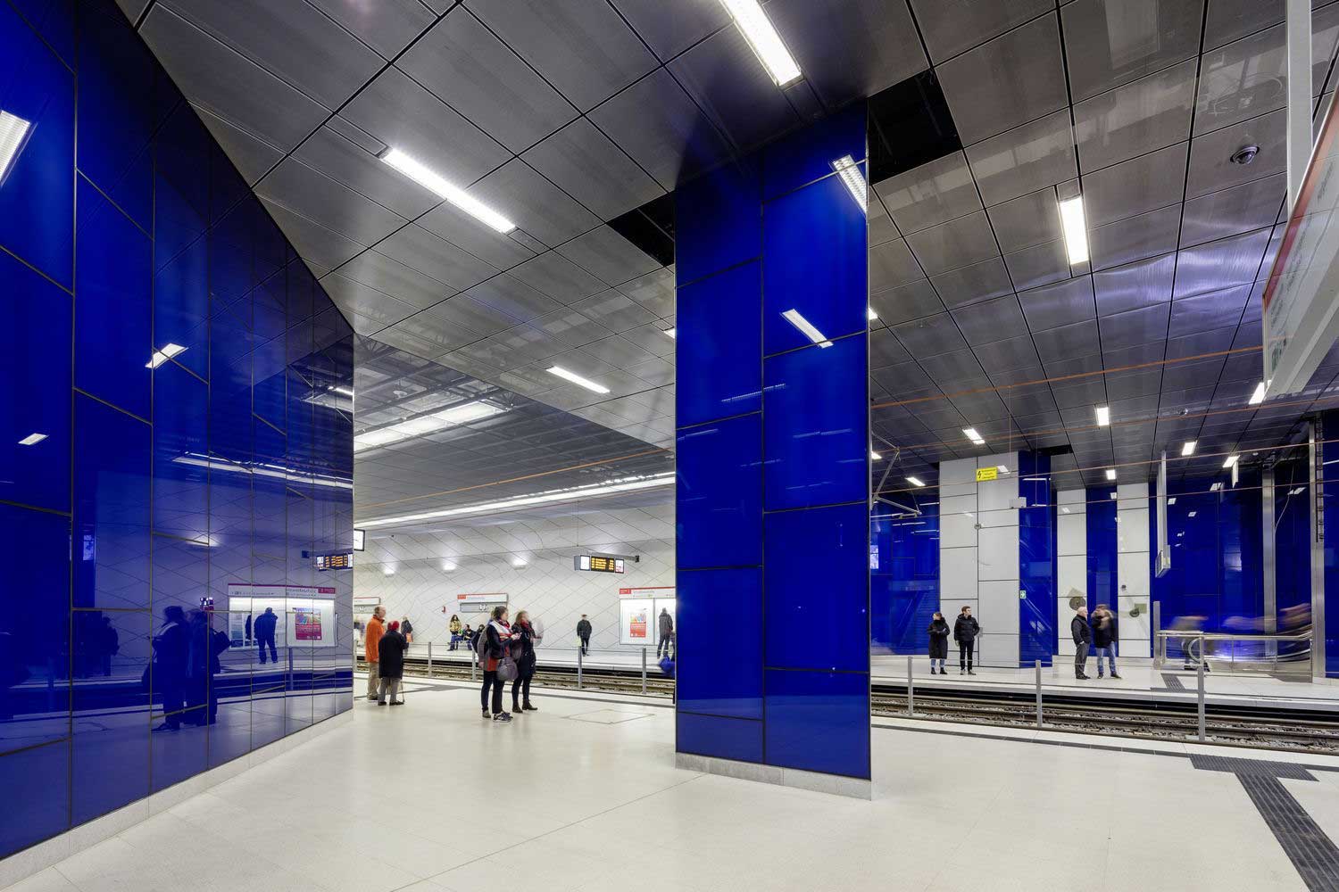
Cold blue shades are associated with reliability, safety, and comfort. Blue tone increases concentration and activates brain activity. Such an environment is suitable for study and creativity and awakens imagination and logical thinking.

Blue tones dull the appetite, so in the kitchen, they should be used only if you follow a diet for weight loss or do not want to gain excess weight. By activating mental activity, the blue color in the interior design soothes, and eliminates irritability and nervousness. Blue and blue shades remove stress and help to cope with self-control.
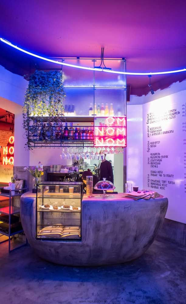
Purple color in architecture
Violet color in architecture and interior design is considered the most difficult, so it should be used in small quantities. With oversaturation, it is irritable, causes aggressive feelings, and anxiety, and can lead to depression. It is recommended to dilute the violet color with light tones, white, milky, beige, and green shades. Calm and neutral colors compensate for the severity of purple.
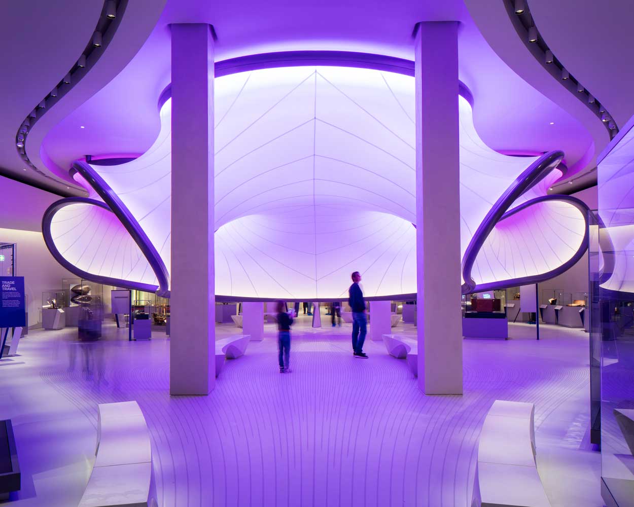
The main advantage of purple in the interior and architecture is its effectiveness and high cost. It helps to emphasize certain areas. With the right use of purple in architecture and interior, it will make the atmosphere rich, attractive, and vibrant.


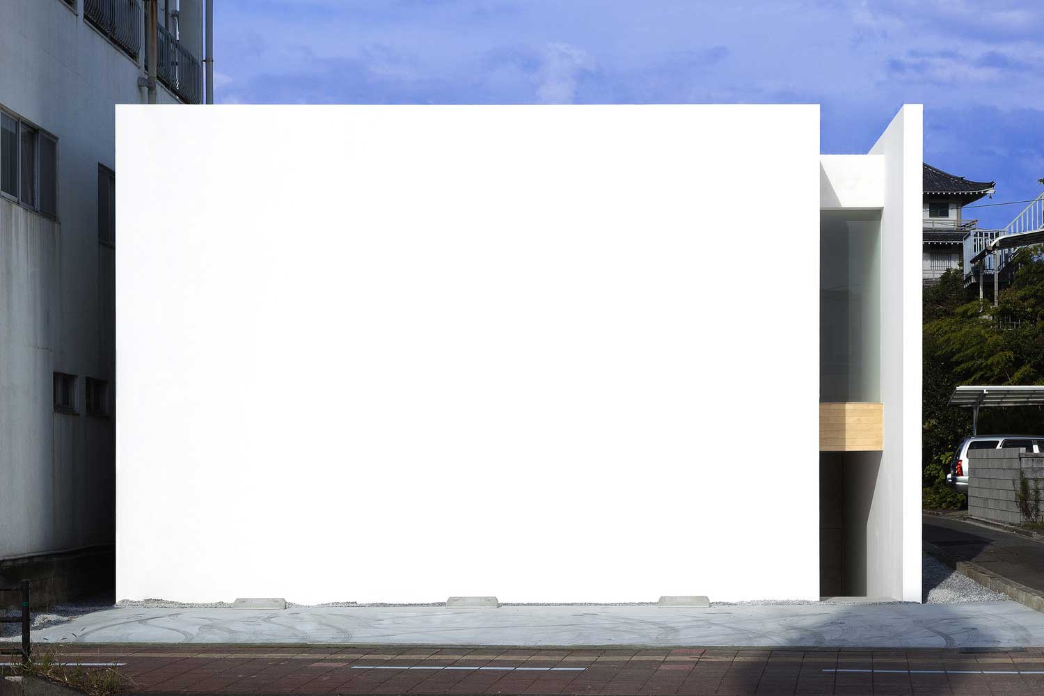
White color in architecture
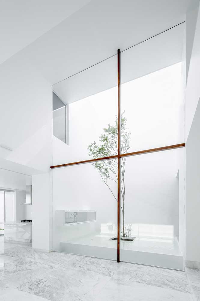
White color in architecture and decor brings lightness and lightness to the room and visually expands the space. To a greater extent, it is neutral and does not burden consciousness at all. In such an environment it is pleasant to relax, relax, positively affects the concentration of attention.
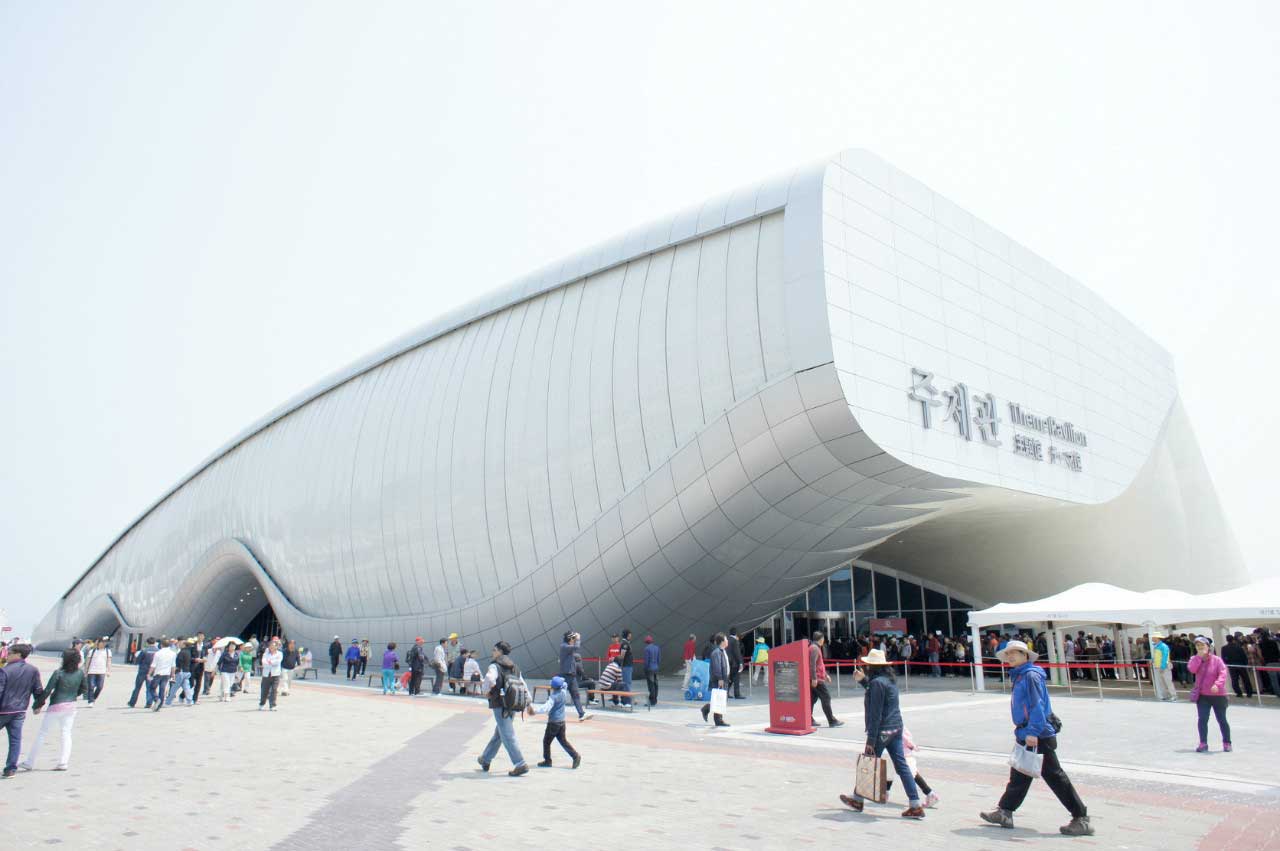
With high-quality lighting, the white color makes the room bright and pleasant for hanging out and perceiving. You don’t get tired of him. This is one of the most popular shades in the design of residential and non-residential spaces and facades. In many cases, and most fashionable, modern interior styles, it is used as a basis.


Black color in architecture
In contrast, dark tones became fashionable and widely used in modern architecture. This is a tool for creating accents in the interior and exterior of buildings – the choice of connoisseurs of trends. The black color itself is depressing, but with good decor and proper lighting of the space, highlighting the facade, combined with other tones, the effect of oppression disappears.
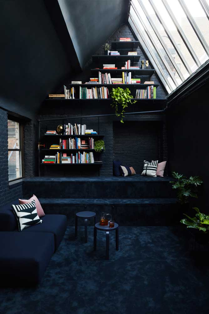
Black looks fashionable, prestigious, and expensive – it is symbolized by luxury and wealth. This color is suitable for calm, persistent people, and helps to concentrate on the right things. Black interiors contribute to the development of thinking. Looking at the use of this color in modern interiors, the stereotypical opinion of its morosity and depression can be considered erroneous.


Thus, color in architecture and interior design is one of the decisive components of the environment and atmosphere. Well-being, productivity, mood, and much more dependent on it. Therefore, when choosing a color palette for the environment, consider not only your preferences and tastes but also the effect that you will achieve using a specific palette.
Color accents in the architecture


