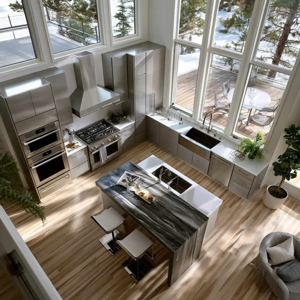
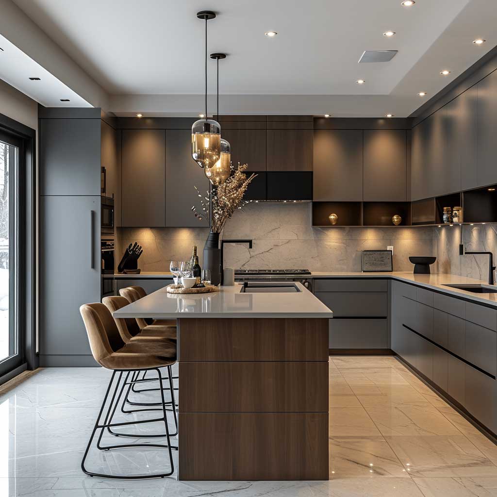
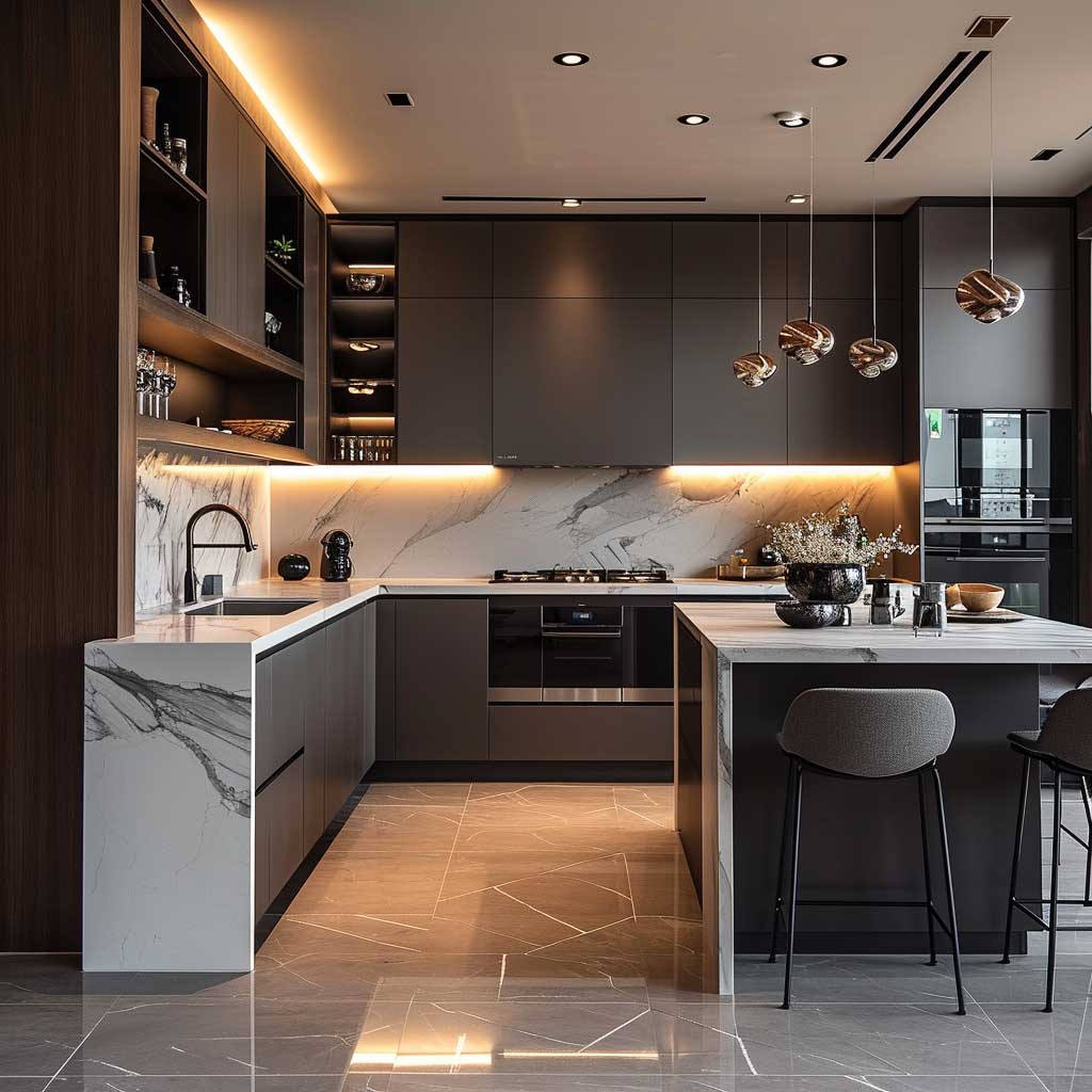
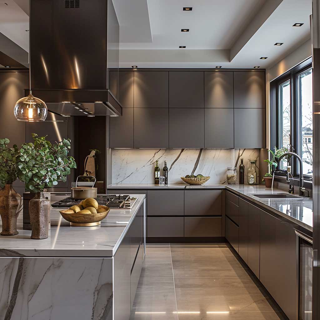
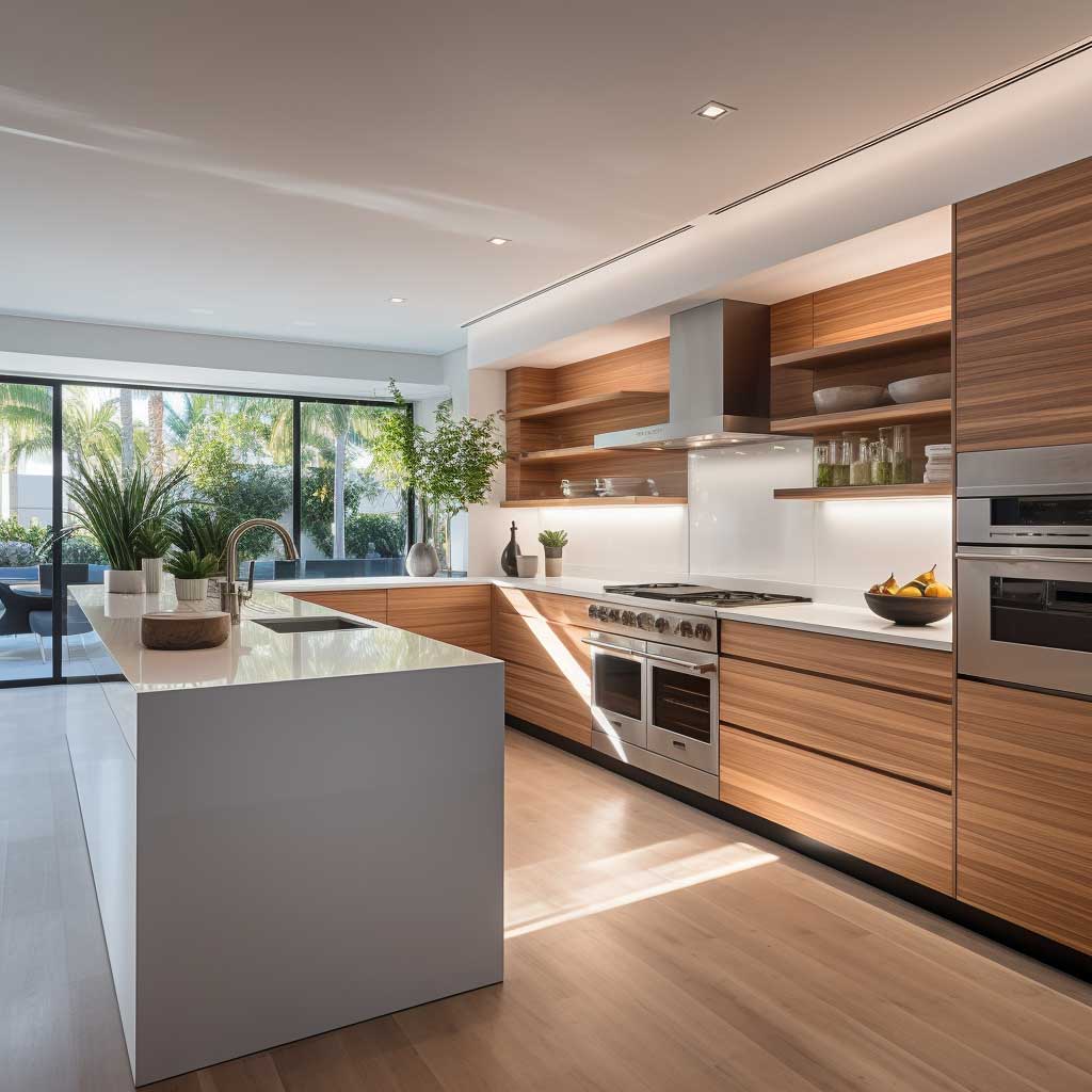
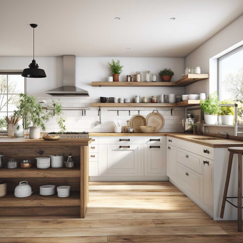
A contemporary u-shaped kitchen gives you more countertop real estate than almost any other layout — three full walls of prep space, with the sink, stove, and refrigerator arranged inside what designers call the work triangle. I’ve stood in enough poorly executed versions of this layout to know one uncomfortable truth: the shape alone doesn’t save you. The decisions made inside the shape do.
Most kitchens that fail the U-shape test get one of three things wrong — they fill every inch with upper cabinetry until the room feels like a vault, they skip the island entirely and leave the open end floating, or they choose a cabinet finish that fights the light source instead of working with it. Fix those three and you’re already ahead of 80% of the renovations I see on Pinterest.
Quick scan: what this article covers
- Why ergonomics inside a U-shape matter more than cabinet style
- How monochromatic palettes make the layout read larger
- Industrial vs. warm finishes — which one ages better
- The sleek-line approach and its one real weakness
- Open shelving: what actually stays on those shelves after six months
- Islands in U-shaped kitchens — when to add one and when to leave it out
Ergonomics Inside a Modern U-Shaped Kitchen Earn Their Keep

The U-shape works like a racetrack — every station loops back to the start without dead ends. Positioning the sink at the base of the U, flanked by the stove and refrigerator on either arm, cuts your movement by roughly 30% compared to an L-shaped kitchen. I tracked my own prep time over two weeks when we reconfigured my old galley into a U and the difference was embarrassing. You stop walking to the counter and start cooking at it.
Counter height matters more than people think. Standard 36-inch countertops suit someone around 5’6″. If you’re taller, go to 38 or even 40 inches on the prep zone — it saves your lower back on long cooking sessions. The baking station, if you have one, should actually drop to 32 or 34 inches; rolling dough at standard height is a posture disaster. IKEA’s SEKTION system lets you spec different heights per cabinet run, which is worth knowing.
Storage in a contemporary u-shaped kitchen should never require bending below your knees or stretching above your head for daily items. Pull-out drawers from brands like Häfele or Blum’s Legrabox line — roughly $180 to $340 per drawer unit — solve the corner cabinet problem that kills every traditional U-shape. Don’t rely on lazy Susans. I’ve owned two and lost a jar of tahini in each.
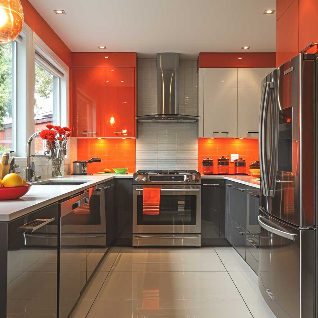

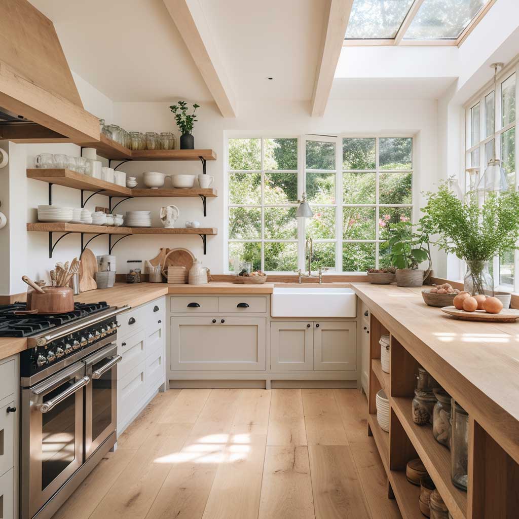
Cabinet color is a real ergonomic factor — not a styling one. Dark uppers in a narrow U-shape (less than 9 feet between walls) compress the ceiling visually and make the room feel like a tunnel. Lighter upper cabinets with a darker base is the move; it grounds the kitchen without closing it in. The mistake I see in renovation accounts constantly is installing floor-to-ceiling charcoal cabinetry in a kitchen that gets maybe two hours of direct light per day.
High-tech appliances earn their price tag in a U-layout. Samsung’s Bespoke refrigerator line ($2,499 and up) integrates flush with cabinetry, recovering the visual space that a protruding fridge typically steals. Miele’s induction cooktops with TempControl run around $3,200 but eliminate most of the guesswork on sauce temperatures. You don’t need both. Pick the appliance that corresponds to your actual cooking habit, not the wishlist version of it.
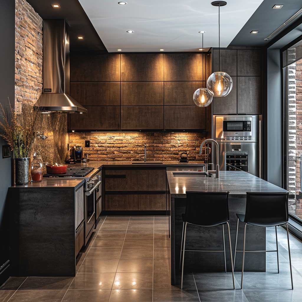
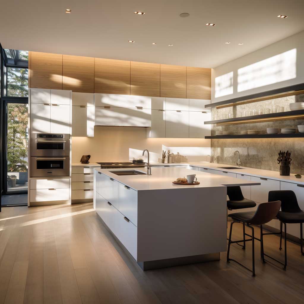
What a Monochromatic Palette Does to a U-Shaped Kitchen Nobody Tells You
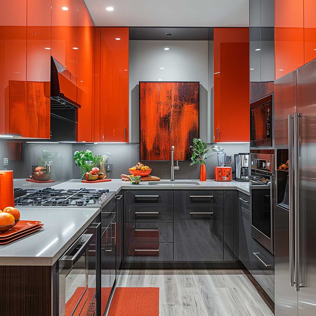
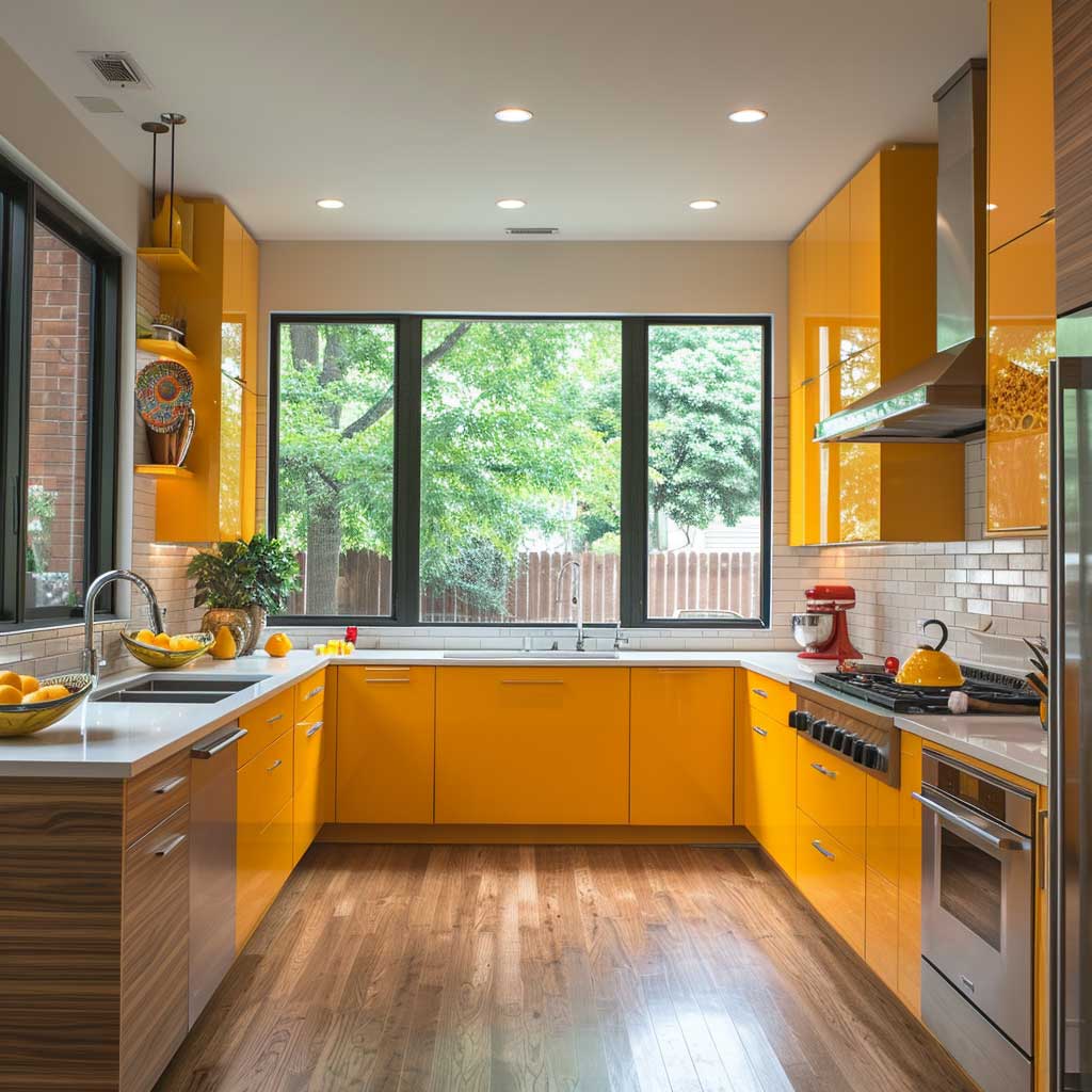
A monochromatic palette in a modern u-shaped kitchen acts like a depth-of-field trick in photography — it blurs the edges of the room so your eye reads volume instead of boundaries. Fog grey upper cabinets with a slightly warmer greige base, laid against a quartz countertop in the same tonal family: the room stops announcing its dimensions. My go-to is Farrow & Ball’s Purbeck Stone paired with their Lamp Room Gray. Not cheap, around $120 per gallon, but zero re-dos.
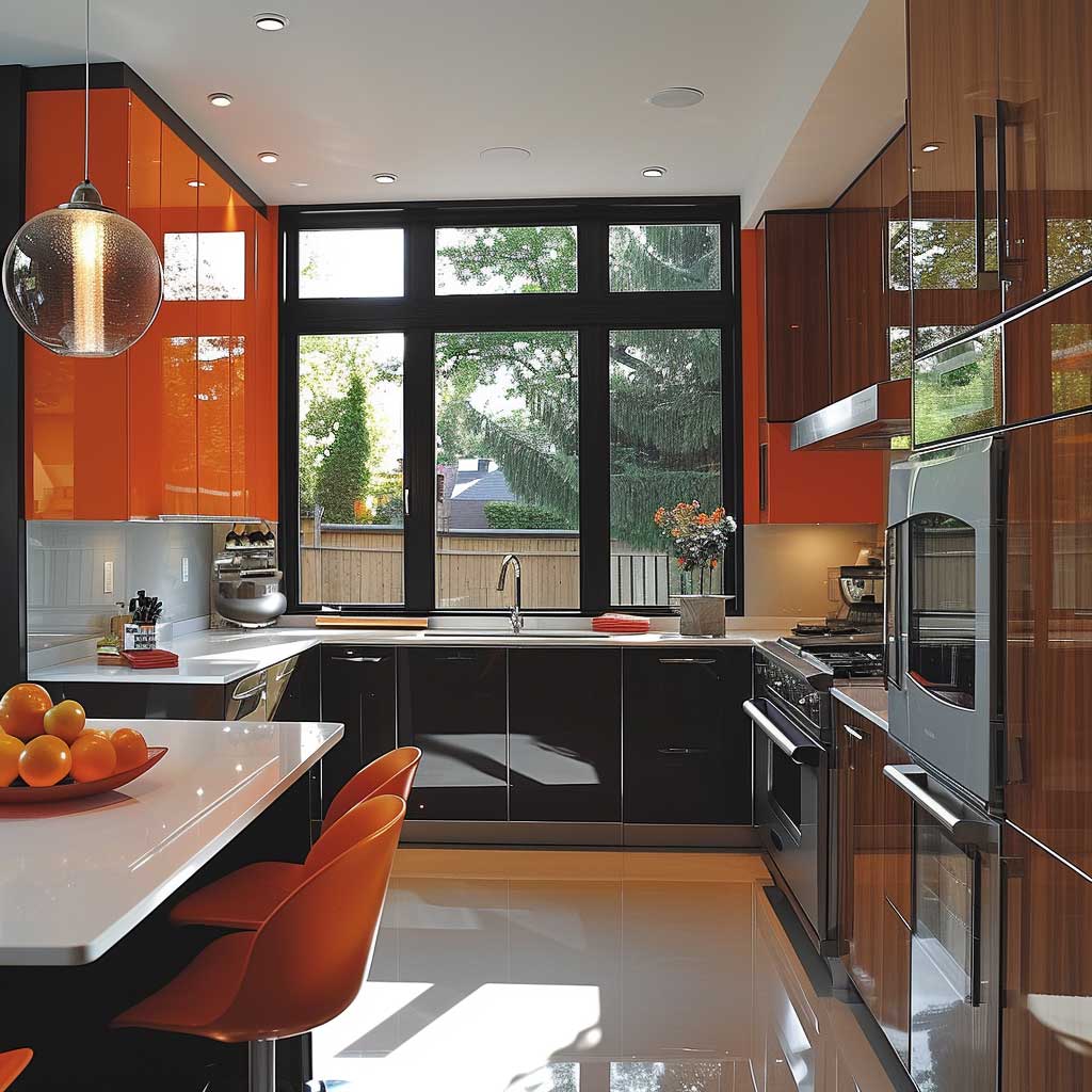
Sleek surfaces are not optional in this palette approach — they’re structural. High-gloss fronts on the upper cabinets bounce light back into the room, compensating for the lack of color contrast. Polished quartz from Caesarstone’s Statuario Nuvo line ($75–$110 per square foot installed) does the same on horizontal planes. Matte finishes work too but only in south-facing kitchens with generous natural light. In a north-facing room, matte reads flat and a little sad by 4pm in November.
Designer fixtures pull the monochrome scheme together without breaking it. Waterfall faucets in brushed nickel — Grohe’s Essence line runs $340 to $680 — read as sculpture against a tonal backdrop. Skip the chrome. Chrome belongs in bathrooms from 2008. Under a monochromatic palette, chrome introduces a coolness that fights the warmth you’re trying to build into the neutral tones.
Don’t Do This
Adding open shelving to a monochromatic U-shaped kitchen and then loading those shelves with colorful mismatched dishes. You’ve spent $800 on tonal cabinet paint and $400 on matching hardware, then you stack an orange Le Creuset next to a blue pasta bowl and a souvenir mug from Barcelona. The shelf becomes the only thing anyone sees. Either commit to a curated display (same ceramic family, same color story) or put doors on the shelves. Floating open shelving in a mono kitchen is a full-time job to maintain.
Cabinetry layout in the monochromatic kitchen rewards smart planning over decoration. You’ll want floor-to-ceiling tall units on one arm of the U — pantry pull-outs, oven column, refrigerator integration — and lower, more open runs on the other arm to let light travel. Symmetry feels safe but rarely photographs well. The kitchens you see on Dezeen and Architectural Digest that look “effortlessly clean” are almost always asymmetric in their cabinet heights. You notice the space, not the cabinets. That’s the point.
I borrowed this trick from a kitchen designer friend who charges $350 per hour: finish the inside face of upper cabinets in the same lacquer as the exterior. When a door is left open — which it always is — you see the same refined surface, not raw particleboard. Adds maybe 8% to your cabinet budget. Worth every cent, especially in kitchens where the island seating faces the upper run. Blue and neutral U-shaped kitchen palettes follow the same logic and are worth studying alongside monochromatic grey schemes.
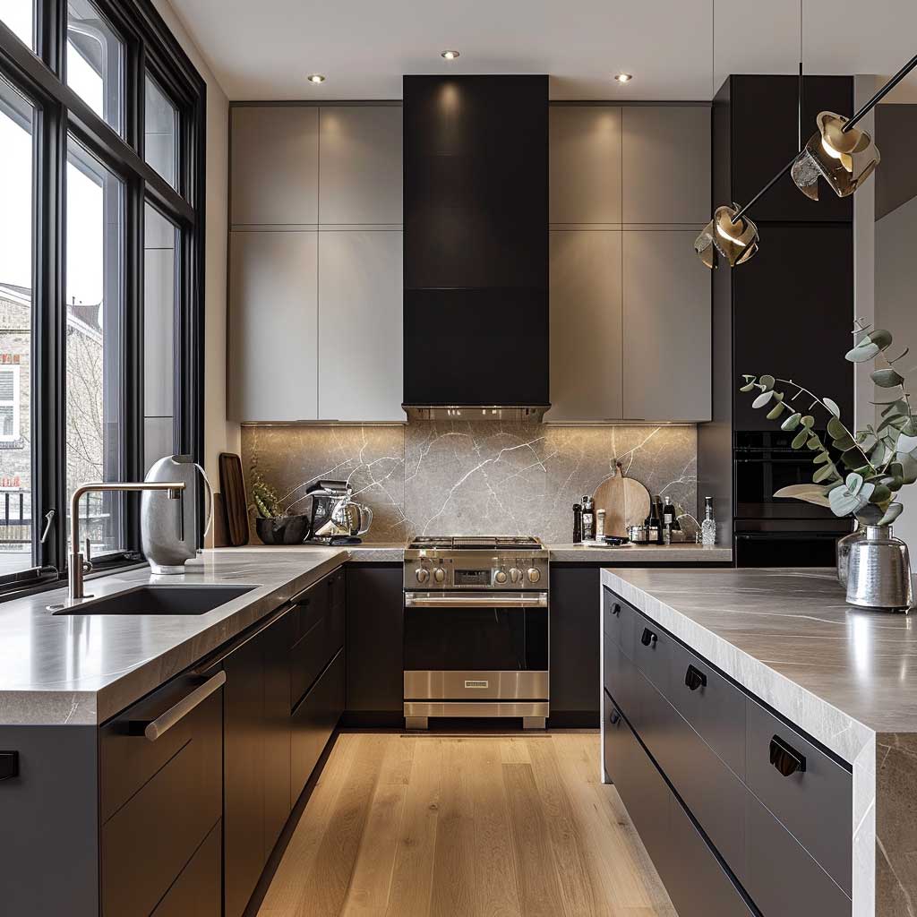
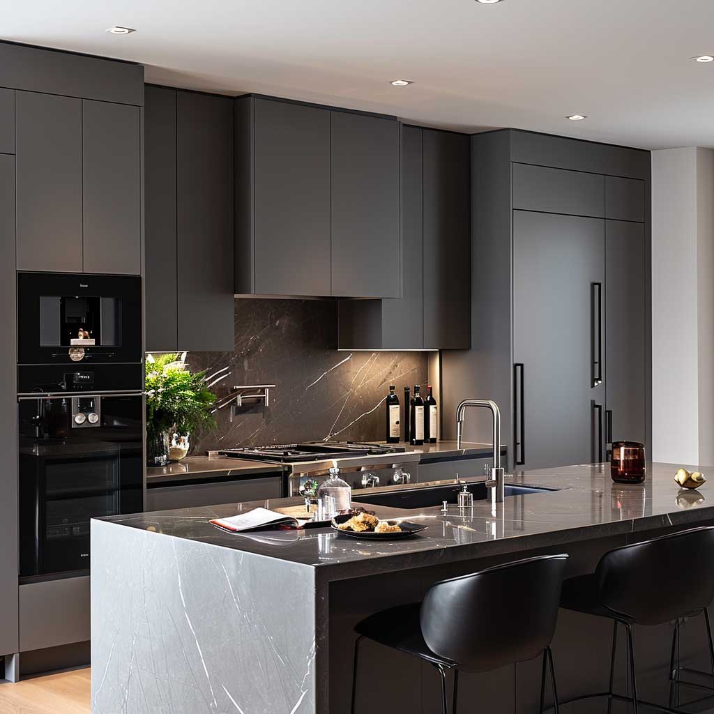
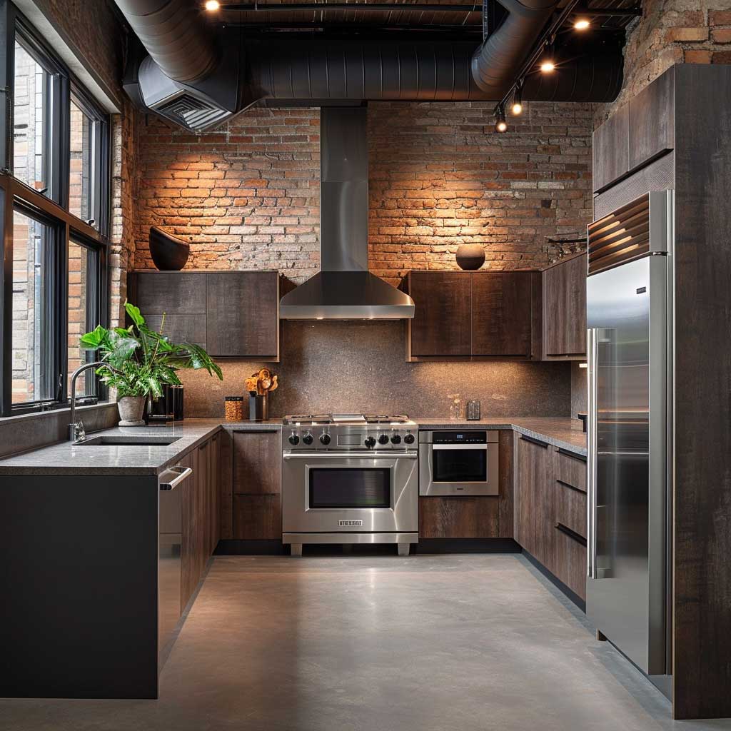
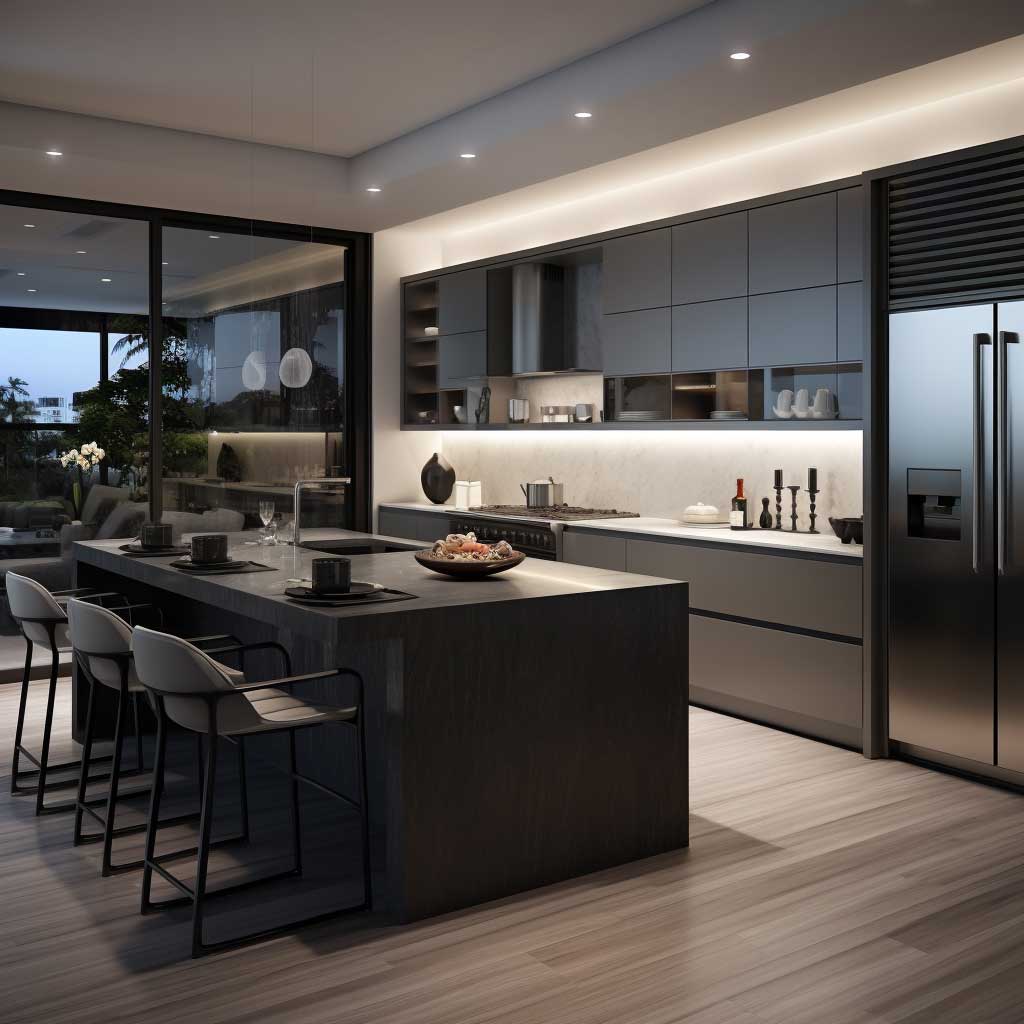
Industrial Finishes in U-Shaped Kitchens Age Differently Than You Expect

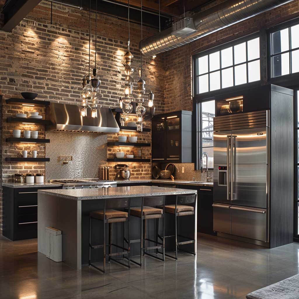
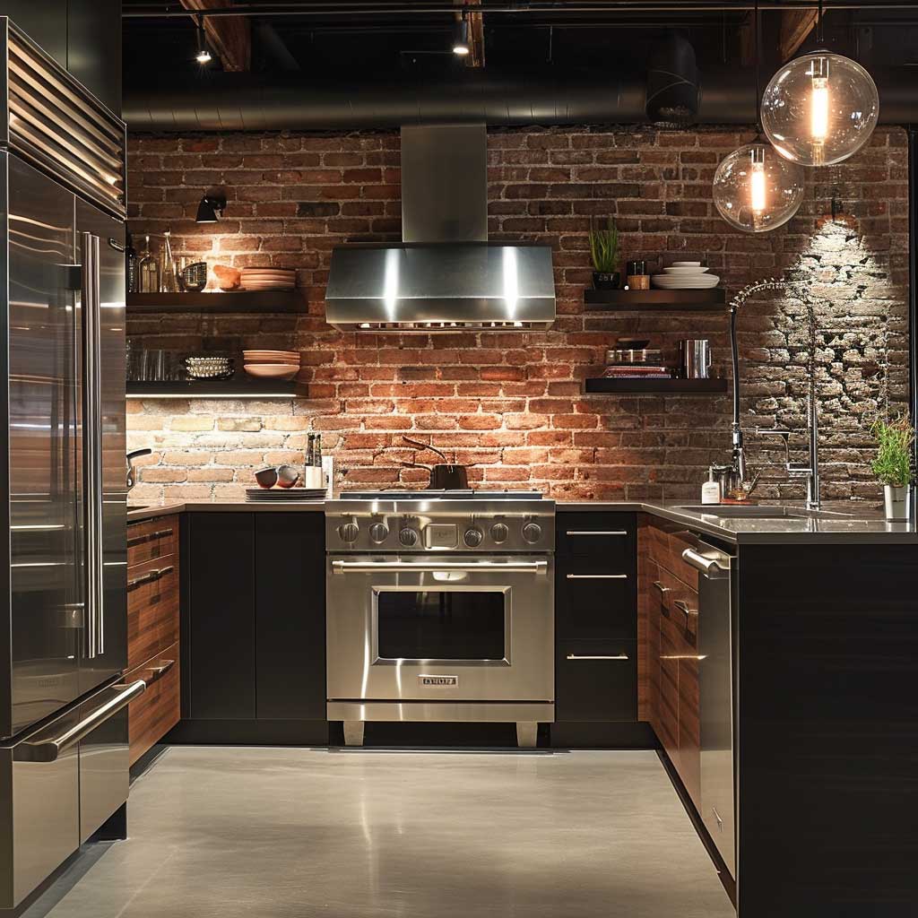
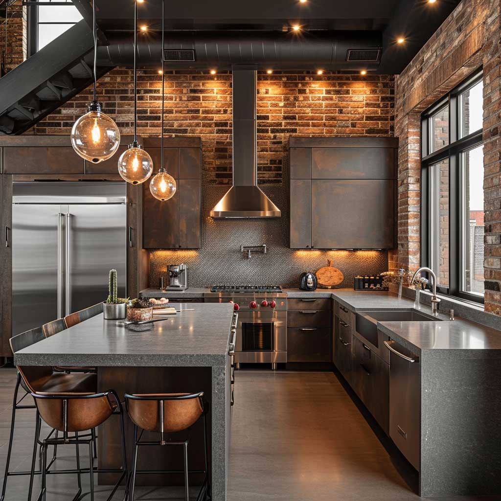
Exposed brick in a U-shaped kitchen photographs like a magazine cover and cleans like a nightmare. The texture traps grease. It traps steam. You will re-seal it every 18 months or the brick goes from warm terracotta to grey-brown disappointment. I have done this personally. If you want the texture without the maintenance, Arto Brick’s Thin Brick Slips ($8–$12 per square foot) are kiln-fired ceramic, sealed at the factory. Same visual weight, zero re-sealing.
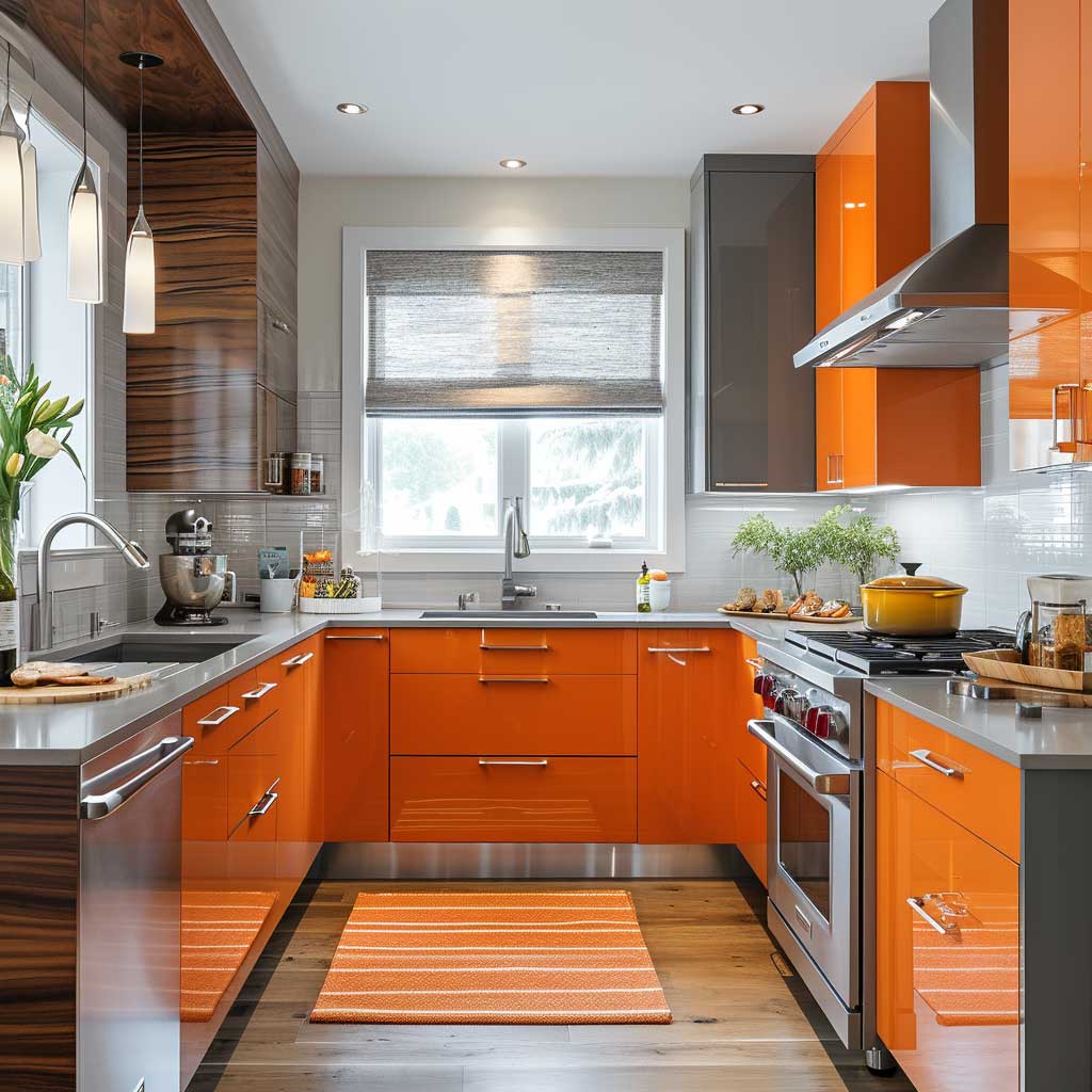
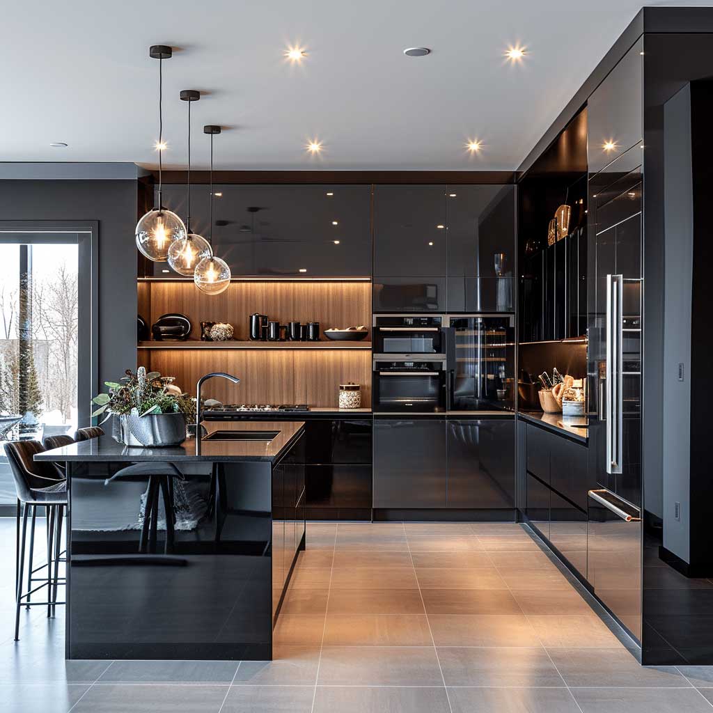
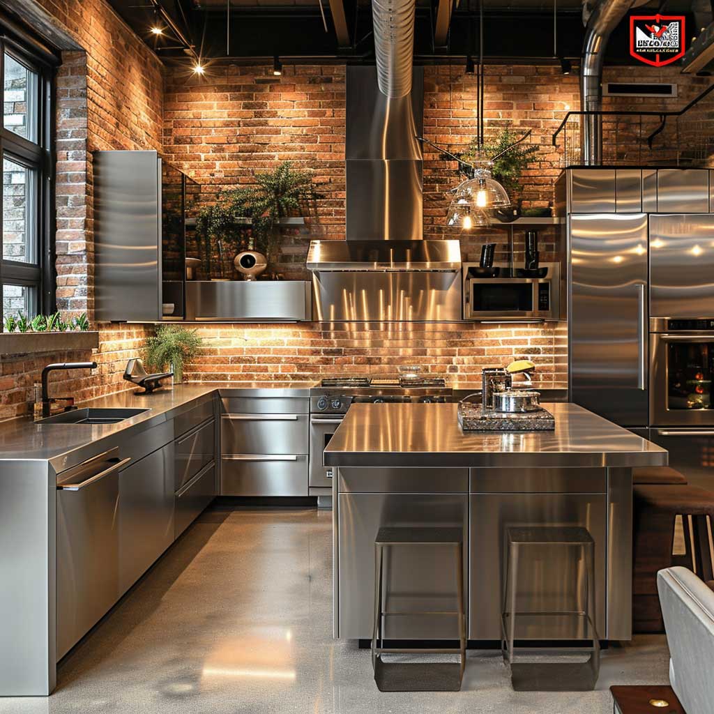
Stainless steel in a modern u-shaped kitchen reads as professional, not residential, when it covers more than two surfaces. The rule I use: steel on appliances, steel on one fixture (faucet or range hood), and stop. Once you add steel cabinet handles to that list, the kitchen starts reading as a commercial prep space, which is cold. Brushed finishes wear better than polished — you’ll see every fingerprint on polished stainless within 20 minutes of your first party.
Lighting zoning makes or breaks the industrial look. Pendant lights over the open end of a U-shape define a dining zone without building a wall. Schoolhouse pendants from Rejuvenation ($195–$420 each) work well here — they carry enough industrial reference to feel intentional without becoming a costume. Pair them with LED strip lighting under the upper cabinets at 2700K color temperature. Anything cooler than 3000K in a kitchen makes the food look wrong and the room feel like a hospital.
Wood and metal together in a U-shaped kitchen is a tension that resolves itself when you pick a single wood tone and stick to it. Two wood tones — say, a light ash cabinet door and a dark walnut floating shelf — fight each other unless they’re separated by at least one solid painted surface. I learned this from a $14,000 kitchen renovation that required a $2,200 correction six months later when the floating shelves came down. Pick one wood. Let the metal carry the contrast.

The open end of the U is actually the most important design decision in an urban-industrial kitchen. Leave it open and you get flow; close it with a peninsula and you get definition. A peninsula at 42-inch height serves as a room divider and bar seating simultaneously. A flat 36-inch extension just becomes where everyone dumps their bags. Height determines use. Choose deliberately. Houzz’s U-shaped kitchen gallery has the clearest examples of how different designers handle this peninsula-vs-open decision across real projects.
Minimalist Lines in a U-Shaped Kitchen Have One Honest Weakness

Sleek lines in a modern u-shaped kitchen are really a commitment to fewer decisions, not to less furniture. Every protrusion you eliminate — door handles, visible hinges, toe kick transitions — demands a more expensive replacement. Push-to-open Grass TIOMOS hinges cost around $18 per door versus $3 for a standard soft-close. Handle-free kitchens budget approximately 12–18% more on hardware alone. Know this before you fall in love with the look on Instagram.
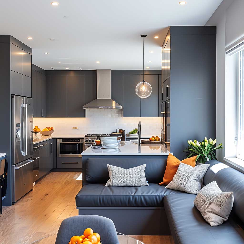
The honest weakness of the sleek-line kitchen is sound. Hard surfaces everywhere — quartz counter, glass splashback, lacquer cabinet, porcelain floor — create an acoustic environment where every pot clang echoes and every conversation at volume feels aggressive. You need at least one soft surface to absorb it: a fabric runner, upholstered seating, or acoustic plaster on the ceiling. I added a 3-inch upholstered bench at the open end of my last U-shaped kitchen and the noise level dropped noticeably. Not scientifically, just noticeably.
Horizontal grain cabinetry is the detail that separates the competent sleek kitchen from the exceptional one. Vertical grain reads as traditional. Horizontal grain reads as architectural. Euro-style rift-cut oak veneer from Decospan — $9–$16 per square foot — gives you continuous grain across the full cabinet run, making the entire wall read as one surface instead of a row of boxes. The Scandinavian-influenced designs you see winning kitchen awards in 2024 and 2025 are almost all built on this principle.
Cleaning is where sleek lines pay you back in real time. No reveals between cabinet doors means no grease traps. A flat quartz backsplash wipes clean in one pass. Contrast this with a subway tile backsplash with standard grout — you’ll spend 20 minutes every six weeks scrubbing those joints with a toothbrush. The aesthetic is simple. The maintenance reality follows directly from the aesthetic. Choose the surface that matches your actual cleaning routine, not your aspirational one.
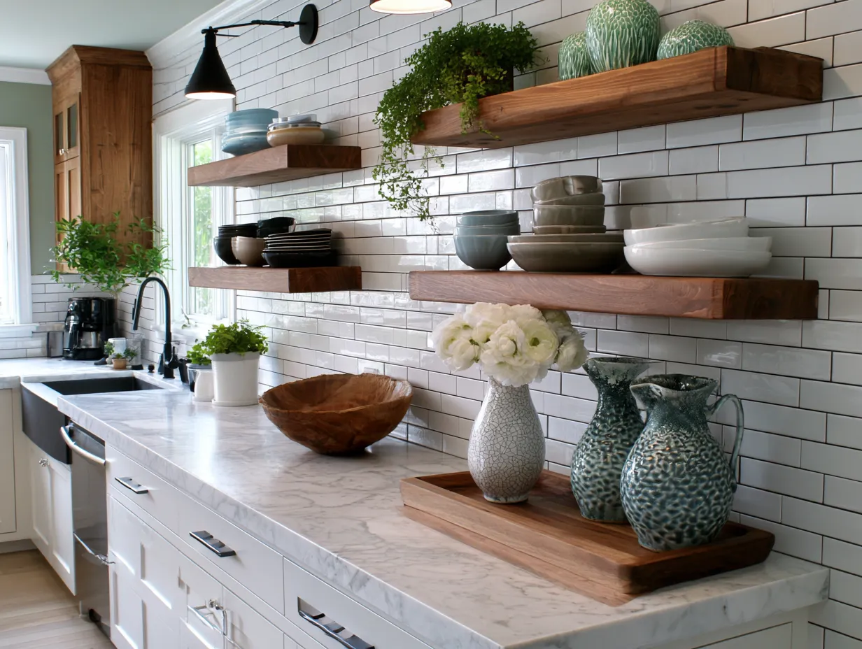
Open Shelving in a U-Shaped Kitchen Looks Right for About Three Weeks
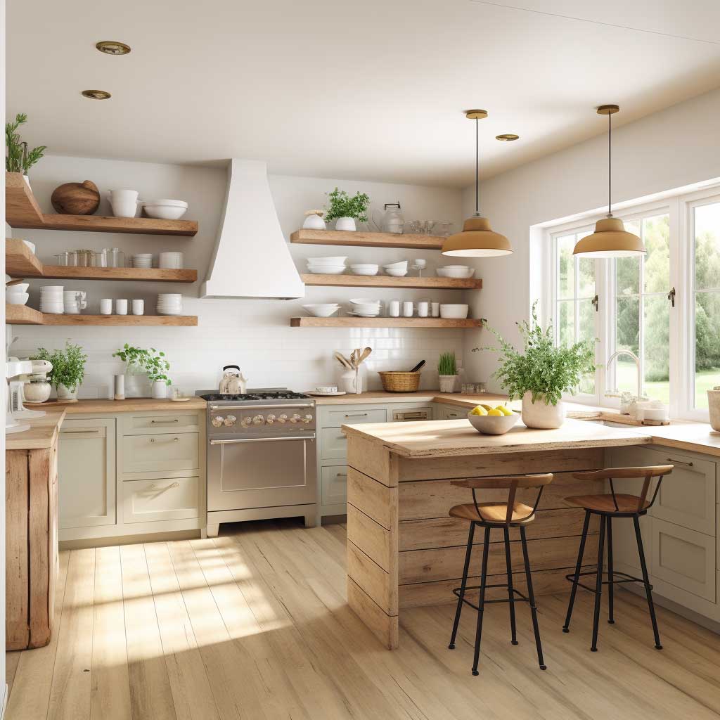
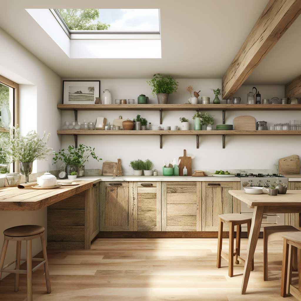
Open shelving in a contemporary u-shaped kitchen is a design decision that punishes ambivalence. If you cook daily and reach for the same six items every session — a cast iron pan, a pasta pot, your go-to cutting board, salt and olive oil, a mixing bowl — open shelves are faster than any cabinet. Everything visible, everything within reach, nothing to open. It’s like a professional kitchen, and it works for exactly the same reason professionals use it.
The problem is that open shelves in a U-shaped kitchen get greasy near the stove and dusty everywhere else. Ceramic and glassware need a wipe-down every two weeks minimum. Items you reach for less than twice a month — the springform pan, the pasta machine, the mortar and pestle — accumulate a film of cooking particulate that is not decorative. My rule: anything that lives on an open shelf must earn its place by being used at least weekly or by being beautiful enough to justify cleaning it.
Shelf material changes the character of the whole kitchen. A 2-inch solid walnut shelf from a local millwork shop (roughly $80–$160 per linear foot) reads warm and deliberate. A white laminate shelf from a box store reads temporary, even when it isn’t. Steel bracket shelves with a black powder coat — available through Etsy sellers like Steel Shelf Company starting at $45 per set — land in the industrial register without overselling it. The bracket style matters almost as much as the shelf itself; an exposed bracket is a design choice, a concealed French cleat says the shelf is just storage.
What actually stays on those shelves after six months? I’ve asked this question to everyone who has renovated with open shelving. The answer is always the same: daily dishes, glasses for water, and at least one plant. The decorative objects migrate to other rooms or to boxes. The cookbook collection shrinks to the two or three you actually use. Plan your open shelving around that honest reality, not the Pinterest version of it. Small u-shaped kitchen designs show how open shelving can double as a space-expanding device when the layout is compact.
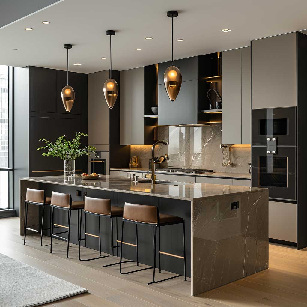
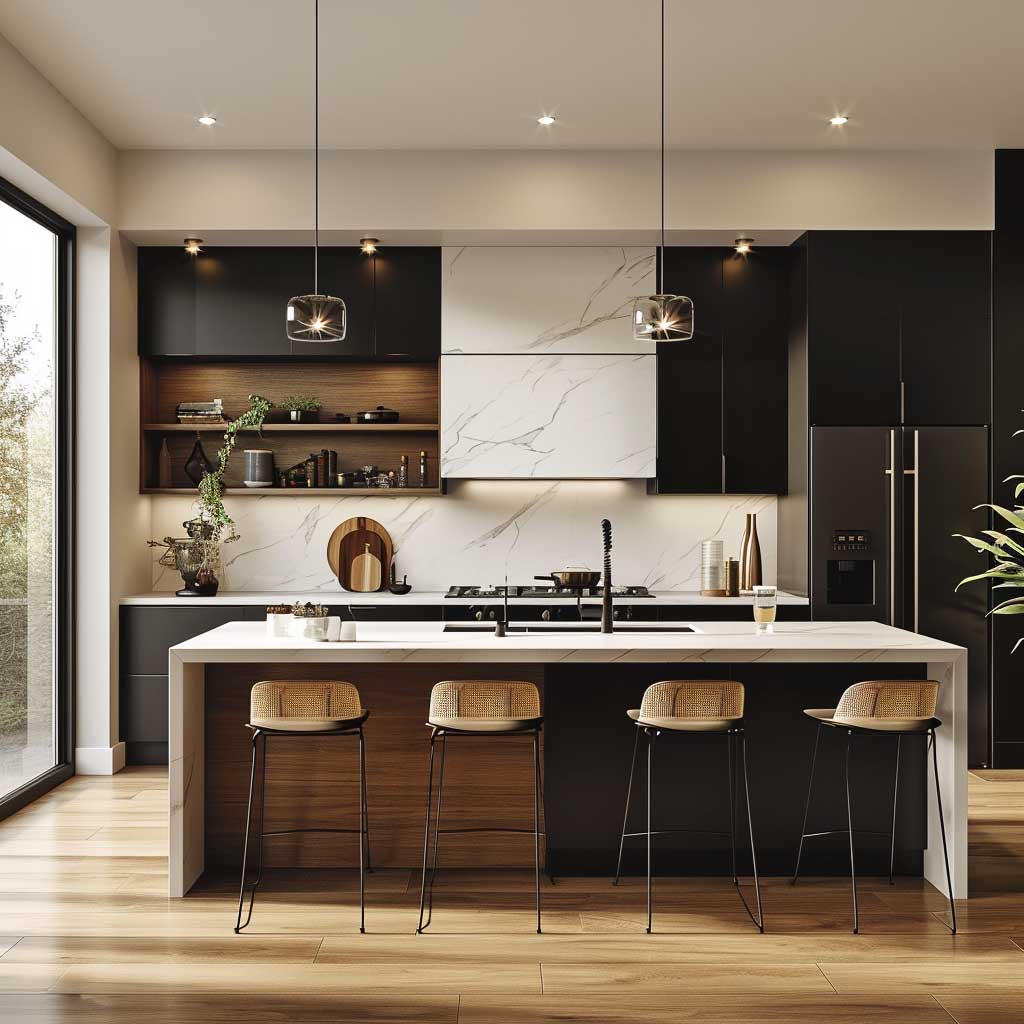
A Kitchen Island in a U-Shape Earns Its Square Footage or Wastes It

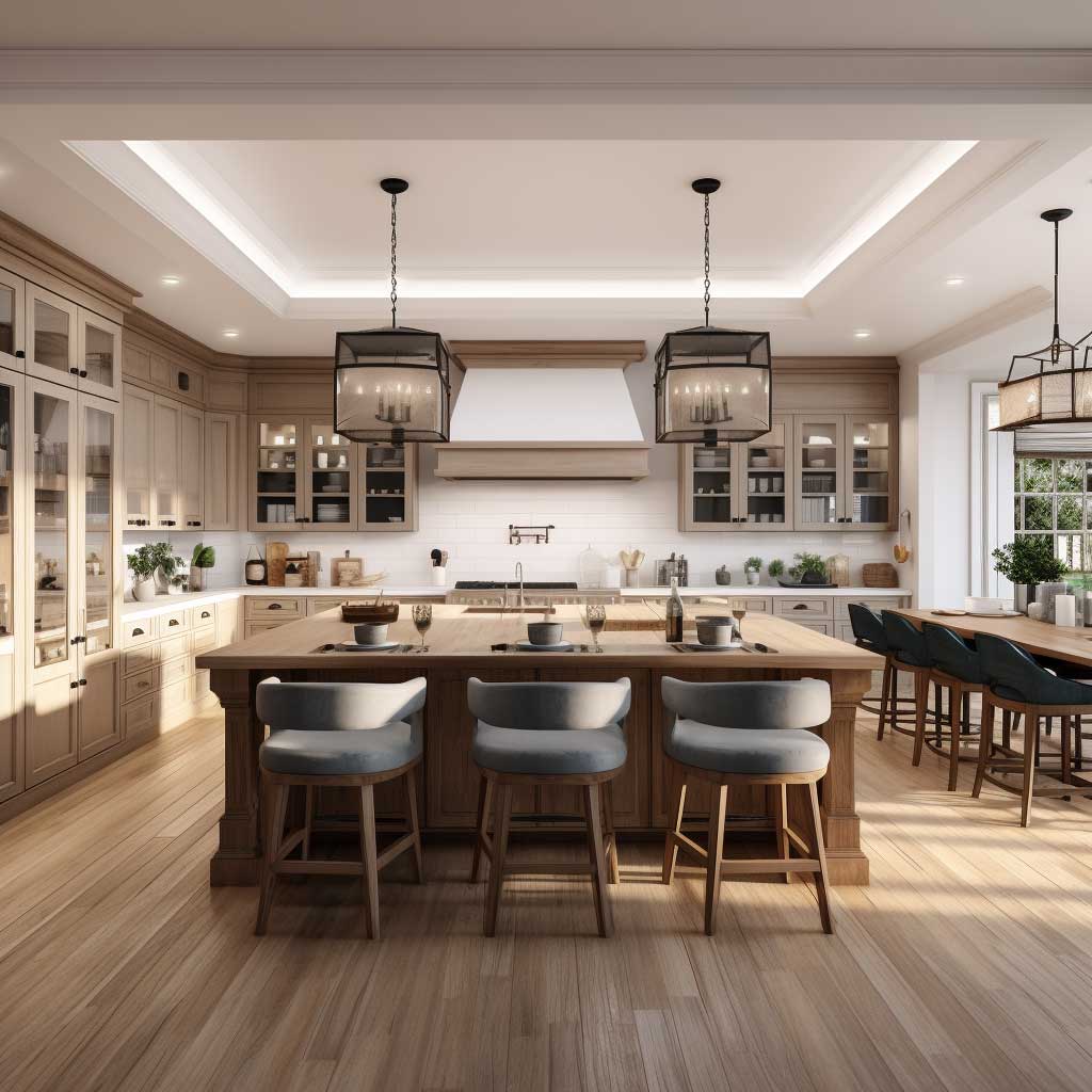

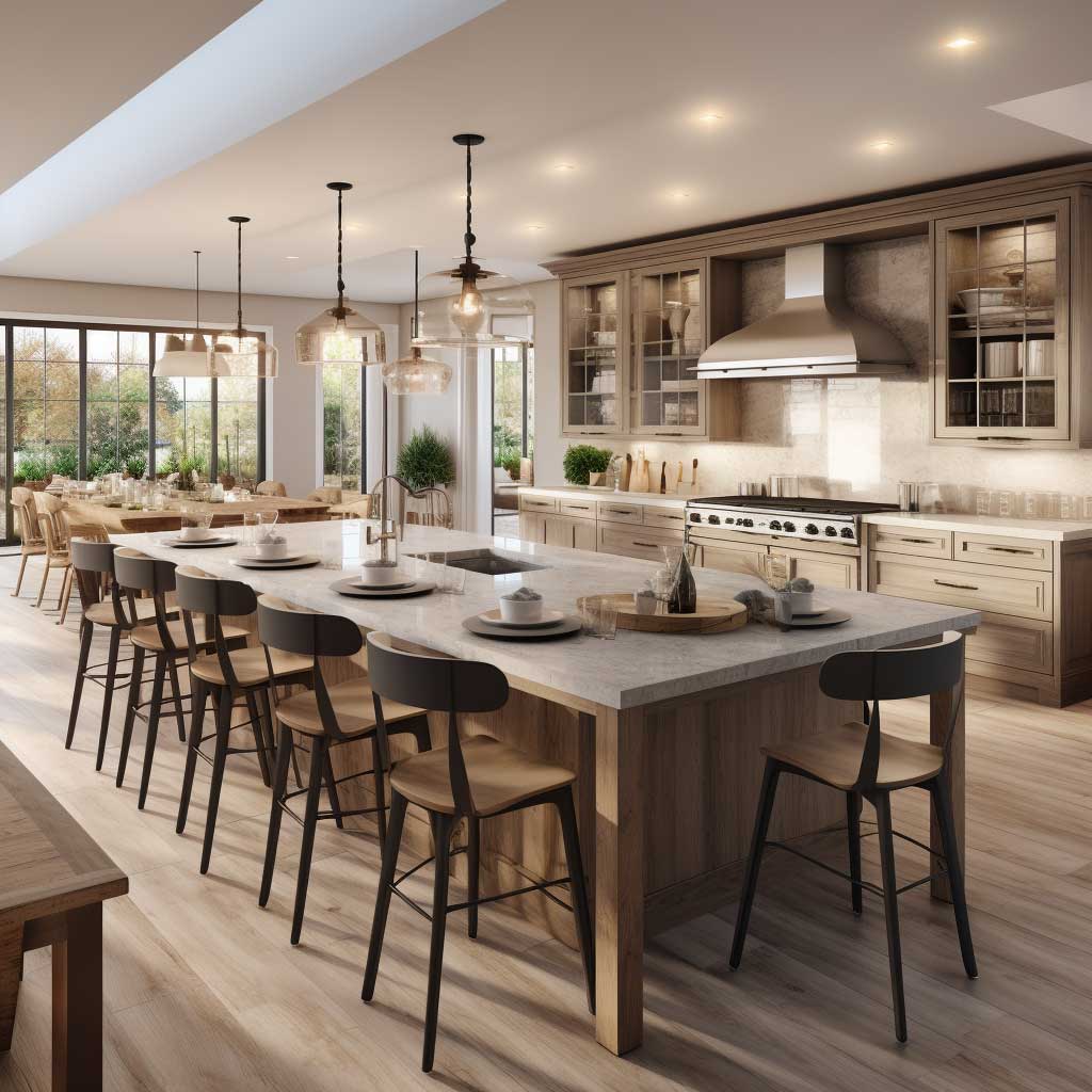
A kitchen island sits at the open mouth of the U like a period at the end of a sentence. It either completes the layout or blocks it. The minimum clearance between an island and the surrounding U-shaped run is 42 inches — 48 inches if two people cook simultaneously. Measure this in your actual space before committing to anything. I’ve seen islands installed in kitchens where the refrigerator door couldn’t open fully once the island was in place, which is a $4,000 lesson in arithmetic.
What an island does well in a modern u-shaped kitchen: it adds a second prep zone that’s separate from the main workflow, it creates bar seating without requiring a separate dining room, and it gives you somewhere to put the wine glasses when you’re prepping for guests. IKEA’s VADHOLMA island ($549) with a walnut top works in kitchens where budget is real. On the higher end, Boffi’s custom islands start around $8,000 and function as furniture rather than cabinetry — a meaningful distinction if the kitchen flows into an open living space.
The island counter material should differ from your U-shaped run countertops — not dramatically, but enough to read as a separate object. If you have white quartz on the perimeter, consider a butcher block or a honed concrete top on the island. The contrast signals that the island has a different function, which it does. Matching everything exactly makes the kitchen feel like it was specced from a catalogue, which is fine for resale and death for personality.
What an island does badly: it becomes a drop zone. Phone chargers, unopened mail, a bag of coffee beans from three weeks ago, two reusable shopping bags, and one mystery charger cable. No overhang for seating makes this worse — an island without seating is a table without chairs, and people will fill its surface with whatever is in their hands when they walk past. Give the island a seating overhang of at least 12 inches and at least 15 inches of knee clearance and it becomes furniture. Without that, it’s a filing cabinet with a nice top.
Final word
The U-shape doesn’t do the work. The decisions inside it do.
Your contemporary u-shaped kitchen succeeds or fails on three things: how the light moves through the space, whether the materials match your real cleaning tolerance, and whether the layout serves your actual cooking habit — not a fantasy one.
Monochromatic palettes read larger. Horizontal grain cabinetry reads architectural. Islands earn their footprint only when clearance is respected. Open shelves reward cooks who actually cook, and punish everyone else.
Save this post before you start spec-ing anything. You’ll want it when the cabinet salesperson starts upselling gloss finishes in a north-facing room.