Mediterranean color palette choices fail most rooms not because the shades are bad but because people throw azure, terracotta, and dusty pink into the same space and wonder why it reads like a souvenir shop. The three palettes below work precisely because each one commits to a single coastal mood — the cool stillness of open water, the heat of clay hillsides, or the amber bruise of a Santorini sunset. I’ve watched clients swap between them mid-project and regret it every time. Pick one. Own it.
You’ll notice none of these schemes require expensive renovations. Sherwin-Williams, Benjamin Moore, and Farrow & Ball each carry ready-made options in every hue listed here, mostly in the $60–$90 per gallon range. The architecture does the rest.
Quick Read
- Azure + White — for living rooms and open-plan spaces; cools overheated interiors without making them feel clinical
- Terracotta + Olive — for kitchens, dining rooms, and any north-facing room that needs warmth it can’t get from sunlight alone
- Sunset Pink + Sea Blue — for bedrooms; softer and less obviously nautical than straight navy schemes
- Each palette has a common mistake that kills the whole effect — covered in full below
- Paint picks, tile brands, and price anchors included throughout
Azure and White Convince a Room It Has More Square Footage Than It Does

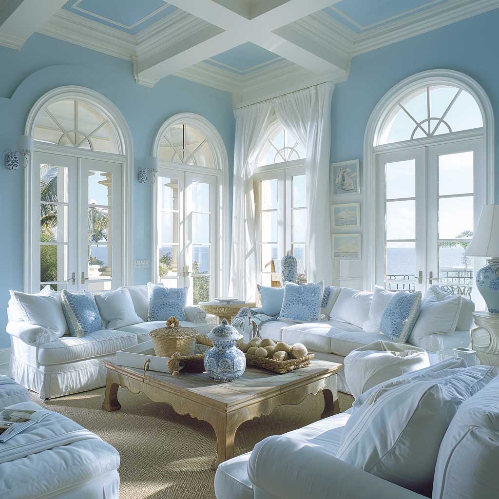

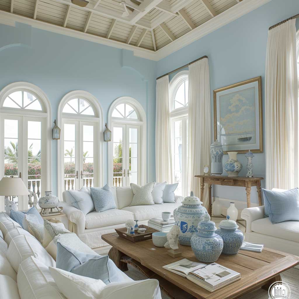
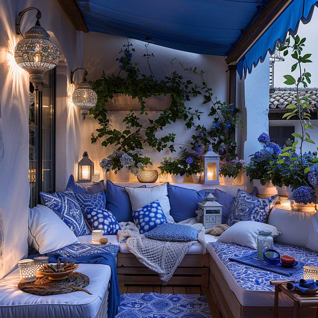
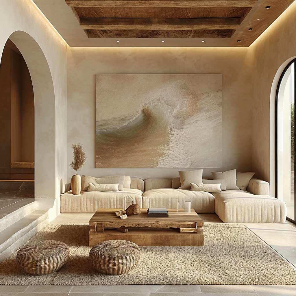
Azure and white is the mediterranean colour scheme that photographs deceptively simple and lives even better in person. Paint your walls Farrow & Ball Lulworth Blue (No. 95) or Benjamin Moore Aegean Teal 2136-40, then run the ceiling and all trim in clean white — I use Chantilly Lace OC-17 without exception. The room expands. Not metaphorically: a 14-foot living room with azure walls and white moldings genuinely reads wider than a cream-on-cream room three feet larger. That’s the optical effect of strong value contrast along the perimeter.
White slipcovered sofas are the classic anchor here. West Elm’s Harmony Slipcovered Sofa runs about $1,600 and holds the look for years. What kills this color scheme? Navy blue accents. I’ve tried them — twice — and both times the room slid from “Aegean morning” into “yacht charter brochure.” Stick to azure and softer cornflower for pillows; anything darker than cobalt pulls the mood offshore in a bad direction. The distinction between azure colour and navy is about 15% lightness on any digital swatch tool. Worth checking before you buy.
Sheer white curtains are non-negotiable in this palette. They diffuse southern light into something close to what you’d see through a salt-bleached cotton shirt — warm but not yellow. IKEA’s LILL sheers at $9 a pair do this just as well as any designer option I’ve tested. Layer two panels per window and let them puddle slightly. Decorative ceramics in Santorini blue and unglazed white, a low-profile wooden coffee table with weathered finish, and you’re done. Resist adding a third colour. The palette’s restraint is the whole point.


What are the actual mediterranean colours in this scheme? Azure sits around hex #007FFF in its purest form, though most painted walls land closer to #4A90D9 after the sheen drops in flat or matte finish. White reflects the rest. That two-colour rule — pure azure and pure white, nothing in between — is what separates a convincing Mediterranean living room from a beach-themed rental. You’ll notice the difference the moment you add a warm cream instead of a true white. It muddles. Keep it stark.
For renters who can’t paint, blue and white living space ideas can deliver the same effect entirely through textiles, rugs, and removable wallpaper — I’ve seen this pull off 80% of the visual result without touching a single wall.
Terracotta and Olive Are What Kitchens Look Like When They Stop Trying to Look Clean


Terracotta and olive is the mediterranean colour scheme that forgives everything — fingerprints, shadows, uneven plaster, mismatched vintage chairs. That’s not an accident. Both colours derive from clay and crushed plant matter; they already contain the randomness of the natural world. A kitchen painted in Sherwin-Williams Cavern Clay SW 7701 (terracotta, around $60 per gallon) with cabinetry in Benjamin Moore Dried Thyme 2145-30 (olive, same price range) looks more expensive at 5 PM with the halogen on low than a white Shaker kitchen looks at any hour. I own a version of this kitchen. It gets used hard and photographs well regardless.
The flooring anchor for this mediterranean colour palette is terracotta tile — specifically unglazed, not the shiny ceramic version. Saltillo tiles from Mexico ($3–$6 per square foot at most tile warehouses) are the traditional choice, and the slight variation in each piece is part of what makes the floor look alive rather than printed. Glazed terracotta is the mistake. It reads as orange bathroom tile from the 1970s and no amount of olive cabinetry recovers the room. Buy unglazed, seal with a penetrating sealer, and don’t overthink it.
Copper cookware hung against olive green cabinetry works because it completes the earth’s own spectrum — clay, plant, mineral. Mauviel M’Heritage copper pans ($120–$300 each) are my go-to and they double as decoration. Wrought iron pendant lights at around $80–$150 per fixture from Pottery Barn or similar complete the material story without adding a fourth colour to manage. The dining table should be wood — distressed, reclaimed, or at minimum wire-brushed. Glass or lacquered surfaces collapse the warmth this palette builds.
Don’t Do This
Adding cream or off-white as a third neutral to terracotta and olive rooms. It sounds like it should soften the palette — it doesn’t. Cream reads as dirty white next to true terracotta and pulls the olive toward khaki. The result is a room that looks like it can’t decide whether it’s a Mediterranean kitchen or a 1990s country cottage. If you need a lighter accent, go straight to warm white (Benjamin Moore White Dove OC-17) and stop there.
Avoid mixing glazed orange tile with olive for the same reason: the orange reads synthetic against the muted, complex undertones of real terracotta. One wrong tile decision can undo $4,000 of cabinetry spend.


Is the terracotta and olive palette only for kitchens? No — I’ve applied it to north-facing sitting rooms that couldn’t catch sun until 3 PM and the rooms finally felt inhabited rather than endured. It’s the only combination in the mediterranean colours family that generates its own warmth optically. Every other mediterranean hue relies on actual daylight to activate. Terracotta and olive perform in the dark. That’s the practical argument for choosing this over azure in cold-climate or north-facing rooms.
More on the history and material logic of this palette at terra cotta interior design projects across every room type — the dining room examples there are particularly useful if you’re applying this scheme beyond the kitchen.
Sunset Pink Meets Sea Blue and the Bedroom Stops Feeling Like a Decision You Made Once


Sunset pink and sea blue is the least obvious entry in the mediterranean colour palette family, which is exactly why it works in bedrooms where the standard blue-white scheme starts to feel like a hotel room after six months. The specific pinks to use: Benjamin Moore Mellow Rose 2169-50 or Farrow & Ball Peignoir No. 286. Both are desaturated enough to read as blush rather than pink, which is critical — saturated pink in a bedroom is a statement the room can’t sustain past a trend cycle. Sea blue here means something like Valspar Aegean Sea 5003-7B. Paired together these colours mimic the exact gradient a Mediterranean sky makes between 7:30 and 8 PM in August.
The bedding is where this colour scheme lives or dies. Linen, not cotton, and in the actual colours rather than a “inspired by” version. Cultiver’s linen bedding in blush ($180–$260 for a duvet cover) and a contrast cushion in their Teal Stripe does this correctly. I stole this pairing from a hotel room in Dubrovnik and have recommended it to four people since. All four kept it past the first year, which is the real durability test for any bedroom palette. What doesn’t work: metallic gold as more than a very small accent. Two gold throw pillows at most — beyond that it tips into honeymoon suite territory.
Sheer pink curtains diffuse morning light into something worth waking up for. This is not decoration; it’s a functional argument. HGTV notes that mediterranean hues in bedrooms specifically benefit from the warm-light interaction this colour produces at dawn — the room reads differently at 6 AM than at noon, which is the natural behaviour these shades were originally calibrated against on actual coastlines. That temperature shift across the day makes the room feel alive in a way that static paint colours don’t.


A large seascape artwork above the bed closes the scheme. Not a framed print from a big-box store — something with actual paint texture and a blue-gold palette. Saatchi Art carries originals in the $300–$800 range that work here. Positioned at eye level from a seated position on the bed, not centered on the wall. Most people hang art too high. In this room, the piece should connect the wall colour to the bedding, not float above the action. That anchoring is what makes the bedroom feel finished rather than assembled.
If you’re working with a full mediterranean-style interior across multiple rooms, Mediterranean style house interior principles covers how to carry material consistency — stone, wrought iron, plaster — across a whole floor plan without each room fighting the next.
For a deeper look at how these colour decisions interact with architectural elements specific to the style, HGTV’s Mediterranean Style 101 is worth a long read — particularly the sections on how warm earthy tones and sea-derived blues are meant to coexist rather than compete in the same home.
Final Word
Mediterranean Colour Schemes Fail One Way: Mixing All Three Into the Same Room
Azure and white, terracotta and olive, sunset pink and sea blue — each one is a complete argument. None of them needs help from the others.
Commit to one palette per space. Let it be the whole story. The Mediterranean coastline itself is brutally edited — miles of white plaster, then sudden terracotta, then nothing but water. That edited quality is what makes it feel like somewhere worth going.
Save this post before you head to the paint store.
Related Topics