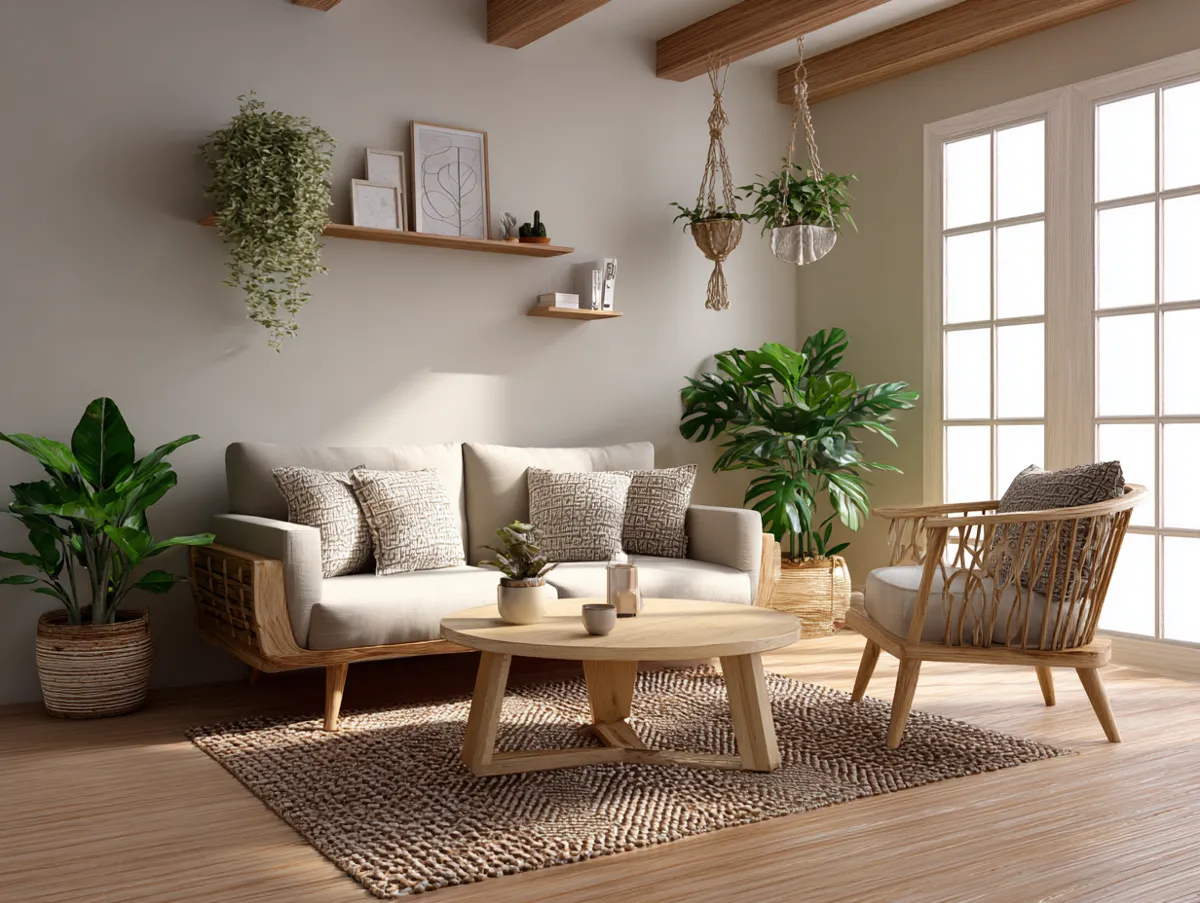
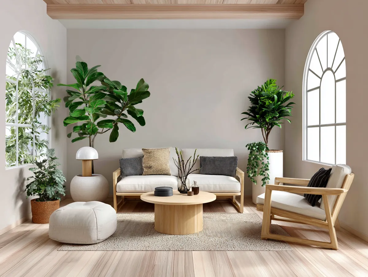
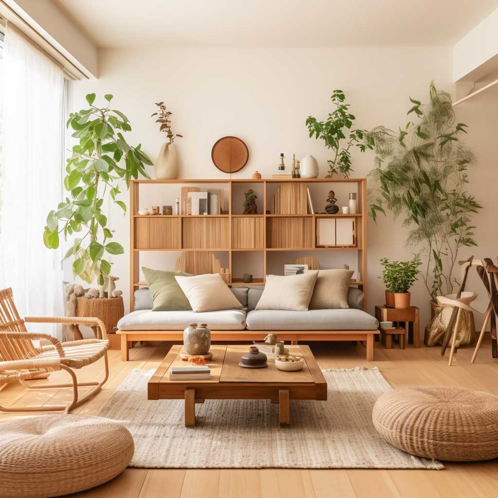
A japandi living room done right reads like silence — the kind that actually costs something. You get it by layering warm oat against raw wood against one dark anchor, not by painting everything Sherwin-Williams Alabaster and calling it a day. I’ve rearranged my own living room three times chasing this balance, and the problem was never the furniture. It was the tonal logic underneath it. Japandi interior design pulls from two philosophies — Japanese wabi-sabi and Scandinavian hygge — but the living room is where those ideas either click or collapse into beige mush.
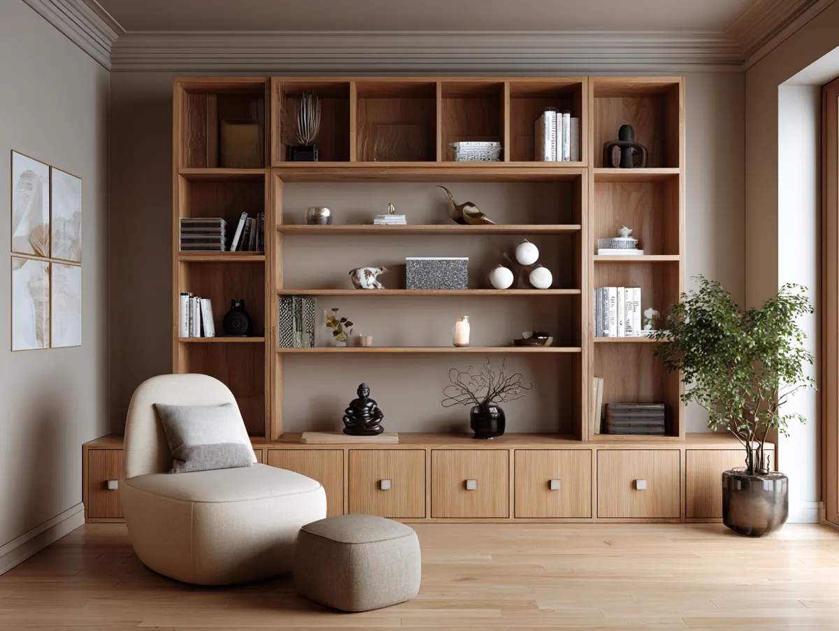
Muji’s $180 low-profile walnut shelf sits in my reading corner and does more for the Japandi feel than any single purchase I’ve made. Not because it’s expensive — because it has grain, weight, and purpose. That’s the through-line here: every choice is intentional. Pull up a chair.
In this post:
- Why neutral tones in a Japandi space need contrast to survive
- The low-profile furniture rules that make the room feel grounded
- Natural materials — wood, stone, plants — ranked by impact
- Functional design principles borrowed from Japanese joinery tradition
- FAQ: specific products, price points, and what to skip
Neutral Tones Work in a Japandi Interior Living Room Only When There Is a Dark Anchor
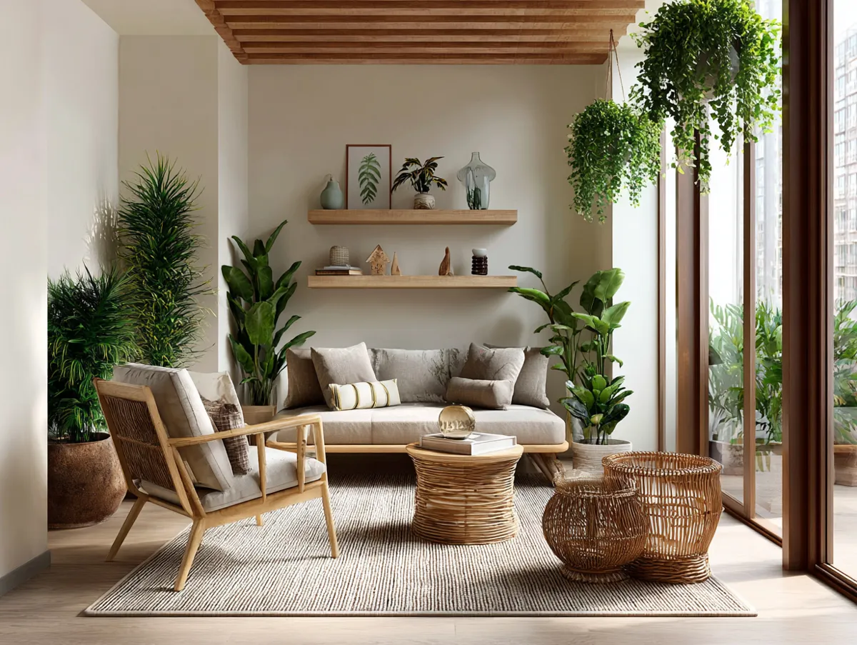
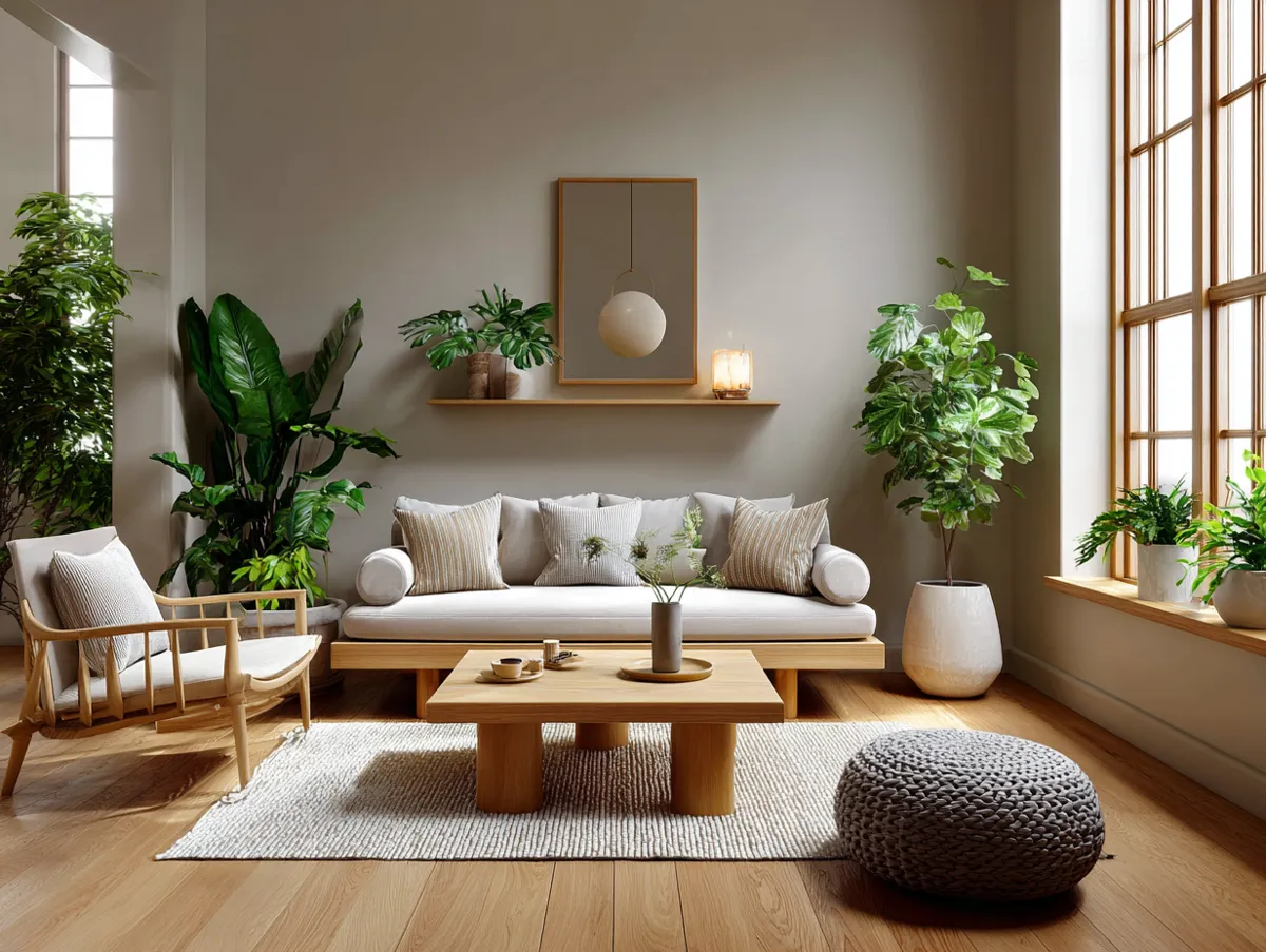
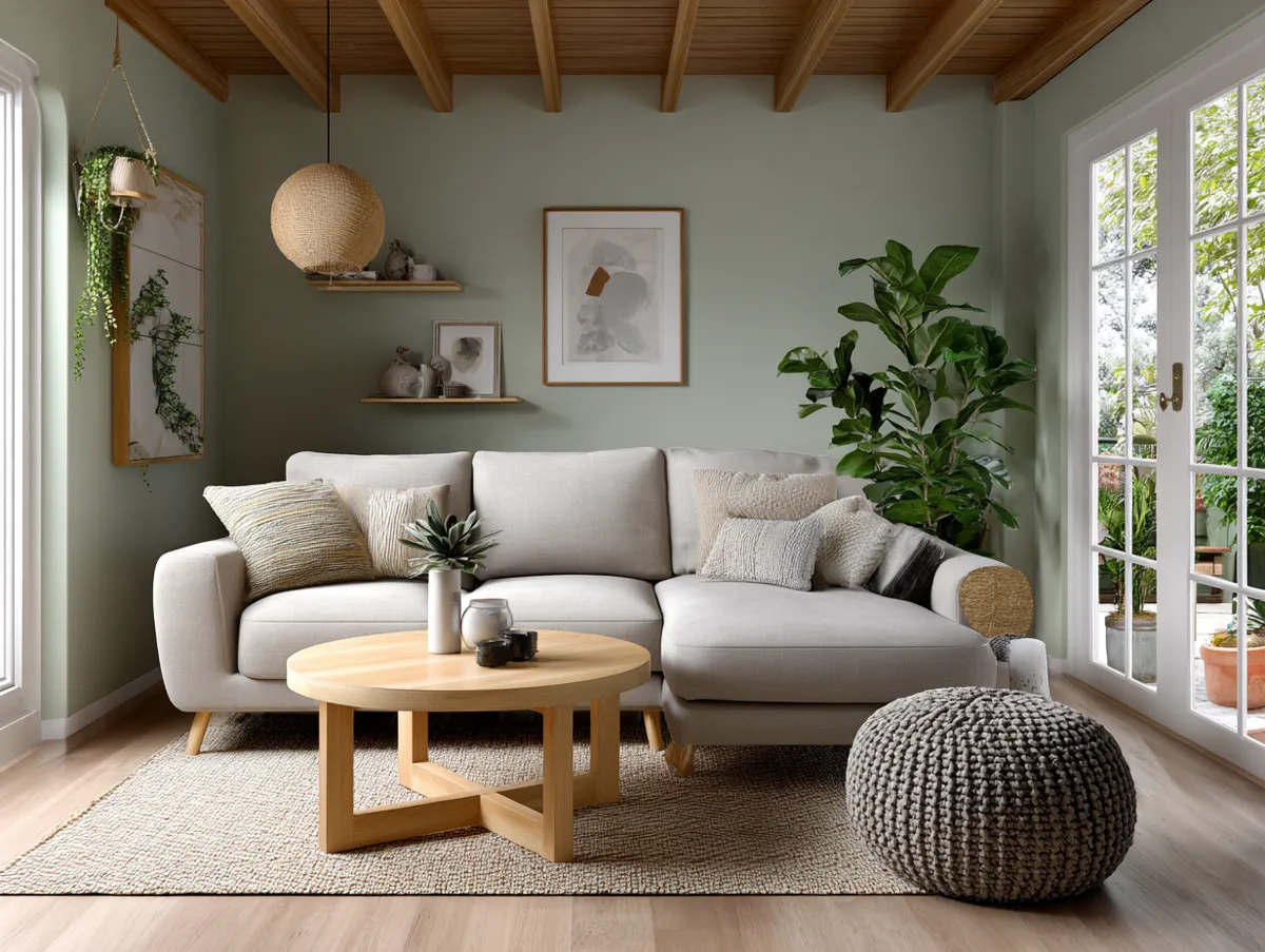
Pale walls and oatmeal sofas make a Japandi living room feel calm. Without contrast, they make it feel unresolved. You need one dark, grounding element — a charcoal linen throw, a matte black Ferm Living bowl on the coffee table, or a low bookshelf in smoked oak — to give the neutrals something to lean against. I painted my walls Benjamin Moore White Dove. Too flat. Swapped to Farrow & Ball Elephant’s Breath at $125 a liter, and the room finally had dimension. The gray-green undertone does the work that no amount of throw pillows can replicate.
Whites and grays are the obvious starting point, but the ones that fail in Japandi spaces are the cool, blue-toned whites. They read as clinical. Warm beiges — the color of undyed linen or raw clay — sit closer to what Japanese interiors actually use. Layer three or four of these tones rather than one flat shade, and the palette stops looking painted and starts looking built. What not to do: avoid greige that trends yellow under warm LED bulbs. It photographs warm and lives cold. Ask for the sample pot before you commit.

Curtains in a Japandi living room deserve more thought than they get. My go-to is undyed linen at 210 cm drop — H&M Home sells a panel for around $35, which is honestly hard to beat for the texture payoff. Avoid blackout options in heavy polyester. They bunch wrong, they shine under side light, and they kill the airy quality that makes a Japandi space breathe. Sheer linen or raw cotton only.
Accessories stay minimal by design philosophy, not by accident. One hand-thrown ceramic piece, one branch in a bottle vase, one small framed print with generous negative space. KINTO’s $48 cast stone mortar on an open shelf counts as decor and function. That’s the Japandi logic at its tightest. Three small trinkets from HomeGoods do not.
Low-Profile Furniture Changes the Ceiling Height Without Moving a Wall
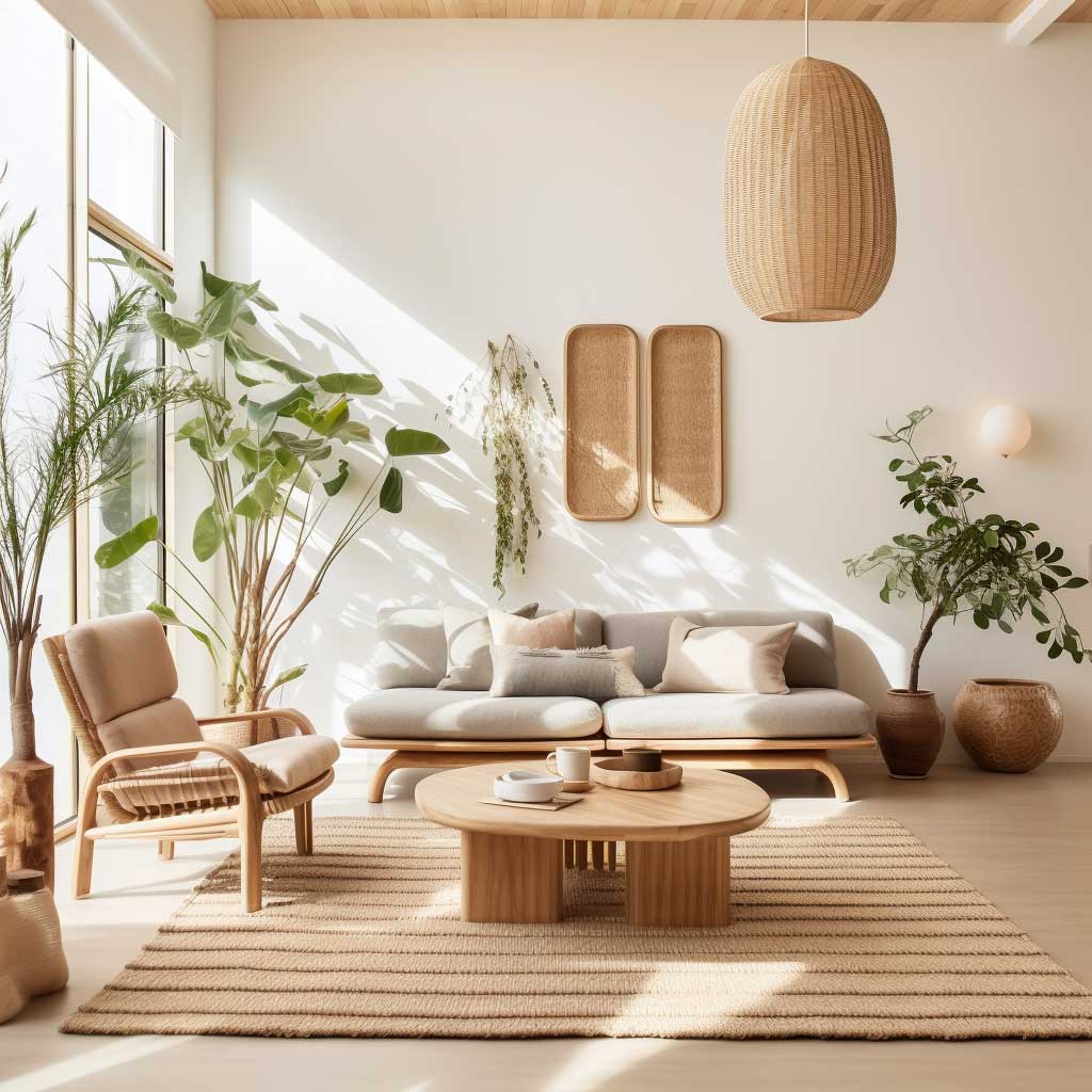
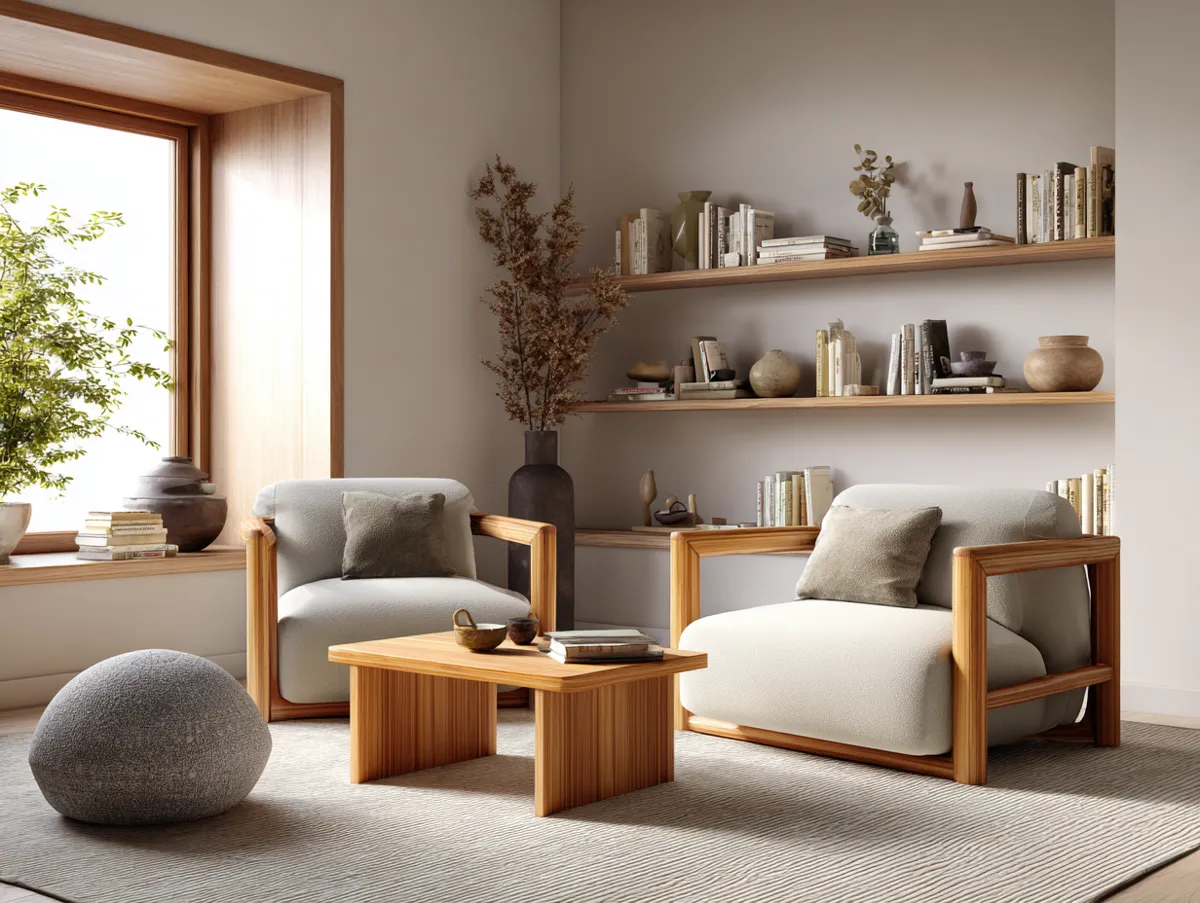
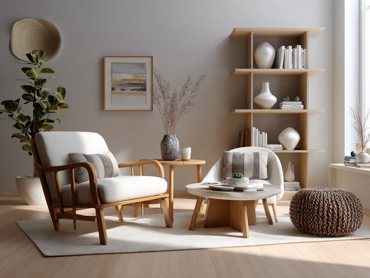
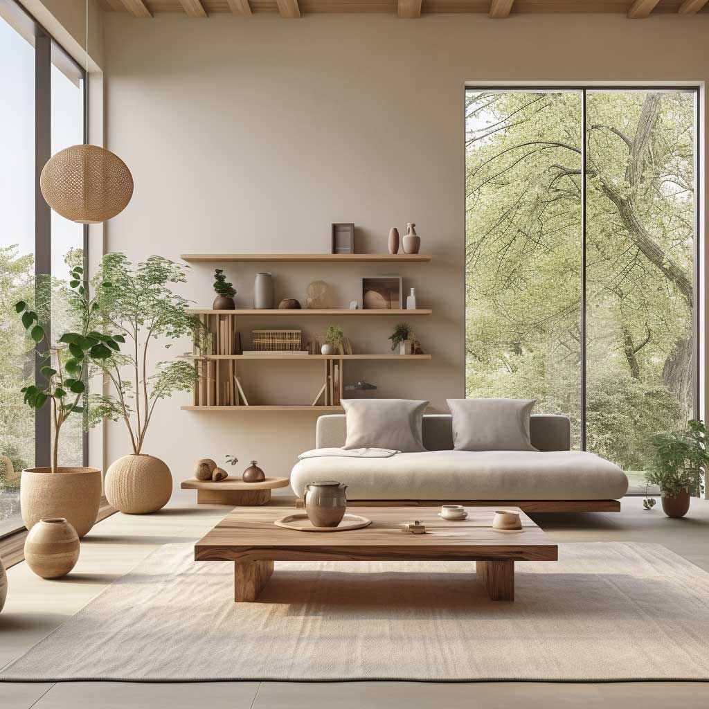
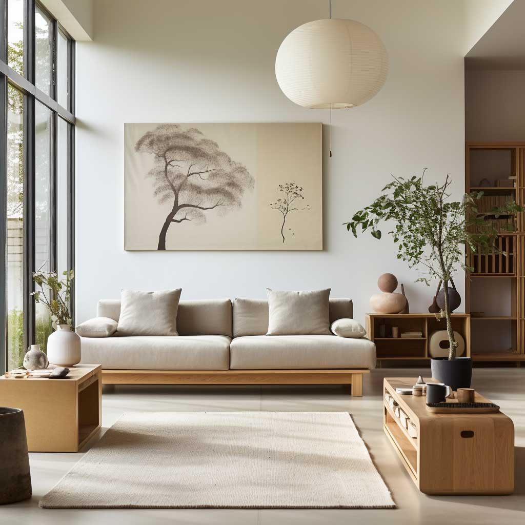
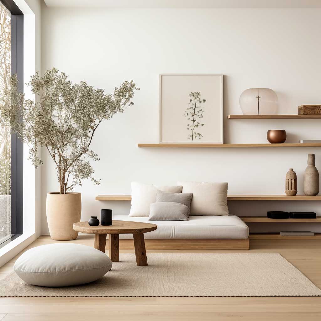
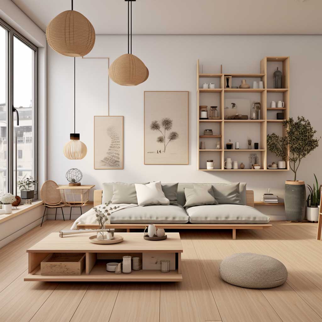
Drop the sofa height by 10 centimeters and you change how a room feels entirely. Low-profile sofas — the HAY Mags at $3,200 or the more accessible IKEA SÖDERHAMN at $799 in a neutral fabric — pull the eye toward the floor and create the sense that the ceiling has lifted. This is the optical trick Scandinavian and Japanese design both rely on, and it’s why Japandi furniture sits close to the ground. I have the SÖDERHAMN in an oat-colored cover. It works.
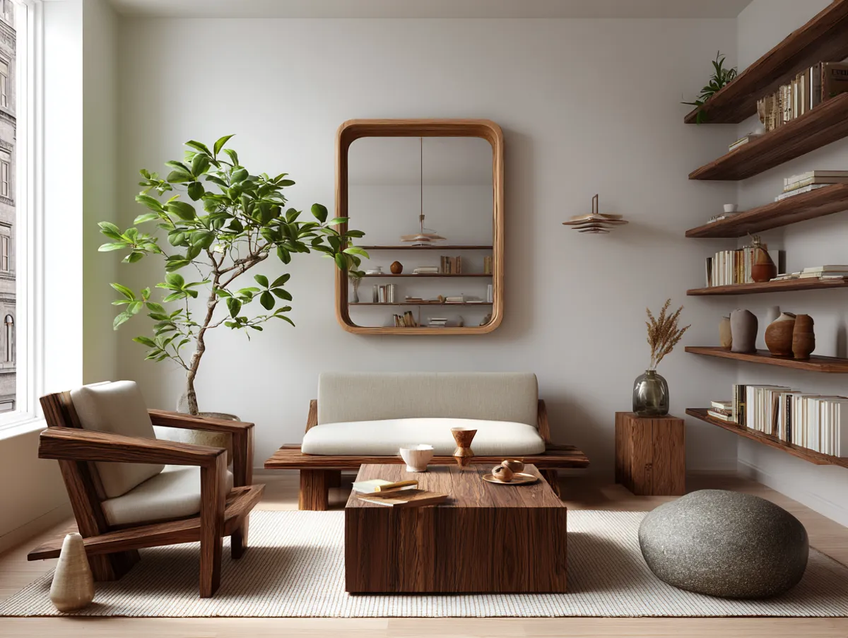
Coffee tables in a Japandi living room are almost always rectangular, low, and made of solid wood or stone composite. Round tables work in bohemian setups, not here — the geometry fights the clean lines. My go-to is a 90 x 45 cm solid oak slab on hairpin legs, sourced from a local carpenter for $280. IKEA’s VITTSJÖ glass-top alternative is $60 and technically works, but the glass reads as modern rather than warm. Skip it if warmth is what you’re after.

Furniture arrangement matters as much as the pieces themselves. U-shaped seating with a centered coffee table mimics the conversational geometry of Japanese living rooms without requiring tatami. Leave a clear walkway of at least 80 cm between any two pieces — crowded Japandi defeats its own purpose. You’ll notice the difference immediately when the path is clear. Air flows differently.
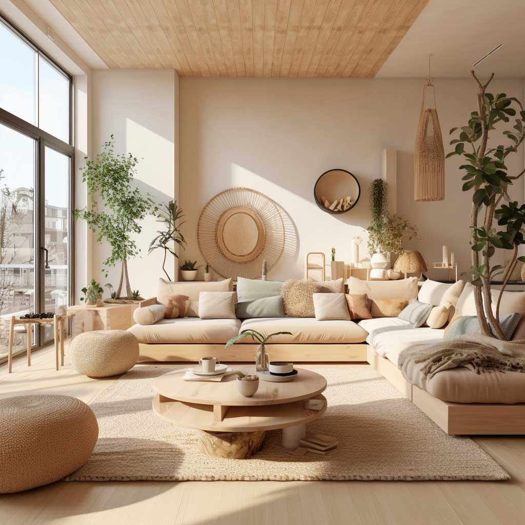
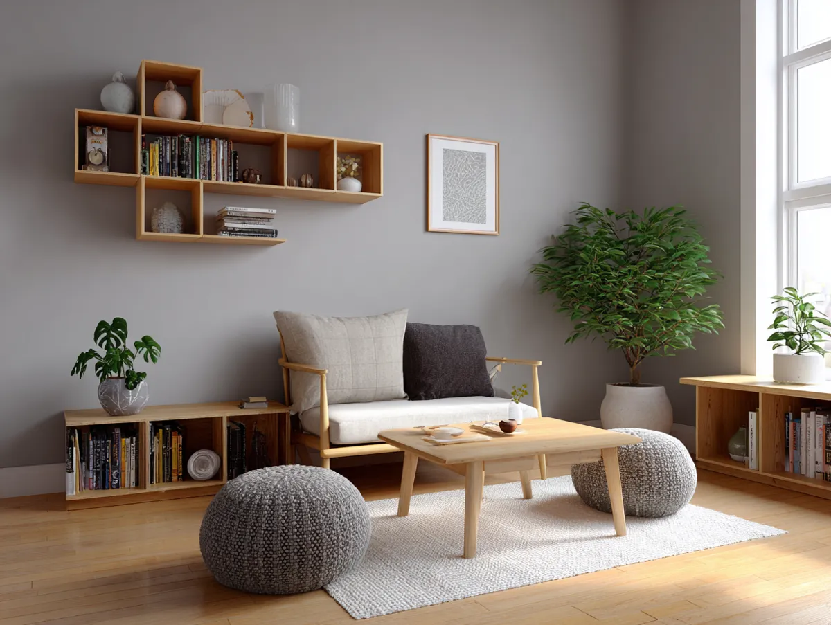
The color palette for upholstery is: warm white, warm gray, pale oat, or deep charcoal. No navy, no terracotta, no sage. Those belong in a different aesthetic. Japandi sofas hold their calm because the colors stay in a narrow temperature range. I stole this approach from a Tokyo apartment tour where every soft surface was within two tonal steps of every other. The room had maybe five pieces of furniture. It felt complete.
Don’t do this: Buying a low-slung sofa and piling it with twelve throw pillows. Cushion stacking is the enemy of Japandi restraint — the entire visual impact of a clean, low sofa disappears under bolsters and lumbar rolls. Two cushions maximum. Both in the same tonal family. One can have subtle texture; neither should have a pattern. A sofa buried in pillows looks like a bed that gave up.
Wood, Stone, Plants — Ranked by What Actually Moves the Needle
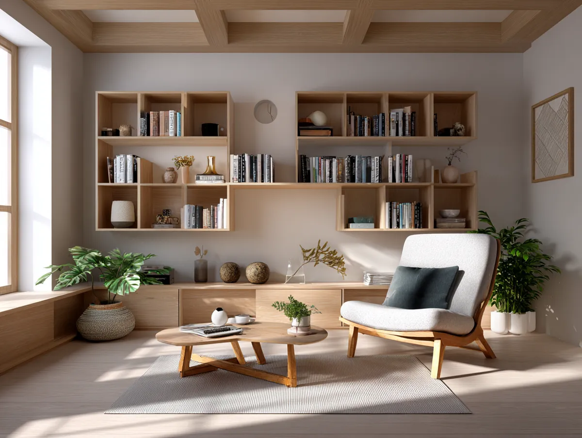
Wood first. Always wood first. It’s the material doing the most work in a Japandi living room — and you need to get the tone right. Light ash and pale oak (think Scandinavian palette) warm up without yellowing. Darker walnut and smoked oak bring Japanese weight. The mistake is mixing warm-toned and cool-toned wood in the same room. I own a pale ash coffee table and a walnut shelf in the same space, and they fight each other constantly. Pick one temperature and stay there.
Stone is the understated element. A slab of matte travertine as a side table surface, or a concrete planter, does more atmospheric work than you’d expect for the footprint it takes up. Muuto’s concrete pendant is $195 and sits beautifully above a Japandi reading corner. Polished marble is too glamorous — the shine reads as opulent rather than grounded. Matte and honed surfaces only. The Japandi color palette works the same logic — earthy and muted beats bright and polished every time.
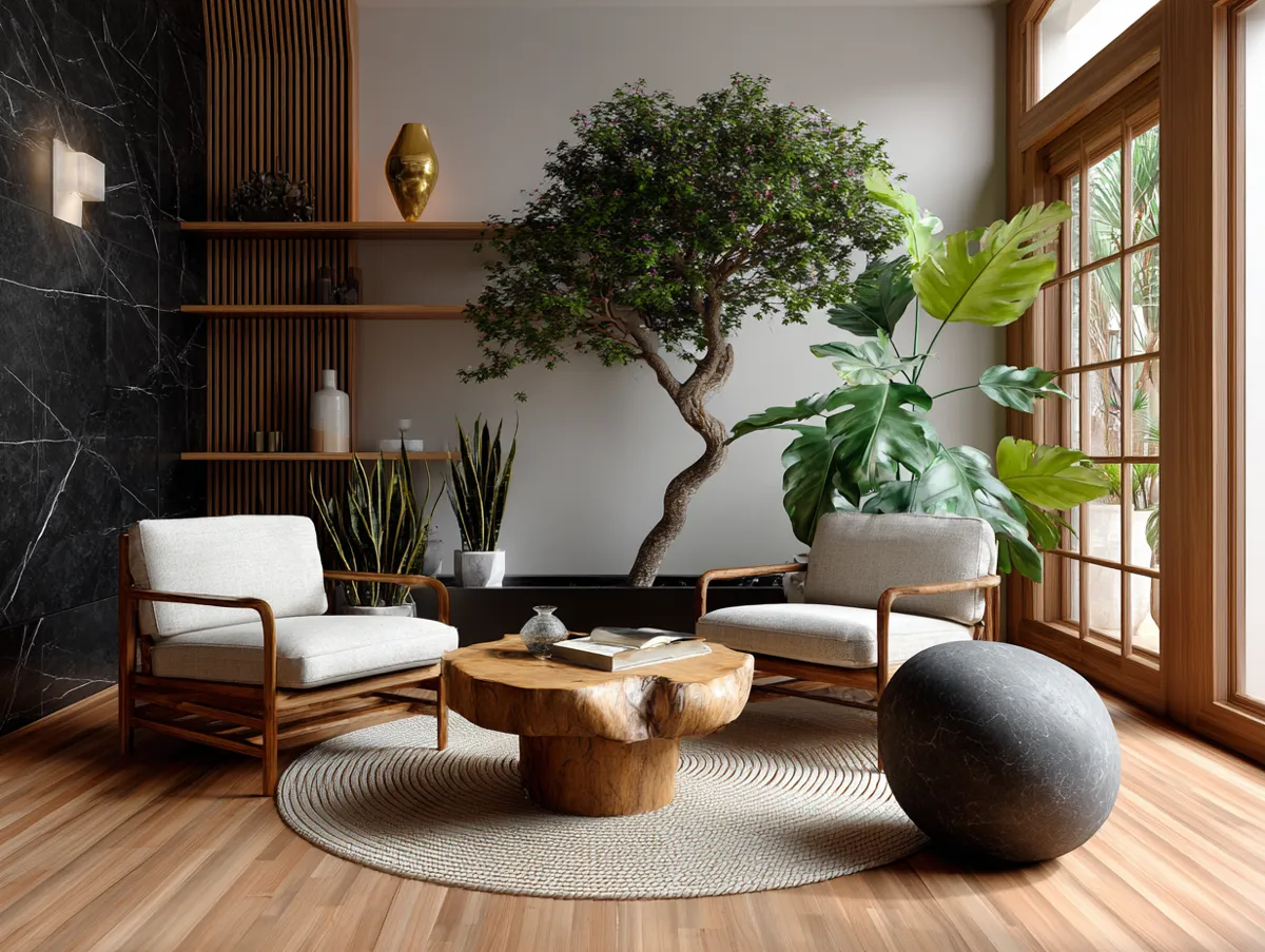
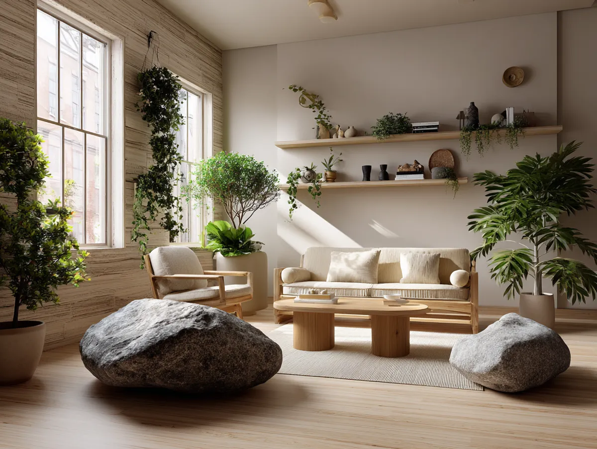
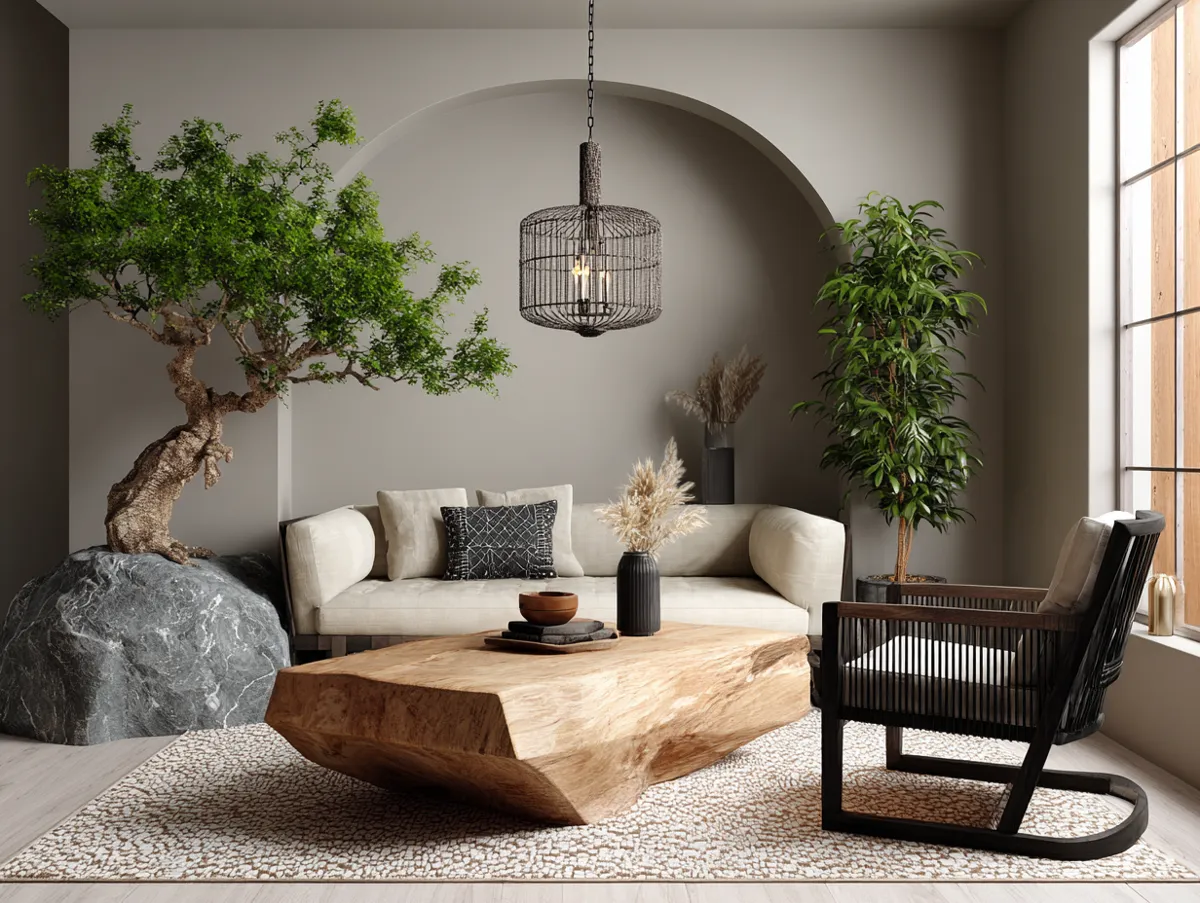
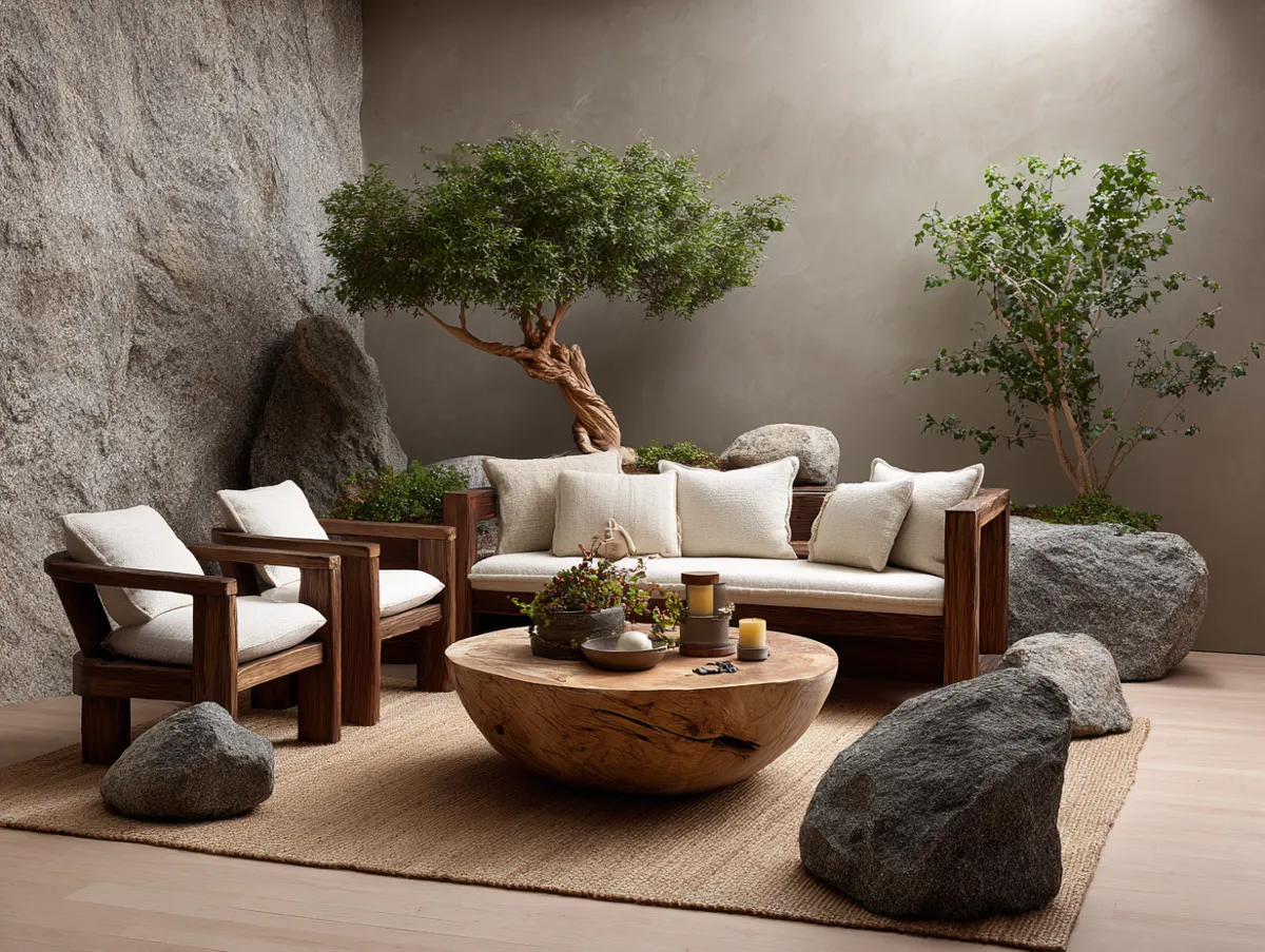

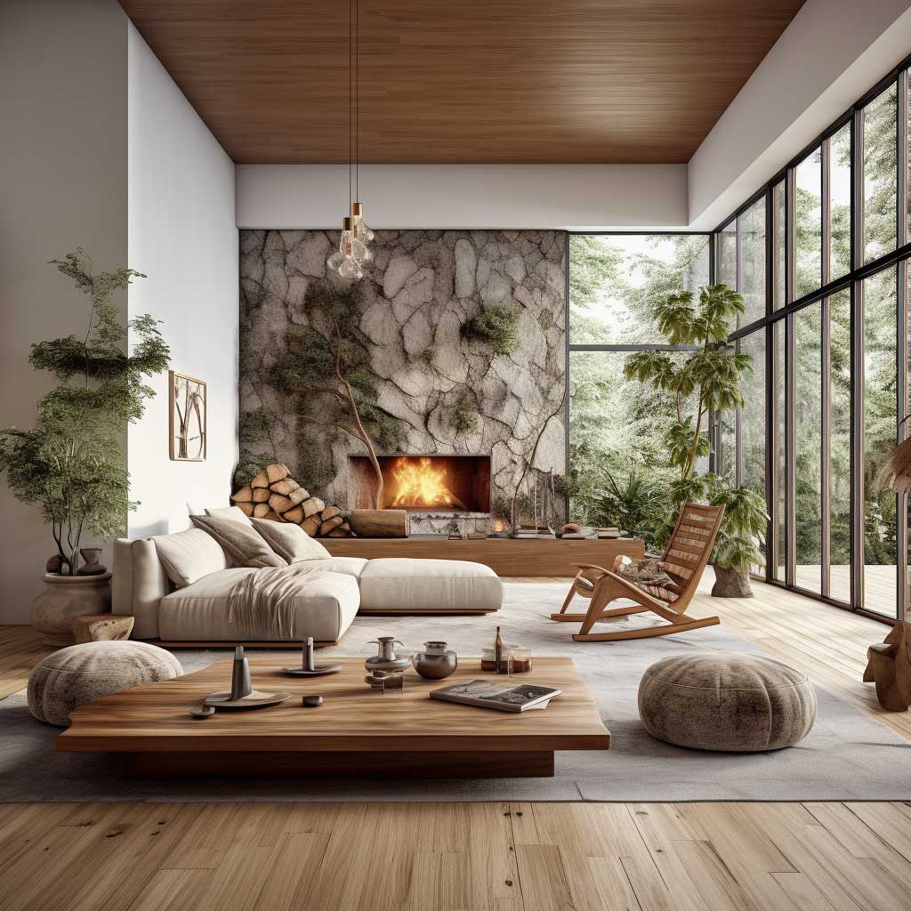


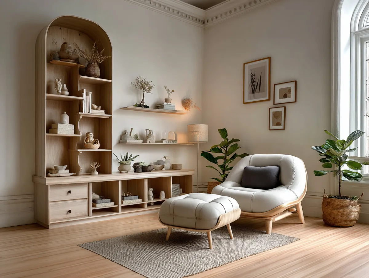
Plants in a Japandi living room earn their place through restraint. One olive tree in an earthy ceramic pot. One bonsai on a low shelf. Dried pampas in a tall bottle vase. What fails: a cluster of six trailing pothos at different heights — that’s a plant shop, not a Japandi room. The rule is fewer plants, stronger presence. Think of each plant as furniture with a biological component. It needs a reason to be in that corner.
Wool and linen textile layers rank just below the three primary materials in impact. A $90 chunky-knit wool throw from Hay or a washed linen cushion from The Citizenry adds the hygge warmth that prevents the space from reading as cold minimalism. Synthetic fiber alternatives look fine in photos. In person, they have no weight, no life, no texture. You’ll feel the difference within a week of living with them.
Storage in a Japandi Space Is Either Invisible or Intentional
Functional design is where Japandi earns its reputation. Every piece of furniture serves a purpose — and storage solutions either disappear completely or become the visual feature of the room. A flush-front TV unit with no visible handles (IKEA BESTÅ configuration costs around $350-$500 depending on size) is the cleaner option. Open shelving works only when the objects on it are curated: three or fewer items per shelf, all within the same tonal range.
What’s the point of multifunctional furniture in a Japandi living room? It’s not a gimmick. A storage ottoman in natural leather — HAY’s Palissade Ottoman runs $420 — replaces both a coffee table and a throw storage bin. One object, two functions, zero visual noise. That’s the Japanese engineering mindset applied to domestic life. I use mine as a footrest, a guest side table, and the place where every blanket lives. Nothing sits on the floor in this corner.


Cable management is the unglamorous detail that breaks Japandi rooms. A power cord trailing across pale oak flooring ruins the entire visual composition the same way a spelling mistake ruins a headline. I run mine through white cable conduit along the baseboard for $12 at any hardware store. Not invisible, but tidy. Media units should face the longest wall so cables drop vertically behind the unit rather than crossing floor space. Boring advice. Necessary advice.
Rugs in a Japandi living room anchor the seating zone without pattern. Natural jute, flatweave wool, or undyed cotton in approximately 200 x 290 cm for an average room. Lorena Canals makes a washable wool version at $380. The furniture pieces that complete a Japandi room all read better when there’s a grounded textile plane beneath them. Avoid any rug with a geometric pattern — it brings visual energy the room is specifically trying to avoid.
Lighting in a Japandi living room is warm, layered, and never overhead-only. A single ceiling fixture reads as a rental apartment. Layer in a washi paper floor lamp from Muji ($65), a small concrete table lamp on the shelf, and warm-spectrum LED bulbs (2700K, not 3000K). The Japanese concept of shading and layered light in interior spaces holds that shadows are as important as illumination — the room should shift mood as afternoon becomes evening.
THE BOTTOM LINE
A Japandi Living Room Isn’t Minimal. It’s Precisely Full.
Every surface holds exactly one thing worth looking at. Every material was chosen because it ages well, not because it photographs well. That distinction separates the rooms that feel right in person from the ones that only work on Instagram.
Start with the wall color. Get the tonal palette right before you buy a single piece of furniture. The room will tell you what it needs after that.
Save this post before you head to the paint store.