Brick and stone house exteriors fail when the two materials compete. I’ve looked at hundreds of facades where the stone accent wall fights the brick base, the colors sit a half-tone off, and the whole thing reads as a renovation project that ran out of budget. The houses that work—and the ones that keep showing up in architecture publications—treat both materials as a single surface language. The stone doesn’t decorate the brick. The brick doesn’t frame the stone. They occupy the same plane with the same weight, and the eye reads them as one.
My go-to reference for getting this right is old commercial buildings from the 1920s, where cost kept architects from over-designing. Natural limestone and common brick were laid in continuous coursing, the color difference did all the work the pattern needed to do. You can steal that logic for a new build at any scale.
Textural contrast between rough stone and laid brick — where the joint matters more than the material
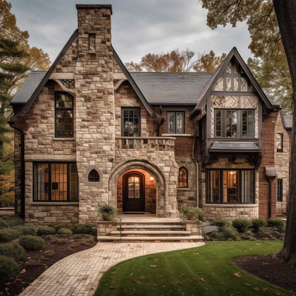
Contemporary brick and stone house exteriors with clean coursing lines
Rustic combinations where mortar color does the heavy lifting
Grand-scale facades and why proportional stone banding changes everything
Historic mixed-material exteriors and what makes the color balance actually work
The one placement mistake that makes stone accents look applied, not architectural
When Rough Stone Meets Laid Brick, the Joint Color Decides Everything


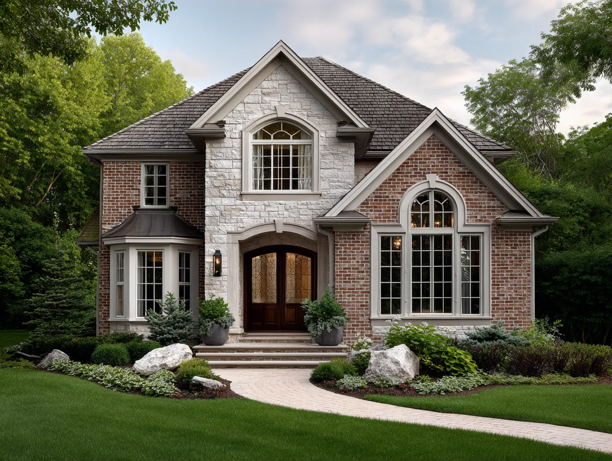
The facade above works because whoever specified this project chose mortar in a buff-tan tone that sits between the brick’s warm red and the stone’s cool gray. That single decision is doing more visual work than the layout of either material. I’ve seen the same stone-brick combination look like a craft project gone wrong when a contractor used white mortar—suddenly every joint is a line drawing that separates the two materials instead of connecting them.
The rough fieldstone sections here have a natural edge that creates real shadow at a two-inch depth. The brick, being thinner and more uniform, reads almost flat by comparison. That contrast in relief is what gives the facade its tactile richness—not the color, not the pattern. You can get this from reclaimed limestone or from cast stone veneer. The material itself matters less than the face depth. Anything under an inch of projection reads as tile, not masonry. Tile looks like decoration. Masonry looks like structure.
Don’t make the mistake of centering the stone on the facade. Centered placement reads as an appliqué—a panel someone ordered from a catalog and stuck on. The stone should continue off the edge of a wall, wrap a corner, or extend below grade line, so it feels like it was there before the rest of the house.
Placing a rectangular stone accent panel centered on a brick gable is the single fastest way to make a facade look like a showroom mock-up. The rectangular stone island surrounded by brick on all four sides reads as an afterthought—a Pinterest upgrade that was never part of the original design. Stone needs to meet a corner, a grade change, or a window surround to feel like it belongs to the structure. If it floats, it decorates. If it terminates, it builds.
Contemporary Brick and Stone Houses Need One Dominant Material, Not Equal Parts

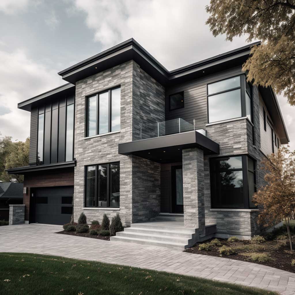

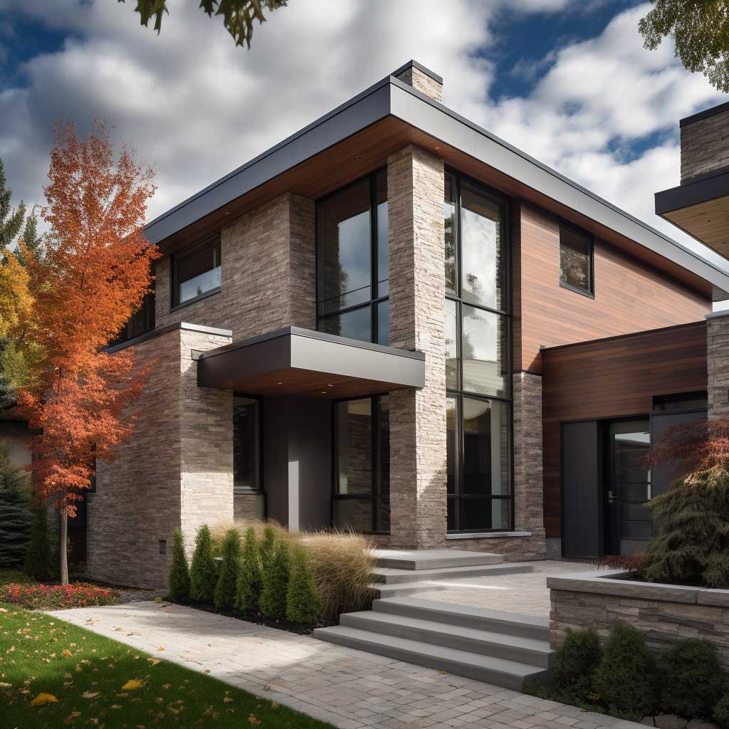
Contemporary brick and stone house exteriors consistently get this wrong: equal coverage. Fifty percent brick, fifty percent stone creates a split-personality facade that resolves into neither material. Every successful version of this I’ve photographed—and I’ve shot a lot of them—uses one material at roughly seventy percent and lets the second material perform a specific function. Stone at the base course anchors the structure visually. Brick from the water table up reads as the wall. The eye gets a clear hierarchy and stops fighting.
The homes above use a horizontal limestone band at floor-line height to transition between materials. That band pulls double duty: it reads as a ledge detail from across the street, and it solves the connection problem up close. You’re never looking at a line where brick meets stone—you’re looking at a third element that separates them intentionally. Cost-wise, that band in cut limestone runs around $18–$28 per linear foot installed. Budget cast stone comes in at $9–$14. The cast stone photographs nearly identically at street distance.
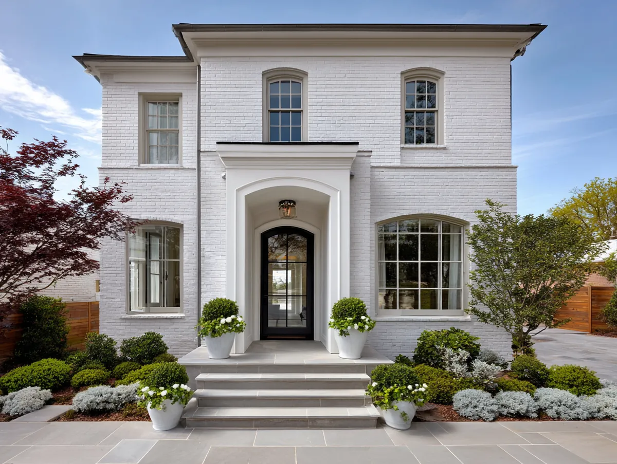
Dark window frames—steel look aluminum or actual steel at the higher end—are doing significant work in these photos. They create vertical lines that cut across both materials, unifying the facade at a third level of detail. Without those frames, the same stone-brick combination would read as softer and less resolved. I own two houses with this material combination; one has dark frames, one has white. The white one looks unfinished to me every single time I pull into the driveway. That’s the detail most online inspirations crop out.
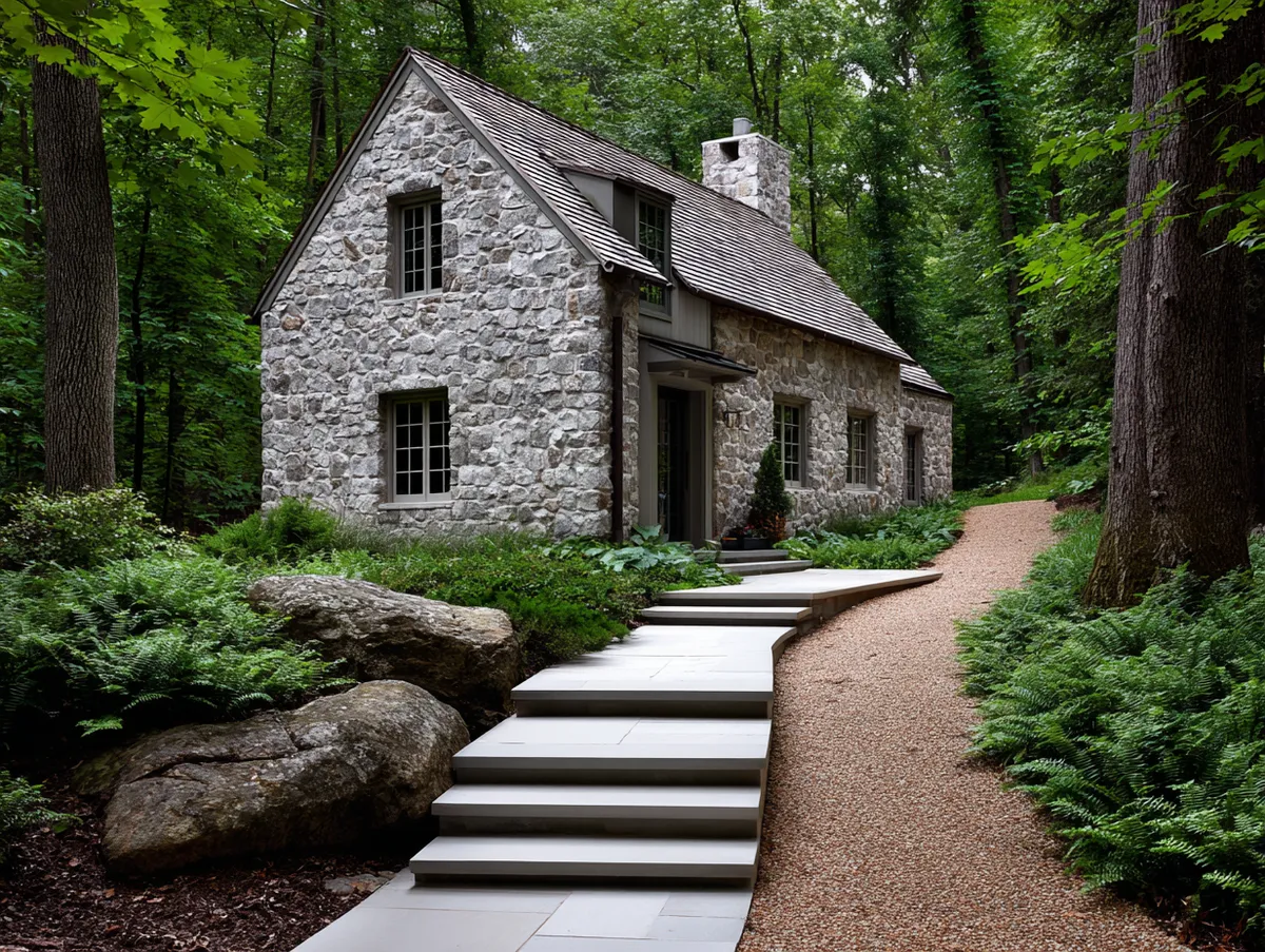
Rustic Stone and Brick Works Because Irregularity Is the Point, Not a Compromise


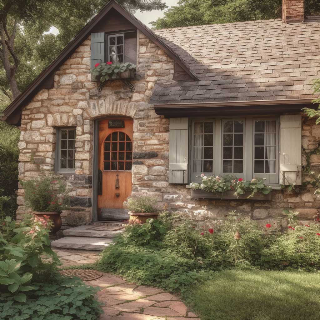
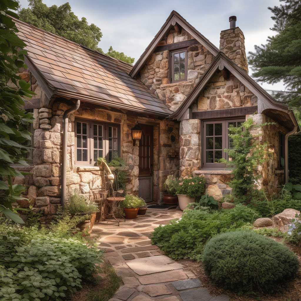
Rustic stone and brick combinations are the most forgiving to build and the most punishing to fake. Real rough-laid fieldstone with handmade brick looks the way it does because the mason made judgment calls at every course—filling a gap with a smaller stone, skipping a brick to accommodate a ledge irregularity. The result has internal logic that only lived-in decisions produce. When you replicate this with uniform manufactured stone veneer and machine-pressed brick, the eye detects something off within about four seconds of looking. It looks like a photograph of a rustic exterior rather than an actual one.
The cottage examples above use stone as the primary wall material with brick appearing at corners, window surrounds, and the chimney stack. That’s a structurally honest arrangement—brick at the high-stress joinery points, stone filling the field. For a new build that wants this look, reclaimed brick from demolition yards will telegraph more age in five years than any new production brick manages in fifty. Budget $3–$7 per reclaimed brick versus $0.50–$1.50 for new. The premium is real. So is the result.
Wide mortar joints—three-quarter inch to one inch—are not a casualty of rustic construction. They’re the point. Wide joints hold shadow at every hour of the day except high noon, and that constant shadow depth is what makes rough masonry read as three-dimensional in photographs and in person. Tight joints flatten the wall. I’ve watched clients choose tight-joint installation to “look cleaner” and then wonder why their stone exterior looks like wallpaper. Joints at three-quarter inch minimum. Non-negotiable if you want the depth.
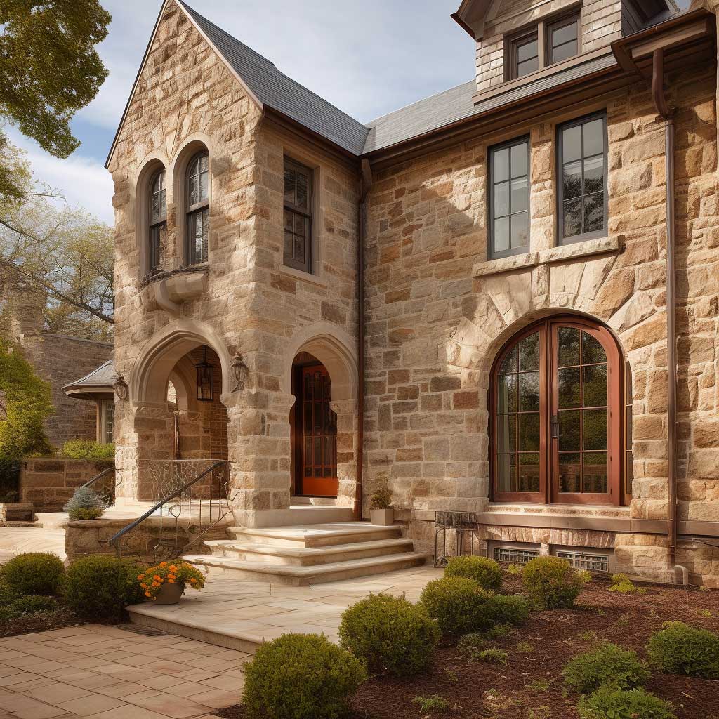
Large-Scale Stone and Brick Facades Earn Their Grandeur Through Proportion, Not Surface Area
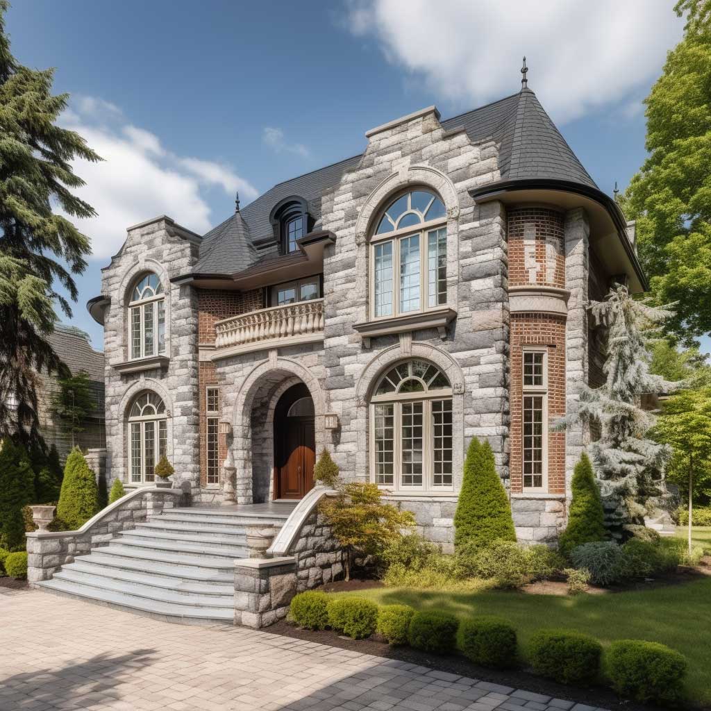
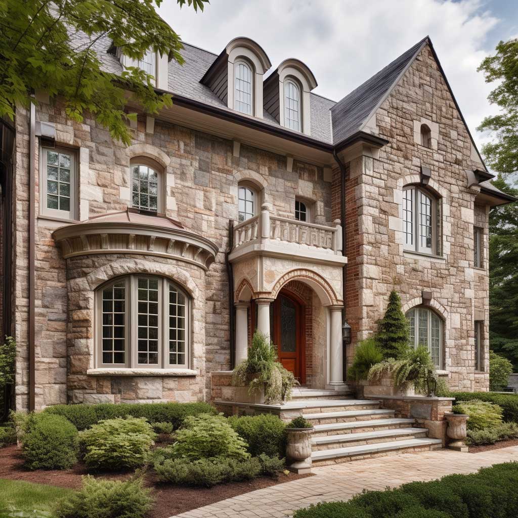


Grand brick and stone house exteriors work from proportion, not from excess. The facades above read as substantial because the stone is deployed at exactly the structural moments that would require heavier material in actual load-bearing construction: quoins at corners, keystones above arched openings, water table at grade transition, cornice at the roofline. The brick fills the field between those load points. This mimics how pre-20th century masons actually built, and the visual logic holds because the logic is real—these are the places where a real structure concentrates stress.
Stone pilasters flanking an entry do more visual work per square foot than any other placement. They frame the focal point of the facade, they create a vertical element that draws the eye upward from grade to roofline, and they establish a human-scale reference that makes the rest of the house read correctly in proportion. For a comparable effect on a standard two-story residence, pilasters don’t need to be carved limestone at $85–$120 per square foot. Indiana limestone cut in simple profiles runs $28–$45 per square foot installed and photographs identically.
One thing these elevated brick and stone exterior design ideas all share: the window surrounds are stone, not brick. Swapping to brick surrounds on an otherwise stone-detailed facade is a budget decision that the eye reads as unfinished. The surround is the one detail visible from every room interior every time someone looks out. Stone surrounds hold shadow at the reveal edge. Brick surrounds look like the trim budget ran out. If cost requires a compromise, do stone surrounds on the front elevation only and brick on the sides and rear. Front elevation stone. Everything else negotiable.
Historic Stone and Brick Combinations Age Well Because the Color Was Already Old When They Built Them


Historic homes with brick and stone exteriors look the way they do because nineteenth-century brick was fired at lower temperatures, which produced a more varied surface with more red-orange-brown variation within a single palette. That variation is exactly what makes aged brick read as authentic rather than monotonous. Modern production brick is fired hotter and more uniformly—better performance, worse patina. If you’re matching existing historic brickwork or building something that should read as old, the standard recommendation is to source handmade or water-struck brick from small regional producers. Cherokee Brick and Tile, General Shale’s heritage lines, and Watsontown Brick all carry surface variation that newer production brick doesn’t.
The stone on these facades is mostly limestone and sandstone—materials that were quarried locally in the 19th century because transport was expensive. Local stone almost always works with local brick because both came out of the same geological context. They share trace minerals, they weather at similar rates, and their natural tones sit in the same temperature range. Modern projects that source stone from one region and brick from another can end up with a material combination that nobody would have ever chosen if they were building in place. Worth checking regional quarry stock before ordering brick.
Deep window reveals—the distance from the exterior face of the wall to the window glazing—are the single detail that separates historic masonry construction from modern surface-applied cladding. Original masonry walls were 12–18 inches thick. The reveals created by that depth produce shadow lines that change character throughout the day, giving the facade a kind of animated quality that no thin-veneer modern exterior replicates. For new construction, a 4-inch reveal minimum is achievable within standard framing. It costs nothing structurally. It changes everything photographically. Every exterior magazine shot that makes you stop scrolling has deep reveals.
The Takeaway
Brick and stone house exteriors look resolved when one material structures and one material fills—not when they share equal billing.
Mortar color connects them or kills the combination. Joint depth creates the shadow that makes masonry read as three-dimensional. Stone belongs at the load points—corners, sills, water table, surround—not centered on field panels. Every example here that reads as intentional follows those three rules, regardless of style or scale.
Modern brick from big producers reads flat. Reclaimed or handmade brick reads aged. Budget the difference where it’s visible from the street.
Save this post.
Related Topics