A two-tone exterior paint scheme does more than update a home’s colour — it redefines its architecture. The right combination draws the eye to details that might otherwise go unnoticed: the depth of a window frame, the weight of a front door, the line where wall meets roofline. For traditional homes in particular, this approach works because it respects the existing structure while modernising how it reads from the street. Below are three proven colour strategies — earthy contrasts, subtle elegance, and bold combinations — each with specific pairing logic and practical application notes.
QUICK ANSWER
The two-tone rule: use the darker shade for trim, not the body. A lighter main facade with darker accents on windows, doors and roofline creates depth without overwhelming the architecture.
| Style | Body Colour | Trim / Accent | Best For | Mood |
|---|---|---|---|---|
| Classic Earthy | Soft Beige | Rich Brown | Colonial, Craftsman | Warm, grounded |
| Forest Tones | Sage Green | Deep Pine | Cottage, farmhouse | Natural, serene |
| Subtle Grey | Muted Grey | Crisp White | Georgian, Federal | Refined, timeless |
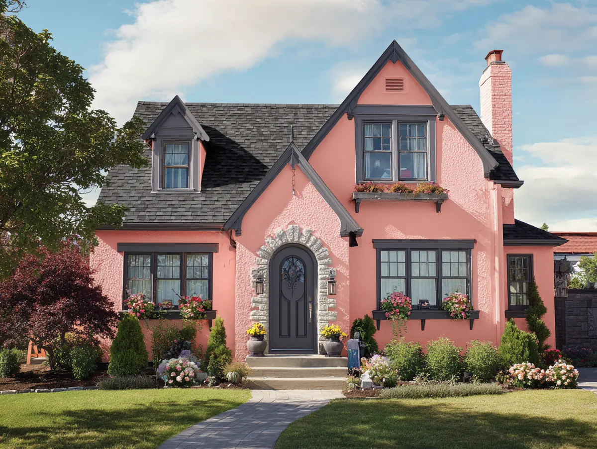
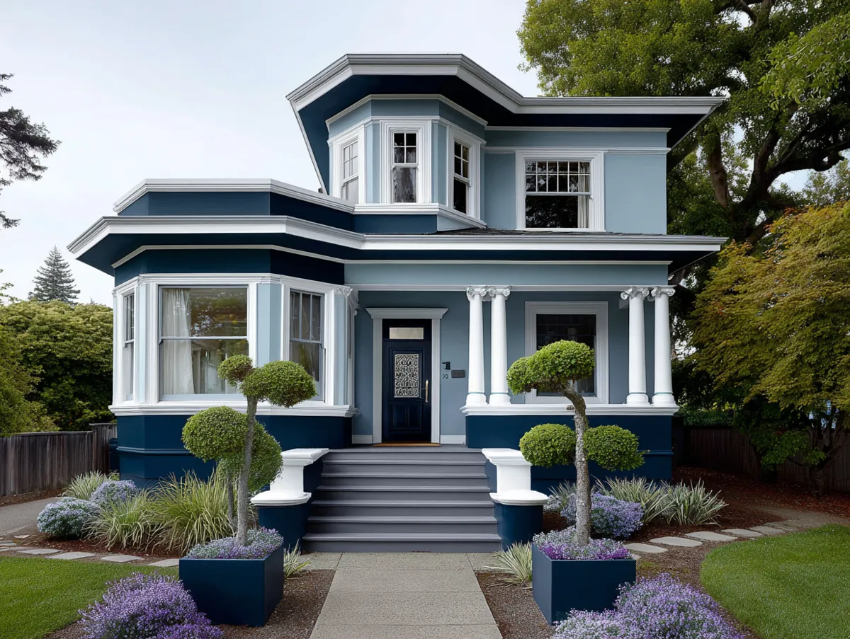
| Blush + Stone | Soft Blush | Warm Stone | Victorian, cottage | Soft, romantic |
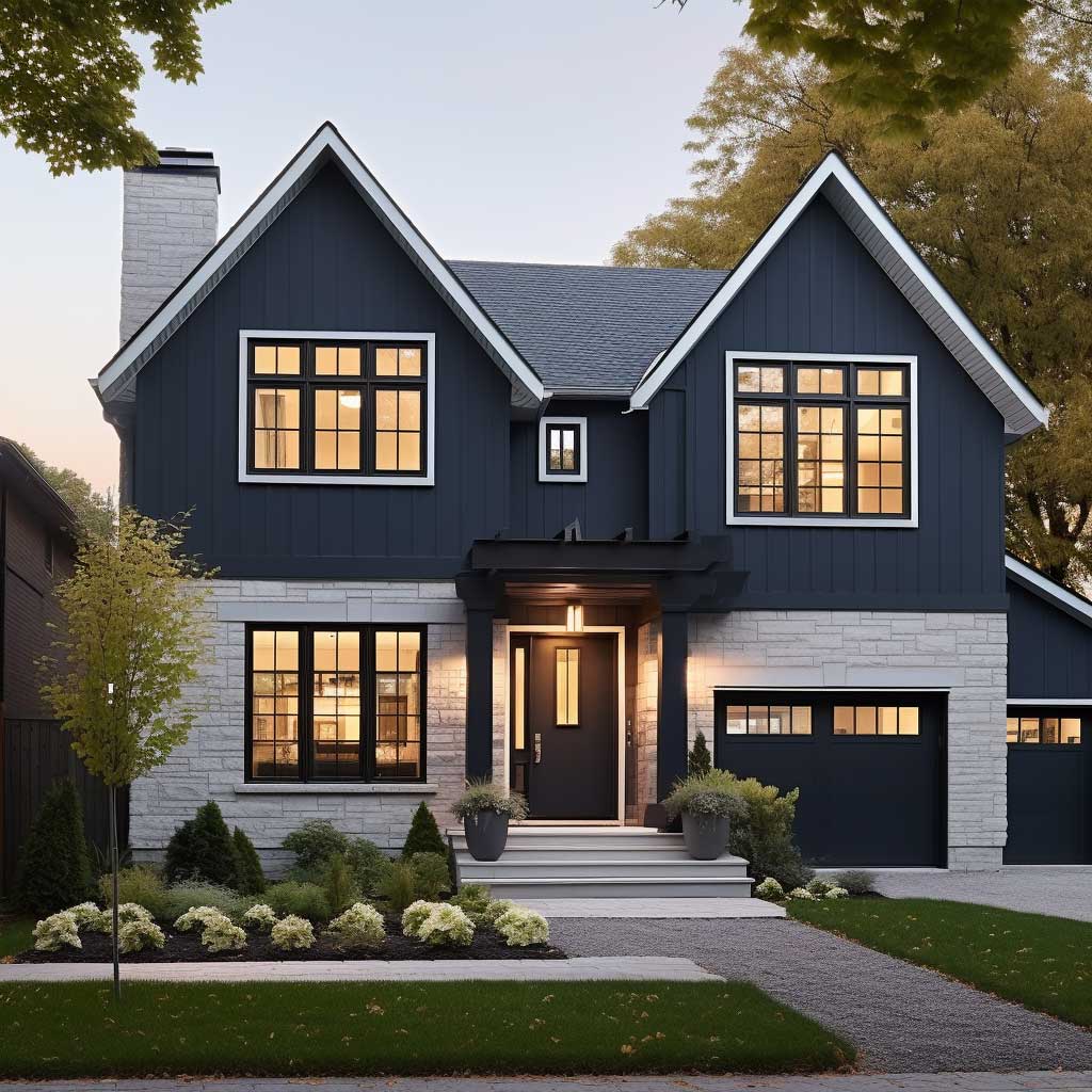
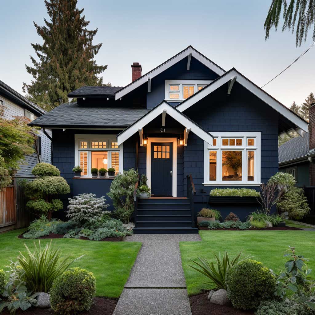
| Navy + Red | Deep Navy | Fiery Red | Colonial, Traditional | Bold, dramatic |
| Forest + Gold | Deep Green | Warm Gold | Tudor, craftsman | Rich, confident |
Earthy Two Tone Exterior Paint: Beige, Brown and Natural Green Combinations
The dance of colors on a home’s exterior is a visual symphony, a reflection of the homeowner’s personality, and the spirit of the house itself. Earthy contrasts, in particular, have a way of grounding a structure, making it one with its surroundings. When we talk about two-tone exterior house paint ideas, earthy contrasts stand out as a harmonious blend of nature and architecture.
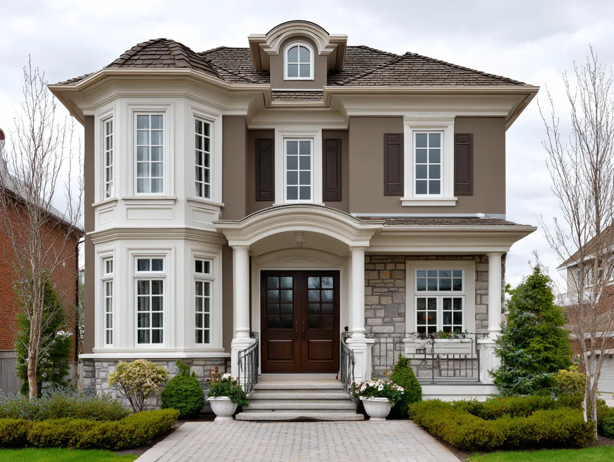
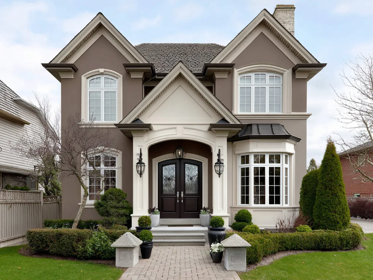
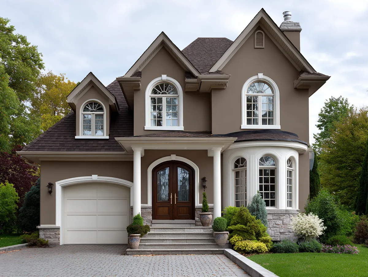
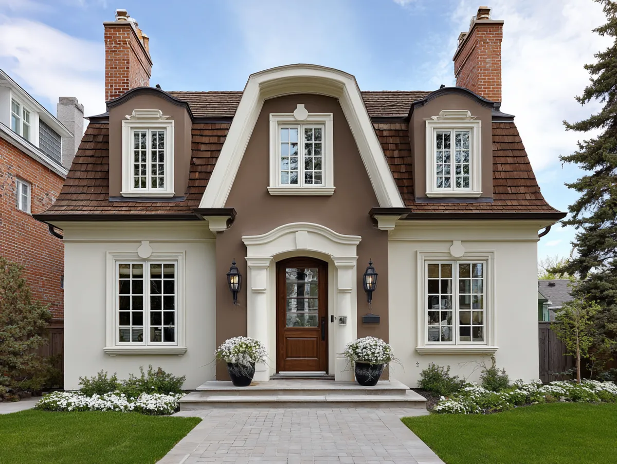
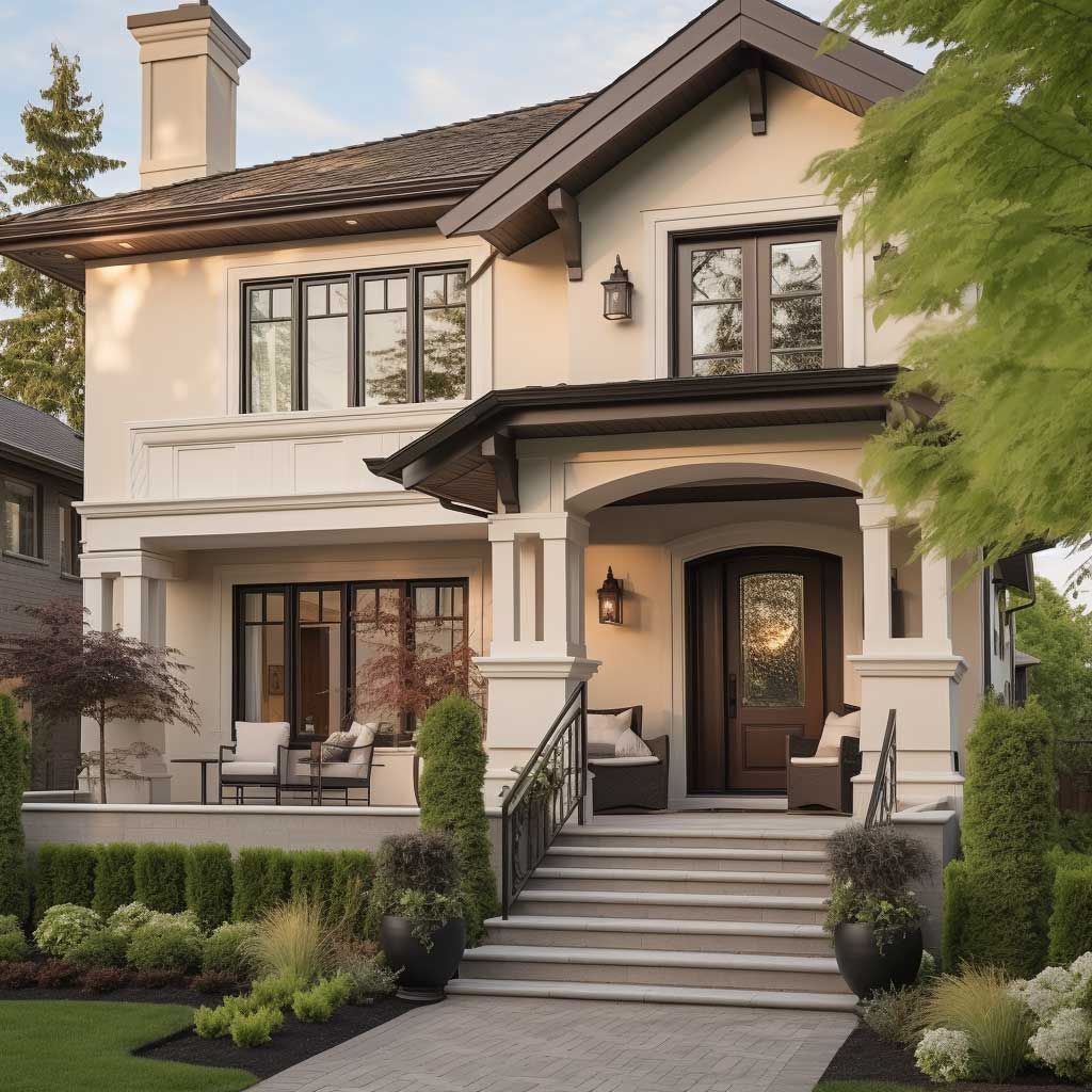
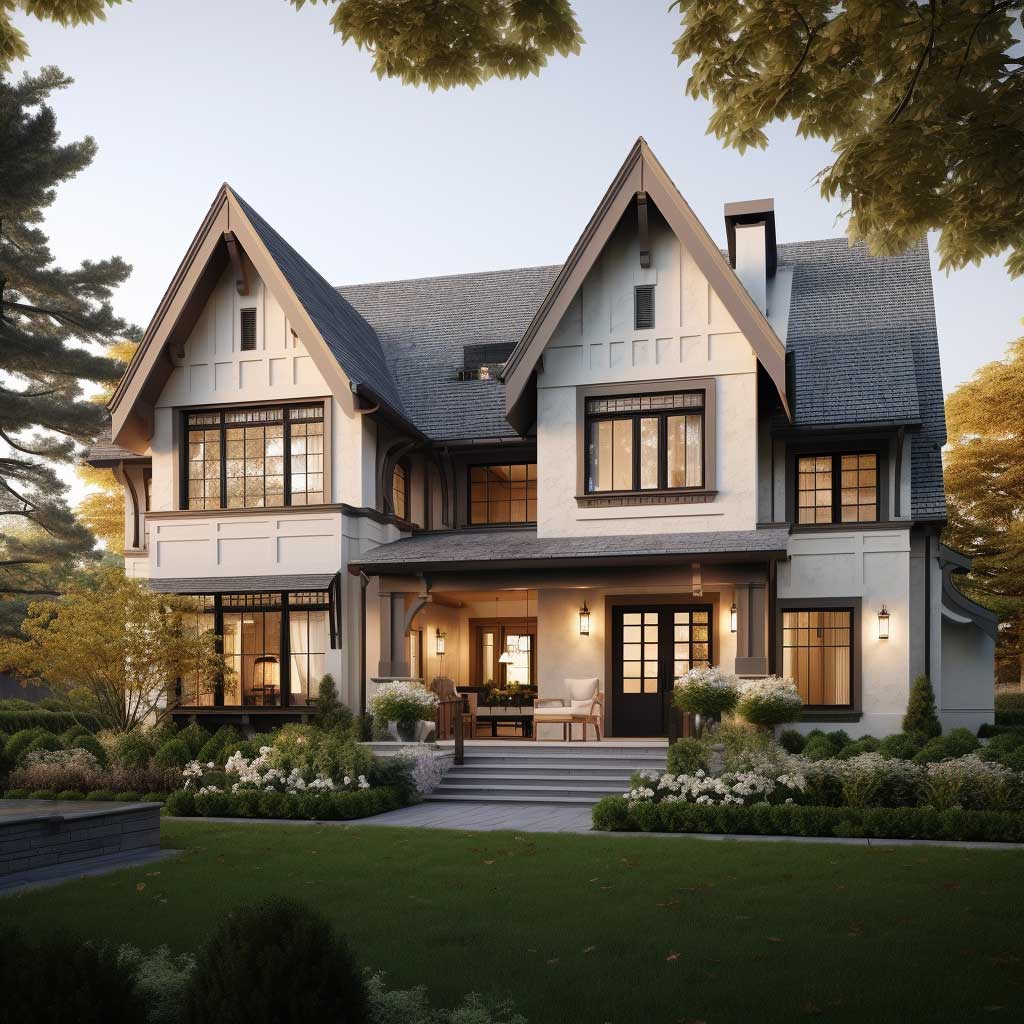
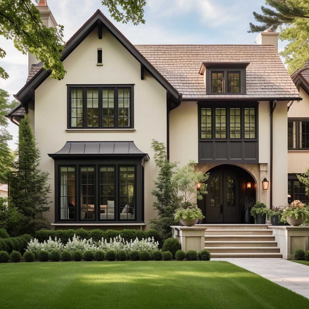
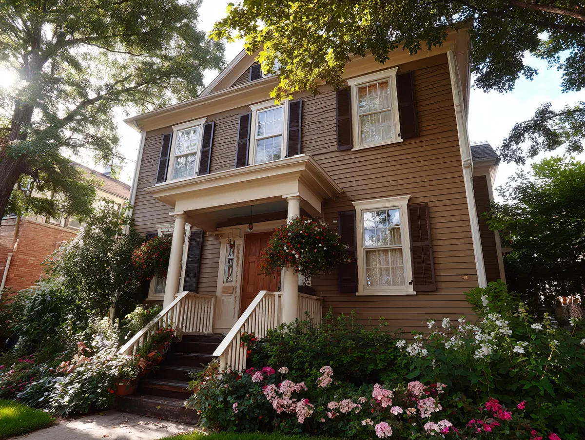
Imagine a traditional home, its walls painted in a soft shade of beige. This color, reminiscent of sandy beaches, serves as a neutral backdrop. But then, the trim, the shutters, and the doors are painted in a deep, rich brown, echoing the color of the soil, the bark of trees, or the wet stones by a riverbed. This combination not only adds depth and dimension to the house but also creates a sense of balance and harmony.
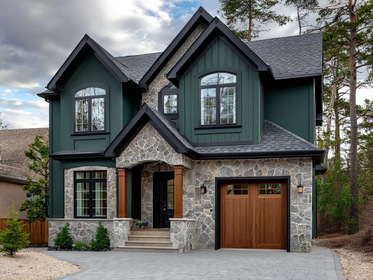
Earthy contrasts in two-tone exterior house paint ideas are not just about beige and brown. Think of the soft green of young leaves paired with the deep green of pine trees. Or the pale grey of a cloudy sky contrasted with the dark grey of storm clouds. Each combination tells a story, a tale of nature and man-made structures coexisting in harmony.
The practical advantage of earthy contrasts is their resistance to dating. Trends in exterior colour shift roughly every 7–10 years, but beige-and-brown or sage-and-pine combinations have maintained relevance across multiple cycles. This makes them a sound investment for homeowners who repaint on a long timeline. When selecting specific shades within an earthy palette, look at the undertones first: a beige with a yellow undertone pairs well with warm, red-based browns; a beige with a pink undertone needs a cooler, grey-brown to avoid the facade reading as muddy. Paint manufacturers typically group compatible earthy tones by undertone family, which makes coordinating easier.
TWO-TONE PAINTING RULES
① Apply darker shades to trim and architectural details — not the main facade
② Test paint swatches in natural light at different times of day before committing
③ Keep the colour ratio at 70% body / 30% accent for balance
④ Match the undertone: warm body colours need warm accents, cool needs cool
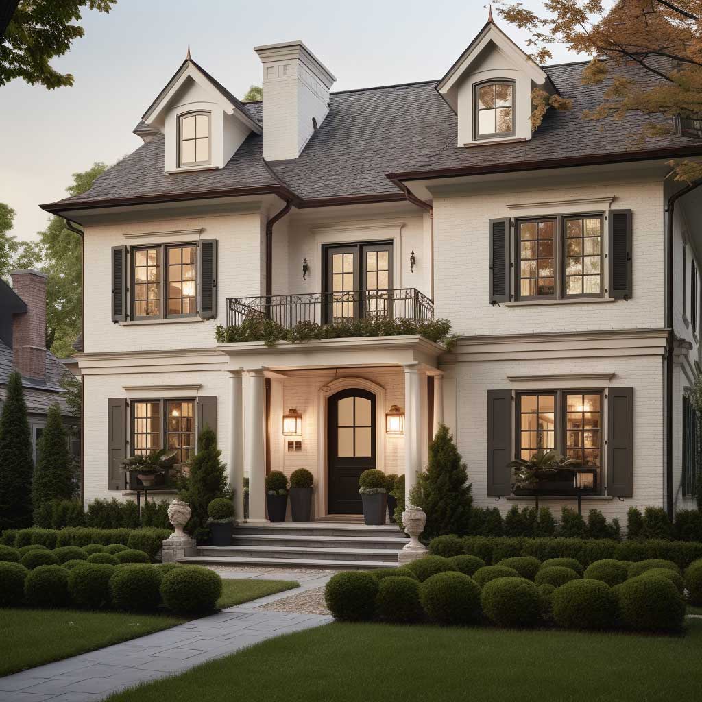
Subtle Two Tone Exterior Paint: Grey, White and Muted Tone Combinations
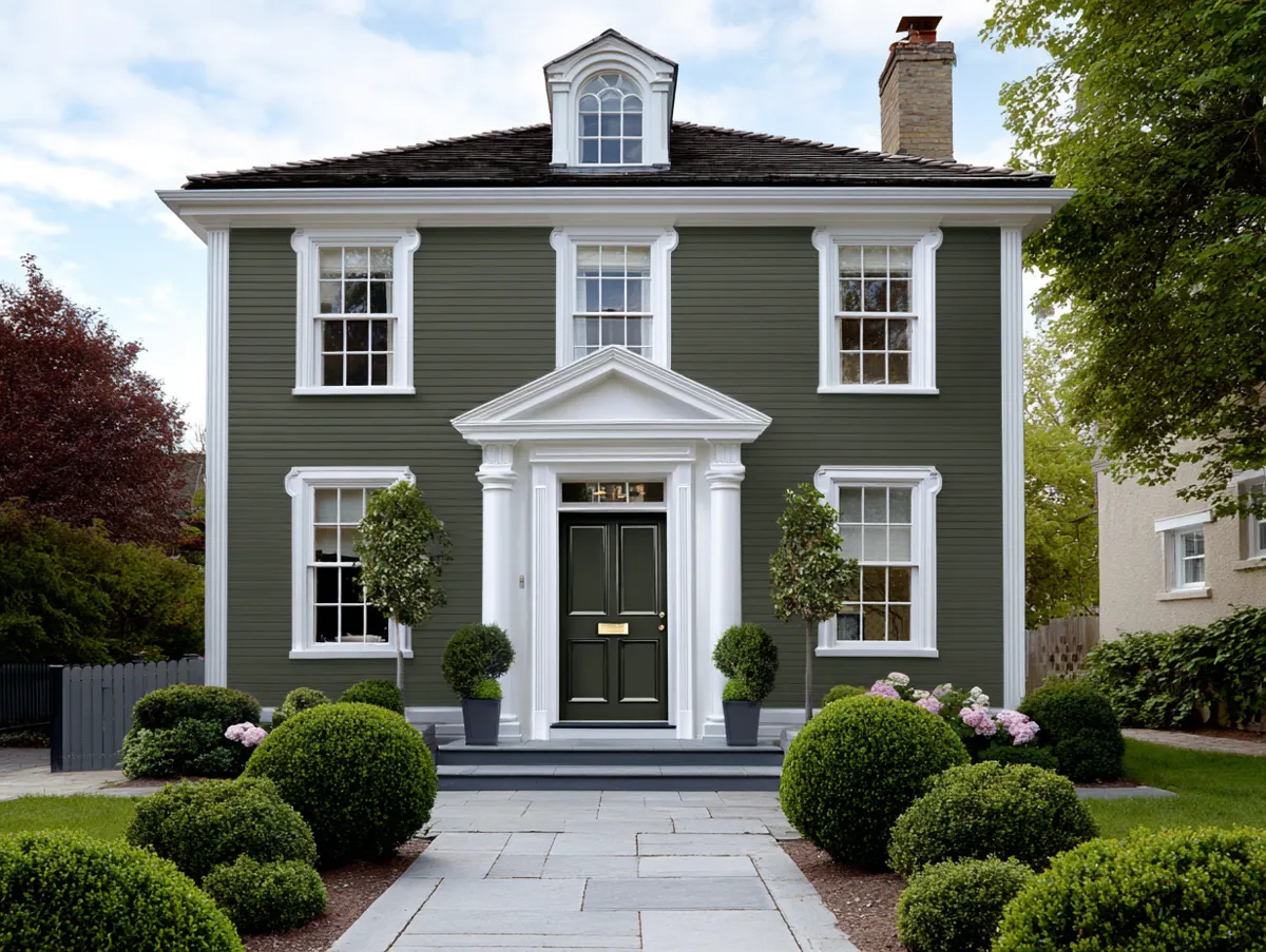
Elegance, as they say, lies in simplicity. In the world of exterior house paint, this adage holds true, especially when we explore the realm of subtle elegance in two-tone designs. The magic of this approach lies in its restraint, its ability to convey beauty without being loud or ostentatious.
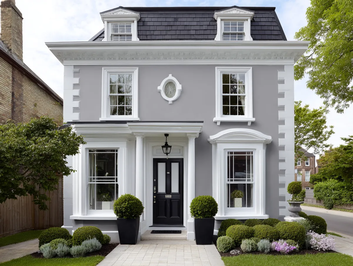
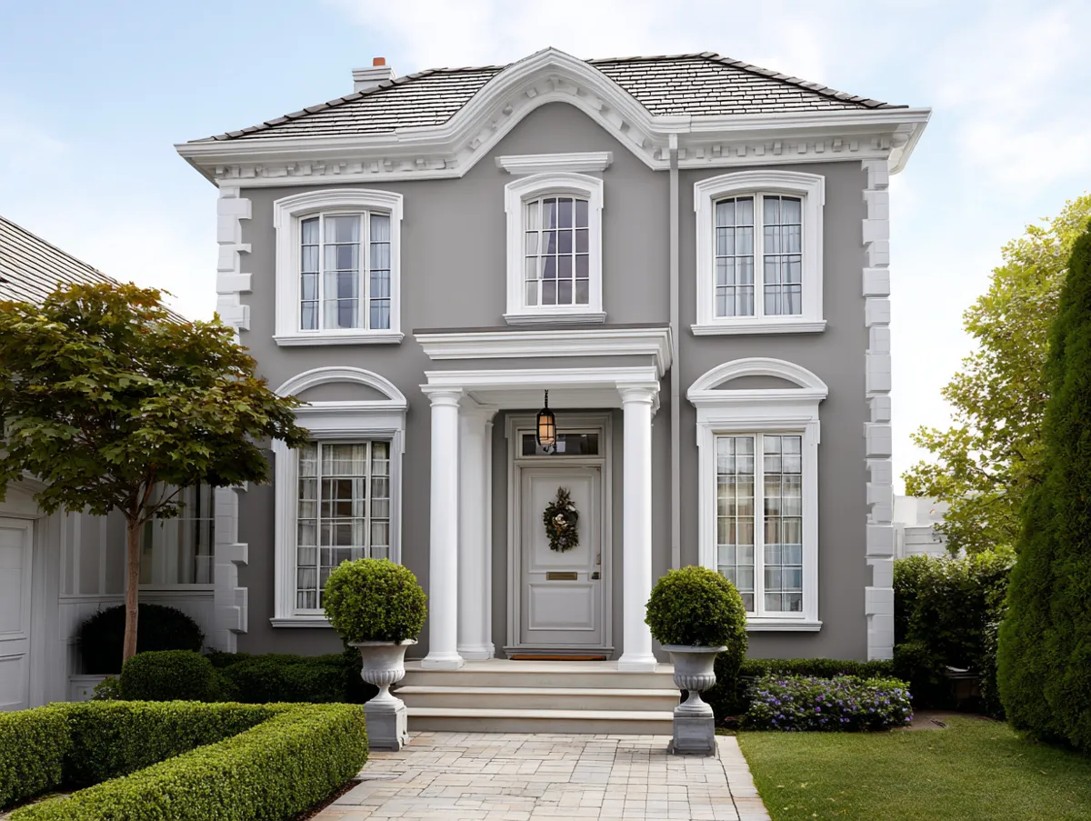
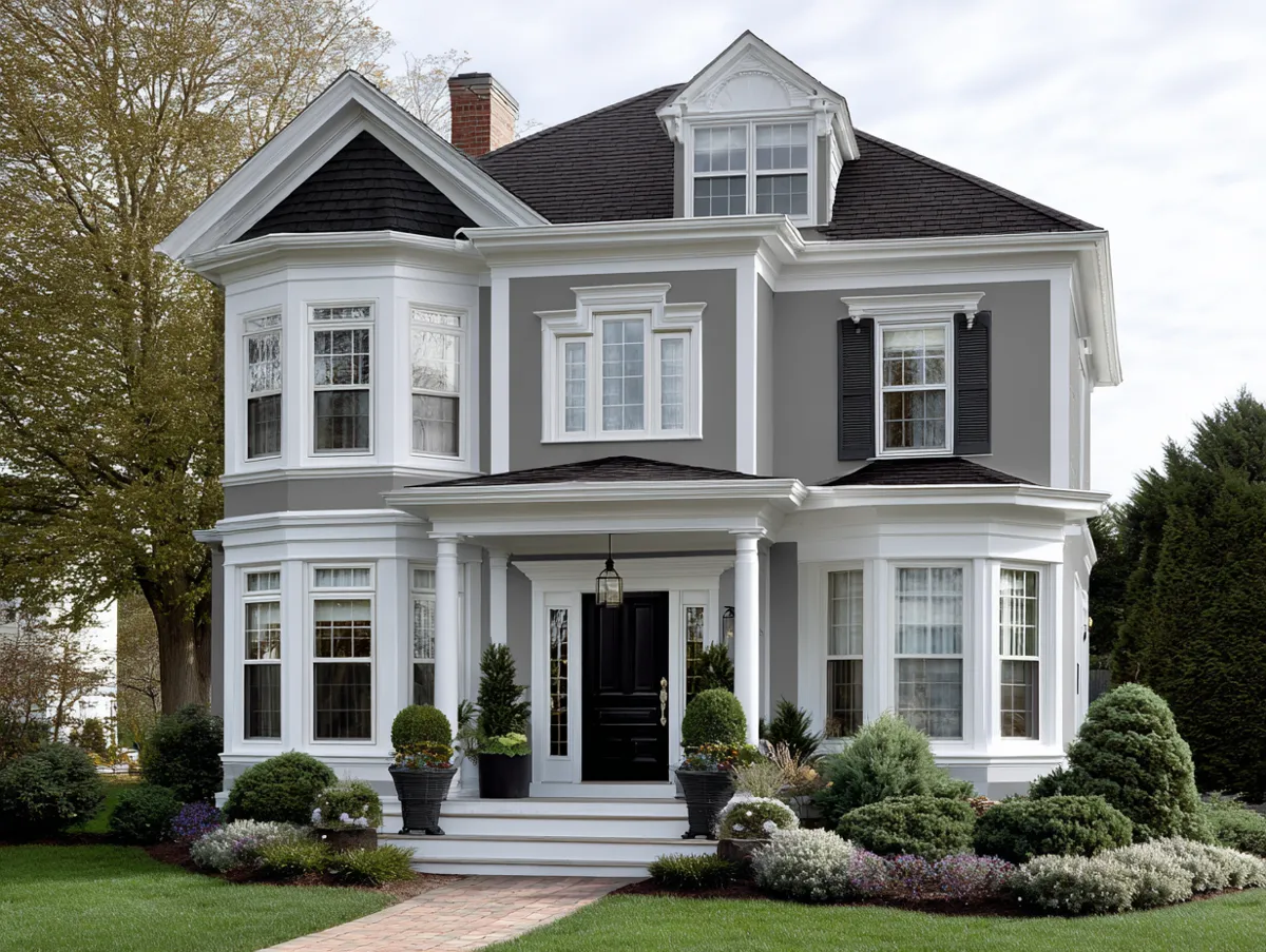
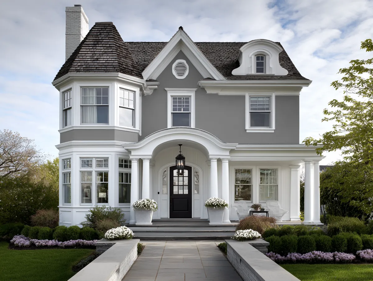
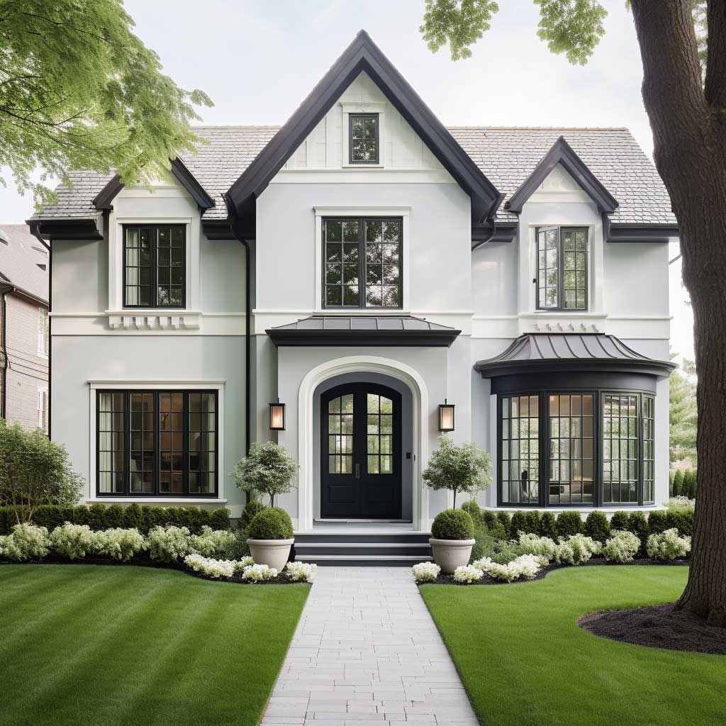
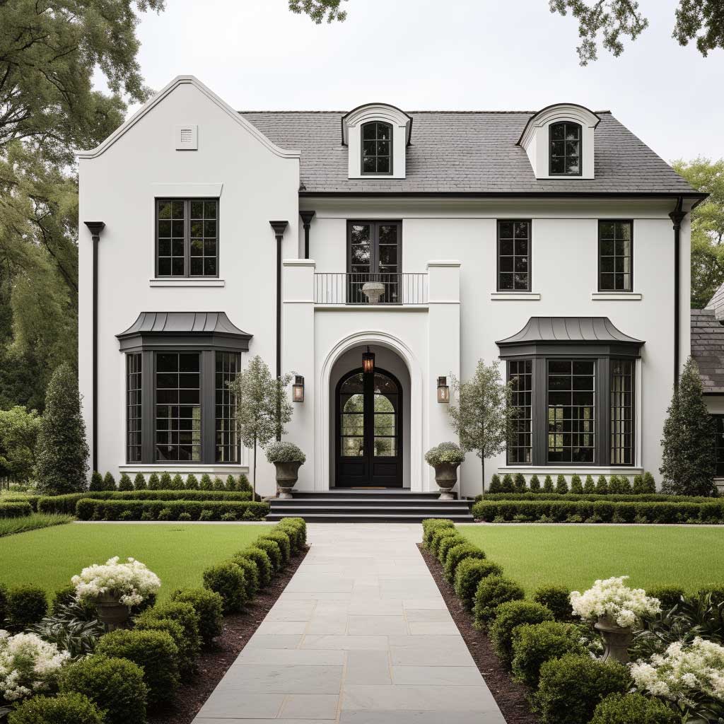
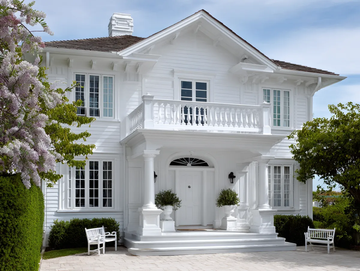
Picture a traditional home, its facade painted in a muted shade of grey. This color, soft and understated, exudes a quiet charm. But then, the accents – the window frames, the door, the roofline – are painted in a crisp white. This combination, though simple, creates a visual contrast that’s striking yet subtle. It’s a design choice that speaks of refinement, of a keen eye for detail, and of an appreciation for understated beauty.
Subtle elegance in two-tone exterior house paint ideas is not just about grey and white. Think of the soft blush of dawn paired with the pale gold of morning sunlight. Or the deep blue of twilight contrasted with the silvery shimmer of moonlight. Each combination, though understated, has a beauty that’s timeless and universal.
The grey-and-white combination in particular succeeds because it relies on contrast in value rather than colour. Both shades sit on the same achromatic axis, so they never clash — only contrast. The degree of contrast is entirely controllable: a light grey body with off-white trim creates a soft, barely-there distinction, while a charcoal body with pure white accents produces a sharp, modern result. For traditional homes with significant architectural detailing — corbels, dentil moulding, pilasters — a higher-contrast grey-and-white combination is usually more effective because it makes those details legible from the street. On plainer facades with fewer architectural features, a lower-contrast approach prevents the exterior from looking flat.
Bold Two Tone Exterior Paint: High-Contrast Color Combinations for Maximum Impact
In a world where homes often blend into one another, standing out can be a statement of individuality, of daring to be different. This is where bold and beautiful two-tone exterior house paint ideas come into play. It’s a design choice that’s audacious, that’s vibrant, and that’s unapologetically unique.
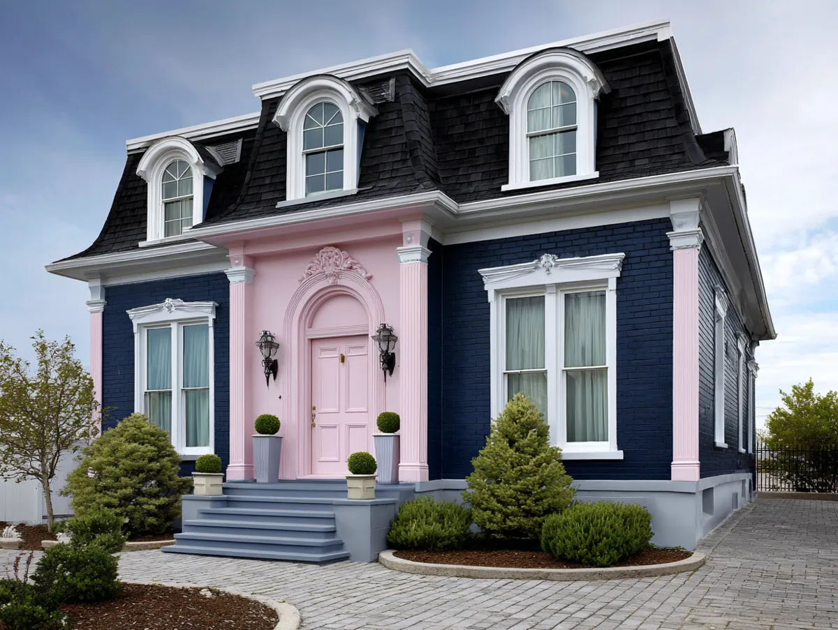
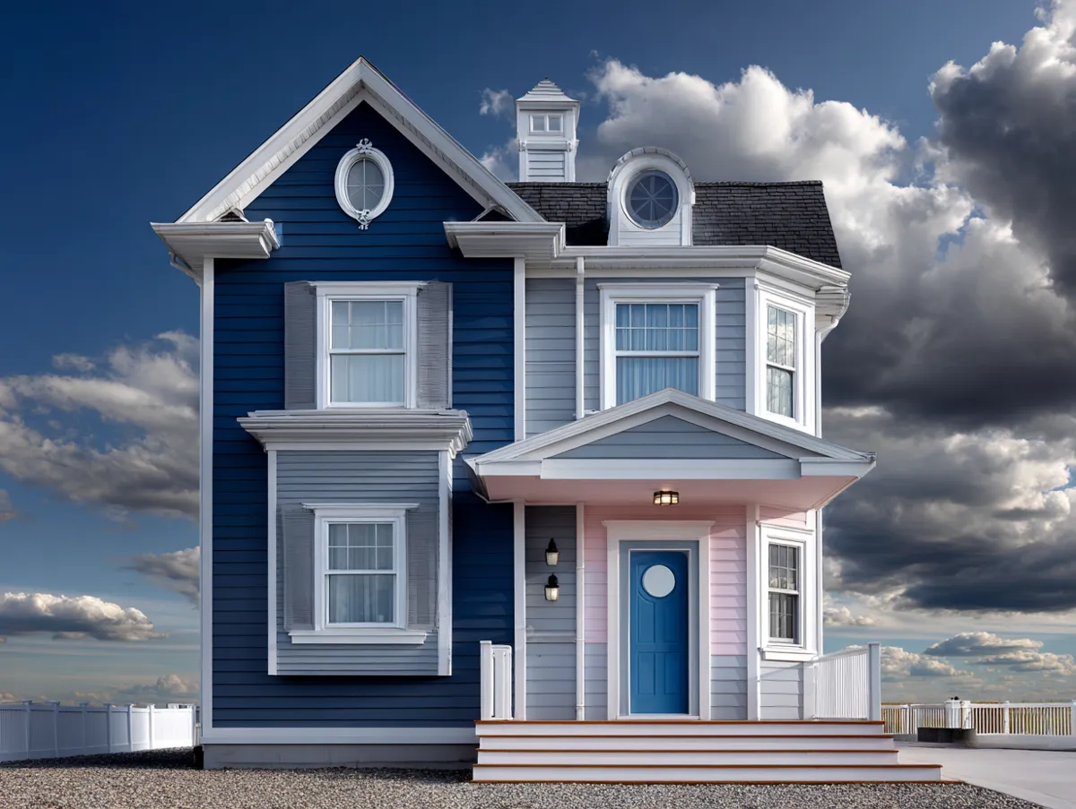
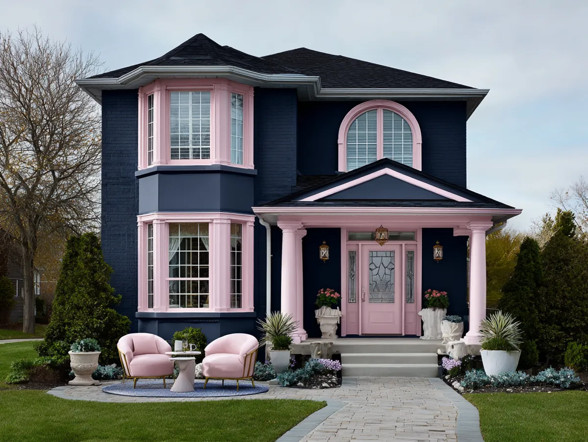
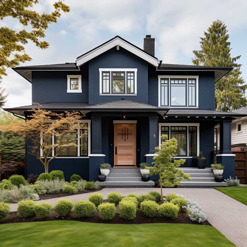
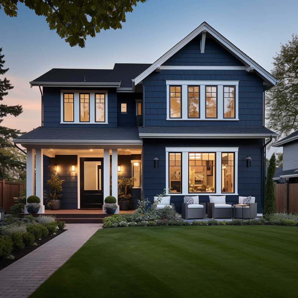
Imagine a traditional home, its walls painted in a deep shade of navy blue. This color, intense and dramatic, serves as a bold backdrop. But then, the accents – the window sills, the balcony, the front door – are painted in a bright, fiery red. This combination, though unexpected, creates a visual spectacle that’s hard to ignore. It’s a design choice that’s both bold and beautiful, that makes a statement, and that demands attention.
Bold and beautiful two-tone exterior house paint ideas are not just about blue and red. Think of the deep green of a forest paired with the bright yellow of sunflowers. Or the intense purple of a summer evening contrasted with the bright orange of a sunset. Each combination is a celebration of color, of the joy of being different, and of the beauty of contrasts.
The risk with bold combinations is over-application. A deep navy body with red accents on every element — shutters, door, window boxes, porch railings — quickly becomes visually exhausting. The more effective approach is to concentrate the bold accent on a single focal point, typically the front door, and use a more restrained version of the accent (darker or more muted) on secondary elements like shutters. This hierarchy gives the eye a clear entry point without competing signals. It also means the bold choice reads as considered rather than impulsive — which is ultimately what separates a house that turns heads from one that simply looks loud.