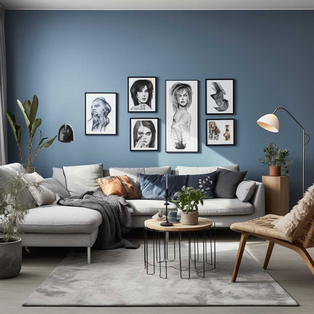
A grey and blue living room sounds simple on paper, but pull it off poorly and you end up with something that feels like a dentist’s waiting room in Reykjavik. The combination works because grey gives blue somewhere to breathe — it’s a relationship built on contrast, not competition. I’ve rearranged my own living room four times chasing this palette, and the rooms that actually look good share three things: deliberate texture, a clear tonal anchor, and at least one element that breaks the expected. Below are seven grey and blue living room ideas drawn from real spaces, with the specifics that make each one worth copying.
You’ll notice that none of these rooms got good by playing it safe. Flat light-grey walls plus any random blue cushion is not a design decision — it’s a placeholder. What separates a grey and blue living room that photographs well from one that actually feels good to live in is the layering of tone and texture across surfaces, not just soft furnishings. The ideas below cover all three original sections of this article — rugs, wall art, and sofas — with enough specifics to actually act on.
What you’ll find in this article
→ Why grey-blue rugs define zones better than furniture placement alone
→ How wall art in this palette works as a focal point — and what type to avoid
→ The grey sofa + blue accent formula, with specific products and price points
→ The one mistake that makes every grey and blue room look unfinished
→ A comparison of grey and blue tonal pairings (light vs. dark blue in the same scheme)
→ FAQ covering dark blue walls, modern grey and blue combinations, and the grey-blue-white trio
The Rug Is Doing More Work Than You Think in a Grey and Blue Living Room
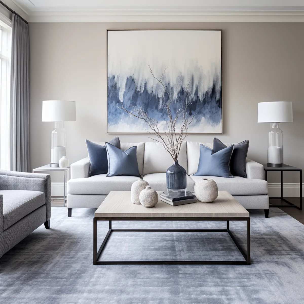
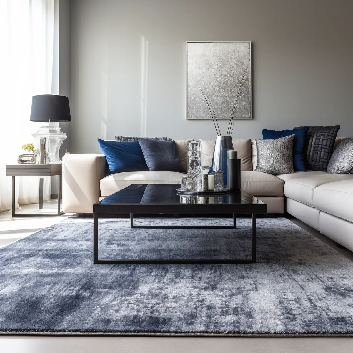
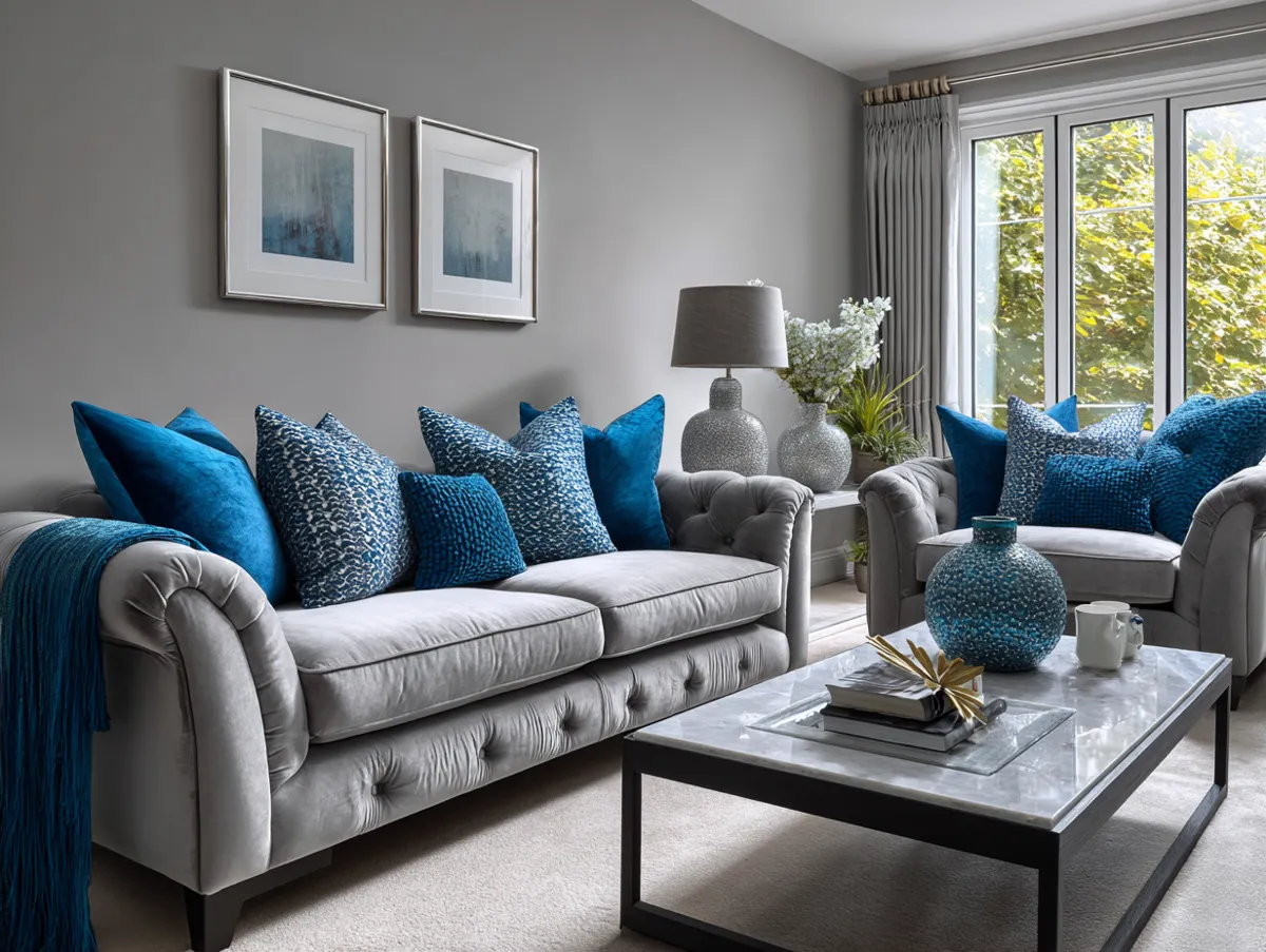
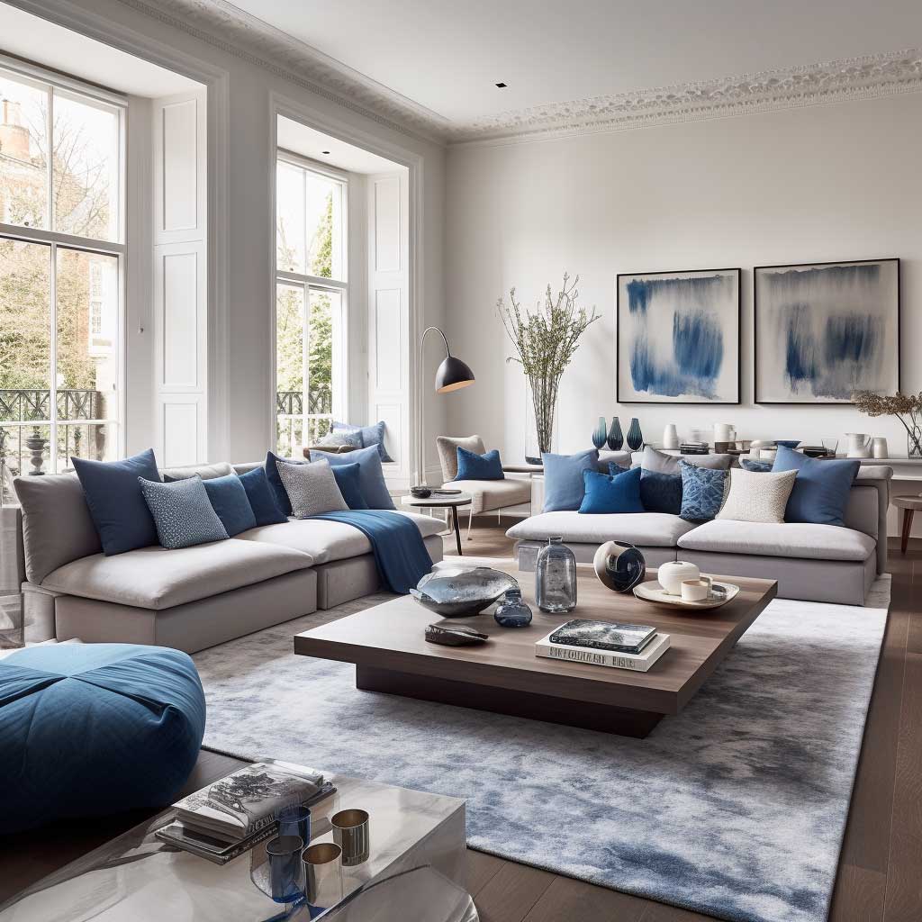
Every living room has one element that locks the rest of the space into place. In a grey and blue room, that element is almost always the rug — not the sofa, not the wall color. I learned this the hard way after spending $400 on a solid charcoal sofa and watching the room look like nothing for six months until I swapped in a flat-weave rug in a grey-and-denim geometric pattern. The whole thing clicked within twenty minutes of rolling it out. A rug in these colors creates the tonal anchor that tells your eye where the seating area begins and ends — it’s the visual equivalent of drawing a circle around the furniture and saying “this is the room.”
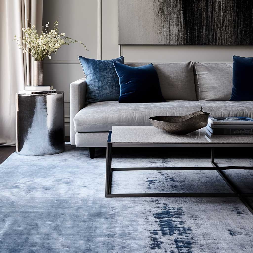
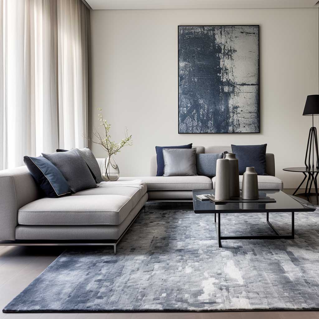
For a grey and blue living room, the rug texture matters as much as the color. A shaggy, high-pile option in dove grey with slate-blue flecks reads cozy and casual — think West Elm Plush Textured rug, around $299 for an 8×10. A flat-weave geometric in navy-and-charcoal reads contemporary and sharp. Don’t mix the two textures in a single seating area. You’ll notice the eye starts competing with itself instead of settling on any one thing, and the whole room feels restless. My go-to when the palette feels too cold is to choose a rug that pulls slightly warm — a grey with an undercurrent of taupe rather than steel will keep the blue from reading clinical.
What doesn’t work? Oval rugs under square coffee tables in this palette. I’ve tried it — the shape conflict undermines the zone-defining job the rug is there to do. Rectangular rugs, sized generously so the front legs of the sofa sit on the rug, are the only format that actually reads intentional in grey and blue living room decor. Undersized rugs floating under the coffee table alone are the single most common reason grey and blue lounge ideas look unfinished in real life versus Pinterest.
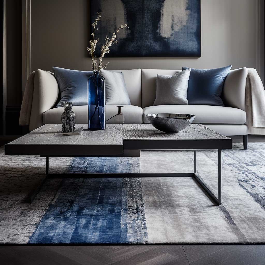
Don’t Do This: Buying a rug with both grey and blue in the colorway and calling it done. A rug with thirty colors in it — including grey and blue — is not a grey and blue rug. It’s a multicolored rug that happens to contain those shades. It won’t anchor your palette; it’ll diffuse it. Stick to rugs where grey and blue are the dominant 80%, with at most a subtle third neutral like cream or warm white. Anything bolder than that, and the rug becomes the whole room’s personality instead of its foundation.
Grey and Blue Wall Art Doesn’t Have to Be Abstract to Hit Hard
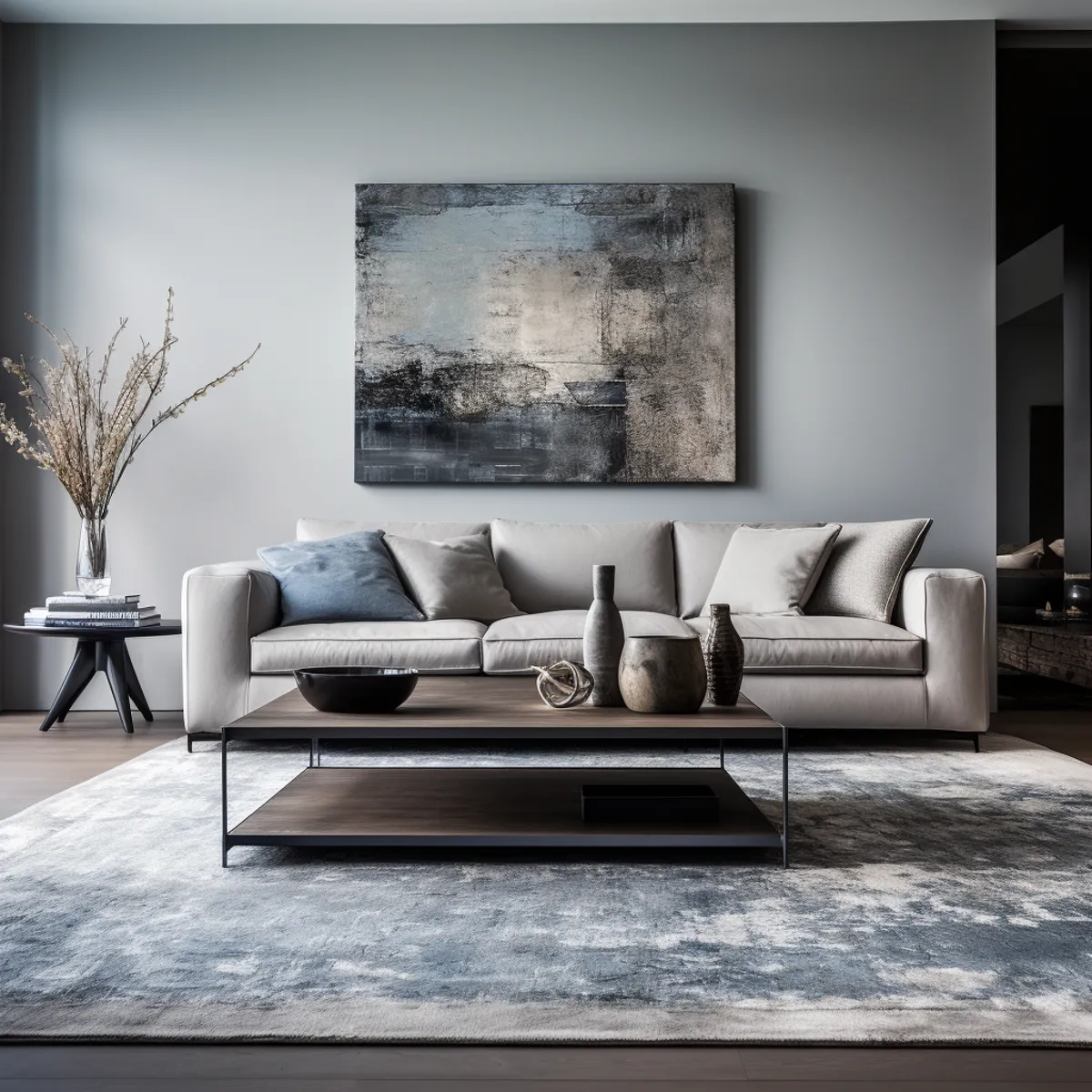
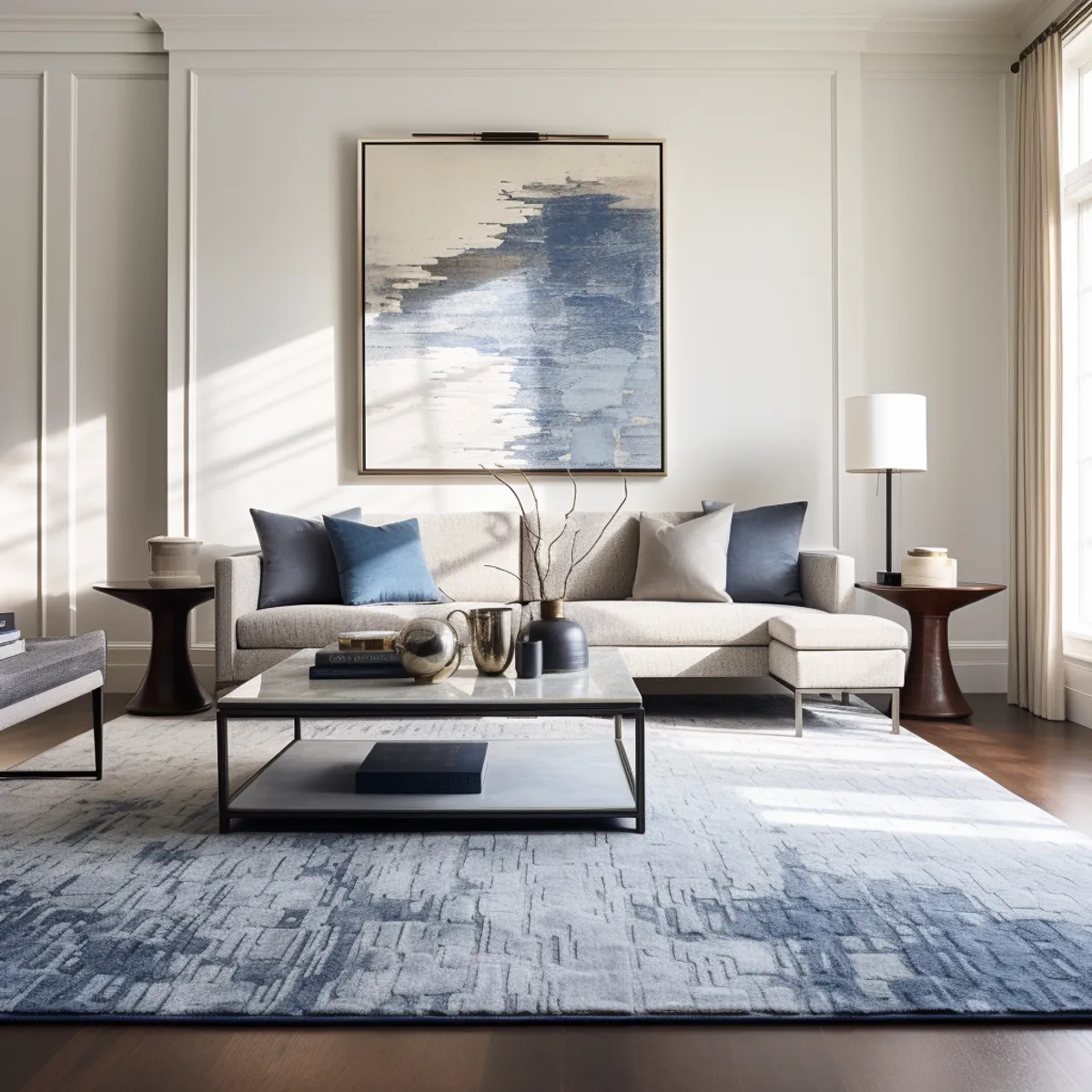
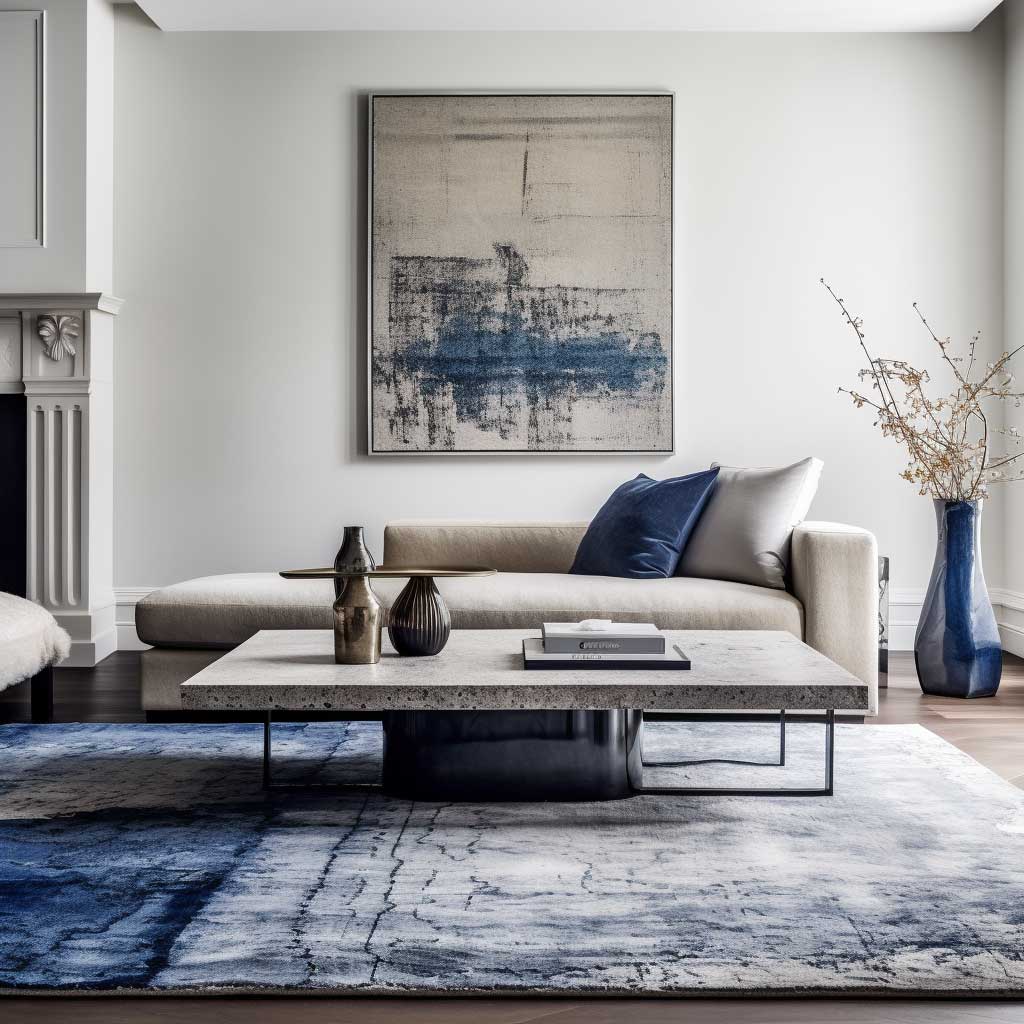
Most people default to abstract canvases when sourcing wall art for a grey and blue living room, and most of those canvases are forgettable by dinner. Abstract art in these colors works when the brushwork has scale and energy — a large-format Society6 or Minted print in charcoal and cobalt for $120–$200 can read genuinely architectural on a wall. Where it stops working is when the abstract becomes decorative wallpaper: small, safe, and placed in a cluster that looks like it came pre-arranged from HomeGoods. A single piece at 40×60 inches does more for a grey and blue room than six coordinated prints in the same palette.
Photography is an underused option here. A high-contrast coastal or industrial photograph — think a fog-hung coastline in gunmetal and steel blue, printed on metal or acrylic — can anchor a grey wall in a way that painterly abstracts often can’t. I stole this trick from a designer friend who sources prints on Saatchi Art and has them printed locally for around $90. You’ll notice it reads more personal and less algorithmically styled than the abstract-canvas approach that’s saturated every grey and blue interior design mood board since 2019.


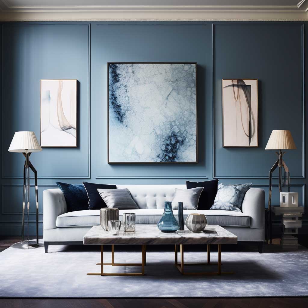

What’s the rule on placement? Center the art at 57 inches from the floor — that’s standard gallery height, and it works in residential spaces because it aligns with average eye level whether you’re seated or standing. Hanging it higher than that is the most common grey and blue living room mistake I see in photos on Pinterest. High art makes the wall look like it has more wall than room, which is the opposite of what you’re going for in grey and blue living room designs that aim for intimacy. See how wall art and furniture work together in a modern grey and blue living room for more placement context.
Scale is the lever most people don’t pull. A 20×20 canvas above a 90-inch sofa looks like a postage stamp on a billboard. Go bigger than feels comfortable — the room will thank you. Triptychs and diptychs work well here if the budget is tight: three 24×30 canvases in the same blue-grey palette spaced 3 inches apart read as one large piece without the large-piece price tag.
A Grey Sofa Stays Flat Until You Know Which Blue to Put Against It
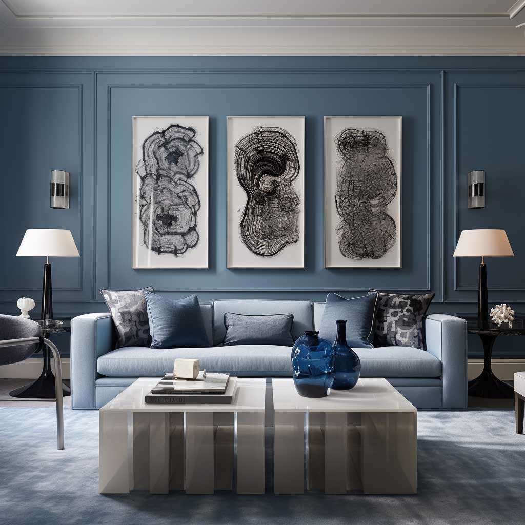
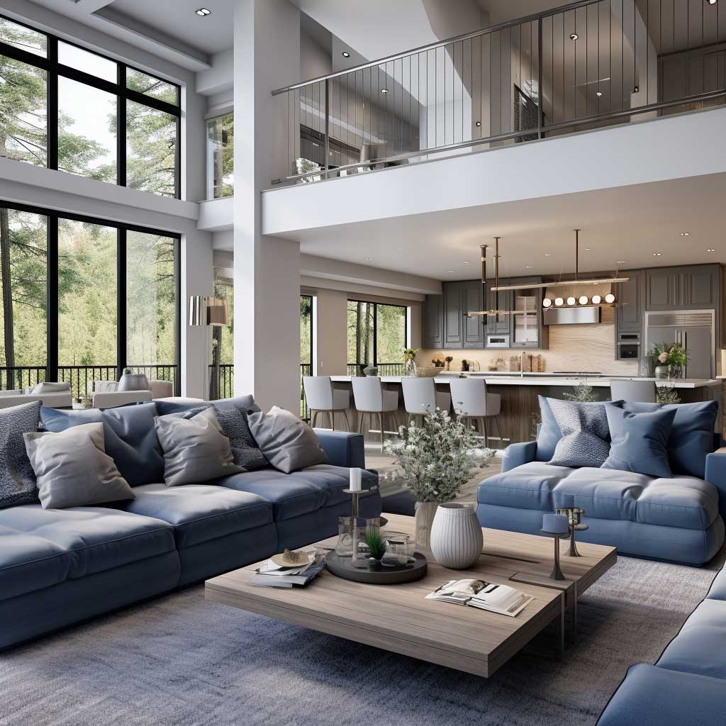
Grey sofas are everywhere, and most of them sit in rooms that feel half-finished. The sofa itself isn’t the problem — grey is genuinely one of the most useful furniture colors you can own in a living room. The problem is that most people throw whatever blue they have at it and expect magic to happen. It doesn’t. The blue you choose matters more than the grey, because grey is passive and blue is active. You need to decide upfront whether you’re going warm or cool: a denim or slate blue reads casual and Scandinavian; a navy reads formal and layered; a cerulean or sky blue reads light and coastal. Pick one direction and commit.
My go-to combination for a grey and blue living room that reads sophisticated without feeling cold is a medium charcoal sofa — something like the IKEA Söderhamn in dark grey at $999 or the Article Nera in cement at $1,299 — paired with navy and powder blue as a two-tone accent. Two cushions in $45 H&M Home navy velvet, two in a powder blue linen, and a navy wool throw from Muuto (around $180). That’s four accessories doing the work of an entire interior design decision. The velvet-linen contrast is the texture layer that keeps it from looking like a catalogue render.


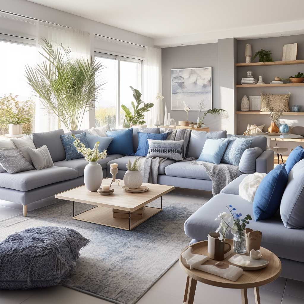

Does a light blue sofa work with grey walls instead? Yes — but the grey on the walls needs to be noticeably darker than the sofa blue, or the two tones merge and the room goes flat. Farrow & Ball Elephant’s Breath (warm greige-grey) walls against a sky-blue sofa is a combination I’ve seen work repeatedly. What doesn’t work is pale blue sofa against pale grey walls: same value, no contrast, no depth. Think of it like pairing a light grey suit with a light blue shirt — technically related, visually boring. More on mixing blue and grey tones across the whole house, including wall and furniture pairings.
One more note on texture: a grey velvet sofa against blue silk cushions is a pairing that photographs beautifully and feels even better in person. Velvet against silk is like a cello against a flute — same register, completely different grain. You’ll notice the eye moves between them naturally rather than landing on one spot and stopping. Skip matching fabric finishes on sofa and cushions. Matching finish is the single fastest way to make a grey and blue room look like a hotel lobby, which is not the compliment it sounds like.
Homes & Gardens rounds up ten designer-approved ways to use this palette, including specific paint colors and sofa upholstery combinations worth bookmarking before your next shopping trip.
| Blue Shade | Best Grey Pairing | Room Mood | What to Avoid |
|---|---|---|---|
| Navy | Medium charcoal or warm greige | Formal, layered, dramatic | Dark grey walls — room goes too heavy |
| Denim / Slate | Light to mid grey | Casual, Scandinavian, everyday | Yellow-toned grey — clashes with denim’s cool undertone |
| Powder / Sky Blue | Dark or warm grey | Light, airy, coastal | Same-value pale grey — no contrast, reads flat |
| Cerulean / Cobalt | Neutral mid-grey or charcoal | Bold, contemporary, editorial | Warm grey — the yellow undertone fights the cobalt’s intensity |
Grey and Blue Living Room
Grey gives blue room to breathe. Blue gives grey a reason to exist. Get the balance wrong and you get a waiting room. Get it right and you get a room people don’t want to leave.
The three decisions that matter most in a grey and blue living room: the rug size, the blue shade relative to your grey’s undertone, and the art scale. Most rooms get all three wrong. Fix one at a time.
Texture is the budget upgrade that costs nothing to change. Swap satin cushions for velvet or linen. The palette stays the same; the room feels three times more expensive.
Save this post before you start shopping — the tonal pairing table above will save you at least one expensive return.
Related Topics