Modern exposed brick wall interior design keeps appearing on every shortlist of timeless home trends — and the reason is structural, not nostalgic. Brick carries its own color story, texture depth, and acoustic weight that no wallpaper can fake. I’ve walked through dozens of loft renovations and Victorian conversions where the brick was there all along, buried under plaster, and the moment it came out it changed everything. You’ll notice pretty fast that exposed brick isn’t a background choice. It’s a commitment. Get the layers around it right and the whole room snaps into focus. Get them wrong and you end up with something that looks like a half-finished construction site — which is exactly what most people regret.
Every section below tackles a specific decision point in the process — from how minimalism actually works with brick (not the way you think), to which color pairings fall flat despite showing up everywhere on Pinterest. Skip the vague inspiration and go straight to what’s adjustable in your own space.
- Exposed brick in minimalist rooms works because of contrast — not in spite of it
- Soft textiles (rugs, linen curtains) are the fastest fix when brick reads as cold or industrial
- Warm-white LED at 2700K does more for brick texture than any paint color on adjacent walls
- Hanging art on brick requires anchors, not adhesive — anything over 5 lbs will fall
- Open-plan layouts need brick on one wall only — two walls and it reads as a tunnel
- Sealing brick with DRYLOK Siloxane 7 prevents dust fallout without changing the color
Minimalism and Brick Are Not Opposites

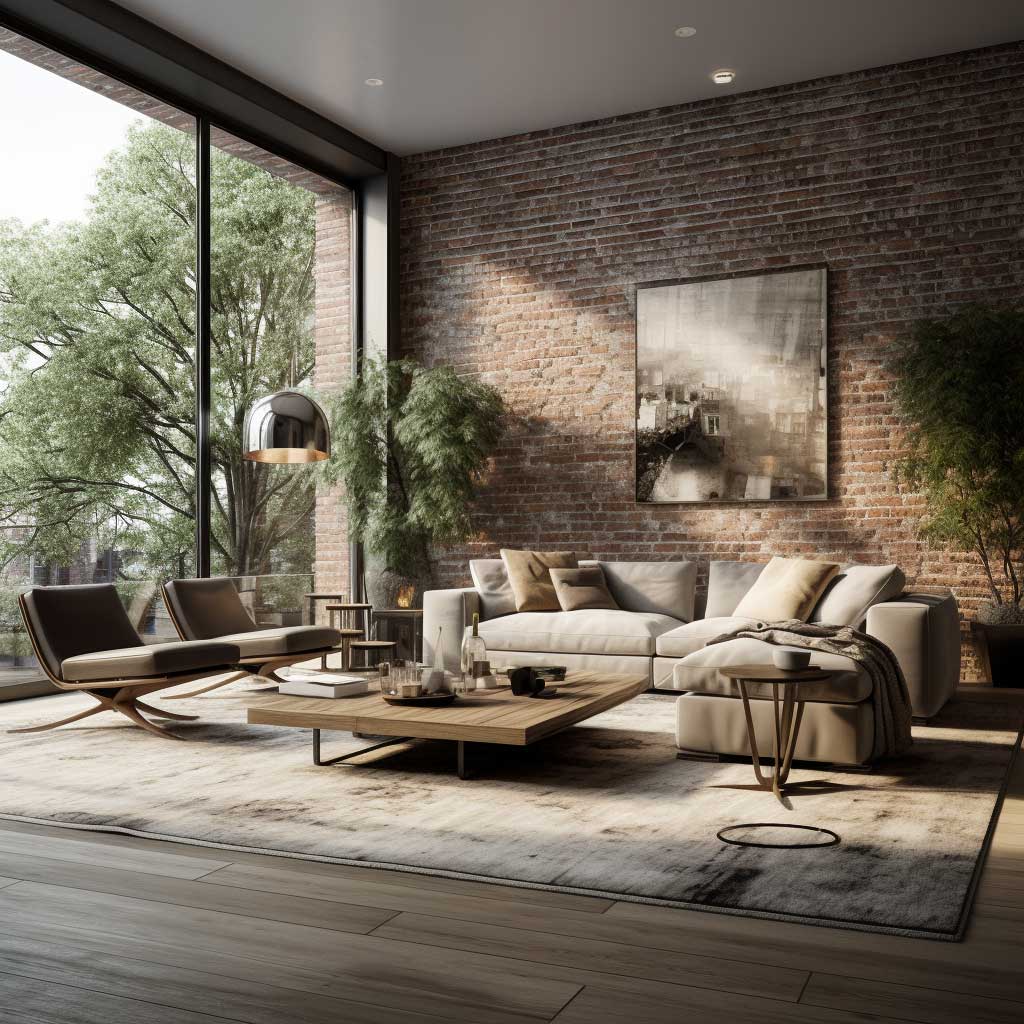
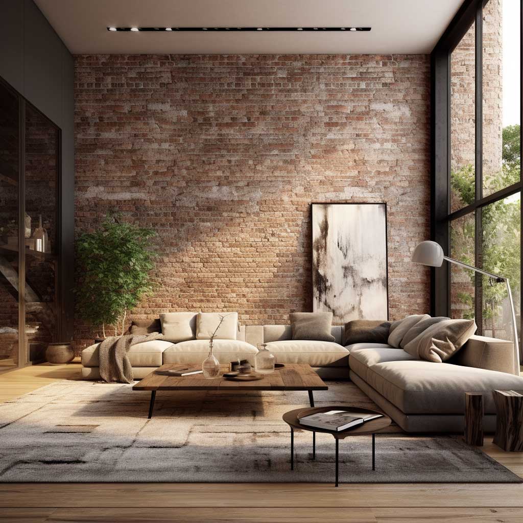
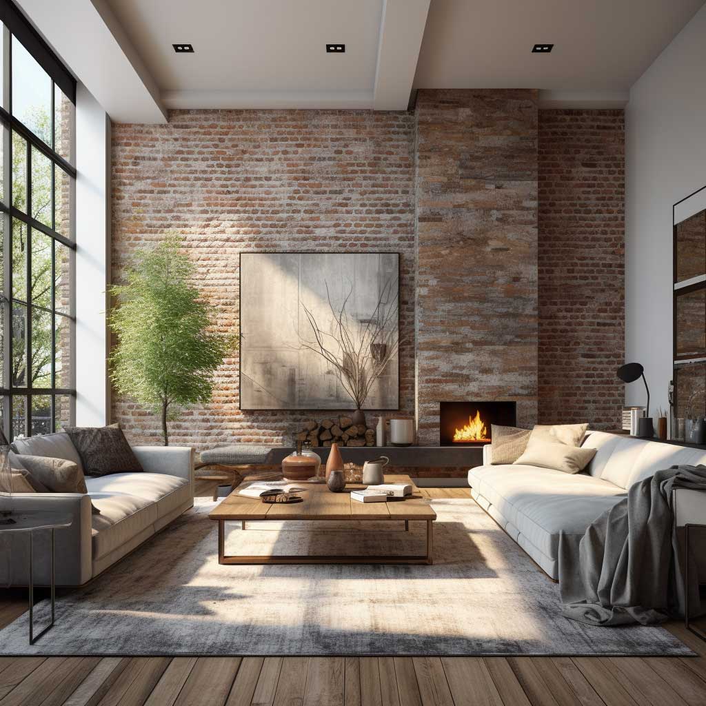
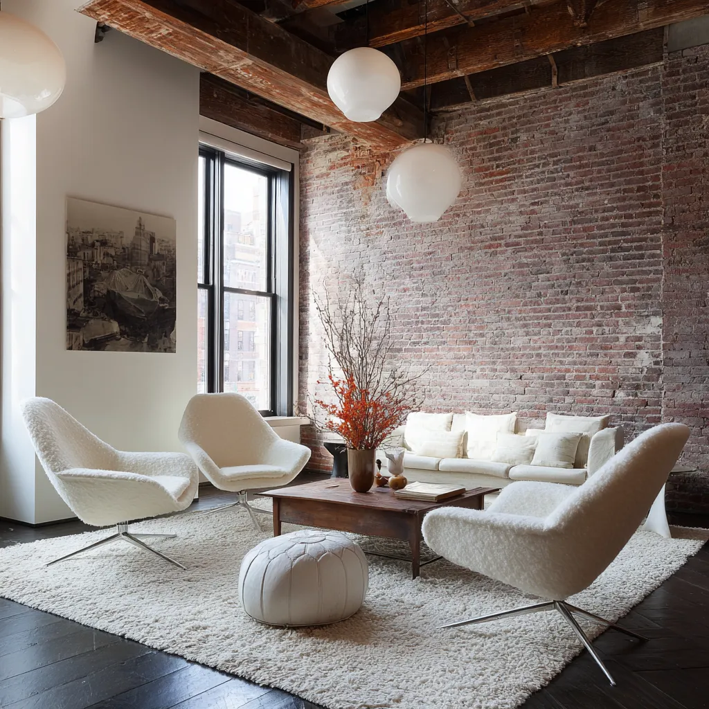
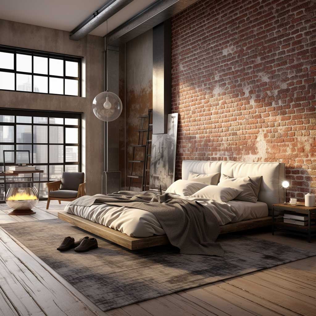
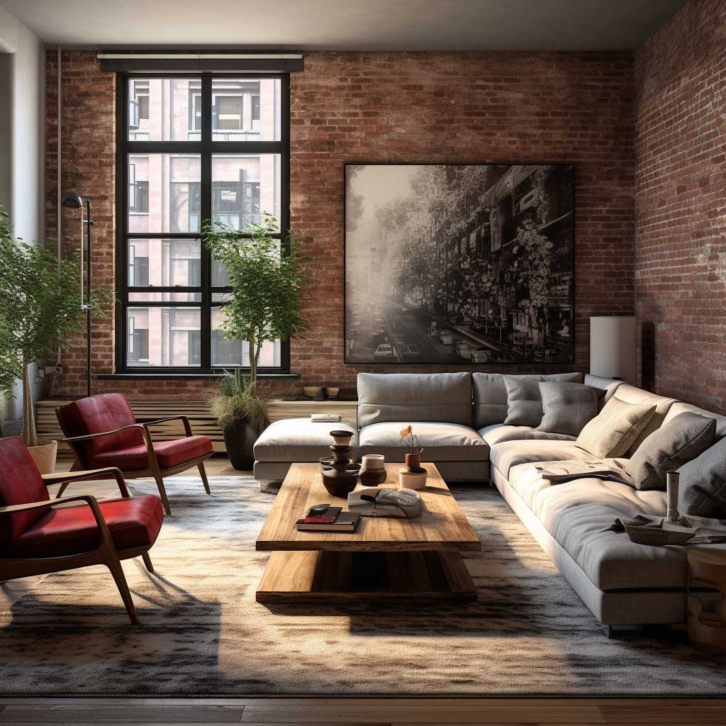
Most people hear “minimalism” and assume it means white rooms with zero personality. My take is the opposite — minimalism is actually the framework that makes exposed brick wall interior design readable. Strip the room down to a low-profile sofa, one wood coffee table, and bare concrete floors, and suddenly every ridge in that brick registers. The surface does the visual work. You stop needing art, shelves, and accent walls competing for attention.
Where people go wrong is adding too much “warmth compensation.” I’ve seen clients layer in chunky baskets, terracotta pots, macramé, and two throw blankets because the brick felt cold. None of it helped. The brick felt cold because the light source was wrong — a single overhead LED at 4000K will make any brick wall look clinical. Swap in a 2700K floor lamp aimed upward along the surface and the room changes completely.
Muuto and HAY both make low-profile furniture that photographs exceptionally well against brick — the Muuto Outline sofa runs around $3,200 and keeps a silhouette clean enough that the wall stays dominant. What fails? Tufted Chesterfields. The ornamental detail fights the brick’s existing texture and the room looks crowded even when it’s not. Pick one textural focal point. Brick is loud enough on its own. Give it room to speak. Read more about brick wall interior design styles and loft approaches here.
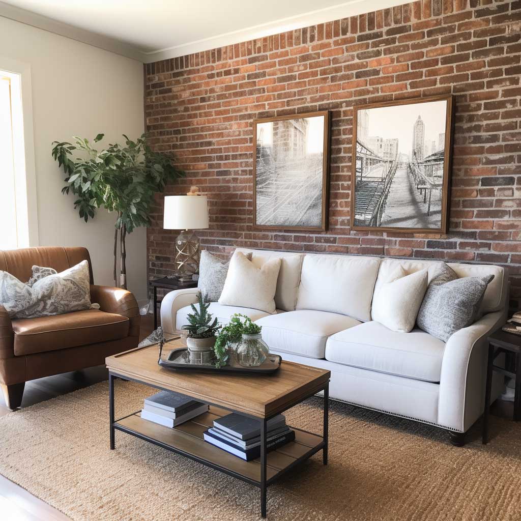
Soft Textiles Fix What Paint Cannot
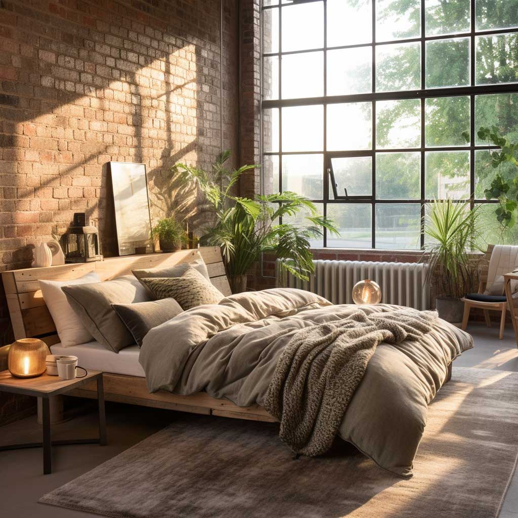
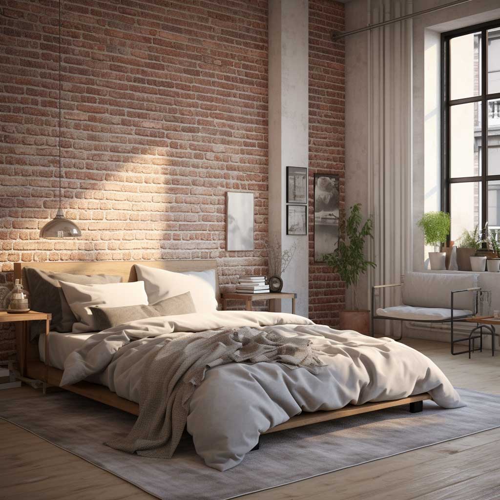

Brick is a hard surface in every measurable way — sound bounces off it, it absorbs heat, and visually it reads as masculine and heavy. Layering in textiles is the counterweight. Think of it less like “decorating a brick wall” and more like sound-mixing: you’re adding frequencies the brick is missing. A flat-weave Beni Ourain rug in off-white (I have one from Loom & Field, around $420 for a 5×8) cuts the harshness completely without competing with the brick’s color.
Linen curtains in a warm oat tone are the move — not velvet, not blackout polyester. The translucency lets light through and softens the room at the edges, which is exactly where the brick starts to feel like a wall closing in rather than a feature. I made the mistake of buying dark charcoal curtains for my first brick-wall apartment. They looked incredible in the morning and like a cave by 4pm. Stick with warm neutrals in any fabric that breathes.
What never works: Sheepskin throws draped directly over furniture pushed against the brick. The visual noise of two competing textures — bumpy brick plus fluffy wool — cancels both of them out. You’re also cleaning brick dust out of that sheepskin for the rest of its life. Keep soft textiles at least 18 inches clear of the wall surface. Let the hard and soft elements exist in separate zones, and the contrast between them becomes the actual design. See how brick pairs with different room arrangements in this living room roundup.
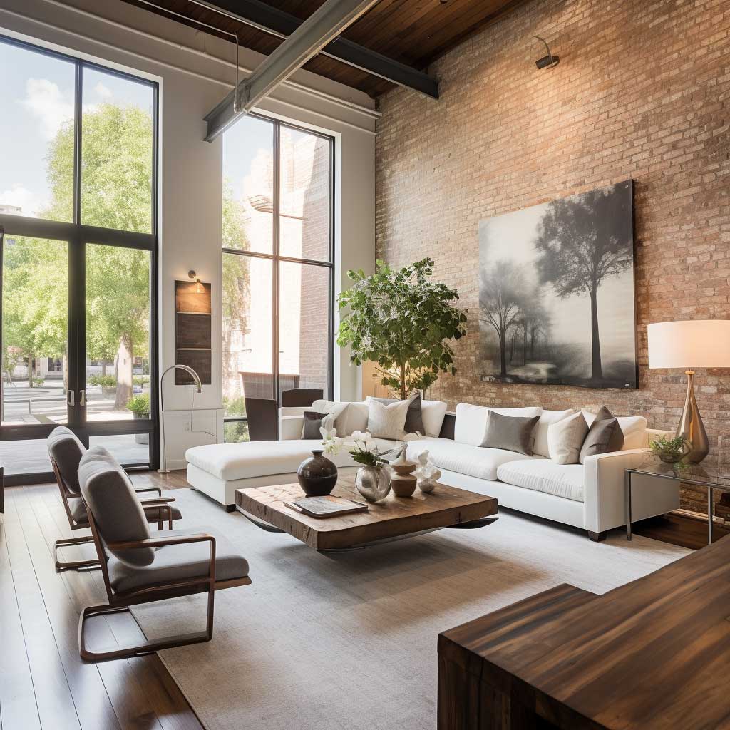
Light Hits Brick Differently at Every Angle

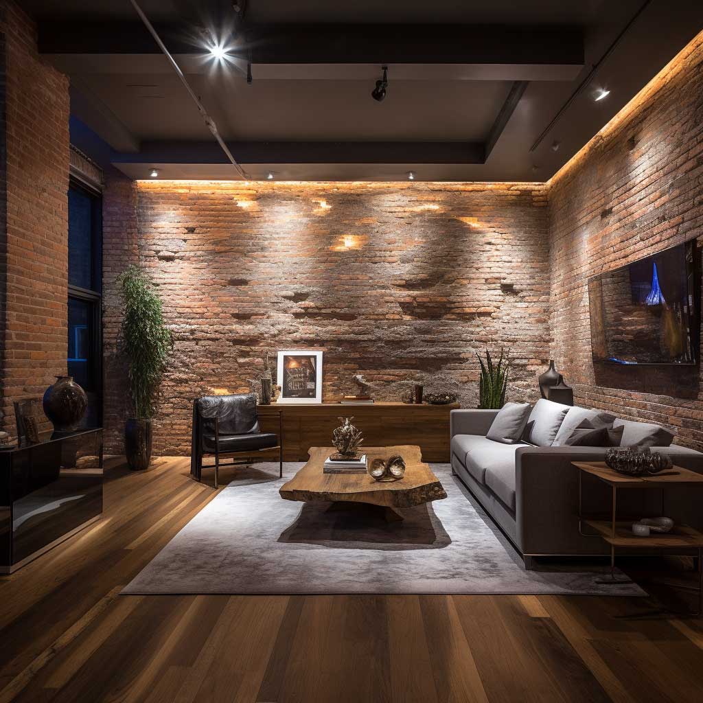

Light grazing — positioning a source at a low angle to rake across the surface — is the single most effective technique for exposed brick wall interior design. A Flos Glo-Ball floor lamp (around $900) placed 12 inches from the wall and aimed upward will cast shadows into every mortar joint and turn a flat brick surface into something that looks architectural. I’ve used this trick in three different apartments. Works every time.
Track lighting installed at ceiling level is popular for brick rooms, but the direction matters enormously. Aim it straight down and you wash the wall flat — the texture disappears and the brick looks like a printed pattern. Angle the heads at 30–45 degrees toward the wall and you get the shadow play that actually makes brick interesting. IKEA’s NYMÅNE track system runs about $75 and the heads swivel far enough to get this angle right.
Recessed lighting feels modern, but it’s the worst option for brick walls specifically. Because the source sits flush with the ceiling and points straight down, you get zero grazing and maximum flatness. You’ll spend $400 on installation and end up with a brick wall that looks duller than it did under a $30 clip light. Use recessed lights for general room fill only — never as the primary source for your brick feature wall. The light that makes brick glow is always oblique, never direct. That’s the one rule worth keeping.
- Don’t use cool-white bulbs (5000K+) near brick. It strips the warmth out of the red and orange tones and makes the wall look like a parking garage.
- Don’t mount flush downlights directly over the brick. You lose the texture entirely — the whole point of exposed brick is its surface depth.
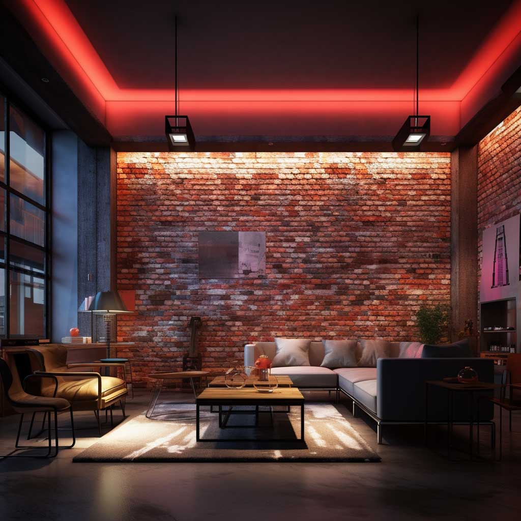
- Don’t hang a single large pendant centered in a room with a brick feature wall. It competes visually for the focal point and wins for the wrong reasons.
- Don’t paint brick white just to “brighten” it. Once it’s painted, the mortar absorbs unevenly and you’ll never get the raw finish back without sandblasting.
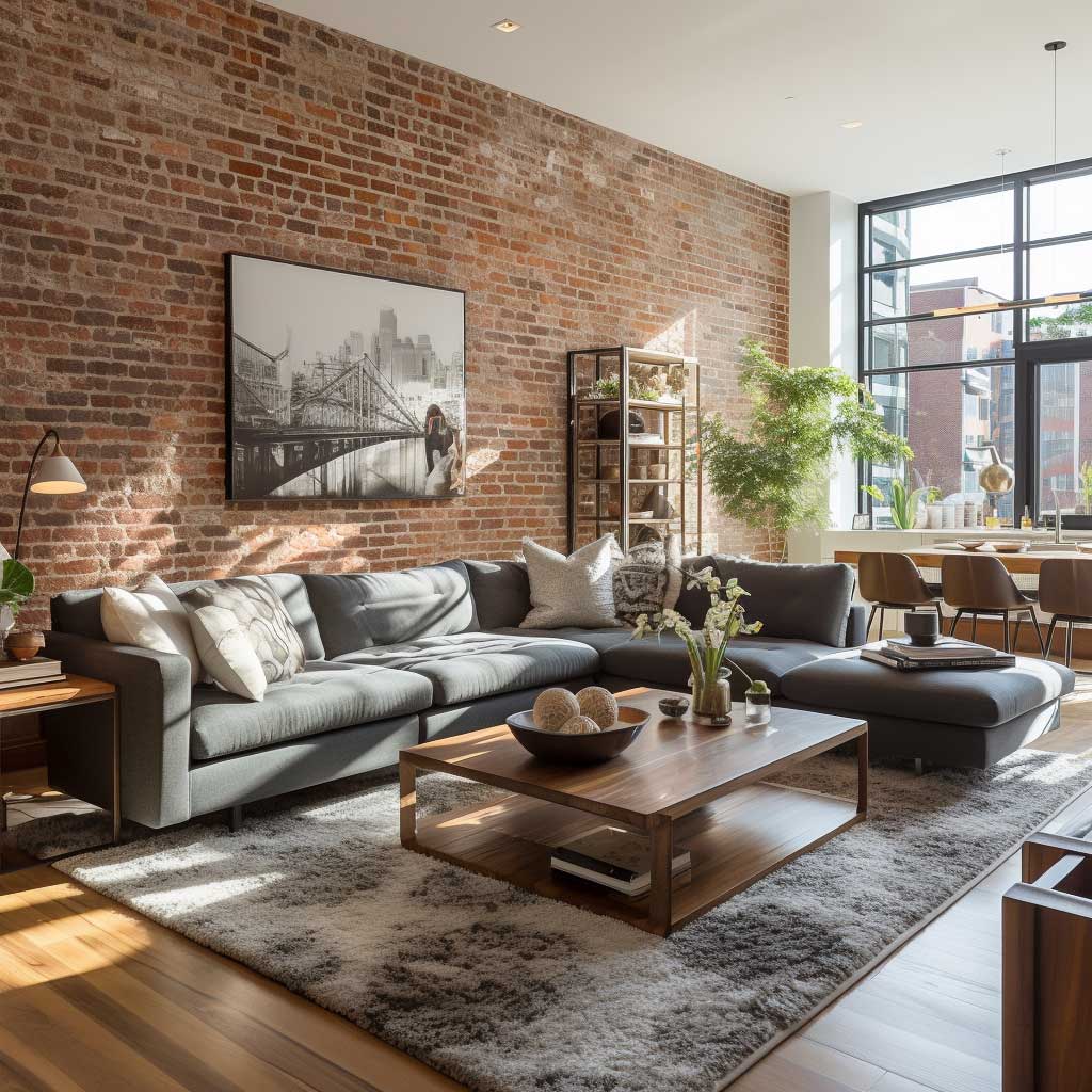
Art on Brick Needs a Frame Strategy, Not Just a Hook
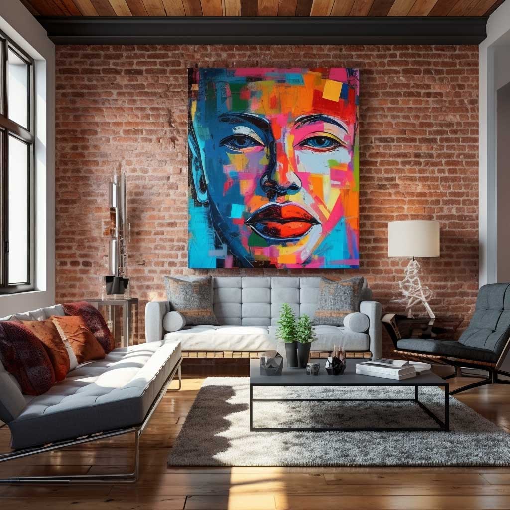


Hanging art on exposed brick interior design involves a mechanical problem first and a visual one second. Command strips and adhesive hooks will fail on brick — the mortar texture doesn’t bond cleanly and the weight tolerance drops by half. Use masonry anchors drilled into the mortar joints (never the brick face itself, which can crack). A $15 Dewalt masonry bit and a standard toggle anchor handles anything up to 30 lbs without drama.
On the visual side: the art needs breathing room. A single large canvas — think 40×50 inches minimum — holds its own against brick because the scale matches. I stole this trick from a gallery in Shoreditch that displayed oversized abstract prints against raw brick columns: the pieces they chose had either a white ground or a monochrome palette, which made the frame pop without the art and brick fighting for the same red-orange real estate. Works exactly the same in a residential room.
Gallery walls on brick are riskier than they look. You need to commit to the arrangement before drilling anything — brick holes don’t patch cleanly. Lay the whole arrangement on the floor first, photograph it from above, then transfer the spacing. What falls flat: small prints under 11×14 scattered randomly. The brick pattern is already a kind of grid, and small frames just repeat it at a different scale, creating visual static. Go large, go few, go bold on color. Then stop.
Open-Plan Rooms Need Brick to Divide, Not Dominate

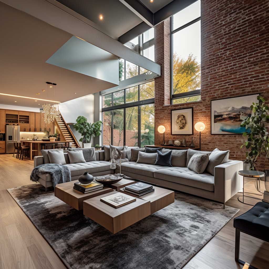
In open-plan layouts, exposed brick wall interior design works best as a zoning device — not a backdrop you repeat across every available surface. Assign one wall to brick and let it mark a transition: the kitchen side ends where the brick begins, or the living zone is anchored by the brick column on the north face. When brick runs along two perpendicular walls in an open plan, the room starts to feel like a bunker regardless of how large it is.
Brick’s acoustic property is genuinely useful in open layouts. It absorbs mid-range frequencies, which means conversation from the dining zone doesn’t bounce directly into the living area at the same volume. No soft furnishing does this as efficiently. You could spend $800 on sound-absorbing wall panels or just leave the existing brick exposed and get most of the same effect for free.
The placement of the sofa matters here more than most people realize. Floating furniture away from the brick wall — leaving 8 to 12 inches of clearance — allows the wall to read as a full surface rather than a sofa back. When the couch is pushed flat against the brick, you lose half the wall visually and gain nothing spatially. Pull it forward. The gap reads as intentional, and suddenly the entire brick wall is visible from across the open plan. That’s the whole point of decorating a brick wall — you want it seen, not hidden behind cushions.
Color Pairings That Brick Actually Responds To


Brick reads as warm — most standard red brick sits somewhere between Pantone 7526 C and 7524 C, which is a mid-warm orange-red. That means the colors you put against it need to either complement the warmth or create a deliberate thermal contrast. Inky navy (think Farrow & Ball Hague Blue at about $120/gallon) on the adjacent wall does both: it’s cool enough to push back against the brick’s heat, rich enough to not disappear, and dark enough to make the brick color seem more vivid by comparison.
What consistently fails: greige. The gray-beige hybrid that swept every home renovation show in the early 2010s turns flat and muddy next to brick because the tones are too close. You end up with a room that looks like someone forgot to finish decorating. The same problem happens with warm whites — they absorb into the brick rather than contrasting with it, and the room loses all visual hierarchy.
Sage green is my go-to recommendation for people who want calm without going dark. It’s the complement to the brick’s orange without sitting in the blue family, which means the room feels balanced rather than high-contrast. The Behr color “Sprig” (around $45/gallon at Home Depot) hits this note perfectly. Use it on the ceiling and the walls opposite the brick, leave the brick itself raw, and the whole room coheres in a way that takes maybe two weekends to achieve. DRYLOK’s guide to sealing and waterproofing brick covers how to protect the brick surface before painting any adjacent walls, which matters more than people think.
Sealing Brick Prevents the Problems Nobody Warns You About

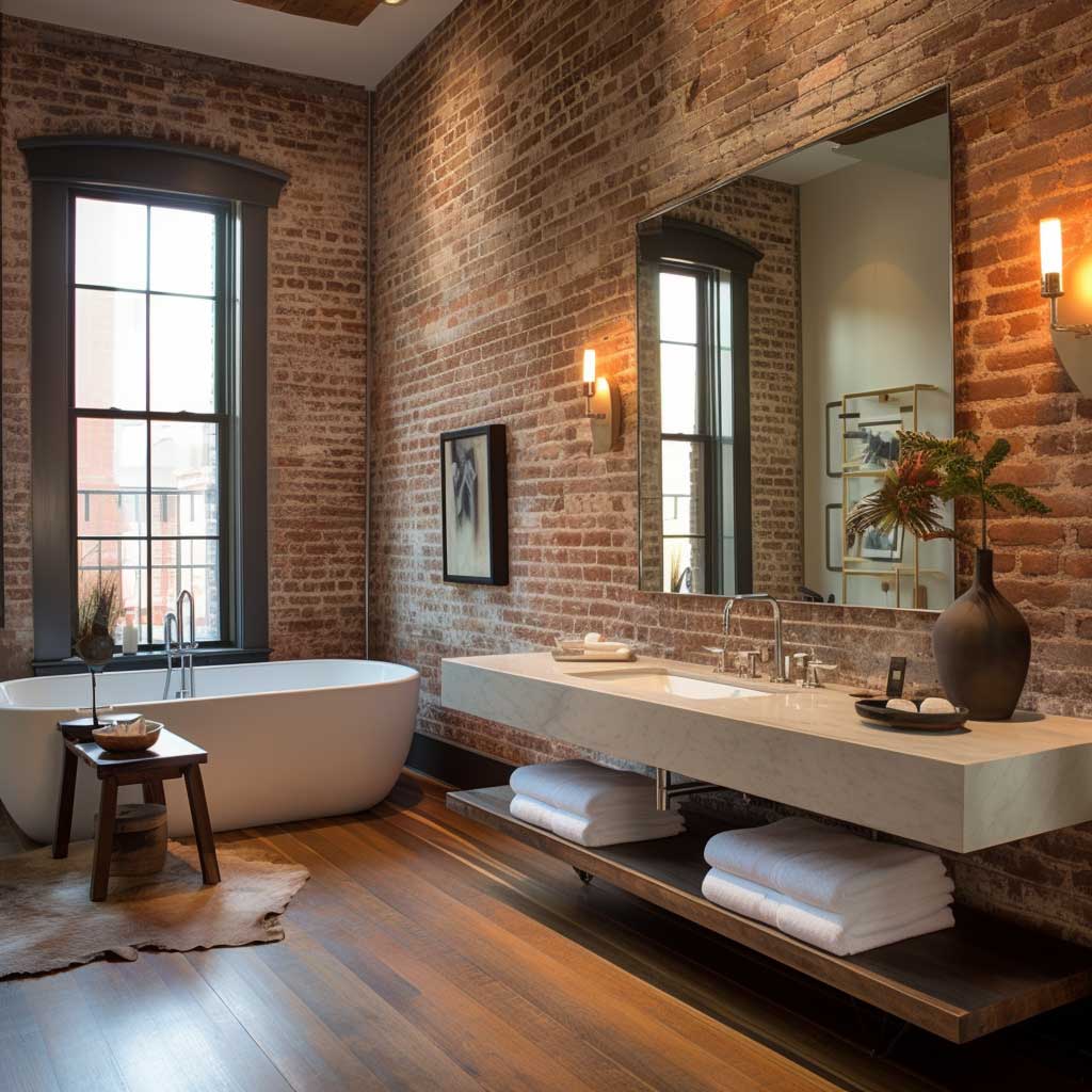

Unsealed exposed brick sheds. That’s the fact nobody mentions in the aesthetic conversation. Within six months of exposing an old brick wall, you’ll find fine red dust on your furniture, your windowsills, and your black clothing. The brick face and mortar joints are constantly breaking down at a microscopic level — especially in older buildings where the original lime mortar is already soft. DRYLOK Siloxane 7 Brick and Masonry Penetrating Sealer (about $35 for a gallon at most hardware stores) stops this without altering the surface color. Apply it with a roller in a single coat and give it 24 hours to cure.
Moisture is the bigger structural problem. Brick is porous and acts like a sponge in humid environments — which describes most kitchens, bathrooms, and ground-floor walls. Without a sealer, the brick absorbs condensation from cooking and showering, and mold establishes itself in the mortar joints within a year or two. You won’t see it immediately. You’ll smell it first, then find black spots along the joint lines that don’t wipe clean. At that point you’re looking at a mold remediation job, not a cleaning job.
Sunlight fading is real but slow — you’ll notice it over five to ten years on south-facing walls with large windows. UV-blocking window film (brands like 3M Prestige run $8–$12 per square foot installed) handles this without blocking visible light. Don’t apply glossy sealants to fix UV damage — they change the surface sheen in ways that read as plastic and look worse than fading. Use a breathable penetrating sealer that maintains vapor permeability. Trapping moisture inside sealed brick is a structural problem, not just a visual one. Test for moisture first with a plastic sheet taped flat against the wall: if condensation appears underneath after 24 hours, address the source before sealing anything.
Takeaway
Exposed brick interior design rewards specificity — vague choices produce vague rooms
The brick itself isn’t doing the work alone. It’s the light angle, the one textile that pulls heat into the room, the color on the adjacent wall that makes the brick read as intentional — these are the actual decisions. Each section here corresponds to a real, adjustable variable in any space.
Seal the brick before anything else. Decorate after. That order matters more than the aesthetic choices that follow it.
Save this post before you start demo or paint shopping — the sequence is everything.