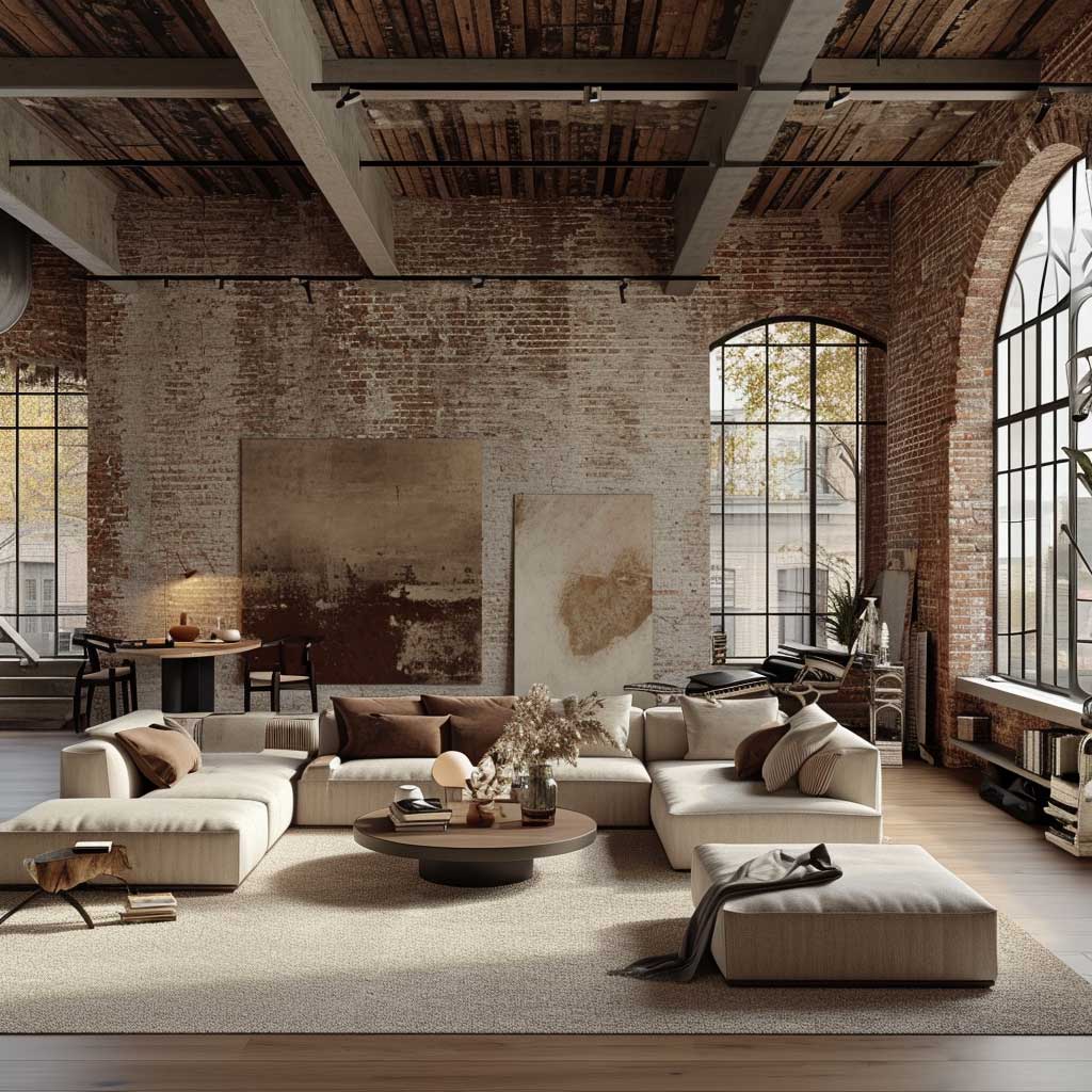
Industrial chic interior design is the rare style that turns a building’s flaws into its biggest selling point. I’ve walked through dozens of renovated lofts where the owner’s first instinct was to cover the brick and box in the pipes — every single one of those rooms looked worse for it. Leave the structure exposed, pair it with furniture that costs real money and has clean lines, and you get something no showroom can replicate.
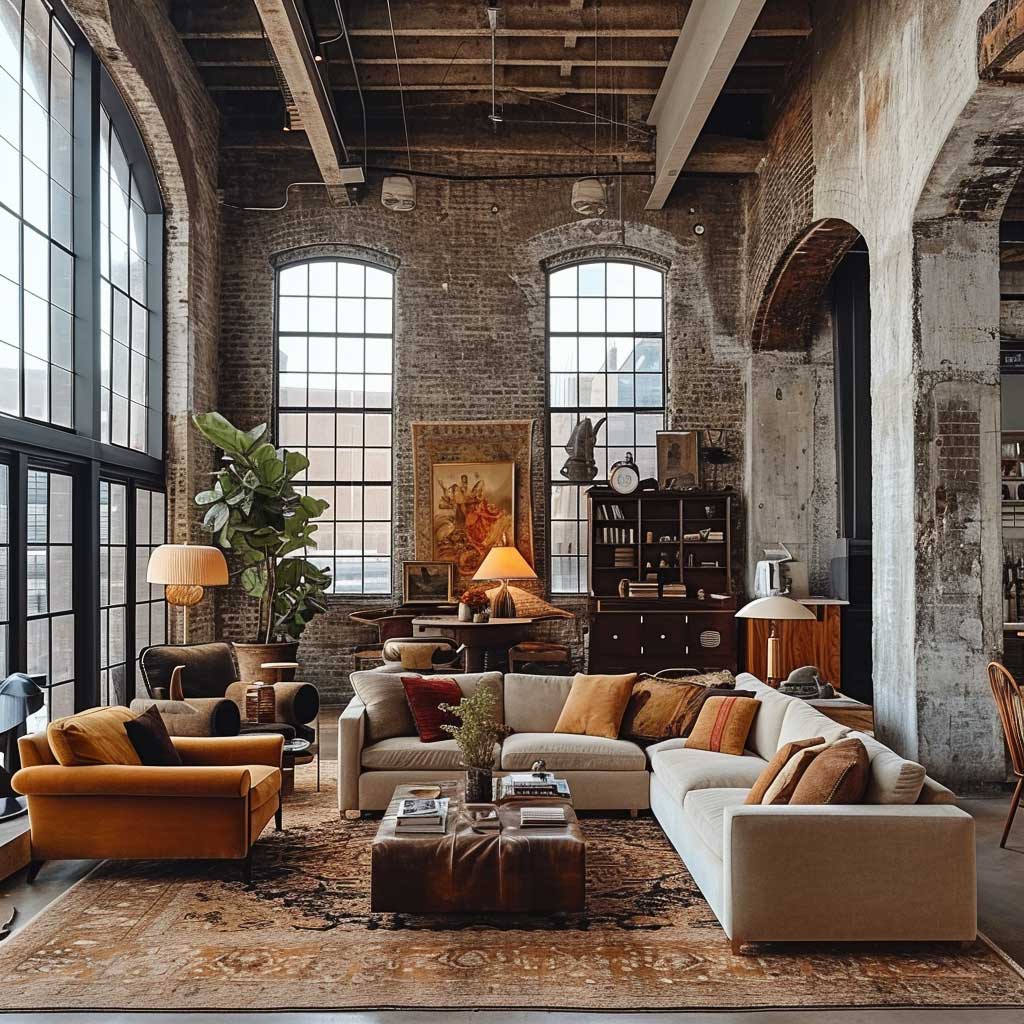
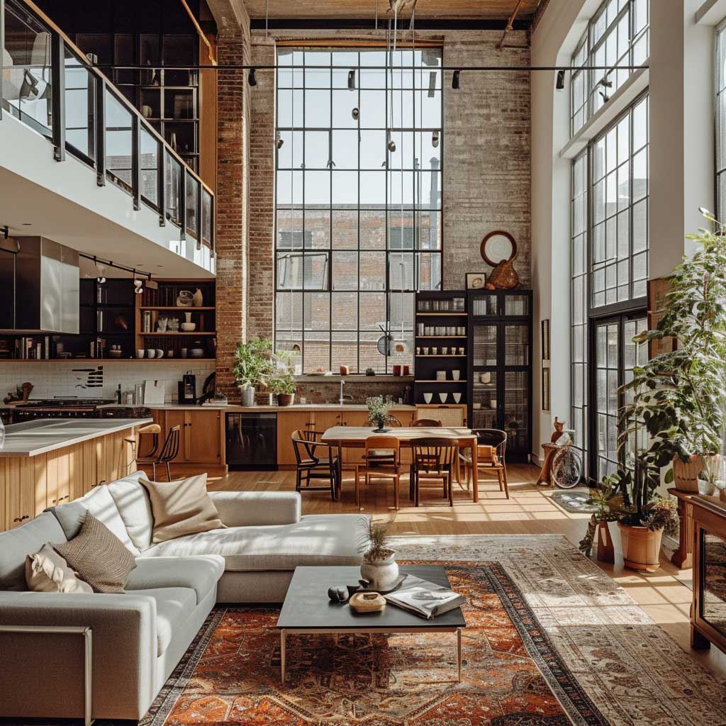
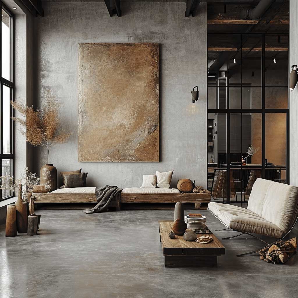
My go-to reference point for this style is a Brooklyn loft I photographed in 2022: 14-foot ceilings, original factory windows, a Restoration Hardware leather sofa in Brompton Cognac at around $4,200, and a concrete floor with three decades of scuffs still showing. Nothing was hidden. Nothing was apologized for. That tension between the raw and the refined is exactly what makes industrial chic design feel alive rather than staged.
You’ll notice the biggest mistake people make with this style is trying to soften it too aggressively — throwing in too many plants, too much linen, too much warmth until the industrial part disappears entirely. Restraint is the actual skill here. Pick two or three anchor materials — brick, steel, reclaimed wood — and let them run the room.
- Why exposed brick and metal beams are the structural backbone of industrial chic design — and how to choose the right finish
- How loft conversions preserve heritage details without looking like a museum
- Polished concrete vs. reclaimed wood vs. raw metal — which texture to lead with per room
- Lighting fixtures that reinforce the industrial aesthetic without looking cheap (specific brands and price points included)
- The single color palette mistake that kills the whole vibe
- FAQ with real answers on costs, brands, and material sourcing
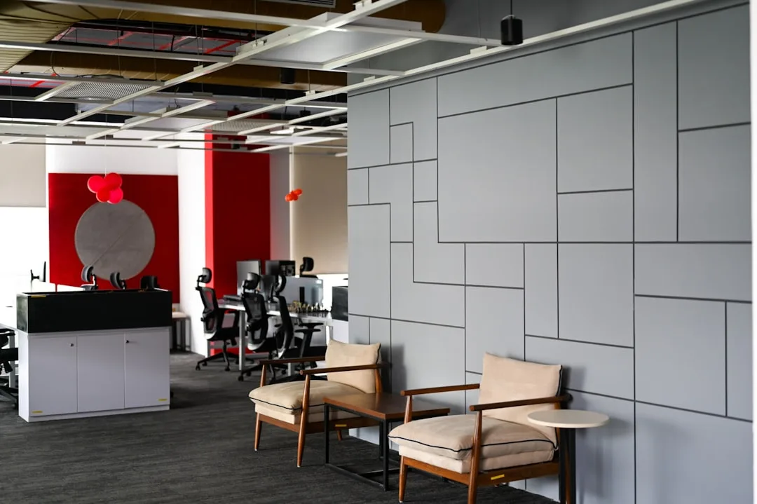
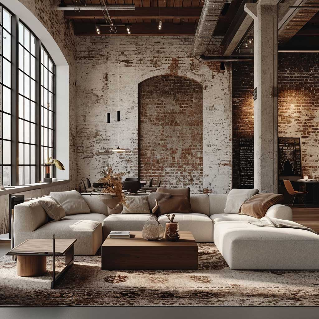
Exposed Brick and Metal Beams Carry Industrial Chic Design on Their Backs

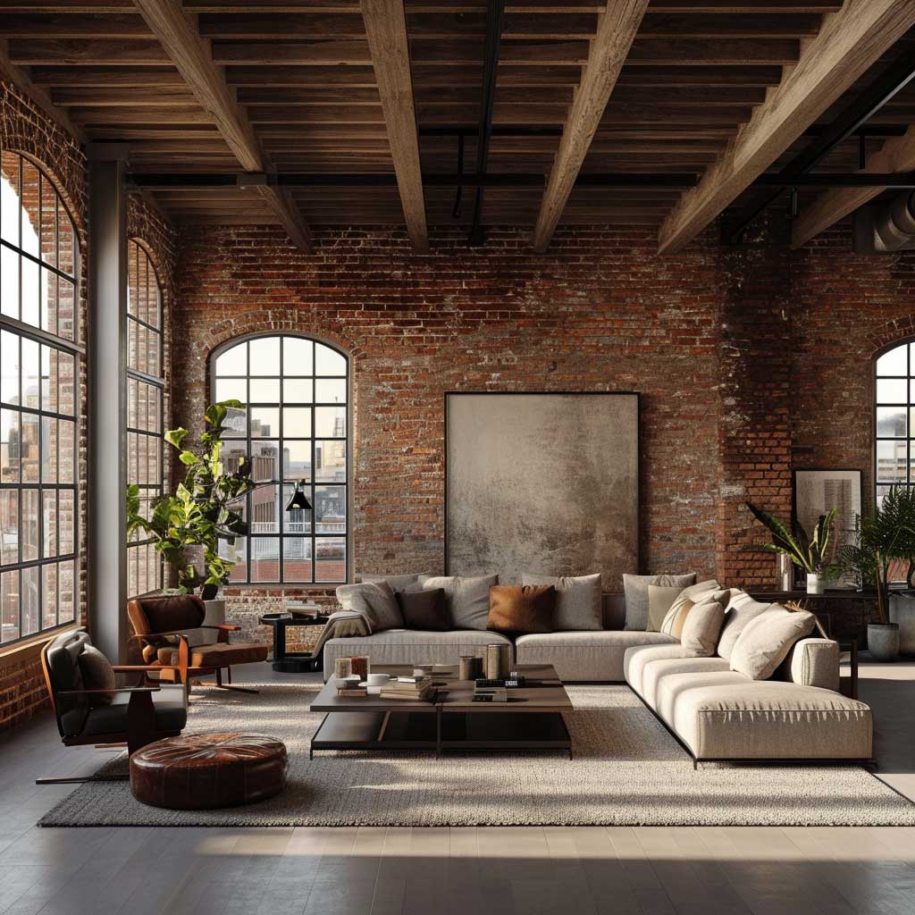

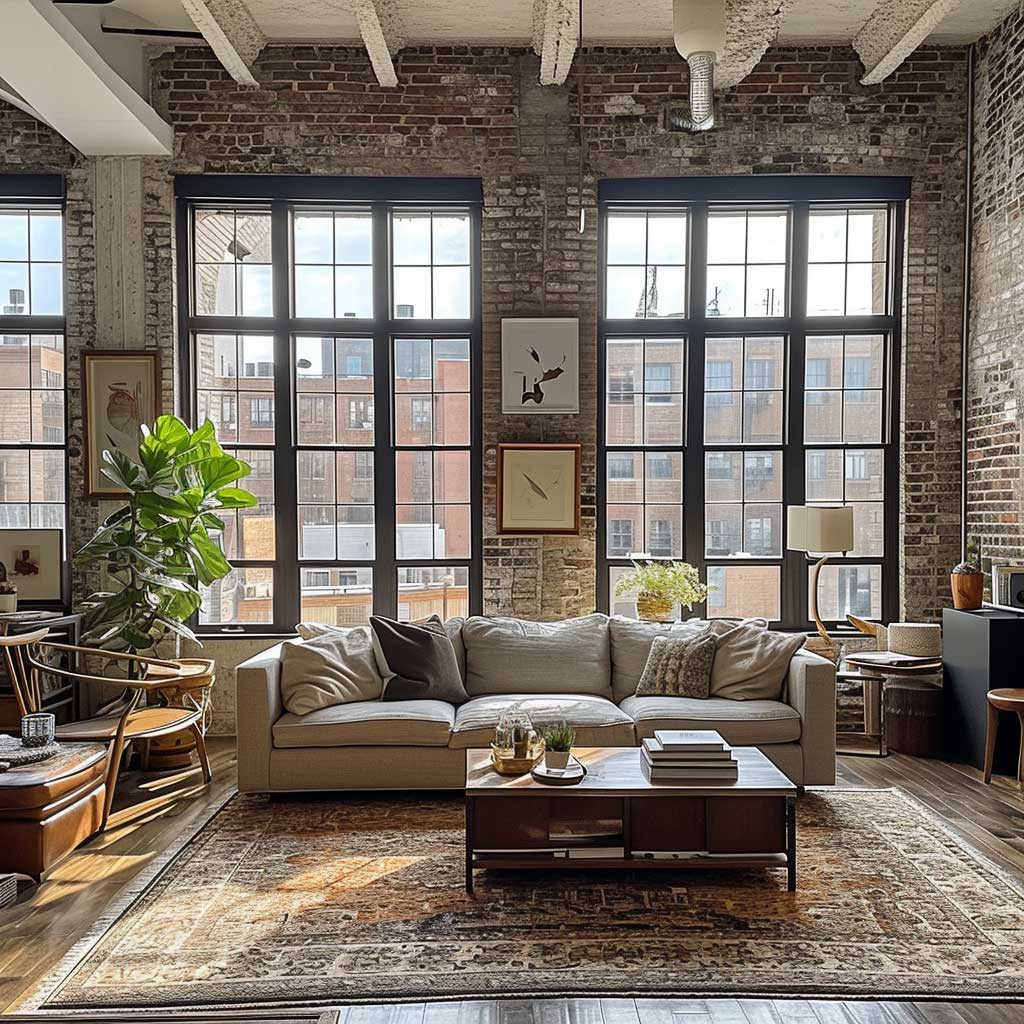
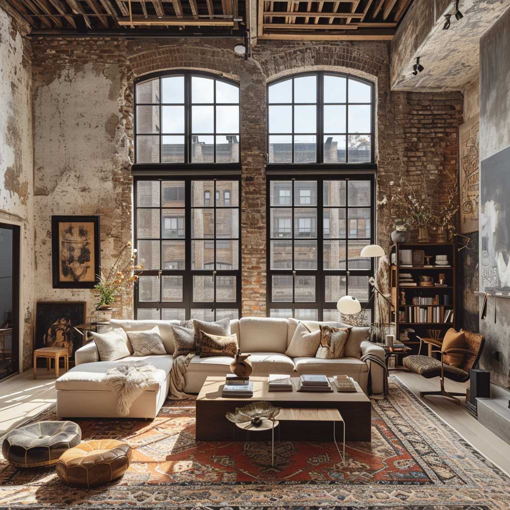
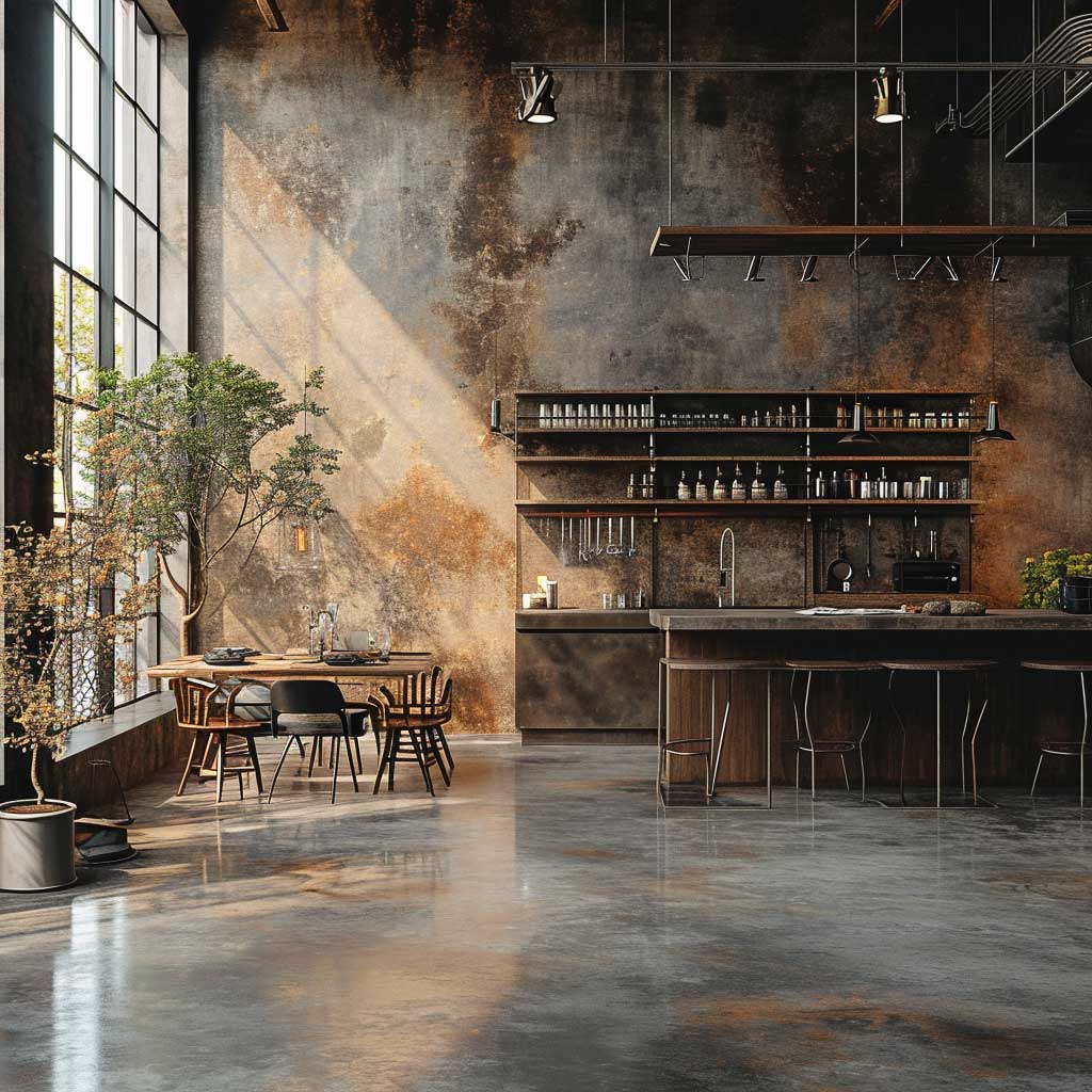
Exposed brick walls and visible metal beams are the two structural elements that define industrial chic interior design more than anything else you can buy or install. The brick does something paint can never replicate: it holds temperature variation, absorbs sound differently across its surface, and ages in a way that actually improves the room. I own two properties with original brick, and the one where we sealed it with a matte penetrating sealer ($80 per gallon from Prosoco) looks dramatically better than the one where a previous owner applied a gloss coating — glossy brick looks fake immediately.
Metal beams divide people, and they should. Do you want the raw mill-finish look — slightly orange, oxidizing slowly — or do you want them cleaned and sealed in a dark primer? The raw version reads as authentic but requires annual inspection for rust spread. The sealed version from a company like Benjamin Moore’s Industrial Coatings line (around $65 per quart) locks the patina in place and gives you control. What you don’t want: painted beams in white or cream. That erases the entire point of leaving them exposed and turns a structural feature into a decorative prop.
Modern furniture earns its place in this context by contrast, not by blending in. A CB2 Avec sofa in charcoal tweed at $1,899 next to raw brick doesn’t fight the brick — it makes the brick look more intentional. The common error is buying furniture that also looks “industrial,” loading the room with distressed metal chairs and reclaimed wood tables until every surface is competing for the same attention. Think of exposed brick as the loud band member: everyone else needs to play it cooler.

Lighting is where industrial chic either locks in or falls apart. Are you using Edison bulbs because they look right, or because they actually produce useful light? A 40-watt Edison gives roughly 450 lumens — fine for atmosphere, useless for reading. I layer them with directional LED track lighting on the same circuit so I can run the track alone during functional hours and switch to Edison-only in the evenings. Schoolhouse Electric makes the best factory-pendant fixtures I’ve found at around $220 each, with a Willamette pendant that lands exactly at the intersection of utility and style. Avoid anything with a mason jar — that’s farmhouse, not industrial, and the two aesthetics don’t actually share DNA.
You’ll also notice that the color of mortar matters more than most people expect. Standard gray mortar against red brick gives you the classic look. White mortar with the same brick pushes the result toward something lighter and more Scandinavian — not wrong, but different. Tinted mortar in a charcoal tone is my recommendation for anyone going full industrial chic: it deepens the whole wall and makes the bricks read as individual units rather than a flat surface. Mapei makes a sanded grout in Charcoal (#04) that works for repointing at about $18 per bag.
- Don’t paint your exposed brick white — it’s irreversible, it closes off the texture, and it reads as a farmhouse move, not industrial chic.
- Don’t use glossy sealers on raw concrete floors — the sheen looks like a gym, not a loft. Matte or satin only.
- Don’t match all your metals — matching every fixture and hardware piece to the same brushed nickel finish makes the room feel like a hotel. Mix matte black, aged brass, and raw steel.
- Don’t over-texture — brick wall, reclaimed wood ceiling, stone floor, plus woven rugs is four competing surfaces. Pick two focal textures and let the others recede.
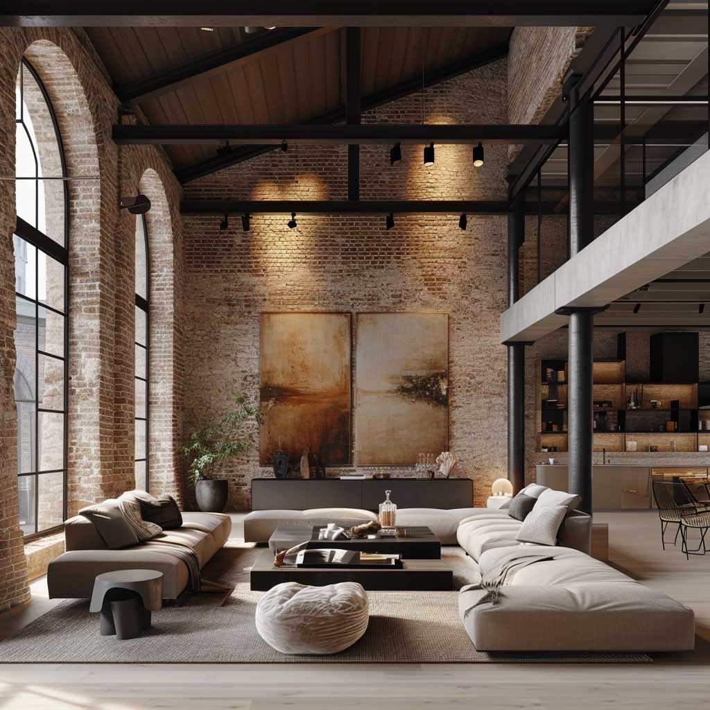
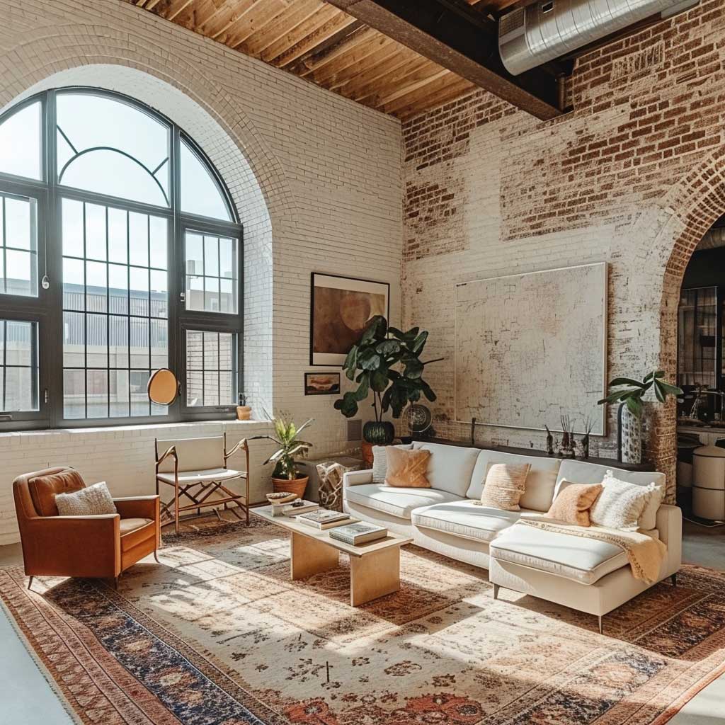
Loft Conversions Keep Industrial Chic Architecture From Becoming a Costume
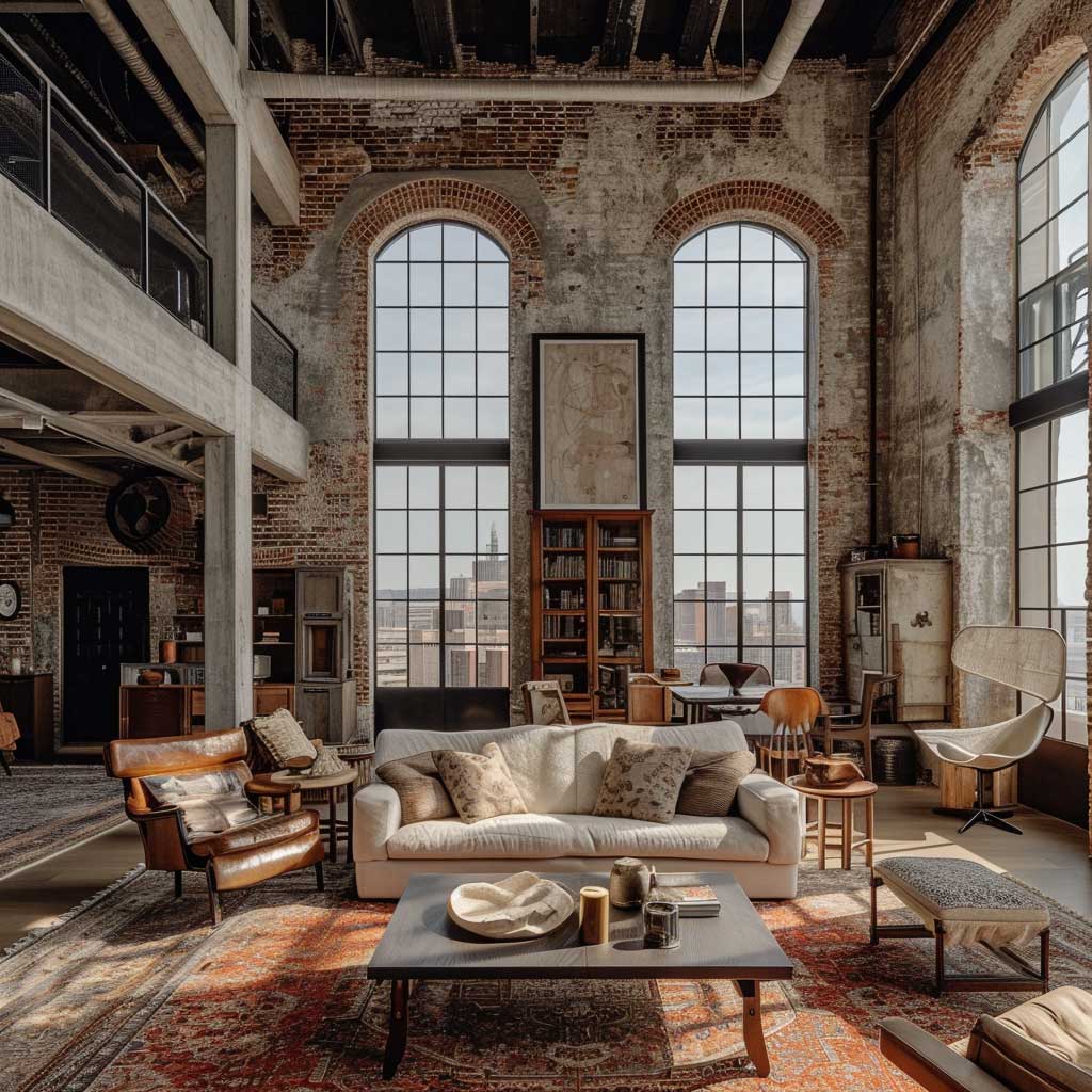
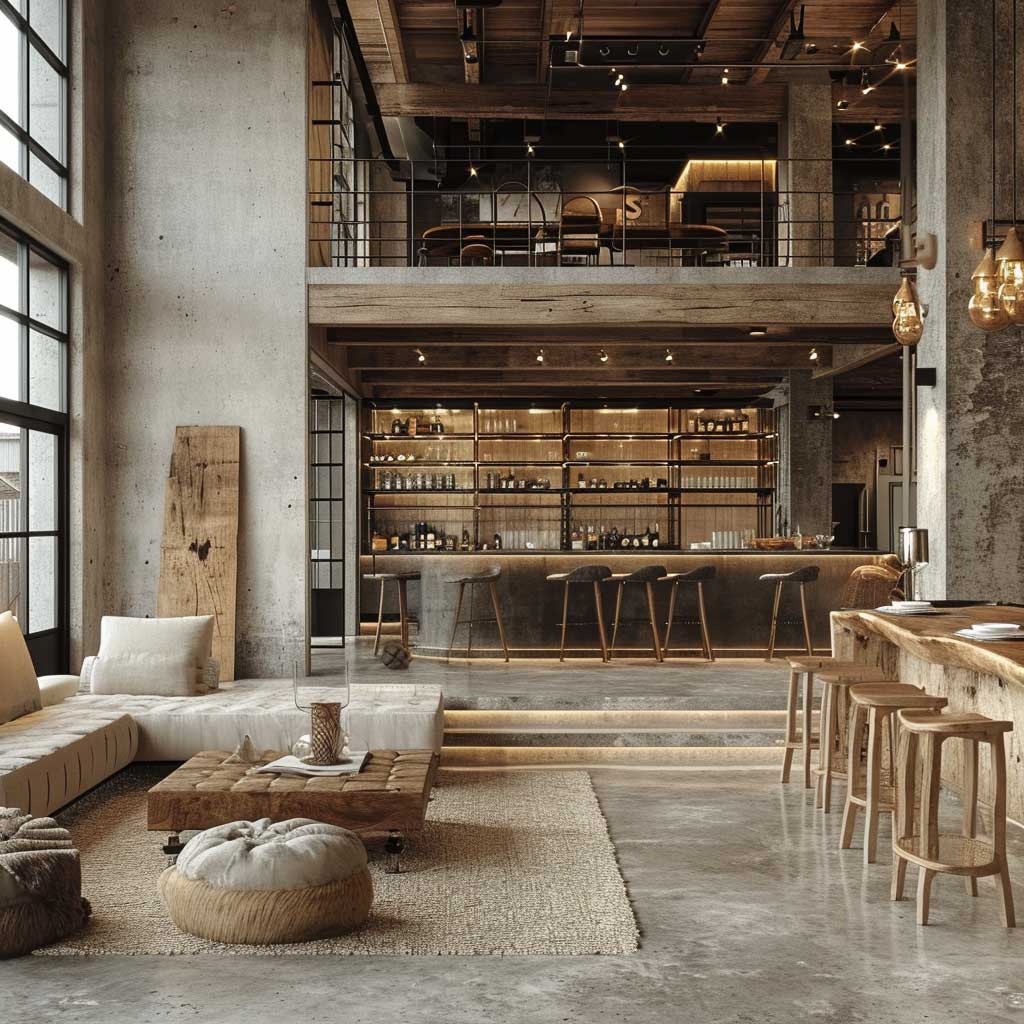
Industrial chic design in a genuine loft conversion operates on a different logic than industrial design faked in a new-build apartment. The real thing has load-bearing columns you can’t move, floor plates that slope slightly, windows in frames that weren’t designed for residential use, and ductwork that runs where it runs. Working with those constraints instead of fighting them produces rooms you genuinely cannot reproduce in a showroom. Think of the building as a collaborator with strong opinions — your job is to edit, not override.
High ceilings above 12 feet create a specific problem that most loft owners underestimate: the room feels cold and disconnected if everything stays at floor level. I stole this trick from a designer working on a Tribeca conversion — she hung a large-scale photo print at 9 feet, essentially creating a visual ceiling within the actual ceiling. Below the print felt warm and contained; above it stayed architectural and expansive. The print was from a Brooklyn-based studio called Artifact Uprising, printed at 48×60 inches on matte metallic paper, around $340. That’s a cheaper intervention than furniture and more effective than paint.
Original wood floors in loft conversions deserve aggressive protection. You can refinish them, but every refinish removes 1/16 inch of thickness — most reclaimed floors can handle three to four refinishes before you’re into the subfloor. My go-to finish for industrial chic floors is Rubio Monocoat in Smoke ($89 per 350ml), which darkens the grain without adding a surface film. It reinforces the aged quality rather than erasing it. What kills original floors is polyurethane applied by someone trying to make old wood look new — that produces a plastic film that peels at the edges within five years. If your loft has exposed brick alongside those floors, how you treat each surface in relation to the other matters more than either surface in isolation.
Furniture in a genuine loft conversion needs to earn its proportions. A sofa that looks substantial in a regular apartment reads as a loveseat in a 16-foot-ceiling space. You need pieces with physical mass — deep seats, thick arms, heavy bases. Room & Board’s Jasper sofa at $3,299 in a dark wool fabric holds its own against serious architecture. Avoid anything on thin legs or with a floating quality: that furniture was designed for rooms with dropped ceilings and standard proportions, and in a loft, it looks like it’s waiting to be moved out.
The color palette in a loft conversion should be settled by the building, not by a paint chip. Count the colors already present — brick red, beam brown, concrete gray, window frame black — and you’ll find you already have four or five tones in the room before you add a single piece of furniture. Bringing in additional strong colors competes with that existing palette. Neutral textiles in charcoal, warm white, and natural linen let the architecture stay dominant. The one accent color I’ve used successfully is deep forest green — a Muuto pendant in Deep Green ($285) over a dining table against a brick wall reads as unexpected without fighting the industrial base.
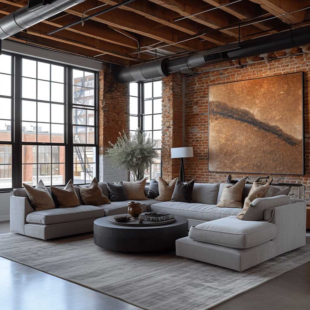
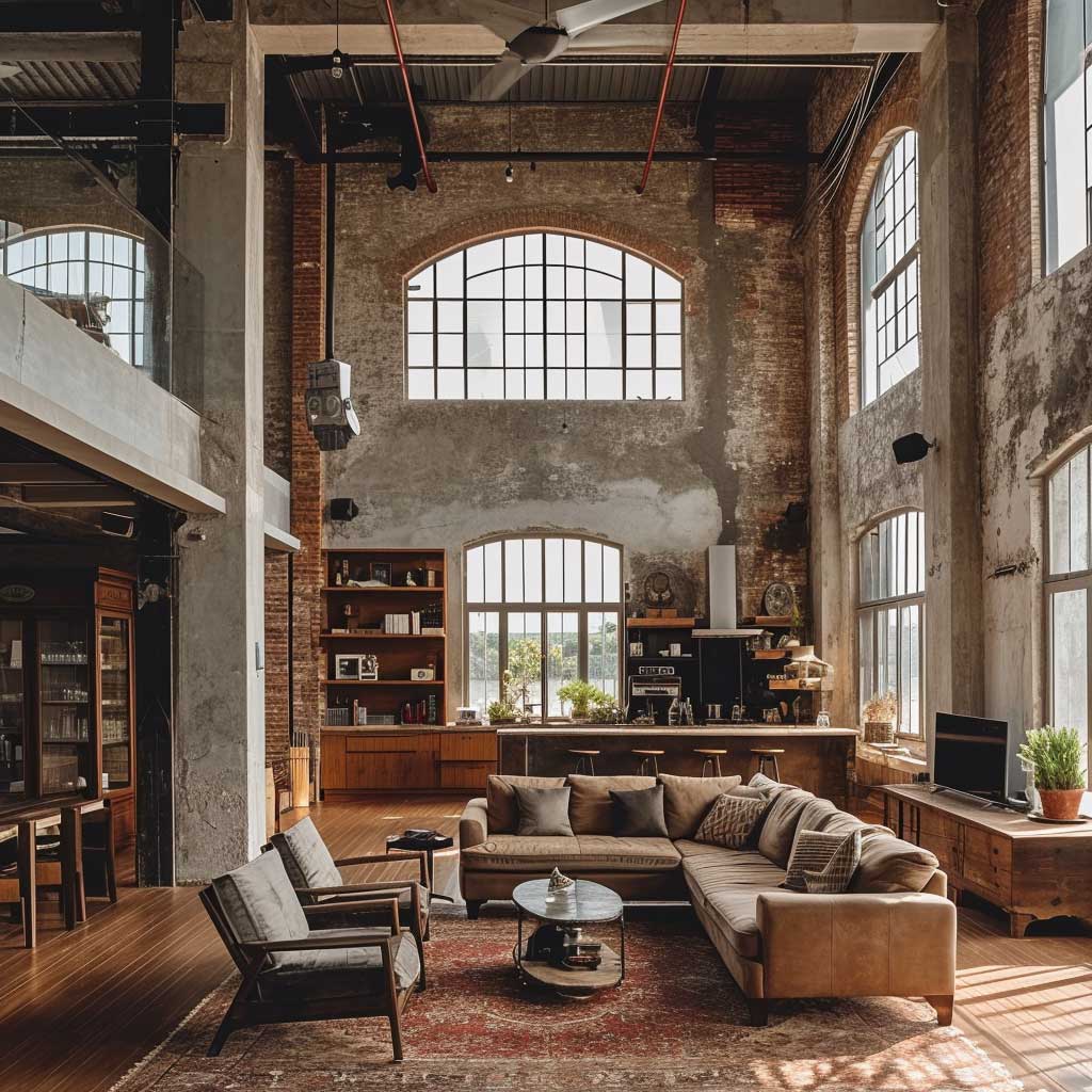
Polished Concrete, Reclaimed Wood, and Metal Accents Define Industrial Chic Interiors Through Texture
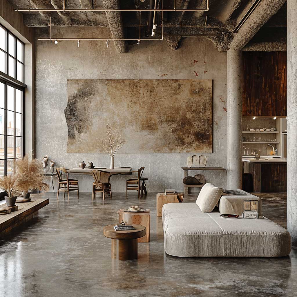


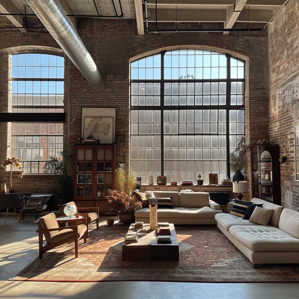
Polished concrete floors are the most copied surface in industrial chic interiors and the most frequently botched. The issue isn’t the material — it’s the finish level. Does polished concrete mean a high-gloss mirror surface or a low-sheen satin? High gloss (Level 4 polish, typically $8–$12 per square foot installed) reflects the ceiling and the furniture, which looks dramatic in photographs and cold in real life. I’ve lived with Level 2 polish — a satin sheen that catches light at an angle but doesn’t mirror — and it reads warmer and more livable without losing any of the industrial character. Ask your concrete finisher to show you a sample at three feet away under artificial light, not just the brochure photos.
Reclaimed wood brings the only element in industrial chic design that genuinely changes with age in a direction you want. Steel rusts. Concrete cracks. Reclaimed wood — already aged — stabilizes and deepens in color as the oils redistribute over time. My go-to source for reclaimed timber furniture is Croft House in Los Angeles: their reclaimed oak dining table ($2,800–$4,200 depending on size) uses Douglas fir or oak from demolished California structures, and each piece ships with documentation of the source building. What doesn’t work is fake reclaimed — new wood distressed with chains or acid. You can tell immediately by the consistency of the “damage,” which is too even and too deliberate to read as authentic.
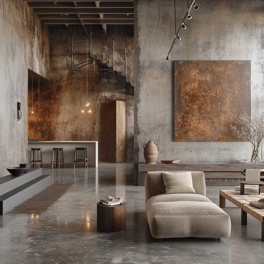
Metal accents in industrial chic design come in three distinct moods, and mixing them without intention is where most rooms go wrong. Raw iron has a warm, slightly orange tone and will change over time. Brushed steel is cooler and more contemporary. Matte black powder coat is the flattest and most graphic option. The color palette you choose for your industrial chic interior design should determine which metal you lead with — a warmer brick-and-wood room calls for raw iron and aged brass; a cooler concrete-and-white room calls for matte black or brushed steel. Running all three metals simultaneously produces a room that looks unresolved rather than layered.
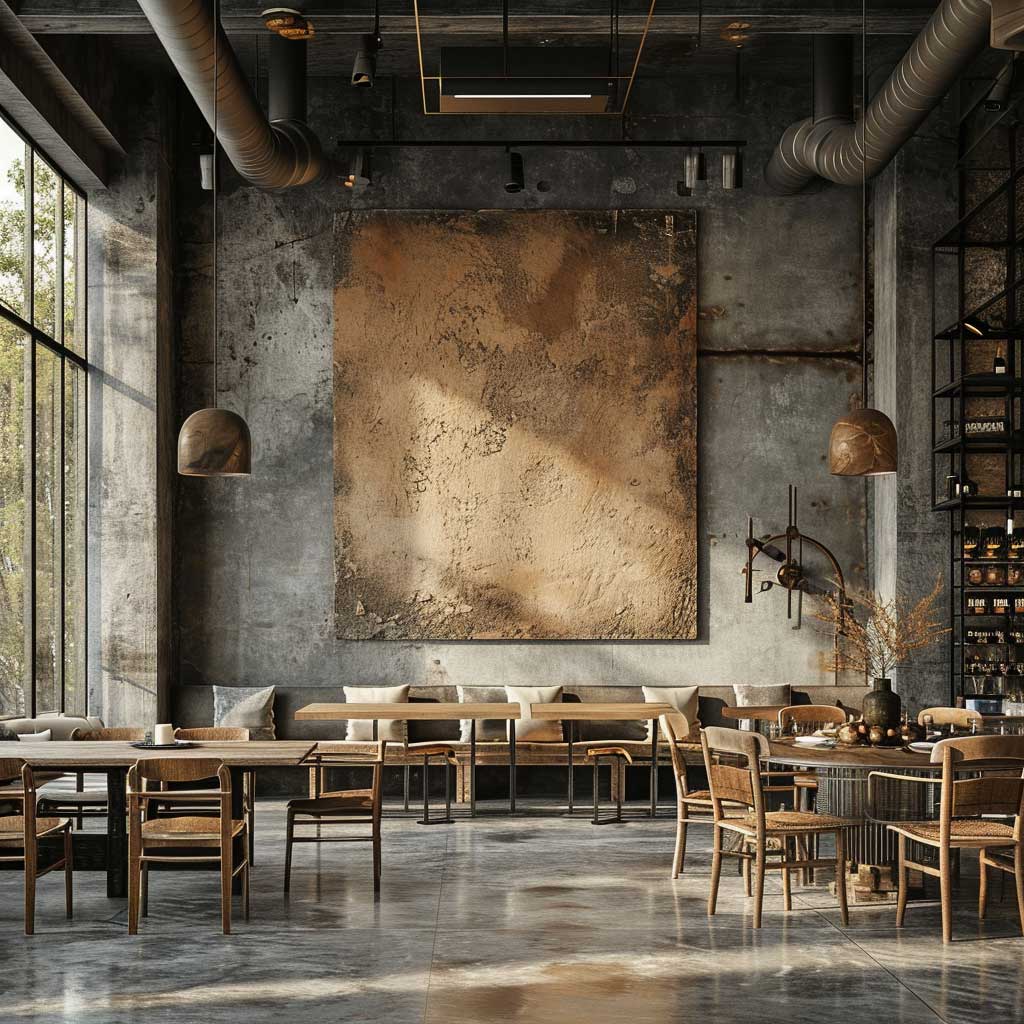
The neutral color palette that industrial chic interiors rely on is narrower than most people realize — it’s not “any neutral.” It’s specifically the colors that exist in the materials themselves: the gray range of concrete (warm gray, cool gray, blue-gray), the brown range of wood (honey, tobacco, espresso), and the black-to-silver range of metal. What gets introduced from outside this palette needs a strong reason to be there. A putty-colored linen sofa sits inside the palette. A beige or cream sofa does not — those tones read as residential neutral, not industrial, and flatten the whole room’s contrast. MasterClass’s breakdown of industrial interior design characteristics confirms that the monochromatic neutral range — whites, grays, blacks — forms the foundation, with material colors (wood, metal) as the only variables.
Lighting in industrial chic interiors should work with the textures, not just illuminate the room. Directional light that skims across a brick wall at a low angle creates shadows in the mortar joints and makes the surface look three-dimensional. The same wall under overhead diffused lighting looks flat and loses half its character. I use adjustable track lighting (Halo’s LZR series, around $45 per fixture) pointed at the brick from six feet away and at 30 degrees from the wall surface. The change in how the room feels from that single adjustment is larger than anything you’d get from changing the furniture.
The Takeaway
Industrial chic interior design rewards the materials you don’t cover up.
Expose the brick. Seal it matte. Let the beams stay raw or coat them in a dark primer — but never paint them white. The building’s bones are the design; furniture is the editing.
Reclaimed wood from documented sources (Croft House, $2,800+), matte or satin concrete finishes, and one dominant metal tone per room will take you further than any amount of accessories. Schoolhouse Electric pendants at $220 each and Rubio Monocoat floor finish at $89 per application are the two purchases I keep recommending because they reliably work.
Industrial chic lives in the contrast between cold surfaces and warm ones — polished concrete meets reclaimed timber, raw steel meets wool upholstery. Remove the contrast and you remove the style. Save this post.
Related Topics