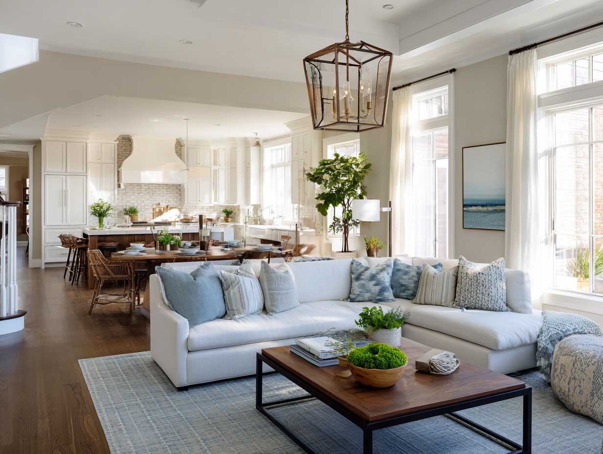
A kitchen and living room combined into one open space sounds like a dream until you’re standing in it and something feels off — the cooking smells sit in the sofa cushions, the two zones compete instead of connect, and every layout decision you made looks random. I’ve been through this twice, and the fix is always the same: zoning, not decorating. The 12 kitchen living room combo layouts below attack that problem from different angles — large islands, industrial contrasts, Scandinavian restraint, rustic warmth — so you can pick the approach that fits your actual floor plan, not just the one that photographs well.
Kitchen and living room combo design has gotten genuinely good in the last few years. Furniture brands like Article and CB2 now build sofas at dimensions that work for open-plan sight lines rather than closed rooms. Pendant lighting designed specifically to float above an island at 30 to 32 inches has become a standard product category. You’ll notice those details in the photos below — they’re not accidents, they’re the decisions that make the difference between a combo space that reads as one room and one that reads as two rooms with a missing wall.

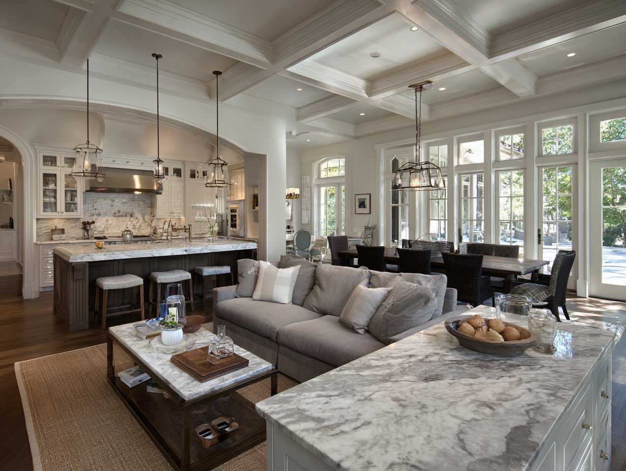
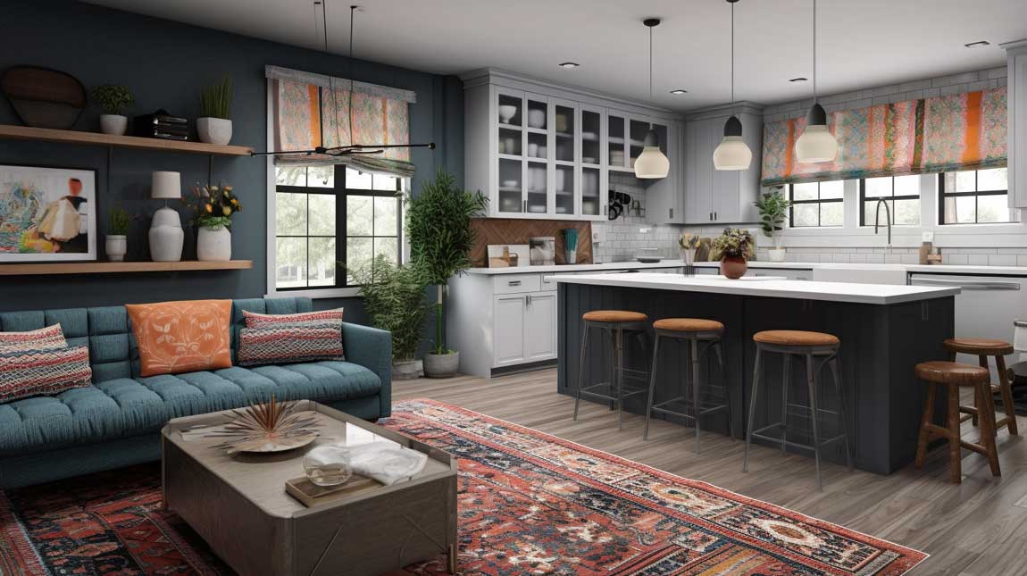
Best zoning tool: A kitchen island with seating on the living-room side — it draws a line without closing the space
Flooring rule: Same material throughout reads as one room; switching to tile in the kitchen only chops the space
Lighting split: Pendant over island on its own switch, recessed spots on another — lets you shift from cooking mode to living mode
Rug size: All four sofa legs on the rug to anchor the living zone; front-legs-only looks cut off in an open plan
Biggest mistake: Two mismatched color palettes — one for the kitchen cabinets, another for the upholstery — that never speak to each other
Budget range to refresh a combo space: $8,000–$25,000 depending on whether plumbing moves
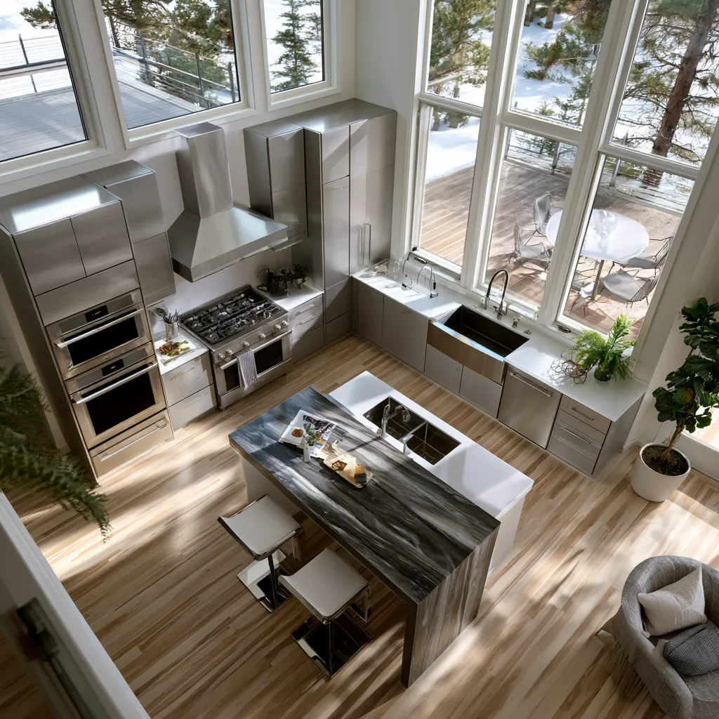
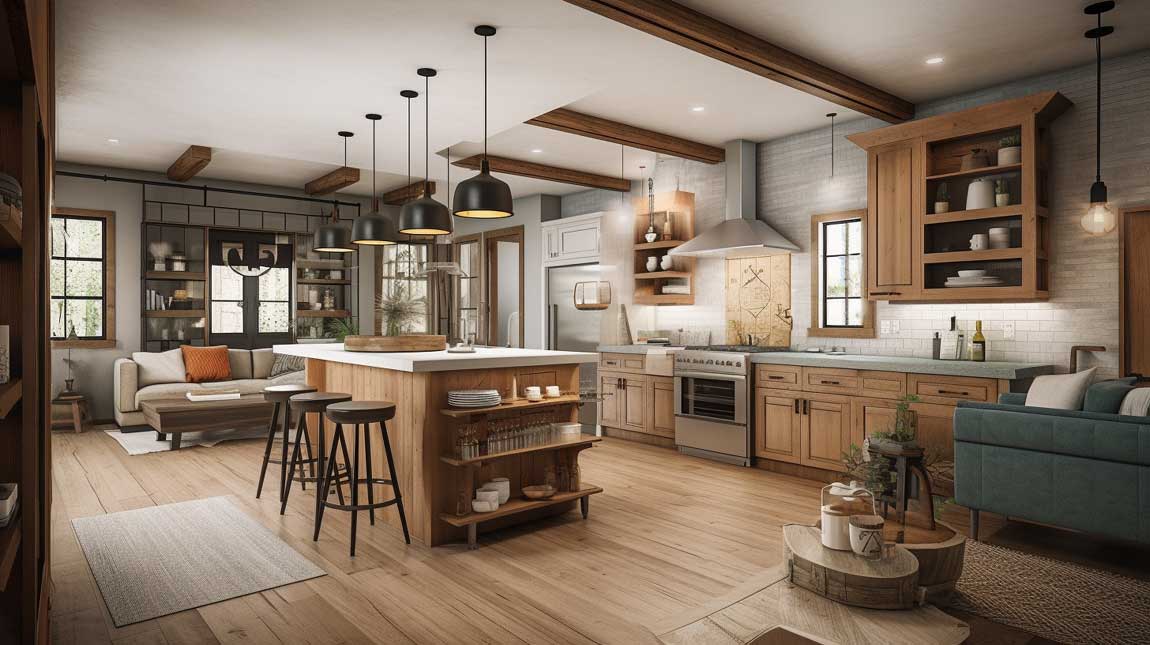
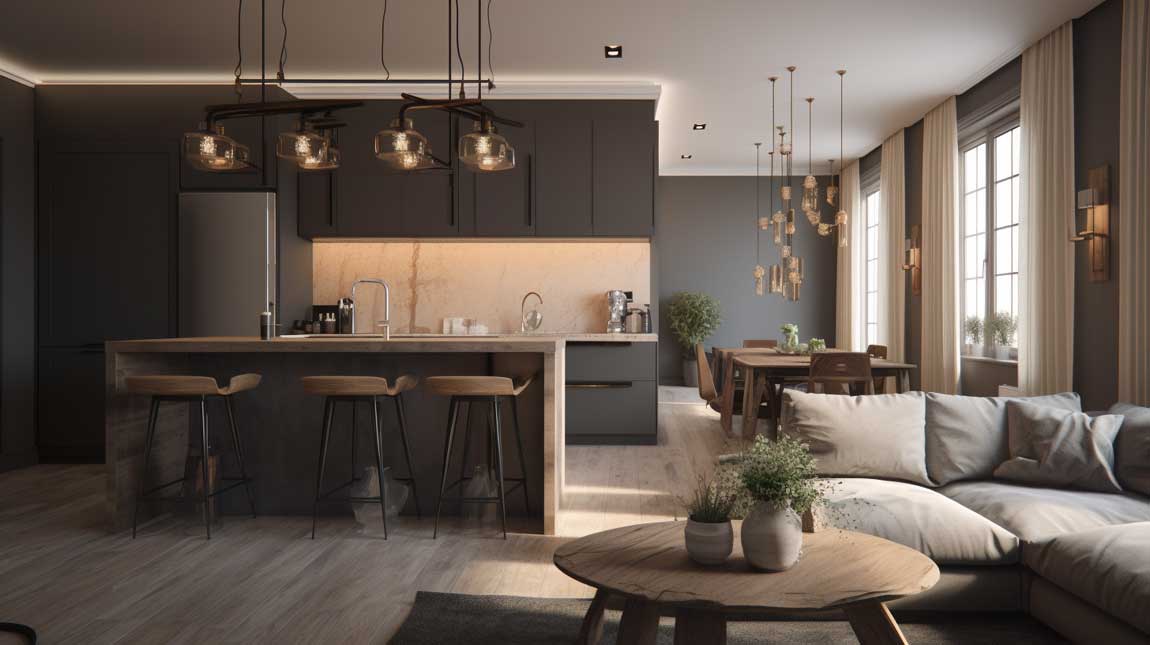
The Large Island Does More Than You Think in an Open-Plan Kitchen Living Room
Stone countertops run about $55 to $95 per square foot installed — Caesarstone Calacatta Nuvo is my go-to for an open-plan island because the veining reads warm from the sofa side and cool from the kitchen side simultaneously. An island this size pulls double duty: prep surface and psychological boundary. You don’t need a wall if you have a slab of quartz telling the room where the kitchen ends.
Seating height matters more than people admit. Standard counter-height stools at 24 to 26 inches place guests at elbow level with someone cooking — close enough for conversation, low enough not to block the sofa sight line. Bar-height stools at 28 to 30 inches work only if the island top is thick and dark enough to visually anchor them. I bought bar-height stools for my first island and they looked like stilts. Wrong call.
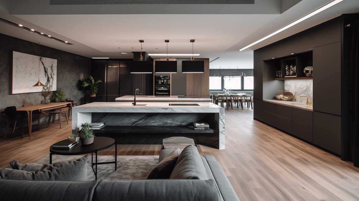
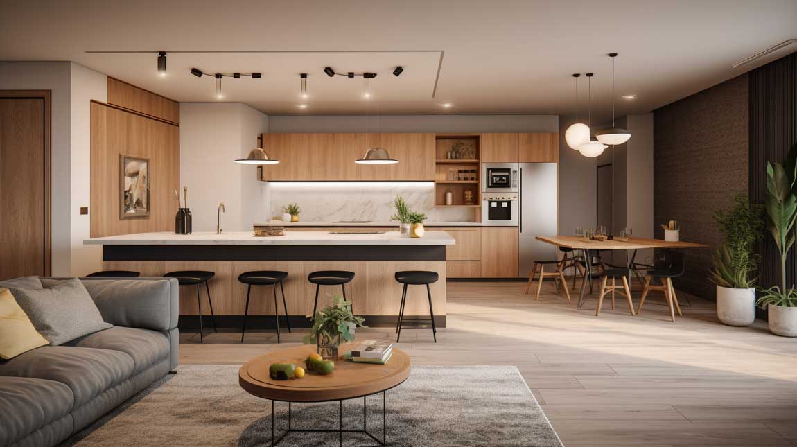
Overhead lighting above an island needs its own circuit. A single dimmer controlling both the pendants and the recessed ceiling spots is the amateur version — you end up with either too much light while watching TV or not enough while chopping. Pendant lights at 32 inches above the countertop surface, on a separate switch, solve the problem cleanly. Three pendants spaced 24 inches apart perform better than one large fixture in a combo-scale room. The open space kitchen and living room ideas at different scales show this pattern consistently: dedicated island lighting is what separates a finished-looking combo from a half-done one.
Large windows on the far wall pull natural light across the full depth of a combined space. Glass-front upper cabinets near those windows act like a mirror relay — they bounce light back toward the living zone. Avoid opaque upper cabinets on any wall facing a window in an open-plan kitchen; the mass kills the light before it gets anywhere.
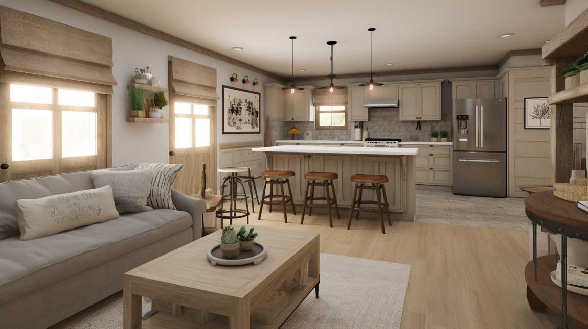
Small Combo Kitchens Hide More Storage Than You’d Expect
Under 150 square feet of combined floor space, every surface has to earn its place twice. Custom floor-to-ceiling cabinetry along one wall adds roughly 30% more storage than standard 30-inch upper cabinets — and eliminates the grease-collecting gap above the doors that nobody cleans. IKEA’s SEKTION system with AXSTAD fronts runs about $200 to $350 per linear foot installed by a third party, which is legitimate value for a small combo renovation.
The breakfast bar extension of the countertop is the small combo’s best trick. Extend the kitchen counter 12 to 15 inches toward the living room on the island or peninsula side and you have casual dining without a separate table eating up floor space. I stole this from a 700-square-foot apartment I toured in Copenhagen — the owner had zero dining table and the space looked bigger for it, not smaller.
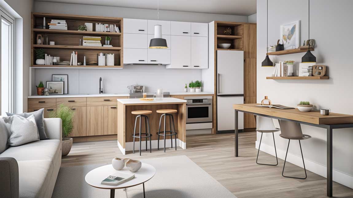
A wall-mounted TV in the living zone frees the floor of a TV console that would otherwise block movement between areas. Floating media shelves from brands like Floyd or West Elm’s framework system ($180 to $340) keep the floor clear and maintain the visual openness. Don’t put a bulky media unit in a small combo — it reads like furniture that belongs in a different room and it always looks wrong.
Mirrors in the living zone of a small combo do what windows can’t always do — they bounce light back from any direction. A 36 by 48-inch leaner mirror on the wall opposite the kitchen reflects the cabinetry, the pendant lights, and the window simultaneously. Suddenly the space reads as twice its actual depth. What’s the cheapest upgrade in a small combined kitchen-living space? A $90 mirror from IKEA’s NISSEDAL range, not a new sofa.
Don’t tile only the kitchen floor. Switching from tile in the kitchen to hardwood or LVP in the living room visually chops the space in half and makes both zones feel smaller. Use one continuous flooring material across the full footprint — then use a rug to define the seating area instead.
Don’t run matching upper cabinet colors all the way to the edge of the kitchen zone. When the same flat cabinetry panel meets the painted wall of the living room without a visual break, the kitchen reads like it was glued onto the room. Stop the cabinetry run before the corner and add a panel of open shelving or a different material to signal the transition.
Don’t skip a range hood with real CFM. A recirculating hood that claims 200 CFM does almost nothing for cooking smells in an open plan. You need a ducted hood with at least 400 CFM or the living room sofa will smell like whatever you made on Tuesday.
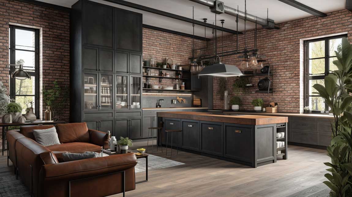
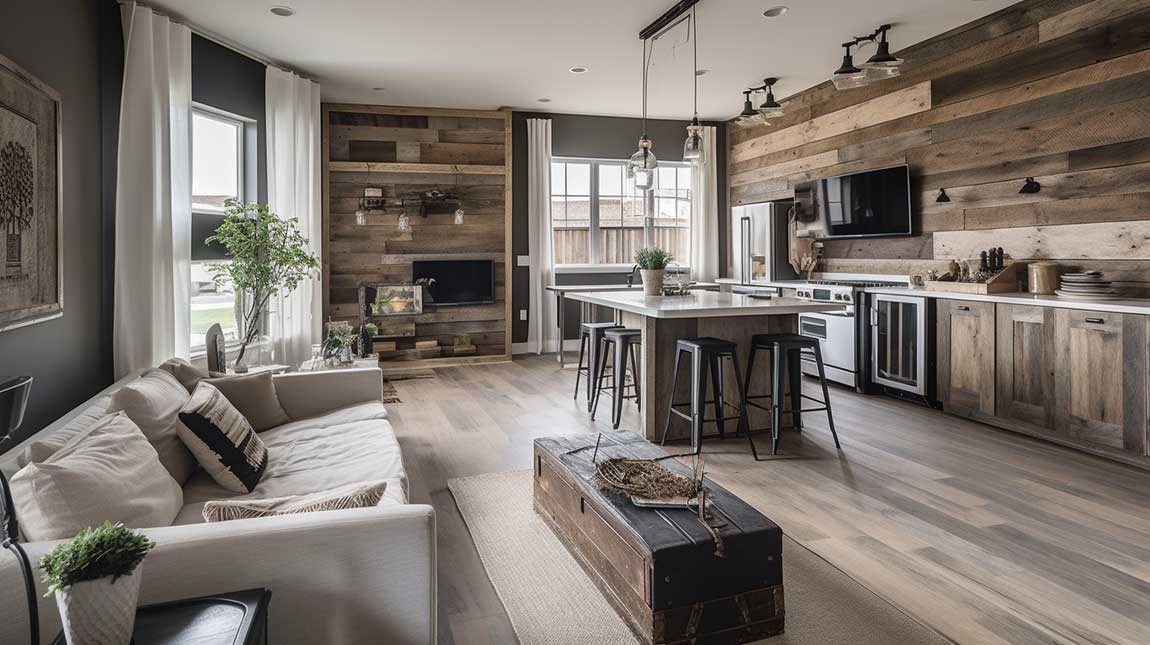
Exposed Brick Reads Differently When the Kitchen Is Right Next to the Sofa
Industrial combo spaces work because raw materials — brick, steel, poured concrete — are equally at home near a cooktop and near a sectional sofa. The logic is self-consistent in a way that polished marble next to an exposed pipe never quite is. You’re not fighting two aesthetics; you’re doubling down on one. That’s why these spaces photograph so well and feel even better in person.
Stainless steel appliances from brands like Bosch (Series 800 range, around $1,200 to $1,800) or Thermador (Summit Series, $2,400 and up) read as industrial without trying. The finish echoes exposed ductwork or metal pendant lights without you having to buy anything extra. Avoid black stainless — it scratches to a bronze-ish color within six months and looks dated in a combo where the living zone upholstery will eventually trend away from it.
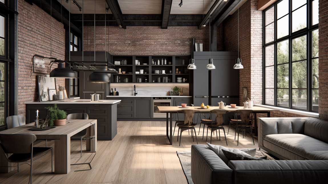
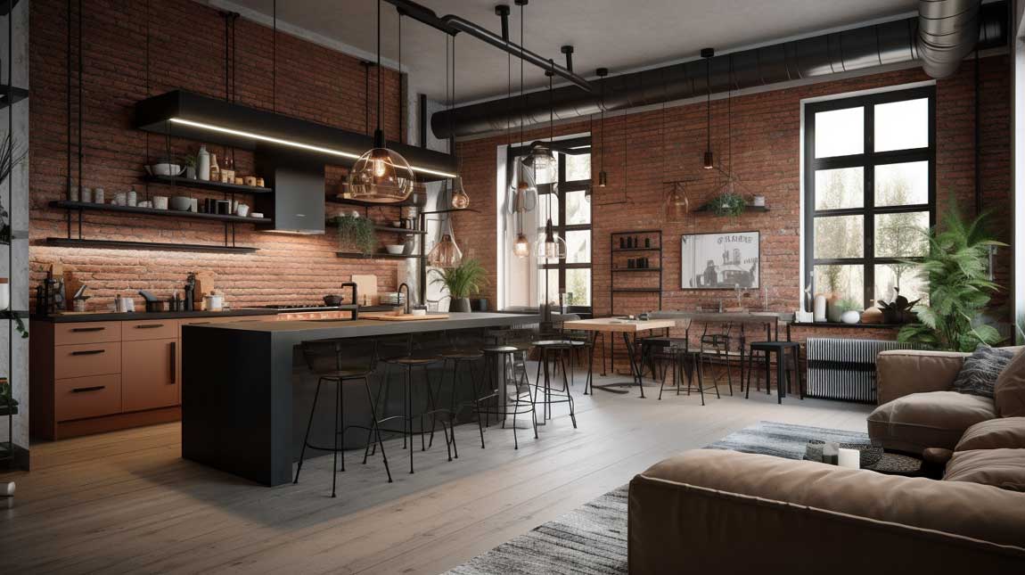
A large area rug in the living zone of an industrial combo does something counterintuitive — it softens the space without contradicting the aesthetic. A flat-weave wool rug from Loloi’s Amber Lewis x Loloi collection ($400 to $900 in 9×12) sits on polished concrete and looks intentional rather than compensatory. The mistake I see most often is choosing a rug that’s too small and too centered under just the coffee table. You need all four sofa legs on the rug, or the seating area floats disconnected from the room.
Skylights in an industrial combo turn the exposed ceiling into an asset instead of a problem. Natural zenithal light lands on brick and concrete differently than window light — it pulls out the texture and warmth that makes these materials worth having. A single 24 by 48-inch fixed skylight costs $800 to $1,500 installed and changes the room more than any furniture purchase will.
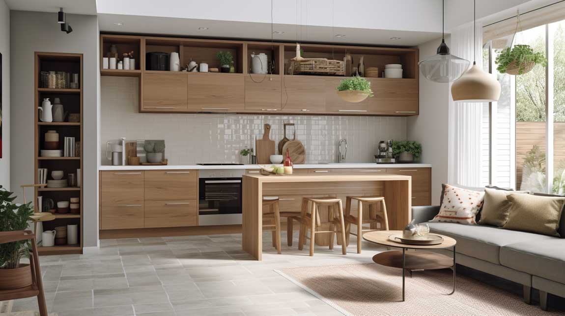
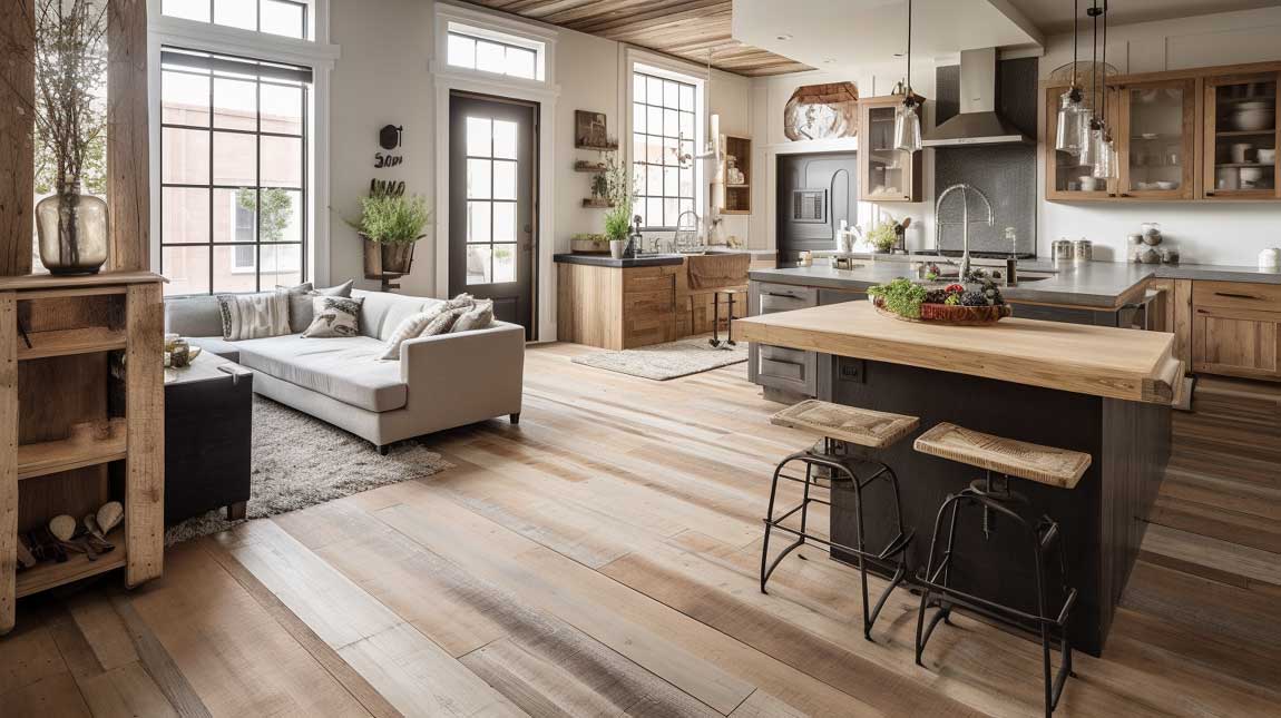
Farmhouse Kitchens Combined With a Living Room Need a Boundary That Isn’t a Wall
Shiplap, exposed beams, and a farmhouse sink all read as kitchen signals — which means in a combined space, the living room needs its own equally strong set of signals or the entire room collapses into a visual soup of wood and white. The wood-burning fireplace is the farmhouse living zone’s anchor. It tells the eye where sitting happens, and it does the job more efficiently than any sofa configuration alone.
Reclaimed wood beams from suppliers like Elmwood Reclaimed Timber ($25 to $55 per linear foot) add authenticity that faux beams never achieve. Touch them once and the difference is obvious. If budget is tight, genuine reclaimed beams on the ceiling and painted MDF shiplap on the walls is a legitimate split — your guests will never know, and you’ll spend $3,000 instead of $12,000.
Open shelving in the kitchen displays dishware that the living zone can actually see — which means it has to look good from 15 feet away, not just up close. White stoneware from Farmhouse Pottery ($45 to $95 per piece) stacks beautifully and photographs neutrally against any background. The mistake is displaying every mug you own on open shelves and calling it farmhouse style. That’s clutter with a shiplap backdrop.
French doors connecting the combined space to an outdoor area extend the farmhouse feeling in a way that no interior element can replicate. When those doors are open, the space doubles. When closed, the glass keeps the view. Standard French door units from Pella or Marvin run $2,000 to $4,500 installed — budget for them before you spend money on a statement light fixture you’ll stop noticing within a month. More on the specific ways these connected zones function together at open space kitchen and living room design.
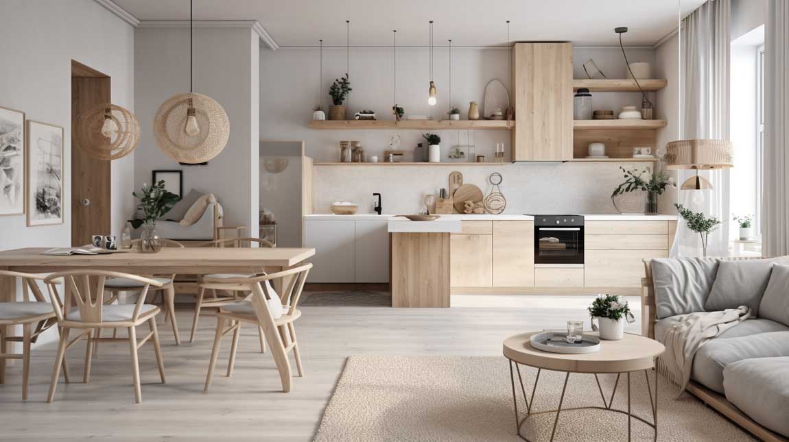
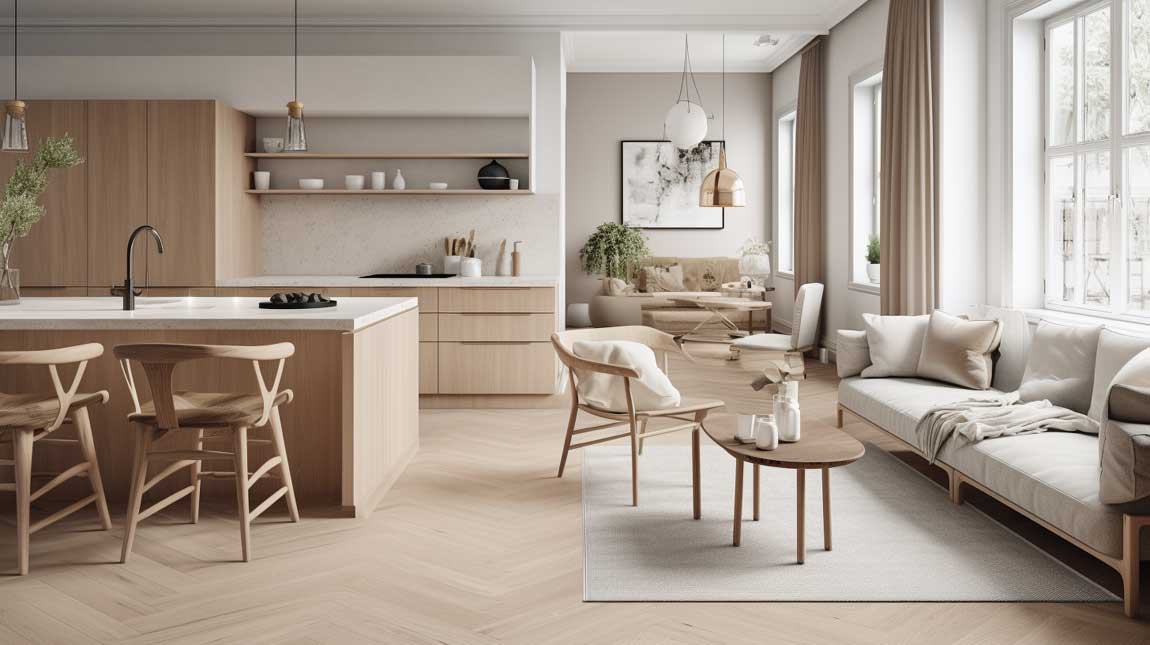
Scandinavian Combos Get the Ceiling Height Wrong More Often Than Anything Else
White cabinetry and light oak flooring are the Scandinavian combo’s signature, and they work precisely because they don’t compete — they recede and let ceiling height do the heavy lifting. Rooms with 8-foot ceilings look average in this style. Rooms with 9 to 10-foot ceilings look architectural. If your ceilings are standard height, ceiling-height cabinetry is the workaround — it draws the eye up and tricks the room into reading taller than it is.
IKEA’s KALLAX shelving unit at $89 to $179 is the Scandinavian combo’s Swiss army knife: it divides the kitchen zone from the living zone visually while staying low enough not to block the sight line above. Use it as a room divider, fill three squares with baskets and two with books, and you have zoning without architecture. I own two of these and they’ve moved through four apartments without looking wrong in any of them.
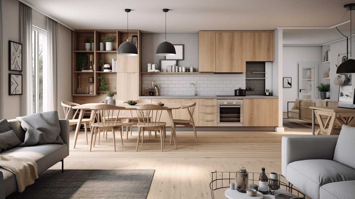
Plants are not optional in a Scandinavian combo — they’re structural. A fiddle-leaf fig in the corner of the living zone ($65 to $120 at most garden centers) introduces vertical mass without visual weight, and it softens the flat-panel cabinetry line that would otherwise read as cold. The plant is doing the same job a throw pillow does, except at a completely different scale. Don’t skip it.
The one thing Scandinavian combos consistently get wrong in DIY attempts: too many small decorative objects on the open shelves. This style’s restraint is its power. Styling with three to five objects per shelf, maximum, beats a fully loaded shelf every time. You’ll notice that in every well-executed example, the shelves are underloaded — that emptiness is intentional, not incomplete.
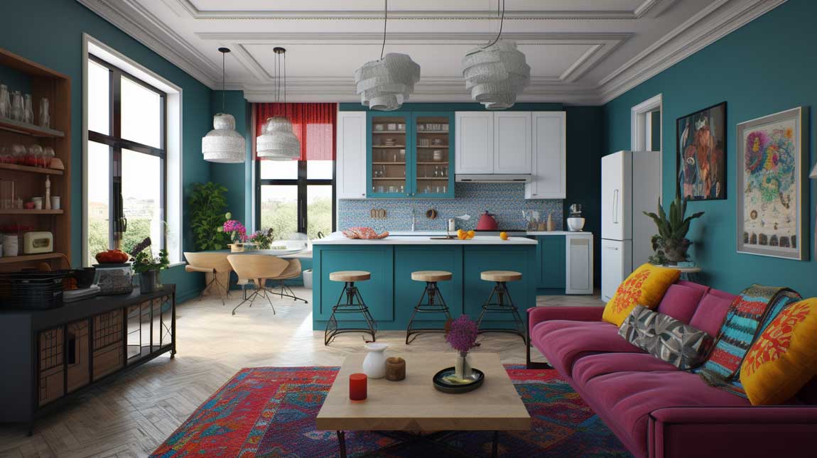
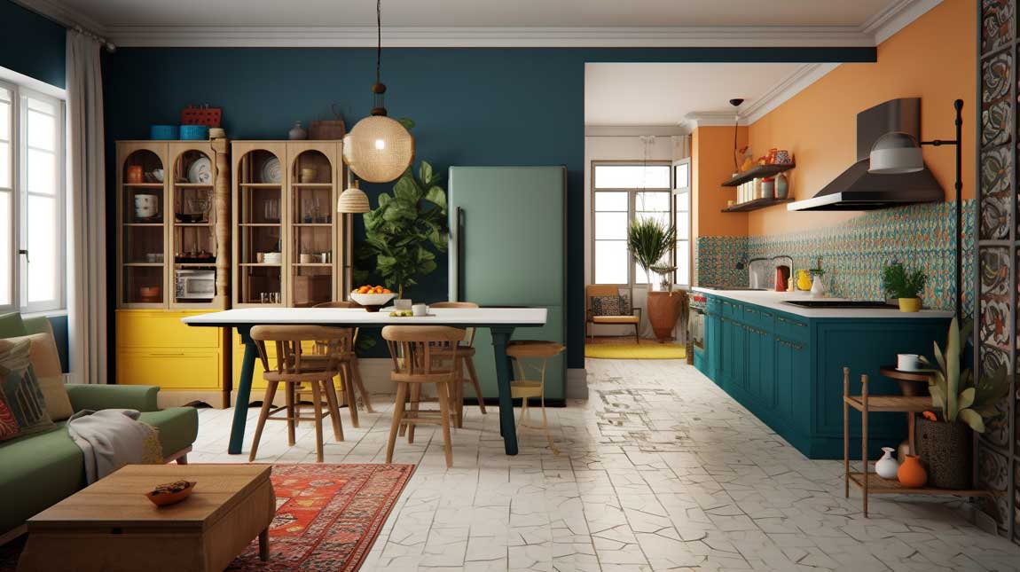
Eclectic Combos Fail When the Color Repeat Breaks Down
Bold cabinetry — forest green, midnight navy, terracotta — works in an eclectic combo only when that color reappears somewhere in the living zone. A single accent pillow, a throw, a vase. Without that repeat, the kitchen and living room look like they belong to different owners. The rule is simple: pick the cabinet color first, then find it again in the sofa or rug before you commit.
Colorful backsplash tile from Heath Ceramics ($22 to $38 per square foot) or Fireclay Tile ($15 to $45 per square foot) gives the kitchen zone a focal point visible from the sofa. That sight line matters in a combo — the kitchen’s most interesting surface becomes part of the living room’s view. Subway tile in white doesn’t do this job. It reads as a background, not a feature, from 12 feet away.
Statement lighting is non-negotiable in an eclectic combo. Schoolhouse Electric’s Willamette pendant ($195 to $285) or a vintage rattan shade from a Etsy seller ($65 to $150) signals that the design is intentional rather than accumulated. Generic flush-mount ceiling lights in a bold eclectic space are like wearing a printed jacket with a plain white tee — the contrast makes the jacket look better. The wrong lighting makes the entire room look like it gave up.
An open floor plan in an eclectic combo encourages movement in a way that a closed kitchen never does. Guests migrate from the sofa to the island naturally because there’s nothing stopping them and something interesting to look at everywhere they land. That social dynamic — the cook engaged with guests without a wall between them — is the real reason people tear down walls. The style is the wrapper; the connection is the point.
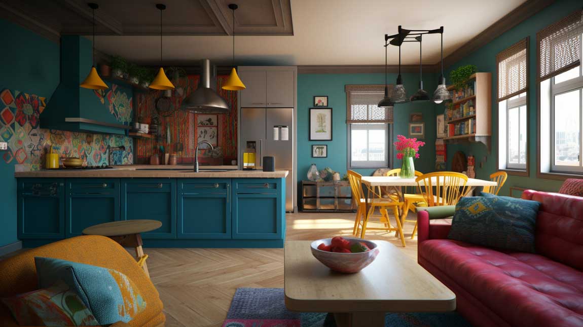
Metal Finishes Pull the Industrial Version of This Layout Together From Both Ends
Matte black hardware on kitchen cabinets at $3 to $12 per pull (Rejuvenation, House of Antique Hardware) repeats visually with a black coffee table leg or a black floor lamp in the living zone. That’s the metal-finish trick in an industrial combo — you buy once in the kitchen and it echoes for free across the room. Mixing metals works only when each metal is dominant in its own zone; splitting them randomly across both zones reads as an error, not a choice.
Open shelving in the kitchen of an industrial combo should carry weight — cast iron, dark wood, stacked ceramics in earthy tones. Floating shelves loaded with white plates look wrong against exposed brick. The material needs to match the register of the space. My go-to shelving bracket in an industrial kitchen is a raw steel pipe bracket from Simplified Building ($25 to $45 per pair) with a reclaimed oak shelf. Total cost per shelf: $60 to $90. Visual impact: considerably higher.
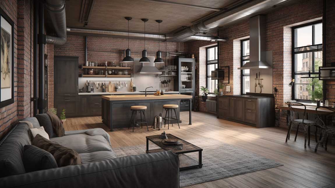
A leather sofa in the industrial living zone ages into the space rather than out of it. Top-grain leather from IKEA’s LANDSKRONA collection ($1,300 to $2,200) develops a patina over years that suits exposed brick better than any fabric ever will. Skip bonded leather — it peels within three years and looks significantly worse than when you bought it. That’s a $900 lesson I learned the unpleasant way.
Large windows and skylights in an industrial combo do double duty: they provide natural light and they reveal the architectural bones — the ceiling grid, the exposed structure — that give these spaces their character. Without that light, industrial finishes look grimy rather than intentional. The difference between a cool loft and a basement is almost entirely a question of how much light the windows let in.
Traditional Kitchens Combined With a Living Room Need One Period-Consistent Element to Commit
Raised-panel cabinetry, a farmhouse sink, and a wood-burning fireplace all signal traditional design — but in a combined space, that signal needs to land in both zones or the living room looks like it arrived from a different decade. The most consistent traditional combos pick one period material — usually dark-stained oak or painted Shaker cabinetry — and mirror its finish in the living room furniture legs or picture frame moulding.
Inset cabinet doors (where the door sits flush inside the frame rather than over it) are the detail that separates a traditional kitchen that photographs as antique from one that photographs as dated. They cost 15 to 25% more than overlay doors and require tighter tolerances from the installer, but the visual result is categorically better. Ask your cabinet maker before you order — not every shop does inset well.
Statement lighting in a traditional combo should be architectural, not just decorative. A lantern-style pendant from Visual Comfort (Suzanne Kasler Ziyi Lantern, around $450) above the kitchen island reads as a piece of furniture rather than a light fixture. That distinction is what elevates a traditional combo from nice to designed. Generic drum shades read as generic regardless of the color you choose.
The open floor plan in a traditional combo works because the fireplace does what a wall would otherwise do — it creates a focal point that faces the kitchen and gives the living zone its reason for existing in that particular spot. Remove the fireplace and you’re left with a sofa pointed at a kitchen. Keep it and you have a room that makes sense from every angle.
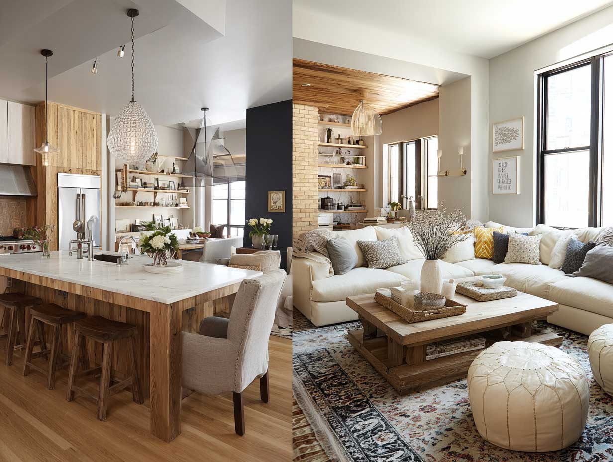
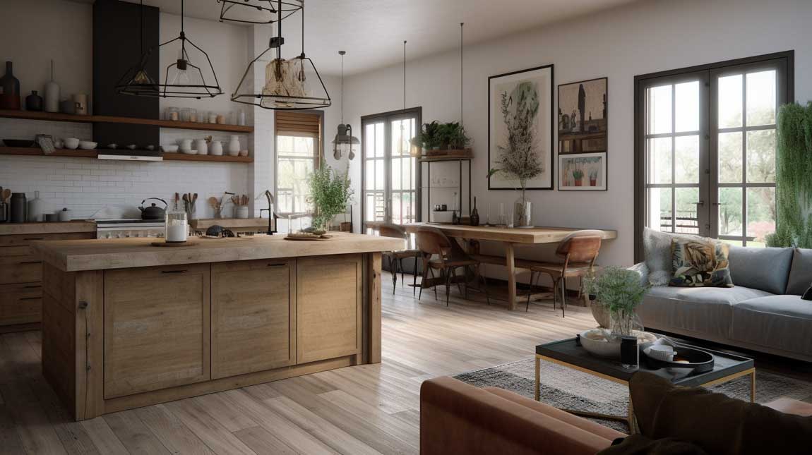
Reclaimed Wood Reads as Texture From the Kitchen and Warmth From the Sofa
The rustic-chic combo’s trick is that reclaimed wood performs visually at two distances simultaneously. From the kitchen side — 3 to 5 feet away — you see grain variation, nail holes, saw marks. From the sofa side — 12 to 18 feet away — you see warmth and texture. No other material does this as reliably. That’s why exposed beams and reclaimed wood floating shelves appear in rustic combos at a frequency that looks like a rule, because it is one.
Vintage-inspired accessories in this style need to be actually old or convincingly old — not the mass-produced farmhouse signs from HomeGoods that every third house already owns. You’re building a room that rewards scrutiny from both zones. A $35 flea market ceramic jug on an open shelf does more for a rustic combo than a $200 set of matching mason jar canisters. One genuine object beats five themed ones every time.
Pendant lights in a rustic-chic combo should be specced as if the kitchen is a restaurant — which it is, from the living zone’s perspective. Vintage-style filament bulbs in a cage pendant or a mercury glass shade ($65 to $180 from Pottery Barn or Schoolhouse Electric) deliver warm 2700K light that photographs amber and feels like candlelight. LED equivalents are fine now — the color temperature matters more than the bulb technology. Avoid anything over 3000K in a space this material-heavy or the room will look like a hardware store.
Greenery on the open shelves — a trailing pothos, a small rosemary plant — does what no decorative object can do in a rustic combo: it introduces biological randomness into a space full of carefully chosen elements. The living zone has its own plant in the corner. The kitchen zone has plants on the shelves. They don’t match. They communicate. That’s the whole idea.
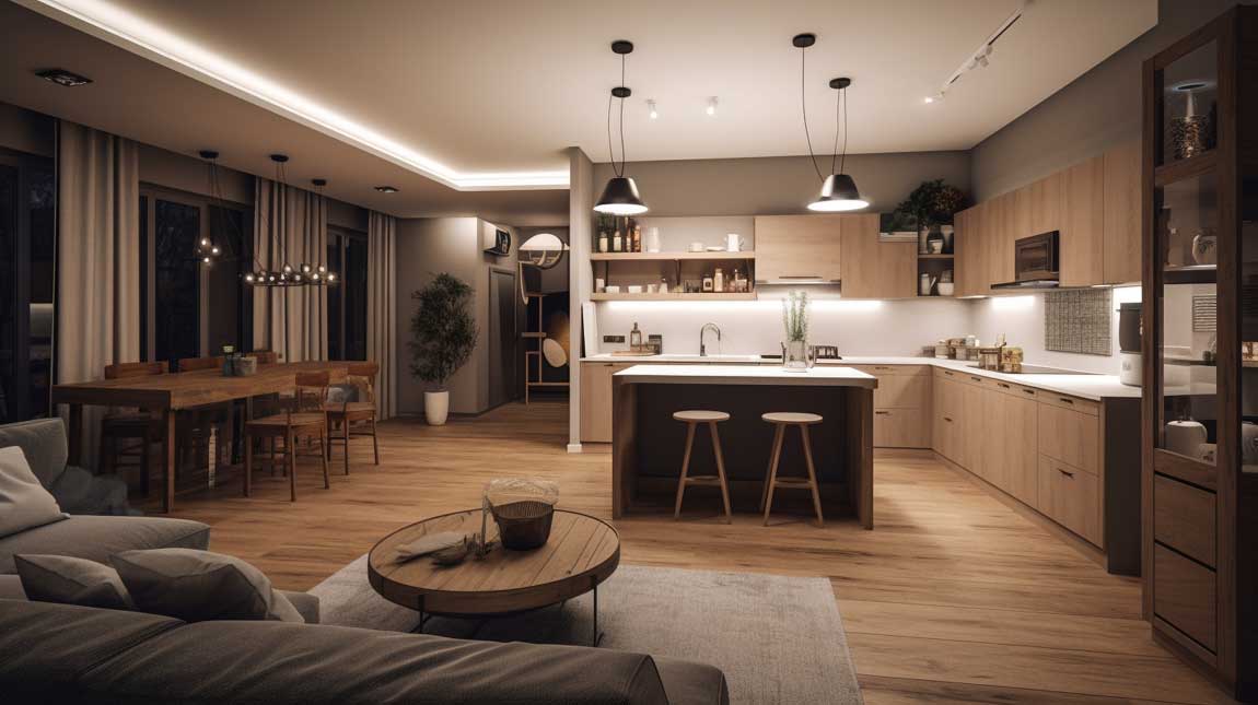
A Second Scandinavian Setup With Warmer Material Choices Changes Who It Works For
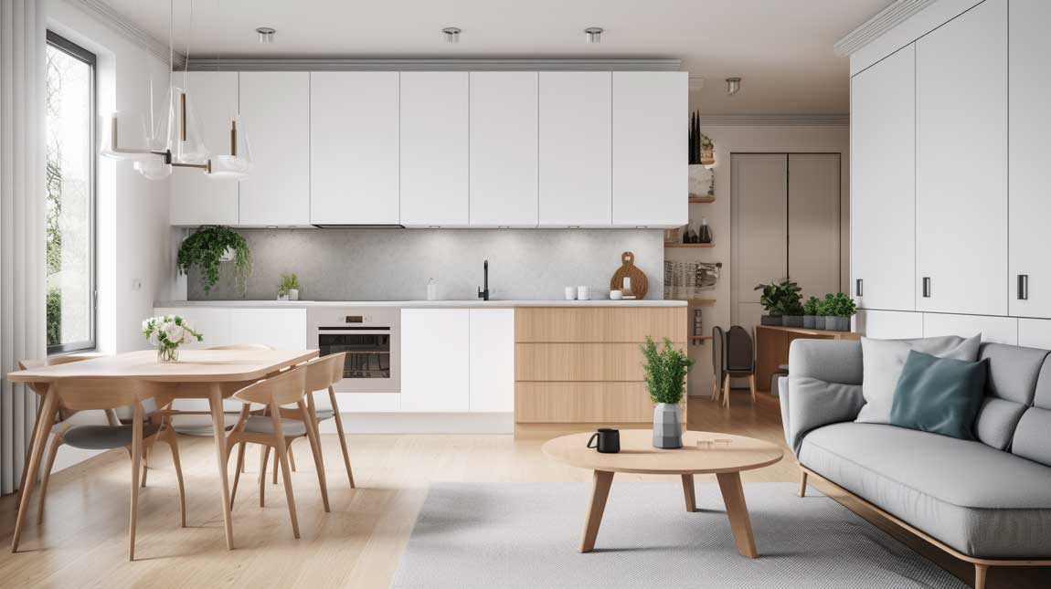
Neutral tones in a Scandinavian combo — soft white, warm linen, pale ash wood — read as calming rather than cold only when the wood tones run warm, not gray. Cool-toned gray-wash oak is the mistake. It photographs Scandinavian but feels clinical in person. Warm-toned natural ash or white oak with a matte oil finish ($8 to $14 per square foot for engineered flooring) holds warmth in the same way that linen upholstery does — without trying.
Natural stone in this version of the Scandinavian combo — a soapstone counter at $70 to $120 per square foot or a limestone backsplash tile at $12 to $25 per square foot — grounds the kitchen zone with material specificity that white paint can never achieve. You notice soapstone differently at different hours of the day. It darkens slightly when wet and lightens when dry. That behavior makes the kitchen feel alive in a way that quartz, however practical, does not.
Smart storage in the Scandinavian combo’s living zone should look identical to smart storage in the kitchen. That means the same hardware, the same wood tone, the same door style. If the kitchen has flat-panel cabinets with matte black pulls, the built-in media unit or bookcase in the living zone should match. When those two zones speak the same material language, the room reads as designed rather than assembled. The small open concept kitchen research consistently shows that material continuity between zones is the single factor that most reliably makes a combined space look intentional.
Minimalist lighting fixtures in a Scandinavian combo — a pendant by &Tradition, a floor lamp by Hay, recessed spots with a clean trim ring — cost more per unit than mainstream fixtures but last visually longer. A $340 Flowerpot pendant by &Tradition still looks current after a decade. A $60 pendant from a big-box store looks dated within three years. In a combined space where the living zone and kitchen zone both live under the same light, that longevity investment pays back at both ends of the room.
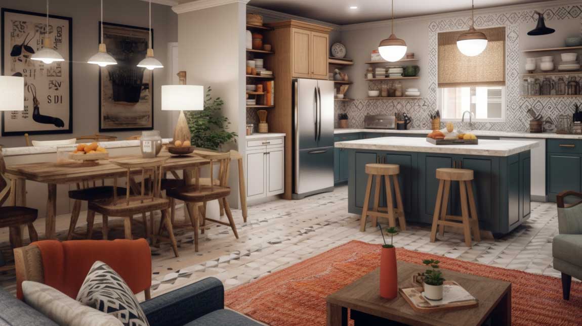
Bold Colors in a Combined Space Stop Working the Moment the Palette Loses Its Anchor
Eclectic and vibrant combos need a dominant neutral that absorbs the color without fighting it. That neutral is almost always a wall — white, warm plaster, or a light greige — and it runs through both the kitchen and living zone without interruption. The colors sit against it: the bold cabinet, the patterned rug, the retro-orange pendant. Remove that neutral anchor and the room looks like a mood board exploded, which is the exact aesthetic the client wanted to avoid.
Funky armchairs from brands like Anthropologie Home ($800 to $1,400) or vintage finds on Chairish ($200 to $600) work in a vibrant combo because they each carry a different pattern — and they both work because neither one is the sofa. The sofa in an eclectic combo should be the most restrained piece of furniture in the room. Let it be a solid color. Let everything else compete around it. The sofa that tries to be the most interesting thing in the room always loses.
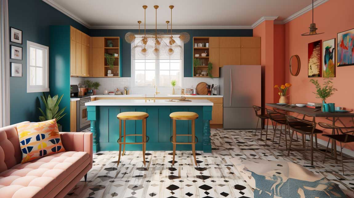
Retro-inspired artwork in a vibrant combo should be framed consistently — same frame profile, different sizes — or the wall reads as chaotic. A gallery wall with mismatched frames, mismatched mat colors, and mismatched orientations isn’t eclectic, it’s unedited. The Homes & Gardens kitchen zoning approach makes the same point about any open-plan space: zones need their own visual anchor, and in the vibrant combo, artwork is the living zone’s anchor the way the colorful backsplash is the kitchen zone’s anchor.
Vintage and modern design elements in a vibrant combo co-exist because they occupy different scales. A mid-century credenza (low, horizontal) pairs with a contemporary pendant light (high, vertical) because they never compete for the same visual territory. The mistake is pairing two vintage pieces of the same scale side by side — they merge into a single object that reads as secondhand shop, not curated living space.
Bottom Line
A kitchen living room combo only reads as one room when both zones share a material language — everything else is staging.
Continuous flooring, a matching hardware finish, and one dominant neutral across both zones cost nothing extra at the planning stage and save you from an expensive redo when the space feels off at the end. The island solves the zoning problem without architecture. The rug anchors the sofa zone without a wall.
Pick your style from the 12 above, then reverse-engineer the material logic before you buy a single piece of furniture. The Scandinavian version wants warm ash, not gray. The industrial version wants a rug big enough for all four sofa legs. The farmhouse version needs a range hood with real CFM.
Save this post — you’ll want to come back to the specific prices and product names when you’re mid-renovation and second-guessing every decision.
Related Topics