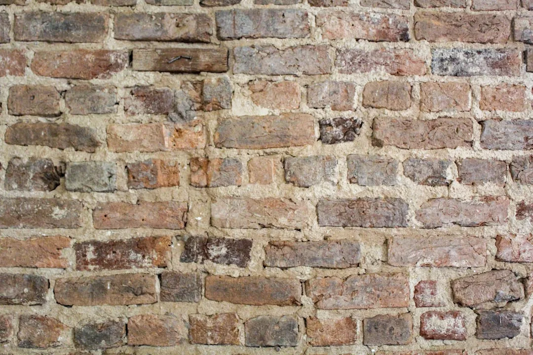
The industrial colour scheme conversation usually stops at grey and metal — which is exactly why so many lofts end up looking like a parking garage with throw pillows. Get the palette right, and exposed concrete stops being a liability and starts being the best textural backdrop in the room. I’ve spent a lot of time pulling apart what makes these spaces actually feel finished, and the answer is almost always the third tone nobody planned for: the one that bridges the raw and the soft. Below are the three colour directions that do this most reliably, with real notes on what to avoid.
You’ll notice these aren’t monochromatic safe plays. Colorful industrial design tends to scare people off, but the rooms that photograph best and live most comfortably are almost always the ones that committed to at least one unexpected hue. Staying too neutral is the most common mistake I see.
Quick Scan
- Moody loft palette: Deep navy or charcoal base + copper or brushed steel accents — works on exposed brick and raw concrete alike
- Soft pastel meets industrial: Dusty pink or muted sage layered over steel and concrete — the contrast is what makes it work, not the colour alone
- Colourful industrial: One saturated anchor (cobalt, burnt orange, deep teal) against a strict neutral field — not three bold colours at once
- Feminine industrial decor: Blush textiles + matte black hardware + warm-white walls — not pink paint on an exposed brick wall
- Colour palette rule: Pick a dominant, a secondary, and one accent. The accent does the heavy lifting.
Moody Hues and Metallic Accents Pull More Weight Than Any Neutral


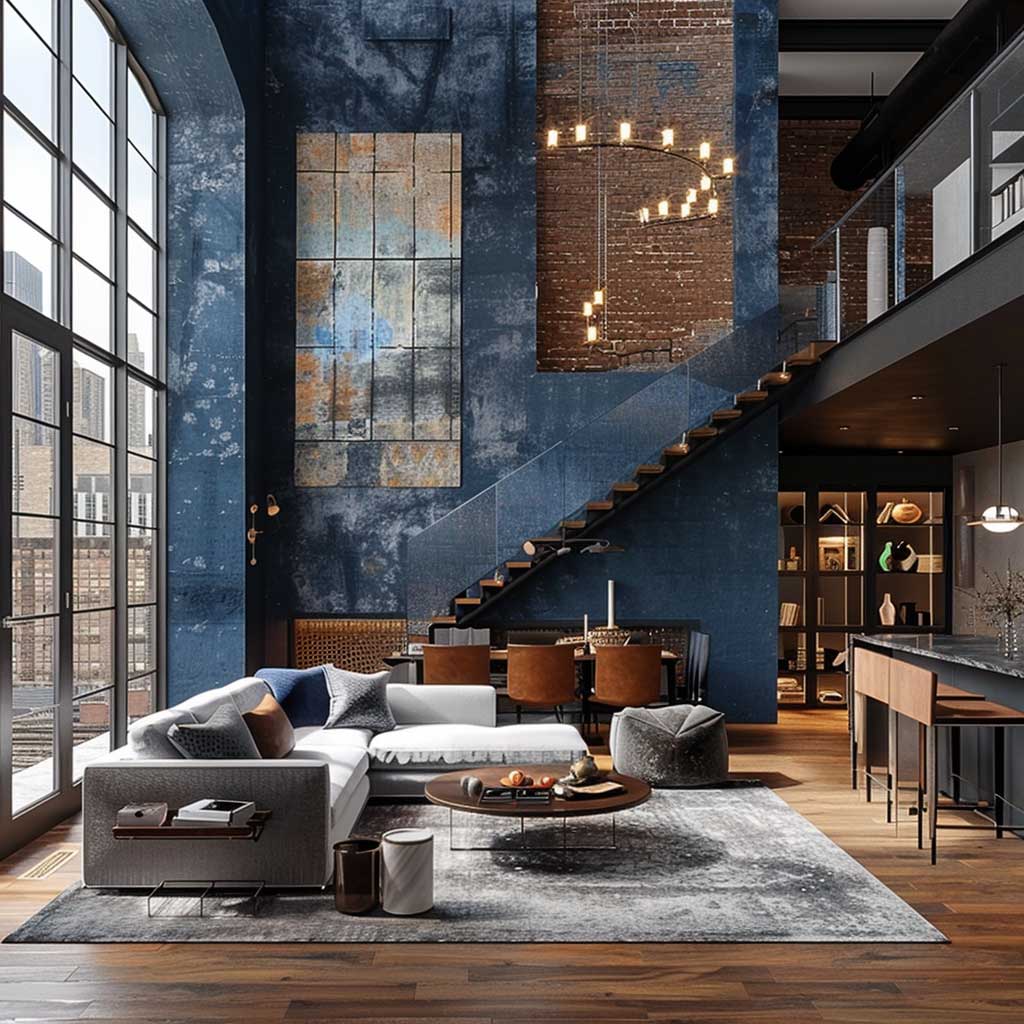

Deep blues — Benjamin Moore’s Hale Navy HC-154 specifically — read completely differently against raw concrete than they do against drywall. Against concrete, the colour deepens, cools slightly, and takes on an almost mineral quality that feels intentional rather than decorative. My go-to move in loft spaces is to paint one raw-masonry wall in a blue this deep and leave the opposing wall as unfinished concrete. The tension between the two surfaces is the design. You don’t need to do anything else to that wall.
Copper is the metallic that bridges warm and industrial without forcing it. Brushed steel keeps everything cool and sleek; copper introduces just enough warmth to stop the space from feeling clinical. I own two copper pendants from Schoolhouse Electric ($189 each) and the difference they made in a loft with polished concrete floors was immediate — the floor stopped reading as cold and started reading as warm grey. Don’t buy cheap copper-finish pieces. The colour oxidises badly and within 18 months you have something that reads as orange-brown rather than copper.
Furniture in this palette should stay low and linear. High-backed sofas compete with the architectural height of loft ceilings and look suburban. You’ll notice in every room that works here that the furniture sits below the midpoint of the wall — it lets the colour and material story play out at eye level and above. That’s not minimalism for its own sake; it’s about not interrupting the backdrop.

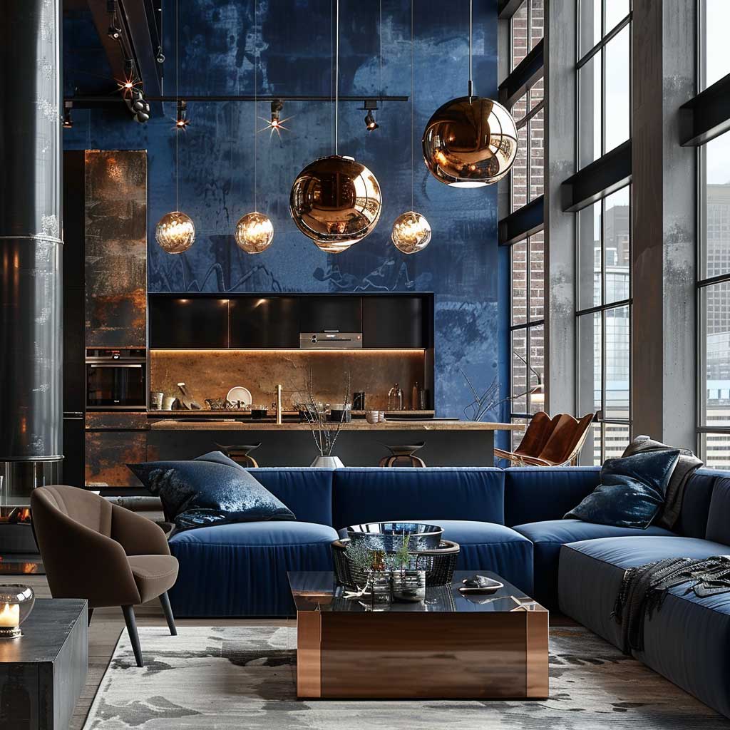


Lighting placement here is less about style and more about information. A single ceiling pendant in a high-ceilinged loft does nothing useful — it lights the middle of the room and leaves every corner cold and dark, which makes the moody palette feel oppressive rather than atmospheric. I stole this trick from a designer I follow: use floor-level uplights aimed at the concrete or brick, and add a table lamp at sofa height. Three light sources at different heights in one room costs around $300-$600 total (Rejuvenation does this range well) and completely changes how the dark colours read at night.
What doesn’t work: warm-white paint paired with this palette. It turns the copper accents orange and makes the whole room feel like a bar that’s trying too hard. Cool white or raw plaster only. The moody palette needs a cool or neutral partner — warmth competes with it rather than supporting it.
Soft Pastels Against Raw Concrete Work Because the Contrast Does the Job
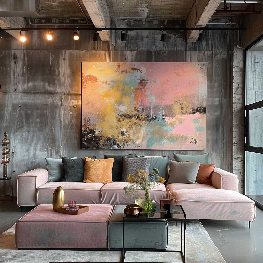
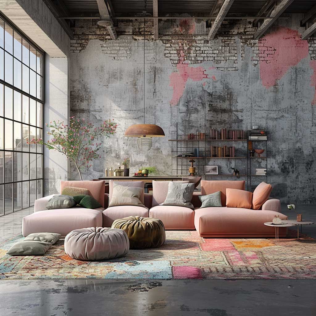

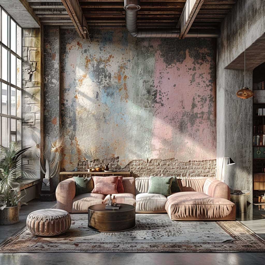
Feminine industrial decor is one of those search terms people use when they can’t find what they’re actually looking for, which is: how do I make a space with raw materials feel like mine rather than like a WeWork. The answer isn’t to add floral prints or rose gold taps. It’s to let a single carefully chosen pastel pull all the softness the room needs — dusty mauve, muted sage, or Benjamin Moore’s First Crush CSP-310 (a 2026 Colour Trends pick that lands perfectly in this role). One colour. Let the concrete do the rest.
The physical logic here is straightforward: concrete has a cool undertone, steel has a cool undertone, exposed ductwork has a cool undertone. You don’t fight that coldness with warmth — you redirect attention away from it by placing something so deliberately soft in the foreground that the eye reads the room as gentle first and raw second. A Crate and Barrel slipcover sofa in dusty blush at around $1,200 achieves this better than a $4,000 accent wall. It’s movable, adjustable, and you can take it with you when you move.
Textiles are where this palette lives. Area rugs, drapery, and throw blankets in muted pinks and washed greens do the heavy lifting — not paint. Painting an exposed brick wall blush pink is the mistake I see most often in this sub-genre, and it never works. The texture of the brick fights the delicacy of the colour and you end up with something that looks neither intentional nor soft. Leave the brick alone. Apply the pastel to what’s already smooth: linen curtains, a velvet Ottoman from CB2, a wool rug.


Mid-century furniture shapes work unusually well here because their organic curves contrast the straight lines and hard angles of industrial architecture without requiring any additional colour effort. A curved Jens Risom-style lounge chair in sage velvet costs around $600-$900 on Wayfair’s mid-century range and reads like you spent considerably more. Is it worth it? For this palette, yes — the silhouette alone earns its keep.
Natural light through warehouse-scale windows changes this palette dramatically across the day. At noon, the pastels go almost white and the concrete reads warm. At 6pm, the pastels deepen and the concrete goes cool blue-grey. Plan your artificial lighting accordingly — you want warmth in the evening to support the pastels, not to fight them. A 2700K bulb in any lamp touching this palette is non-negotiable. 3000K reads cold. 3000K is for the kitchen and nowhere else. For more on industrial chic colour scheme directions, that breakdown covers the monochromatic grey territory this section intentionally skips.
Colorful Industrial Design Fails When You Add Too Many Colours at Once
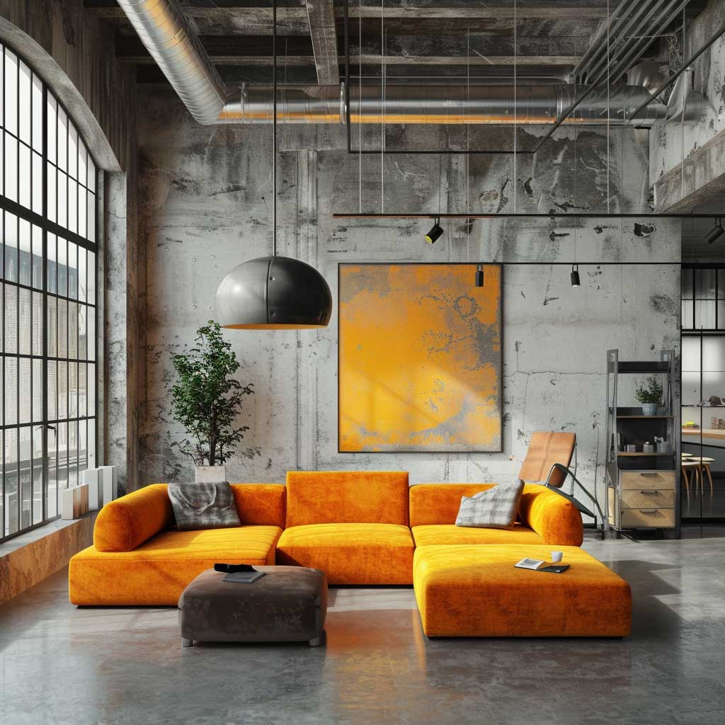


Colorful industrial interior design has one rule that every successful room I’ve seen follows without exception: one saturated colour, everything else neutral. The rooms that look chaotic and exhausting — the ones you scroll past on Pinterest rather than saving — always have three or four competing accent colours. Cobalt sofa, orange rug, green plants treated as colour, yellow lamp. Each one individually is fine. Together they make the concrete backdrop feel random rather than grounded. Pick one. Commit.
The best single-colour industrial anchors are cobalt blue (Farrow and Ball’s Pitch Blue No. 220 at the darkest end), deep teal (Benjamin Moore’s Teal Ocean 2058-20), and oxidised orange (Farrow and Ball’s Babouche or Setting Plaster in the richer version). All three read as intentional against concrete without needing accessories to justify them. You’ll notice none of these are yellow, despite how often yellow appears in “industrial colour scheme” imagery — yellow against concrete goes acid fast. It needs white walls, not raw ones.
Abstract art is a better carrier for saturated colour than soft furnishings in this context. A 36-inch canvas in a single dominant colour costs roughly $200-$400 from Society6 or Saatchi Art, mounts flat against a concrete or white wall, and doesn’t compete with the architecture the way a coloured sofa does. It also reads as deliberate in a way that accent cushions never quite achieve. I’ve replaced three accent chairs with large-format prints and every room looked more resolved immediately.
Dont Do This
Three bold colours in one industrial room. Every space that tries this looks like a colour-theory exercise rather than a home. One saturated anchor, the rest neutral.
Warm-beige paint behind copper fixtures. The orange tones compound each other and you end up with something that reads amber-brown across the whole room. Cool white or nothing.
Blush paint on exposed brick. The texture is too rough for the delicacy of the colour. The brick wins. Use pastels on smooth surfaces only.
Yellow accent walls in lofts with concrete floors. Yellow reads acid against the cool grey of polished concrete. Reserve yellow for spaces with warm-wood flooring only.
The modern industrial colour palette conversation is really a conversation about proportion. How much of the saturated tone is enough to read as intentional without becoming dominant? For a 400-square-foot open-plan living area, I work with about 15-20% of the visual field in the accent colour — roughly equivalent to one sofa, one large print, or one wall in a space with three other raw-material surfaces. Below 15% and it reads as accidental. Above 30% and the rawness of the architecture disappears under the colour. The formula isn’t complicated once you see it.

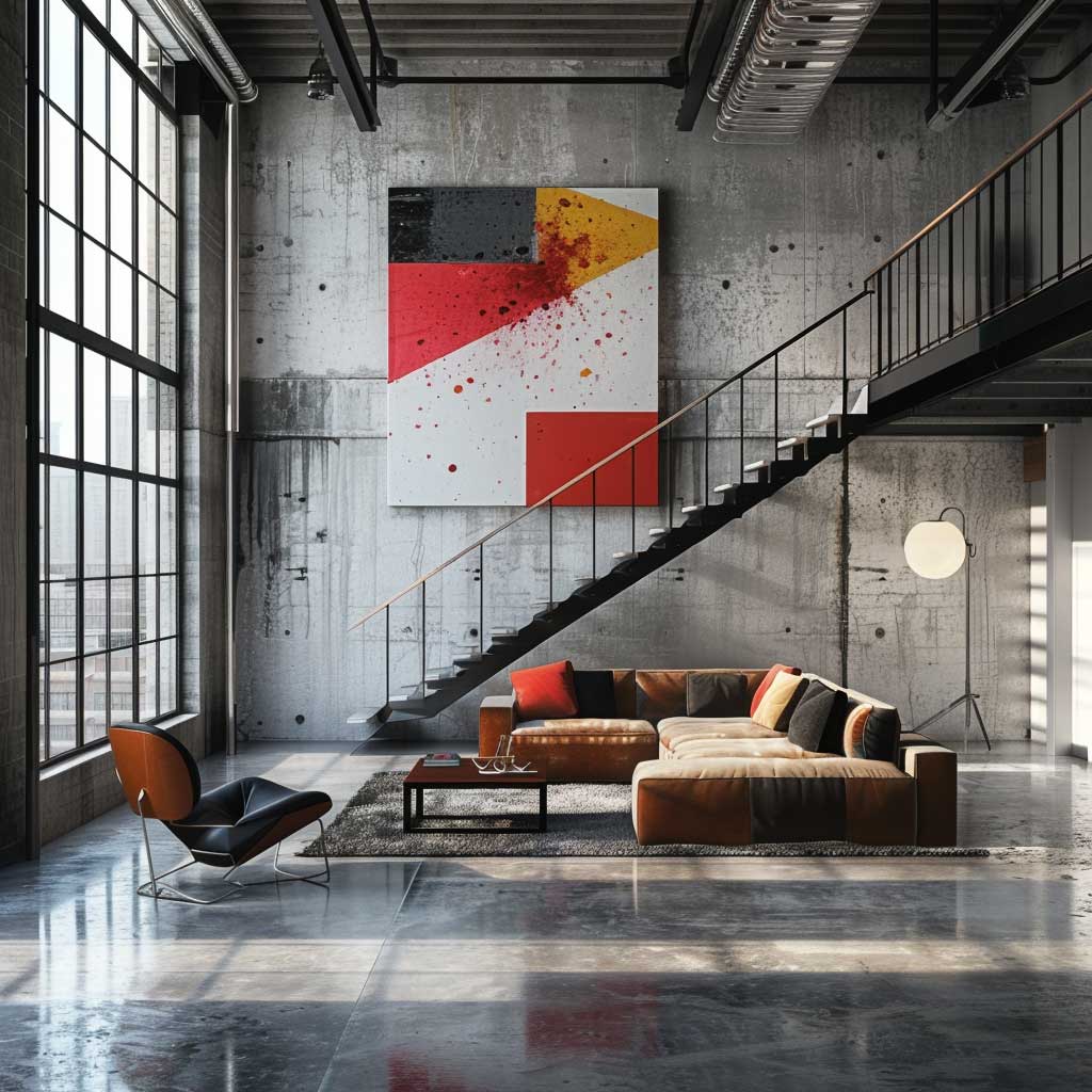
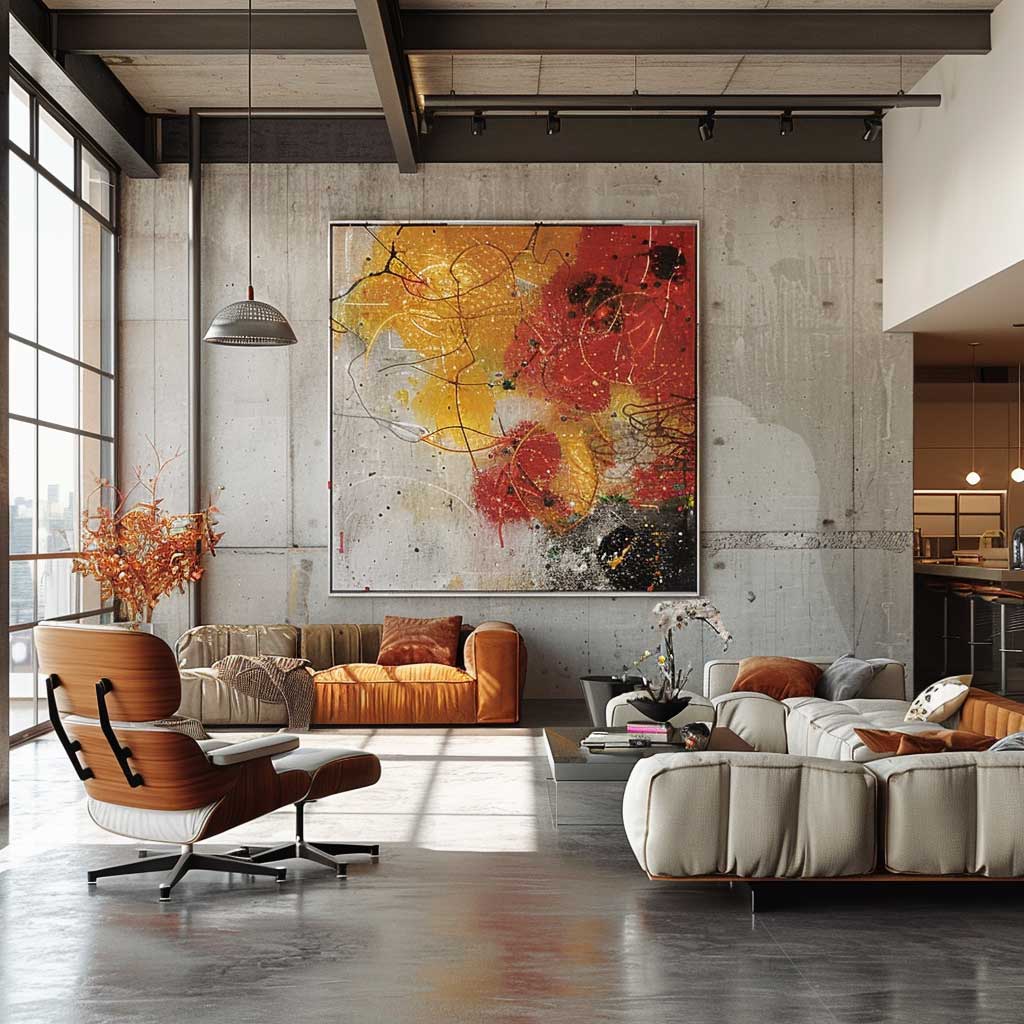

What makes colorful industrial design feel resolved rather than restless is the same thing that makes a good outfit work: one statement piece, everything else quiet. The industrial backdrop — concrete, steel, exposed pipes and beams — is already doing a lot of visual work. The colour’s job is to give the eye somewhere to land, not to compete with the architecture. Treat the room like a sentence: one subject, the rest supporting it. For further reading on bold colour palettes in industrial lofts, that post goes deeper on the red-and-black and yellow-and-concrete combinations this section only touches.
Industrial Colour Schemes
The industrial colour palette isn’t grey by default. It’s a neutral field waiting for one colour to tell it what to do.
Three directions, one rule each: go moody with deep navy and real copper, go soft with a single pastel on smooth surfaces only, or go bold with one saturated anchor and nothing else competing.
The mistake isn’t choosing the wrong colour. It’s adding a second one before the first one has done its job.
Save this post and come back when you’re at the paint store staring at sixty greys and forgetting everything you knew.
Related Topics
FAQ
What is the best colour scheme for an industrial interior?
How do I add colour to an industrial space without it looking chaotic?
What colours work for feminine industrial decor?
Is yellow a good colour for an industrial loft?
What is a modern industrial colour palette for a living room?
How much does it cost to do an industrial colour scheme on a budget?
Complete guide
Loft Design Ideas That Transform Raw Space Into Home
Bedrooms, kitchens, living rooms, styles, materials, layouts — all in one place