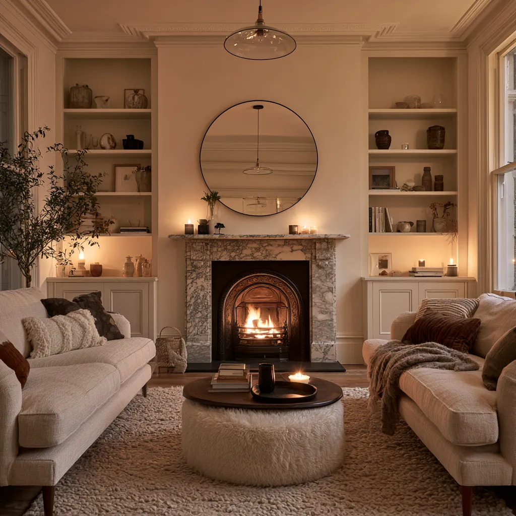
Living room wall painting ideas that go beyond a flat coat of color are the fastest way to shift how a space reads. I’ve tried a few of these myself, and the difference isn’t subtle — one afternoon with the right technique and a $30 glaze can make a room feel built, not rented. You’ll notice most people paint their walls once and never revisit them. That’s the mistake. The wall is the largest surface you own, and it’s doing absolutely nothing for you.
This post covers three distinct approaches — color wash, chalkboard paint, and nature frescoes — plus the specific situations where each one fails. Not every technique suits every room. Knowing which one to skip saves you a weekend.
Quick Scan
- Color Wash — pastel glaze over a base coat; best for rooms with natural light
- Chalkboard Paint — matte black or dark green; interactive and erasable
- Nature Fresco — hand-painted mural; requires a muralist, costs $400–$2,000+
- Don’t skip: lighting test before committing — pastels shift dramatically under warm bulbs
- Best budget pick: color wash with Benjamin Moore Regal Select + their latex glaze, around $80 total
Color Wash Walls Look Expensive Because the Texture Reads as Intentional Depth


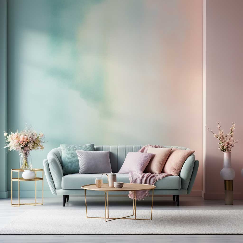

Color wash is a faux painting technique where thinned latex paint or glaze goes over a solid base coat in overlapping brush strokes. The result looks like a watercolor bled directly into the plaster. I’ve bought cheaper versions of this effect at craft stores, and they look exactly like that — cheap. The real difference is the glaze-to-paint ratio: Benjamin Moore recommends mixing their Latex Glaze with Regal Select Interior paint at roughly 4 parts glaze to 1 part color for the truest translucent finish.
Pastel tones — baby blue, pale sage, dusty rose — are the go-to for this method because they stay readable even when layered. You need natural light to pull this off. My go-to test: hold a paint chip against the wall at 3pm and again at 7pm with your lamps on. Warm-toned bulbs can turn a pale lavender into a muddy grey-pink faster than you’d expect. That’s the part nobody warns you about.
The technique itself isn’t difficult, but it does require patience between layers. Apply the base coat and let it cure — not just dry — for 24 hours. Then load a 4-inch brush with your glaze mixture and work in long, overlapping X-strokes. You’ll notice the depth builds after the third pass. Don’t rush to a fourth. Two to three layers is almost always enough; more than that flattens the effect back to a standard painted wall.
What doesn’t work: trying this on a dark base coat. I’ve seen it attempted with deep teal as a base and a light grey glaze over it — the result looked like a smudged chalkboard, not a sophisticated wall. Stick to white or off-white bases. The furniture pairing is equally important — matching your wall color to the right furniture palette determines whether the room feels curated or confused.

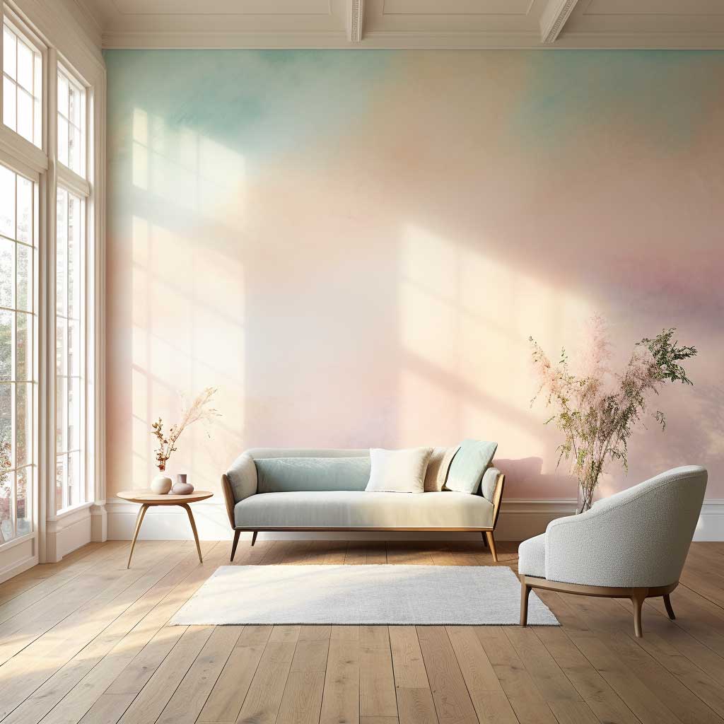


Furniture pairings that work: linen sofas, rattan side tables, white oak shelving. All of these read as neutral enough to let the wall carry the personality. Plush rugs in oatmeal or cream add texture without visual noise. Skip anything with a high-gloss finish near these walls — lacquered furniture bounces light off the glaze layer and kills the watercolor illusion entirely.
Budget reality: a full living room color wash costs around $80–$120 in materials if you DIY it. A professional faux finish painter charges $3–$8 per square foot. For a 12×15 room, that’s $540–$1,440 before furniture moves. Worth it if your walls have imperfections — the glaze technique actually hides minor drywall texture better than flat paint does.
Chalkboard Paint Rewards the Room That Gets Actually Used


Rust-Oleum Chalkboard Paint in black runs about $12 a quart and covers a standard accent wall with two coats. The matte black surface that results isn’t a design gimmick — it’s a working canvas that changes every week. I stole this trick from a café in Brooklyn: keep a single piece of white chalk and one piece of bone chalk at the base of the wall. The tonal difference between the two gives even rough sketches a sense of shading that looks deliberate.
Does chalkboard work in every living room? No. It needs contrast. A room with dark flooring and moody furniture ends up absorbing the wall instead of framing it. The rooms where it hits right are the ones with light wood floors, white or cream furniture, and at least one large window. The black becomes the anchor, not the cave.
Functional use matters more than most design posts admit. You can pin quotes that rotate monthly, map out party seating, let kids draw without guilt, or sketch out furniture arrangement experiments before you move anything. The wall pays for itself. One thing that never works: framing the chalkboard wall with heavy gold mirrors or ornate sconces. It looks like a restaurant that can’t decide what it is.
Don’t Do This
- Don’t use chalkboard paint on all four walls — it reads like a sensory deprivation chamber, not a design choice.
- Don’t skip the “seasoning” step — rub a piece of chalk sideways across the entire fresh surface and wipe clean before first use, or you’ll get permanent ghost marks from your earliest drawings.
- Don’t try color wash over a dark existing wall without a blocking primer first — the old color bleeds through the glaze and muddies everything.
- Don’t place a nature fresco in a room with high humidity — moisture causes fresco paint to bubble within 18 months.


Lighting the chalkboard wall is where most rooms fall short. Track lighting aimed directly at the surface washes out chalk detail. What actually works: a warm Edison-style fixture positioned at a 45-degree angle from the wall, roughly 18 inches out. The indirect raking light makes chalk lines pop with shadow and gives even simple doodles a graphic quality. Soft ambient overhead lighting handles the rest of the room.
Maintenance is genuinely easy. A damp microfiber cloth erases everything cleanly. For artwork you want to keep, spray a light coat of Krylon Crystal Clear matte fixative — $8 at any craft store — and it seals chalk permanently without changing the matte appearance. I own two walls treated this way and the preserved drawings still look crisp after three years.
Nature Frescoes Cost More Because You’re Commissioning a One-of-a-Kind Wall
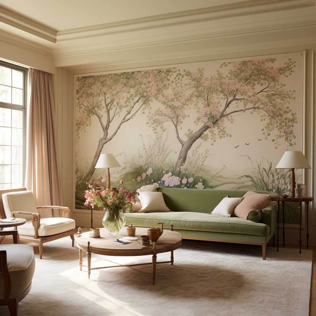
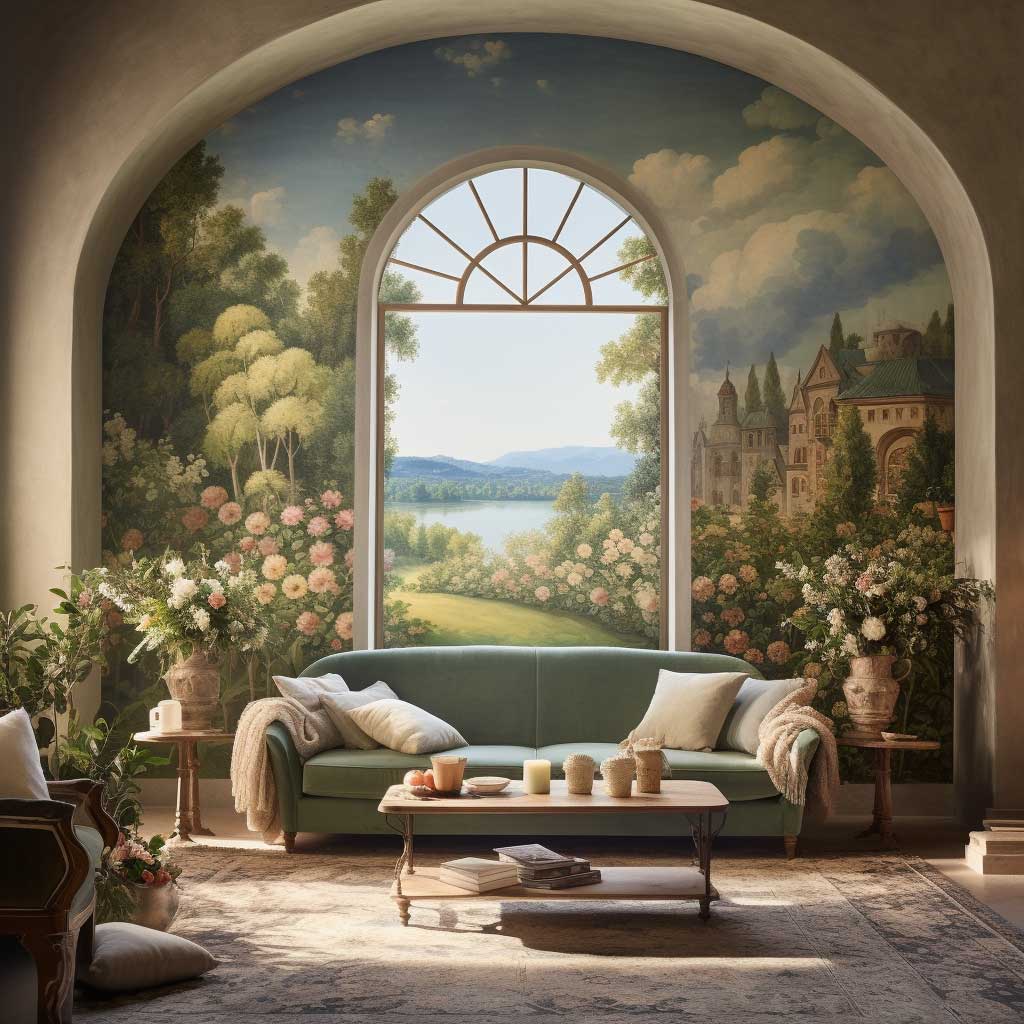
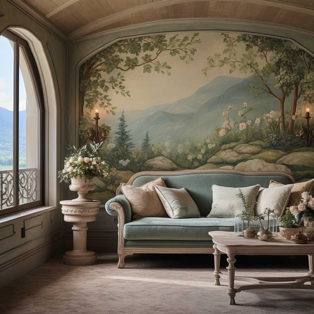

A traditional fresco — pigment pressed into wet lime plaster — is genuinely a different object than a mural or wallpaper. The color becomes part of the wall structure, not a layer on top of it. You’ll notice this when you stand in a room with one: the wall breathes differently, the light catches the surface at angles a printed design never manages. Expect to pay $400 for a simple botanical section and upward of $2,000 for a full panoramic scene involving a trained muralist.
Nature subjects dominate for a practical reason. A forest scene or floral pattern is forgiving of the inevitable slight imperfections in hand-painted work — the organic irregularity reads as texture rather than error. Geometric frescoes, on the other hand, demand precision that almost nobody can execute cleanly on a live plaster surface. I’ve seen geometric fresco attempts that looked fine in photos and deeply uneven in person.
The furniture brief for a fresco room is short: stay out of the way. Natural linen, undyed wool, raw wood finishes. Colors pulled directly from the mural palette. One designer whose work I follow described it as “the wall is the art; everything else is the frame.” That’s exactly right. A busy patterned rug under a fresco wall is like putting a second painting inside the first — the eye doesn’t know where to go. For more on how wall art design affects the entire room atmosphere, see this breakdown of how wall painting designs shift a living room’s atmosphere.


Lighting a fresco correctly is the difference between a museum wall and a hotel lobby. Directional LED spotlights on a dimmer track, positioned 12–18 inches from the wall and angled at roughly 30 degrees, bring out the plaster texture and make the painted layers readable. Natural daylight does the same thing for free between 9am and 2pm in a south-facing room. Avoid recessed downlights directly above the mural — they flatten the surface and make even the most detailed fresco look like a large print.
What most people get wrong when commissioning a fresco: choosing a subject before choosing the light. The mural artist needs to see your room at different times of day before finalizing any color palette. A scene painted for warm afternoon light looks completely wrong under cool overhead LEDs. Any muralist who doesn’t ask to visit the space first isn’t the one you want painting your wall.
Technique Comparison
| Technique | DIY Cost | Pro Cost | Skill Level | Best Room Type |
|---|---|---|---|---|
| Color Wash | $80–$120 | $540–$1,440 | Beginner | Any room with natural light |
| Chalkboard Paint | $12–$25 | N/A (DIY only) | Beginner | Light floors, white furniture |
| Nature Fresco | Not recommended | $400–$2,000+ | Professional only | South-facing, dry climate |
TAKEAWAY
Living Room Wall Painting Ideas Only Work When the Technique Matches the Light
Color wash needs natural daylight to stay legible. Chalkboard paint needs a light room to anchor rather than consume. A nature fresco needs a professional who visits the space first.
The $12 Rust-Oleum chalkboard can outperform a $2,000 fresco if the room suits it. Pick by light, not by ambition.
Save this post before you buy a single can of paint.
Related Topics
FAQ
What is the easiest wall painting technique for a living room?
How much does it cost to paint a living room wall with a mural or fresco?
What color wash works best for a small living room?
Can you put chalkboard paint on just one wall?
What paint finish is best for living room walls?
How do modern living room wall painting trends differ from traditional approaches?
Complete guide
The Living Room Design Ideas Vault Every Home Needs Right Now
Color, walls, furniture, layouts, styles, smart tech — 300+ ideas in one place