Drawing room wall paint design shapes every first impression a guest forms before they sit down. I’ve repainted my own living room three times chasing the right formula, and the lesson that stuck is simple: the wall isn’t background — it’s the argument the room is making. From bold geometric patterns on feature walls to colour-washed plaster that shifts with the afternoon light, the range of modern painting ideas is wider than most people ever try. You’ll notice that the rooms that stop guests mid-conversation all share one thing — the walls do something deliberate.
Colour for a drawing room is not about picking a favourite shade from a chip fan. It’s a sequence of decisions: undertone, finish, sheen level, what happens at the dado line, how the colour reads at 8pm under warm bulbs. My go-to test is painting two A3 sheets of cardboard in the top candidates and living with them taped to the wall for 72 hours before committing. Behr’s Swiss Coffee looks like a warm cream in the shop; it reads nearly white in a north-facing room. Context is everything.
Quick scan — what’s in this article
- Stripes and lines: which direction actually adds height vs width
- Abstract paint techniques you can execute without an artist on speed dial
- Monochrome walls: the one finish combination that stops them looking flat
- Nature murals: sizing and placement mistakes that kill the illusion
- Metallic accents: gold vs copper vs silver — what pairs with which base colour
- Gradient walls: how to blend cleanly without visible seams
- Texture overlays: plaster, lime wash, rag roll — cost and coverage breakdown
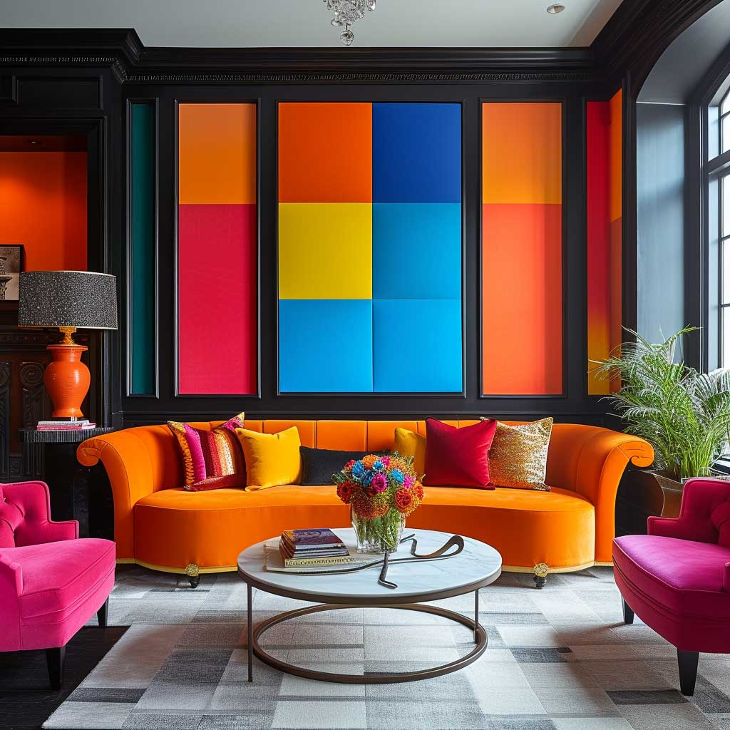
- Colour blocking: proportions that work in small and large rooms
- Geometric patterns: how to tape and execute without professional help
- FAQ: paint brands, finish types, colour combinations for drawing rooms
Stripes and Lines on Drawing Room Walls — Width and Direction Change Everything
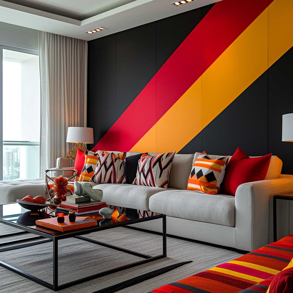


Vertical stripes push the ceiling up — visually, at least. I’ve used this trick in a flat with 2.4m ceilings and it genuinely reads taller in photos. The rule is simple: keep stripes narrower than 15cm for the illusion to hold. Go wider and the room starts to feel like a cinema foyer, not a drawing room. Tape is the most important purchase in this project, not the paint.
Horizontal stripes work the opposite way — they push walls outward, which suits narrow drawing rooms more than square ones. The error I see constantly is using full contrast: bright white next to strong charcoal. It looks like a barcode. Use two tones of the same hue instead — Benjamin Moore’s Revere Pewter next to Edgecomb Gray, for example — and the effect reads as sophisticated rather than loud. You’ll notice the difference immediately.
Diagonal lines are the most theatrical option and the most risky. They add movement that some people find energising and others find exhausting after six months. A metallic diagonal in a muted gold over a dark sage base — something like Farrow & Ball’s Mizzle with a gold stripe — reads rich and restrained, which is the combination worth chasing. Avoid contrasting diagonals in rooms smaller than 4m × 4m; they make the space feel off-balance rather than dynamic.
Tonal stripes — same colour family, matte against eggshell finish — are the most underused option in drawing room wall paint design. Paint one coat in a matte finish, tape off alternate bands, and apply the same colour in eggshell. No second colour needed. The sheen difference catches light at angles and reads as a subtle stripe that looks expensive without reading as a “feature wall” in the tired sense of that phrase.


Furniture placement matters more than people realise with stripe designs. A sofa running parallel to vertical stripes reinforces the height effect; a sofa running perpendicular to horizontal stripes widens the visual field further. I stole this trick from a hotel bar in Lisbon and it has not stopped working. Don’t centre furniture randomly — align it deliberately with the stripe direction.
What doesn’t work: rainbow stripe combinations lifted from children’s rooms. It sounds obvious until you’re standing in a paint shop with ten swatches that individually look great. Three colours maximum. Two is almost always more effective. Pick your palette from the existing furniture and let the wall reflect it, not compete with it. A sofa in terracotta with a stripe wall in dusty rose and warm white is a room. Three unrelated paint colours on a stripe wall is a puzzle.
Abstract Paint Walls for Drawing Rooms Without Hiring a Muralist
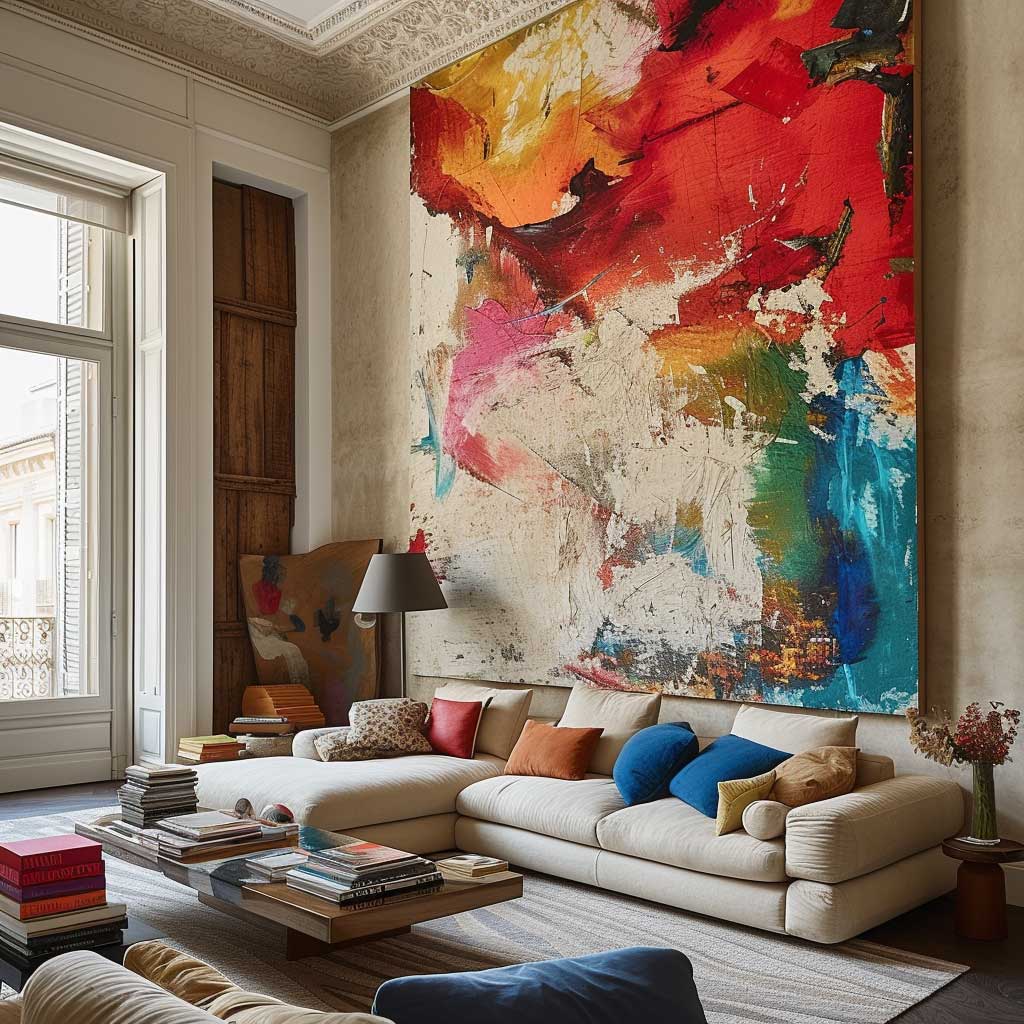


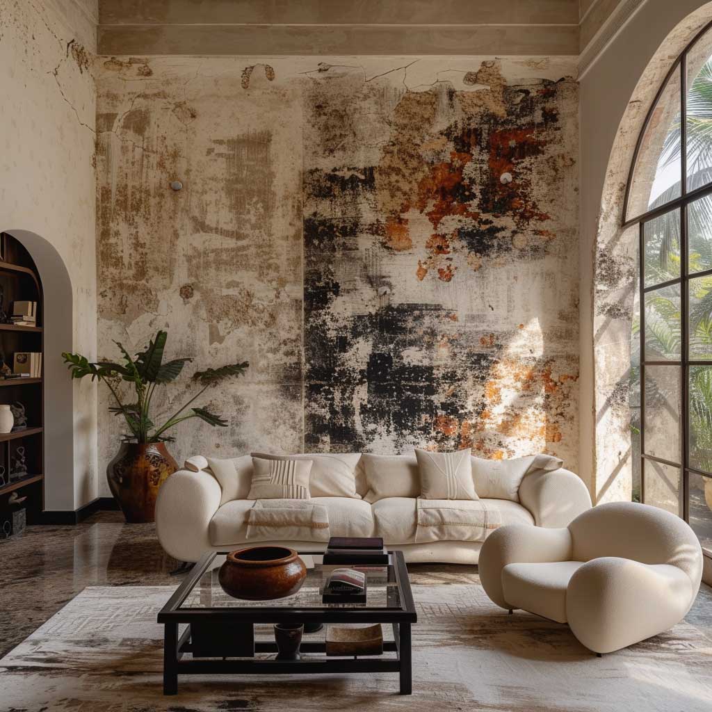
Abstract drawing room wall paint design is the category where people either spend $3,000 on a muralist or convince themselves it will look terrible and do nothing. Both responses miss the middle ground. A large-scale brushstroke cloud — two colours, wide decorating brush, base coat plus a second loaded colour swept in loose arcs — takes about two hours and costs under $40 in materials. The result looks intentional if the colours are right and disastrous if they’re not, so start with the palette.
Colour choice for abstract walls should draw from the room’s fixed elements — the floor, the sofa, any art you’re keeping. I own a burnt terracotta rug and have pulled the same dusty clay tone into an abstract wall treatment twice in different flats. It works because the wall feels continuous with the room rather than dropped in from somewhere else. Ask yourself what colour is already in your drawing room at ground level, then push one shade lighter or darker for the wall.
Texture is what separates abstract wall paint from abstract wall art. Sponging, rag-rolling, and stippling all add depth without requiring any painting skill beyond patience. Rag-rolling is the most forgiving: roll a bunched cotton rag through diluted paint and press it against the wall in loose irregular strokes. It takes under an hour for an average wall and hides patchy base coats better than any other technique. Stippling requires a specific brush ($25–$45 from Wooster or Purdy) and creates a tighter, more controlled texture — better for formal drawing rooms.
The mistake I made my first attempt at abstract walls was going too dark in the accent colour. I chose a deep indigo over a warm white and it read as bruise rather than depth. The fix was a glaze — a translucent mixing medium available from most paint suppliers for around $12 — thinned 3:1 with the original white. Applied over the indigo in loose strokes, it dialled the colour back to something the room could absorb. Keep your glaze on hand before you commit the final colour. It’s cheaper than a full repaint.

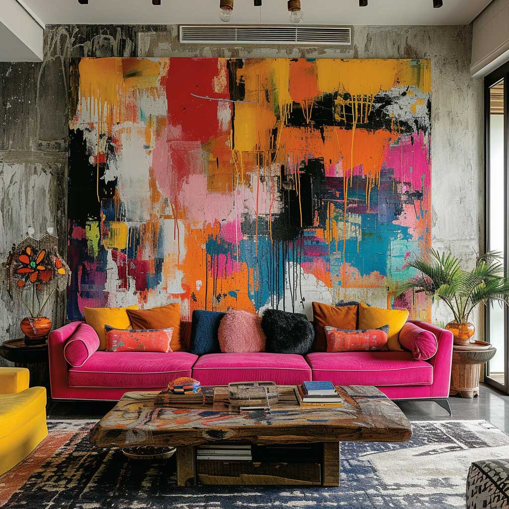
Geometric shapes lift abstract wall design into a different register. Concentric circles, loose arc clusters, and overlapping rectangles of colour give structure without rigidity. You don’t need to freehand them — a string compass and chalk line cost nothing and produce clean radii that look deliberate. I’ve used this method for a circular feature around a pendant light in a client’s drawing room: the circle was 2.4m diameter in a deep forest green, and the room completely reorganised itself around it.
Abstract walls work as conversation starters precisely because they don’t announce a theme. Guests ask about the technique, not the colour. That’s the goal — a room that prompts curiosity rather than delivers a declaration. Keep the furniture calm and let the wall do the talking. Velvet sofas and abstract walls are a reliable combination because velvet absorbs attention rather than competing for it.
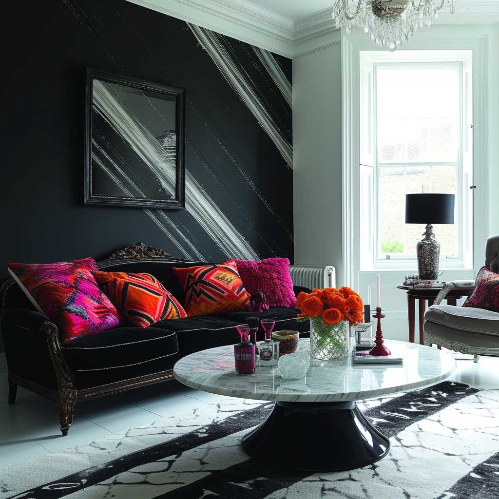
Monochrome Drawing Room Walls — Why Matte Alone Never Works


Monochrome wall paint design for drawing rooms fails in one specific way more than any other: flat matte on all four walls, nothing else. Matte is beautiful. It photographs well, hides imperfections, and reads sophisticated in editorial images. In real life at 7pm with overhead lighting, it turns rooms into caves. The fix costs nothing extra — it’s a finish combination, not a new product.
My go-to monochrome drawing room formula is this: walls in matte, skirting boards in eggshell or satin, ceiling in the same matte colour one shade lighter. The sheen on the skirting creates a visual boundary without introducing a second colour. The lighter ceiling lifts the room without breaking the monochrome logic. I’ve done this in warm white (Farrow & Ball’s All White), medium grey (Dulux Polished Pebble), and deep charcoal (Benjamin Moore’s Black Jack). It works at every value.
Choosing the base colour matters more in a monochrome scheme than in a mixed-palette room because there is nowhere to hide an undertone error. Warm grey with blue undertones reads purple under warm bulbs — I’ve lived with this mistake and it is deeply unpleasant. Test your grey under the actual bulbs you use in the room before committing to a full tin. Sherwin-Williams’ Agreeable Gray (SW-7029) is the most reliably warm grey at $70–$85 per gallon; it reads consistently across lighting types in a way that most mid-range greys don’t.
Textural diversity is the monochrome room’s only source of visual interest, which makes it non-negotiable. Lime wash over a plaster base, a panel of fabric wallpaper, or even a deliberately rough patch of exposed render behind a console table — all of these break the flatness without adding colour. The error is going monochrome and then filling the room with furniture in the same finish level. You’ll notice the room feels like a furniture catalogue page rather than a room someone lives in.


Furniture choices in a monochrome drawing room should introduce contrast through material, not colour. Polished brass, raw linen, smoked glass, brushed steel — these materials read differently from matte paint without breaking the colour logic. My go-to combination is a warm greige wall with a velvet sofa in the same tonal family and a raw oak coffee table. Three neutrals, three finish levels, zero colour conflict. The room feels finished rather than bare.
Where monochrome drawing rooms break down is in artwork choices. People who commit to a monochrome palette often choose monochrome art to match, and the room becomes a study in beige. One framed piece in a saturated colour — a Matisse-blue print, a terracotta photograph, a bottle-green botanical — is enough to anchor the wall and prove the neutral palette was intentional rather than safe. Don’t match the art to the walls. Match the frame and let the art do whatever it wants.
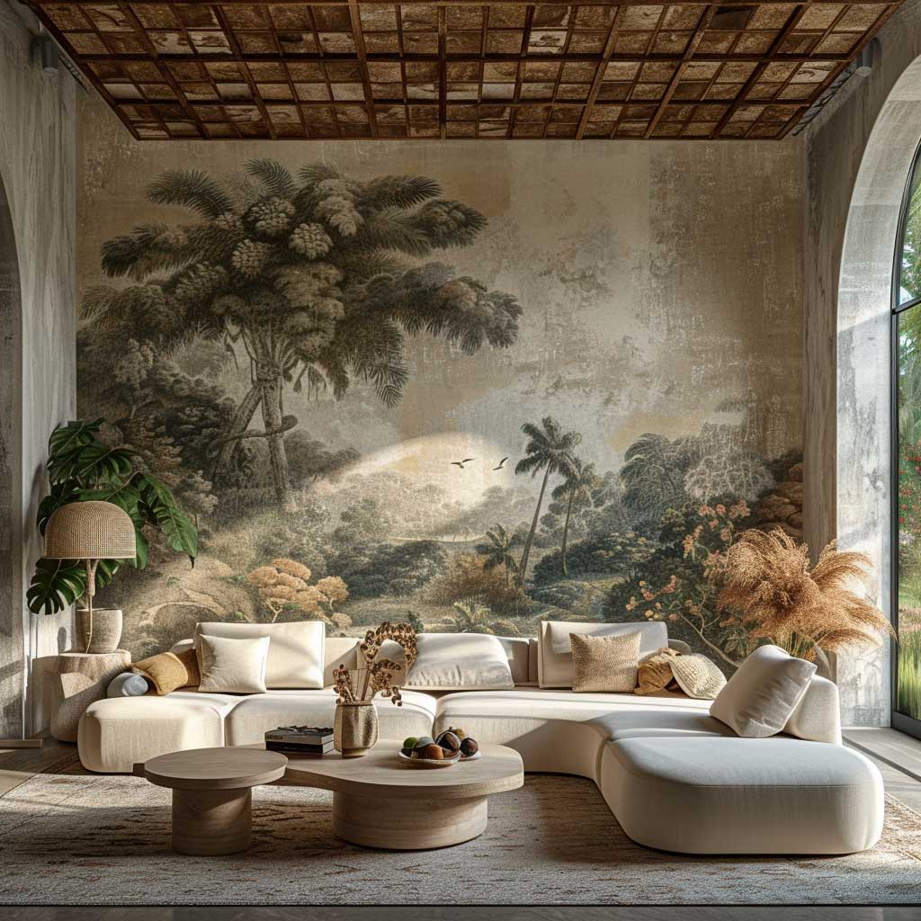
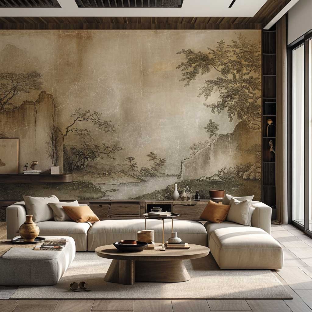
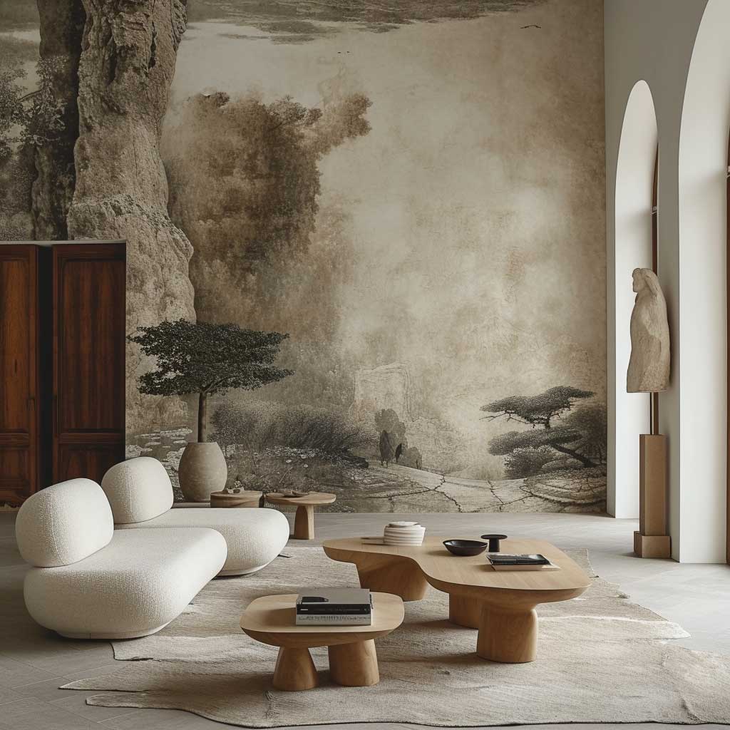
Nature Murals in Drawing Rooms — Where People Get the Scale Wrong


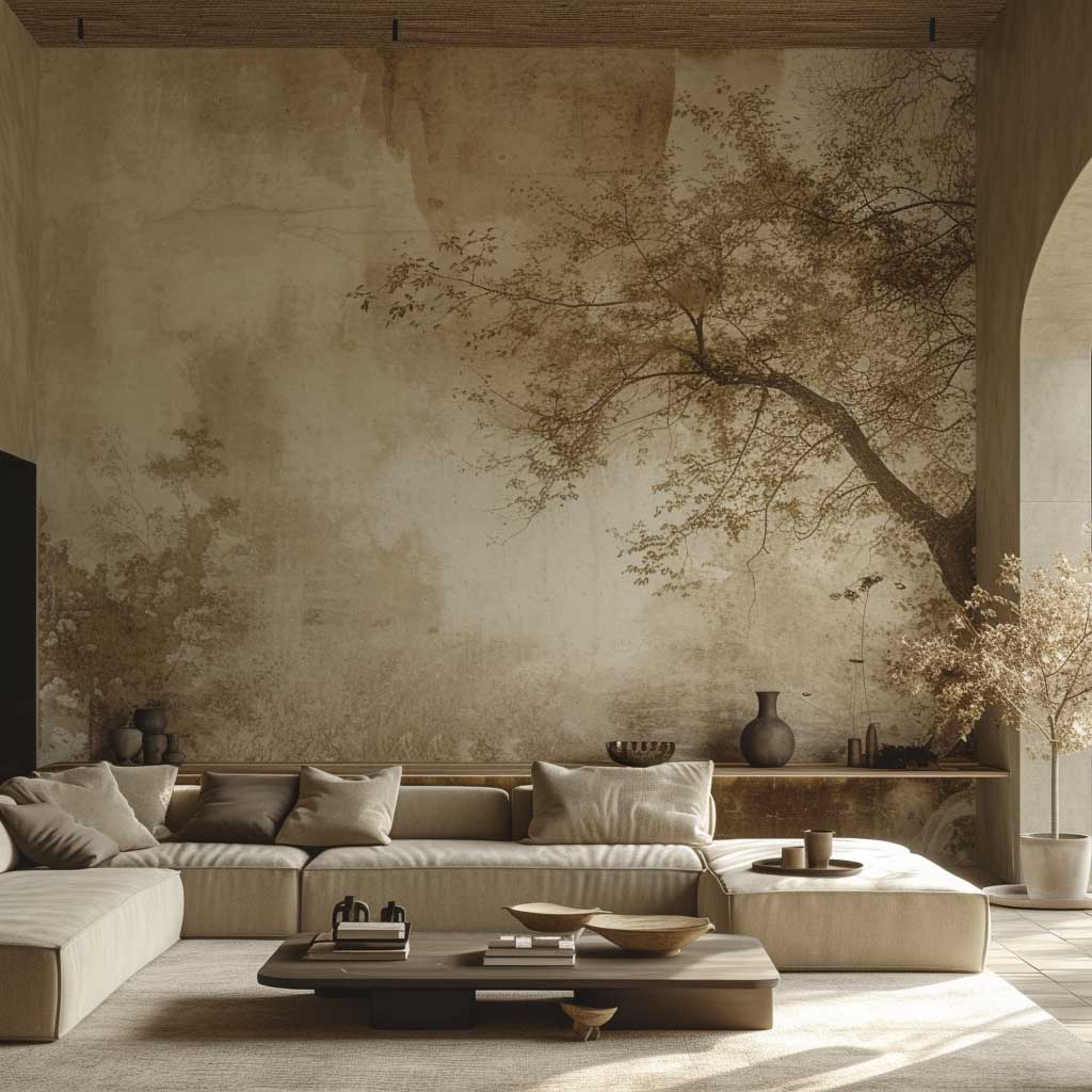

Nature-inspired murals for drawing rooms are experiencing a second wave, and the trend has split into two camps: hyperrealistic forest panoramas printed on wallpaper panels, and hand-painted botanical abstractions done by a decorator with a brush and a reference image. I’ve installed both. The printed wallpaper route costs $400–$900 for an average wall with installation; the painted version depends on the decorator but typically runs $600–$1,500. Neither is cheap. Both are transformative when the scale is right.
Scale is where nearly every nature mural goes wrong. Oversized leaves on a small drawing room wall make the room feel theatrical in the wrong way — like a prop set rather than a home. The rule I follow: the mural’s largest element should be no more than one-third the wall height. In a 2.7m ceiling room, that means your biggest leaf or tree trunk cap at 90cm. Below that threshold, the mural reads as a room with depth. Above it, the room disappears into the image.
Choosing the right mural for drawing room lighting is as important as choosing the right image. A dark forest mural in a north-facing room becomes oppressive by October. You need either a light-toned mural — bleached pampas, soft watercolour botanicals — or a room with generous artificial light you’re willing to use. South-facing drawing rooms can handle darker, denser murals because the light shifts across them through the day and reveals detail. I’ve specified a Komar 8-piece forest wall mural for two clients — roughly $150 self-install — in south-facing rooms only. It works. In north-facing rooms, I use the same company’s cloud and sky prints at around $120 and let the ceiling feel like weather.
Furniture placement around a nature mural requires restraint. The mural is the room’s lead element. Placing a large bookcase against it, or hanging art over it, or pushing a sofa flush to the mural wall so guests sit with their backs to it — all of these read as misuse of the design. Float the sofa 60–90cm from the mural wall, facing it. Let the wall be seen from the primary seating position. What you’re creating is the experience of looking at a landscape from a chair, which is exactly what biophilic design is supposed to do.

The psychological argument for nature murals in drawing rooms is not interior-design marketing — it’s documented. Biophilic environments reduce cortisol and increase perceived spaciousness, which is why hospital waiting rooms increasingly use botanical wallcoverings. Your drawing room is not a hospital, but your guests’ nervous systems respond the same way. A well-placed forest mural makes a room feel three times its actual volume. A poorly placed one makes it feel like a garden centre.
Natural materials — rattan, linen, raw wood, stone — complement nature murals without competing. The error is overcorrecting into full jungle mode: a forest mural plus six indoor plants plus a rattan suite plus a jute rug is too much. Two of those four elements at most. The mural already does the nature work; the room just needs to hold it. More drawing room wall design ideas for different room sizes and orientations are covered in this roundup of drawing room design trends.
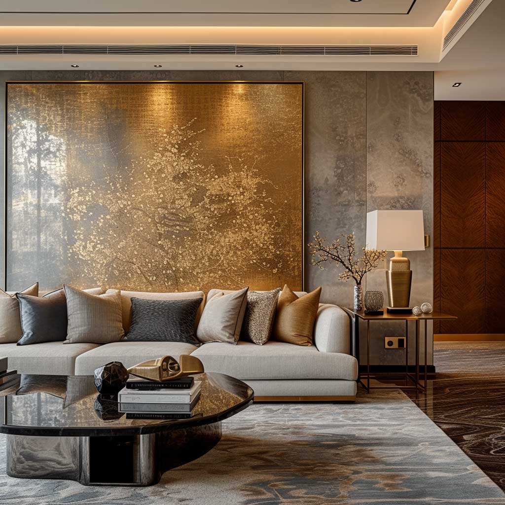
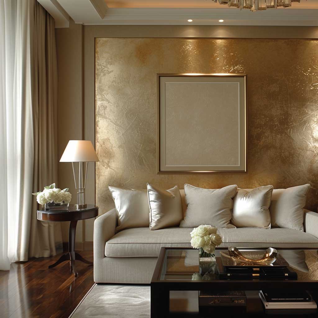
Metallic Accents on Drawing Room Walls — Gold, Copper, Silver and When to Use Which
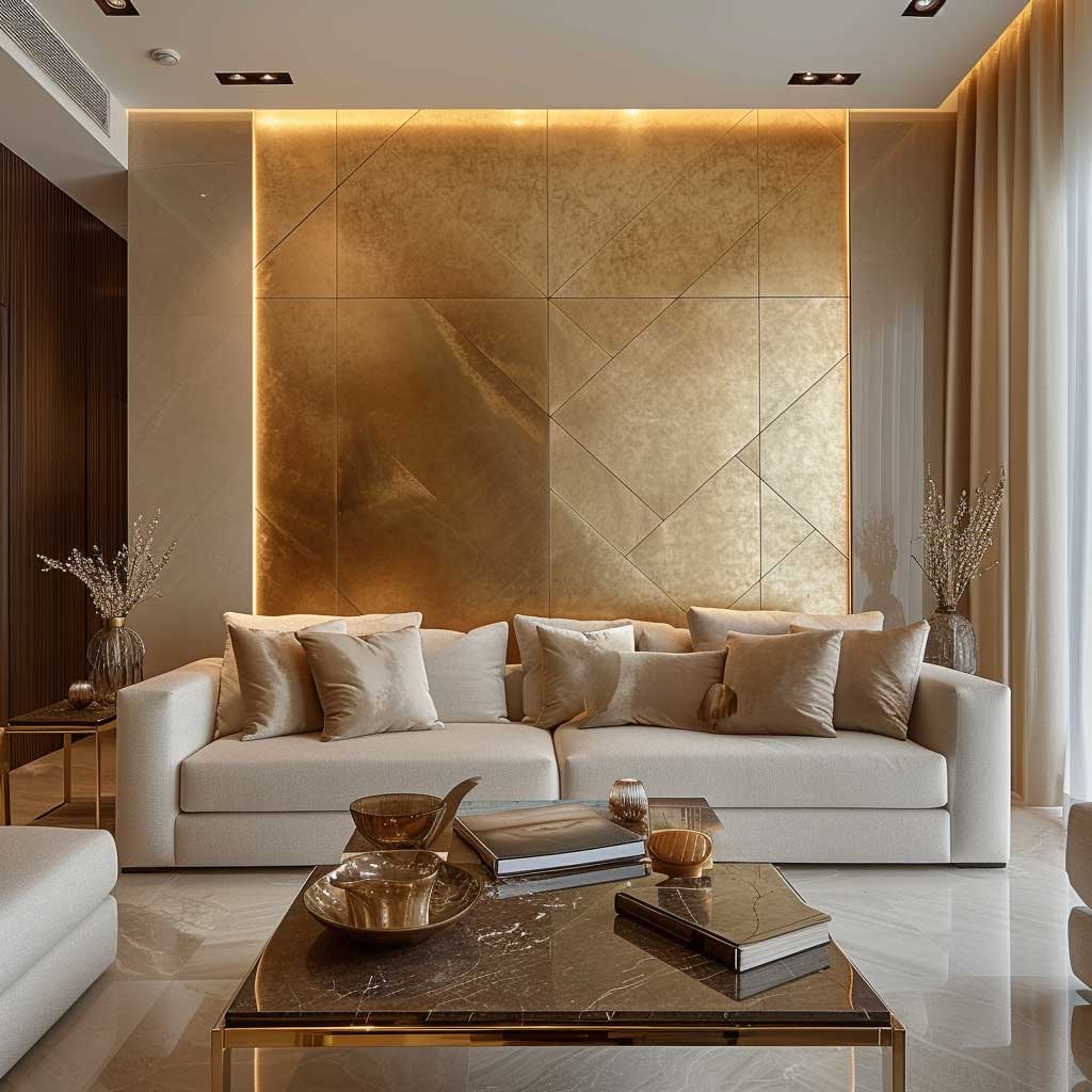
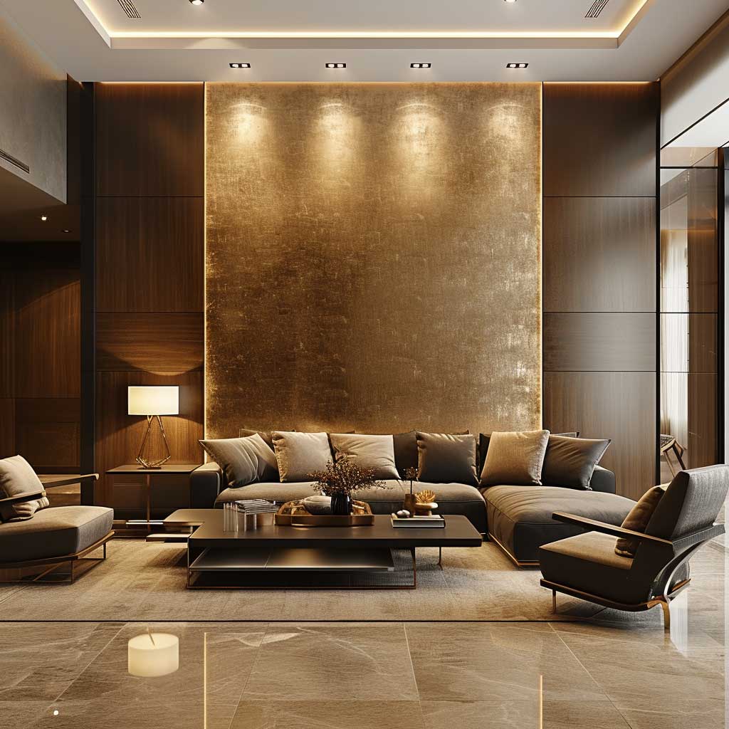


Metallic wall paint for drawing rooms works best as an accent, not an entire wall treatment — and almost no one follows this when they first try it. Full gold walls look elegant in hotel lobbies with 5m ceilings and professional lighting rigs. In a domestic drawing room they look like a jewellery box. Restrain the metallic to a panel, a stripe set, a stencil pattern, or the room’s architectural detailing, and it works. Commit it to four walls and you’ll be repainting in six months.
Gold pairs with rich, dark base colours — navy, forest green, burgundy, deep charcoal. It turns flat and unconvincing against pastels and warm whites because there is no contrast for the reflective surface to play against. Copper reads warmer than gold and suits terracotta, rust, and deep earth tones. Silver and pewter belong in cool-toned rooms — slate grey, blue-grey, icy white — where their cool sheen adds depth rather than fighting the base palette. Get the warm-cool relationship wrong and the metallic reads cheap rather than luxurious.
Modern Metallic by Rust-Oleum (around $18–$22 per 250ml) is the product I use most often for accent metallic work in drawing rooms. It’s roll-on, available in gold, silver, copper, and bronze, and covers existing paint without a specialist undercoat. For larger feature panels, Mylands’ Metallic Collection at $45–$55 per litre gives a finer, more even sheen that photographs better. Don’t use craft store metallic paint on wall areas — the coverage is too thin and the shimmer flattens out by the second year.
Don’t Do This — The Metallic Mistakes That Date a Drawing Room
- Full metallic accent walls in small rooms. Without sufficient wall area to dilute the sheen, the room feels like a corridor in a nightclub.
- Mixing metal tones on the same wall. Gold stencil over a silver wallpaper base is not eclectic — it reads as indecision. Pick one metallic per room.
- Metallic ceilings in drawing rooms with low lighting. A glossy metallic ceiling with no cove lighting or directional spots turns into a dark mirror, not a glittering canopy.
- Stencilled metallic patterns on a rough or textured base. The pattern bleeds into the texture and the result looks like a craft project. Sand the wall smooth first.


Architectural detailing is where metallic paint earns its money fastest. Cornicing, ceiling roses, dado rails, and panelling grooves painted in a metallic while the flat field stays matte — this is the application that makes a room look as if it cost twice what it did. You’re not covering a wall in gold; you’re outlining the room’s architecture in it. A Farrow & Ball Dead Flat wall with cornicing in Mylands Gold Leaf sits in that exact register, and guests ask about it every time.
Accessories and furniture with metallic finishes reinforce the wall treatment without duplicating it. A brass side table, a mercury glass lamp, a gilded frame — any one of these picks up the wall’s metallic note and sends it across the room. The drawing room stops reading as a room with a metallic feature wall and starts reading as a room where metal is part of the language. That shift is the difference between a feature and a design decision.
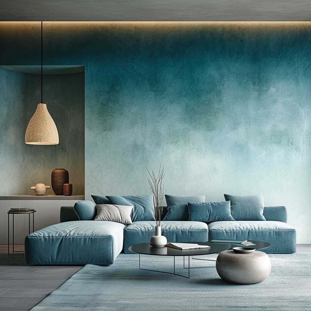
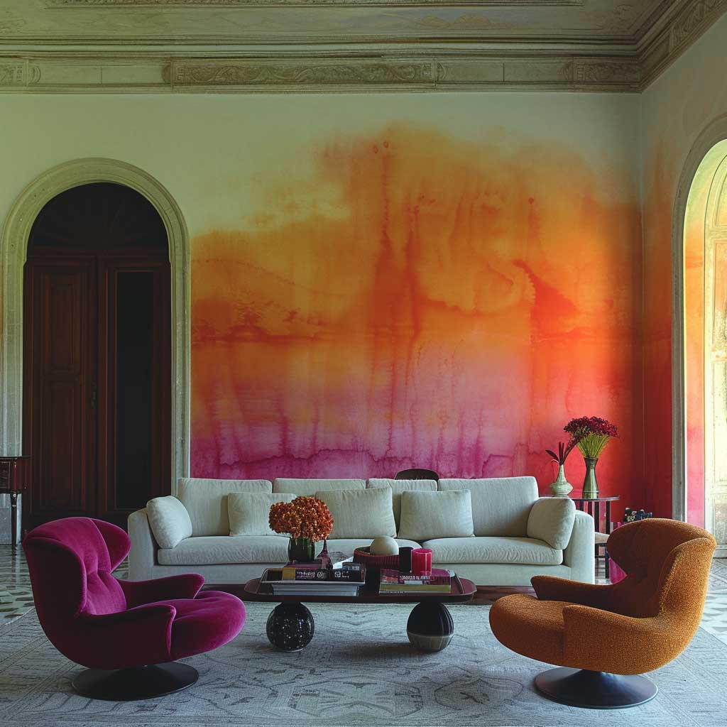
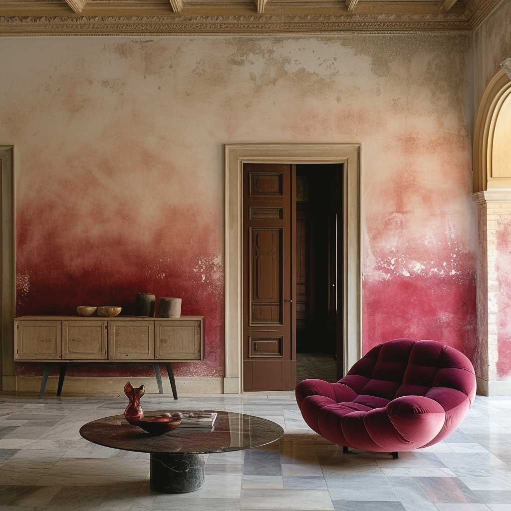
Gradient Paint Walls in Drawing Rooms — How to Blend Without Visible Lines
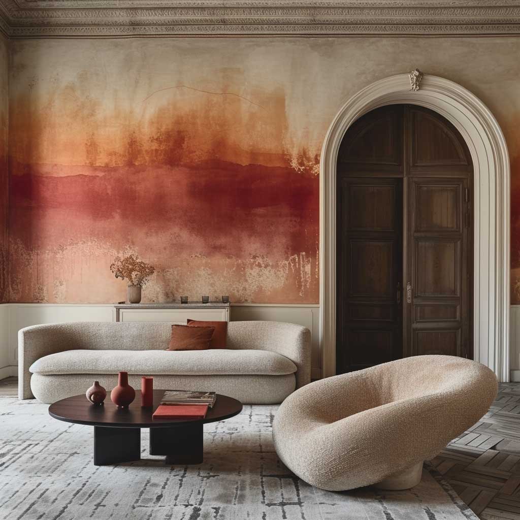
Gradient — or ombre — drawing room wall paint design is the trend that looks technically impossible until you understand the one technique that makes it work: wet-into-wet blending. Both colours must be wet simultaneously in the transition zone. If you let the first colour dry before applying the second, you get a hard line regardless of how much you brush over it. The transition zone needs to be at least 30–40cm wide to blend cleanly. Narrower and it streaks; wider and the gradient effect disappears into a colour wash.
Colour selection for gradient walls follows the same logic as the monochrome palette — undertone consistency. A warm terracotta-to-blush gradient fails if one colour has yellow undertones and the other has pink. Buy from the same brand’s chip fan and move two or three steps along a single colour family. Benjamin Moore’s Historical Collection does this particularly well; the fan is organised by undertone family, making gradient pairs obvious. I’ve used Pale Straw (HC-41) into Hawthorne Yellow (HC-4) for a warm drawing room gradient at around $65–$75 per gallon each.
Direction matters for the reading of the room. A top-to-bottom gradient that goes dark at the floor and light at the ceiling mimics the natural way sky and earth are oriented. It grounds the room and feels restful. The reverse — dark at the ceiling — reads dramatic and deliberately unnatural, which can be striking in a room with high ceilings and abundant lighting, but suffocating in standard-height rooms. Horizontal gradients work best on feature walls only, not wrapped around the full room, where the transitional zones become disorienting.
What doesn’t blend? High-contrast colour pairs. A yellow-to-blue gradient sounds like a sunset but produces green mud in the transition zone. Red to green does the same. The rule is: colours no more than 90 degrees apart on the colour wheel, or colours in the same family at different values. Cool navy to pale blue — yes. Warm terracotta to sage — no. If you want contrast, use a three-colour gradient with a neutral bridge between the two saturated colours, which adds complexity and buys the transition zone space to work.


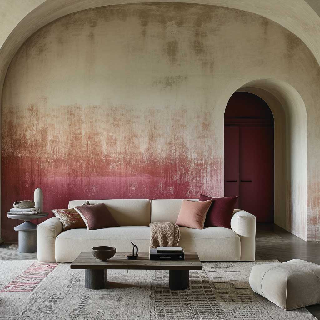
Lighting transforms a gradient wall throughout the day in a way no other paint technique matches. Morning sidelight hits the transition zone and emphasises the blend; overhead noon light flattens it; evening warm light deepens the darker zone and makes the lighter zone glow. This is the closest thing to a painting that a wall can be. I’ve had clients describe their gradient drawing rooms as feeling “alive” — that’s the light interaction, not just the colour.
Finish for gradient walls should be eggshell or satin — not matte. Matte absorbs the light that makes the gradient read as a gradient. Eggshell reflects enough light to keep the colour transition visible across all lighting conditions. The additional sheen also makes the wall more washable, which matters in a drawing room where hands and backs brush walls daily. Valspar’s Premium Interior in eggshell is around $50–$60 per gallon and blends exceptionally smoothly — I’ve used it on four gradient projects.
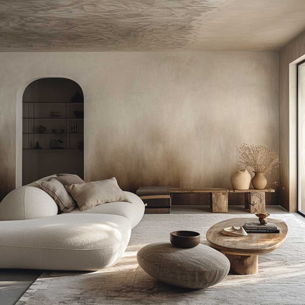
Texture Overlays for Drawing Room Walls — Plaster, Lime Wash, and Rag Roll Compared


Texture overlay is the drawing room wall treatment that earns the most questions from guests and requires the least explanation when you’ve done it well. Venetian plaster is the reference material for this category — it’s been used on walls since the Renaissance for a reason. Applied in two or three thin coats with a steel trowel and burnished with a soft cloth or plastic scraper, it produces a surface that shifts between stone and silk depending on the viewing angle. Cost for professional application runs $12–$18 per square foot. Self-application with Portola Paints’ Roman Clay — around $85 per gallon — gives 80% of the result at 20% of the cost if you’re patient.
Lime wash is the texture I recommend most for drawing rooms in period properties. It adds depth without adding weight, which matters in rooms where the architecture is already doing a lot. Classico Limewash by Portola ($65–$80 per gallon) goes on with a large natural-bristle brush in loose, overlapping strokes. The variance in tone and the visible brush work is the point — it looks like a wall that has aged beautifully, not like a wall that was finished yesterday. I’ve done my own dining room adjacent to the drawing room in this finish and it hasn’t looked tired in three years.
Rag rolling is the accessible entry point into texture overlays — no specialist tools, no long learning curve. You need a base coat, a glaze mixed with a second colour, and a clean cotton rag. Press and twist the rag against the glazed wall in irregular overlapping strokes before the glaze dries. The result is an irregular, organic texture that reads similarly to sponging but with more movement. Cost is essentially zero beyond the glaze ($15–$20 at any paint supplier). The texture hides existing wall imperfections better than any smooth paint treatment, which makes it the correct choice for older drawing rooms with uneven plaster.
What texture overlay does that flat paint cannot do is create a physical relationship between the room and its light sources. Morning light rakes across a textured wall and emphasises the relief; evening light softens it. This dynamic keeps the drawing room from feeling static — a room that changes as the day progresses feels more inhabited and more interesting to spend time in. It’s the spatial equivalent of a fire in a fireplace: not necessary for warmth, but transformative for atmosphere. For drawing rooms where colour and texture combine in the same treatment, this collection of texture paint designs in bold palettes shows how far you can push the technique.


Furniture choice opposite a textured drawing room wall should lean smooth. Upholstered pieces — tight-back sofas, polished leather chairs, velvet ottomans — read as a deliberate contrast against a rough or layered wall. Avoid rattan or rough linen against heavily textured walls; similar surface energy at different scales reads as clash rather than complement. The textured wall already provides the tactile interest in the room; the furniture’s job is to receive it rather than repeat it.
Acoustic benefits are real but rarely mentioned. Textured walls — particularly thick plaster applications — absorb mid-range frequencies that bounce off smooth surfaces. Drawing rooms used for conversation (rather than home cinema) benefit from this reduction in echo. It’s not dramatic, but it is the reason that textured-wall rooms feel quieter and more intimate than equivalent rooms with flat paint. Guests lower their voices slightly, conversations feel more private. Worth knowing before you decide texture is purely decorative.
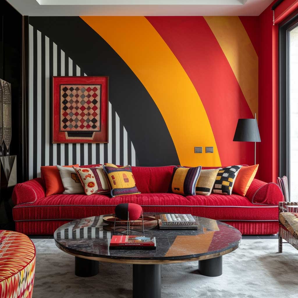
Colour Blocking on Drawing Room Walls — Proportion Is the Decision, Not the Colour
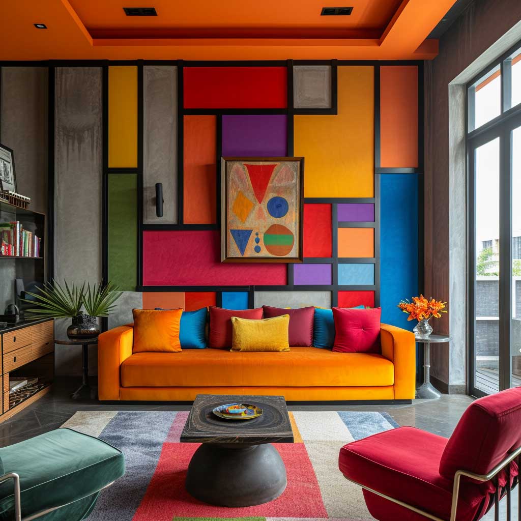

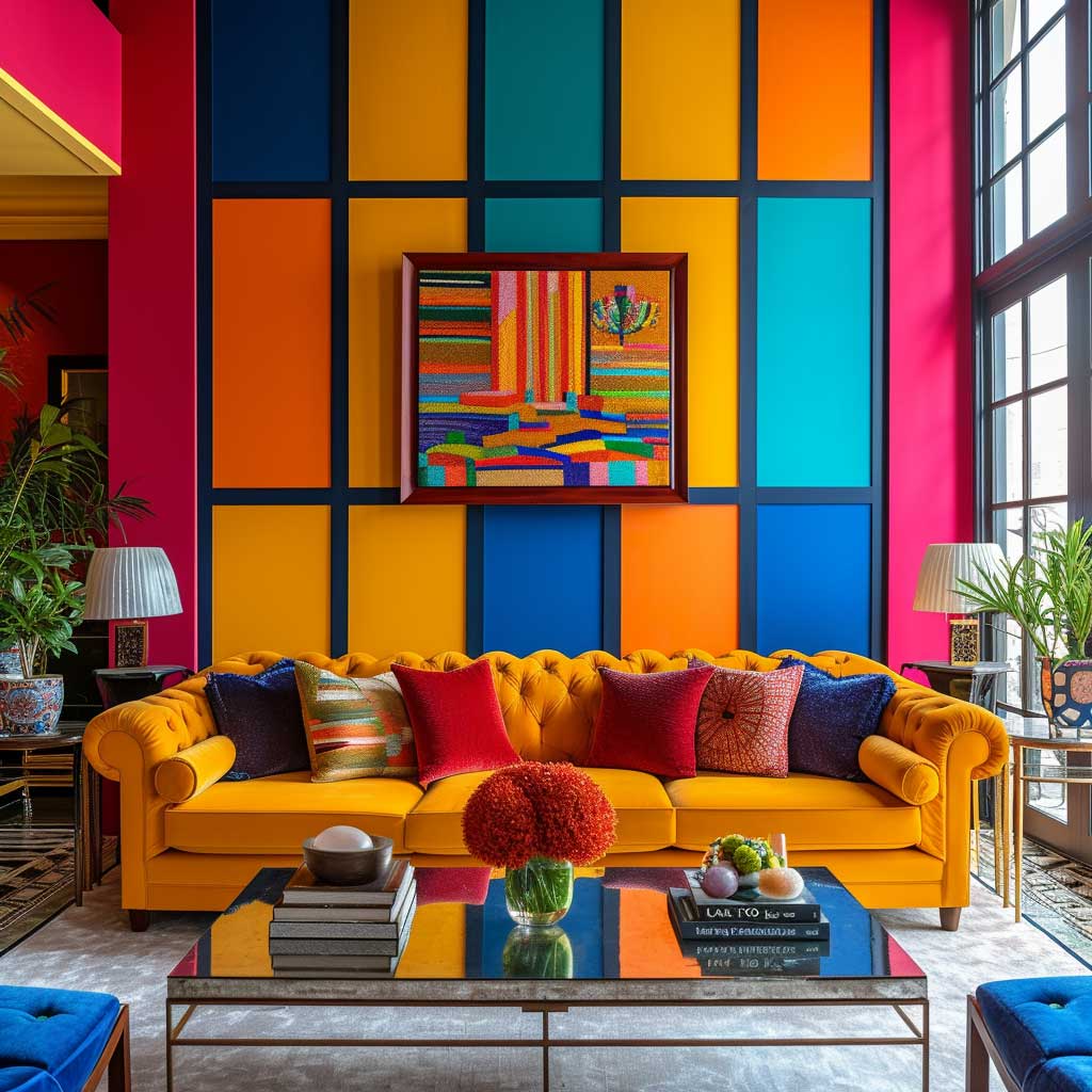

Colour blocking in drawing rooms is not about choosing two exciting colours and painting half the wall each. That’s what makes most colour-blocked walls look unresolved — the 50/50 split creates tension without resolution. Proportion is the actual decision. The ratio that consistently works is 60/40 or 70/30 — one colour takes the majority of the wall, the second occupies the minority. The dominant colour grounds the room; the secondary colour creates the moment without challenging the first for authority.
The colour block line placement changes the room’s reading entirely. A horizontal split at dado-rail height (90–100cm from the floor) with a darker colour below and lighter above is a traditional interpretation that suits period drawing rooms. A split placed at two-thirds height — around 180cm in a standard room — reads contemporary and creates a sense of enclosed comfort in the lower zone where furniture lives. I’ve used the two-thirds split with Benjamin Moore’s Hale Navy below and a soft warm white (Cloud White OC-130) above in a client’s Victorian terrace drawing room and it was the single most commented-on feature of the house.
Colour selection for blocking follows the warm-cool rule more strictly than any other drawing room paint technique. The block that occupies more space should be the calmer, more neutral colour. The accent block should be the more saturated or unexpected tone. Reversing this — saturated colour dominant, neutral colour accent — makes the room feel unbalanced and slightly aggressive. Deep emerald below, warm cream above: yes. Warm cream below, deep emerald on the top two-thirds: unsettling unless the room has very high ceilings and generous light.
Multi-block drawing room walls — three or more colour regions on a single wall — are territory most people shouldn’t enter without a sketch and a professional eye. When it works, it reads like architecture. When it doesn’t work, it reads like an art classroom. The safe rule is two blocks per wall, a maximum of three walls treated, one wall left plain. That plain wall becomes the room’s breath. Without it, the colour blocking reads as decoration rather than design.


Textures and finishes can play within the colour block format without adding a second colour. Matte below, satin above — same colour — reads as a soft block in certain lighting. This is a useful move in rentals where landlords restrict colour changes, because it uses a single neutral but still creates the visual division that makes colour blocking interesting. I’ve done this in my own rented flat in Dulux’s Cornfield Yellow, a muted mustard at around $45 per 2.5L tin.
Artwork placement in a colour-blocked drawing room needs to account for which zone it sits in. Art placed in the dark lower zone disappears unless it’s high-contrast or has a light mat. Art placed in the light upper zone is often where it reads best — against a pale background, colours in the artwork do their full work. Don’t hang art that straddles the colour block line; the edge of the artwork and the wall edge create competing horizontal divisions and the room becomes very busy in a 30cm strip across its midsection.
Geometric Pattern Walls for Drawing Rooms — How to Tape and Execute Without Professional Help


Geometric wall paint design for drawing rooms lives or dies by the quality of the tape application. Frog Tape is the baseline requirement — standard blue painter’s tape bleeds on satin and eggshell finishes and produces a line that looks like a child did it. Frog Tape at $8–$12 per roll produces a clean edge that reads professional. Seal the tape edge with a thin coat of your base colour first, let it dry, then apply the geometric colour. The base colour seals any small bleeds; the geometric goes over it cleanly.
Diamond patterns are the most manageable geometric for self-execution. Mark a grid with chalk lines, tape the diagonals, paint alternate diamonds. Remove tape while slightly wet. A diamond pattern at 40cm × 40cm on an average drawing room wall takes about four hours including drying time between coats. The result reads as wallpaper from three metres away, which is exactly the goal. I’ve done this in a tonal execution — same colour, different sheens on alternate diamonds — for a client who wanted pattern without the commitment of two colours.
Circular and arc patterns require different tools. A string compass — a pin in the wall, a piece of string, a chalk pencil tied at the end — is the only way to produce clean circles at wall scale without freehand error. For overlapping circles (a classic Bauhaus wallcovering pattern), map the centres first, draw all the arcs before you tape anything, then tape and paint the overlapping segments in sequence. It’s repetitive but not technically difficult. The planning stage takes longer than the painting.
What size geometric pattern works for which room size? Large-scale patterns — elements over 40cm — work in rooms with wall lengths over 4m. Below that threshold, large geometrics make the walls feel as if they’re closing in. Small-scale patterns — elements under 20cm — create a texture-like reading from across the room, which suits compact drawing rooms because the wall still reads as a surface rather than as a repeating shape. The mistake is scaling up a pattern you saw in a magazine without checking the room dimensions in the photo against your own. For smaller drawing rooms and compact living spaces, simple wall painting designs adapted for limited wall area give reliable geometric results at appropriate scale.


Geometric patterns bridge traditional and contemporary drawing rooms in a way that almost no other wall treatment manages. A classic-proportion diamond pattern in a period home reads as updated rather than out of place; the same pattern in a flat-pack contemporary flat reads as sophisticated. The geometry adjusts its register to its context, which is why it works across such a wide range of drawing room styles. It’s not nostalgic and it’s not fashionable in the way that specific colours or trends are fashionable. Good proportion is geometric’s most resilient quality.
The Benjamin Moore Aura Interior Paint in matte — around $75–$85 per gallon — is my standard recommendation for geometric painting projects. The self-priming formula means one coat covers adequately in most geometric applications where you’re going from white to a mid-tone, which cuts the project time roughly in half. For dark-to-light geometric reversals, two coats are still needed. Benjamin Moore provides free colour consultations at their store locations, which is worth using before committing geometric colours to an entire wall. Benjamin Moore’s living room paint colour inspiration tool is also useful for testing colour combinations digitally before purchasing.
Drawing Room Wall Paint
The wall you choose to paint first changes the room permanently. Make it deliberate.
Drawing room wall paint design is not a background decision — it’s the primary design decision. Every other element in the room responds to it.
Start with the finish and scale, not the colour. The right colour in the wrong finish or the right pattern at the wrong scale fails every time.
Save this post before you buy a single litre of paint.
Related Topics


