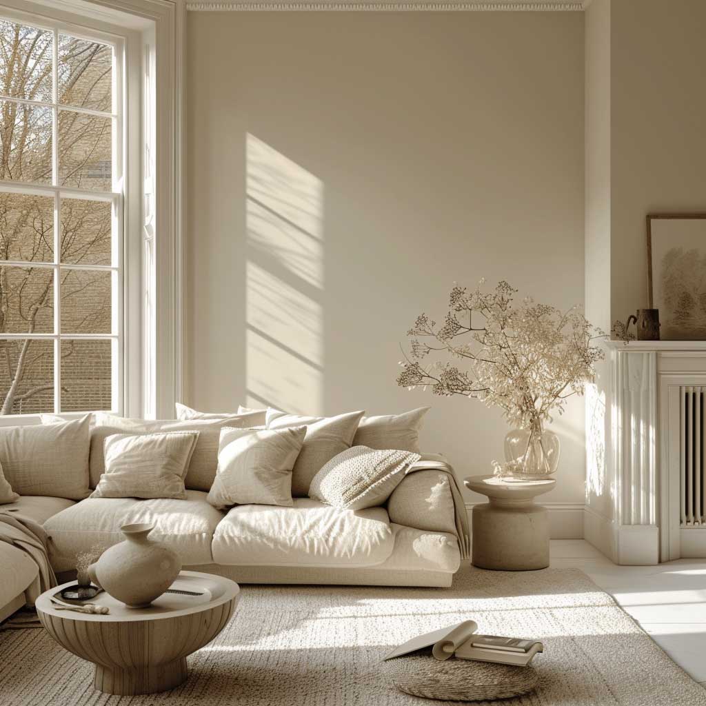
The wall colour combination for living room you choose does more than fill space — it sets the emotional temperature of every hour you spend there. I’ve repainted the same room three times chasing the right feeling, and each time the mistake wasn’t the colour, it was the combination. You need two things working together: a dominant hue that grounds the room and a secondary tone that stops it from feeling like a paint sample. Get that pairing right and the furniture almost doesn’t matter. Get it wrong and a $4,000 sofa still looks wrong.
Colour theory gives you the framework, but living rooms are tested at 7 PM under warm lamplight, not at noon in a showroom. Benjamin Moore’s Hawthorne Yellow HC-4 looks like a warm gold at noon and a burnt amber by evening — same wall, completely different room. That shift is the thing most people don’t account for. Swatch every finalist at 9 PM under your actual lamps before committing.
Quick Scan — What This Covers
✔ Warm + cool tone pairings that balance without going bland
✔ Bold vs soft contrast — where to put the drama and where to pull back
✔ Earthy wall colours and which furniture they actually need
✔ Pastel combinations that look intentional, not default
✔ Monochromatic rooms done right — texture as the real colour
✔ Light palette living rooms: how to stop them looking clinical
✔ Jewel tones and what kills their effect
✔ Neutrals that hold weight versus neutrals that disappear
✔ Texture + colour layering for rooms that read differently morning and night
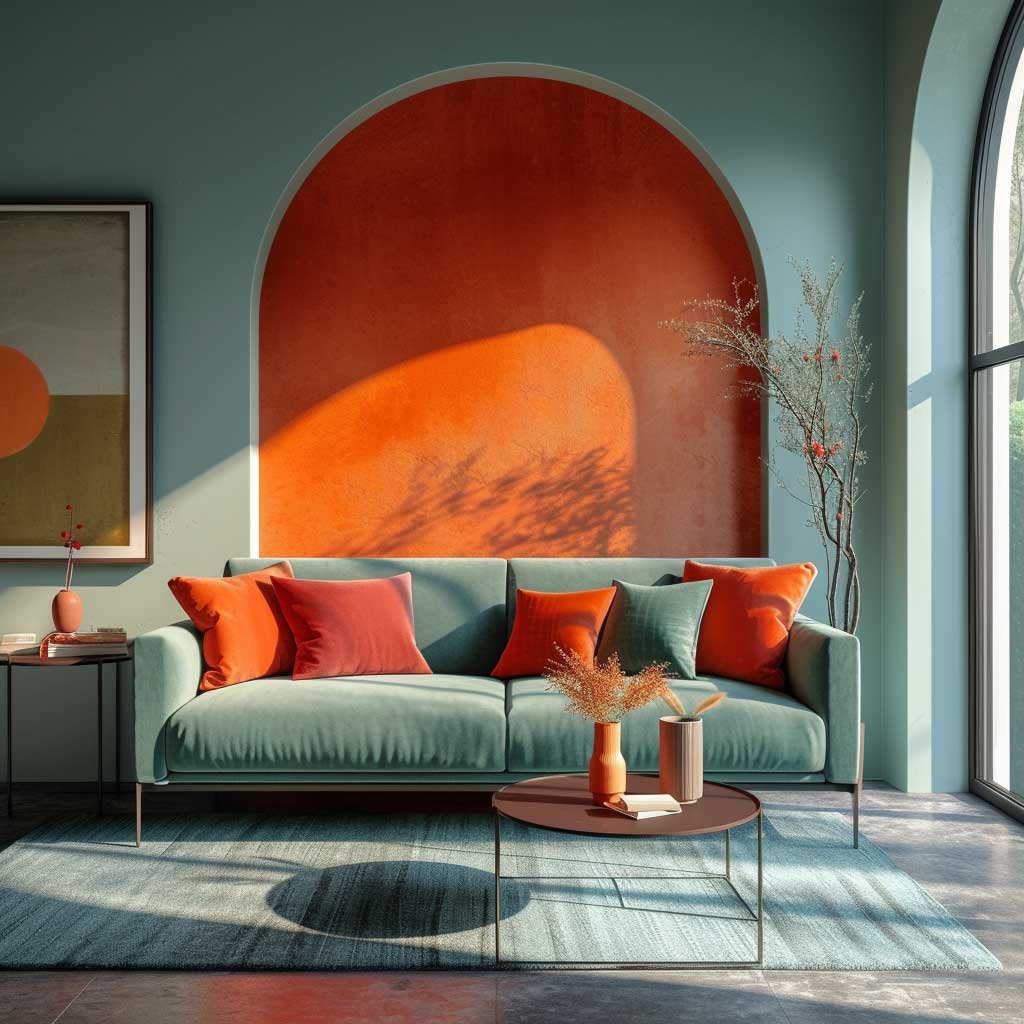
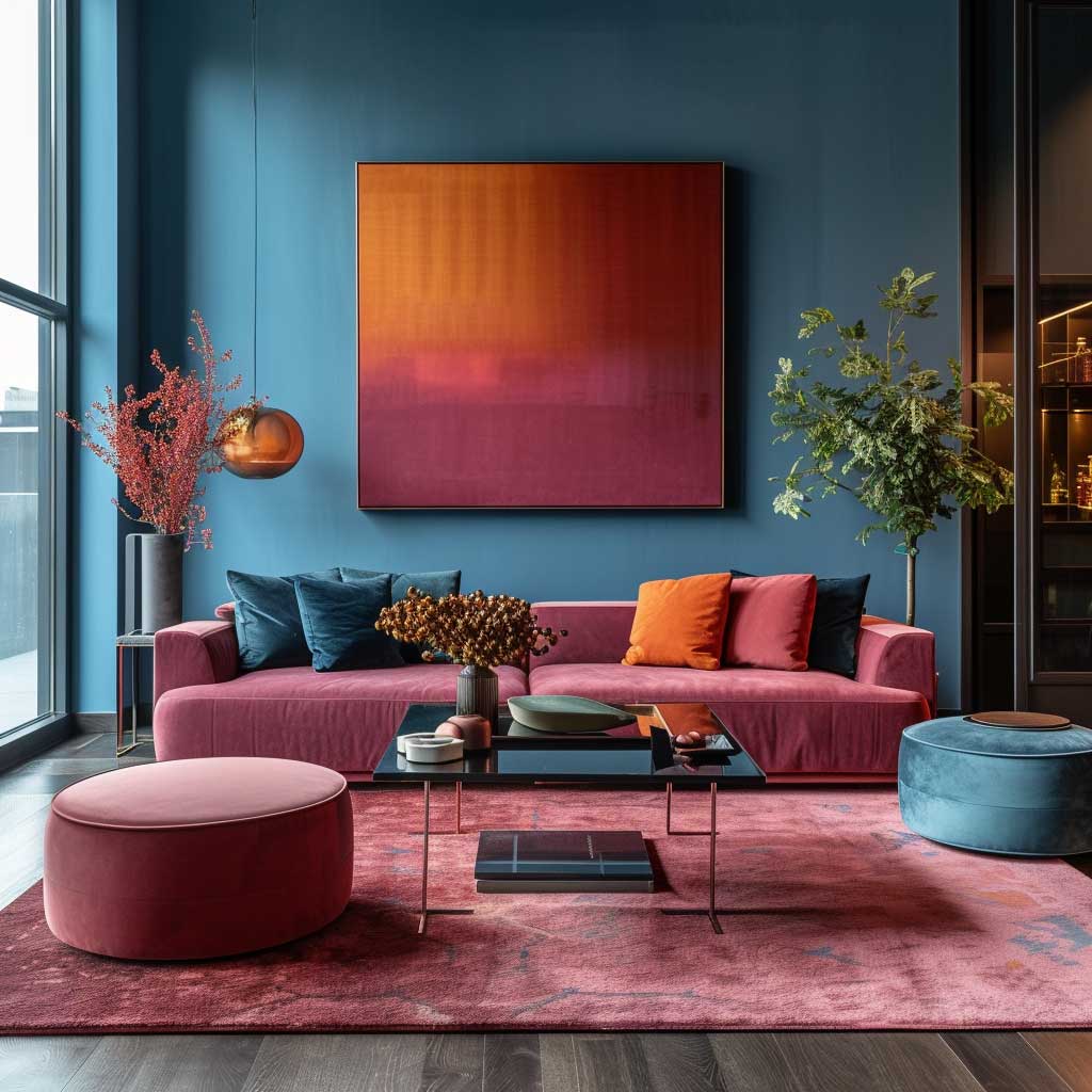
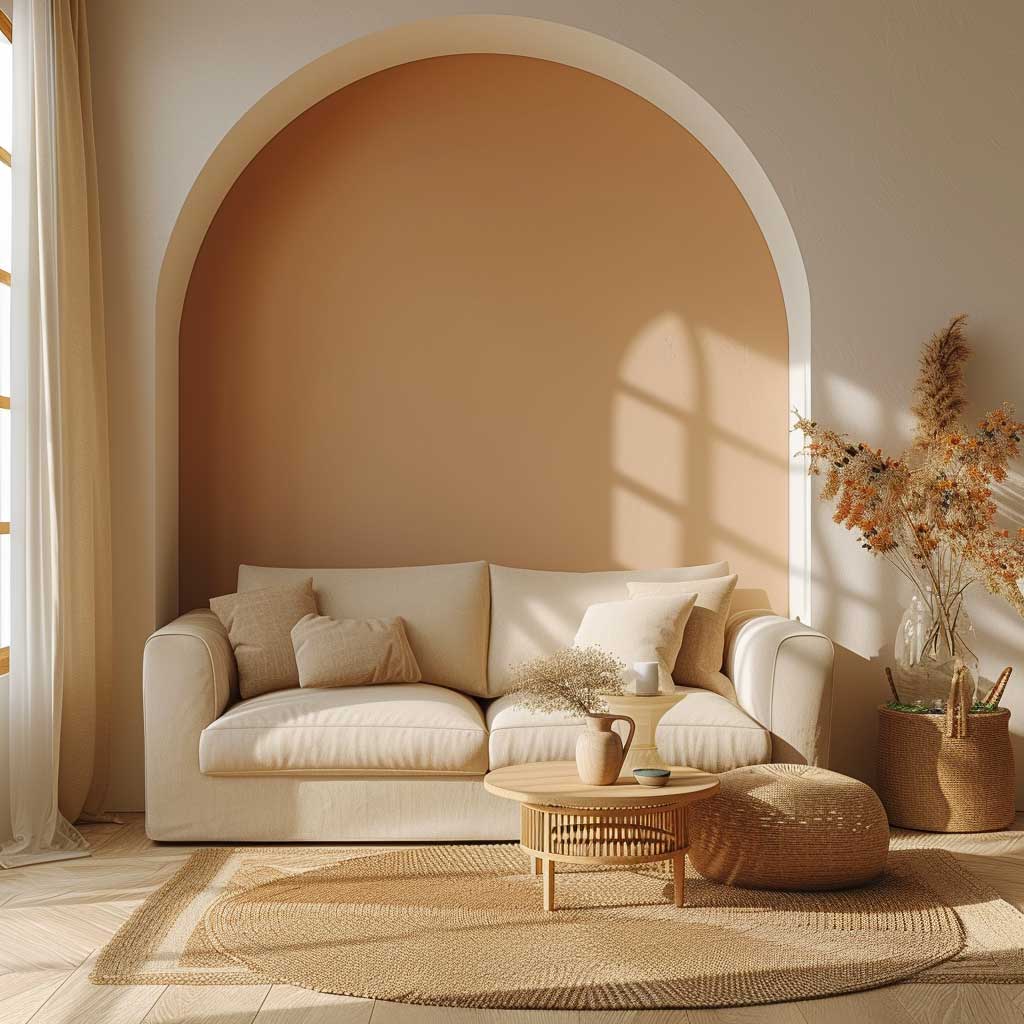
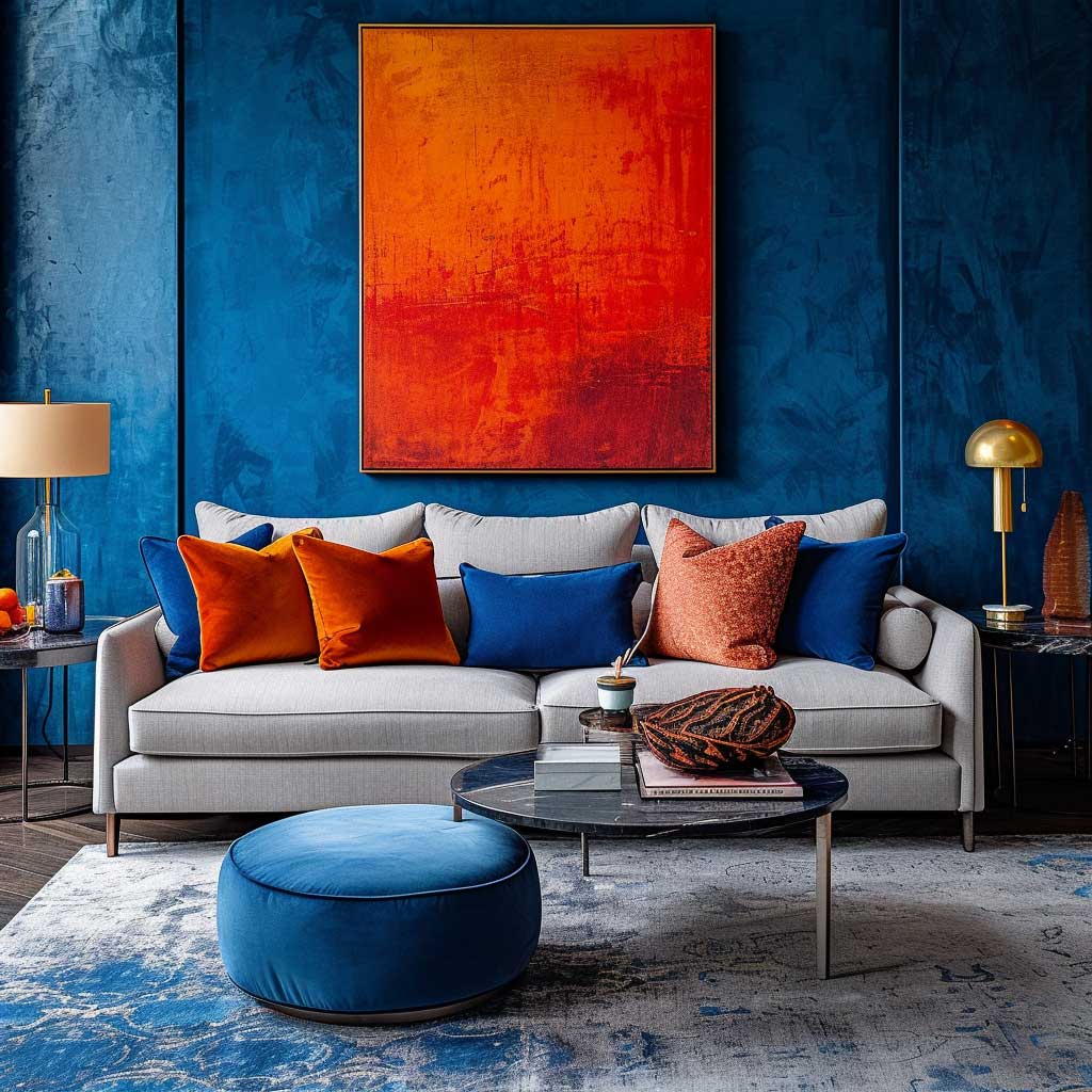
Warm Orange Meets Cool Blue and Nobody Loses
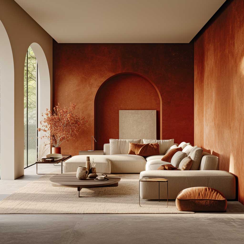
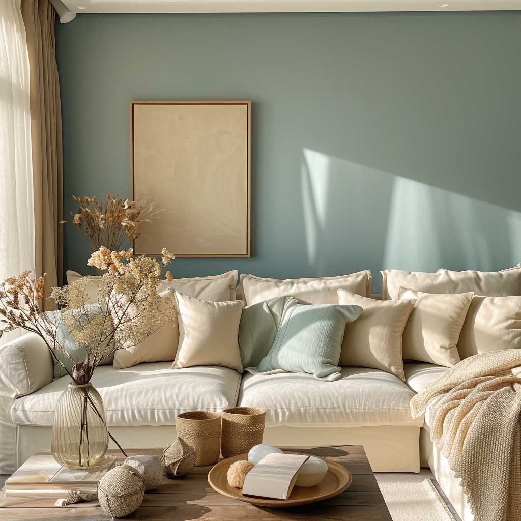
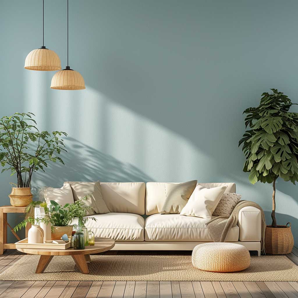
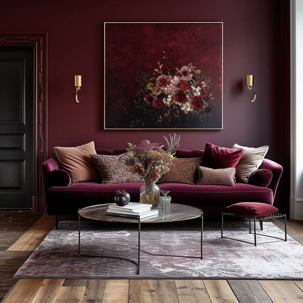
The wall colour combination for living room that gets the most mileage is a warm-cool split — and the reason is physiological, not aesthetic. Warm tones (terracotta, burnt orange, deep ochre) trigger a subtle sense of enclosure and comfort, the same reason firelight feels good. Cool tones (dusty slate blue, sage-tinged grey, muted teal) open the walls visually and slow the heart rate down. Put them in the same room and you get something a single-colour scheme never delivers: a space that feels cozy and spacious at the same time.
The ratio matters more than the specific colours. My go-to formula is 70/30 — cool dominant on three walls, warm concentrated on the feature wall. I’ve watched clients flip this and make the warm tone dominant: it almost always reads as a hotel lobby by accident. The warm side needs to be the accent, not the envelope. If you want a specific reference, Benjamin Moore’s Atmospheric (a blue-green) on three walls paired with a terracotta feature — Sherwin-Williams Copper Mountain SW 9005 — is the version I’d put in my own room tomorrow.
What doesn’t work: mixing a warm primary (straight red-orange) with a cool primary (pure cobalt). The contrast is too high and the room starts to feel like a fast food logo. You need the muted, dusty versions of each — the ones with grey or brown in them. Proportions and paint finish matter too. Natural light will pop cool colours during the day; warm lamplight at 8 PM will make the terracotta sing. It’s not one room — it’s two rooms on a timer.
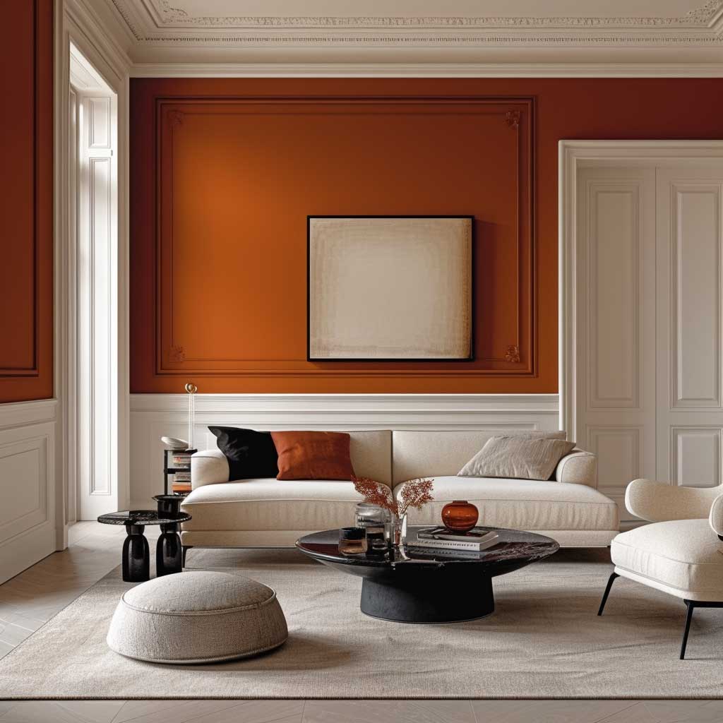
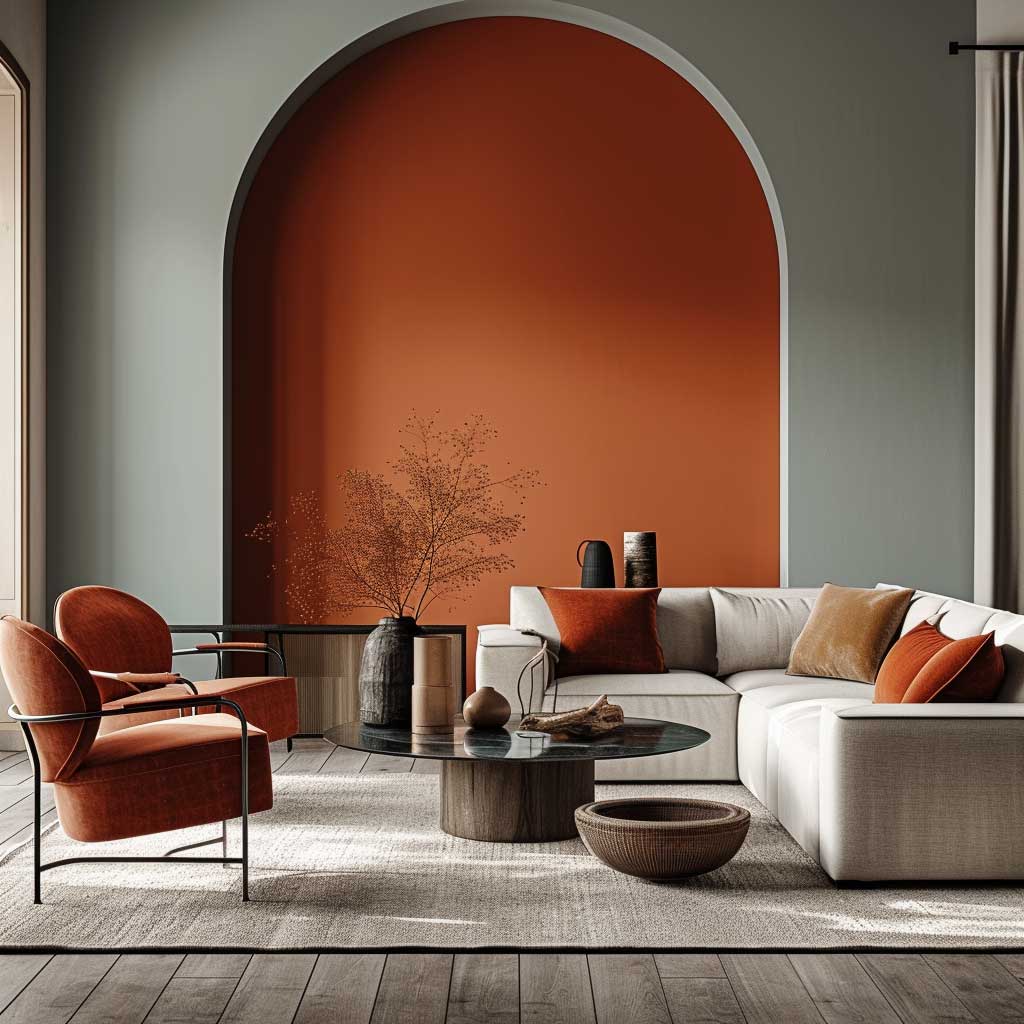
Texture amplifies what colour can’t do alone. A rough linen sofa against a cool blue wall reads differently than the same blue wall behind a polished leather piece. The linen softens the cool tone; the leather sharpens it. I use this as a correction tool — if the room feels cold after painting, add woven textiles before touching the wall again. Rugs in warm camel or rust can shift the whole temperature without a drop of paint.
The mistake I see most often is picking colours that work on the swatch and then buying the wrong finish. Matte on both walls flattens the contrast you worked for. Put a slight eggshell on the feature wall — it catches light differently and makes the warm tone punch harder at night. Not a huge difference. Enough of one.
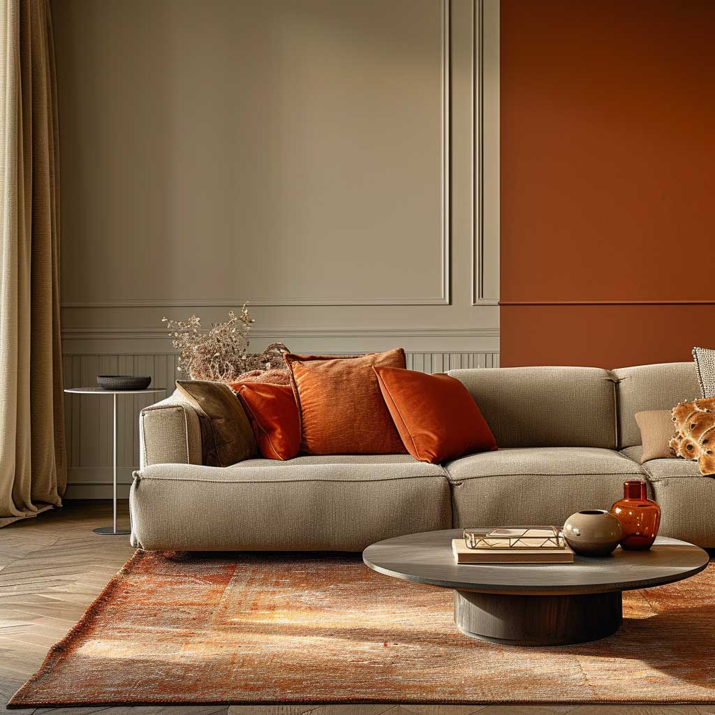
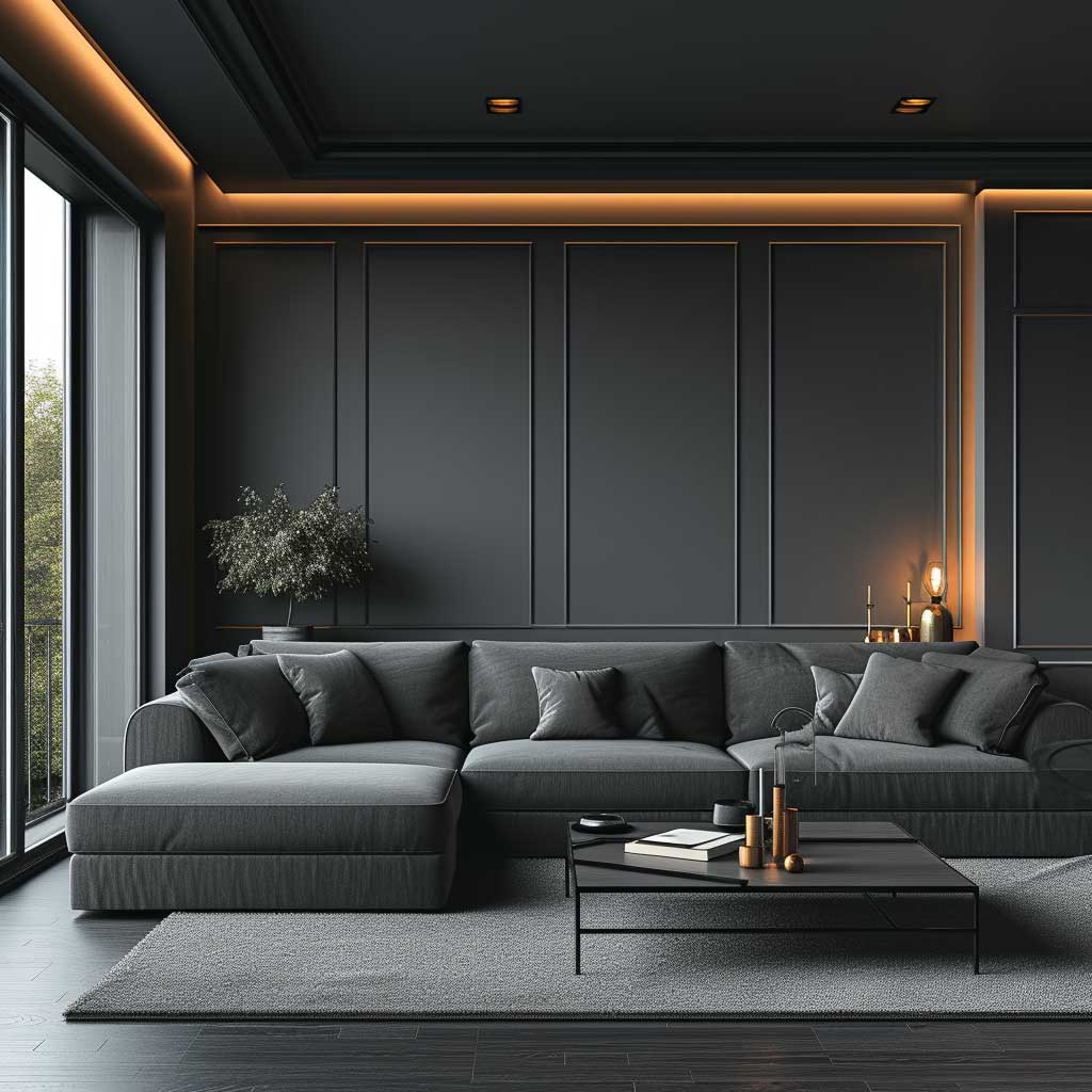
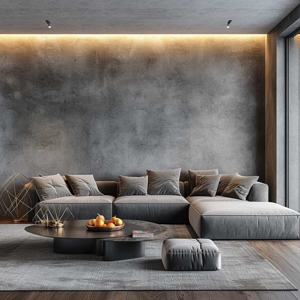
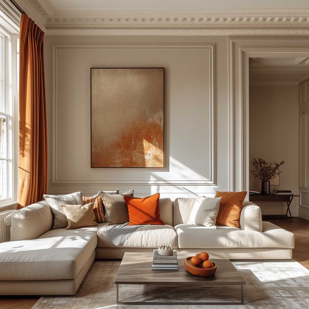
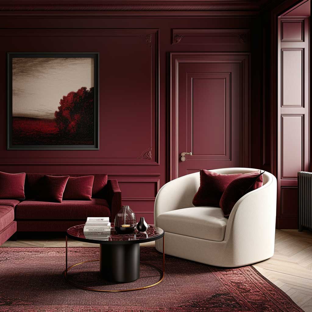
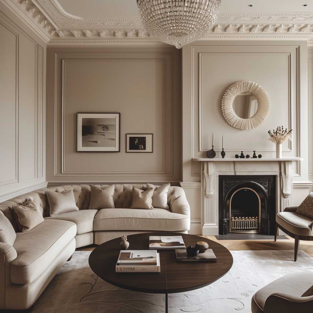
Deep Navy Feature Wall Against Blush Grey — The Contrast That Holds
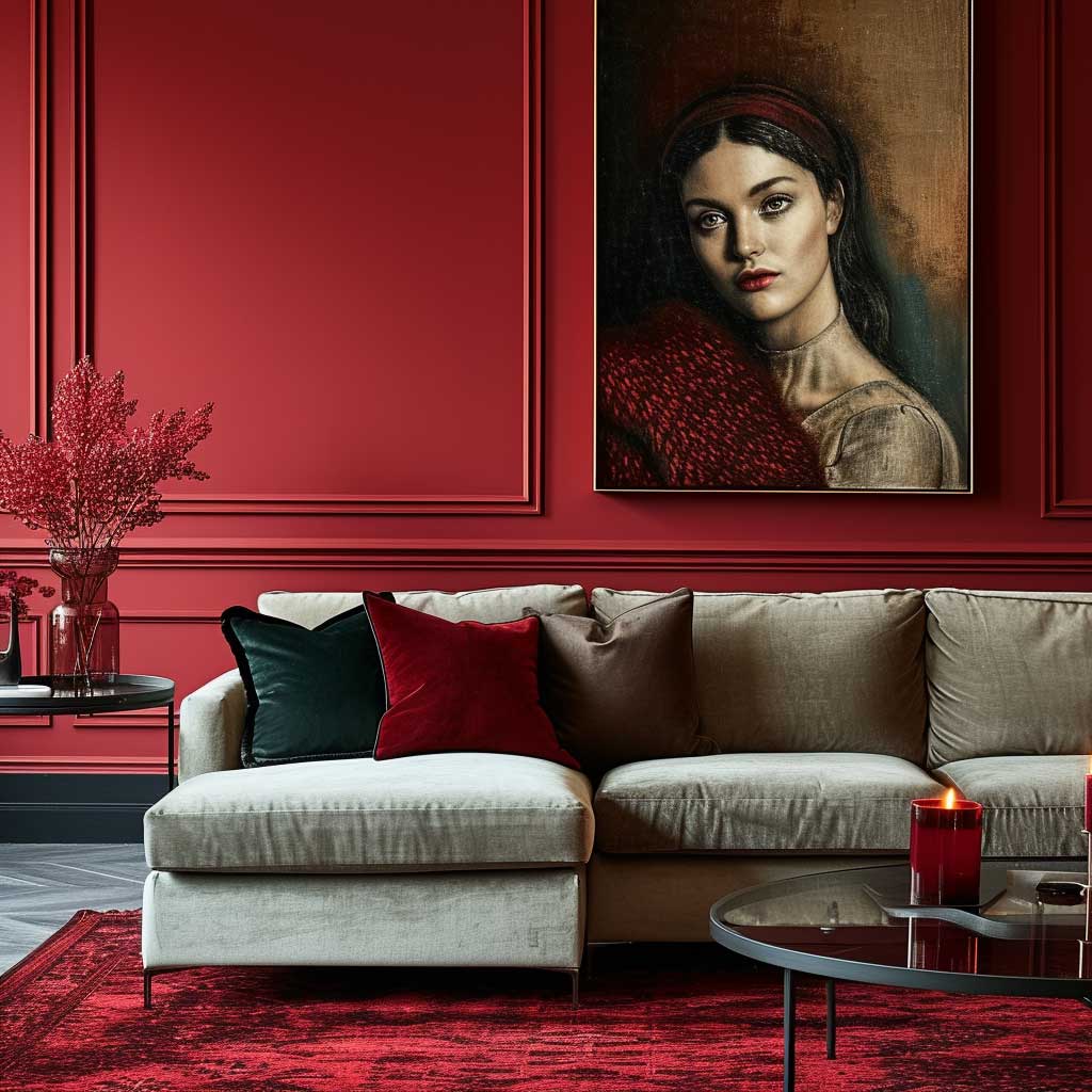
Bold-plus-soft is the colour combination for living room walls that interior designers default to for a reason: it solves two problems at once. The bold colour (a deep navy, a full-strength terracotta, a dark forest green) gives the room a focal point and stops it from looking like a rental. The soft surrounding tone (blush grey, off-white linen, pale sage) keeps the overall space from collapsing into a cave. You’ll notice this pairing in almost every room shortlisted in H&G’s living spaces coverage — there’s a version of it everywhere because it genuinely works at every budget.
My go-to execution: Farrow & Ball’s Hague Blue on the chimney breast or the wall behind the sofa. The three remaining walls in Farrow & Ball Elephants Breath — a warm, off-grey that reads as almost-neutral but has enough greige in it to feel intentional. This is not a combination that needs expensive furniture to sell it. I’ve seen it work over a $400 IKEA EKTORP sofa in cream and it looked like a magazine shoot. The dark wall absorbs everything around it and the furniture pops as a result.
What kills this combination: choosing a bold colour that’s too saturated and a soft colour that’s too white. Pure white against deep blue creates a graphic, high-contrast look that belongs in a kitchen or a bathroom — not a living room where you want to feel wrapped in, not stared at. The soft tone needs warmth in it. Farrow & Ball’s Strong White or Benjamin Moore’s Chantilly Lace are too cool and too clean. Go with something like Benjamin Moore White Dove OC-17 — just enough cream to take the edge off. That one degree of warmth changes the whole room.
Don’t Do This With Your Bold Wall
❌ Matching your bold wall colour to your sofa colour — they’ll compete and both will lose. The bold wall needs a contrasting neutral furniture anchor.
❌ Painting all four walls in the bold colour if your room is under 20 square metres. It reads as a mistake, not a design decision. One wall. Maximum two.
❌ Using a matte finish on a dark bold wall in a low-light room — dark matte in low light goes completely flat. Opt for eggshell to get some light reflection.
❌ Adding too many bold-colour accessories to “tie in” the wall. One or two cushions in a related shade is enough. More than that and the whole scheme looks desperate.
Velvet upholstery is the material that makes this combination sing louder than anything else. A deep red velvet sofa against a soft cream wall costs less than $800 at Article or West Elm’s sale section and immediately reads as considered, not accidental. The velvet catches light differently at every hour and adds the tactile layer the wall can’t provide. Avoid leather in this combination — it competes with the bold wall’s sheen in a way that velvet doesn’t.
Lighting: the bolder your feature wall, the more you need warm-toned bulbs. Colour temperature around 2700K keeps the deep colours feeling cozy at night. Daylight bulbs (5000K and up) make deep blues and greens look slightly clinical — like a dentist’s waiting room painted navy. Not the result you want.
For more specific colour combinations that work across every furniture style, take a look at living room wall colors that complement every furniture style — it breaks down which shades survive a furniture swap without repainting.
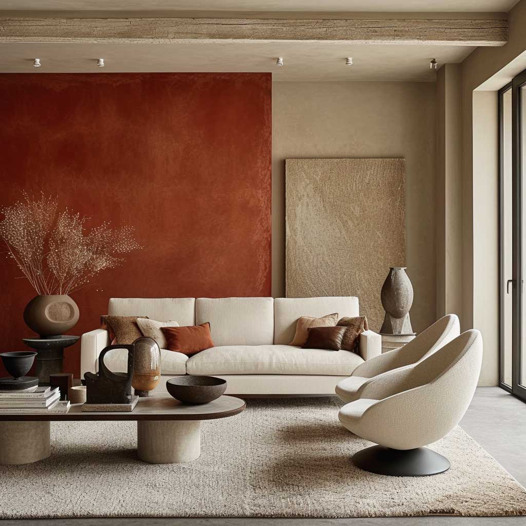
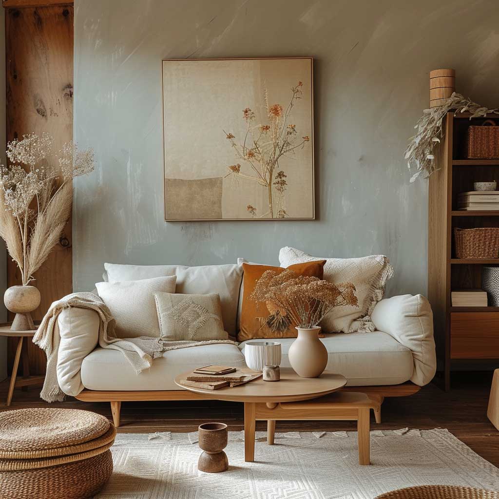
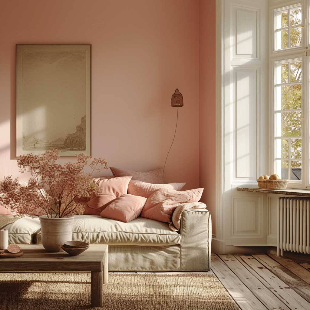
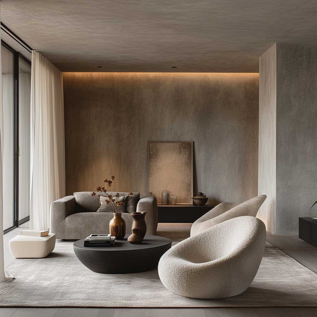
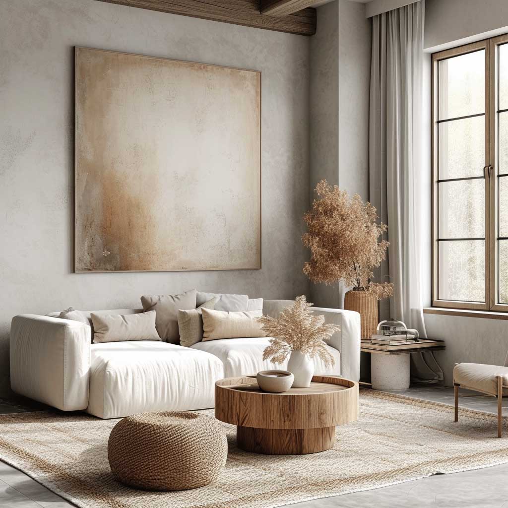
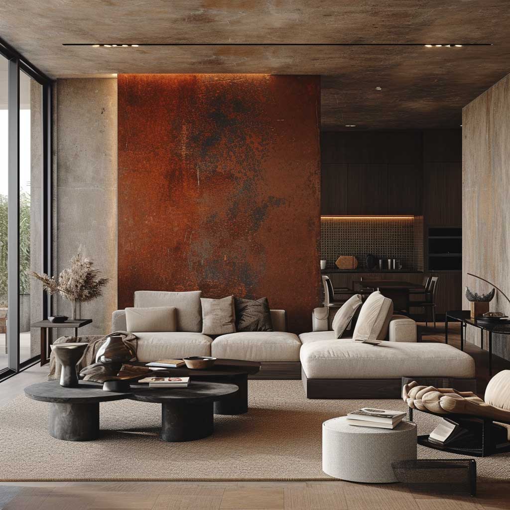
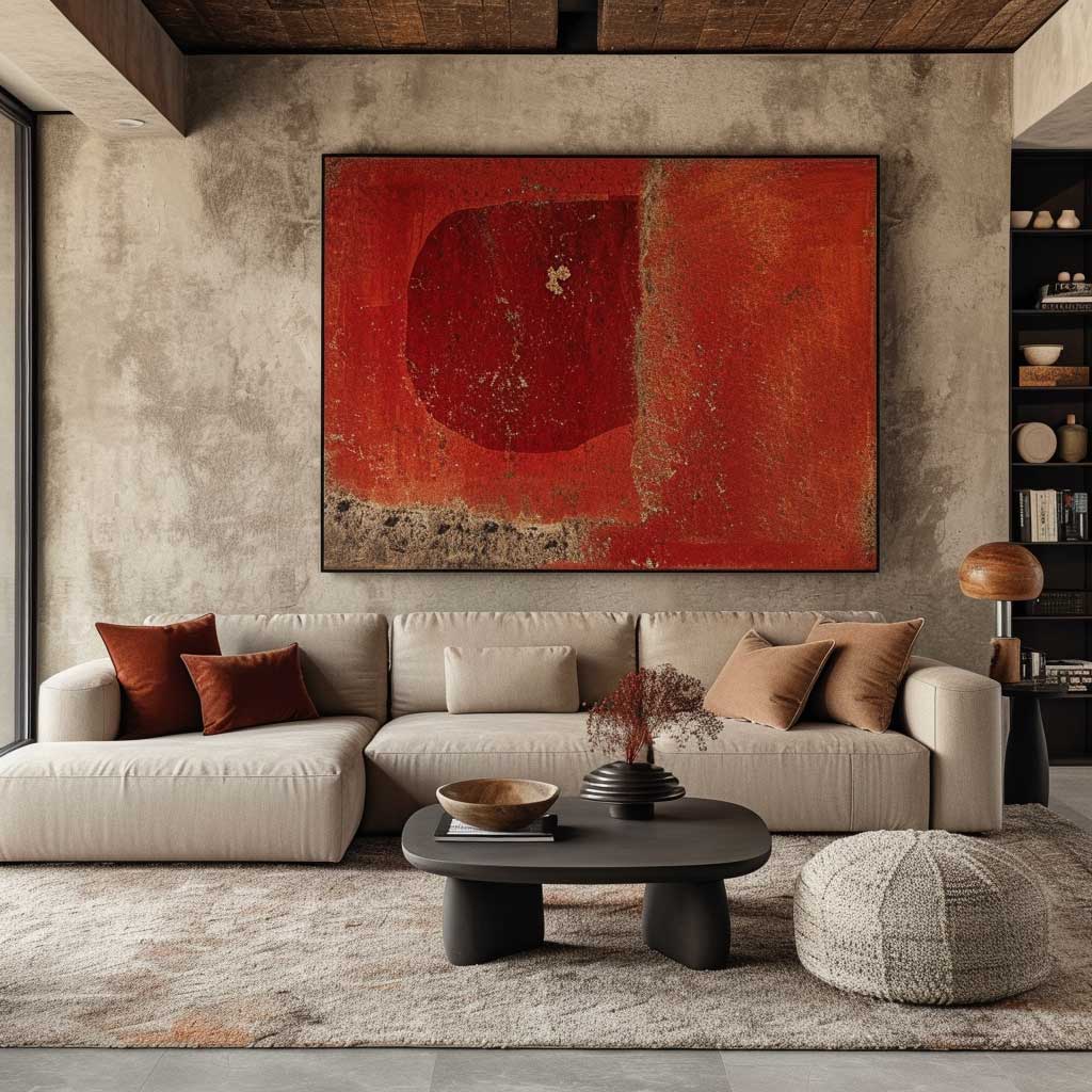
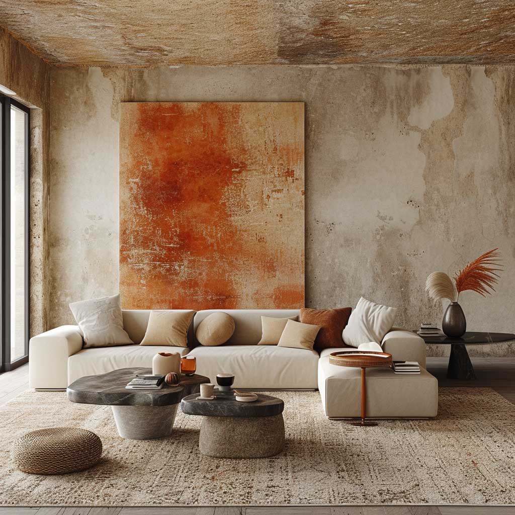
Earthy Wall Colours Work Because Soil Is Already a Neutral
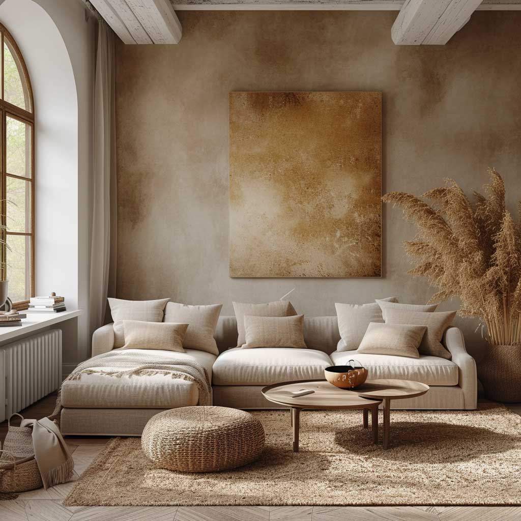

Earthy colour combinations for living room walls have been everywhere since 2022 and they’re not slowing down — because the science behind them is solid, not just a trend cycle. These are the colours your nervous system already recognises from the outside world: clay, warm sand, dried sage, dark walnut, warm terracotta. They don’t demand attention. They settle. That’s the quality most living rooms actually need and almost no-one asks for explicitly when they walk into a paint shop.
Benjamin Moore’s Gloucester Sage is the specific shade I’d put at the top of any earthy shortlist — a muddy green with enough grey to read as neutral from certain angles, and enough green to feel alive from others. Pair it with Farrow & Ball’s Dead Salmon (yes, that’s the real name) on the ceiling and you have a room that looks like it was designed by someone who knows what they’re doing, for about $130 in paint total. I stole this combination from a designer’s Instagram and it has not let me down since.
Natural wood furniture is not optional with earthy wall tones — it’s structural. A room with moss green walls and an all-white furniture kit looks like someone painted a room and then forgot to decorate it. The wood is what reads as “intentional.” Oak, walnut, and raw pine all work, but they work differently: oak reads warm and Scandinavian, walnut reads mid-century and rich, pine reads rustic and casual. Pick the one that matches the mood you’re after, not just the one on sale.
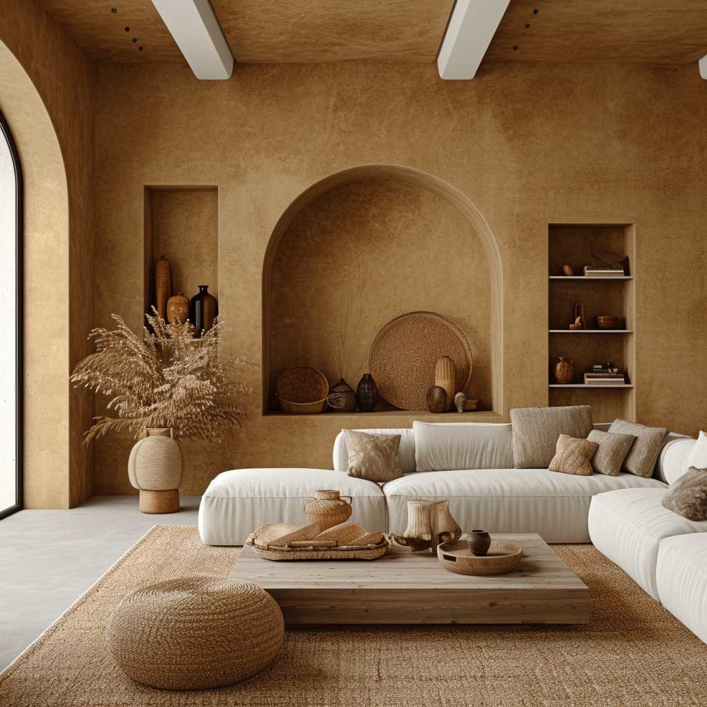
Plants in an earthy-toned room are not a decorating cliché — they’re a calibration tool. A Monstera or Fiddle Leaf Fig against a sage wall doesn’t disappear; it reads as part of the colour story. Against a grey or white wall, the same plant looks like a green object in a neutral box. Earthy walls give plants context. That said, skip tiny plants dotted on shelves — one large plant in a terracotta pot does more visual work than fifteen small ones.
What I’ve seen fail: combining earthy walls with glossy black furniture. The matt organic feeling of an earthy wall colour combination is immediately broken by a glossy black coffee table or TV unit. The sheen reads as cold and the whole warmth of the scheme collapses. Matte black — a slightly different product — is fine. Glossy black is not. Worth specifying when you’re shopping.
You can explore more options for feature walls that work with earthy living room palettes over at bold feature wall ideas for living rooms — particularly the stone and wood options which pair very naturally with earthy colour schemes.
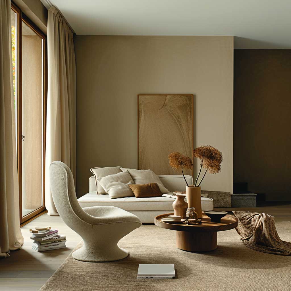
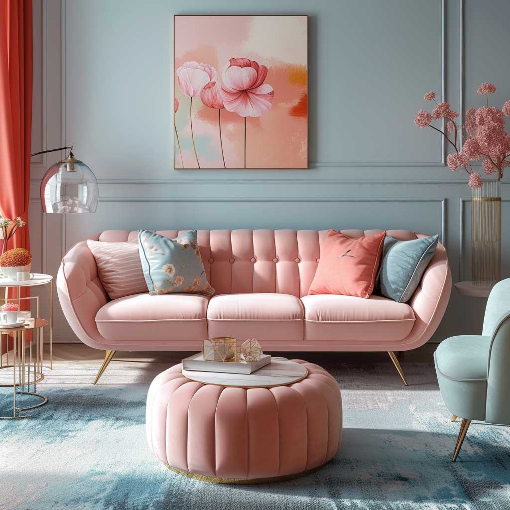
Pastel Colour Combinations That Read Intentional Rather Than Default
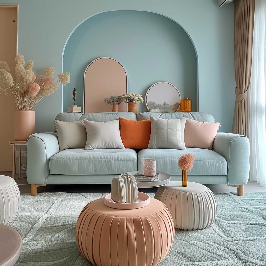
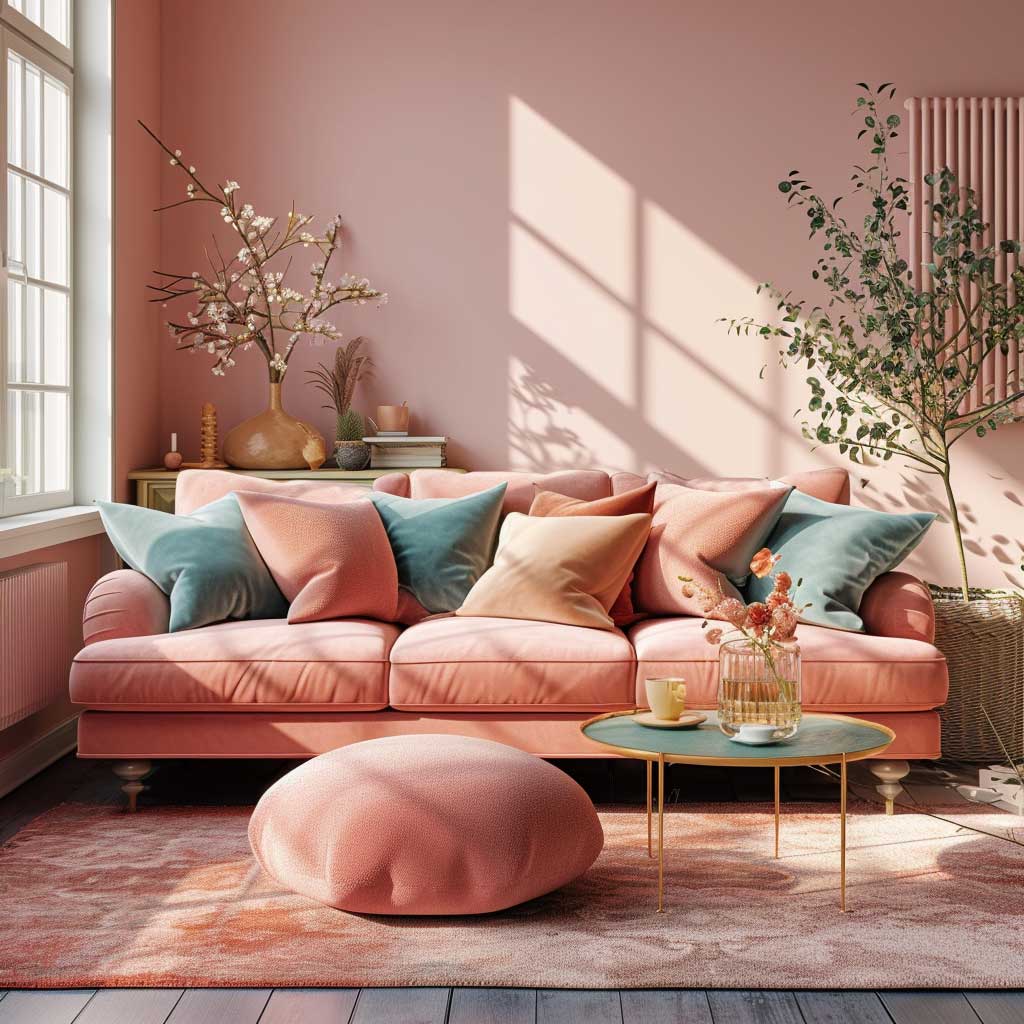
Pastel colour combinations for living room walls fail in exactly one way: when the pastels chosen look like they came from a baby shower registry. The difference between a pastel room that reads as designed and one that reads as default is the specific shade. You want dusty pastels — pastels with grey or brown in them — not saturated candy versions. Farrow & Ball’s Mizzle (a dusty jade green) paired with their Peignoir (a grey-pink) is the version that appears in shoots. The same idea in a straight mint and a straight blush from B&Q looks like a nursery.
The combination I’d use: Mizzle on the dominant three walls, Peignoir on the fireplace wall or alcoves. Budget about $90 per litre for Farrow & Ball. Is it worth it over Dulux? In pastel territory, yes — the pigment depth in cheaper pastels often disappears on the wall. You pay twice in paint, once in labour. If budget is the constraint, Benjamin Moore’s Pale Oak OC-20 plus a dusty lavender from their Aura line gets you 80% of the way there for half the price.
Vintage furniture is the natural pairing here. Not because pastels are exclusively “old” — they’re not — but because the worn patina of vintage wood against a soft wall gives the palette texture and age it needs to look deliberate. A flat-pack shelf unit against a pastel wall looks like a placeholder. A worn oak bookshelf against the same wall looks like a choice. The furniture tells the wall why it’s there.
Soft, diffused lighting is non-negotiable with pastels. A single overhead pendant in a pastel room turns the walls grey-beige at night — the colour disappears. Layered lighting (floor lamp, table lamp, wall sconce) keeps the colour present and warm after dark. I own two IKEA Ranarp floor lamps and two Hay Silhouette pendants — the Ranarp throws warm pools of light that a pastel wall bounces back beautifully at about $40 each. Don’t pay more for this; the bulb temperature (2700K) matters more than the lamp brand.
What kills the pastel scheme: introducing one item in a colour that’s more saturated than the wall. A bright red cushion, a strong mustard throw, a vivid teal plant pot — any of these will make the pastel walls look washed out by comparison. Stay within one tonal family. The room speaks quietly. Let it.
Monochromatic Living Rooms Where Texture Does the Work Colour Won’t
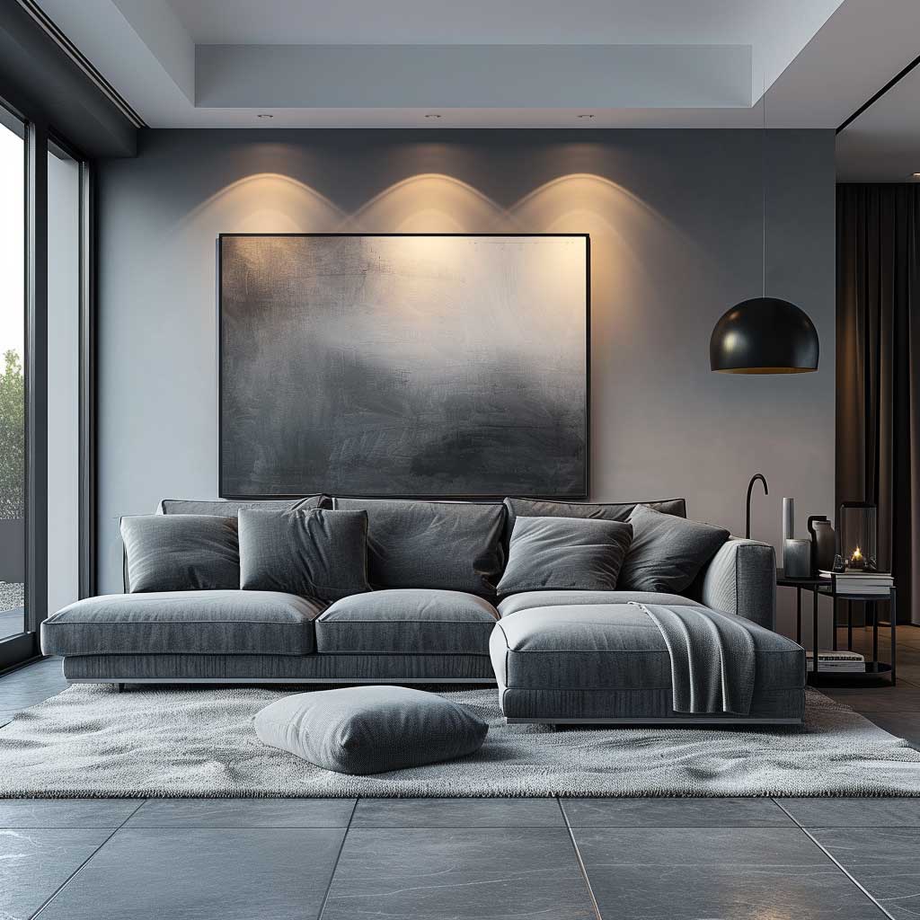
A monochromatic wall colour combination for living room design is the one scheme that punishes lazy decorating harder than any other. Single-colour rooms survive on texture alone. Take away the texture and you have a blank box that looks unfinished and depressing — regardless of how expensive the paint is. The rule is simple: if you’re removing colour contrast, you have to replace it with tactile contrast. A velvet sofa, a shaggy rug, a woven wall hanging — at least three different surface textures before the room feels complete.
Deep charcoal is the monochromatic option that photographs best and lives in best. Farrow & Ball’s Railings (off-black with a blue tinge) or Benjamin Moore’s Wrought Iron 2124-10 — both around $60-70 per litre — on all four walls and the ceiling is the “colour drenching” technique that designers are using right now. It sounds like too much. It isn’t. The uniformity makes the ceiling feel higher, not lower, because there’s no visible line separating wall from ceiling. What you’re buying with that extra paint is the disappearance of the room’s edges — and that reads as space.
What fails: a monochromatic room in a mid-tone. Not dark enough to feel dramatic, not light enough to feel airy — rooms painted in a medium greige or a mid-tan that goes nowhere. These look like the room can’t decide what it is. Commit to either pale (Benjamin Moore White Dove or Chantilly Lace) or dark (Railings, Hague Blue, Down Pipe). The middle is where monochromatic rooms go to die.
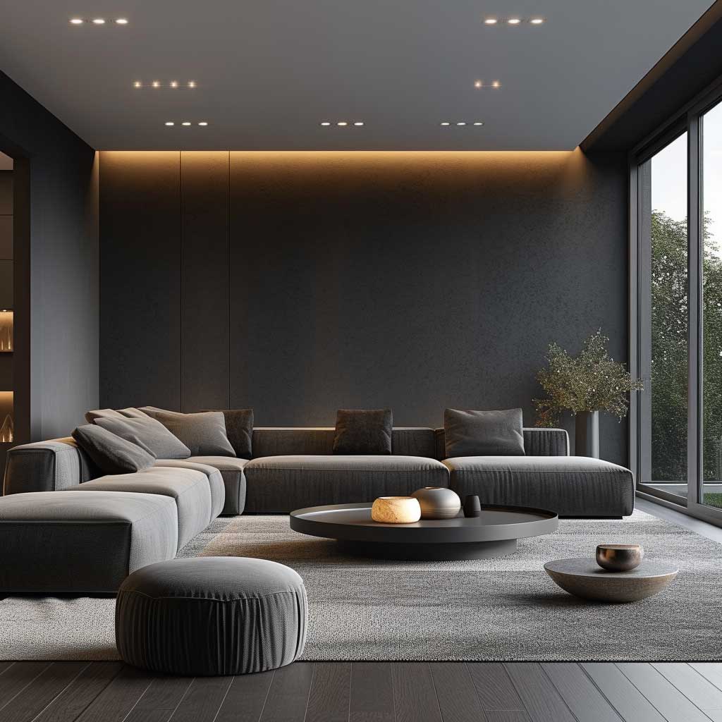
Metallic accents — brass in particular — are the fastest way to add contrast without breaking the monochromatic spell. A brass Pooky table lamp, a set of Maisons du Monde brass picture frames, or even a RIBBA from IKEA with a brass mat will catch light and break the flat uniformity of a single-colour room without introducing a competing hue. Chrome reads cold in this context. Brass reads warm. The choice matters.
Natural light does more than any other variable in a monochromatic room. North-facing rooms should avoid deep dark tones unless you have very good artificial lighting. South-facing rooms can carry Railings or Hague Blue without feeling like a crypt. Check the orientation before you commit to a dark monochromatic scheme — this is one of the two variables (the other being ceiling height) that determines whether it works or suffocates.
Light Palette Rooms That Don’t Look Like a Hospital Waiting Area
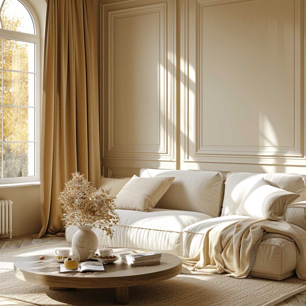
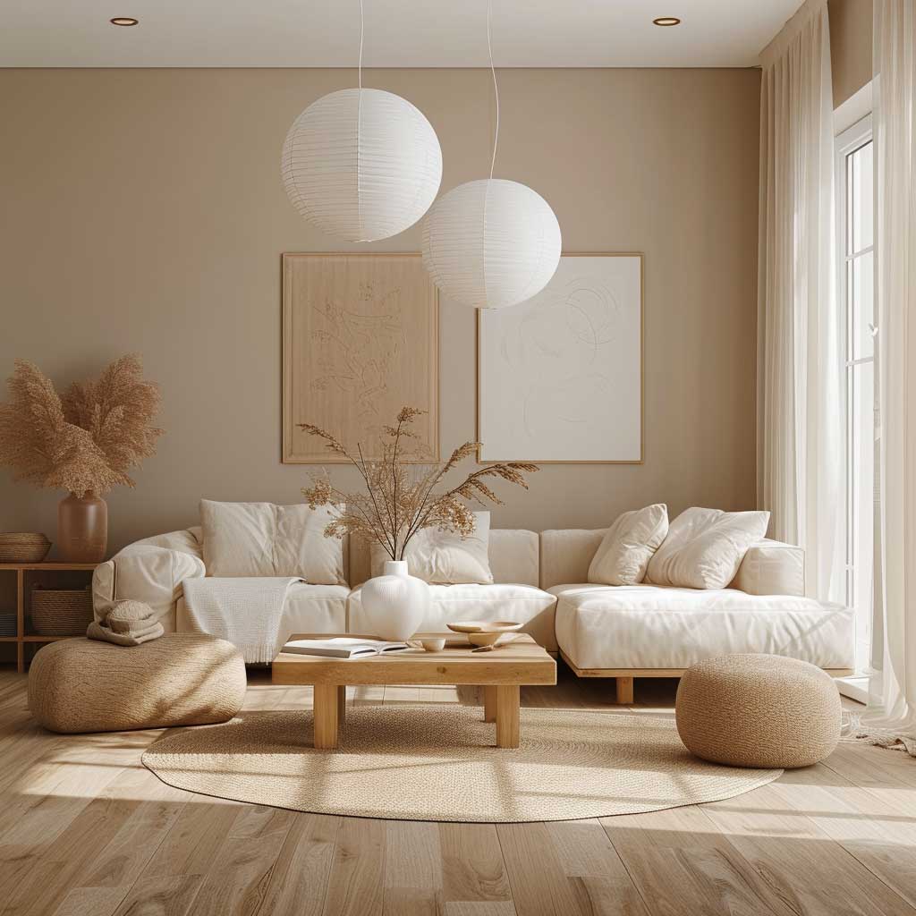

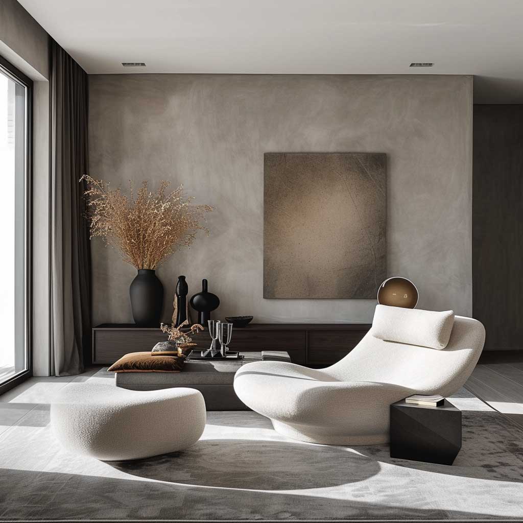
Light wall colour combinations for living rooms work or fail on one thing: whether the warm tones are in the paint or in the objects. Pure white walls with all-white furniture is a cold clinical trap that most rooms can’t escape without significant natural light. The trick I use — and I’ve used it in three different flats — is to go one step warmer than you think you need on the wall. Benjamin Moore Pale Oak OC-20 instead of White Dove. Farrow & Ball String instead of Pointing. That one step gives the room just enough amber that warm lamplight in the evening bounces gold rather than grey.
Light palettes also need a heavier item to anchor them. Pick one dark or high-contrast piece — a dark wood coffee table, a deep-toned area rug, a black-framed mirror — and make it deliberate. Without an anchor, a light room reads as unfinished regardless of budget. The dark item is the visual full stop. Skip it and the room keeps asking a question it can’t answer.

Light walls work with almost every interior style from Japandi minimal to full maximalist — they’re a neutral container, not a style statement. That’s both their strength and their risk. The room tells whatever story the objects inside tell. You’re not off the hook just because the walls are pale. If anything, you’re more on the hook. The furniture, the art, the textiles — they have nowhere to hide against a light backdrop.


Knitted and woven textiles are the texture layer that saves light rooms from feeling stark. A Bolia knitted throw at $120, a jute rug from Sukhi around $300, or even a Marimekko cotton cushion — anything with a rough, organic weave adds the dimensional quality a smooth pale wall removes. Smooth walls plus smooth furniture in a pale palette is the fastest route to a room that looks like a show home nobody lives in.
For context on which specific paint shades designers are reaching for in 2026 — including which light neutrals are in favour right now — Homes & Gardens covers the current colour trends with named paint references from Farrow & Ball and Benjamin Moore that are worth cross-referencing before you buy.


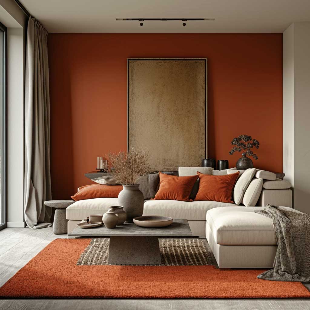
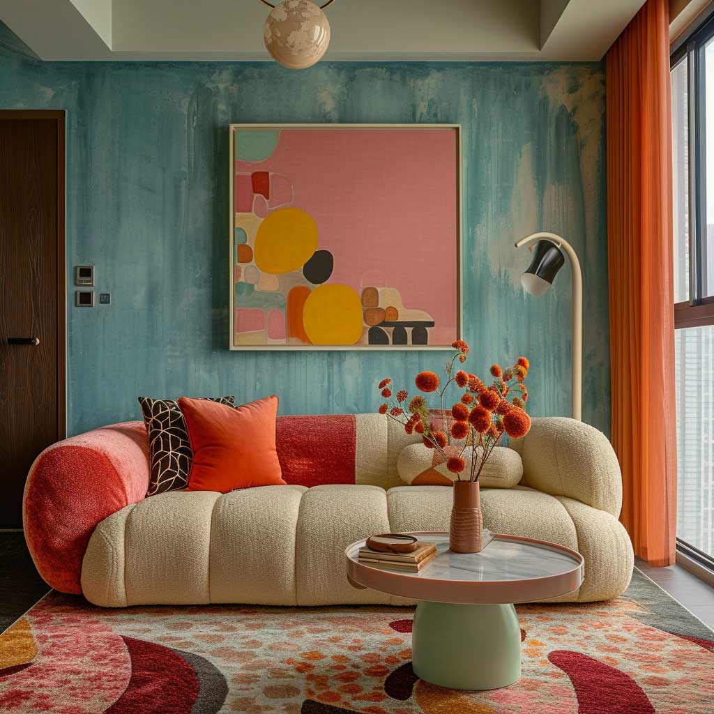
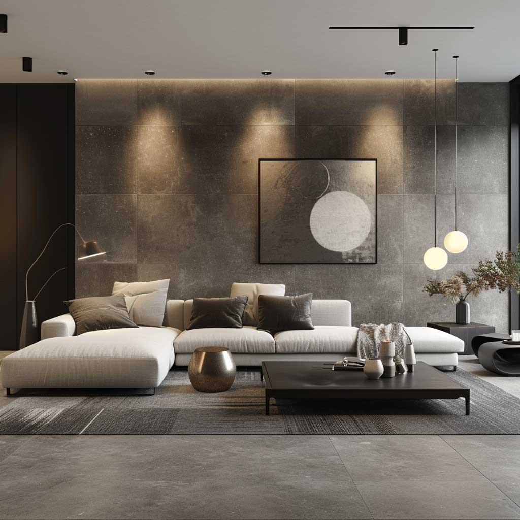
Jewel Tone Walls Reward the Room — But Only If the Lighting Is Right

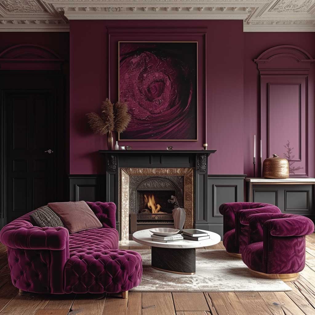

Jewel tone wall colour combinations for living rooms are the highest-risk, highest-reward option on this list. Done correctly — right shade, right sheen, right lighting — you get a room that looks like it was designed specifically for you. Done with any one of those three variables wrong and you get a room that feels like a regrettable mistake. The stakes are higher because the colours are more saturated and more expensive to correct. That said, the specific shades to shortlist: Farrow & Ball’s Studio Green, their Inchyra Blue, and Sherwin-Williams Emerald Isle SW 9128. All three have been consistently in editorial living room coverage for over three years. That consistency is not coincidence.
Jewel tones make a room feel intimate because they absorb light rather than reflect it. Is that a good thing? Depends entirely on what you use the room for. Dinner parties, film nights, close conversation — jewel tone walls make those feel luxurious and warm. Working from home in a jewel tone room for eight hours — that same absorption starts to feel heavy. Choose your dominant activity before you choose the colour. I use this as the one qualifying question for jewel tone rooms: if you spend most of your time in there during the day with daylight, go two shades lighter than your instinct. If it’s primarily an evening room, go with your gut.
Velvet upholstery at $600-1,500 for a two-seater is the material that most amplifies jewel tone walls — Habitat, Made.com, and West Elm all carry velvet sofas in the teal, forest green, and deep blue family that work directly. A linen sofa in ivory or warm white against a jewel tone wall also works beautifully. What doesn’t work: mid-tone upholstery (grey, beige, brown) against a jewel tone wall. The contrast flattens to zero and neither element has presence. Contrast or complement. Not middle ground.

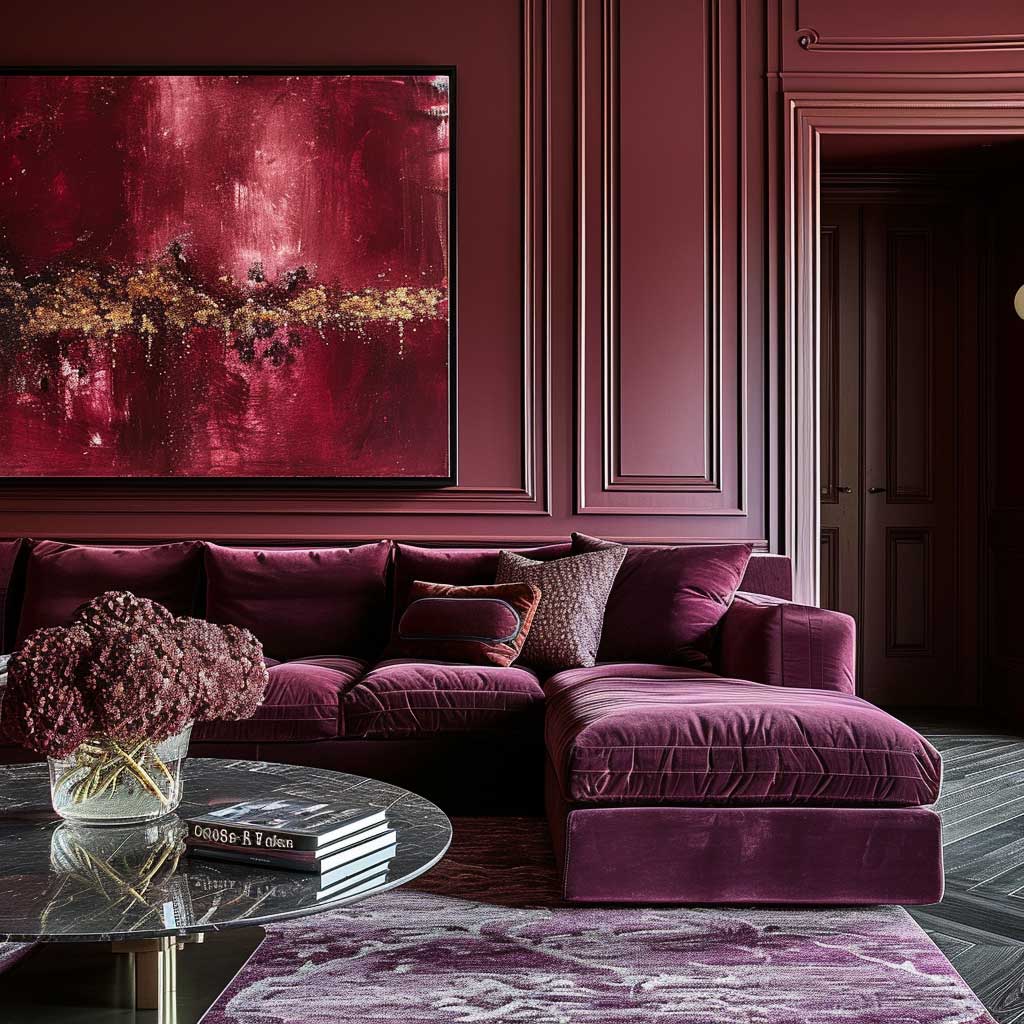

Gold and brass — not silver, not chrome — are the metallic accents that hold up against jewel tones. A brass Pooky pendant above a seating area with emerald green walls, a set of gold-framed mirrors on a sapphire blue wall — these combinations have a reason every designer gravitates toward them. Silver and chrome read cold against saturated colour. Brass reads warm. It matches the depth of jewel tones instead of fighting them.
Ambient lighting at 2700K is the one specification that determines whether a jewel tone room delivers at night. At 3000K, the colour goes slightly cool and clinical. At 2700K, the richness of the paint saturates further and the room feels like something. That’s a $0 difference — it’s a light bulb swap. Worth knowing before you spend $300 on paint and then accidentally neuter it with the wrong lamp.
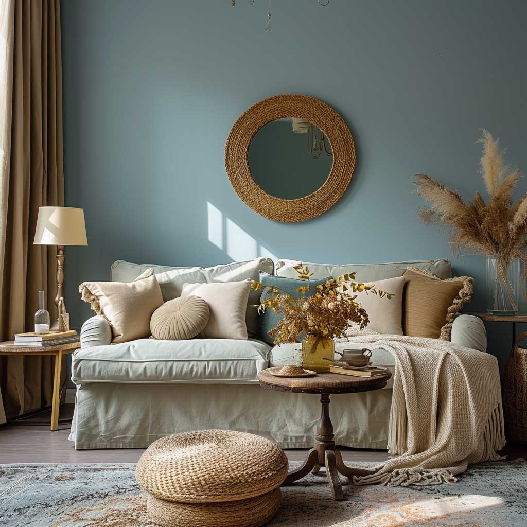
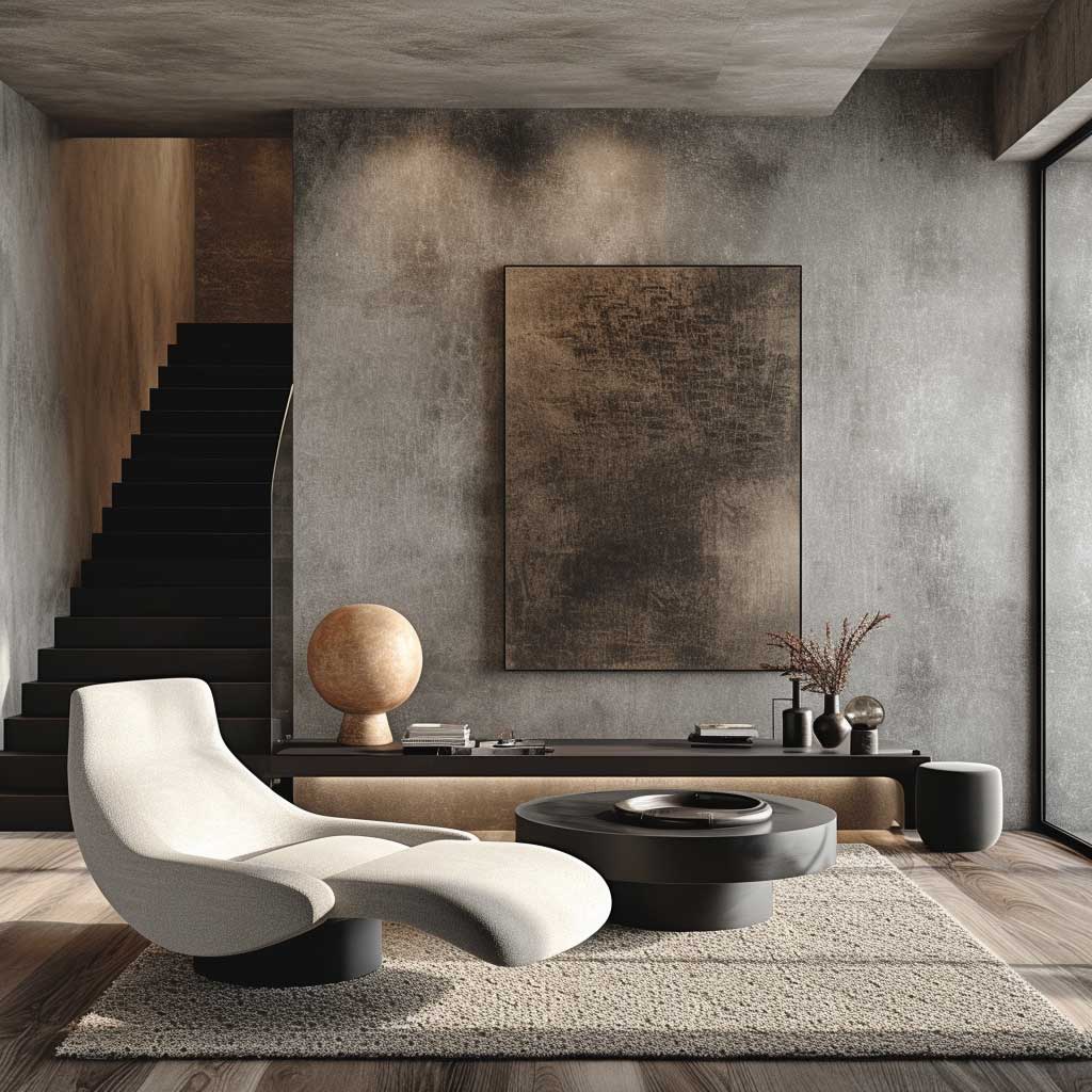
Neutral Wall Colour Combinations That Carry Weight Rather Than Disappear


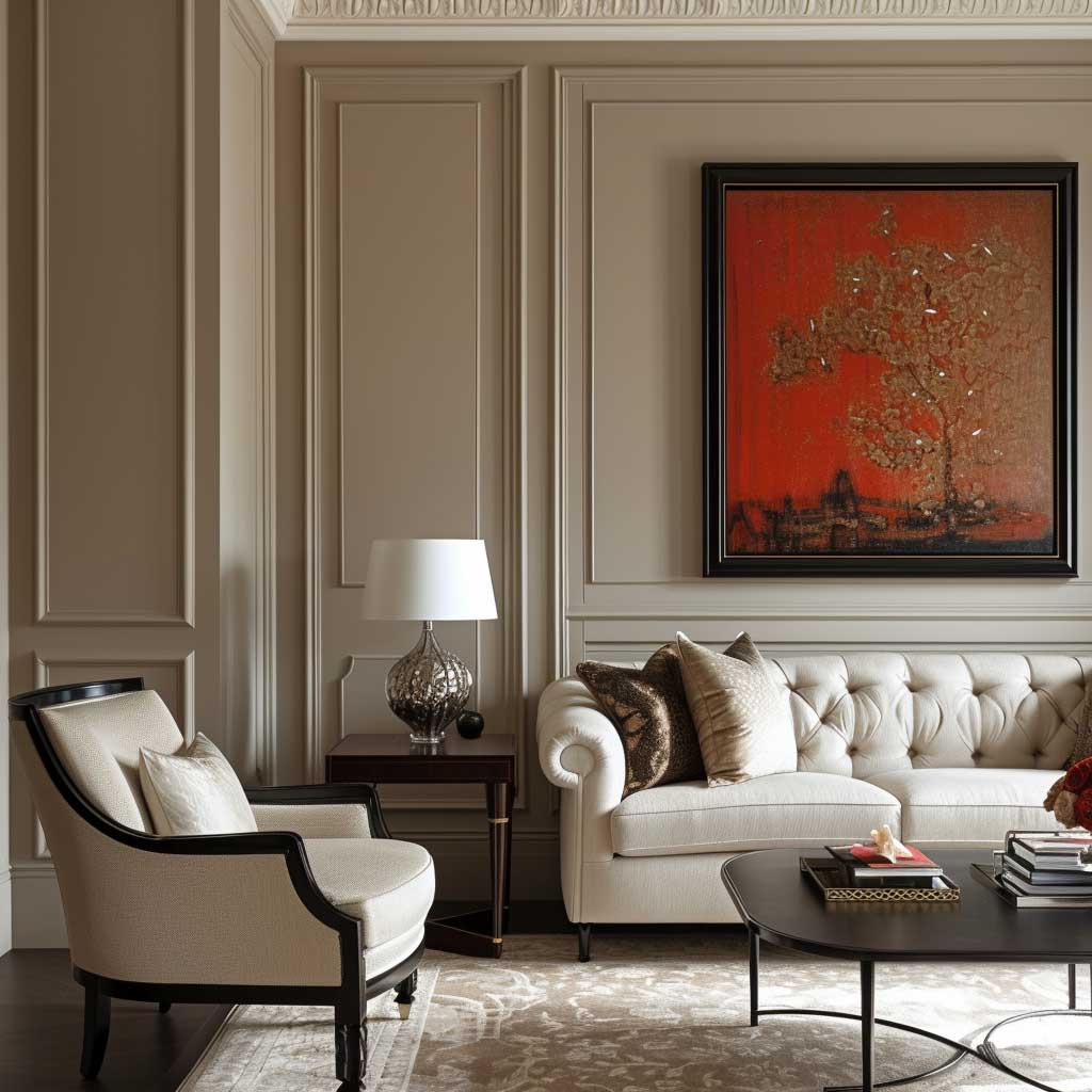
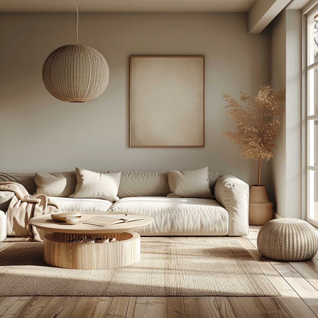
Neutral colour combinations for living room walls are in the middle of a shift right now, according to designers tracking what’s moving in and out of favour in 2026. The flat, cold greige that dominated rental properties and show homes for the past decade — Dulux Perfectly Greige, anything called “pebble” — is being replaced by richer browns. Farrow & Ball’s Mouse’s Back, Benjamin Moore’s Dark Chocolate — warm, slightly deep neutrals that hold weight in a room rather than disappearing into the walls. The difference between a disappearing neutral and a holding neutral is brown undertone. If you can see a pink or purple undertone in your neutral (a common trap with mid-range grey), it reads as faded and flat. Brown undertone reads as warm and considered.
The best neutral pairing I’ve landed on: Farrow & Ball’s Elephant’s Breath (warm greige) on three walls, their Mole’s Breath (deeper grey-brown) on the fourth. Same colour family. One step darker on the accent wall. No drama, no feature wall that looks like a design decision from 2015 — just a room that has depth without announcing itself. Paint cost for a standard 4x4m room: about $180 for both. I’ve priced this out.
Neutral walls are where your art, your furniture, and your collected objects finally get their moment. A gallery wall that gets completely lost against a dark or busy wallpapered wall suddenly has presence against a warm greige. Leather in cognac, terracotta pots, a stack of books in natural linen covers — these items read beautifully against a warm neutral and disappear into a bold-coloured wall. If you’ve spent money on things rather than on paint, neutrals are where that investment pays off.


Natural wood, cognac leather, and linen are the three materials that read best against warm neutral walls — because they share the same colour vocabulary (warm, brown-based, organic). A glass-and-chrome furniture kit against a warm neutral wall looks like a stage set that hasn’t been struck. The room needs organic material to complete the neutral palette’s logic. Pick at least two of the three and the room answers itself.
Natural daylight shifts warm neutrals through three or four different reads across a day. The same Elephant’s Breath wall that looks like a pale lavender-grey at noon looks like a warm mushroom at 4 PM and a rich taupe at 9 PM. This is not a flaw — it’s why neutrals feel more interesting than they photograph. You don’t fully understand a neutral until you’ve lived with it for a week. Order samples. Big ones. A4 minimum, painted directly onto the wall, not a card held against it.
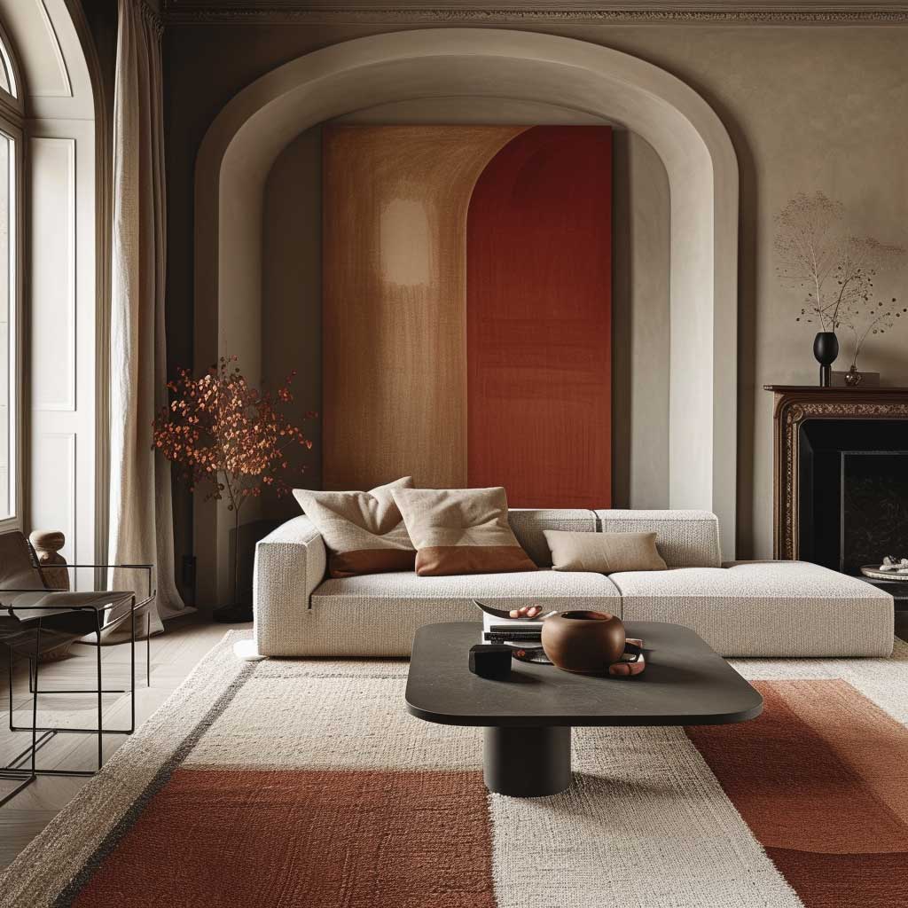
When Texture and Colour Are Split Evenly the Room Always Wins

Colour ideas for living room walls often focus entirely on the paint and then treat the room’s objects as an afterthought — but a wall colour that doesn’t have a corresponding texture strategy reads flat no matter how well-chosen. Think of the wall colour as half a sentence. The textures in the room are the second half. A soft grey-blue wall (I’ve been using Farrow & Ball’s Mizzle for this) paired with a jute rug, a boucle chair, and a raw linen throw isn’t just decorating — it’s building a layered material story where every surface contributes a different quality of light and touch.
The pairing I’d build a room around right now: Dulux Heritage DH Lichen (a dusty sage, around $35 per litre) on the walls, a Rugs.com jute rug at $180-300, a Heal’s boucle armchair at $800, and a Hay Market throw at $120. Total material investment around $1,200-1,400 on top of paint. The room will read at a level that suggests significantly more spend. That’s not a budget trick — it’s what happens when wall colour and texture work in the same direction.
Bold accent colours in cushions and curtains can be introduced without breaking the texture-colour pairing — but they need to be related to the wall tone rather than competing with it. Ochre cushions against a sage wall work because ochre is the warm complement of cool sage. Cherry red against the same wall looks like a mistake. The accent colour should feel like it was always somewhere in the room; you’re just highlighting it. If it looks like it arrived from outside the colour family, it didn’t.


The adaptability of this approach over time is what I keep coming back to. Changing the room’s mood by swapping cushions or a throw is a $40-120 operation. Changing the mood by repainting is a $200-500 operation plus a weekend. Build the wall colour and texture pairing as the fixed layer and treat the accent items as the variable layer. Your future self will thank you every time the season shifts.
Lighting interacts differently with smooth versus textured surfaces and that difference shifts throughout the day. Raking light across a textured wall (a bedside lamp positioned low, for example) picks up any brush texture in the paint or any unevenness in the plaster — and that looks intentional, like a Venetian plaster finish, if the colour is right. The same raking light on a smooth white wall just highlights imperfections. Textured surfaces and warm wall colours are naturally forgiving of imperfect walls. This is a practical consideration nobody mentions.
For more inspiration on specific paint shades that work across every living room style, the full breakdown at paint colours for modern living rooms covers named shades with honest notes on how they behave in real conditions — including the yellow-shift problem and which greys go purple under certain lights.
Final Word
The right wall colour combination for living room changes how the room feels at every hour — not just in photos.
Colour doesn’t work in isolation. Every combination on this list depends on the finish, the lighting, the furniture material, and the direction your windows face. Get those variables aligned and even a $35-per-litre Dulux choice will outperform a $90 Farrow & Ball applied without thought.
The one thing I’d have you take away: test every shortlisted colour at 9 PM under your actual lamps, on the actual wall, in a painted square at least A4 in size. That test catches more expensive mistakes than any design rule.
Save this post before you start shopping — it’s easier to cross-reference here than to scroll back through screenshots.
Related Topics


