Pick the wrong exterior paint colour combination and your house looks like a mood board that never got edited. I’ve watched neighbours spend $3,000 on labour only to end up repainting 18 months later because the shades looked great on a sample card and completely wrong on stucco at noon. The three combinations below — grey and white, blue and yellow, green and beige — are not trendy, they are structurally sound. Each one reads well in full sun, holds up in shade, and gives painters something concrete to work from.
You’ll notice this article skips the abstract colour theory. What you need is specific shades, finish types, and the cases where each combination fails — so you don’t learn that on your own driveway.
What this covers
- Grey and white — which grey undertone to avoid, and which finish to skip
- Blue and yellow — how to weight the two colours so the result doesn’t look like a sports stadium
- Green and beige — specific paint codes, the olive green mistake, and when matte beats satin
- FAQ covering 3-colour combos, front elevation specifics, and contrast walls
Grey and White on the Exterior — What Goes Wrong and Why It Goes Right
Grey and white is the exterior paint colour combination you see on every house that looks expensive without trying. The reason is simple: grey is already a diluted version of every other colour, so it never fights with the landscape. Benjamin Moore’s Stonington Gray HC-170 with Decorator’s White OC-149 trim runs about $65–$70 per gallon for both, and that specific pairing has worked on Georgian, Colonial, and contemporary box builds without a single awkward afternoon light situation. You’ll notice the magic happens between 3pm and 5pm when direct sunlight hits a grey facade — the undertone reveals itself. Cool greys turn slightly blue. Warm greys go a little lavender. Pick the wrong one and your “neutral” house suddenly reads purple.
Architectural styles that respond best: Georgian and Colonial proportions love the symmetry that grey-white reinforces. I’ve also seen it work on mid-century flat-roofed houses where the contrast between white soffits and grey siding replaces ornament entirely. What doesn’t work — and I need you to hear this — is a cool grey on a north-facing facade with mature tree cover. The wall goes dark, the white trim looks grey, and the whole thing reads like a concrete car park. If your front elevation faces north, go warm grey or drop one shade lighter than your instinct.
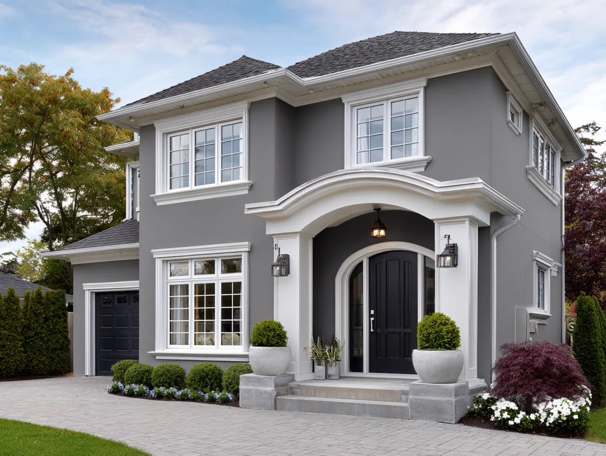
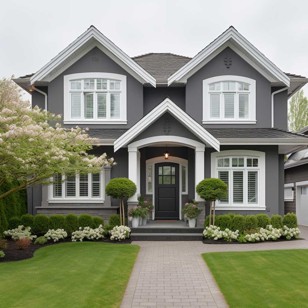
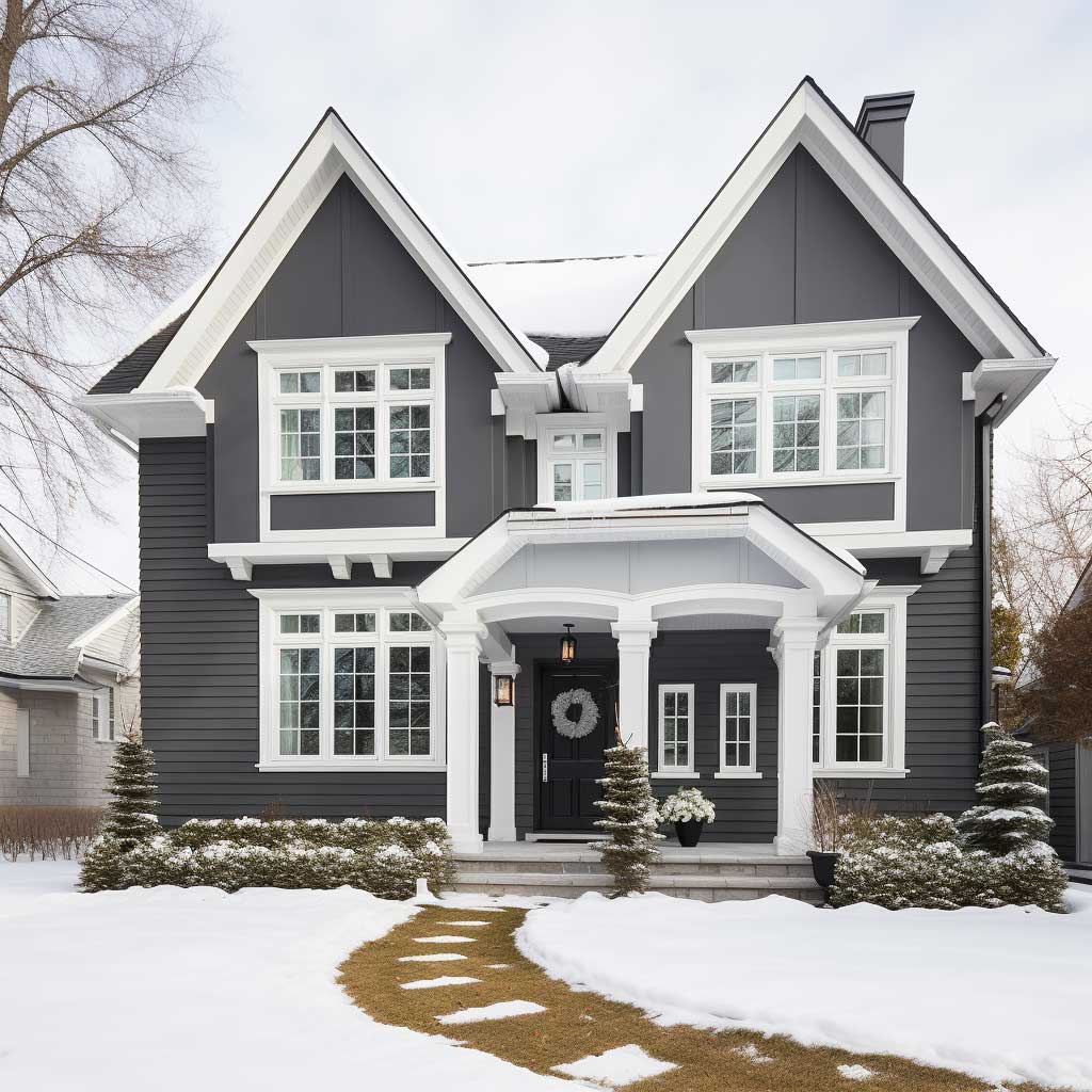
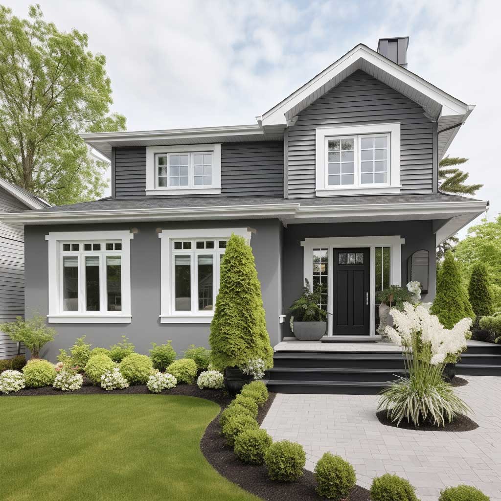
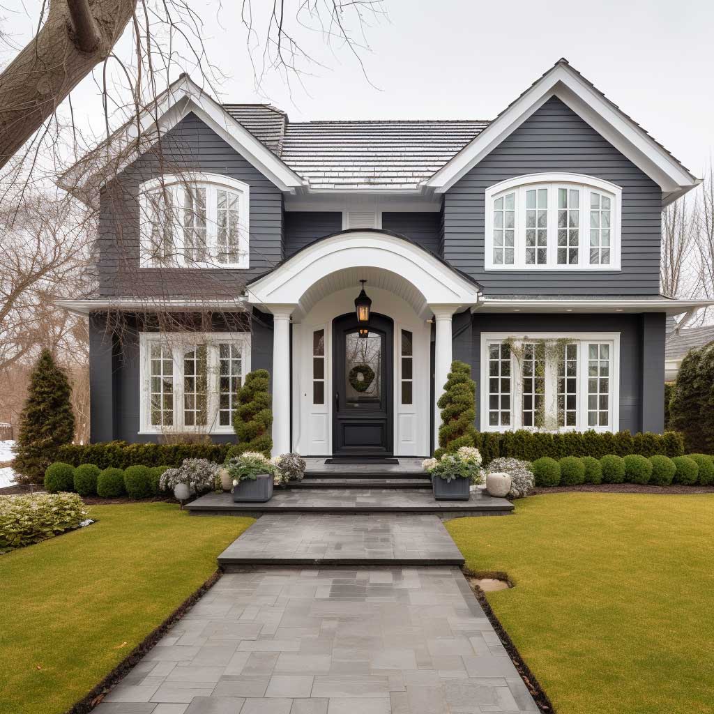
For finish, never gloss on a grey exterior wall. Gloss catches every imperfection in render and every waviness in timber cladding — it turns your facade into an accidental fun-house mirror. My go-to is Sherwin-Williams Exterior Satin finish on the siding and a semi-gloss on white trim only. That difference in sheen between body and trim is what gives the combination visual separation from 20 metres away. Flat on the trim is a mistake I see constantly; it erases the definition the whole scheme depends on.
If grey-white feels too quiet for a front elevation facing a busy street, add a single accent. Benjamin Moore’s Hale Navy HC-154 on a front door costs $70 a litre and turns the whole facade into a considered decision rather than a default. Don’t paint the garage door navy too — that’s how one strong choice becomes a theme park. Keep the accent to one surface. The grey does the rest.
For more on how grey reads across different exterior conditions, this breakdown of outside house paint ideas across American-style homes shows how the same grey-white palette behaves on five different architectural types.
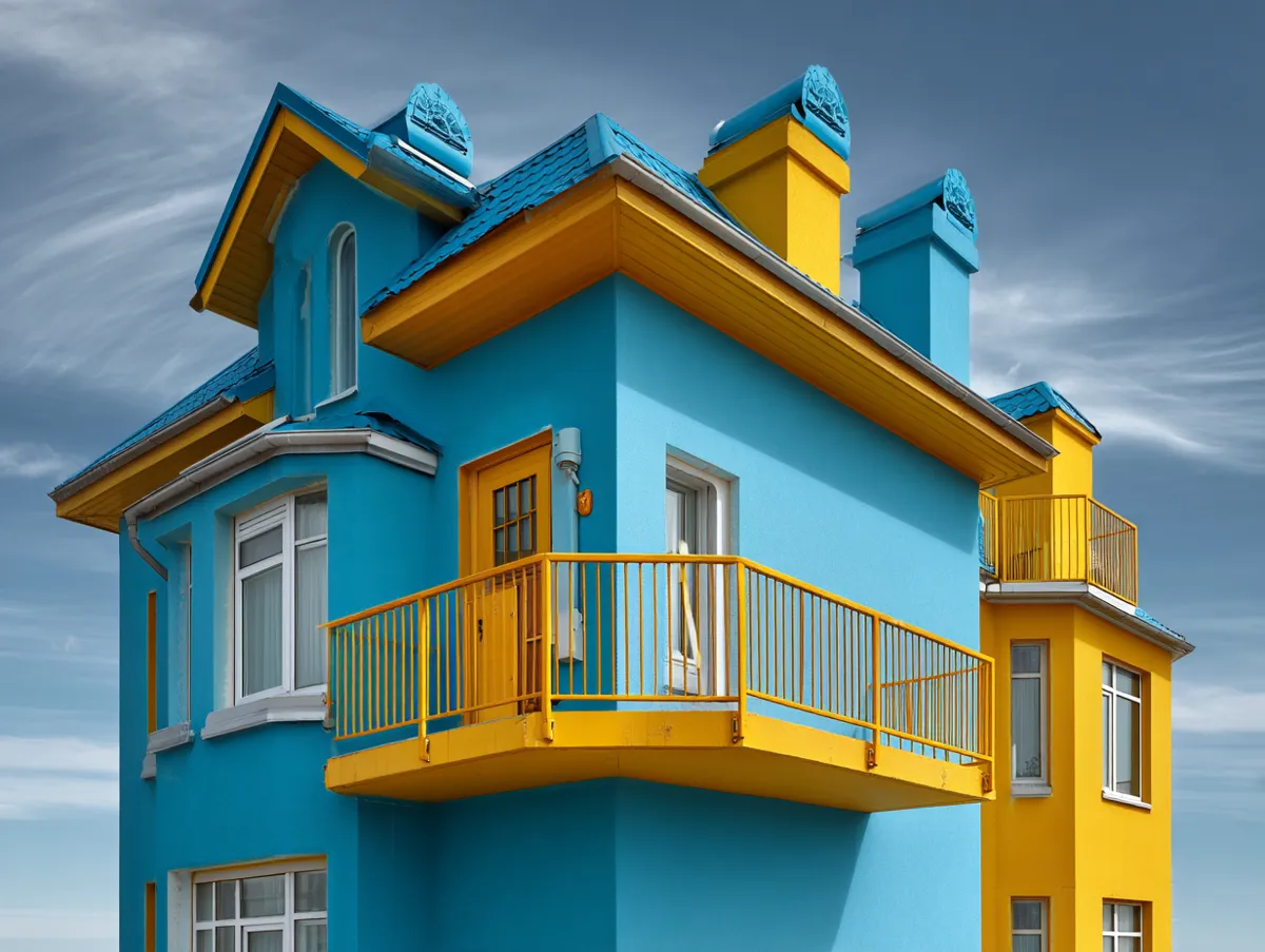
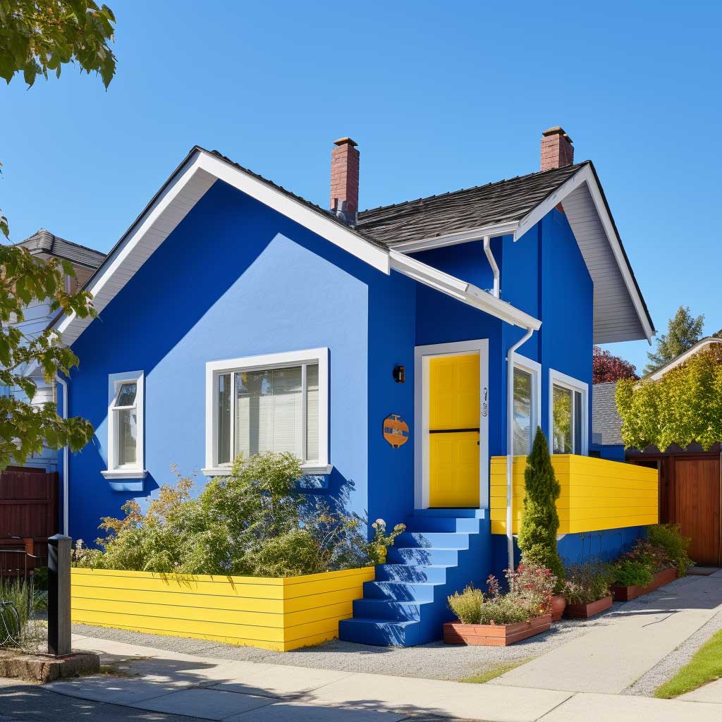
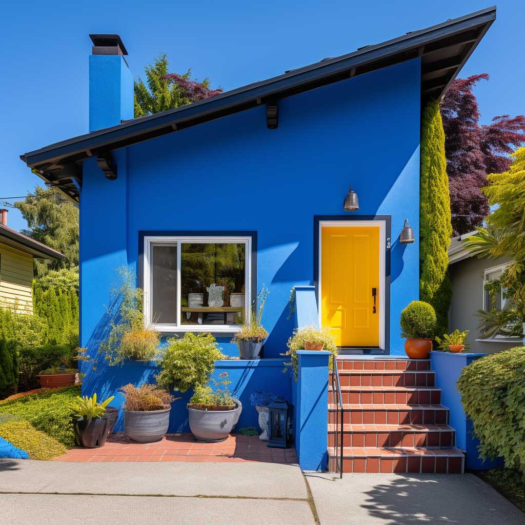
Blue and Yellow Exterior Walls — the Weight Ratio Nobody Mentions
Blue and yellow is a bold exterior paint colour combination that fails at least 60% of the time because people treat it as a 50/50 split. It isn’t. The rule is 80% blue body, 20% yellow on trim or accent surfaces — shutters, porch columns, front door. Flip that ratio and you have a house that looks like someone couldn’t decide between two colours and chose both. I’ve seen Victorian terrace homes in slate blue with buttery yellow window surrounds that look genuinely architectural. I’ve also seen bright cobalt walls with lemon-yellow trim that looked like a fast-food franchise. The shade temperature matters as much as the proportion.
Sherwin-Williams Indigo Batik SW 7602 paired with their Afternoon SW 6672 (a warm, muted yellow) runs about $55–$65 per gallon. That’s the safest version of this combination: a blue with enough grey in it to stay calm, and a yellow with enough beige in it to avoid screaming. Pure primaries — cobalt and lemon — are for front doors on otherwise neutral houses, not for two entire exterior surfaces fighting each other.
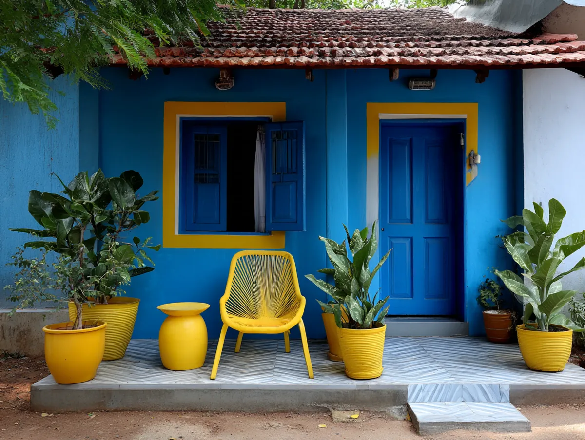
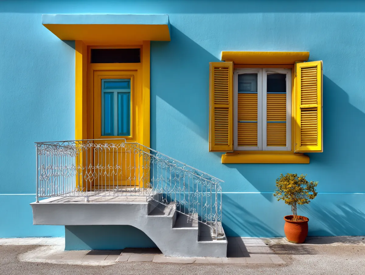
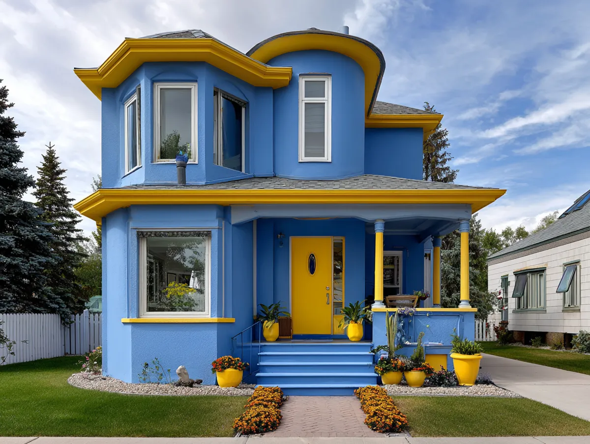
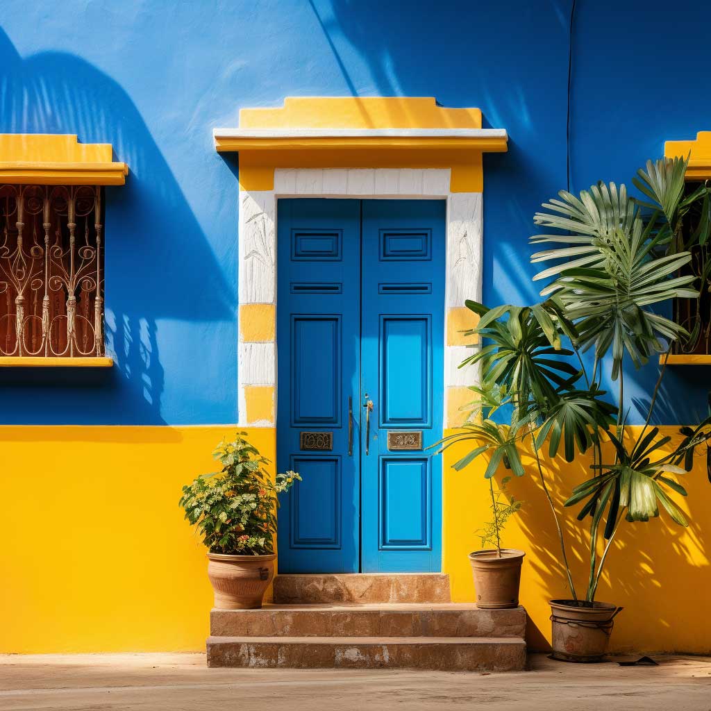
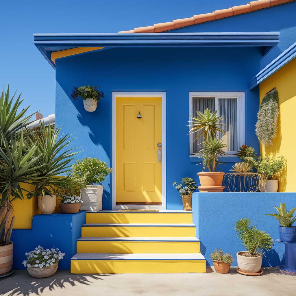
Victorian and Cottage architectural styles handle blue-yellow better than most because the ornate trim work gives the yellow somewhere to live without taking over the whole composition. Think of it like framing a painting — the yellow is the gilt frame, the blue is the canvas. Modern flat-facade builds struggle with this combination because there’s nowhere for the accent to anchor. If your house has no shutters, no porch columns, and no projecting window surrounds, blue and yellow will read as two competing body colours on a blank wall. In that case, use blue as the sole body colour and restrict yellow to the front door only.
Don’t Do This
Don’t use a high-gloss finish on blue exterior walls. Blue pigments contain phthalocyanine, which UV-degrades faster than most other pigment families. Gloss accelerates that process — you’ll see fading in patches within two summers. Use satin or eggshell on blue siding and save the gloss for yellow trim where it actually adds pop rather than just highlighting chalking paint.
Also: don’t skip a dedicated exterior primer on new render before applying blue. Blue covers poorly without primer and you’ll need a third coat, doubling your labour cost and adding two extra days of drying time.
Coastal homes near water get the most from this combination because the blue echoes the sky and sea horizon naturally — the house looks like it belongs rather than landed. Urban settings work too, but only if you accept that blue-yellow will attract attention. If your goal is kerb appeal without standing out, this is not your combination. If you want the house to be the one people photograph, this is exactly it.
For a broader look at how blue behaves across different exterior paint colour combinations on classically styled homes, this piece on green and blue exterior shades is worth reading alongside this section.
Green and Beige Exterior Colour — When the House Disappears Into the Landscape on Purpose
Green and beige is the exterior paint colour combination for homeowners who want the house to look as if it grew there. Not a passive choice — an intentional one. I own a property near a wooded boundary and the difference between the right sage green and a generic “nature” green from a discount hardware store is about $2,400 in repainting costs. Get this wrong and your house looks camouflaged in the worst way: dingy, tired, like the paint ran out. Get it right and the house reads as settled, permanent, expensive without being showy.
Benjamin Moore’s Saybrook Sage HC-114 with their Navajo White OC-95 trim is my go-to version of this combination. Saybrook Sage runs about $68 per gallon in Aura Exterior; Navajo White is $65. What you’re buying is a green with enough yellow in it to stay warm, and a beige with enough warmth to read as intentional rather than faded. That’s the failure mode for this palette: beige that looks like the original white that stopped being white. If your trim beige doesn’t have a positive yellow or brown undertone, it will read as dirty white, not warm beige.
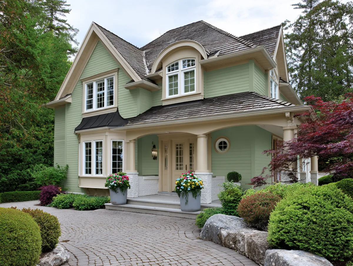
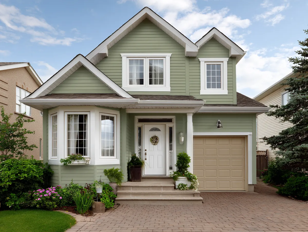


Craftsman and Ranch architectural styles are where green-beige hits hardest because the natural material palette — stone plinths, exposed rafter tails, wood porch posts — already speaks the same language. The paint is reinforcing what’s already there, not fighting it. Georgian or contemporary minimalist homes don’t respond as well. The combination reads as too soft against symmetrical classical mouldings, and against a flat modern facade it disappears entirely — which sounds good until you realise your house has no visible personality from the kerb.
The olive green mistake: dark olive with a grey undertone looks rich in a showroom and military-drab on stucco or fibre cement. I stole this observation from a colour consultant who repainted the same house twice to fix it. The grey undertone in olive pulls out the grey in the cladding substrate, and the whole facade goes cold and institutional. Stay on the warm, yellow-green side of the spectrum — Sherwin-Williams Privilege Green SW 6193 is the reliable fallback at around $58 per gallon. Matte finish on green is almost always the right call; it reads as intentional, grounded, and it doesn’t show roller marks in raking afternoon light the way satin does.
For a deeper look at how forest green behaves next to stone-grey materials, this article on forest green and stone grey exterior combinations covers exactly that interaction with real examples.
| Combination | Best Arch Style | Finish (Body) | Approx. Cost/Gal | Main Risk |
|---|---|---|---|---|
| Grey + White | Georgian, Colonial, Contemporary | Satin (never gloss) | $65–$70 | Cool undertone goes purple on north face |
| Blue + Yellow | Victorian, Cottage | Satin or Eggshell (never gloss) | $55–$65 | Wrong weight ratio makes it look busy |
| Green + Beige | Craftsman, Ranch | Matte (body), Satin (trim) | $58–$68 | Grey-undertone olive reads institutional |
Final Word
Exterior paint colour combinations reward specificity. Vague shade names and discount-aisle paint produce vague, disappointing results.
Choose a specific Benjamin Moore or Sherwin-Williams shade code, test a 600mm square on your actual facade for three days across different lighting conditions, and buy the right finish for each surface. That process costs about $40 in test pots and saves you $3,000 in repainting.
The three combinations here — grey-white, blue-yellow, green-beige — cover most residential scenarios. None of them require a designer. They require a decision.
Save this post before you buy a single can.
Related Topics