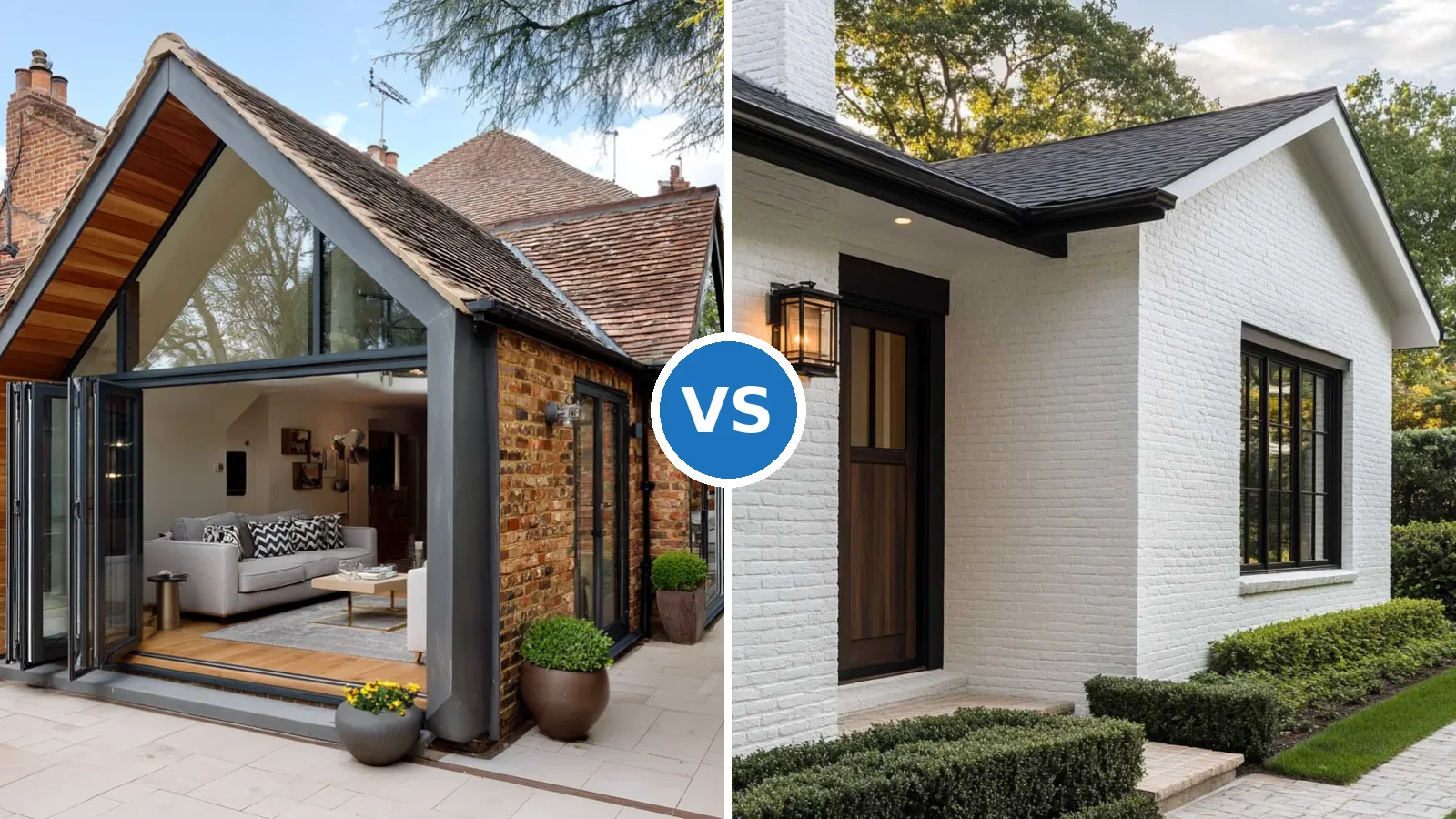
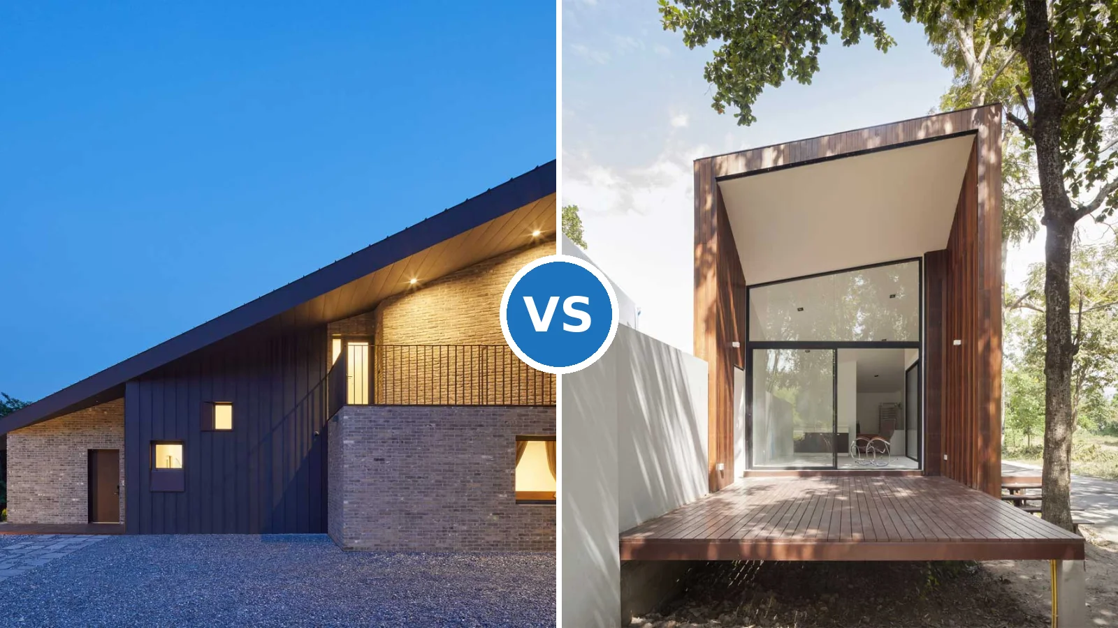
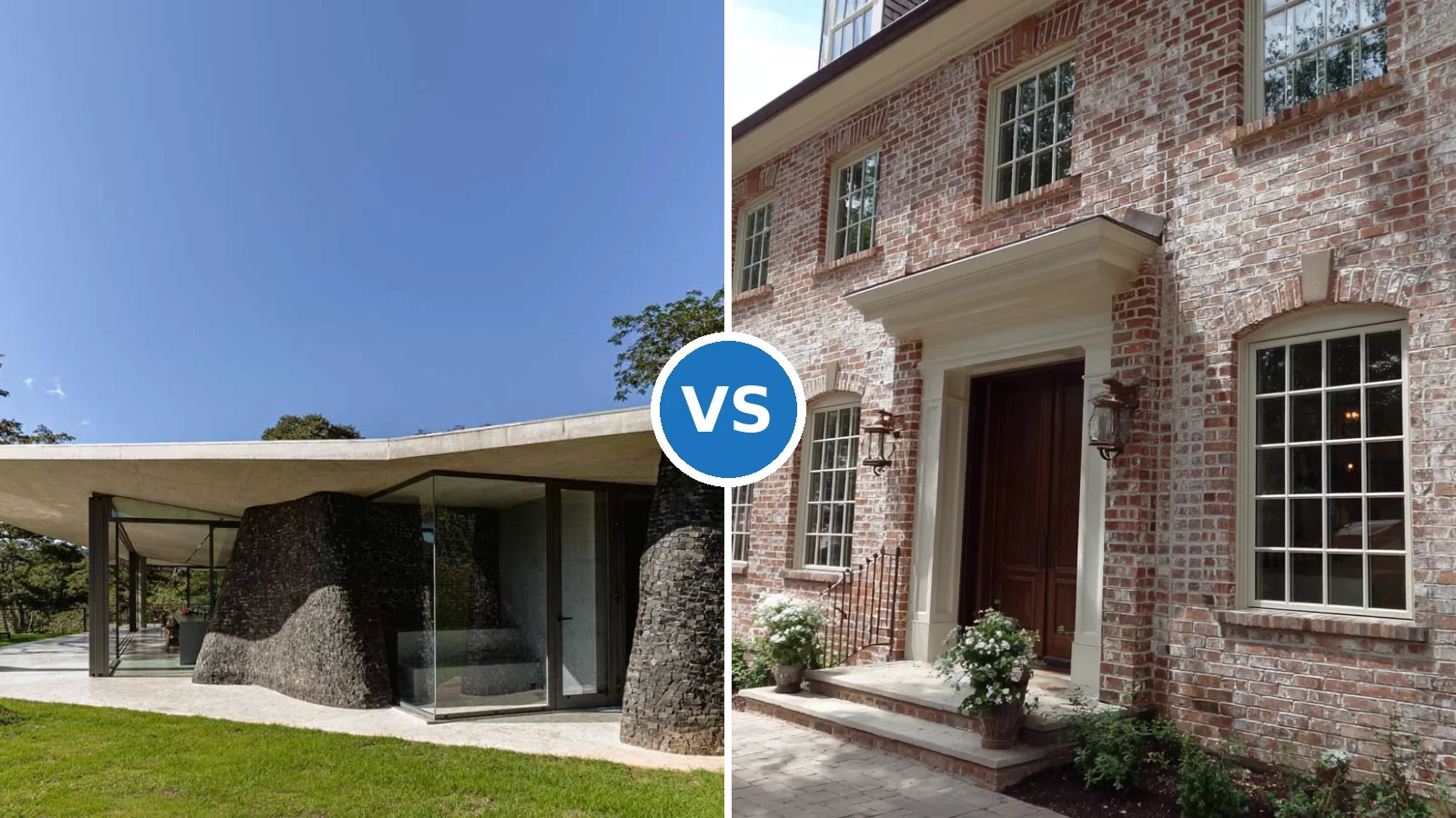
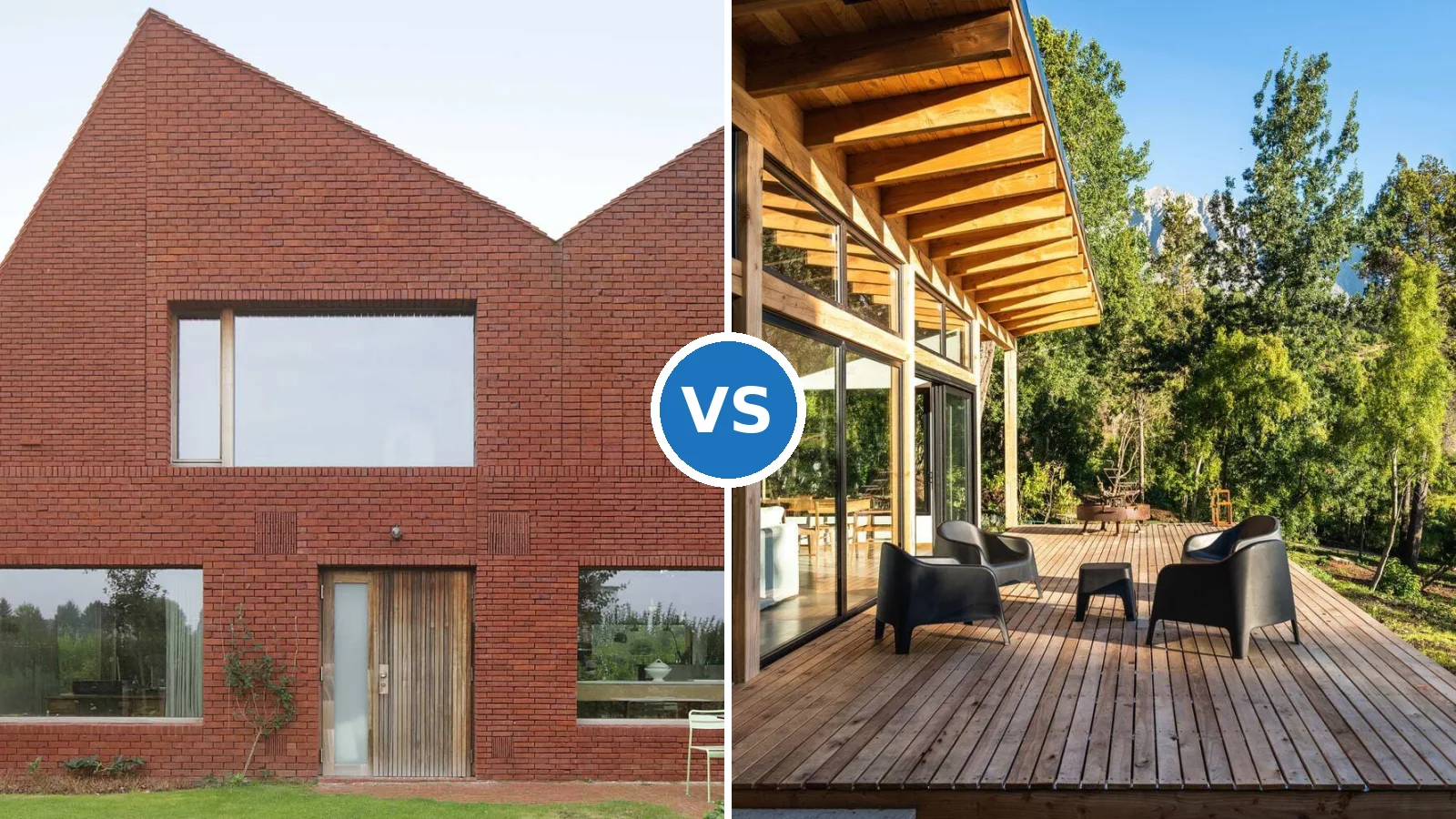
The white and maroon combination for house fronts has been quietly winning over the neutrals-only crowd — and once you see it on a real facade, you’ll understand why. Deep maroon paired with crisp white trim creates the kind of contrast that reads confident from the street rather than cautious. This isn’t a trend borrowed from Instagram; it’s a pairing rooted in classical European architecture that scales from a compact bungalow to a sprawling colonial.
The challenge most homeowners face isn’t the colour itself — it’s getting the balance right. Maroon as the dominant body colour can feel heavy if the white isn’t distributed strategically across trim, window frames, and entry details. Too little white and the facade closes in. Too much and the maroon loses its authority. The sections below break down four colour combinations that front this pairing alongside complementary options, so you can choose with confidence rather than guesswork.
Sherwin-Williams confirms that exterior paint lasts between 7 and 10 years depending on paint quality and climate — which means whatever colour combination you choose, you’re living with it for a decade. That’s reason enough to get it right the first time.
– White and maroon combination is strongest when maroon covers 60–70% of the facade and white handles trim, window frames, and entry columns.
– Aqua with grey reads modern and urban — best for homes with clean architectural lines.
– Golden yellow with black is high-contrast and dramatic; one wrong shade tips into theatrical.
– Deep purple with silver grey signals regal presence but fades faster than most exterior colours — budget for repainting every 4–6 years.
– A gallon of quality exterior paint covers 350–400 sq ft and lasts 7–10 years. Don’t cut costs here.
Aqua and Grey — Where Modern Architecture Gets Its Nerve


Aqua and neutral grey on a house front does something unexpected: it makes urban settings feel coastal without pretending to be something they’re not. The aqua — that blue-green that sits between sky and sea on the colour wheel — adds energy to a facade without demanding attention the way a saturated primary does. Pair it with a mid-tone grey and the result is sophisticated rather than playful. Benjamin Moore’s Aegean Teal, named Colour of the Year in 2021, holds up particularly well on exteriors because its grey undertone keeps it grounded in changing light.
The mechanic worth understanding here is contrast management. Aqua has a naturally high chroma — it reads bright even in shade. Grey absorbs that intensity without neutralising it. Think of grey as the volume knob. A cooler grey (think silver-toned) sharpens the aqua; a warmer greige softens it into something more relaxed. Does your front receive direct afternoon sun? Stylists recommend going one shade lighter on the aqua than you think you need — saturated hues on south-facing walls read two shades darker by 3 PM than they do on the paint chip.
One gallon of premium exterior paint covers 350–400 square feet per coat, according to Sherwin-Williams. A typical single-storey facade needs 10–15 gallons for two coats, which puts the material cost for a quality product like SW Duration (around $70 per gallon) at roughly $700–$1,050 before labour. The anti-advice here: don’t apply aqua to more than 60% of the facade. Cover the body in aqua, keep the grey to trim, eaves, and architectural bands — flip that ratio and the facade reads like a hospital rather than a home.
For more exterior pairings that hold their ground beyond a season, see these house exterior paint colour combinations that cover four tested schemes with real failure points included.
Golden Yellow with Black — Contrast That Earns Its Drama


Golden yellow paired with midnight black on the front of a house works exactly like a tailored suit in a bold fabric — the cut has to be impeccable or the whole thing falls apart. The warmth of golden yellow draws the eye immediately; black trim gives it structure and stops it from reading as cheerful rather than architectural. What’s the right shade of yellow? Stylists recommend staying in the amber-gold range rather than going lemon or mustard. Benjamin Moore’s Hawthorne Yellow (HC-4) is a reliable starting point — it has enough ochre to keep it warm and enough depth to avoid looking like a sunflower.
Black on exterior trim is doing more functional work than most homeowners realise. It defines rooflines, sharpens window reveals, and gives the garage door a visual anchor. The trick here is sheen: semi-gloss black trim on a flat yellow body creates a hierarchy the eye reads as intentional. Without that contrast in finish, both colours compete on the same visual plane and the facade reads flat. Premium exterior paints like Benjamin Moore Aura Exterior run around $80 per gallon and hold colour significantly better under UV than budget lines — relevant when black is involved, since faded black goes grey faster than almost any other colour.
What doesn’t work: going full golden yellow on a facade without any white relief. Without at least a slim white band — under eaves, around windows, at the foundation line — the warmth of the yellow becomes oppressive up close. A home in the tropics can get away with it thanks to natural bleaching from sunlight, but in most temperate climates, full-saturation yellow reads aggressive rather than welcoming at street level. Keep white as a supporting note and let the black do the contrasting.
Don’t choose your colour from a phone screen or a gloss-printed brochure. Golden yellows, aquas, and maroons all shift dramatically between backlit digital displays and real exterior surfaces in natural light. Buy sample pots (around $8–$12 each at most paint retailers), paint 2×2 ft squares directly on the wall, and check them at 8 AM and 4 PM over two consecutive days. A colour that looks perfect at noon on a sunny day can read completely differently on an overcast morning — and overcast mornings are how most neighbours will see your house on the school run.
White and Maroon Combination House — What the Ratio Actually Looks Like


The white and maroon combination for a house front is among the most searched exterior pairings for a reason: it delivers classical gravitas without requiring period architecture to pull it off. Maroon — that deep red-brown with purple undertones — reads as heritage rather than aggressive. It’s the colour of Victorian estates, colonial shutters, and university buildings that have been standing for a century. On a modern home, it does something interesting: it ages the structure backwards, lending it a sense of permanence that new builds rarely carry.
The ratio question is where most homeowners go wrong. Designers recommend the 60-30-10 rule for this pairing: maroon covers about 60% of the visible facade surface, white handles 30% (trim, window surrounds, fascia boards, columns), and a third accent element — typically a darker shade of maroon or a charcoal — fills the remaining 10% on the front door or shutters. According to 360realtors.com, deep maroon is among the trending exterior colours for 2026, particularly for heritage-style and colonial homes where it pairs with gold or cream trims. The mistake is going 80% maroon: it reads dark at distance, especially on facades that don’t get direct morning sun.
What shade of white? This matters more than most colour guides admit. Bright white (pure titanium white) next to rich maroon creates a clinical edge — think pharmacy signage rather than heritage architecture. Creamy white or off-white with warm undertones softens that contrast into something more like old plaster and carved stone. Benjamin Moore White Dove (OC-17) is the reference point here. It sits warm enough to partner maroon without reading as cream, and it holds its tone well as exterior paint weathers over time. Avoid cool blue-whites next to maroon — they make the red undertones in the maroon look purple rather than deep red.
For homes considering the deeper purple direction on the exterior, purple exterior paint ideas covering lavender, plum and lilac on real houses — with trim guidance and shade-by-shade failure points — is worth reading before you commit to any dark jewel tone.
Deep Purple with Silver Grey — Regal Presence Without the Risk of Dated


Deep purple with silver grey on a house front operates like a statement piece in an otherwise restrained wardrobe — it carries the whole look from a single deliberate choice. The purple earns its authority when it has grey baked into it. A pure saturated purple (think violet) on an exterior reads theatrical; a purple with visible grey undertones reads regal. Benjamin Moore Black Raspberry (2072-20) is the reference shade for this — dark enough to command presence at street level, muted enough that it doesn’t look like a haunted house in overcast light.
Silver grey on trim and architectural bands does the balancing work. It shares purple’s cool undertone, so the two colours read as a family rather than a contrast — the overall effect is monochromatic depth rather than the stark opposition you get with white trim on purple. Does silver grey work on all architectural styles? Stylists recommend it specifically for flat-roof and contemporary builds where the sleekness of the grey underlines the geometry. On a Victorian with ornate gingerbread trim, silver grey softens too much; black or charcoal would hold the decorative detail better.
The maintenance reality: purple pigments degrade faster under UV than blues, greys, or neutral tones. Budget for repainting every 4–6 years rather than the standard 7–10-year cycle, particularly on south-facing and west-facing walls where UV load is highest. Using Benjamin Moore Aura Exterior (around $80 per gallon) instead of a mid-range product extends the repainting interval and holds colour depth significantly longer. According to Sherwin-Williams, their Emerald® Exterior Acrylic Latex can also extend paint lifespan — worth comparing if you’re pricing the project. The anti-advice: don’t choose a purple with visible pink undertones. On a swatch it reads fine; on a 2,000 sq ft exterior in afternoon light, pink creep makes the house look accidental rather than authoritative.
Exterior paint selection — including how long different finishes hold on south-facing walls and how to prep properly before any colour change — is covered in detail by Sherwin-Williams’ exterior painting guide, which walks through surface prep, temperature constraints, and coat timing.
| Combination | Best Architecture | Key Risk | Repaint Cycle |
|---|---|---|---|
| Aqua + Neutral Grey | Contemporary, urban, mid-century | Aqua reads too saturated on south walls at midday | 7–10 years |
| Golden Yellow + Black | Victorian, craftsman, colonial | Yellow becomes oppressive without white relief | 7–10 years |
| Maroon + Creamy White | Colonial, heritage, bungalow | Wrong white turns the maroon purple in cool light | 7–10 years |
| Deep Purple + Silver Grey | Modern, flat-roof, contemporary | Pink undertone creep in direct afternoon sun | 4–6 years |
Front of House Colour
Four Combinations. One Decision. Get the Ratio Right.
Maroon and white wins on heritage facades when maroon holds 60% and off-white handles the trim — never the reverse. Aqua with grey works hardest on clean contemporary lines where the grey acts as a volume control for the aqua’s chroma. Yellow and black demand attention and reward it; the trick is keeping white as a quiet third note rather than a lead. Purple with silver grey is the highest-stakes choice — beautiful when the undertone is purely cool, risky the moment pink creeps in at the swatch stage.
Premium exterior paint costs $70–$80 per gallon and covers 350–400 sq ft per coat. Budget lines cover the same area but start degrading colour noticeably in 3–4 years instead of 7–10. The cost difference on a typical repaint job is $300–$400 total — not the place to save money when you’re living with the result for a decade.
Save this post before your next trip to the paint aisle.
Related Topics