Living room wainscoting is one of the few wall treatments that changes how a room reads architecturally — not just how it looks in photos. I’ve installed four different styles across two houses and made expensive mistakes with each one. Dark panels that ate my natural light, vertical boards that made a wide room look like a bowling lane, mixed materials that clashed the moment I added a sofa. What I know now is that getting living room wainscoting right comes down to one decision made before you buy a single panel: where the color split lands on the wall and what it does to the proportions of the space.
The four styles below cover the full range of what actually works in a living room — from two-toned paneling that tricks the eye into seeing more height, to mixed-material designs that belong on the walls of a boutique hotel. Each section includes what to avoid and what to order first.
In this post:
- Two-toned wainscoting — the color-split formula that reads tallest
- Vertical panel wainscoting — what it actually does to room proportions
- Dark wainscoting — the contrast rules that keep it from going heavy
- Mixed material wainscoting — how to combine textures without chaos
- FAQ — height, cost, and color questions answered with numbers
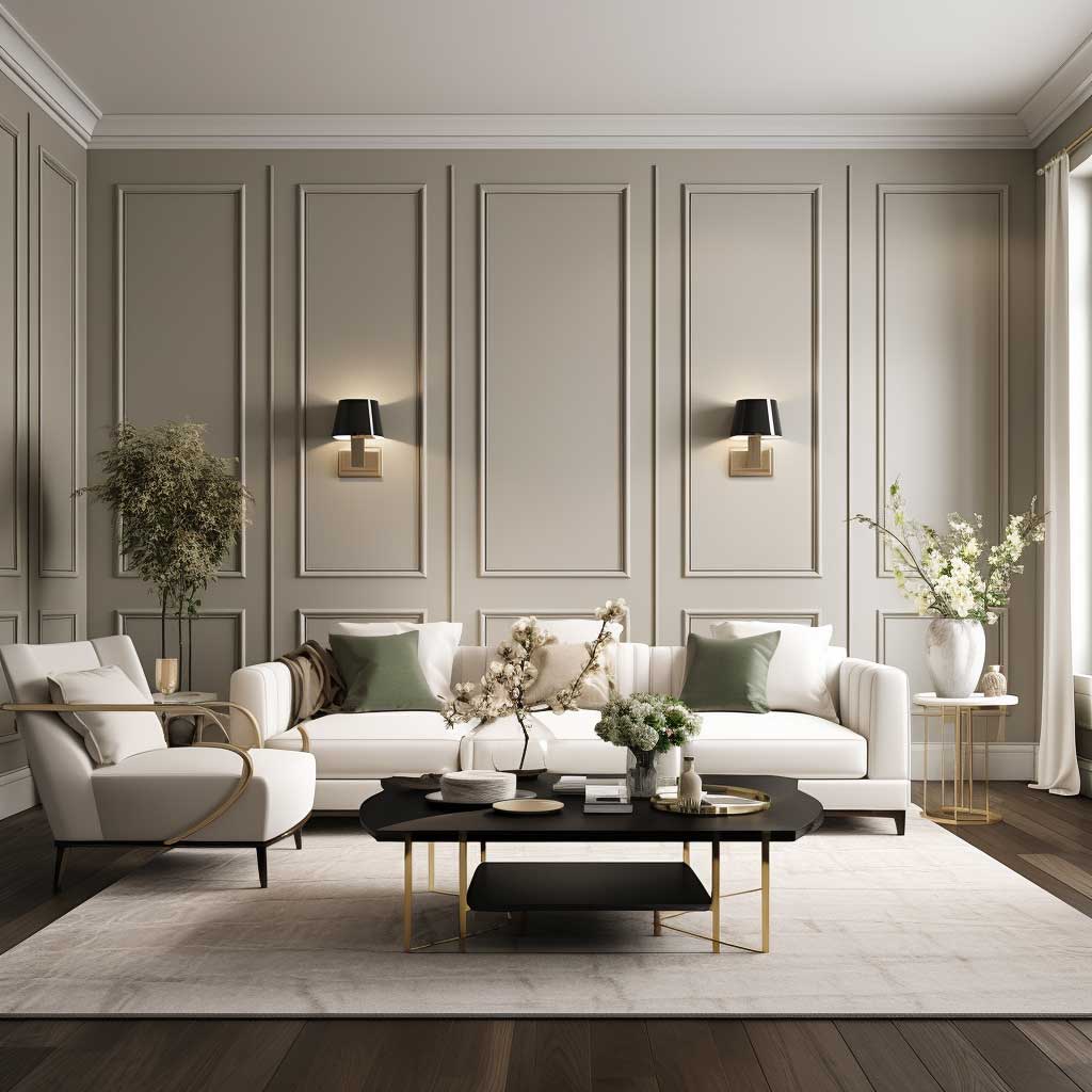
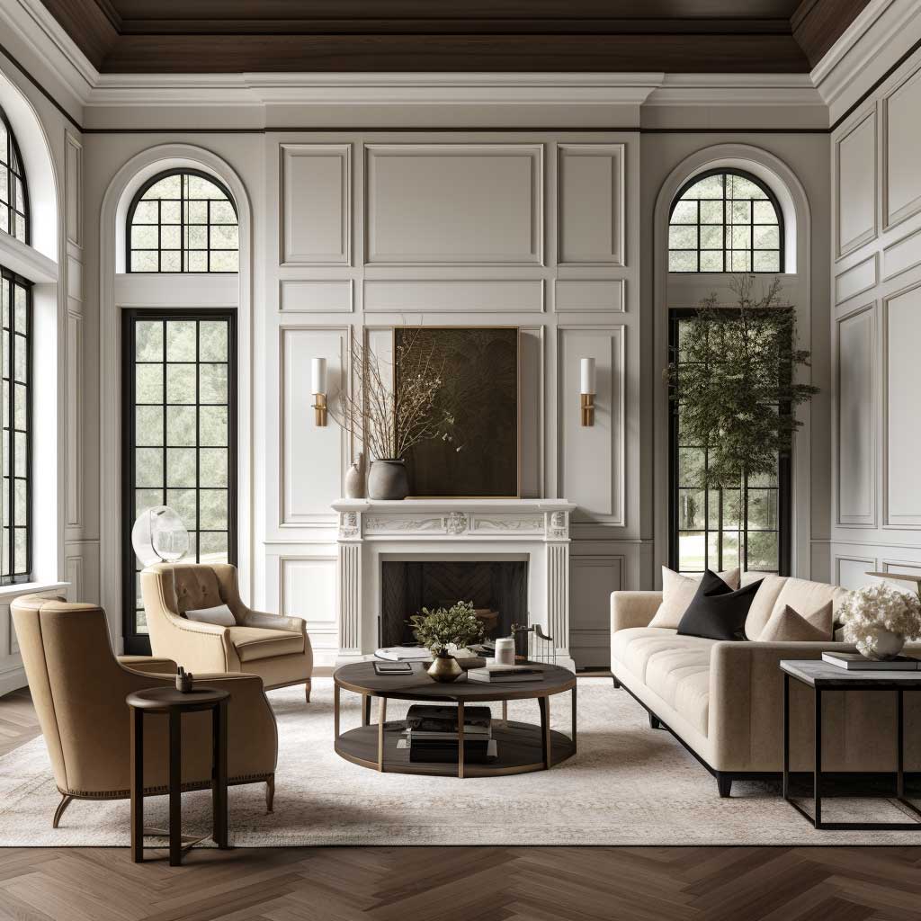
Two-Toned Wainscoting and the Color Split Formula
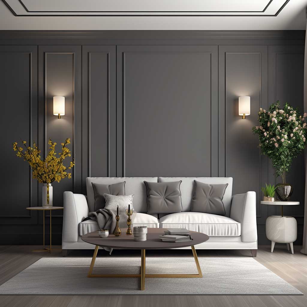
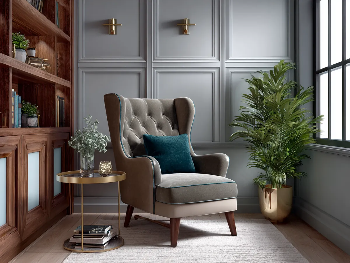
My go-to reference point for two-toned living room wainscoting is the chair rail rule: panels covering the bottom third of the wall read as grounded and formal, while anything above 40% of total wall height starts to feel heavy. I learned this the wrong way. I ran dark charcoal panels up to 54 inches in a room with 8-foot ceilings and the whole space felt like a basement by noon. Drop it to 36 inches, switch to a warm greige like Benjamin Moore Revere Pewter, and the same room opened up completely.
Two-toned living room wainscoting works because it hands the eye a visual floor line that anchors furniture without competing with it. You need the upper wall to be at least two shades lighter than the panel — three shades is safer. Sherwin-Williams Accessible Beige on the panels paired with Alabaster above is a combination I’ve seen hold up in every lighting condition, north-facing or south. The contrast does the lifting. Subtle tones that match too closely collapse into a single flat wall once the sun moves.
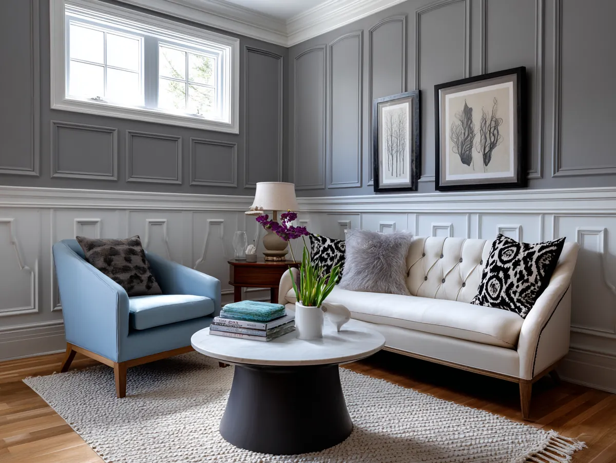
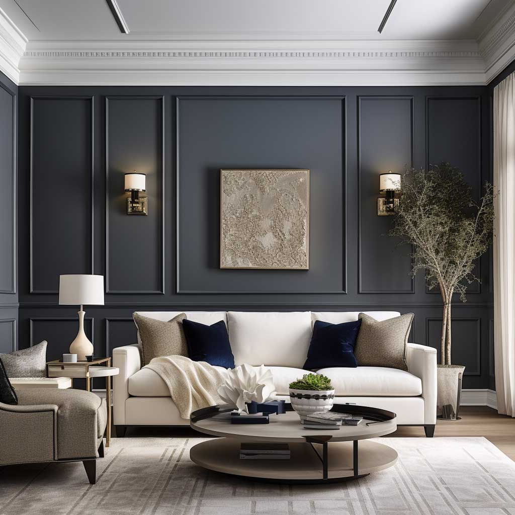
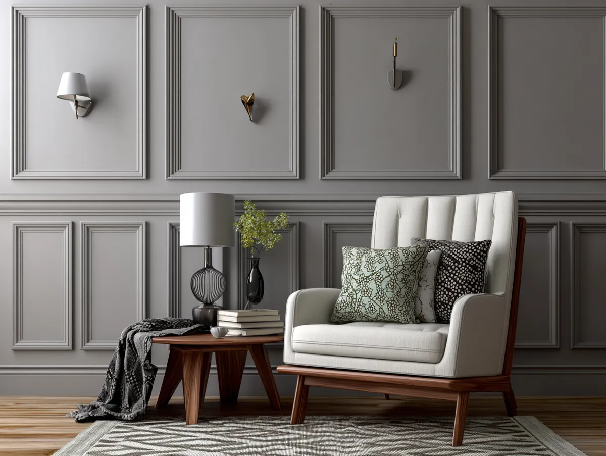
Beadboard is the panel type I reach for first in two-toned installations. The vertical grooves add genuine texture without competing with the color contrast — it’s doing two jobs at once. Picture frame wainscoting is the upgrade move for formal living rooms: you get geometric depth on the panel face, which makes the color split feel intentional rather than accidental. Avoid flat MDF panels with two-toned schemes. Without texture, the lower panel just looks like you ran out of paint. I’ve seen it. It’s not the look anyone was going for.
For a room under 200 square feet, budget $800–$1,200 installed for a standard beadboard run using pre-primed MDF from a lumber yard. If you want solid wood — poplar is the value choice at roughly $3–$5 per linear foot — add another $400 to that estimate. The color is free. The chair rail cap is not: Metrie’s Colonial cap rail runs about $1.80 per linear foot, and you’ll need it to finish the top edge cleanly. Skip the cap and the whole installation reads unfinished, regardless of how good the paint color is. See more wainscoting styles for every room in this roundup.
Vertical Panel Wainscoting Changes Room Height Without Moving a Ceiling
Vertical panel wainscoting in a living room is the closest thing to a structural illusion you can achieve with paint and wood. The upright lines pull the eye from baseboard to ceiling in one uninterrupted sweep, and in a room with 8-foot ceilings, that single trick can make the space feel like it has 9. I stole this approach from a designer friend who used 1×4 poplar boards on 12-inch centers — the spacing matters more than people realize. Too wide and you get a ranch house vibe. Too narrow and the wall looks like a crate.
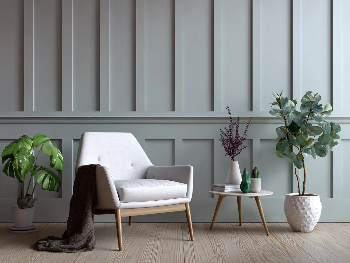
The finish color on vertical panels needs to stay within one shade family as the ceiling. Paint the panels a mid-tone and leave the ceiling bright white and you’ll kill the height effect — the eye sees the contrast as a stopping point, not a continuation. Match them closely and the vertical line reads uninterrupted all the way up. You’ll notice the difference in every photo you take of the room. It’s not subtle.
What doesn’t work with vertical paneling: wide rooms. A living room wider than it is long gets even wider-looking with vertical lines. Board and batten on a 20-foot-wide wall in a low-ceiling space looks like a highway horizon. If your room is wider than tall, go with horizontal paneling or the picture frame style — both interrupt the horizontal emphasis instead of reinforcing it. Ask yourself the proportion question before you order anything.
In a minimalist living room, vertical panels painted in Farrow & Ball Elephant’s Breath or Benjamin Moore Collingwood hit a sophistication level that almost no other single-material treatment reaches. You don’t need crown molding, a fireplace surround, or a statement light fixture to make the room feel finished. The panels do the architectural lifting on their own. Add one linen sofa and a floor lamp and you’re done. Panel painting techniques that make any style of wainscoting land better are covered here.
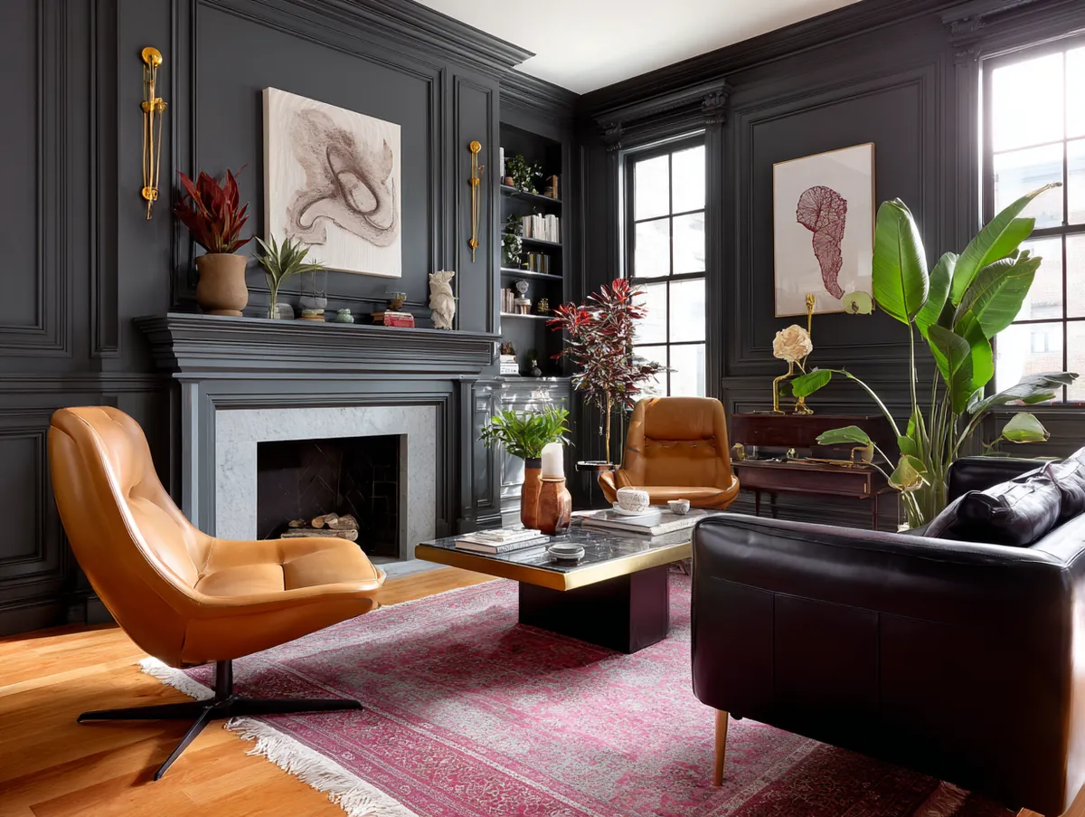
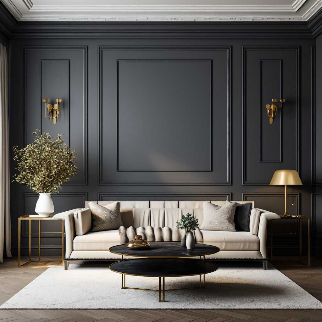
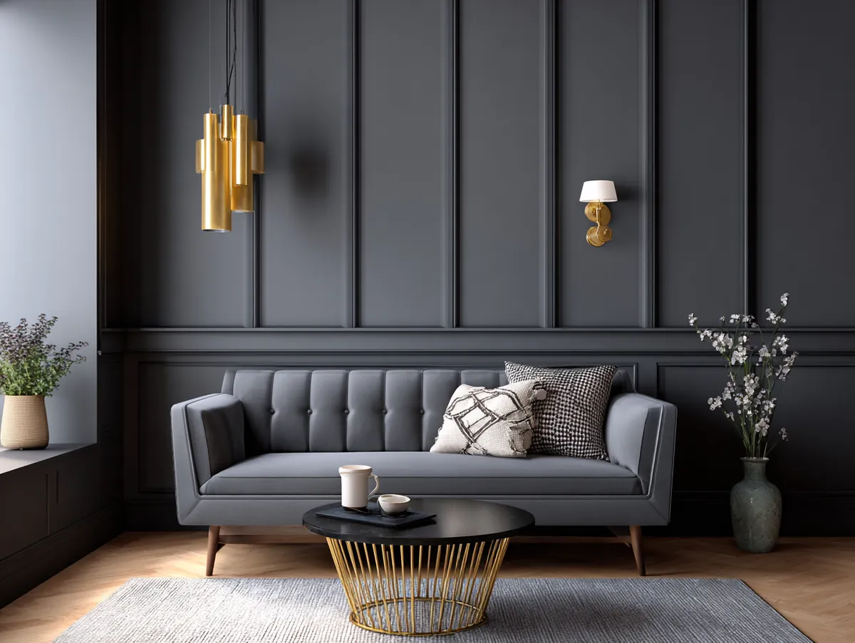
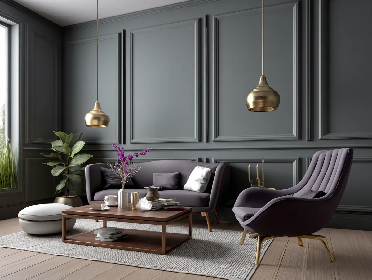
Dark Wainscoting in a Living Room Works Until the Lighting Doesn’t
Dark wainscoting in the living room is the design choice that photographs beautifully in every single Pinterest pin and then disappoints in every north-facing room with one ceiling light. I own this mistake personally. I painted a board-and-batten accent wall in Benjamin Moore Black Beauty in a room with one east-facing window and zero recessed lighting. By 3 p.m. in winter, the room felt like the inside of a cabinet. The fix cost $400 in LED recessed cans. The lesson cost more.
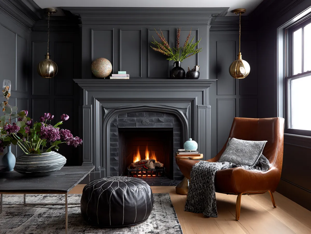
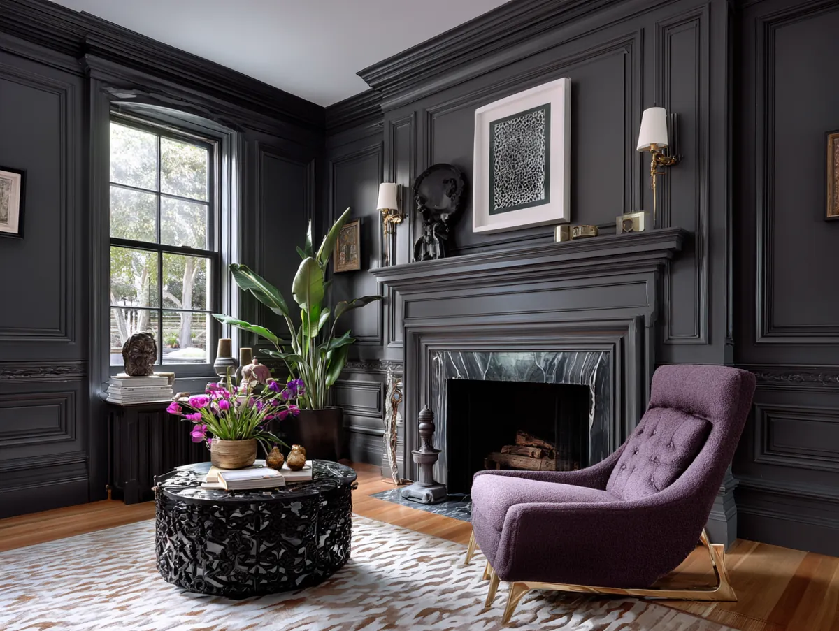


Dark wainscoting done right needs three things working together: a light upper wall (minimum LRV of 75), furniture in warm neutrals or cream, and at least two independent light sources below the chair rail line. The darkness on the lower wall becomes intentional and cozy rather than just dark. Farrow & Ball Hague Blue at $120 per gallon is the aspirational choice — deep navy with enough green undertone to read richly rather than coldly. For a $40 alternative, Behr Blueprint in an eggshell finish lands within one shade family and survives a side-by-side comparison in most living rooms.
Dark wainscoting is a commitment in a way that light paneling isn’t. Repainting from black to white takes three coats of primer and two of finish — I’ve done it and I wouldn’t recommend it as a casual weekend project. Choose the dark color only after you’ve sat in the room at every hour of the day and decided you can live with low light in the lower half of the space. If that gives you pause, go one step lighter than your instinct. Hague Blue becomes Inchyra Blue. Black Beauty becomes Wrought Iron. The drama stays. The regret doesn’t.
Don’t Do This with Dark Wainscoting
Don’t choose a dark wainscoting color based on how it looks on a paint chip under fluorescent store lighting. That’s how you end up with panels that read purple instead of navy in your actual living room. Buy a quart, paint a 12×12-inch board, and hold it against your wall at 9 a.m., 2 p.m., and 7 p.m. with your usual lights on. That’s the only test that matters. Also: don’t match the dark panel color to your sofa. It collapses the room into a single tone and removes every visual anchor the contrast was supposed to create.
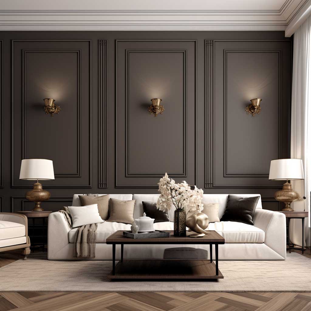
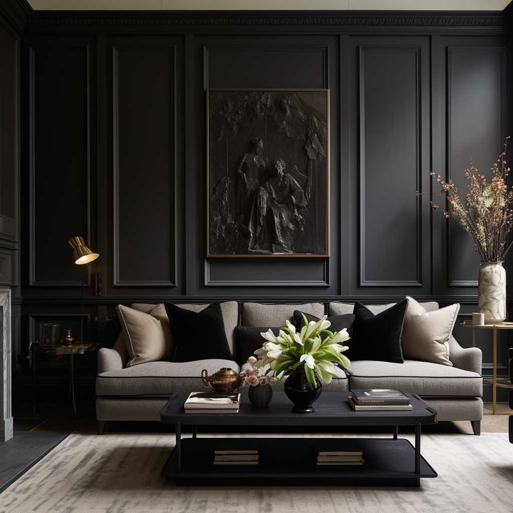
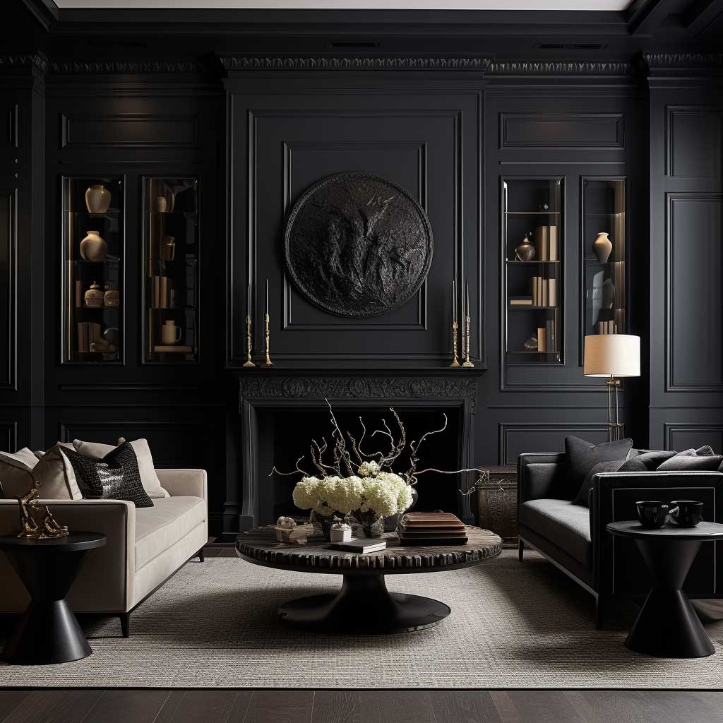
Mixed Material Wainscoting Fails Before It Starts Without a Finish Anchor
Mixed material wainscoting in a living room is the hardest of the four styles to execute well and the most spectacular when it lands. The failure mode is almost always the same: two materials that each look good individually but share no finish logic — a raw oak panel next to a brushed nickel metal insert next to a polished stone tile. You’ve got three different reflectivity levels, three temperature readings, and zero connection. It looks like a showroom floor rather than a design decision.

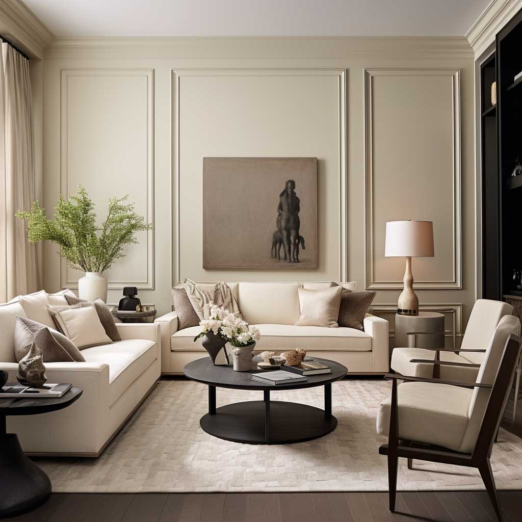
The combination that works most reliably is reclaimed wood panels framed by black steel flat bar. The matte surface of the wood and the semi-gloss steel share a temperature — both run warm or cool depending on the wood species — but differ in texture and reflectivity in a way that reads intentional. I’ve seen this done with 3/4-inch Douglas fir planks from a salvage yard at $2–$4 per board foot, framed with 1/8-inch flat bar from a metal supplier at about $1.50 per foot. The total material cost for a 12-foot feature wall comes in around $300–$500. Labor, if you hire it out, adds roughly $600–$900 depending on your market.
Glass insets paired with stone tile are the other combination worth considering if your room runs contemporary or hotel-adjacent in style. The glass panels (Oceanside Glasstile starts around $25 per square foot) inject light into what is otherwise a dense, textural surface — the stone absorbs and the glass reflects, which keeps the wall from feeling oppressive. What doesn’t work is combining three materials. Two materials, one dominant and one accent. That’s the rule. Every time someone has shown me a three-material wainscoting installation, at least one element was fighting the others. Keep it binary. If you’re weighing material options for living room wall treatments, this breakdown of panel types is worth reading first.
The harmony question in mixed material wainscoting isn’t about matching colors — it’s about matching finish logic. Matte with matte works. Gloss with gloss works. Matte with gloss works only if the glossy element is the minority by surface area. Flip that ratio and the room starts to look like a kitchen backsplash rather than a living room wall. You’ll notice it immediately when the furniture goes in. By then, fixing it means starting over.
Wainscoting Material Comparison
| Style | Best Room Type | Material Cost (per sq ft) | DIY Difficulty |
|---|---|---|---|
| Two-toned beadboard | Any size, any orientation | $2–$6 | Low |
| Vertical panel | Taller than wide rooms | $3–$8 | Medium |
| Dark contrast | South/west facing, well-lit | $2–$6 + lighting | Low (paint), Medium (boards) |
| Mixed material | Feature wall, contemporary rooms | $5–$30+ | High |
The Bottom Line
Living Room Wainscoting Earns Its Keep When the Color Logic Is Correct
Every style covered here — two-toned, vertical, dark, mixed material — succeeds or fails at the same decision point: the relationship between panel color, upper wall color, and lighting. Get that relationship right and the room reads intentional from the first photograph. Get it wrong and no amount of expensive material or skilled installation recovers it.
Before you commit to any of these four approaches, paint sample boards and test them in your actual room at three different times of day. The living room you have — its light, its proportions, its orientation — tells you which wainscoting style belongs there. Trust that over any trend.
Save this post before you start shopping for panels. You’ll want to come back to the material costs and color pairings when you’re standing in the lumber aisle.
Related Topics