Modern hallway panelling ideas live or die on proportion — get the panel height wrong and the whole corridor reads like a DIY weekend gone sideways. I’ve seen this mistake in person more times than I’d like to admit, including in my own first attempt. The space between floor and your dado line is where modern panelled hallway character actually lives, and understanding that single variable will change every decision you make after it. Whether you’re working with a narrow Victorian corridor or a wide open-plan entry, the material and finish choices below apply directly.
You’ll notice most inspiration images lean heavily on painted MDF boards in matte white or off-white. That’s not a coincidence — it photographs cleanly, it costs around $1.09 per sq ft at Home Depot for a basic composite panel, and it holds paint without warping in low-humidity interior corridors. What the photos don’t tell you is how much the lighting and ceiling height are doing to carry those images. A flat, overhead-lit hallway with the same panels will read completely differently.
Quick Scan
- Monochrome panels — single-colour palette, maximum contrast from light; works best above 2.7m ceilings
- Subtle wood accents — oak or walnut veneer strips paired with painted MDF; budget $6–$13/sq ft for acoustic wood slat panels
- Clean lines, neutral tones — white or warm greige MDF mouldings; Shaker grid or simple rectangle frames
- Vertical panels — elongates the corridor visually; board-and-batten in pine or MDF, $2–$4/linear ft
- Contrasting textures — matte panel next to gloss lacquer strip; no extra cost if you plan finish zones before painting
- Soft-toned panels — Farrow & Ball Elephant’s Breath or Dulux Perfectly Taupe over primed MDF
- Hidden storage panels — push-latch flush doors; adds $300–$800 per unit for cabinetmaker joinery
- Reflective surfaces — mirrored panel inserts or gloss lacquer; multiplies perceived width in corridors under 90cm
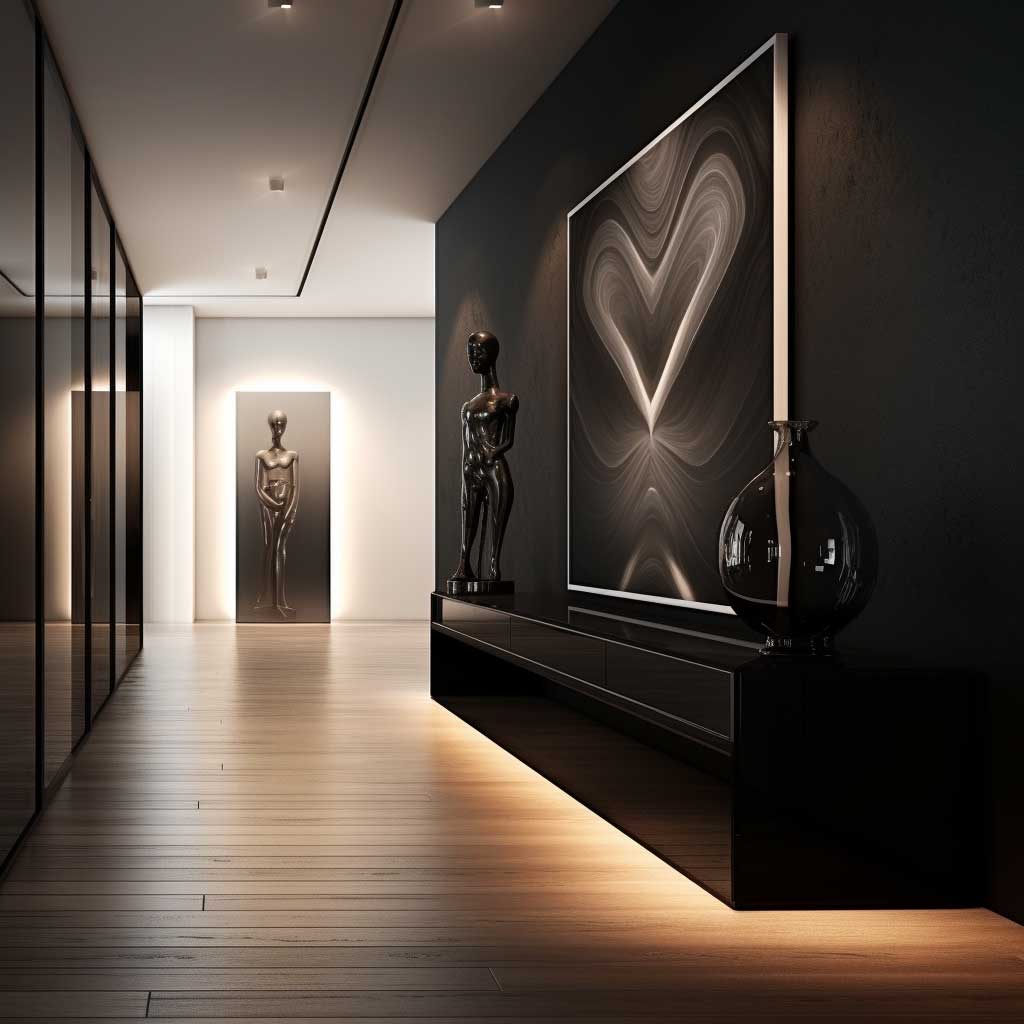
Monochrome Panels Earn Their Drama From Shadow, Not Paint Colour

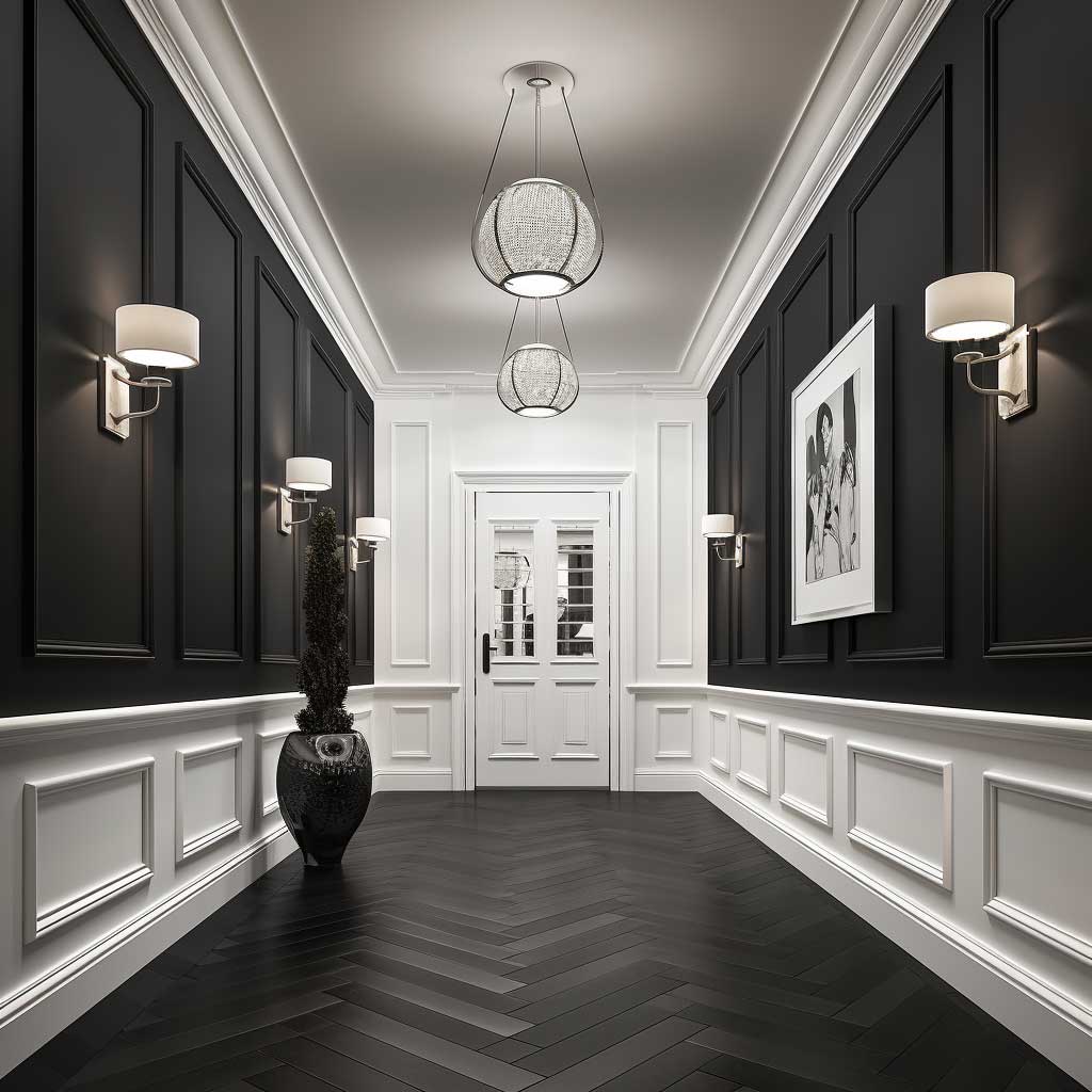

Monochrome doesn’t mean boring. It means you’ve removed colour as a variable and forced every other element — texture, shadow, panel depth — to do actual work. My go-to approach for a modern panelled hallway is to paint both the panels and the wall behind the moulding frames in the same colour, so what you read is pure shadow line, not a colour block. That shadow, even at 3mm depth, changes the entire visual weight of the corridor. Farrow & Ball All White over primed MDF mouldings gives you this for around $120 in paint for an average 4-metre hallway run.
Stick to one base colour. The mistake I see constantly is people introducing a contrasting trim or skirting colour, thinking it adds interest. It adds noise. Your eye should travel the length of the hall uninterrupted, not snag on a cream skirting against a grey panel. Keep it all the same paint code. You’ll notice the difference in photographs immediately — single-colour panels render without competing focal points.
What genuinely doesn’t work in a monochrome hallway: glossy tiles on the floor fighting with matte panels on the wall. I tried this pairing once and the reflections from the tiles made the matte panels look dirty and uneven. Matte floor, matte panel, single source of gloss — either the light fitting or one accent mirror — is the formula that holds. Keep the light fitting visible from the front door so the reflection anchors the end of the corridor.
Lighter shades genuinely do open narrow corridors, but the cutoff is around 1.2 metres width. Below that, I’d argue a warm off-white like Dulux Natural Hessian reads better than pure white — pure white flattens under artificial light and makes the panels disappear. Above 1.5m width, you can go darker and the drama pays off. That’s the corridor width where charcoal or deep navy panels start to look considered rather than claustrophobic.
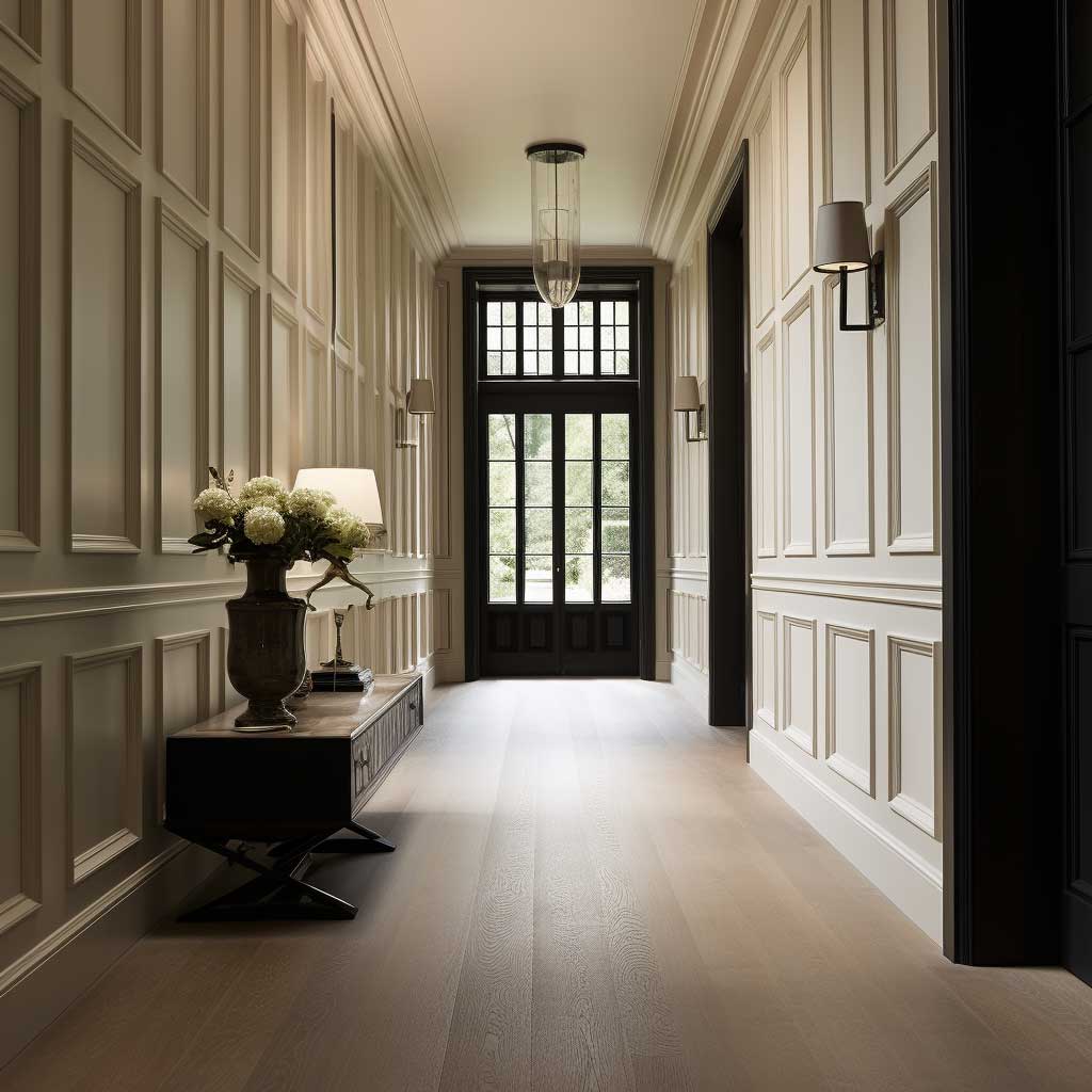
Wood Strips Work Until They Touch the Wrong Material


Wood slat acoustic panels from Art3d — the White Elm version runs $131 for 21 sq ft on Home Depot — give you a ready-made look that took interior designers years to develop from scratch. The slats are MDF backed with polyester, so they don’t warp the way solid timber does in corridors with front door draughts. I own two of these panels and they’ve held their shape for 18 months in a north-facing hallway that hits below 10°C in winter. That’s not a test most solid pine strips pass without splitting at the joints.
The material pairing question is where most people go wrong. Wood strips next to brushed brass fixtures: yes. Wood strips next to chrome: usually no — the cool metal temperature reads against the warm grain and makes both look cheap. Wood strips next to polished concrete floors: only if the concrete is sealed and warm-toned (cream or sand aggregate, not blue-grey). You’ll notice the ceiling matters too — a white plaster ceiling above dark walnut panels reads clean; a yellowed ceiling above the same panels reads dingy. Fix the ceiling first.
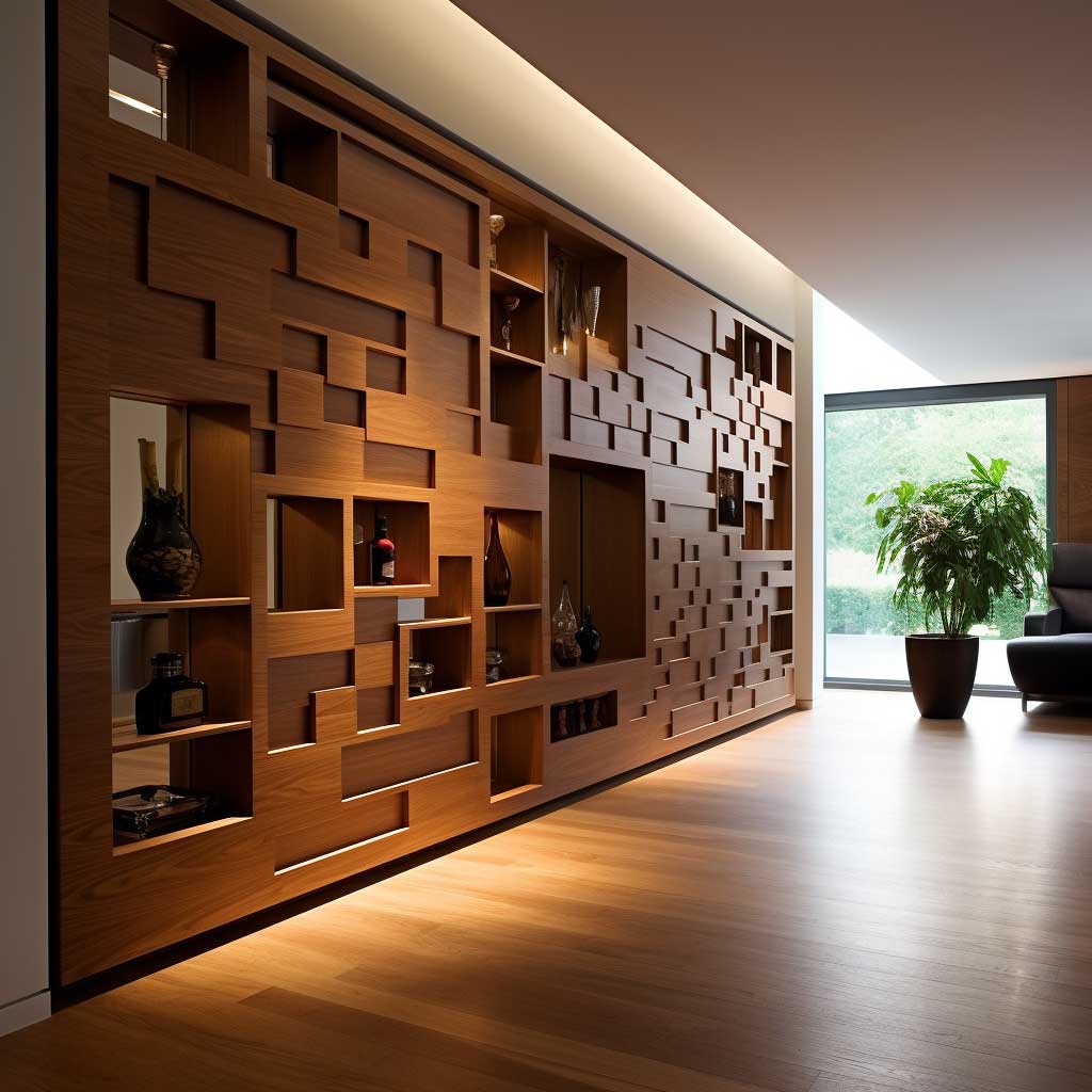
For a hallway panelling design that uses wood as accent rather than main material, the rule I stole from a joiner I worked with is this: wood should cover no more than 30% of the total wall panel area. At 40% and above, the corridor shifts from contemporary to traditionally rustic, which is a different brief entirely. Keep the remaining 70% in painted MDF and the wood reads as architectural detail rather than a cabin. For small hallway panelling ideas where space is tight, a single vertical timber column flanking the door frame achieves the same warmth with even less material.
Skip the mahogany stain. It dates a hallway faster than anything else I know — including carpet. Natural oak, pale ash, or white-oiled pine are the finishes that read contemporary in 2024. If you want dark wood, go for a very black ebonised finish rather than a mid-brown stain; mid-brown stains photograph muddy and age into something that looks like 1990s pub furniture within five years.
Don’t Do This
- Don’t mix wood tones — oak panels against a pine skirting board is the visual equivalent of wearing two different blacks. Pick one wood species and finish for the whole corridor.
- Don’t panel all four walls in a narrow hallway. Two facing panel walls at under 1m corridor width create a tunnel effect that no amount of lighting fixes.
- Don’t install panels before fixing uneven plaster — moulding applied over a bowed wall telegraphs every dip. Skim coat first, full stop.
- Don’t use peel-and-stick wood veneer panels as a permanent solution. The adhesive fails at temperature swings, and the seams show within 12 months near an exterior door.
Neutral Shaker Grid Panels and the One Colour That Ruins Them


Shaker-style rectangle moulding panels are the safest hallway panelling choice for a reason — they sit on the line between classical and contemporary without committing to either, which means they age well and photograph reliably. The grid version, where panels are laid in a regular matrix from floor to dado, is the format I’d recommend first. It’s forgiving if your walls aren’t perfectly plumb, because the grid obscures minor inconsistencies. You can buy pre-cut MDF moulding kits from most timber merchants for £80–120 ($100–150) for an average hallway length, which undercuts any decorator’s materials quote significantly.
The colour that ruins a neutral Shaker hallway is warm yellow — specifically anything with a golden or buttery undertone applied over cool white panels. You’ll notice it immediately in evening light: the yellow ceiling or door reads as stained, not intentional. If you want warmth, go greige. Dulux Perfectly Taupe or Benjamin Moore Revere Pewter applied across panels and surrounding wall creates the serene, airy read that most people are after when they type “modern hallway ideas” into Pinterest at midnight.
The dado rail placement is where most DIY hallway panel projects go wrong geometrically. Standard advice puts the rail at one-third of ceiling height, but that’s a rule designed for 3-metre ceilings. In a typical UK or North American 2.4-metre ceiling, one-third height puts the rail so low it looks like wainscoting rather than a panelled corridor. I’d push it to 40% of ceiling height — around 96cm from floor — for a better visual balance. For entry hallway decor where the rail position anchors multiple design elements, getting this measurement right before you cut a single piece of MDF matters more than any paint choice.
One thing a neutral panel grid won’t do on its own: add any tactile interest. The panels are smooth, the paint is flat, and the result is a corridor that reads as finished but not interesting. A bolder wall paneling approach — adding a thin shadow gap between panels by routing a 2mm channel along the inner edge of each moulding frame — adds that tactile dimension without changing the overall clean aesthetic at all. It takes an extra 90 minutes with a router, and it’s the detail that makes a Shaker grid look custom-made rather than off-the-shelf.
Vertical Panels in Small Hallways Do One Job and It’s Not Decorative


Vertical panels are a spatial trick, not a decorative statement, and treating them as decorative is where the brief gets muddied. Their job is to pull the eye upward, which counteracts the tunnel compression that narrow corridors create. The moment you start thinking about which vertical panel “looks nice” and stop thinking about the ceiling-to-floor ratio of the strips, you lose the point. Board-and-batten in pine runs $2–$4 per linear foot for materials; a typical 4-metre hallway wall uses roughly 12–14 linear feet of vertical battens, so the material cost sits well under $60 before paint.
Strip spacing is the variable no one discusses in small hallway panelling ideas content. Too wide — battens more than 30cm apart — and the vertical rhythm breaks down; your eye reads individual strips rather than a continuous upward movement. Too narrow — under 10cm — and the wall starts to look like a radiator grille. The 15–20cm spacing range is where vertical panels perform their optical job correctly. I’ve measured this against several hallways and the 18cm gap is the one that consistently photographs as “architectural” rather than “DIY.”
Running vertical battens all the way to the ceiling — skirting board to cornice — is the version that works. Stopping them at dado height undermines the entire point: you need the eye to travel the full height of the wall to make a low ceiling read as higher. Stopping mid-wall just creates a banded effect that emphasises the ceiling rather than drawing attention away from it. Floor-to-ceiling vertical panels in a corridor with 2.4-metre ceilings will read as having 2.7-metre ceilings in photographs and in person. That’s a real perceptual gain worth the extra 60cm of batten material.
What genuinely doesn’t work: applying vertical battens horizontally to create a herringbone or chevron effect in a narrow hallway. I’ve seen this done on Instagram and it looks striking in a wide loft-style corridor, but in a standard residential hallway under 1.2 metres it compresses the space horizontally and creates claustrophobia. Diagonal lines in small corridors read as walls leaning inward. Stick to true verticals.
Matte Against Gloss — The Texture Pairing Most Corridors Get Backwards


Contrasting textures in a modern panelled hallway work the same way seasoning works in cooking: the contrast amplifies both elements. A matte panel next to a gloss lacquer strip makes the matte look richer and the gloss look sharper than either would look on their own. The mistake most people make is putting the gloss on the large panel field and the matte on the trim, which is backwards — gloss on large surfaces in hallways picks up scuffs and fingerprints within weeks of installation, and the maintenance cost is real. Keep gloss confined to the narrow trim elements where it catches light without catching handprints.
Polished marble next to raw MDF is a pairing I’d avoid in a hallway. It reads expensive on paper and looks mismatched in person — the material temperature gap between stone and board composite is too wide for a narrow corridor to absorb. Polished marble belongs in bathrooms and large entrance foyers where it has space to breathe. In a standard residential hallway under 10 sq metres, pair textured materials within the same temperature family: raw plaster next to matte paint, or brushed oak next to honed limestone floor tile. Same temperature, different surfaces.
Wall panelling for hallways that incorporates texture zoning — different finishes in the upper and lower panel fields — is a technique borrowed from hospitality design. Hotels use it because the lower third of a corridor wall takes the most physical contact and needs a harder, more cleanable surface. Practical logic. You can apply the same thinking at home: ceramic tile lower panel to dado height, painted MDF moulding above. The tile runs $3–$8/sq ft for porcelain in a hallway-appropriate format; it handles bags, boots, and general contact without showing marks, and the MDF above it can stay in flat paint indefinitely. According to Real Homes, board-and-batten panelling “remains classic and timeless” in entryways regardless of how individual style trends cycle — texture zoning is how you extend that lifespan further.
One texture nobody talks about but should: fabric-insert panels. A stretched linen insert inside a painted MDF frame gives you acoustic dampening — corridors are echo chambers — plus a tactile softness that photographs warmly. Kvadrat’s Remix fabric in neutral colourways costs around $50–60 per metre and stretches cleanly over a 5mm plywood backer. I’ve used this in a home studio corridor and the acoustic difference alone justified the cost before anyone even looked at it.
Soft Colour Panels Fail When the Adjacent Door Colour Is Ignored


Soft-toned panels — dusty sage, blush, pale stone, warm greige — are the most forgiving colour choice in a hallway because they read as neutral in most lighting conditions while still giving the space a personality that white walls don’t. You’ll notice that all the most-shared hallway panelling images on Pinterest use colours in this range. Farrow & Ball Mizzle, Elephant’s Breath, and Purbeck Stone are the three I see most frequently, and there’s a reason: they have complex undertones that shift between warm and cool depending on the light, which means they almost always look intentional even in bad lighting conditions.
The failure mode for soft panels is ignoring the door colours flanking them. A dusty sage panel wall with white interior doors reads clean. The same dusty sage panel wall with cream doors in a slightly different white reads as a mistake — both colours compete to be the neutral, and neither wins. I’ve had this exact problem in a client’s hallway: the panels were Farrow & Ball Cromarty, the doors were Dulux White Mist, and the 5% warmth difference between them made both look dingy. Repainted the doors to match the panel trim colour. Fixed instantly.
Pastel blues and dusty pinks deserve a specific mention because they’re frequently chosen for their Pinterest appeal and then lived with uncomfortably for years. A pastel blue hallway panel looks serene in a south-facing corridor with warm afternoon light. In a north-facing hallway — the most common orientation for front corridors in terraced houses — the same blue reads cold and institutional after 6pm. Test your shortlisted colours in situ at three times: 9am, 1pm, and 7pm with artificial light on. The 7pm test is the one that saves you from a year of regret.
Soft tones also need confident skirting and door frame colours to hold the composition together. A common and avoidable error: painting the skirting the same soft tone as the panels. The skirting disappears into the panel and the whole corridor looks like it’s floating. Skirting should be 10–15% lighter or darker than the panel — in the same colour family, but with enough value contrast to define the floor plane. Think of it like the frame on a painting: without it, the canvas blurs into the wall. Pairing soft-toned panels with sleek metal hallway furniture in brushed brass or matte black anchors the palette without pulling the eye away from the panels themselves.
Hidden Storage Panels Cost Three Times More Than They Look


Hidden storage panels are the most photographed and least honestly priced idea in the modern hallway panelling category. What looks like a seamless wall with a coat cupboard behind it is, in reality, a joinery project that costs $300–$800 per unit for a cabinetmaker to build and fit, plus the panel facade on top. The push-latch mechanism alone — Sugatsune make the most reliable version, around $45–$80 per latch — needs to be specified and installed with enough clearance that the panel face doesn’t bow under repeated use. I’ve seen three of these installations fail within two years because the latch wasn’t rated for the panel weight.
The practical case for hidden storage panels is strongest in hallways where there’s no alternative storage and the corridor is wide enough to accommodate 300–400mm of depth without closing off the walking line. That depth threshold is non-negotiable for hanging coats. Shallower than 300mm and you’re storing bags and shoes only; the hangers hit the back panel and the coats wrinkle. Most hallways are under 1.5m wide, which means taking 400mm for storage leaves 1.1m of walking width — technically passable but not generous. Measure before you spec.
What this approach handles well that open shelving doesn’t: hallway clutter becomes invisible at a push. No coat hooks piled with three jackets, no shoes in a row by the front door, no umbrella stand. The visual result is a corridor that reads as architectural rather than domestic. For modern hallway ideas in apartment buildings or townhouses where the hall is the first thing visitors see, that read matters in a way it simply doesn’t in a house with a separate utility room. The functional tradeoff is accessibility — you need to remember where things are, and the push-latch mechanism slows you down by two seconds. Not a problem unless you’re the kind of household that grabs things at a sprint.
Skip the IKEA Pax-behind-a-panel shortcut if you want the seamless look. Pax units are 580mm deep and stand proud of a standard stud wall, which means the panel facade has to project into the hallway by at least 40–60mm. That projection is visible at an oblique angle from the front door, and it breaks the flush-wall illusion entirely. A proper hidden storage installation uses a purpose-built shallow unit or converts the space between studs — typically 140mm in a modern partition — for a genuinely flush result.
Mirror Panels Borrow Space From the Room Next Door


Mirrored panels in a hallway panelling design work on a simple optical principle: the reflection doubles the perceived volume of the space by showing you what’s behind you. What you’re borrowing is the visual depth of the room at the end of the corridor — the living room, the kitchen — reflected back through the hall. The narrower the hallway, the more powerful this effect. Below 90cm corridor width, a single floor-to-ceiling mirror panel on one wall is the single most effective spatial intervention you can make, more impactful than any paint choice or panel style.
The rule I apply to reflective surfaces in corridor design: position the mirror to reflect a light source, not another wall. A mirror that reflects the opposite blank wall just shows you two blank walls. A mirror that reflects a pendant light or a window multiplies the light in the space — genuinely makes the corridor brighter without adding a single additional fixture. In a north-facing hallway with no natural light, this is worth $200–400 in custom mirror panel fitting, which is less than an electrician’s quote for a new lighting circuit.
Too much reflective surface is a real problem that looks fine in photographs and terrible in daily life. Full mirrored walls on both sides of a narrow hallway create an anxiety-inducing infinity effect and make the space feel like a changing room in a mid-range department store. Not what anyone wants to walk through at 7am. One reflective surface, opposite a painted panel wall with some texture: that’s the correct ratio. The textured matte wall gives the reflection something interesting to show rather than just duplicating another mirror. For hall and staircase designs where the mirror panel sits at the base of a staircase, angling the panel slightly — 2–3 degrees off vertical — reflects the upper staircase into the hallway level, which creates a layered depth effect rather than a flat duplicate.
Antique mirror glass — slightly foxed, warm-toned, with minor distortion — reads as architectural detail rather than a practical mirror, which sidesteps the dressing-room association entirely. Pilkington’s Satin Glass is the product I’d reach for in a corridor where you want the light-amplifying benefit without the clinical clarity of modern flat mirror. It costs around $80–120 per sq metre from glazing suppliers and installs the same way as standard mirror glass. Your reflection is soft enough that you don’t feel watched when you walk past it. That comfort factor is underestimated.
Panel Material Comparison
| Material | Cost/sq ft | Durability | Best Use | Avoid If |
|---|---|---|---|---|
| Painted MDF moulding | $1–2 | High (interior) | Shaker grid, any painted style | Near exterior doors with condensation |
| Pine board-and-batten | $2–4 | Medium (seasonal movement) | Vertical panels, farmhouse style | Unheated corridors or cold climates |
| Wood slat acoustic panels (MDF-backed) | $6–13 | High | Warm wood accent, echo reduction | Very narrow hallways (visual clutter) |
| Porcelain tile lower panel | $3–8 | Very high | High-traffic, texture zoning | Walls with significant movement or flex |
| Mirror / antique glass panel | $80–120 | High (if fixed properly) | Light amplification in dark corridors | Both facing walls (infinity effect) |
Final Word
Modern Hallway Panelling Pays Back Every Dollar in Daily Visual Comfort
Panel depth, material temperature, and dado rail height are the three decisions that determine whether a hallway reads as designed or decorated. Get those three right and the choice between wood accents or monochrome or reflective surfaces becomes secondary — they all work on a correctly proportioned corridor.
Most hallway panelling projects fail not because the panels are wrong but because they were installed on a poorly lit, improperly primed, or unevenly plastered wall. Fix the wall first. Then choose your panel style.
The $1.09/sq ft MDF panel and the $13/sq ft acoustic wood slat panel can both produce a corridor worth photographing — the difference is the installation quality and the adjacent decisions around colour, lighting, and furniture scale. Save this post and come back to it before you order materials.
Related Topics