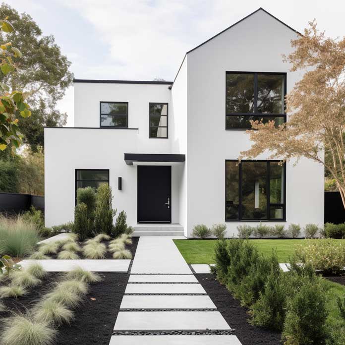
A pink and black house exterior stops being a novelty the moment the proportions are right. Blush pink walls paired with charcoal black trim, window frames, and entry doors work because the contrast obeys the same visual rules as any high-performing palette — light field, dark edge — only executed with color confidence that most neutral choices never reach.
The GSC data behind this page is proof the search interest is real: hundreds of people each month are typing “pink and black house” and “blush pink house exterior” specifically — not just “exterior color ideas.” That intent is narrow, which means the reader has already made a shortlist decision and is looking for execution guidance. That’s exactly what this article delivers.
What follows covers three distinct approaches to the same palette — blush walls with charcoal accents, a minimalist pink-black facade, and urban architecture in blush and charcoal — along with the paint realities, lighting logic, and material choices that determine whether the look holds up for five years or fifteen.
- Blush pink works as a wall field color because its low saturation reads as warm rather than juvenile — the charcoal anchors it.
- Pink and red colorants are among the fastest to fade outdoors; budget for premium exterior paint ($60–$100/gallon) to maintain vibrancy beyond 3 years.
- South- and west-facing walls can fade 2–3× faster than north-facing ones — plan paint grade accordingly.
- Matte finish on blush softens harsh midday light; semi-gloss or satin on charcoal trim adds definition without looking theatrical.
- The most common mistake is using the same sheen on both colors — the palette needs contrast in finish as much as in hue.
Blush Walls Read Differently When Charcoal Does the Framing


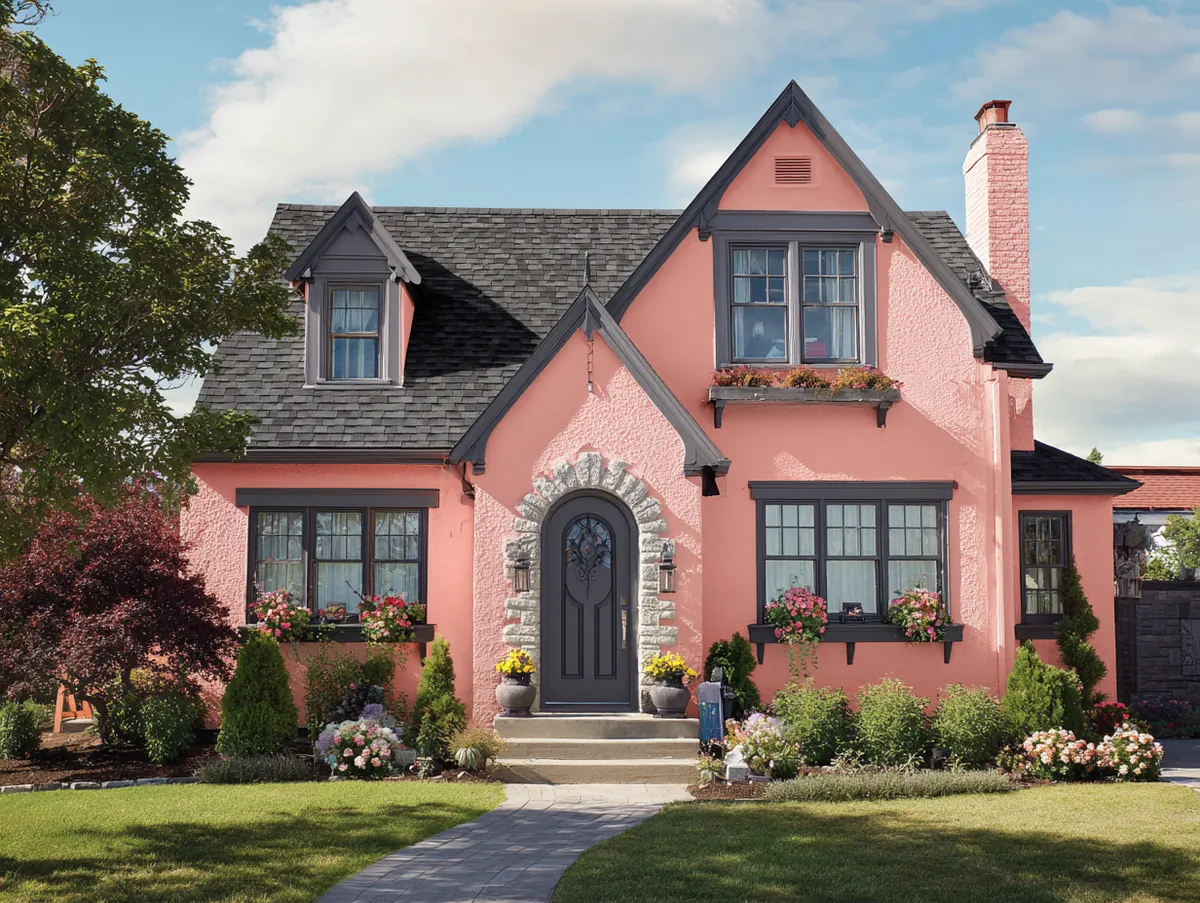
Blush pink walls with charcoal accents work because the charcoal is doing structural work, not decorative work. The dark window frames, door surround, and roofline define the architectural skeleton of the house. Remove them, and the blush reads as a one-note pastel. Keep them, and the overall composition has the same resolved quality as a tailored outfit with a strong belt. The pink stops looking soft and starts looking intentional.
What finish sheen should blush pink walls carry? A matte or flat finish is the practical choice: it absorbs direct midday sun rather than bouncing it back, which keeps the color reading as warm rather than washed-out. The trade-off is durability — flat exterior paints fade faster under UV exposure. On a south-facing elevation, pink colorants can degrade noticeably within 1–3 years without a UV-resistant binder. Sherwin-Williams Duration exterior runs $60–$93 per gallon and offers an elastomeric film rated for UV resistance; Benjamin Moore Aura Exterior runs $90–$100 per gallon and includes Color Lock technology that embeds pigment within binding molecules specifically to resist fade. Neither brand is overkill for this palette.
Do charcoal accents belong in a flat or glossy finish? Stylists consistently recommend satin or semi-gloss for trim and frames when the main field is matte — the finish contrast does more visual work than the color contrast alone. A charcoal door in flat paint against a blush flat wall reads as two different hues. That same door in satin becomes a feature. Don’t underestimate how much sheen differential shapes the palette’s outcome.
The landscaping logic here is simple: use plants that extend the blush-to-dark continuum rather than interrupt it. Pale roses or ornamental grasses near the foundation echo the warmth of the pink without competing with it. Avoid red flowering plants directly against the blush walls — they create a color argument nobody wins. Dark-leafed shrubs like Japanese barberry or burgundy loropetalum repeat the charcoal accent in organic form, which grounds the composition without adding more painted surface.


Evening lighting reveals a specific strength of this palette. Warm-temperature LED fixtures (2700–3000K) intensify the pink undertone in blush and make the charcoal recede, which produces a house that looks genuinely glowing rather than floodlit. Aim fixtures at the blush wall surface, not at the charcoal trim — the trim will catch ambient light without washing out its depth. Architects who work with this palette regularly note that the at-night reading is often more compelling than the daytime one, which is a rare property for an exterior color story. If you’re considering modern house outside colour combinations beyond pink and charcoal, the same lighting logic applies to any palette where one tone is significantly darker than the other.
Don’t apply the same flat-matte finish to both the blush walls and the charcoal trim. When both surfaces share the same sheen, the palette loses its visual hierarchy — the charcoal framing stops reading as structure and starts looking like it was rolled out as an afterthought. Sheen differential is doing most of the compositional heavy lifting in this palette. The second common error is choosing a blush pink with strong red or coral undertones: these read as salmon against dark trim rather than blush, and the whole pairing shifts from refined to retro. Test the blush color against a charcoal swatch in full sun before committing — the combination changes significantly in outdoor light.
Minimalist Facades Where Pink and Black House Logic Takes Over


A pink and black house with a fully minimalist facade operates on a different visual logic than the accent-based approach. Here, blush pink covers large, unbroken wall planes — no shutters, no decorative trim — and the charcoal appears only at structural interruptions: window frames, the door plane, the roofline. The house becomes a study in two shapes of negative space meeting. It’s closer to a painting than a decorated building, and that’s exactly what makes it read well in photograph.
The proportional risk in this approach is scale. On a smaller house — say, under 1,500 square feet of visible facade — the blush field is self-contained enough to anchor the charcoal accents. On larger volumes, the blush can start to overwhelm without enough dark contrast to break it. A practical rule: charcoal should occupy at least 15–20% of the total visible facade area. If the window frames and door together fall short of that threshold, add a charcoal band at the roofline or use charcoal fascia boards to bring the ratio up. Under-contrasted, the palette reads as a pink house with dark windows. Over the threshold, it reads as a composition.
Surface material choice matters more here than in the accented version. Smooth-finish fiber cement siding — brands like James Hardie offer panels specifically rated for darker accent colors — holds both blush and charcoal more cleanly than wood lap siding, which introduces visible texture variation that can make the flat color planes look uneven. Fiber cement painted panels on a premium exterior line can hold their color for 7–10 years on north- and east-facing walls; south-facing elevations typically need attention 1–2 years sooner. The charcoal sections deserve the most UV-resistant product in the lineup, since dark colors absorb more heat and degrade pigment faster.
Is this palette safe for resale? That question comes up often, and the honest answer is: in markets where design-forward buyers are active, an executed minimalist pink-black facade commands attention rather than penalty. The risk is over-personalized execution — unusual color choices on houses where architectural lines are ordinary. The palette earns its keep when it’s amplifying structure that’s already interesting. If the house has no particular architectural story, stick to the accent-based approach rather than the full-field minimalist version.


Outdoor furniture and hardscape choices in the minimalist pink-black context should avoid the temptation to introduce a third strong color. Natural teak or ipe decking reads as a neutral — warm without competing. Concrete pavers or pale limestone pathways let the pink and black composition hold the foreground. The error is adding a terracotta planter or a cobalt outdoor cushion: suddenly the house looks like it can’t decide what kind of house it is. For a deep dive into how other pink-adjacent exterior palettes handle the same saturation challenge, the coral pink and deep green exterior wall paint ideas on this site show a similar field-color logic applied to a warmer pink family.
Blush Pink and Charcoal Black in Urban Settings Change the Register


Blush pink and charcoal black applied to urban residential architecture — attached townhomes, narrow-lot city builds, multi-story infill — changes the palette’s register entirely. The city context provides its own dark accents: asphalt, concrete, shadow. The blush pink walls don’t need to carry the emotional weight they do in a suburban green-lawn setting; instead, they punctuate the urban gray. The house reads as a warm interruption in an otherwise cool streetscape, which is why this palette has gained particular traction in dense urban markets in the past three years.
Balconies and railings are where the charcoal accent lives at the multi-story scale. Powder-coated steel in a charcoal or near-black tone — RAL 7021 Black Grey is a common powder-coat specification — provides a maintenance-stable surface that won’t require repainting on the same schedule as the painted wall. Steel railings typically hold powder-coat finish for 15–20 years before showing degradation, while the blush walls will likely need a refresh at the 7–10 year mark. Planning the maintenance cycles separately is the practical reality of this palette in an urban setting.
Why does blush pink succeed where conventional urban colors fail? The pink softens the street-level experience in a measurable way. Urban streetscape researchers note that warm-toned building facades increase pedestrian dwell time relative to gray or beige alternatives — the color psychology is real even if the research is still accumulating. For the homeowner, the more practical observation is that blush pink never looks dirty. Urban grime accumulates as warm-gray particulate, which blends with the pink undertone rather than appearing as a stain. This is the opposite of the experience with true white or very pale gray urban facades, which show soiling acutely. Paint the urban house blush — it’s a low-maintenance choice dressed up as an aesthetic one.


Green space in the urban blush-charcoal context functions as a third color rather than an accessory. Rooftop gardens, street-level planters, and espalier greenery against the blush wall face bring the palette into biological territory — something living is participating in the composition. This approach reads naturally on the street rather than decorated, which matters in dense urban settings where house-as-designed-object can look out of place. Privet hedges or simple boxwood in charcoal-painted planters extend the dark accent rhythm down to ground level without requiring additional paint surfaces. For exterior paint that holds its vibrancy in both the blush and the dark tones across urban pollution and UV exposure cycles, Benjamin Moore’s Aura Exterior line uses Color Lock technology to embed pigment within the binding molecules, specifically addressing the fade vulnerability that comes with pink pigments outdoors.
| Approach | Best For | Paint Finish Logic | Main Risk |
|---|---|---|---|
| Blush Walls + Charcoal Accents | Suburban homes with strong architectural lines | Matte blush, satin charcoal trim | Blush fade on south-facing walls within 1–3 years without premium paint |
| Minimalist Pink + Black Facade | Design-forward homes with clean siding planes | Flat or matte blush field, semi-gloss charcoal frames | Color ratio imbalance — charcoal must reach 15–20% of facade area |
| Urban Blush + Charcoal Architecture | Attached townhomes and narrow-lot infill builds | Satin blush walls, powder-coat charcoal steel elements | Mismatched maintenance cycles — steel railings outlast paint by 5–10 years |
Takeaway
The Pink and Black House Palette Works Because the Rules Are Simple
Light field, dark edge, sheen contrast, and a paint grade that matches the UV exposure of your elevation. Get those four variables right and the palette does everything else on its own.
South- and west-facing blush walls need premium exterior paint — $60–$100/gallon — or you’ll be repainting within three years instead of seven to ten. Charcoal trim in satin or semi-gloss defines the architecture; the same charcoal in flat paint just darkens it.
Urban blush pink doesn’t read as soft or suburban in a city streetscape — it reads as warm, and it resists urban soiling better than white or pale gray. That’s a practical dividend most people don’t anticipate when they choose the palette for aesthetic reasons. Save this post.