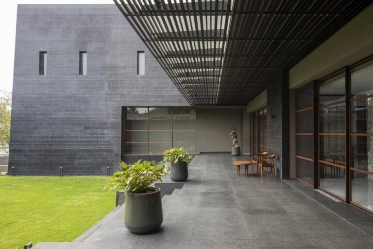
Champagne gold and ebony on a house exterior do something most color pairings don’t: they hold their ground across every hour of daylight. The ebony reads deeper at noon and more atmospheric at dusk; the gold catches morning light and glows entirely differently at golden hour. That’s not a happy accident — it’s why designers reach for this palette when the brief is luxury without noise.
The question homeowners actually wrestle with isn’t whether the combination works. It’s which element carries more weight — and the answer depends on the building’s architecture, the proportion of each color, and where the gold appears. Trim, hardware, window frames, and fascia all respond differently to champagne tones against a deep ebony base.
What follows covers three distinct applications of this palette: residential homes, bold urban facades, and commercial exteriors. Each section includes the specific decisions that separate a polished result from an expensive mistake.
– Champagne gold works best on trim, window frames, and architectural details — not the main body color
– Ebony as a primary exterior color absorbs UV faster; south- and west-facing walls may show fading in 3–5 years without premium paint
– Benjamin Moore Aura Exterior (~$90–100/gallon) offers stronger color retention on deep tones than standard lines
– The gold-to-ebony ratio matters more than the specific shades — stylists recommend keeping gold to 20–30% of visible surface
– Commercial applications of this palette signal luxury positioning; the same logic applies at the residential scale
Champagne Gold and Ebony Pull Off What Neutrals Never Could
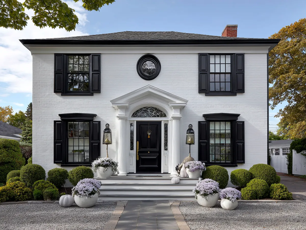
Colors that go with champagne gold at the residential scale need to do two things: hold contrast without competing, and age without looking like a maintenance problem. Ebony handles both. Think of the pairing like a tailored charcoal suit with brushed gold cufflinks — neither element is loud, but the combination reads instantly as deliberate. The ebony anchors; the gold elevates.


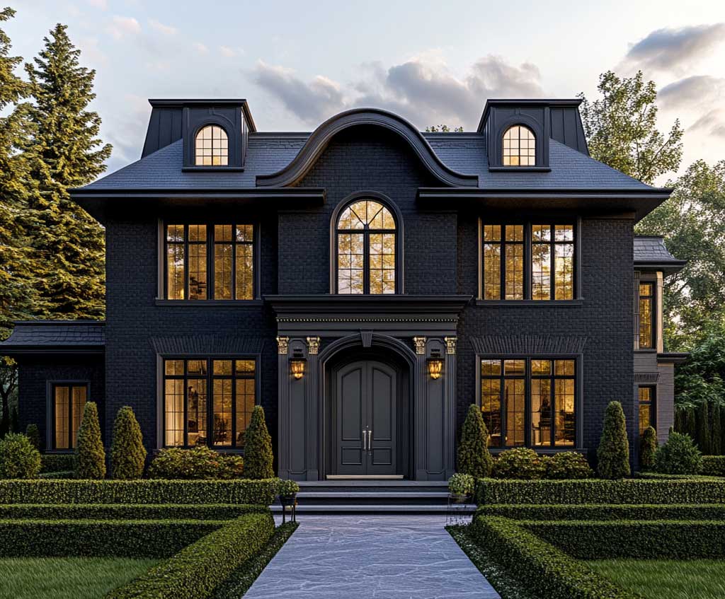
Proportion is where most attempts at this palette go sideways. Stylists recommend keeping champagne gold to roughly 20–30% of the exterior’s visible surface area — window surrounds, fascia boards, front door hardware, and corbels are ideal targets. Cover more than that and the gold loses its punch; it starts reading as a paint color rather than an accent material. One architect’s shortcut: if the gold elements are visible from across the street as distinct points of light, the ratio is right.
The ebony base is doing more structural work than it appears. Deep, true blacks with a matte finish emphasize the geometry of a home — clean rooflines look crisper, window placements read as more intentional, and any stone or wood accent nearby gains contrast it wouldn’t have against a gray or beige body. What doesn’t work is cutting the ebony with a warm dark brown thinking it’ll soften the palette — it muddies the gold and flattens the whole composition. The trick here is to commit to a genuine near-black like Benjamin Moore Black HC-190 or Sherwin-Williams Tricorn Black SW 6258, then let the champagne elements do the softening.


Does the surrounding landscape change how this palette performs? Significantly. Ebony facades absorb UV at a higher rate than light colors — the south- and west-facing elevations of a dark-painted home can show fading in as little as 3–5 years, compared to 5–7 years for lighter colors on the same surface. That’s the trade-off the color demands. Using a premium exterior paint like Benjamin Moore Aura Exterior (around $90–100 per gallon) narrows that gap considerably — its Color Lock technology is specifically engineered for color retention on deep, saturated hues. Skipping the premium line to save $20 per gallon usually means repainting two years sooner, which costs far more in labor than the upfront difference. For more on how dark tones perform as primary facade colors across different architectural styles, the dark house exterior roundup covers thirty-plus real applications worth reviewing before committing.
The garden plays a supporting role that’s easy to underestimate. Green foliage against ebony turns almost neon-vivid by comparison — the eye reads more contrast and more color saturation everywhere. The champagne gold then functions like a warmth signal, pulling the whole scene back from stark drama into something more welcoming. You’ll notice this effect most clearly in late afternoon when the gold elements warm and the ebony cools — two simultaneous shifts in the same palette.
Black Gold Exteriors Work Harder on an Urban Facade
Black and gold house exteriors solve a specific urban problem: how do you make a building read as premium without resorting to expensive materials or elaborate ornamentation? Ebony cladding with champagne gold details answers that question through contrast alone. The dark body flattens the visual noise of a dense streetscape — competing storefronts, signage, parked cars — and the gold creates a single, clear focal point. Pedestrians register it as intentional design rather than incidental color.


The mechanics of how gold elements appear at street level deserve attention. Champagne gold on window frames or entry surrounds catches ambient city light differently at different hours — in direct afternoon sun it reads warm and bright; under overcast skies or at dusk with artificial lighting, it takes on a softer, more muted quality that reads as brushed metal rather than paint. That perceptual shift is a feature, not a limitation. It means the facade changes character across the day without any deliberate design intervention.
Don’t extend champagne gold to more than one or two surface elements on the same facade. A gold entry surround is a focal point; gold entry surround plus gold window frames plus gold signage bracket is a three-ring circus. The rule stylists apply: pick the element closest to eye level and make that the gold one. Everything above it stays ebony. The moment gold appears at multiple heights simultaneously, the visual hierarchy collapses and the facade starts reading as overdone rather than deliberate.
Don’t apply ebony over unprepared or moisture-compromised siding, either. Dark paint amplifies surface imperfections — every crack, patch, and texture inconsistency becomes more visible, not less, against deep black. Prep work matters more on dark exteriors than on any other color family.
What’s the right gold-to-dark ratio for an urban building with multiple floors? A common approach is to concentrate the champagne elements at ground floor entry points, then use ebony exclusively above. This anchors the pedestrian experience — the moment of arrival is marked with warmth and detail — while the upper floors read as a clean, architectural mass. Reversing this, with gold at the roofline and ebony at street level, tends to produce a building that looks heavier than it is. The eye expects warmth at access points, not at height. For a broader look at what drives the dark exterior trend across residential and urban applications, the reasoning behind why exterior colour combinations hold or fail over time applies directly here.
Maintenance expectations on urban facades differ from residential ones. Street-level surfaces accumulate grime faster — exhaust particulate, dust, and water runoff all show more visibly against ebony than they would on a lighter color. A semi-gloss or low-lustre finish on the cladding (rather than flat or matte) makes cleaning significantly easier without creating an unwanted reflective surface. The champagne gold elements, if applied as metallic paint rather than anodized hardware, benefit from the same sheen level. Flat metallic paint on exterior trim collects dirt in its texture and dulls within a single season in a city environment.
Luxury Color Palette Thinking Applied to a Commercial Exterior
A premium colour combination for house exterior design borrows its logic directly from the commercial luxury sector — and it works in both directions. The same palette that signals exclusivity on a boutique retail facade translates to a residential exterior because the underlying mechanics are identical: dark mass, restrained metal accent, clean geometry. What shifts is the scale of application and the materials available. Residential projects typically rely on paint; commercial applications often use anodized aluminum cladding, powder-coated steel frames, and glass with warm-tinted interlayers. The visual result looks similar; the performance over decades is quite different.


On a commercial building, the champagne gold typically appears in functional elements rather than purely decorative ones — door pulls, entry canopy framing, signage backing plates, and storefront mullions. This is a meaningful design distinction. When the gold element serves a function, it reads as a material decision rather than a color choice, which raises the perceived quality of the entire facade. A gold-painted trim strip and a gold-anodized aluminum window frame occupy the same visual space but communicate entirely different things about the building’s budget and attention to detail. You’ll notice this difference immediately when the gold appears next to glass: paint next to glazing looks flat; metal next to glazing reflects and shifts.


Lighting after dark is where commercial applications of this palette genuinely outperform residential ones. A well-lit ebony facade with uplight on champagne gold entry elements creates a scene that reads as designed rather than illuminated. The dark body absorbs ambient light rather than reflecting it, which makes the lit gold elements pop far more dramatically than they would against a lighter background — the same physics that make stars visible only against a dark sky. Specifying warm-temperature LEDs (around 2700–3000K color temperature) next to champagne gold preserves the warmth of the metal tone. Cool daylight LEDs shift the gold toward green-white, which destroys the effect entirely. According to Benjamin Moore’s exterior color guidance, dark, dramatic exterior paint colors are now considered a design mainstay rather than a trend — a shift that reflects how deeply the palette has embedded itself across both residential and commercial contexts.
The one place this combination reliably misfires on commercial buildings is when the ebony cladding meets a conventional beige or gray building next door. The contrast between an ebony facade and a standard commercial neighbor is so pronounced that the dark building tends to read as isolated rather than bold — especially in low-rise strips or retail parks where the streetscape is built on visual continuity. Urban infill projects in dense, varied contexts handle this better because no visual continuity exists to disrupt. The trick here is that context determines whether the palette reads as confident or confrontational.
| Application | Gold Element | Maintenance Interval | Key Risk |
|---|---|---|---|
| Residential home | Trim, window frames, fascia | 3–5 yrs dark paint (south/west face) | UV fading on ebony body |
| Urban facade | Entry surround, door hardware | Semi-gloss finish extends cycle | Grime visibility on flat ebony |
| Commercial exterior | Anodized framing, signage plate | Material-dependent, longer cycle | Palette reads isolated in bland context |
The verdict
Ebony and champagne gold reward commitment — half-measures produce neither glamour nor restraint.
The residential, urban, and commercial applications of this palette share one rule: the ebony must be deep and committed, and the gold must be sparse enough to function as punctuation. Homeowners who dilute the ebony with brown or the gold with cream end up with an expensive beige scheme. Use premium exterior paint — Benjamin Moore Aura Exterior at $90–100 per gallon offers the color retention this palette demands on south and west elevations. On commercial applications, specify anodized or powder-coated metal over paint wherever the gold element is within arm’s reach of foot traffic.
The dark-to-gold ratio sits between 70/30 and 80/20 across every successful example in this palette. Anything beyond that is either all dark (powerful, but loses the glamour) or all gold (warm, but loses the authority). Save this post before your next exterior color consultation.
FAQ
What colors go with champagne gold on a house exterior?
What is a premium colour combination for house exterior when budget allows?
How long does dark exterior paint last before fading?
Does the champagne gold palette work on a front house with PVC or vinyl exterior?
How do colors that go with champagne gold change based on the color palette of a luxury home?
Is the black and gold house exterior trend fading or still current?
Complete guide
Black Home Color Ideas for Every Room and Every Mood
Living rooms, bedrooms, kitchens, bathrooms, exteriors — all in one place