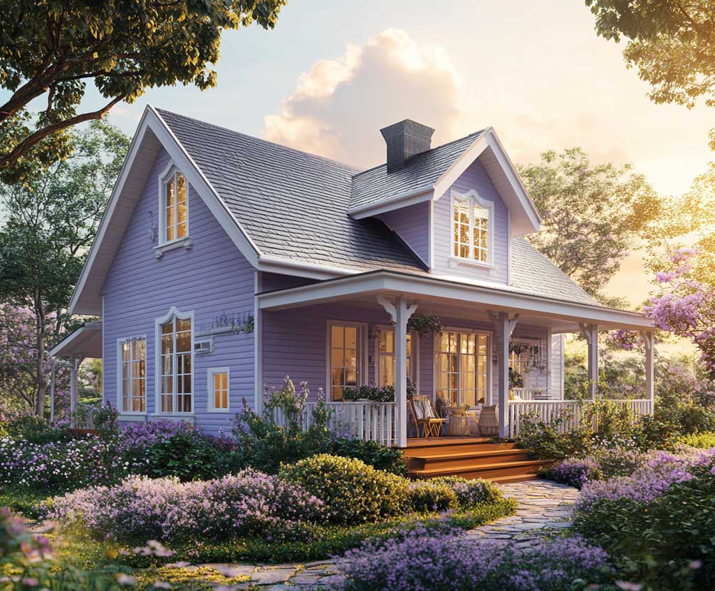
Purple house exterior colour is one of the fastest ways to divide a neighbourhood — the wrong shade reads like a birthday party, the right one stops traffic. The difference between lavender that looks like old money and violet that looks like a day-care wall comes down to tone, trim, and which side of the house faces south. Done right, a purple and white house paint scheme creates one of the boldest, most photographed facades on any block.
Three distinct purple families are worth considering for an exterior: lavender for period homes, violet-purple for mid-century or contemporary structures, and deep regal purple for clean-lined modern builds. Each behaves differently in direct sun, ages at a different rate, and demands a different trim strategy. Picking the wrong family for your home’s architecture is the single most common error — and it’s entirely avoidable.
This article covers all three, with specific paint picks, confirmed prices, trim rules, and the fading reality that most colour guides skip. Expect concrete numbers, not mood boards.
– Lavender works on Victorians and pre-1940 colonials — pair with cream-white trim, never bright white
– Violet-purple on mid-century and contemporary homes reads regal without the garish risk
– Deep regal purple on modern flat-roof builds adds visual weight — budget for more frequent repainting
– Purple fades faster than most exterior colours; plan to repaint every 4–6 years, or use fade-resistant paint from the start
– South- and west-facing walls lose colour up to 3× faster than north-facing surfaces
– White trim is universal — use satin on siding, semi-gloss on trim, high-gloss on the front door
Lavender and White House Paint on a Victorian or Colonial


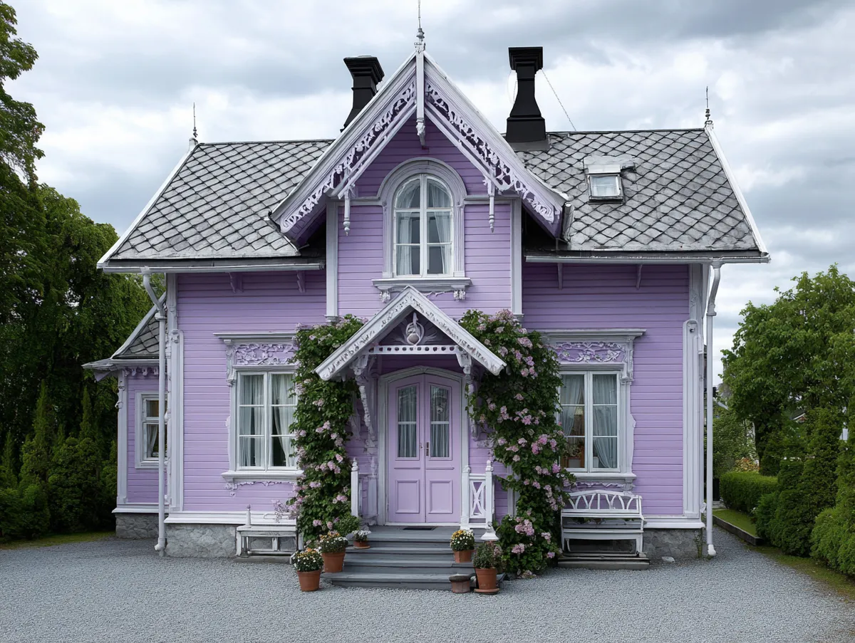
Lavender and white house paint is one of the few colour combinations that gets more accurate with age — Victorian architecture has an actual historical relationship with purple tones, so the choice reads as informed rather than eccentric. Sherwin-Williams Potentially Purple (SW 6821) and Benjamin Moore Lavender Mist (2070-60) are both regularly documented on restored period homes; exterior-grade cans run $55–$70 per gallon depending on product line. The lavender acts like a photographic backdrop, pulling every carved corbel, gingerbread bracket, and porch column into sharper relief against the pale wall. That’s the architectural argument for it — nothing shows detailing like a mid-tone coloured field behind it.
What trim colour you choose matters more than most people expect. Crisp bright white (think Sherwin-Williams Extra White) creates a clinical edge against warm lavender — the contrast is too stark and makes the purple look cheaper. Cream-white or soft white reads gentler and warmer; Benjamin Moore Simply White (OC-117) sits in the right range. The trick stylists recommend is checking both options on the actual siding at noon and at 4 PM — lavender shifts toward pink at golden hour, and bright white trim amplifies that shift badly. A satin finish on the siding and semi-gloss on trim is the standard combination for durability and visual contrast.
Lavender is a light-pigment colour, and light pigments fade faster than deep ones under UV exposure. South-facing walls can lose up to 40% of their original colour intensity within 3–5 years without a fade-resistant formula, according to UV coating research. Sherwin-Williams Duration and Benjamin Moore Aura Exterior are the two most frequently cited fade-resistant options for purple tones — both use advanced UV-blocking binders that standard SuperPaint doesn’t include. Budget for repainting every 4–6 years regardless, and plan it into the house cost: lavender is a maintenance-forward choice.
Don’t use this palette on a 1970s ranch or split-level with aluminum siding. Lavender needs the context of vertical profiles, layered mouldings, or decorative woodwork to land correctly. On a flat, horizontal facade with no architectural detail, it just looks confused. The colour isn’t wrong — the architecture is the wrong canvas.


Landscaping reinforces the lavender or works against it more than most homeowners realise. Think of it the way a museum frames a painting — the border shapes the perception of the work. Lavender bushes, Russian sage, or catmint planted along the foundation line echo the wall colour without matching it exactly. Dead-on matching looks staged; a slight warm-cool mismatch between flowering plants and the wall reads as intentional. Red or orange flowers planted directly against a lavender wall create a harsh clash visible from the street — avoid those combinations entirely in the front garden.
Bob Vila’s exterior paint guide notes that purple works particularly well on historical homes when the chosen shade carries gray undertones rather than pure blue-violet. That gray backbone is what keeps lavender from reading as saccharine. If the swatch in the store looks purely pink-purple with no gray, put it back and go a tone darker. For more context on how purple exterior paint ideas translate across lavender, plum, and lilac shade families, the differences in trim strategy and fade rates are covered in detail.
Regal Purple Colour House Exterior on a Deep-Tone Facade


Deep regal purple on an exterior facade behaves differently from lavender in almost every respect — it absorbs heat, slows fading relative to lighter purples, and creates a sense of visual mass that anchors larger homes in their settings. Benjamin Moore Black Raspberry (2072-20) is the shade that keeps showing up on well-executed regal purple facades; it runs approximately $65–$80 per gallon for exterior grade and sits dark enough to read as serious without crossing into black at dusk. The key quality to look for is the absence of pink undertones — on a swatch, pink creep looks manageable, but on 2,000 square feet of siding in direct sun it shifts the whole facade from regal to berry.
Ice white trim is what makes a deep purple facade work structurally. Think of the pairing the way a white-faced clock works — the dark field creates the contrast that makes every detail legible. Window frames, door surrounds, dentil mouldings, and corner boards painted in crisp white against a deep purple body draw the eye exactly where the architecture wants it. This is not a scheme where off-white trim works: against a deep saturated purple, cream-white goes muddy and loses its function as a contrast element. Use a true white with cool undertones — Benjamin Moore Chantilly Lace (OC-65) is one of the most-cited pairings for this reason.
Does deep purple absorb more heat than lighter exterior colours? Yes — dark-pigmented surfaces can push surface temperatures well above 150°F on west-facing walls during summer afternoons, which accelerates binder breakdown. That’s not a dealbreaker, but it means choosing an exterior paint with elastomeric properties or high-quality acrylic binders designed for thermal expansion. A mid-range exterior acrylic from Sherwin-Williams — the A-100 line at $49.49/gallon — won’t perform adequately for a deep purple facade with heavy sun exposure; step up to Duration or Emerald and the investment in paint prevents a premature repaint cycle.
Warm exterior lighting at night is the multiplier nobody budgets for when they choose deep purple. Under warm amber uplighting, a regal purple facade shifts toward burgundy-plum — richer, more dimensional, closer to a jewel box than a paint colour. Under cool white LED floods it goes flat and loses its depth. If you’re committing to this palette, plan the exterior lighting at the same time as the paint rather than treating it as an afterthought. It’s the difference between a house that photographs beautifully at night and one that just looks dark.

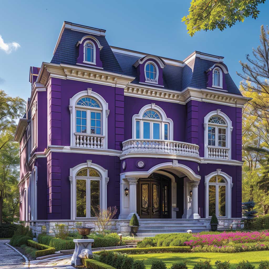


Garden colour around a deep purple exterior follows a stricter logic than around lavender. Lush greens — lawn, hedges, clipped boxwood — provide the natural counterpoint that keeps the purple from looking isolated. White flowering plants along the front path, hydrangeas especially, soften the overall palette without competing with the wall colour. What doesn’t work: red roses or any orange-toned plantings directly against the purple wall. The clash is aggressive in real life in a way that never comes through in photos. Garden designers who work with bold exterior colours refer to this as “colour temperature clash” — warm tones against a cool-dominant purple create visual friction rather than contrast.
The longevity argument for a deep regal purple exterior is counter-intuitive: darker purples fade more slowly than lavender, which means the repainting cycle stretches to approximately 5–6 years rather than 4 on the lighter end. That’s the equivalent of one full paint cycle saved over a fifteen-year period — which, at professional labour rates of $25–$60 per hour plus materials, represents real money. The caveat is surface prep: a deep purple facade applied over an inadequately primed or cleaned surface will chalk and peel faster than any shade-related prediction, regardless of paint quality.
Don’t choose a purple exterior colour from a phone screen or a backlit paint brand website. Every swatch on a digital display is a lie — the colour is rendered in RGB light, not in reflected sunlight off stucco or wood siding. Order physical sample pots. Paint a 2×3-foot board. Tape it to the actual wall and check it at 8 AM, noon, and 4 PM for two full days. Purple shifts more under changing light than any other colour family — and the shift between morning and dusk is not subtle.
Don’t pair ice white trim with a regal purple body and then paint the gutters and downspouts a third colour. Gutters and downspouts should match either the body or the trim — a third colour turns service elements into visual noise. Match them to the trim white and they disappear into the architecture the way they’re supposed to.
Violet Purple House Exterior on a Minimalist or Contemporary Build


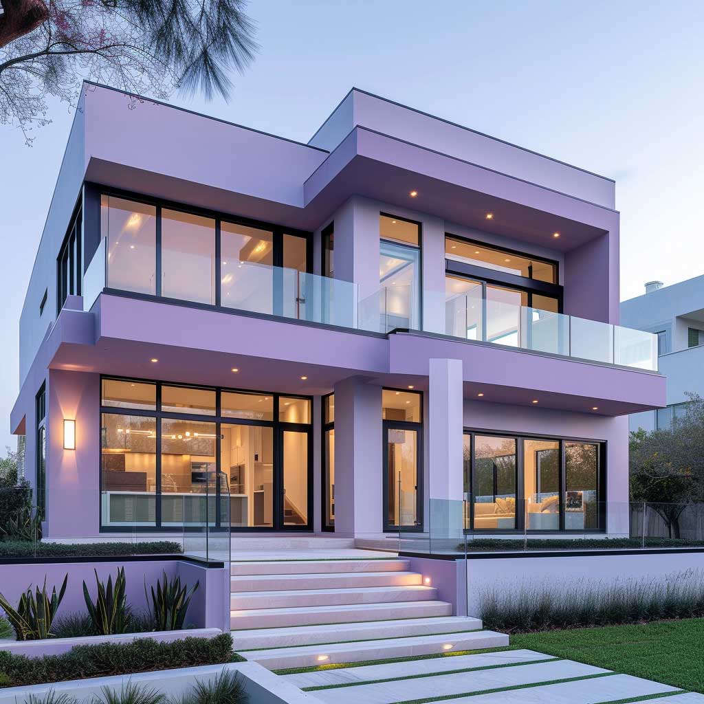

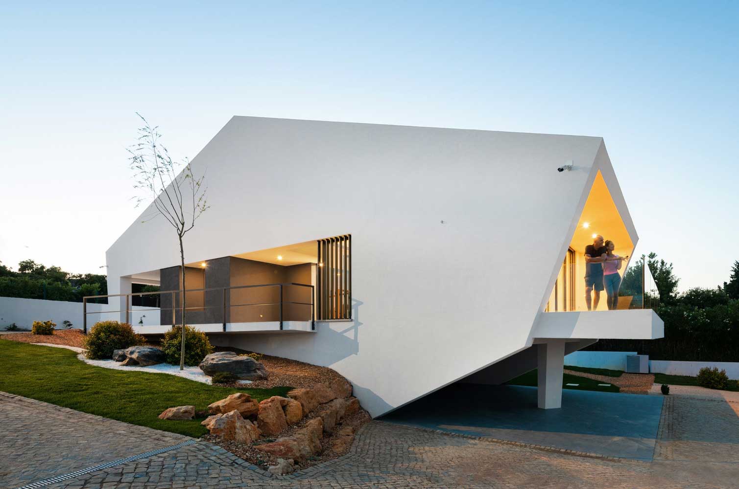
Violet purple sits between lavender and deep regal purple in saturation — it carries enough blue-red to read as decidedly purple, but enough gray to avoid the saccharine quality that makes some lighter shades look accidental. On a flat-roofed, clean-lined contemporary build, violet purple does something neither lavender nor plum can do alone: it adds both visual weight and warmth, making the structure feel grounded without looking heavy. The large blank planes of modern architecture — long uninterrupted wall surfaces, floor-to-ceiling glazing — give the colour room to develop its depth in a way that a heavily ornamented Victorian simply doesn’t have.
Large windows are the structural partner to violet on a contemporary facade. They serve the same function as trim does on a Victorian: they provide the frost-white contrast that gives the purple its context. Floor-to-ceiling glazing reflects sky, greenery, and surrounding landscape back into the facade, which means the house doesn’t read as a single flat purple rectangle — it reads as a dynamic composition where the colour, the reflection, and the structure all contribute. What happens if the windows are small or few? The purple closes in on itself and the house looks like a painted box. Window proportion is a prerequisite for this colour choice on minimalist builds.
The earthy undertones in a good violet purple connect it to natural surroundings more than most synthetically bright colours do. Where does the connection break? When the surrounding landscape is dominated by warm-toned materials — red brick paths, terracotta paving, ochre gravel. Violet purple reads as a cool colour, and cool colours clash with warm-toned ground materials in a way that feels unresolved rather than dynamic. Neutral concrete, grey stone, or dark basalt paving are better material companions for a violet exterior. A common approach is to test material samples against the paint board before finalising either choice.

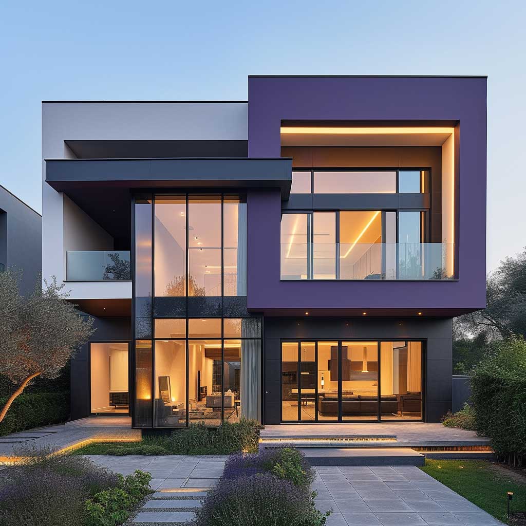


Frost white on a violet contemporary facade should be used as a plane, not just a trim line. Horizontal bands of white across a long single-storey facade, white reveals around window openings, or a white ground-floor section with a violet upper floor — these are the placements that exploit modern architecture’s geometry rather than just outlining it. A common approach in contemporary residential design is to treat white and violet as two separate material zones rather than as body and trim. The result looks architectural rather than painted. You’ll notice the difference in listing photos immediately: houses that use colour as zone-defining strategy photograph with clear compositional logic; houses that just put white trim on a coloured wall photograph as just a coloured house.
Exterior paint cost for a quality violet finish depends on the line chosen. Sherwin-Williams A-100 Exterior Acrylic Latex starts at $49.49 per gallon — functional for a protected surface with good prep, but not for a highly saturated colour on full sun exposure. The Emerald Exterior line at $93.99 per gallon includes UV absorbers that measurably extend colour retention, which matters for violet tones that would otherwise fade to grayish-nothing within 4–5 years on south-facing planes. For more ideas on how violet purple fits into the broader category of house exterior paint colour combinations that don’t date quickly, the comparison across other colour families is worth reading before committing to purple.
The minimalist lifestyle argument for violet-and-frost is that the exterior colour sets the compositional tone for everything inside. A home whose exterior palette is disciplined — two colours, clear zones, no decorative noise — signals something about how the interior is organised. This isn’t superstition; it’s what architects mean when they talk about coherence between inside and outside. The exterior colour is the first sentence the house says. Violet and frost, used with structural intention, is a first sentence that holds up to scrutiny. According to Bob Vila’s exterior colour guidance, purple shades with gray undertones retain architectural credibility over time in ways that pure blue-violet hues do not. For a contemporary home, choosing violet with a gray backbone rather than a blue-heavy one is the single most important shade decision to make before committing to any specific paint product.
| Shade | Best Architecture | Trim Pairing | Repainting Cycle |
|---|---|---|---|
| Lavender | Victorian, Colonial, pre-1940 | Cream-white or soft white | Every 4–5 years |
| Violet Purple | Contemporary, mid-century, minimalist | Frost white or cool white | Every 4–6 years |
| Regal / Deep Purple | Modern flat-roof, large-scale homes | True white, charcoal, or ice white | Every 5–6 years |
The Bottom Line
Purple Exterior Works When the Shade Matches the Architecture
Lavender belongs on period homes with ornate detail; regal purple works on large-scale facades where visual weight is the goal; violet sits in between and performs best on clean-lined contemporary structures with significant glazing.
Purple fades faster than most colours — budget $49–$94 per gallon for a fade-resistant exterior formula, plan to repaint every 4–6 years, and never test a shade on a phone screen. South- and west-facing walls need the most UV-resistant formula available.
Trim colour is not decorative — it’s structural. Cream-white for lavender, frost white for violet, true cool white for deep regal. Get that pairing wrong and the purple will look like an accident, not a decision. Save this post.