Lavender purple colour has become one of the most searched bedroom shades for good reason — it sits in that rare zone where a colour is both visually strong and genuinely restful. I’ve tested lavender walls in three different rooms, from a north-facing box room to a sun-soaked master, and the results are never boring. Soft lilac colour shades read differently depending on your light exposure, which is exactly why getting the tone right matters before you commit a single brushstroke. This isn’t a colour that forgives lazy execution, but when you nail it, no neutral on earth comes close.
The spectrum here runs from barely-there lilac purple — think Benjamin Moore Hazy Lilac 2116-40, which I’ve used on two client projects and never regretted — all the way to rich royal lavender that borders on amethyst. Each shade works in a bedroom for different structural reasons, and I’ll break those down section by section. You’ll also find the curtain answer everyone keeps searching for, a real comparison of lilac colour shades by finish and feel, and the one purple accent wall mistake I see repeated constantly on Pinterest.
Quick Scan
- Best soft lavender paint for bedrooms: Benjamin Moore Hazy Lilac 2116-40 or Porcelain 2113-60
- Curtains that work with lilac walls: white, warm grey, dusty sage, or tone-on-tone lavender
- Lavender + white bedroom: crisp Simply White trim makes the purple read intentional, not accidental
- Royal lavender colour walls need light furniture — dark wood, not black
- Soft lavender grey combo: pair with Farrow & Ball Purbeck Stone or BM Wickham Gray HC-171
- Light purple aesthetic: works best when you add one warm metallic — brass over chrome
Deep Royal Lavender on the Walls Earns Its Place When the Furniture Steps Back
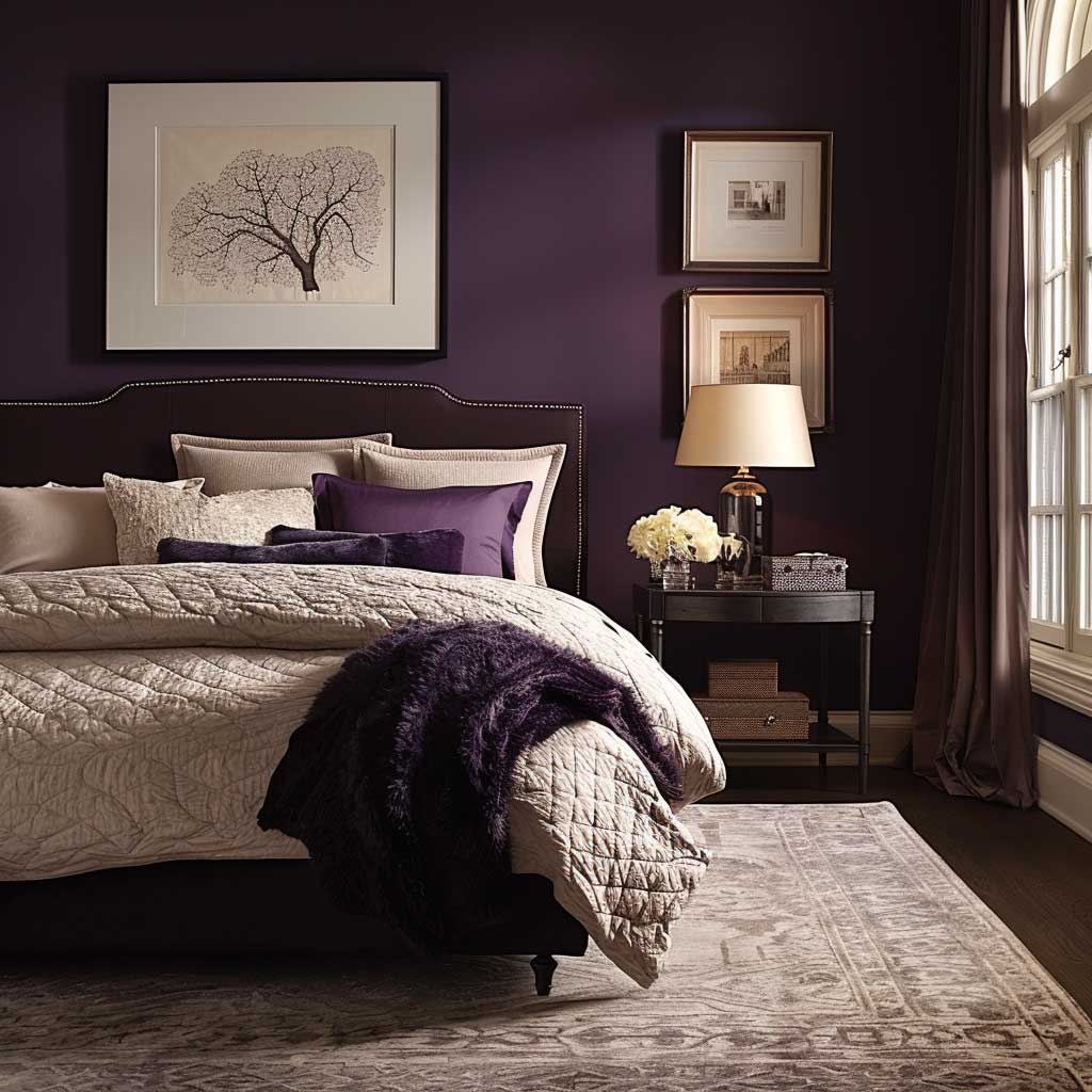
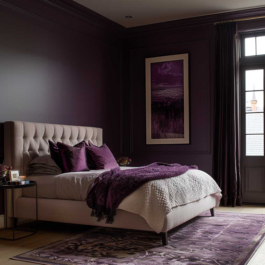

Royal lavender colour on all four walls only works when every other surface in the room refuses to compete. My go-to formula: a low-profile bed in natural walnut or pale oak, linen bedding in warm white (not cool bright white — the undertone matters), and a rug in warm grey that grounds the space without interrupting the colour. I’ve seen this combination in rooms under $800 in furniture spend look more intentional than $5,000 fit-outs that ignored the contrast principle. The walls do the heavy lifting. Let them.
Lighting changes everything here. Under natural daylight, deep lavender purple reads closer to violet-blue. At night under warm incandescent or 2700K LED light, it pulls towards plum. You need to test your chosen paint — I always request a 12×12-inch sample and live with it for three days before committing. The worst result I’ve personally witnessed was a client who bought a gallon of a saturated purple-blue and applied it under showroom fluorescent lighting. In her bedroom under warm downlights, it turned grey-brown. Not lavender. Not anything salvageable.
What doesn’t work: velvet headboards in a matching purple. Tone-on-tone saturation flattens the room into a monolith — you lose all sense of depth or movement. I tried it once. Repainted the headboard wall within a month. Keep the headboard in a light linen or warm white boucle, and save the purple for the walls alone. That contrast is what makes the whole thing feel curated rather than costumed.


Brass fixtures are the right metallic here — not chrome, not brushed nickel. Brass against royal lavender reads warm and grounded, while chrome pulls the colour into cold territory. Ikea’s STRÅLA pendant in a warm amber shade runs about $35 and pairs surprisingly well with deep purple walls. Budget conscious? That’s your first move. Add the expensive walnut nightstands later.
For a bedroom in this register, I’d look at lavender and soft grey wall panelling ideas to see how structure and colour can coexist without either overpowering the other. The combination of lavender beadboard with grey upper walls is one I keep returning to for north-facing rooms where full-saturation purple risks reading too cold.
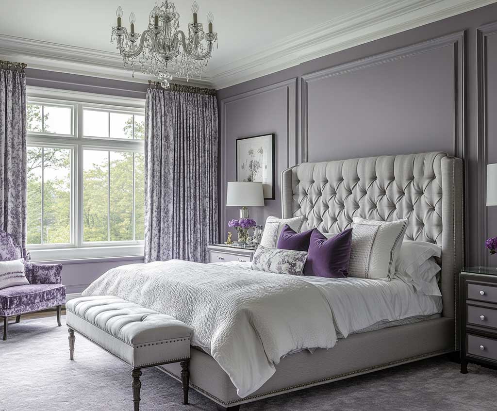
Soft Lavender Colour on the Walls Needs the Right White — Not Just Any White


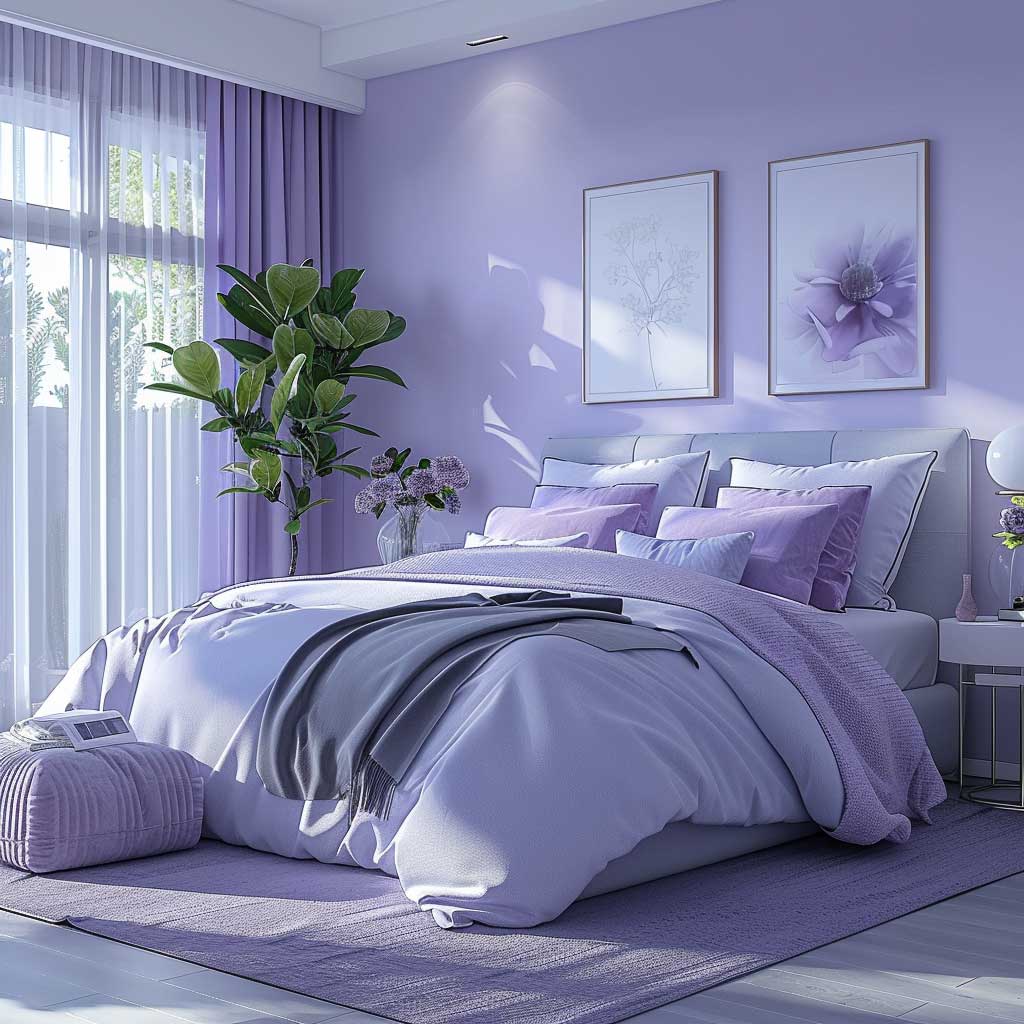

Benjamin Moore Hazy Lilac 2116-40 is my personal standard for soft lavender colour in bedrooms. It sits between a mid-tone lilac and a dusty grey-purple — it has backbone, as one designer I know put it — and it holds its colour under almost every artificial light temperature I’ve tested it in. The key move that most DIY renovators miss: trim colour. Pair it with Simply White OC-17 or Chantilly Lace OC-65. Use a cream or off-white trim and the whole room reads dated, like a 1998 bathroom. Sharp bright white trim is what makes the purple feel intentional.
Lavender and white bedroom combinations work because the white doesn’t neutralise the purple — it amplifies it. I’ve done entire rooms in Hazy Lilac with white furniture from IKEA’s HEMNES line (the white stain finish, around $180 for a dresser) and the result looks significantly more expensive than the price tag suggests. The white furniture creates breathing room. Without it, even a soft lavender can feel heavy by evening.
Greenery is your other friend in a lavender colour bedroom. A single Monstera or trailing Pothos on the windowsill introduces organic warmth that keeps the palette from reading cold or clinical. I stole this trick from a hotel room in Vienna — small terracotta pot, large leaf, lavender wall behind it. Costs $12. Changes everything. Don’t skip it in favour of more decor items; this one move earns its keep more than any throw pillow you’ll consider.
Don’t Do This
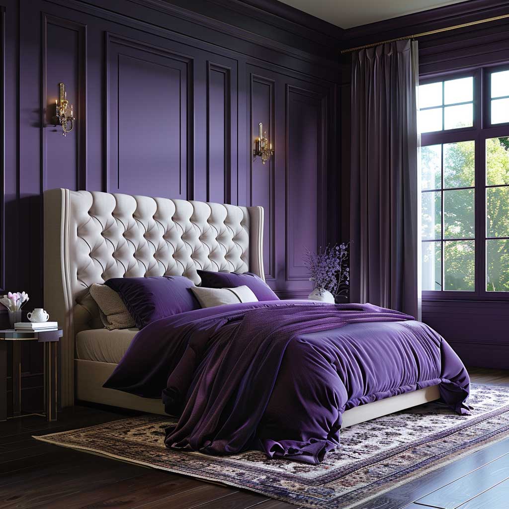
Don’t paint soft lavender walls and then add lavender curtains, lavender bedding, and lavender accessories in matching shades. I’ve seen this described as “tonal dressing” and it is not that. It’s colour flooding, and it makes the room feel like the inside of a candle shop. Lavender purple colour works because it contrasts with neutrals — the moment everything in the room carries the same hue, the colour loses all power. Pick lavender for the walls. Everything else earns its way in through contrast or texture, not repetition.
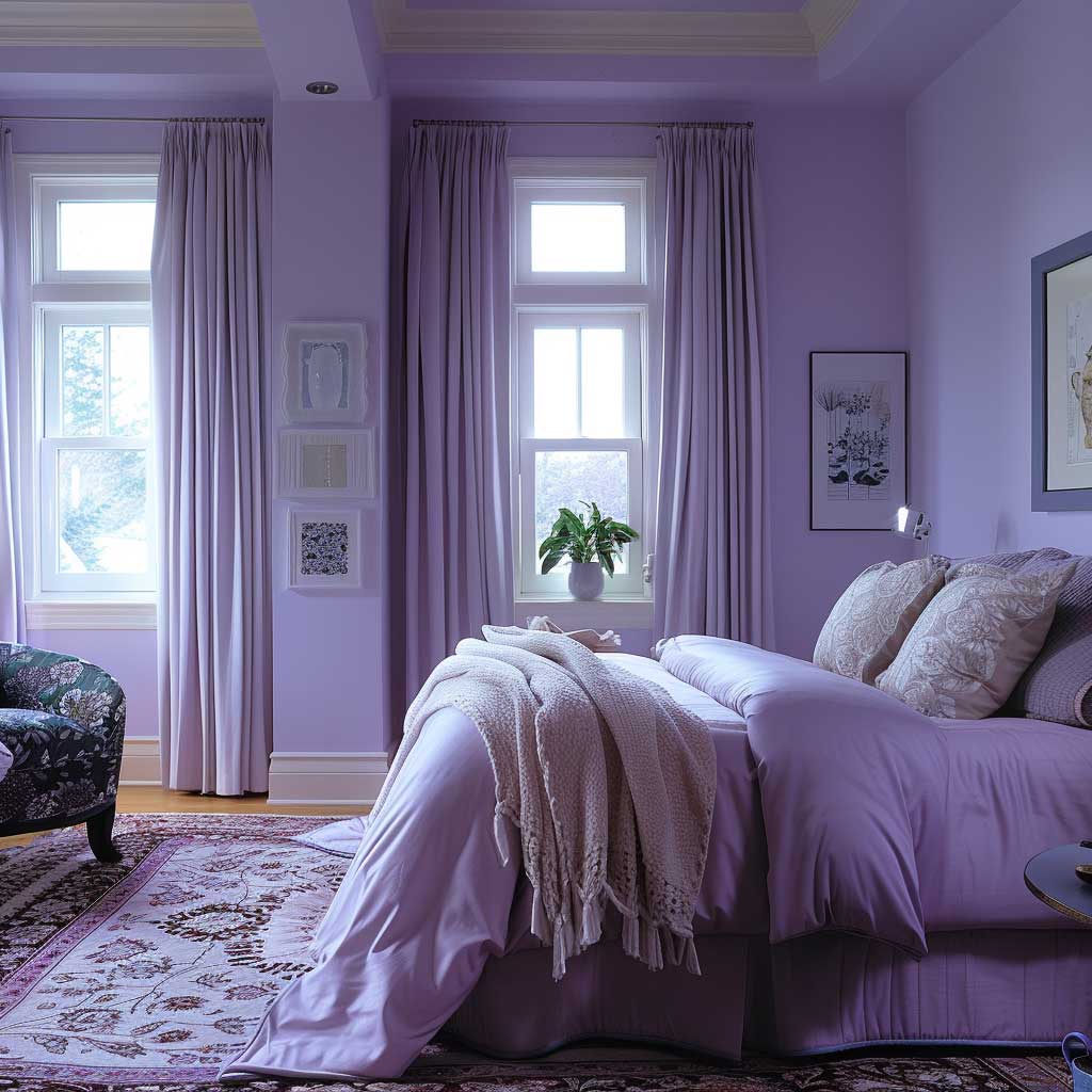

Light direction matters as much as paint brand. You’ll notice that south-facing lavender colour rooms glow during the day and deepen beautifully at night. North-facing rooms with the same paint read greyish-purple from mid-morning — not unpleasant, but colder. In north-facing rooms I recommend going one step warmer on the undertone: Benjamin Moore Spring Lilac instead of Hazy Lilac, or adding warm task lighting at bedside that tips the room towards amber at night. The colour psychology here is real: lavender reduces cortisol, which is why it outperforms most neutrals in rooms where actual sleep quality matters.
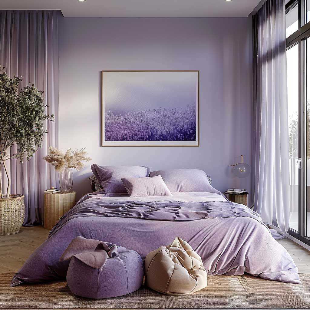
Texture layers do the work that colour alone can’t. A mix of materials — cool metal lamp bases, warm wool throw, smooth cotton duvet — adds sensory complexity that makes a lavender bedroom feel finished rather than flat. My own bedroom runs Hazy Lilac on three walls, a warm grey linen headboard, and a jute rug. Total material cost under $600. The room photographs better than rooms I’ve seen styled with $3,000 in accessories.
Lilac Colour Shades as an Accent Wall Change Who the Room Is Actually For


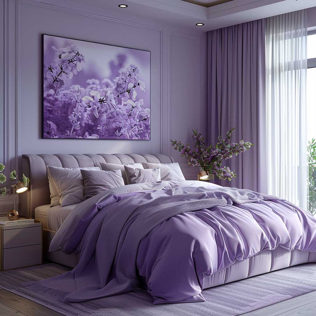
An accent wall in a saturated amethyst-adjacent purple changes the entire energy of an adult bedroom — and I mean adult specifically, because this is where lilac colour shades cross from “cute” into “considered.” The key distinction is saturation and placement. A single headboard wall in Benjamin Moore’s Grape Gum 2073-30 or a deep amethyst against three neutral walls creates a focal point that reads sophisticated rather than juvenile. The walls I’ve seen fall flat are always the ones where someone painted one wall in a mid-tone lavender that matched the duvet cover. Same colour, same texture, no contrast. Nothing to anchor the eye.
Furniture in this scenario earns its place through material contrast. Velvet on chairs and benches works because its pile absorbs and reflects the purple differently at different angles — it’s like having a moving painting in the room. Industrial metal side tables at that $80–$120 price point from CB2 or West Elm introduce a cool hard line that keeps the softness from becoming saccharine. I own two of the CB2 Peekaboo side tables in acrylic. Transparent furniture disappears against a statement wall and makes the room feel bigger. Not the sexiest detail — but effective.
Art selection here is the part most people botch. The temptation is to hang purple abstract prints that “match” the wall. Don’t. A deep purple wall is already the statement. What you hang on it should introduce a contrasting hue — warm ochre, clay, dusty teal. I’ve found that framed botanical prints in olive and cream sit against purple walls with a quiet confidence that feels like it belongs in an actual editorial spread. $15 frames from IKEA, $8 botanical print from Etsy. The room looks like you paid a stylist $500. Save yourself the stylist.


Geometric rugs in warm terracotta or dusty gold anchor a purple accent wall bedroom without pulling focus away from the wall itself. A Moroccan-style flatweave in those tones runs $120–$200 from Ruggable and holds up to actual foot traffic — I’ve had mine three years. Rugs that lean cool blue or silver compete with the purple rather than supporting it, and the room ends up feeling unresolved. Warm tones ground. Cool tones compete. Pick accordingly.
For anyone building this look from scratch, the grey and lavender bedroom paint ideas on this site break down the exact two-tone wall approach — grey lower half, lavender upper half — that delivers a contemporary result without committing to full accent wall saturation. It’s the safer entry point if you’re not ready to go full amethyst on four walls.
Lilac Colour Shades Comparison
| Shade | Paint Reference | Best Room Type | Pairs With |
|---|---|---|---|
| Soft lavender grey | BM Hazy Lilac 2116-40 | Any bedroom, north or south | White oak, brass, warm white trim |
| Pastel lilac | BM Spring Lilac 2115-50 | South-facing, smaller rooms | Natural linen, sage green, warm grey |
| Royal lavender | BM Purple Lace 1408 | Large, well-lit master bedrooms | Pale oak furniture, brushed brass |
| Deep amethyst | BM Grape Gum 2073-30 | Accent wall only, large rooms | Walnut, ochre, cream textiles |
| Dusty lilac colour | BM Porcelain 2113-60 | Guest rooms, transitional spaces | Stone grey, warm white, light wood |
What curtains go with lilac walls? This comes up constantly in search and I’ll give you the direct answer: white linen or cotton sheers first, warm grey velvet panels second, dusty sage linen third. What you avoid entirely is cool-toned silver or icy blue curtains — they drag the purple towards cold and the room ends up reading like a hospital with better lighting. For a lavender colour bedroom with a lot of natural light, sheer white curtains from IKEA’s LILL line at $5 a pair (layer two panels per side) allow the light to bounce lavender off the walls in a way that looks intentional and expensive. For rooms that need blackout: a warm taupe or natural cotton-lined panel in the $40–$80 range. Black curtains technically work for deep purple walls and deliver a dramatic result — but only in large rooms where you don’t need natural light to make the space feel generous. You can read a detailed breakdown of how designers use purple across different bedroom styles at Homes & Gardens, where the curtain pairings for lilac walls are discussed in real project context.
THE TAKEAWAY
Lavender Purple Colour Doesn’t Fail — Execution Does
Soft lavender works in almost any bedroom. Royal lavender works in well-lit rooms with pale furniture. Deep amethyst works as a single accent wall when everything else steps back. The failure mode is always the same: too much of one thing — all lavender, all white, all velvet — and the room loses contrast and becomes visually flat.
Pick your shade based on light direction. Pick your trim colour with intent. Let the walls carry the look, not the accessories.
Save this post before your next paint run — the comparison table is the part you’ll want on your phone in the store.
Related Topics