Maximalist living room decor is the only design approach where adding more actually fixes the room — but only when you know the order of operations. I’ve pulled apart and rebuilt enough of these spaces to say clearly: the rooms that fail aren’t too full, they’re too random. Color comes first. Texture comes second. Furniture placement is architecture. You’ll notice the difference the moment you walk in — a well-composed maximalist room reads as intentional, not chaotic, even when every surface is covered.
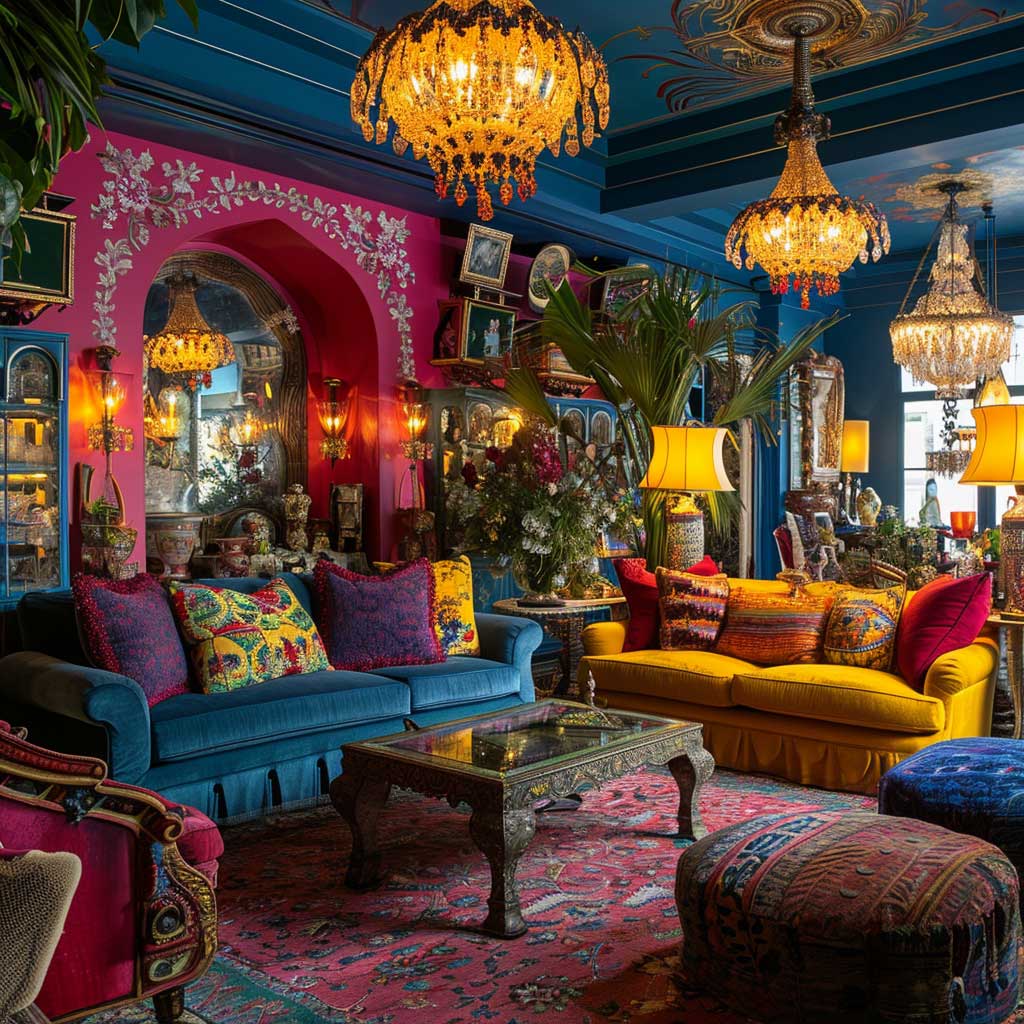
Jewel tones are the load-bearing wall of this aesthetic. Emerald, sapphire, amethyst — not pastels, not neons. Pick one dominant hue and let it run through at least three surfaces before you bring in a second. My go-to anchor is a velvet sofa in deep teal from Article ($1,800–$2,400), placed against a wall painted in Farrow & Ball Hague Blue No.30 ($120/2.5L). From there, everything else is negotiation. The mistake most people make is buying the art first and painting around it — that’s backwards.
Quick Scan
✦ Dominant color first — jewel tone across 3+ surfaces before adding a second hue
✦ Texture contrast — velvet against linen, silk against burlap, smooth against rough
✦ Antiques + modern — one Baroque or Victorian piece grounds the eclecticism
✦ Three-layer lighting — ambient chandelier, task lamps, accent spots on art
✦ Gallery wall rule — odd numbers, mix frame sizes, never all one era
✦ Pattern mixing — florals, geometrics, and stripes can coexist if they share one color
Rich Textures and Bold Patterns Make or Break the Whole Room

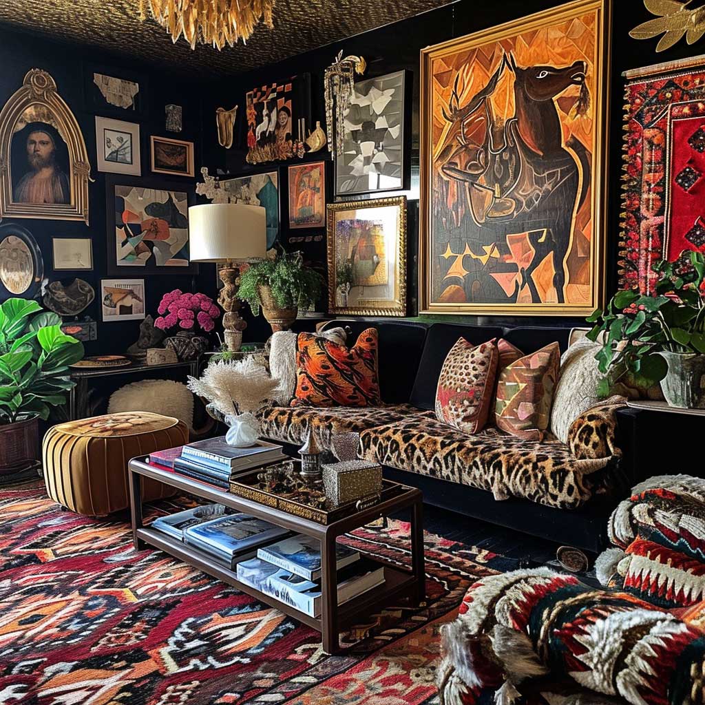
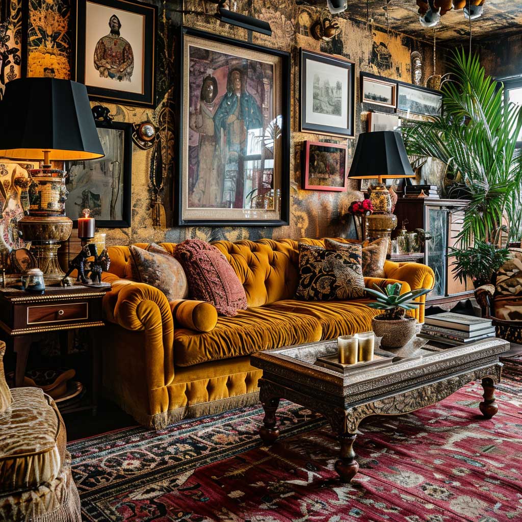
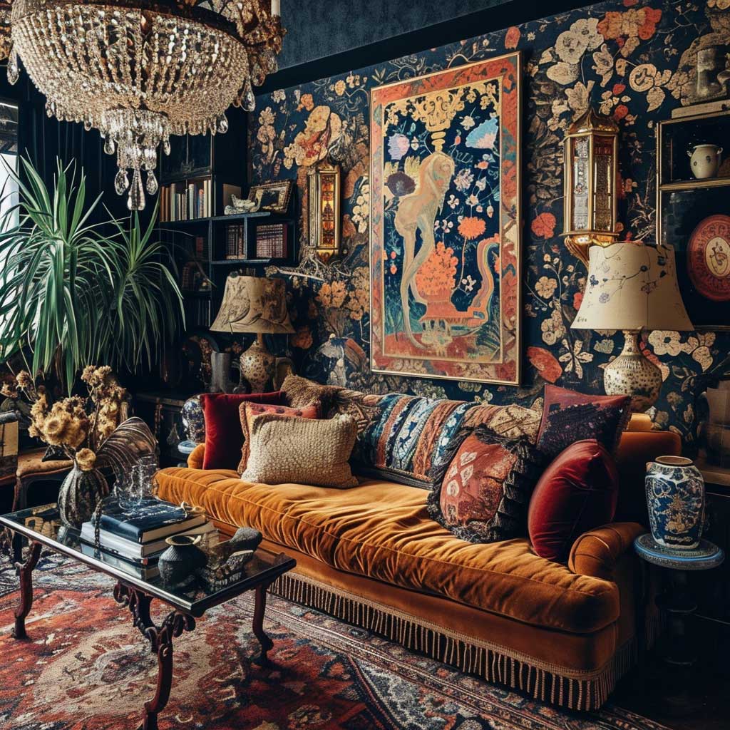
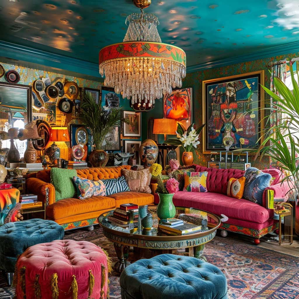
Texture is what separates a maximalist living room from a storage unit with ambitions. Velvet, silk, and brocade do most of the heavy lifting — but they need a rough counterpart to actually read as intentional. I own two boucle chairs that cost $340 each from CB2, and placing them next to a silk-velvet sofa created a tension that no amount of throw pillows could have achieved on its own. That friction between smooth and nubby is the point. Rooms where every surface shares the same texture register as flat, no matter how many patterns are present.
Bold patterns work in maximalist decor when they share at least one color — that’s the only rule you need. Floral wallpaper in terracotta and navy? Pair it with a geometric rug in navy and cream. The florals and the geometry don’t compete; they lock. You’ll notice this in every room that photographs well: a single unifying hue threads through three or four different pattern types. What doesn’t work — and I’ve seen this repeatedly — is mixing three patterns with three completely separate color families. The room looks like a sample sale, not a home.
Jewel tones are the backbone of maximalist living room color. Emerald, sapphire, and amethyst carry visual weight without becoming aggressive, which is why they keep appearing in the rooms that actually feel livable rather than exhausting. Saturated hues like these absorb light rather than bouncing it, which softens the intensity of a room packed with pattern. Don’t reach for the lighter versions of these colors — dusty teal instead of true teal, muted purple instead of deep amethyst. Diet maximalism is no good, as one designer I follow put it.
The mistake I see constantly in maximalist living room ideas is treating every surface as equally important. It isn’t. The sofa is the anchor — everything else decorates around it. Pick the most expensive, most textured piece you can afford for that spot, then build outward. A $2,200 velvet sectional from maximalist interior design references that ArtFasad covers will always read better than six accent chairs that don’t agree on a period.
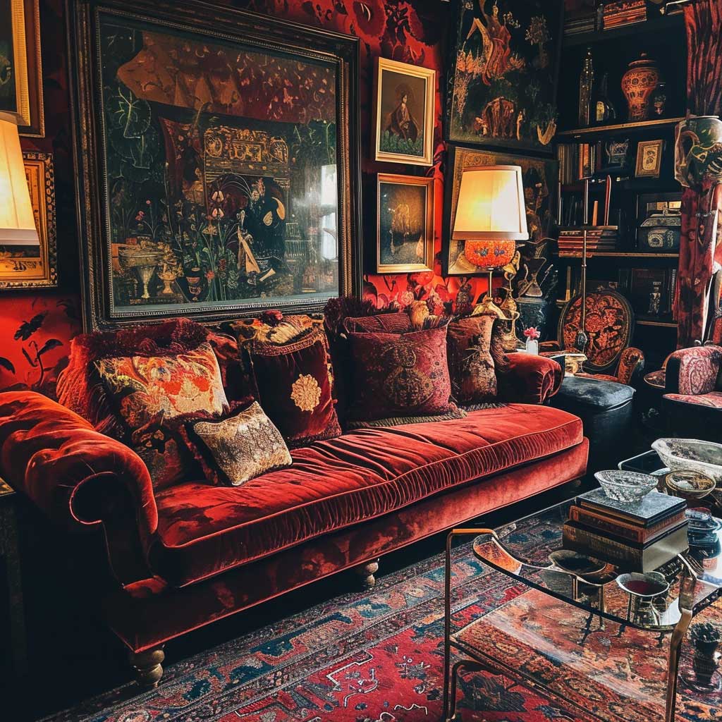
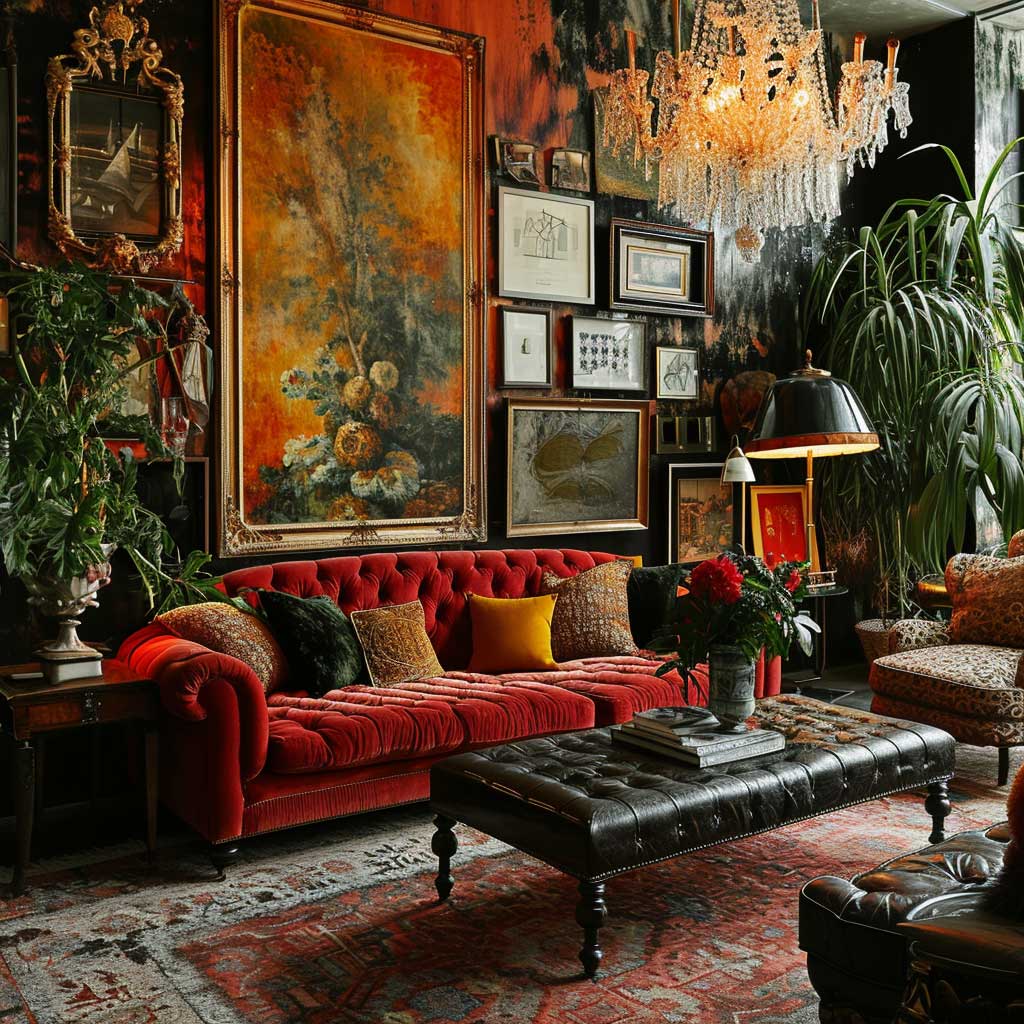
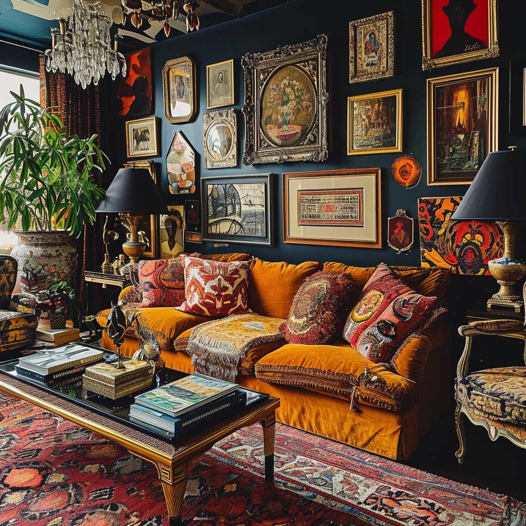
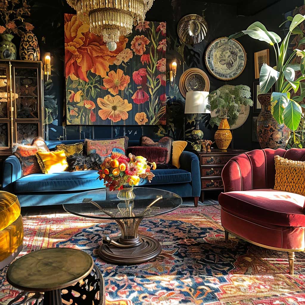
Furniture in a maximalist room runs the full style range — Baroque next to Bauhaus, Victorian next to 1970s Italian. The trick is that at least one piece needs to be genuinely old or genuinely unusual. A IKEA sofa reupholstered in Schumacher fabric reads better than a brand-new “eclectic” sectional from a mass-market retailer. Why? Because maximalism is fundamentally about history accumulating in a room, not history being simulated. Real age has a quality that reproduction can’t fake.
Gallery walls are the finishing move, not the opening one. Hang them after every piece of furniture is placed, because the wall arrangement needs to respond to what’s happening below it. Mix frame sizes, mix eras — one oil painting, one modernist print, one personal photograph, one vintage illustration. The symmetrical all-matching-frame gallery wall reads as Pottery Barn, not Pinterest-worthy maximalism. And never center a gallery wall unless there’s a very specific architectural reason to do so.
Antiques Inside a Modern Maximalist Living Room Hold the Whole Thing Together
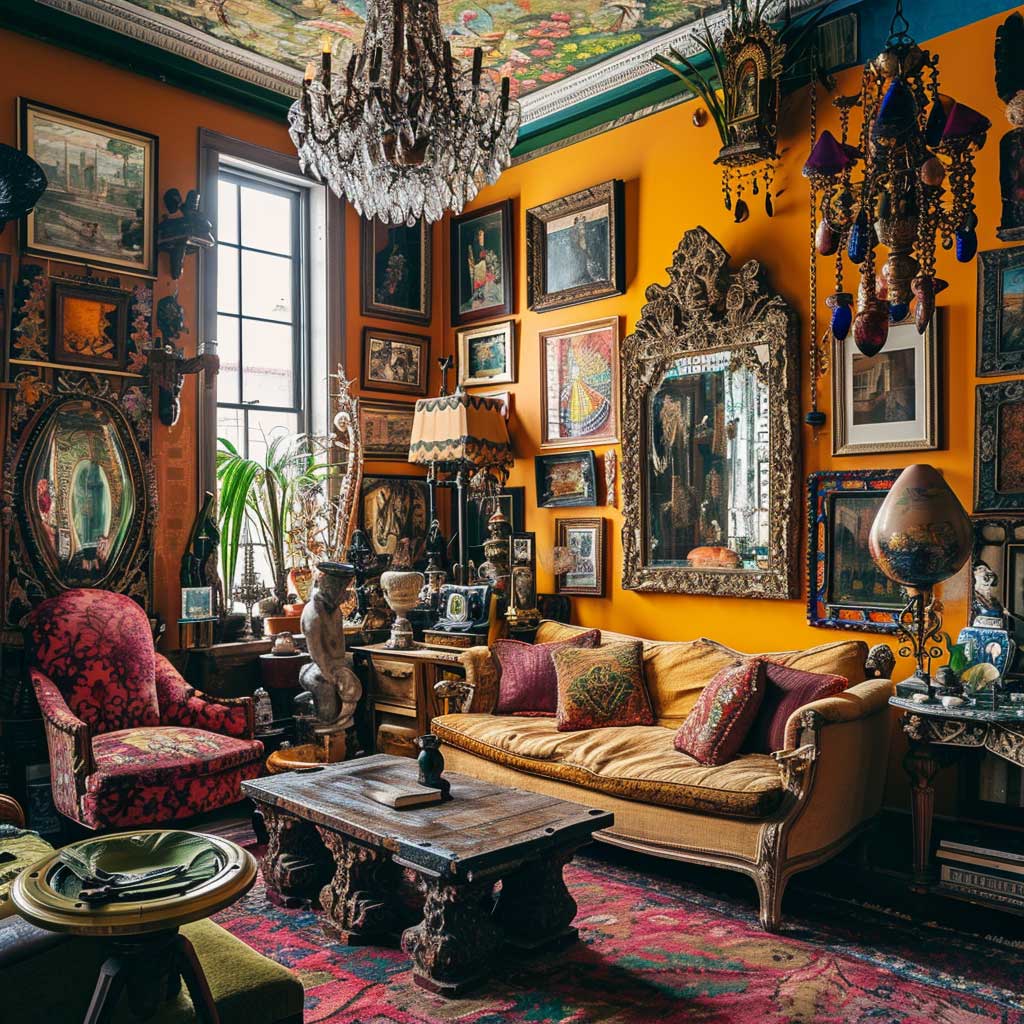
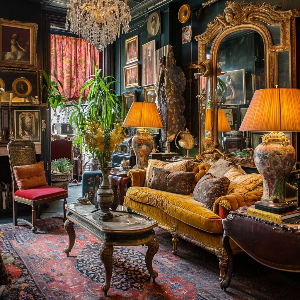
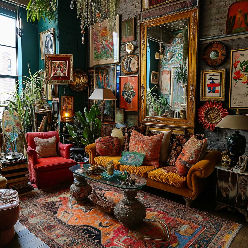
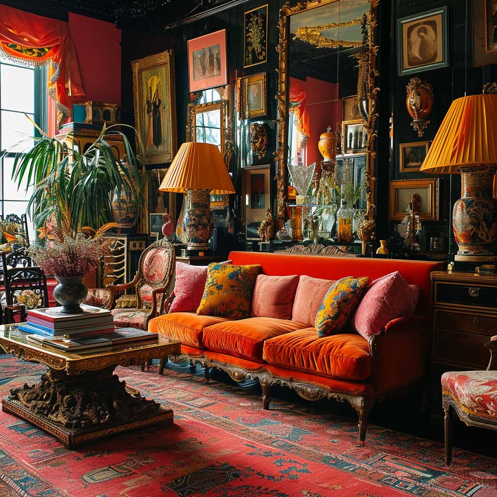
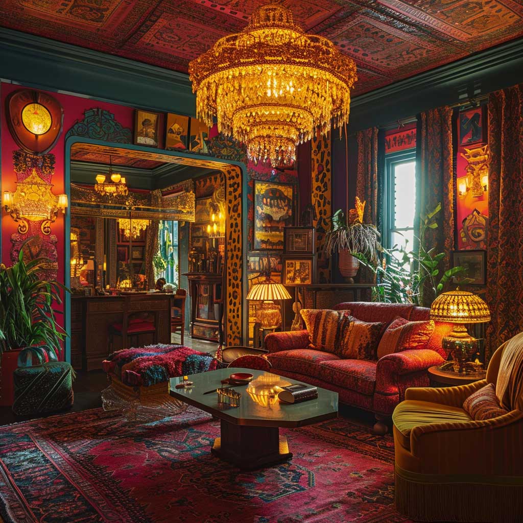
One genuine antique does more for a maximalist living room than ten curated accessories from West Elm. I stole this principle from a decorator who works exclusively on Upper East Side apartments: the antique is the credibility piece — it signals that the room has been lived in and collected, not assembled in a single afternoon. A single Victorian side table, a carved Baroque mirror, or an 18th-century cabinet immediately shifts the entire room’s register. These pieces run $300–$2,000 at auction houses like Chairish or 1stDibs, and they’re worth every dollar.
The fear most people have with antiques is that they’ll look stuffy or dated. The opposite is true in a maximalist room. Placing a gilded Baroque chandelier above a low-profile mid-century sofa creates the kind of tension that makes a room photogenic. Period contrast is a compositional tool, not a mistake. What looks dated is when everything in the room comes from the same era — that’s when maximalism slides into period-room cosplay rather than living space.
Color choices around antiques should be confident. Deep, saturated walls — Farrow & Ball’s Preference Red No.297 at $120/2.5L, or Benjamin Moore’s Midnight Navy 2067-10 at $75/gallon — make antique wood and gilt finishes pop in a way that neutral backgrounds never can. Think of the antique piece as a painting you’re lighting correctly: the wall behind it is the frame. A beige wall behind an ornate walnut cabinet is the equivalent of leaving a Rembrandt in a fluorescent hallway.
Don’t Do This
Don’t mix three pattern families with three different color palettes. Florals in terracotta, geometrics in navy, and stripes in sage green will fight each other until the room feels like a migraine. Share one color across all pattern types — even one bridging hue is enough to make the mix read as deliberate rather than desperate.
Also: don’t buy antiques specifically to look maximalist. Faux-worn reproduction furniture from big-box stores reads as costume, not collection. A real $400 piece from an estate sale will always outperform a $1,200 “vintage-inspired” piece from a chain retailer.
Mixing fabrics around antique furniture follows a specific logic: the upholstery needs to acknowledge the period without copying it. A Victorian cabinet paired with a velvet sofa in jewel green works because velvet is period-adjacent without being period-accurate. Pairing that same cabinet with a slubby linen sofa creates a jarring transition — linen reads as too casual, too farmhouse, for the formality an antique piece carries. You need to meet it halfway.

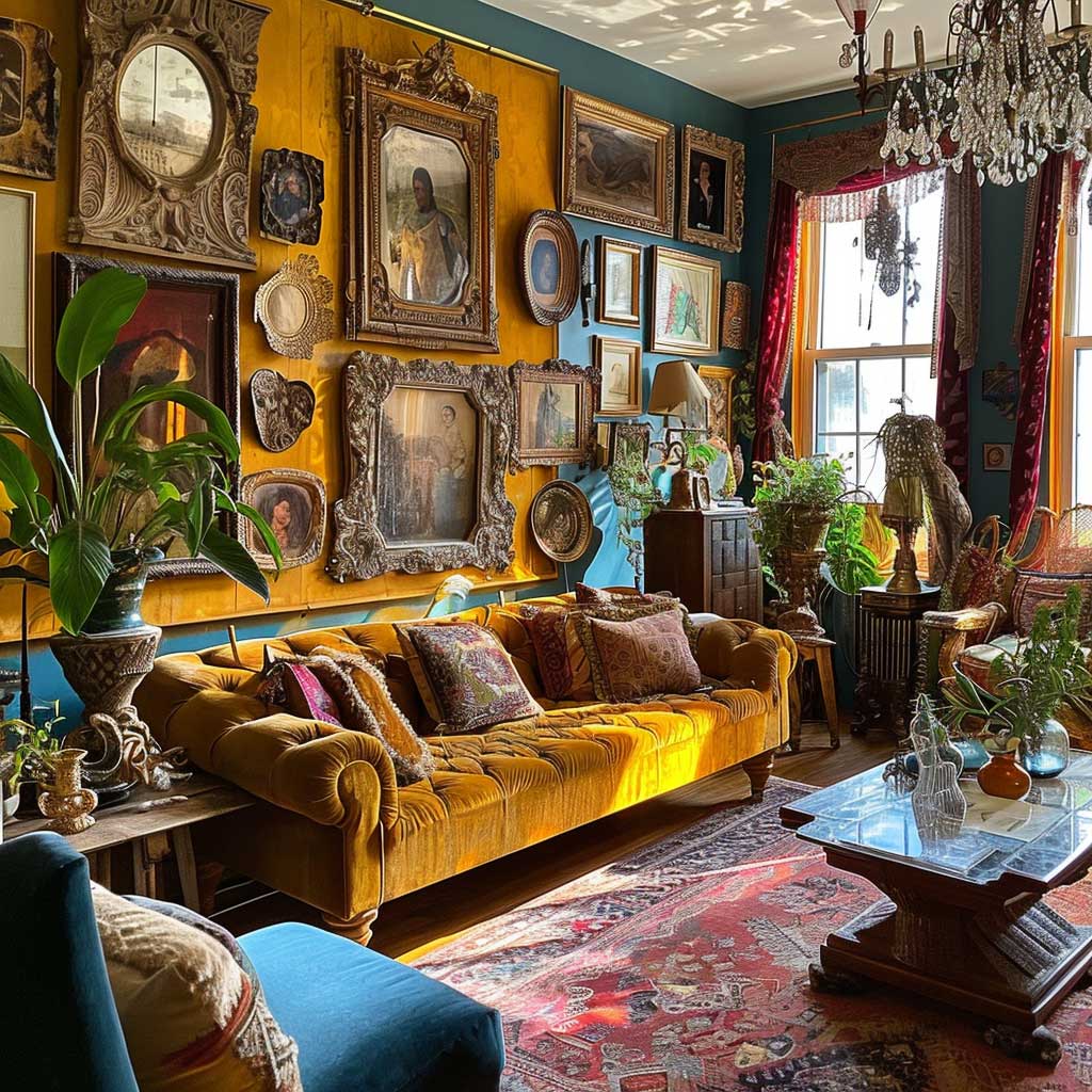
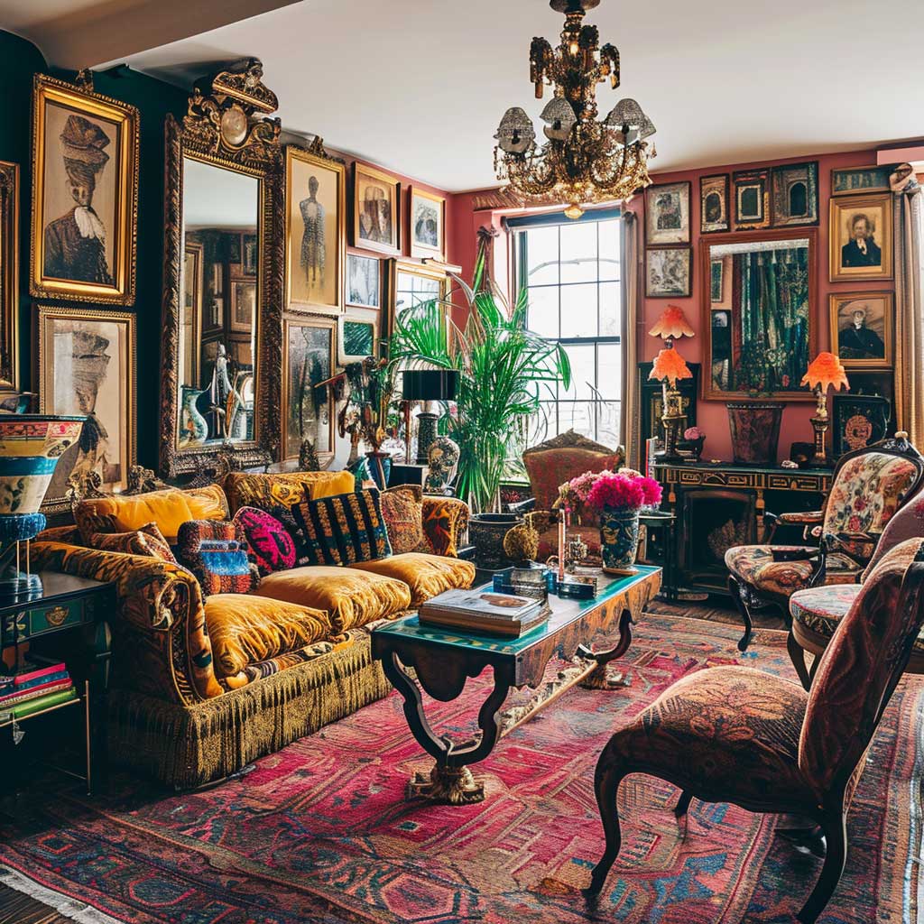
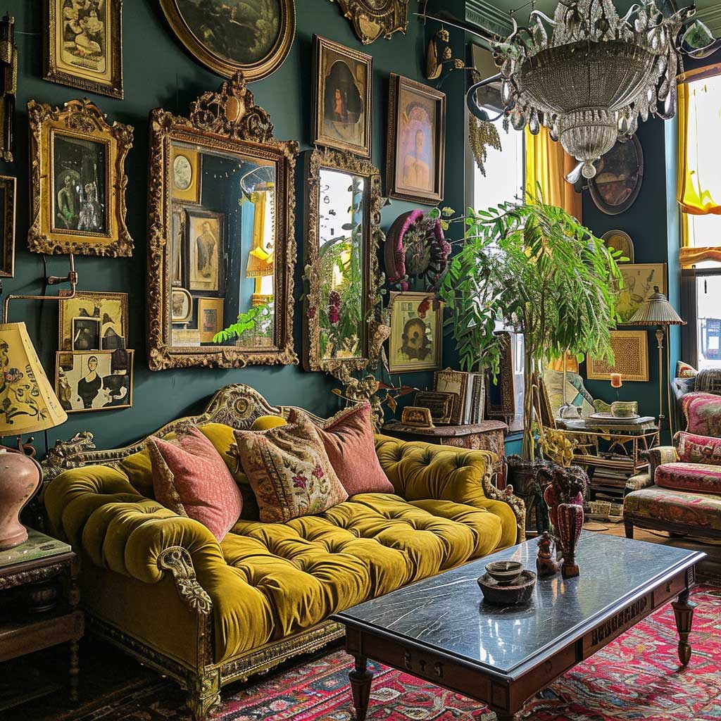
Decorative objects collected over time are the punctuation of a maximalist room — they don’t carry the sentence, but they change how it reads. Vases from different countries, sculptures in different materials, framed photographs alongside original art: group them by material or color rather than theme, and the arrangement looks considered rather than random. Three bronze objects together read as a collection. Three objects that happen to all be from different trips read as clutter with a backstory.
Contemporary art alongside antiques creates the dialogue that makes a maximalist living room feel alive rather than preserved. A large abstract canvas above a Victorian console is not a contradiction — it’s a conversation. The rule I follow: the older and more ornate the furniture, the more stripped-back and graphic the art should be. They define each other. Pair ornate with ornate and both disappear into noise.
Layered Lighting Turns a Flat Maximalist Room Into One You Actually Want to Stay In
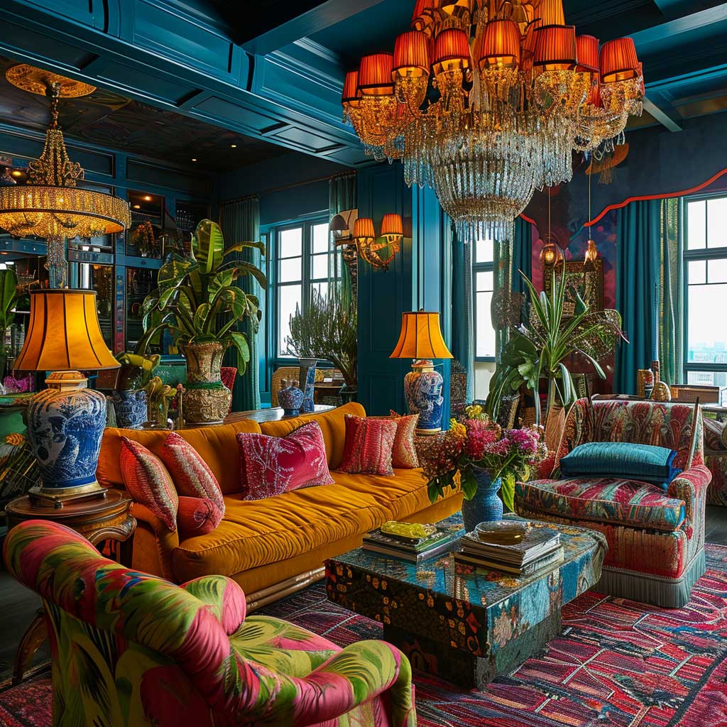
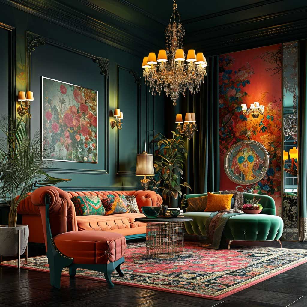
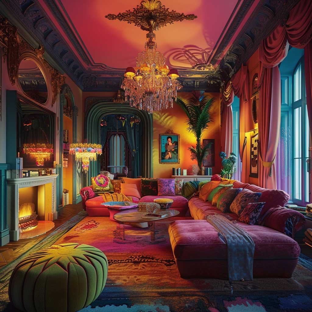
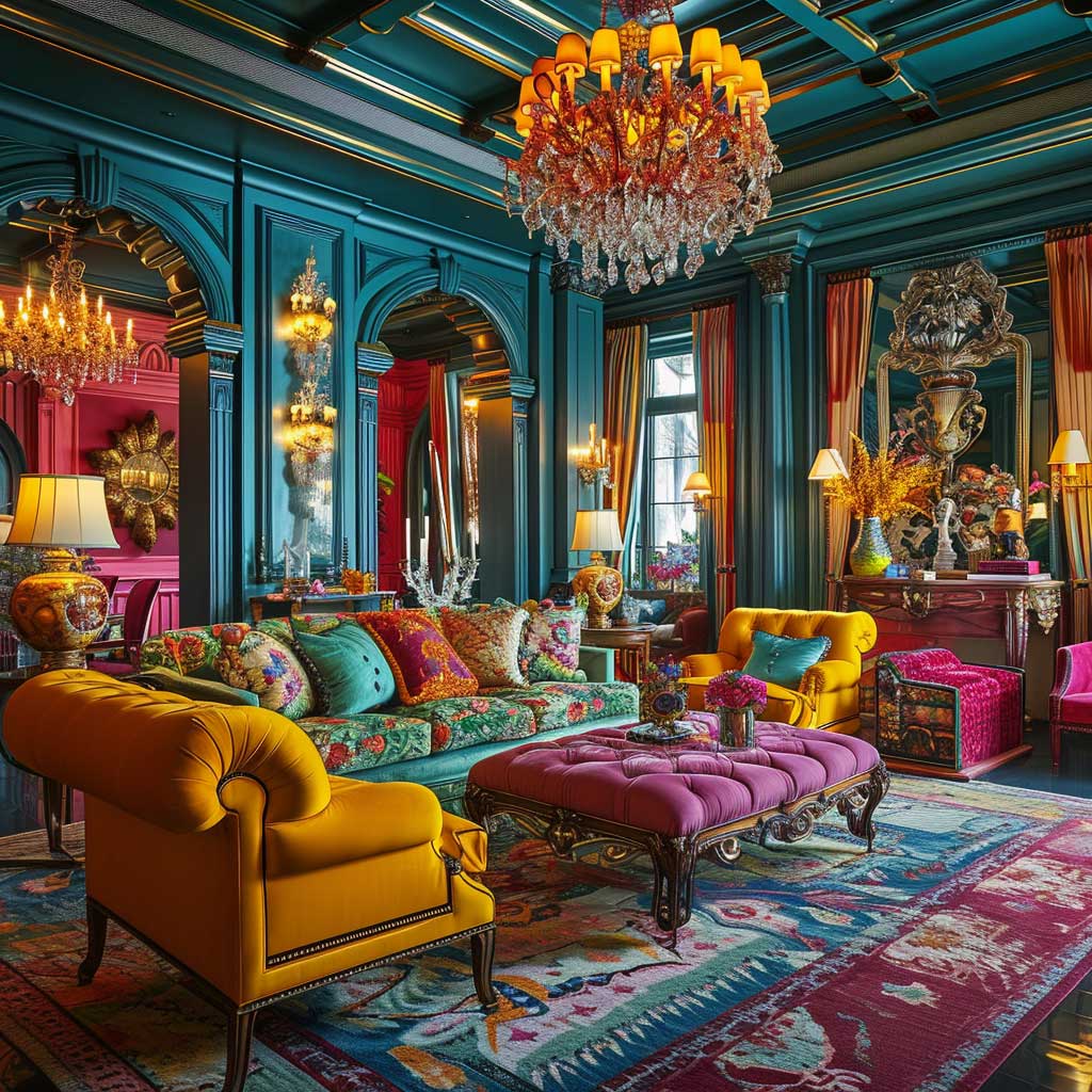
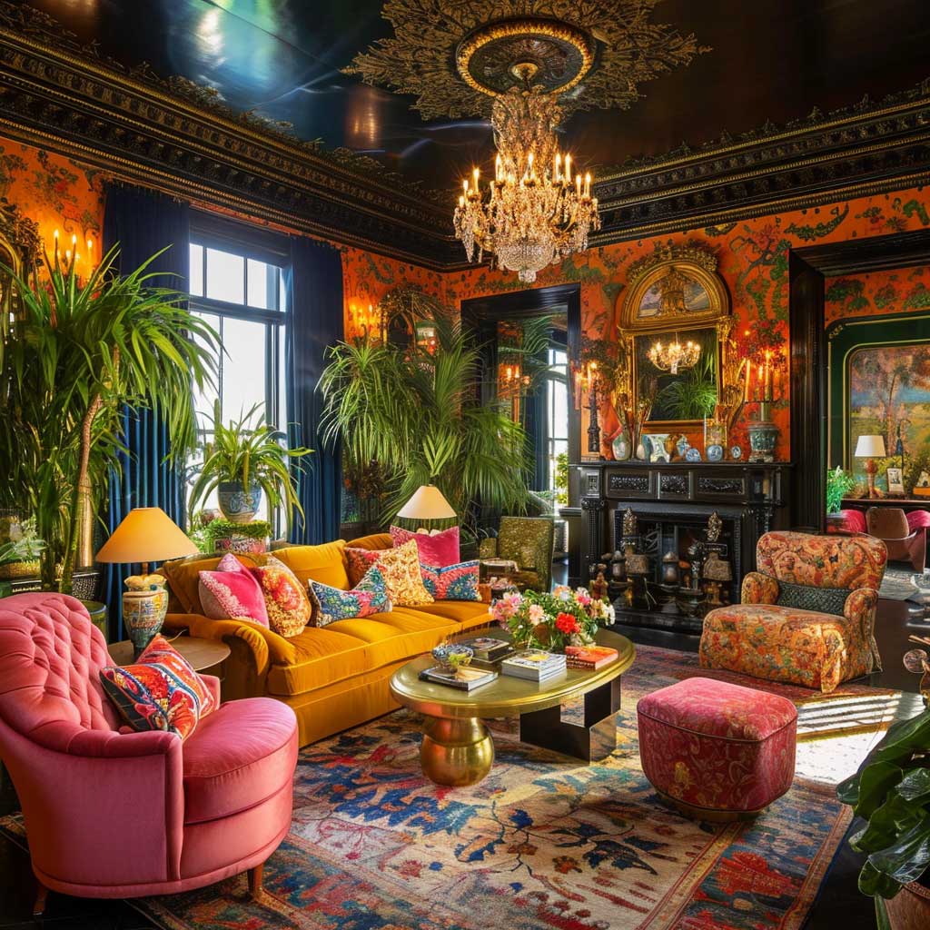
Overhead lighting alone kills a maximalist living room. It flattens everything — the texture disappears, the jewel tones go dull, the entire composition collapses into one evenly-lit plane. The room needs at least three sources of light operating at different heights and intensities simultaneously. A chandelier for ambient, floor lamps at sofa height for warmth, and picture lights or LED strips for accent — that layered structure is what allows every layer of the room to be visible at once. Remove one tier and you lose depth.
The chandelier in a maximalist room is not optional decor. It is structural. West Elm’s sculptural rattan chandeliers ($350–$600) work well in rooms with warm jewel tones; for rooms running cooler with sapphire and amethyst, a brass or black iron chandelier from CB2 ($400–$900) reads cleaner. What you should not do: install a flush-mount ceiling fixture and compensate with a dozen floor lamps. The hierarchy of light matters — the chandelier establishes the ceiling as part of the room, which matters enormously in a maximalist space where vertical surface is part of the story.
Task lamps beside seating areas serve a dual function in maximalist living room design — functional lighting and additional visual layering. The lamp itself becomes an object: sculptural base, richly colored shade, unexpected material. I own a pair of Christopher Spitzmiller-style ceramic lamps ($280 each, found on Etsy from smaller studios) that do more compositional work than the shelving unit behind them. The shade color needs to warm the ambient rather than fight the wall color — amber, rust, and deep ivory shades tend to work in jewel-toned rooms where cooler white shades would wash things out.
Accent lighting is where most people skip steps, and you’ll notice the cost of that immediately. Picture lights on gallery walls — even inexpensive clip-on versions at $40–$80 each — pull the art forward and make the wall read as a curated installation rather than an arrangement. LED strip lighting under floating shelves adds a layer that most visitors can’t consciously identify but respond to viscerally. The room feels richer without them being able to say why. According to Homes & Gardens, combining ambient, task, and accent lighting is what creates the visually dynamic atmosphere that defines a well-executed maximalist space.
Dimmer switches are non-negotiable. The maximalist room that works at a party on full brightness also needs to work at 30% on a Thursday evening when nobody is performing for anyone. Without dimmers, you’re choosing between functional and atmospheric — but that’s a false choice. Lutron Caseta dimmers ($60–$80 per switch) handle this with zero drama. Install them on every circuit in the room, including lamps plugged into smart outlets.
Color temperature makes or breaks how the jewel tones perform. Warm bulbs (2700K) deepen emerald and sapphire into something almost edible; cool bulbs (4000K and above) pull those same colors toward cold and institutional. My go-to is Philips Warm Glow LED at $8–$12 per bulb — they dim to an amber warmth that makes velvet look like it’s been lit by candlelight. For accent lighting over art, bump up to 3000K so the colors on canvas read accurately without going clinical.
Lighting fixtures as objects deserve their own conversation in a maximalist living room. A room already dense with pattern, texture, and color needs lighting that participates rather than just illuminates. Sculptural floor lamps with brass detailing, pendant lights in hand-blown colored glass, sconces with maximalist shades that echo the wall color — each one is a decorative element that also happens to produce light. The ones that don’t work: generic drum shades in white linen, recessed cans, anything that reads as “background.” In a maximalist room, jewel tone color design principles apply to lighting choices as much as to paint and upholstery.
Final Word
Maximalist Decor Rewards Every Layer You Add — As Long As Color Comes First
Start with one dominant jewel tone across three surfaces. Add texture contrast before you add more pattern. Let one genuine antique anchor the whole room’s credibility.
Three tiers of light — ambient, task, accent — turn what could be an overwhelming room into one that shifts mood with a dimmer switch.
Save this post before your next furniture or paint decision — it’s easier to build from a framework than to fix a room that went sideways at step one.