Exterior wall paint colours in the cream-and-brown family keep appearing on the most photographed facades for a reason — they age differently from trends. Creamy beige holds its tone across seasons without reading as builder-grade, and rich chocolate deepens rather than fades when applied to trim, shutters, and architectural details. Together they hit a register that neither stark white nor full-colour schemes can reach.
Colour consultants note that the combination succeeds because both hues share warm undertones — there’s no temperature clash, no awkward shift when the afternoon light changes. The palette works on stucco, painted brick, and rendered facades alike. For homes where the roof or stonework already carries earth tones, this pairing compounds the effect rather than fighting it.
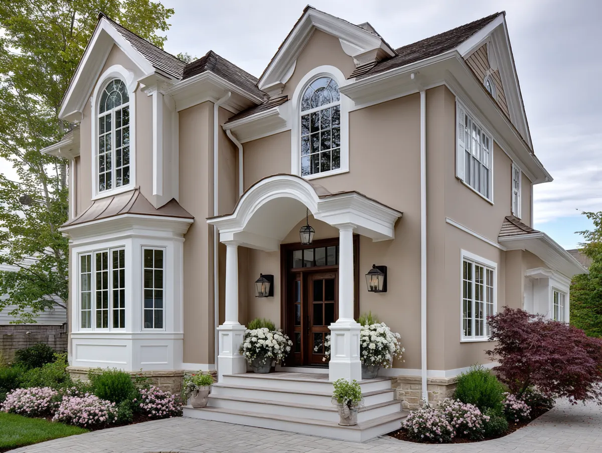
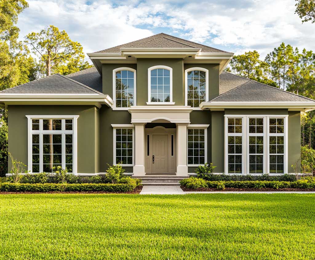
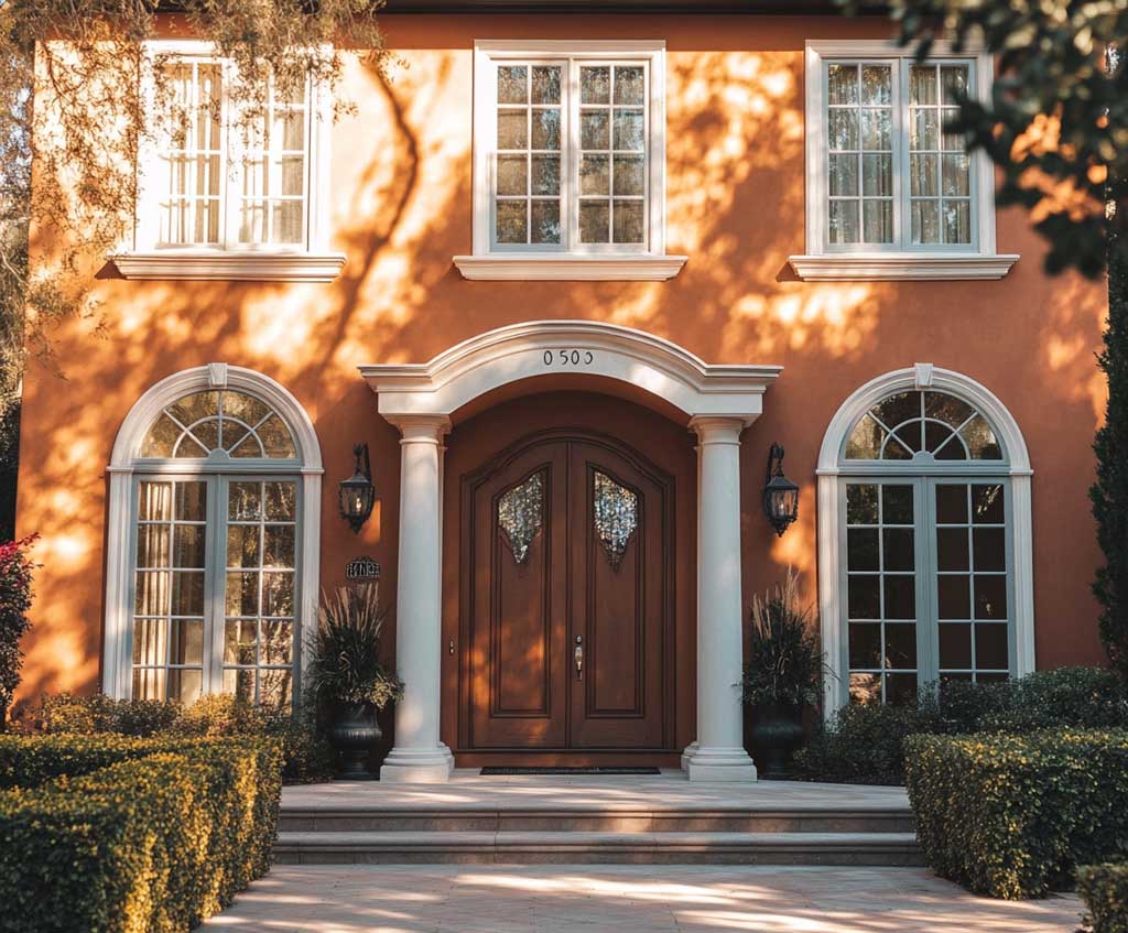
A gallon of Sherwin-Williams SuperPaint exterior acrylic latex runs around $69 in beige or cream tones — a mid-tier price that buys advanced acrylic resin technology rated for fade resistance across varying climates. Quality exterior paint applied properly lasts 5–10 years on most surfaces; stucco can extend that to 12. The photos below show three distinct applications of this palette: creamy beige as a primary body colour, rich chocolate as a bold accent, and the two neutrals working together on a multi-storey facade.
- Creamy beige reflects sunlight and helps keep interiors cooler in warm climates — lighter hues can add up to 5 years to paint lifespan compared to darker shades in high-UV zones.
- Rich chocolate works best as an accent on 20–30% of visible surface — trim, shutters, doors — not as the dominant body colour.
- Combining the two neutrals on a multi-storey home prevents large walls from feeling heavy while anchoring architectural details.
- Paint coverage runs 350–400 sq ft per gallon; measure your facade before buying to avoid under-ordering on a custom-tinted batch.
- Both hues share warm undertones, so they don’t conflict at different times of day — a key advantage over mixed cool/warm palettes.
What Creamy Beige Does to a Facade That Warmer Neutrals Cannot


Creamy beige occupies the narrow band between true white and warm sand — light enough to avoid heaviness on a large wall, warm enough to read as intentional rather than unfinished. Ask what colour exterior wall paint looks good on a multi-window facade, and nearly every paint consultant will land in this zone. The reason is practical: cream reflects enough light to keep the wall from advancing toward the viewer, while the yellow-to-orange undertones prevent the coolness that makes standard whites feel clinical on a sunny day.
On a facade with detailed cornices, window surrounds, or porch columns, this hue acts as the supporting cast rather than the star — it makes those features readable without competing with them. Lighter shades in the cream family can also help keep interiors marginally cooler by reflecting rather than absorbing solar heat, a measurable advantage in warmer climates. Painters note that cream-toned acrylic latex holds pigment longer than richer tints because the colorant load is lower, meaning less UV-induced breakdown over time.


Does the colour work with greenery? Consistently well — foliage reads as more saturated against a warm neutral than against cool white or gray, so existing landscaping gets a visual upgrade without a single plant being moved. The one thing to avoid: pairing cream walls with bright white trim. The contrast is too stark, turning the trim into neon-level highlights that draw the eye away from the facade’s actual details. Off-white or light stone trim keeps the palette coherent. For a broader look at classic exterior wall paint colour combinations that use neutrals at every tier — body, trim, accent — the contrast principle plays out across multiple architectural styles.
Repainting schedules matter more than most owners realize. Wood siding holds exterior paint for 3–7 years; stucco extends that to 5–12; brick can go 8–17 years between coats depending on the climate and product quality. Cream-toned finishes on brick fall at the longer end of that range because the low colorant load fades slowly and evenly rather than in patches.
Rich Chocolate on Trim — Where Exterior Wall Paint Colour Gains Its Edge


Rich chocolate in exterior paint is having its moment — design editors at Brick&Batten named deep warm browns like Sherwin-Williams Urbane Bronze as one of 2025’s dominant exterior colour movements, citing their ability to deliver drama without the coldness of all-black schemes. On trim, shutters, and doors, this hue works by creating a shadow-depth effect: the darker segments appear to recede slightly, making the lighter body colour feel like it’s stepping forward. Applied to window surrounds on a two-storey home, the result is a facade that looks professionally designed even when the landscaping is sparse.
The practical question is always proportion. Chocolate brown covering more than 30% of visible exterior surface starts to read as heavy, particularly on homes with limited natural shade from trees or porches. Used on 15–25% of the surface — trim, one feature element, and the front door — it behaves like punctuation, making everything around it more legible. What doesn’t work: applying rich chocolate to large horizontal bands or entire walls. That approach removes the contrast effect entirely, and the colour shifts from sophisticated to oppressive by mid-afternoon.


Brown exterior paint fades more slowly than most other colour families because earth-tone pigments have a lower UV sensitivity than the red, green, or blue colorants used in bolder shades. Darker colours do absorb more heat — a real consideration on south-facing walls in high-sun climates — but the warmth of brown undertones means the shift is less extreme than with cooler darks like navy or charcoal. For surfaces that get direct afternoon sun, stylists recommend going one shade lighter in the initial test sample, then deepening only after checking how the colour reads at 3 PM.
Chocolate tones are compatible with brick, wood, stucco, and composite cladding — the warm undertone finds an echo in almost every natural material. The accent that most often undercuts the effect? Pairing it with a bright white that has cool (blue or purple) undertones. The temperature clash reads as accidental rather than designed. Off-white, cream, or warm stone is the right counterpart — see how that relationship plays out across multiple home styles in these house exterior paint colour combinations.
Don’t apply rich chocolate as the dominant body colour on a single-storey home with a low roofline — the dark perimeter shrinks the visual height and makes the facade look bunker-like, especially by midday when there’s no shadow variation to create depth. Reserve chocolate for trim and accent elements only, and keep the body in a colour at least four shades lighter. Similarly, avoid pairing chocolate brown with a cool off-white trim: clashing undertones make the combination look unresolved rather than deliberate. Test both colours together on a 2×2 ft patch in direct sun before committing.
Creamy Beige Plus Chocolate — How Neutral Exterior Wall Paint Colours Work as a System


Cream and brown exterior wall paint colours work as a system because they solve opposite problems at the same time: the lighter hue keeps the facade from feeling imposing, while the darker one stops it from reading as blank. On a multi-storey home with expansive wall area, this division of labour is especially visible — cream on the main body prevents the structure from advancing aggressively toward the street, while chocolate on eaves, moldings, and window frames gives the eye something specific to land on at each floor level.
The proportion formula that works consistently is roughly 70% body (cream), 20% trim and architectural detail (chocolate), and 10% or less for any additional accent — a contrasting door colour, for example. Shift the chocolate above 30% and the palette tips from layered to heavy. The trick here is treating the darker colour like a frame rather than a fill: its job is to define edges, not cover surfaces.
Homes and Gardens’ exterior colour experts confirm that warm neutrals like creamy whites and soft beiges are leading the 2025–2026 palette shift, specifically because they pair so easily with earthy accent tones — a direction that benefits the cream-and-chocolate combination directly. Paint on stucco in this palette typically holds 5–12 years; on painted wood, 3–7 years depending on surface preparation and the quality of the primer coat. Skipping primer on previously painted wood is the single fastest way to cut that range in half.


Undertone matching is the detail most homeowners overlook. Both cream and chocolate need to share a warm base — yellow, orange, or red-leaning — otherwise the palette fractures when the light changes. A cream with a green undertone paired with a red-leaning chocolate will look off at different times of day even if both swatches looked fine at the paint store. Always review samples outdoors, side by side, at morning and afternoon light before buying full gallons. Returning custom-tinted paint typically incurs a 20% restocking fee or is impossible outright.
According to Homes and Gardens’ exterior colour analysis for 2026, warm neutrals in this range are among the few palettes that perform well in both high-UV southern climates and cloudier northern light — the warm undertone compensates for flat light conditions by adding perceived warmth, while the beige body colour avoids the chalky look that cream can develop in intense sun without proper UV-resistant finish coats.
| Variant | Best Application | Surface Coverage | Key Risk |
|---|---|---|---|
| Creamy Beige (body) | Main walls, large surfaces | 70% of facade | Green undertones clash with warm chocolate trim |
| Rich Chocolate (trim) | Shutters, eaves, window frames, front door | 15–25% of facade | Too much coverage makes facade feel heavy |
| Cream + Chocolate Combined | Multi-storey homes, detailed facades | All surfaces proportioned 70/20/10 | Undertone mismatch looks accidental in changing light |
For homes surrounded by mature greenery, the cream-and-chocolate palette functions like the warm neutrals that landscape designers use as negative space — it lets the planting saturate visually, so the garden reads as richer without any additional planting. The darker chocolate trim grounds the facade at its edges, preventing the lighter body from floating or appearing unanchored on large open wall sections. According to Homes and Gardens’ 2026 exterior colour analysis, warm neutrals paired with earthy accent tones are the palette movement with the clearest cross-climate longevity.
Exterior Colour Verdict
Cream and chocolate is a two-ingredient formula — but only when the proportions are right.
Creamy beige on 70% of the facade; rich chocolate on trim, shutters, and one feature element. Deviate from that ratio and the palette stops working. Quality exterior acrylic latex (budget $65–$90 per gallon for a mid-to-premium product) applied over a properly primed surface holds this colour combination for 5–10 years on most substrates.
Undertone matching is non-negotiable. Both hues need warm bases — sample them outdoors together at 8 AM and 4 PM before buying.
Save this post before your next exterior repaint project.
Related Topics