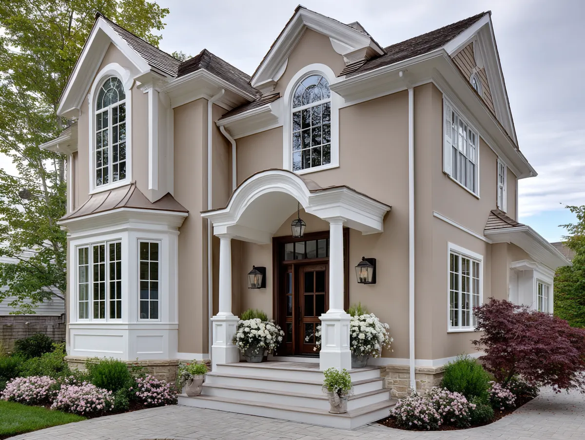
Burgundy and taupe on a home exterior is one of the few color pairings that reads as both bold and restrained at the same time. The deep wine tone of burgundy commands attention on trim, shutters, and front doors, while taupe — that warm gray-brown that borrows from both earth and stone — holds the composition together without competing for the spotlight. Stylists in the architectural color space consistently point to this duo as a reliable choice for classic homes that need presence without visual noise.
The combination works because it exploits contrast without resorting to opposites. Burgundy sits in the red-violet family and carries connotations of wine cellars and aged leather. Taupe, grounded in brown and gray, functions almost like a warm neutral — it lets the burgundy breathe rather than crowd it. Think of it like a charcoal blazer over a deep garnet shirt: the pieces are distinct, the result is coherent.
A practical note before you commit: dark colors, including burgundy, absorb significantly more UV radiation than lighter shades. Homes with south- or west-facing burgundy trim may need a touch-up or full refresh in as few as 3–5 years, compared to 5–7 years for lighter accent colors on the same surface. Plan your product choice accordingly — Benjamin Moore Aura Exterior ($90–$100/gallon) carries a lifetime limited warranty and is specifically formulated for color retention on darker shades.
– Burgundy reads best as an accent color — trim, shutters, doors — not as a full-body paint on large wall surfaces.
– Taupe works as the primary body color; warm-toned taupe (with brown undertones) pairs better than cool greige.
– Dark burgundy on sun-exposed walls fades faster — budget for 3–5 year repaint cycles on south and west elevations.
– One gallon of exterior paint covers 250–350 sq ft; trim requires roughly 1 gallon per 50 linear feet.
– Burgundy and taupe also translates indoors: the same ratio logic applies to living room accent walls and upholstery.
What Burgundy and Taupe Actually Do to a Classic Exterior


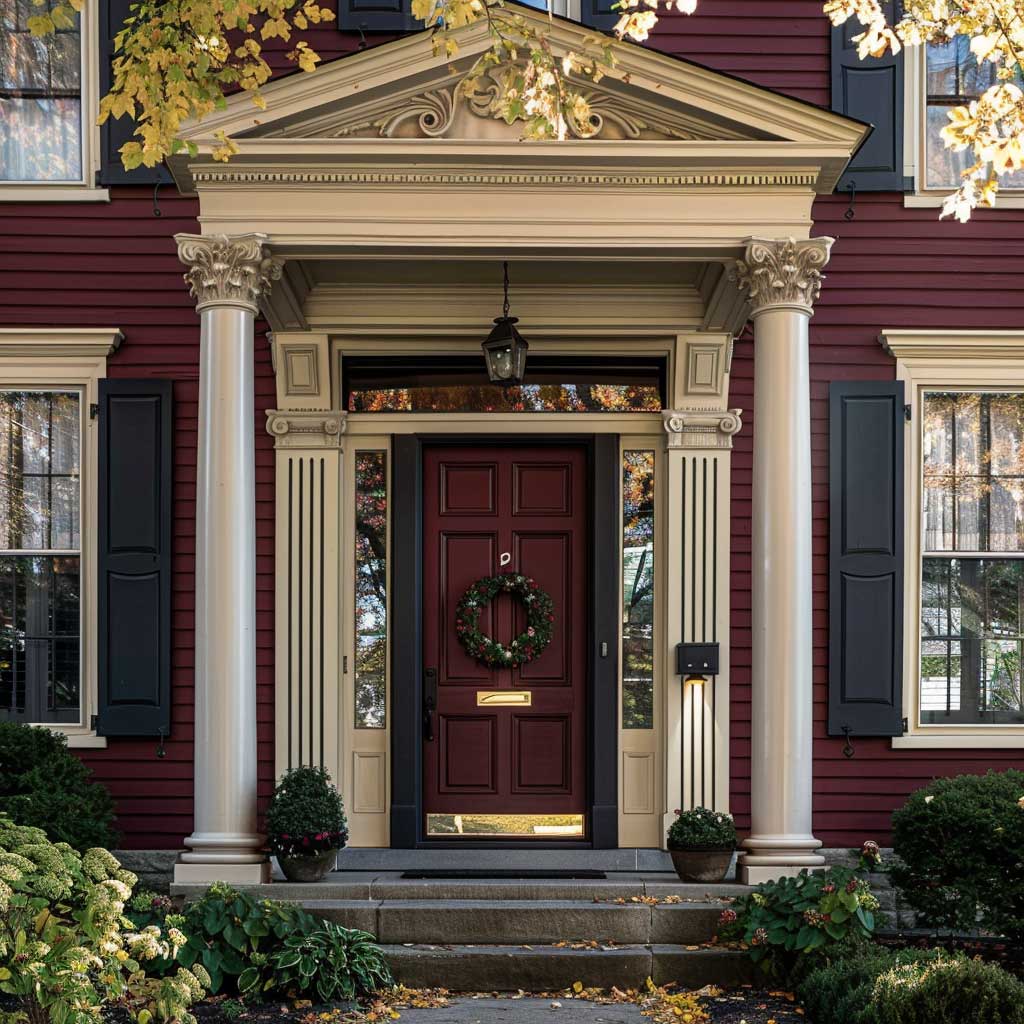

Taupe and burgundy become genuinely interesting on a classic exterior because each color amplifies what the other suppresses. Taupe, by itself, risks reading as muddy or indecisive — it sits in the no-man’s-land between beige and gray. Burgundy, used solo as a body color on a large house, can feel heavy and institutional. Together, the burgundy locks in the taupe’s warmth and gives it direction, while the taupe softens burgundy’s intensity so the house doesn’t look like a Victorian funeral parlor. The trick here is proportion: taupe does the heavy lifting as body color (roughly 70% of the visible facade), with burgundy deployed on architectural detail only.
Ask yourself where the eye naturally lands when approaching your house from the street. Usually it’s the front door, then the window frames, then the roofline trim. Those are exactly the surfaces where burgundy earns its place. Sherwin-Williams offers SW 6300 Burgundy — a warm, slightly muted red-violet rated for both interior and exterior use — as a starting point for this accent strategy. The muted undertone keeps it from reading as fire-engine red while still registering as a deliberate, confident choice from 30 feet away. A common approach is to test the color on the actual siding or trim boards for at least 48 hours before committing to gallons, since burgundy shifts perceptibly between morning shade and direct afternoon sun.
Don’t try to apply burgundy to the full body of a two-story home and expect it to look intentional. At that scale, a deep red-violet reads as oppressive rather than elegant — it absorbs too much visual weight and makes the structure feel smaller. The homes that pull off a burgundy exterior successfully tend to use it on cottage-scale structures or single-story facades where the total surface area is modest. On anything larger, keep burgundy where it belongs: the details.


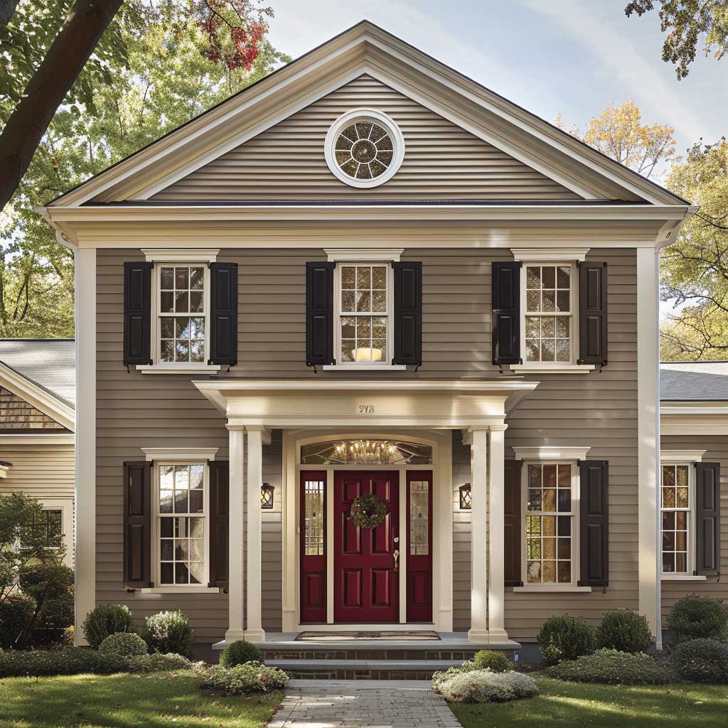
What color is taupe, exactly, when it comes to exterior paint? The most workable exterior taupes sit in the LRV (Light Reflectance Value) range of 35–55 — light enough to avoid a gloomy basement feel, dark enough to read as substantive rather than builder-grade beige. Benjamin Moore’s Revere Pewter (HC-172) leans cooler and works well with burgundy because it doesn’t compete in the red spectrum. Warmer taupes with more brown — like Sherwin-Williams Accessible Beige or Kwal’s Sandstorm — make the burgundy accent feel richer. You’ll notice the difference most in late afternoon light, when warm-toned taupes glow and cool-toned ones go flat.
Burgundy Paint Color on Exterior Walls: Where It Works and Where It Fails

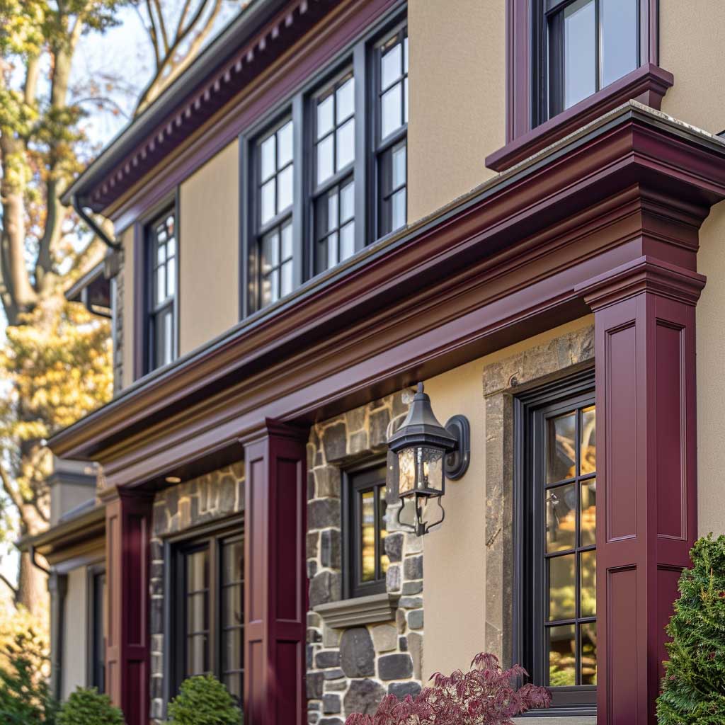


Burgundy paint color on an exterior surface behaves differently depending on what it’s next to and how the light hits it. On south-facing trim that receives 6+ hours of direct sun daily, research from professional painters’ communities consistently shows that dark colors fade 30–40% faster than the same color in a shaded location. That’s not a reason to avoid burgundy — it’s a reason to buy Benjamin Moore Aura Exterior ($90–$100/gallon) instead of a mid-grade option, and to plan for touch-ups on the sun side every 3–4 years while the shaded north elevation holds for 6–8 years.
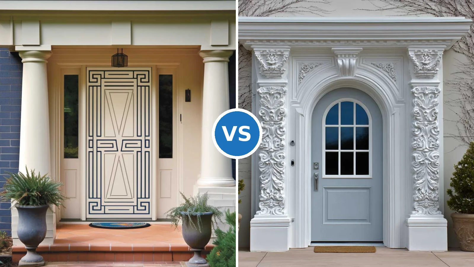
Surfaces where burgundy reliably delivers the result you’re picturing: front doors (high-gloss burgundy on a door creates a lacquered, intentional effect), window shutters and casings, porch columns, and garage door panel frames. Surfaces where burgundy typically disappoints: large flat wall sections, gable ends, and foundation bands — anywhere the color has no neighboring element to play against. On a flat wall, burgundy without architectural detail nearby just sits there looking like a color that wasn’t quite committed enough to be red. What are the best trim details to paint in burgundy? Narrow moldings, door surrounds, and eave brackets — pieces with shadow and depth, where the dark color adds definition rather than just coverage.
Exterior painting pros recommend choosing a satin or semi-gloss sheen for dark accent colors like burgundy. Flat sheen on a deep color creates a chalky appearance after the first rain season and makes the color look faded even when it’s not. Semi-gloss on the trim also protects the wood better — it sheds water rather than absorbing it, which matters especially on horizontal surfaces like sill caps and top rails. For a house exterior paint colour combination that holds up across multiple years, sheen choice is as important as the color itself.


The light behavior across a burgundy and taupe facade changes significantly throughout the day — and this is worth accounting for before you finalize your color selections. At golden hour (late afternoon), burgundy deepens toward a near-black purple-red, which reads as sophisticated and anchored. Under overcast skies, the same color can appear duller and murkier, especially if the taupe body has cool gray undertones. A warm-toned taupe acts as insurance against this shift: it holds its own warmth on gray days and keeps the burgundy from looking like a color that misjudged itself.
Don’t choose your burgundy shade from a paint chip viewed under indoor LED lighting. Burgundy is one of the colors most likely to shift dramatically between store lighting and outdoor sun — it can read as brown, purple, or deep maroon depending on the UV and surface angle. Buy a peel-and-stick swatch or sample pot and tape it to your actual trim for a full week before ordering gallons.
Don’t pair burgundy with a cool taupe that has blue or gray undertones. Cool taupe pulls the burgundy toward purple and makes the whole exterior feel cold and slightly off. Test the two colors side by side outdoors in afternoon light before committing — if the taupe makes the burgundy look lavender, swap it for a warmer tone.
Architectural Detail Becomes the Canvas for This Color Pairing
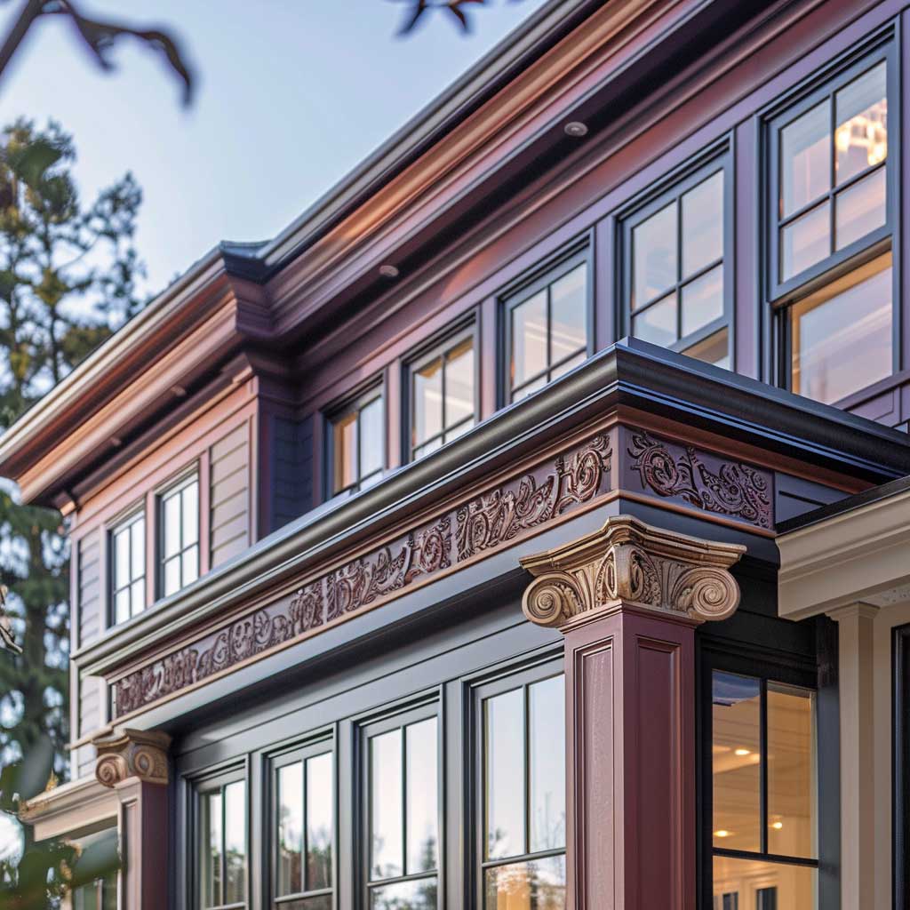


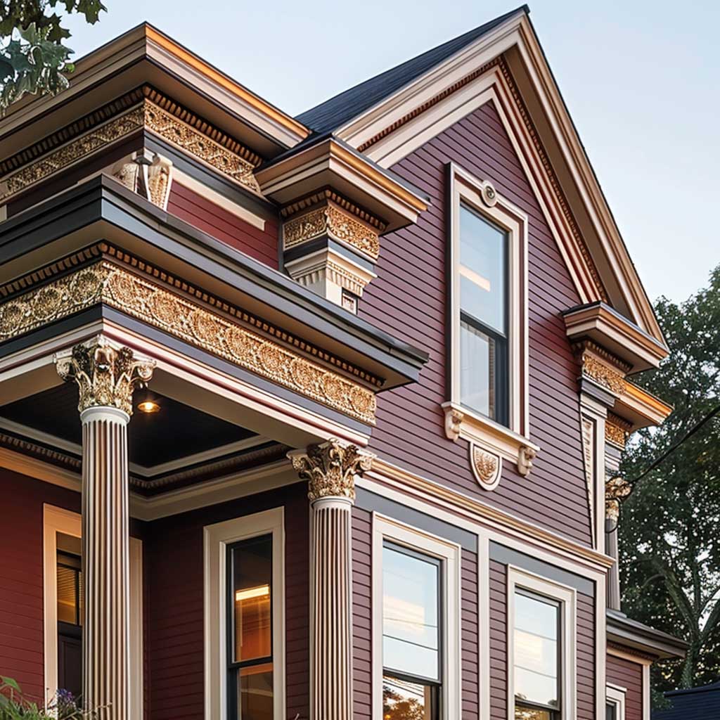
This Old House’s exterior color guidance identifies burgundy red as one of the most effective accent choices for homes with established stone or masonry — precisely because it warms the gray spectrum of stone without fighting it. That observation holds for taupe-body homes too: the taupe creates a stone-like neutrality, and the burgundy brings the warmth that stone exteriors often lack. The more pronounced the architectural detail — column capitals, decorative brackets, cornices, window surrounds — the more the burgundy has to work with. A plain Colonial box with no exterior ornamentation gives the color nowhere to land.
Maroon and beige combinations function on the same logic, and the terms are often used interchangeably with burgundy and taupe in real estate listings and paint store consultations. The distinction worth knowing: true maroon leans brown-red, while burgundy leans purple-red. On an exterior, maroon reads as slightly more rustic and earthy, while burgundy reads as more formal and European in character. Neither is wrong — the right choice depends on the architecture. A Craftsman bungalow with exposed rafter tails and taupe board-and-batten siding tends to suit maroon better. A Colonial or Federal with symmetrical windows and classical moldings looks sharper in true burgundy. Choosing maroon and a light brown (taupe leans light brown in warm light) as your exterior palette is a decision grounded in architectural logic, not just color preference.
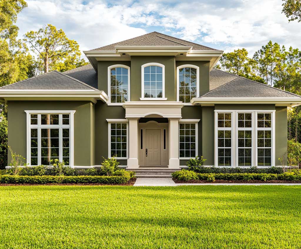
Paint trim in sequence from largest to smallest element: body first, then major trim (fascia, corner boards), then secondary trim (window casings, door surrounds), then the accent color last. Applying burgundy out of sequence — before the body color is dry — risks contamination that turns the dark accent muddy at the edges. A gallon of exterior trim paint covers roughly 50 linear feet per coat; a full trim package on a 2,000 sq ft home typically requires 4–6 gallons of trim color. Budget for that quantity rather than hoping two gallons will stretch. For a broader look at how dark green exterior house paint navigates the same trim-sequencing and sheen decisions, the same principles apply across the dark-accent-on-neutral-body category.


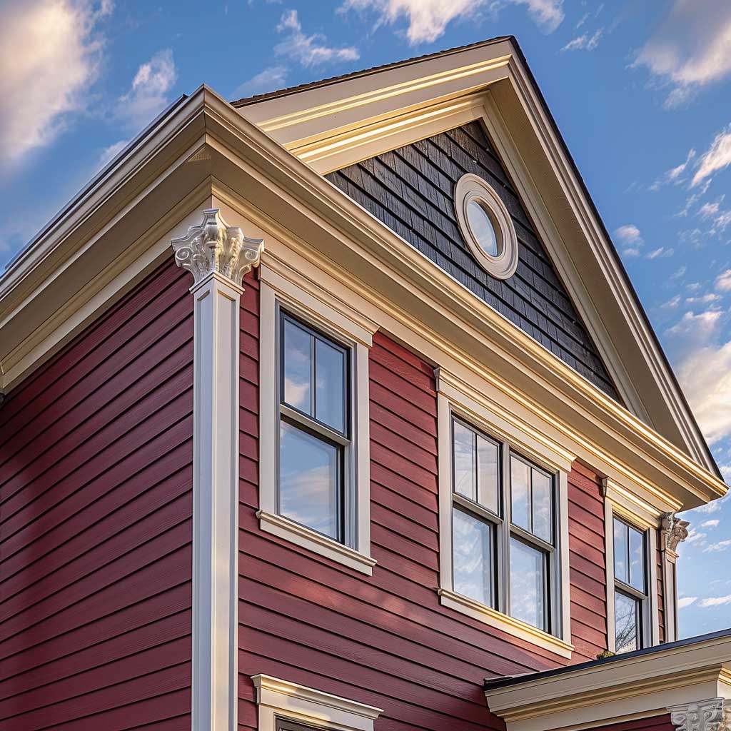
Burgundy’s relationship with light is its most useful property on an exterior — and its most punishing one if mismanaged. The color contains enough red pigment to catch warm light beautifully, shifting from deep wine at noon to near-amber at sunset on west-facing surfaces. That dynamic quality is what makes a burgundy door look alive rather than flat. The risk comes from UV degradation: red pigments break down faster than earth tones, which is why choosing a premium exterior line matters more for burgundy than for any neutral in your palette. Sherwin-Williams Emerald ($80–$90/gallon) and Benjamin Moore Aura ($90–$100/gallon) both offer advanced fade resistance for darker shades — the per-gallon cost premium is worthwhile when the color is doing as much visual work as burgundy does on this palette.
A word on what roof color does to this combination: burgundy and taupe read best under a charcoal gray or black roof. Brown roofs introduce a competing warm tone that muddies the taupe. Red-toned roofs (terra cotta tile, cedar shake that’s oxidized to orange-brown) conflict directly with the burgundy and should prompt reconsideration of the palette — or at minimum, a shift toward maroon (browner) rather than true burgundy (more purple). Gray asphalt shingles are the most forgiving roof under this color scheme, and conveniently the most common. For reference on how exterior color authority This Old House recommends burgundy as a complementary accent on stone-based exteriors, the logic maps directly to taupe-as-neutral scenarios as well.
| Combination | Best Architectural Style | Accent Placement | Key Risk |
|---|---|---|---|
| Burgundy trim + warm taupe body | Colonial, Federal, Georgian | Window casings, door surround, shutters | Taupe turns cool/purple if undertone is wrong |
| Maroon trim + light brown (taupe) body | Craftsman, bungalow, farmhouse | Porch posts, rafter tails, front door | Maroon reads as muddy next to orange-toned wood |
| Burgundy door + full taupe exterior | Any symmetric style | Front door only | Single accent looks timid if door frame isn’t also painted |
| Burgundy and beige (lighter taupe) | Victorian, Queen Anne | Multiple trim layers | Beige can look too pale and wash out in bright sun |
The Verdict
Burgundy and Taupe Works Because the Ratio Does All the Work
Taupe covers the body — roughly 70% of visible surface — in a warm neutral that flatters every architectural style from Colonial to Craftsman. Burgundy goes on the details: door, shutters, casings, eave trim. That’s the formula.
Premium exterior paint ($80–$100/gallon) is non-negotiable for burgundy specifically — dark red pigments fade faster than any other color family, particularly on south and west elevations. Budget for a 3–5 year repaint cycle on sun-facing accent surfaces.
Match your taupe to your roof first. Warm-toned taupes (brown-based) suit gray or charcoal roofs and let the burgundy read as wine rather than purple. Save this post.