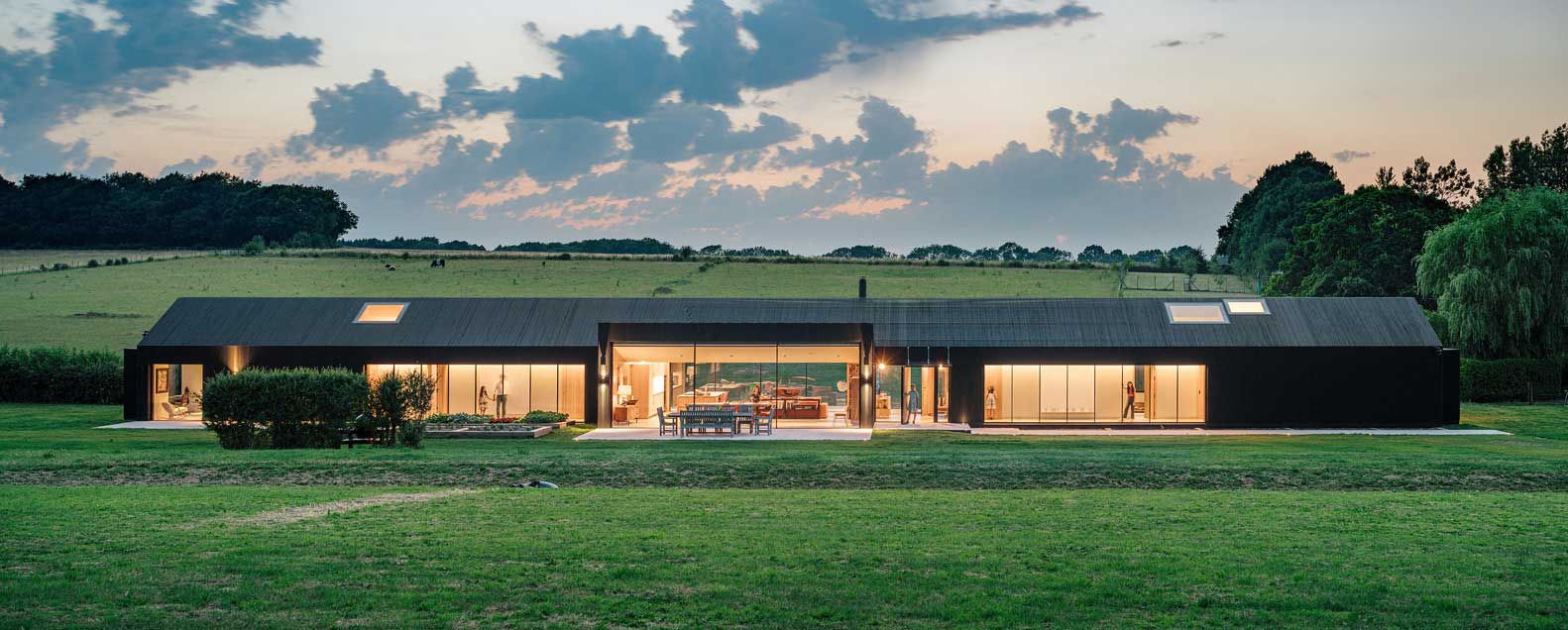
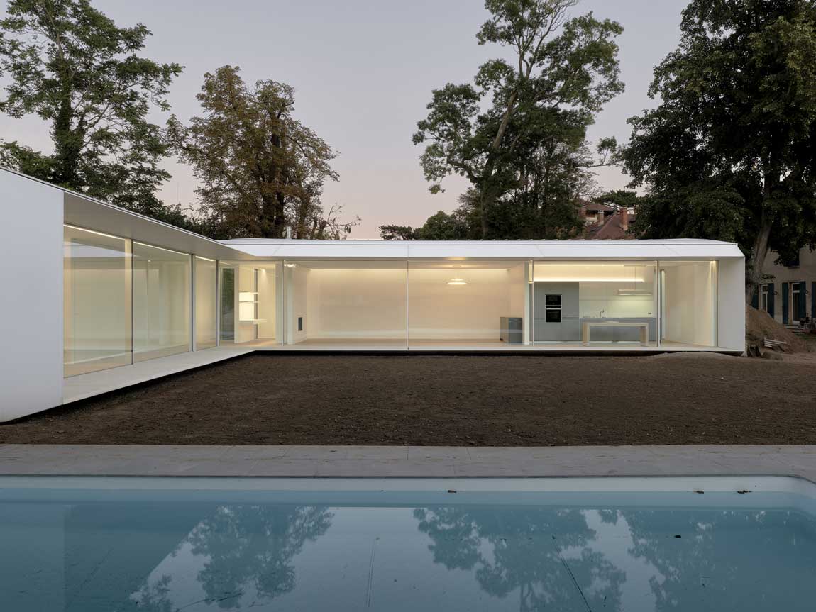
Single story modern farmhouse exterior color schemes do one job that multi-story homes never have to worry about: they control how wide and grounded the house looks from the street. Paint the body and trim the same value and you lose the roofline. Go too dark on the siding and a low-slung ranch reads like a bunker. I’ve painted three houses and made every one of those mistakes before I understood that color placement matters more than color choice. You’ll notice the difference the second you drive up.
The three schemes below cover different personalities — clean neutrals, earthy organics, and bold contrast — but each one was chosen because it works specifically on a one-story silhouette. Not every palette does.
Quick Scan
- White + Soft Gray — widens the facade, highlights trim detail, works on any lot
- Earthy Green + Cream — sage green body with cream window trim; best on wooded or suburban lots
- Navy + White — maximum contrast, makes a one-story feel intentional and architectural
- Benjamin Moore and Sherwin-Williams dominate every section — for good reason
- Paint costs run $60–$85/gallon; full single-story exterior typically needs 15–20 gallons of body color
White Siding With Soft Gray Trim Photographs Wider Than It Is


Sherwin-Williams Alabaster (SW 7008) on board-and-batten siding with Dovetail (SW 7018) on window frames, shutters, and the front door — that’s my go-to for a single-story that needs to look deliberate rather than plain. Alabaster costs around $75/gallon and reads warm in morning light, clean at noon. Dovetail stops it from looking like a rental. The gray pulls every architectural edge forward, which is exactly what a horizontal house needs.
What doesn’t work? Pure bright white paired with stark black trim on a one-story. It reads nautical-themed fast food, not farmhouse. I’ve seen neighbors try Benjamin Moore Chantilly Lace with Jet Black and regret it by summer — the contrast is too punchy for a low silhouette. You want gray, not black, because gray acknowledges the middle tones in your roof and landscaping.
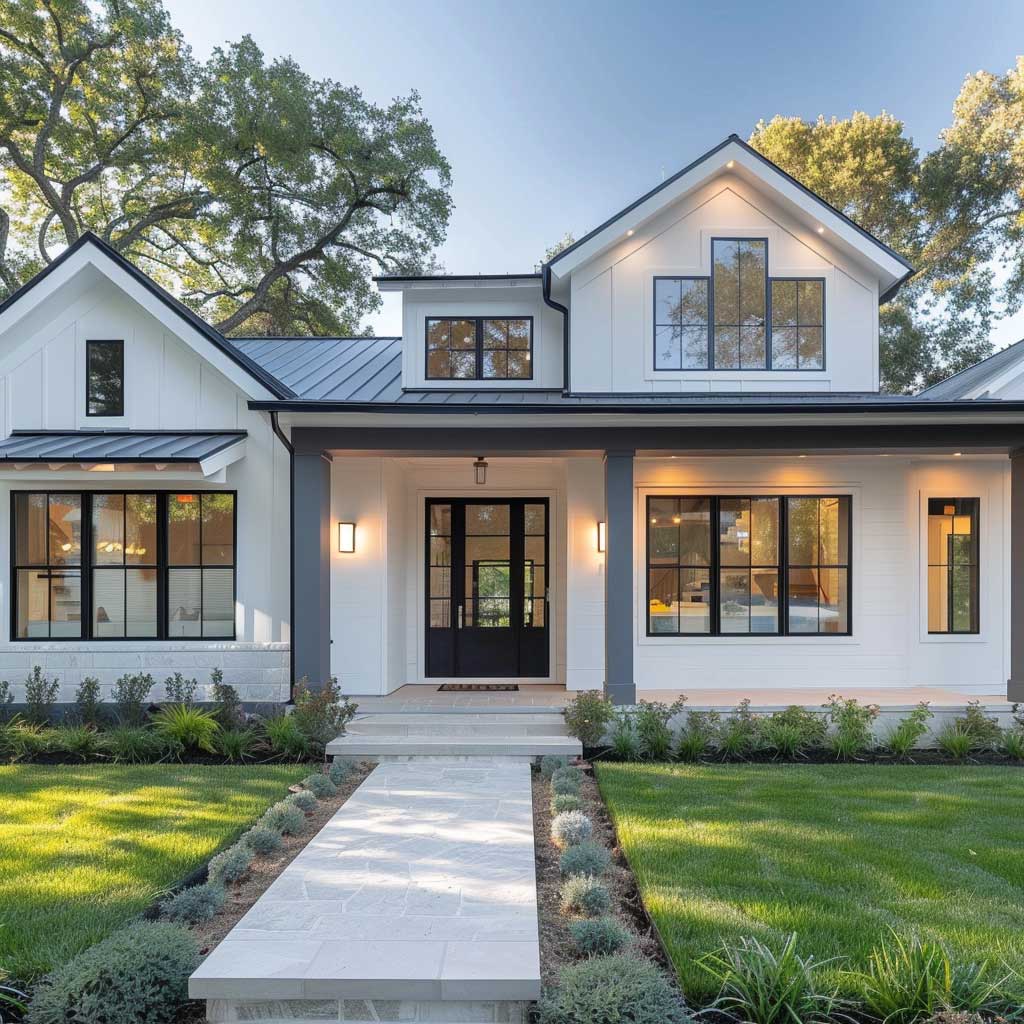

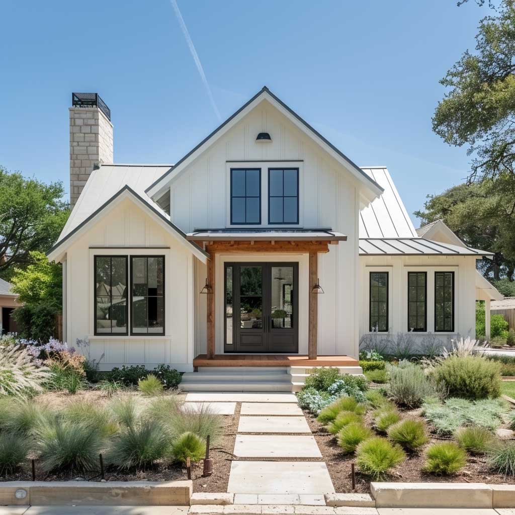
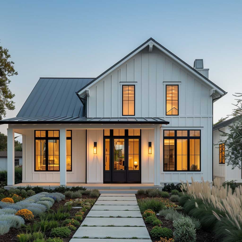
Does white show dirt faster than any other color? Yes. But on textured board-and-batten siding, rainfall actually rinses most of the surface grime. Smooth lap siding is a different story — skip white there unless you’re ready to power-wash twice a year. Light landscaping along the foundation — boxwoods, ornamental grasses — keeps the palette from feeling clinical. Three plants, maximum. More than that and you’re competing with the facade.
This combination has survived every design trend since 2010 without looking dated. It photographs well in every season, which matters if you’re ever listing the house. Neutral enough to appeal to buyers. Specific enough to feel personal while you live there.
Earthy Green Body With Cream Window Trim Disappears Into a Wooded Lot


Benjamin Moore Salisbury Green HC-139 is the specific shade I’d use here, not a generic “sage.” Salisbury Green sits between olive and sage — warm enough to read as earthy, cool enough to not look like a military installation. Pair it with Benjamin Moore White Dove OC-17 on all the trim and you get a contrast that defines every window without fighting the siding. A gallon of HC-139 runs about $72 at most Benjamin Moore dealers. You need more of it than you think — deep colors require two full coats on most siding profiles.
The cream trim does something that pure white can’t: it warms the green instead of cooling it. Pure white next to Salisbury Green makes the siding look slightly yellow-gray. Not good. White Dove keeps it grounded. I stole this trick from a contractor friend who’s painted over 200 farmhouses in the Southeast and never once used brilliant white with any green body color.
This palette carries beautifully into interior spaces too. Green exterior paint palettes on modern homes work best when the outdoor color shows up again inside — in linen curtains, ceramic vases, or a kitchen island in a similar green-gray tone. It creates continuity that makes a house feel designed rather than decorated.
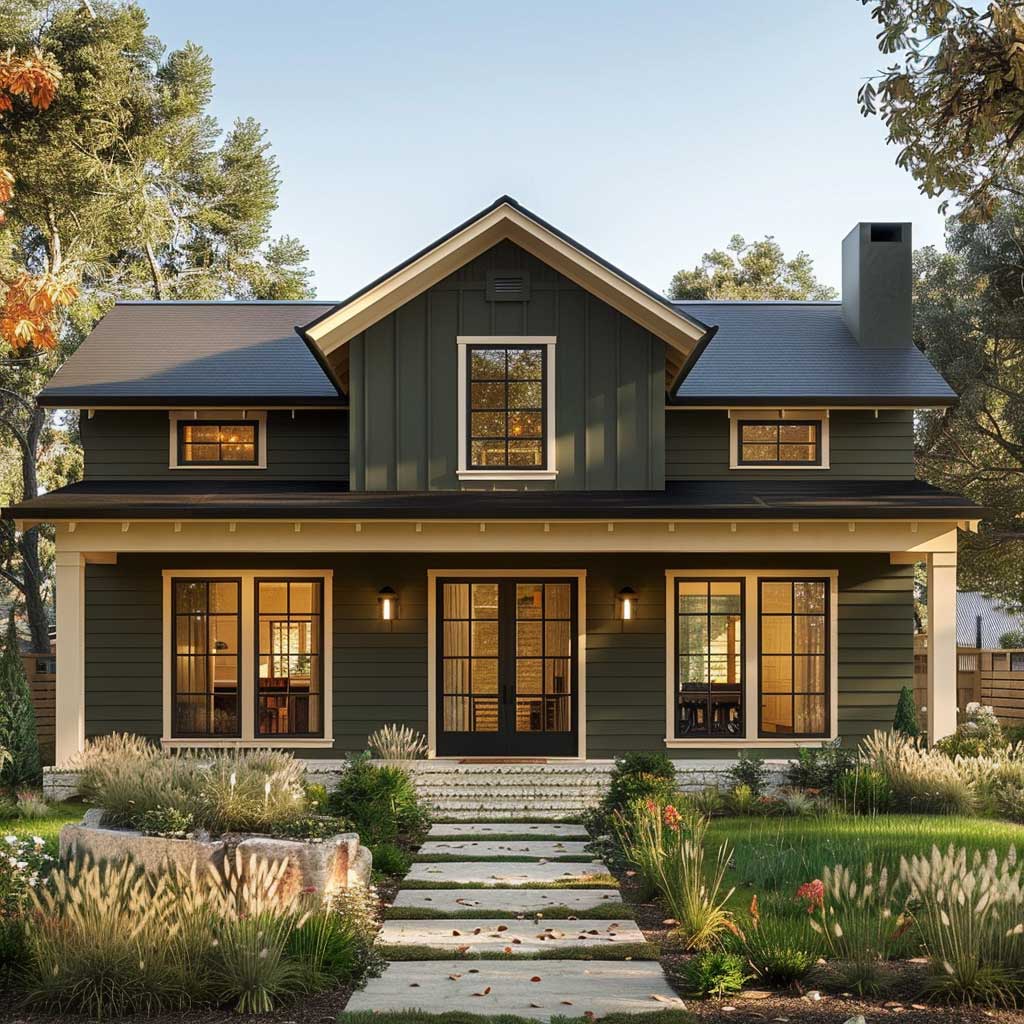


On a fully exposed suburban lot with no trees, this palette can look heavy — the green absorbs light rather than reflecting it, so the house can feel smaller in flat noon sun. Test a large sample board in direct light before committing. Native grasses and wildflowers along the foundation work better here than formal boxwoods; they echo the organic quality of the green and make the whole composition feel intentional rather than accidental.
What kills this palette? Bright Kelly green or anything labeled “apple green” near this scheme. I’ve seen a green-cream farmhouse destroyed by a single apple-green garden hose reel left on the porch — it turned the sophisticated Salisbury Green into a backdrop for a dollar store display. Keep accessories in rust, aged brass, or dark walnut on this palette. Nothing neon.
Don’t Do This
Matching your body color to your roof shingles — on a single-story this makes the whole house read as one flat mass. You lose the roofline, the fascia disappears, and the house looks like it’s trying to hide. Always keep at least two values of contrast between your siding, trim, and roof. A medium gray roof with a white body and soft gray trim is a three-step value range that keeps every element readable from the street. Same color body and roof on a one-story = invisible architecture.
Also avoid bright accent colors on a front door if your body color is already saturated (like navy or deep green). A red door on a navy farmhouse looks like a fire station. Keep the door one shade darker or lighter than the trim — not a different color family entirely.
Navy Siding Makes a Single-Story Look Like It Was Designed, Not Just Built


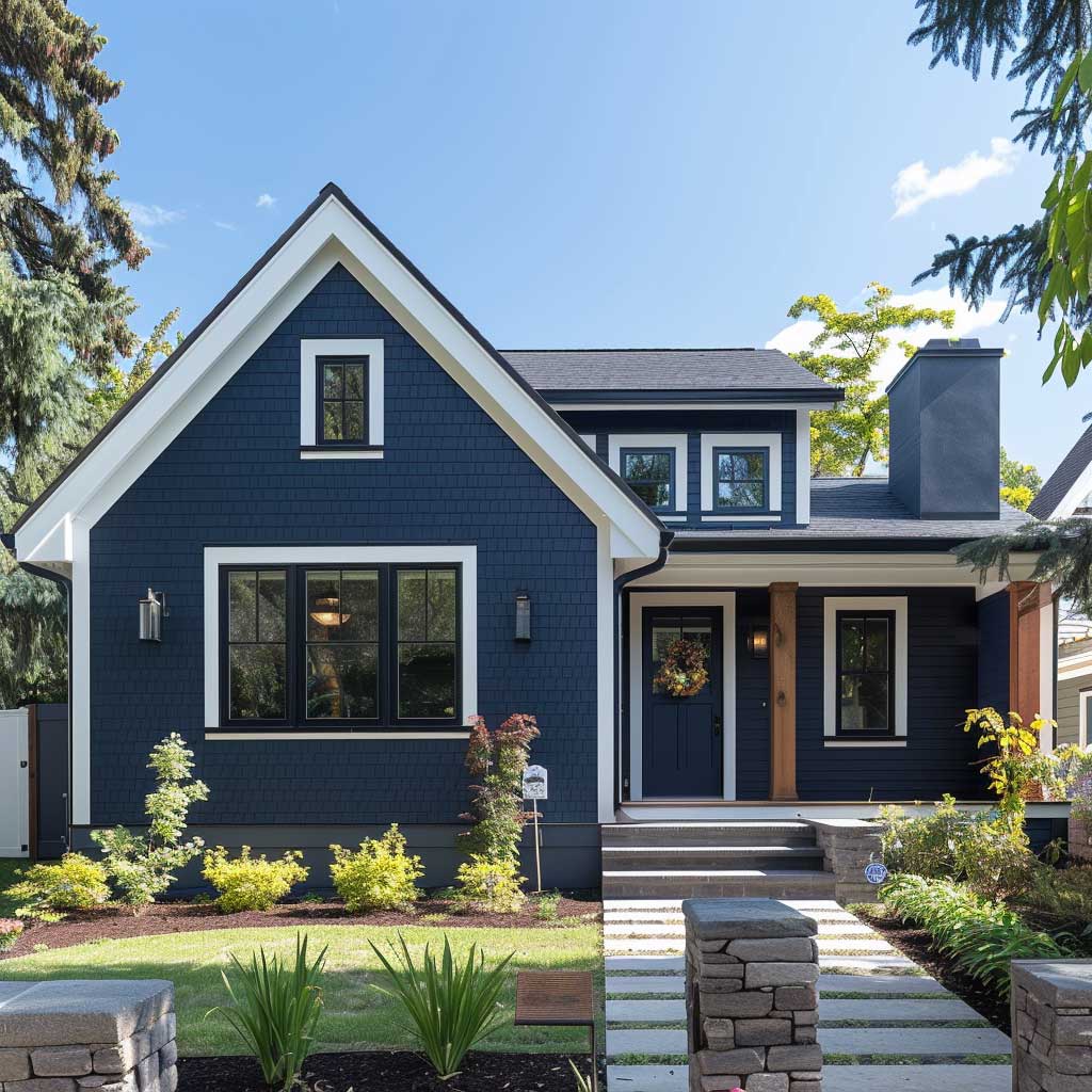

Benjamin Moore Hale Navy HC-154 is the benchmark. Every other navy I’ve tried — and I’ve tried seven — reads either too purple in shade or too royal in direct sun. Hale Navy stays true in every light condition, which matters on a single-story because three walls of the house are visible at once from any corner of your yard. Pair it with Revere Pewter HC-172 on trim instead of a pure white if your neighborhood has warm-toned brick homes nearby — the off-white reads more cohesive. Pure white trim works on isolated lots.
Navy on a single story does something counterintuitive: it reads as confidence, not heaviness. A two-story painted navy can feel oppressive. A one-story in Hale Navy feels grounded and intentional — like someone made a decision instead of defaulting to beige. You’ll notice neighbors slow down when they drive past. That’s either them admiring it or reconsidering their own beige. Probably both.
For a comprehensive breakdown of how to pair two colors on a traditional facade — including where to put the darker shade and where not to — these two-tone exterior house paint ideas walk through color placement by architectural element. Worth reading before you order samples.
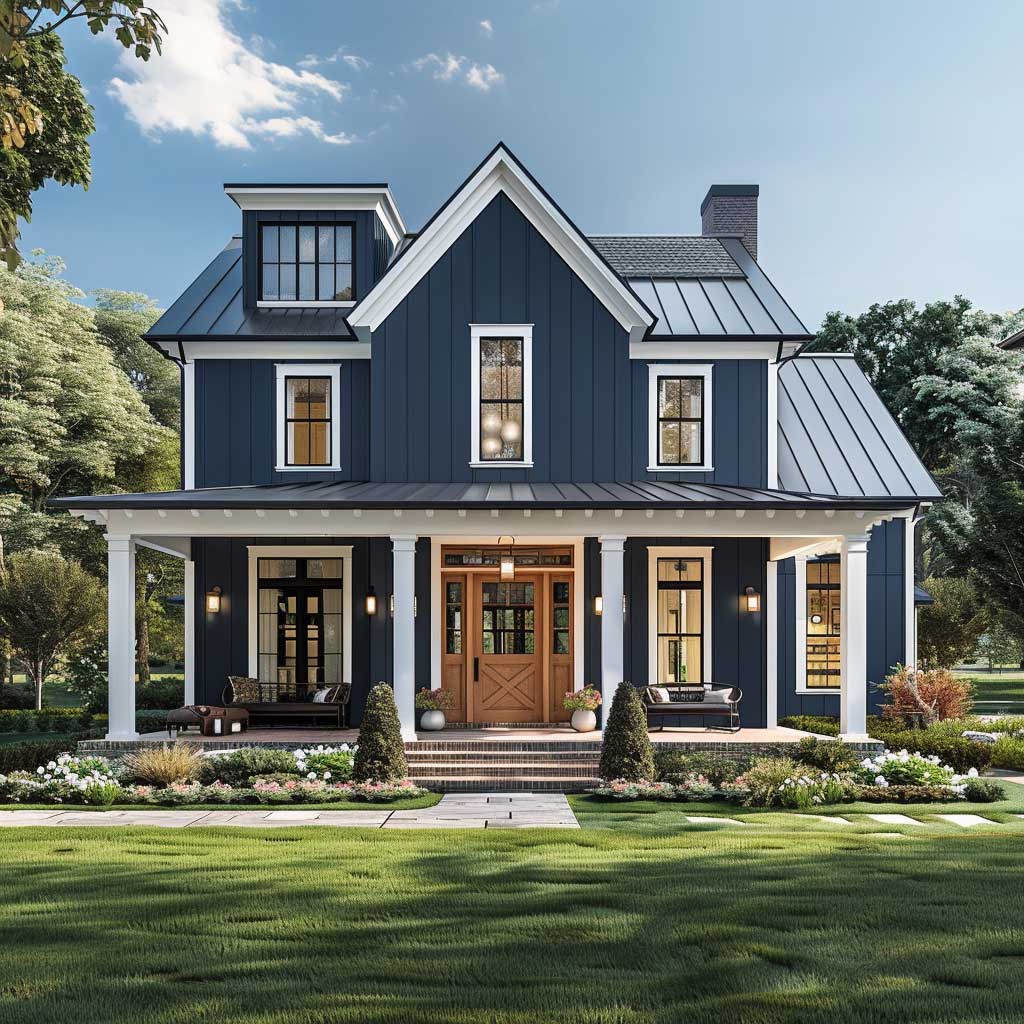
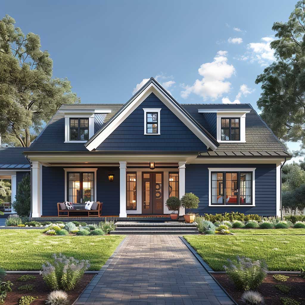


Landscaping around navy keeps minimal and architectural — ornamental grasses, low junipers, gravel beds. Anything too colorful fights the navy for attention. Light-colored flower beds in cream, blush, or pale yellow hold their own without competing. Brick and Batten’s farmhouse exterior color analysis confirms that black metal fencing used as a replacement for white wood picket fencing gives the navy palette a sharper modern edge without adding a new color. I’d add matte black house numbers and a matching mailbox for the same reason.
The one downside nobody mentions: navy fades faster than pale colors on south-facing walls in high UV zones. If you’re in Texas, Arizona, or Florida, budget for a touch-up coat every five to six years. Sherwin-Williams Emerald Exterior ($85/gallon) holds pigment better than the base line at $65/gallon. Worth the price difference on a saturated color like this.
Final Word
Color Placement on a One-Story Is an Architecture Decision, Not a Paint Decision
Pick your body color last. Start with your roof shingle tone, your foundation material, and your trim. Everything else follows from those fixed elements — and on a single story where the horizontal line dominates, getting the trim value right matters more than the exact body hue.
Each of the three schemes here — white-gray, green-cream, navy-white — can look wrong on the wrong house and exactly right on the right one. Test large sample boards for 48 hours in both morning and afternoon light before you buy five gallons.
Save this post before your next trip to the paint store.