Exterior paint colours for small houses do something that square footage alone never can — they change how a home reads from the street before anyone gets close enough to measure it. The wrong shade makes a compact footprint look apologetic. The right one makes it look deliberate, like the size was the whole point. Colour is the fastest architectural decision a homeowner can make, and on a small house it carries more visual weight per square foot than on a large one.
Three distinct strategies show up again and again on small houses that hold their own visually: bright saturated hues that command attention through contrast, deep dark tones that use shadow and depth to add perceived mass, and light neutral palettes that erase the visual boundary between wall and sky. Each approach requires a different trim logic, a different tolerance for maintenance, and a different understanding of how light behaves on your specific facade. Skip those variables and the colour decision is essentially a coin flip.
The options below cover all three strategies with specific brand references and verified prices — because “choose a nice neutral” is not advice, it’s a delay tactic. Choose the section that matches your house’s architecture and your appetite for upkeep, not the one that looks prettiest on a chip under fluorescent store lighting.
- Bright colours (turquoise, yellow, bold blue) — work by contrast; white trim essential; require repaint every 4–6 years.
- Dark colours (deep navy, slate, charcoal) — add perceived mass and sophistication; absorb heat; can read as smaller without strong trim contrast.
- Neutral colours (beige, warm gray, greige) — highest resale appeal; Zillow data shows light gray exteriors sell for up to $3,496 more than expected; most forgiving for undertone errors.
- Light Reflectance Value (LRV) above 50 is the threshold where a colour begins to visually expand a small facade.
- Sherwin-Williams Emerald Exterior runs $60–$80 per gallon; quality exterior paint on a small house is where to spend, not where to cut corners.
- Test every candidate on a 2×2-foot patch of the actual wall — indoors and daytime chips are two different colours.
Bright Exterior Paint Colours for Small Houses Command the Street
Bright exterior paint colours for small houses operate on a simple visual principle: contrast grabs attention before scale does. A turquoise or deep yellow house reads as large and intentional from the curb because the eye locks onto the colour rather than calculating the footprint. Stylists who work on compact bungalows and cottages consistently recommend saturated hues precisely because they reframe the conversation — the house isn’t small, it’s bold. The trick is making the boldness look architectural rather than accidental, and that depends almost entirely on the trim.
White trim is non-negotiable with bright exterior colours. It provides the contrast line that defines window frames, rooflines, and door surrounds, and without it a saturated colour reads as a paint mistake rather than a design decision. A turquoise house with matching or near-matching trim collapses visually into one undifferentiated blob. The white creates the edges that read as “someone planned this.” Benjamin Moore White Dove OC-17 and Sherwin-Williams Pure White SW 7005 both work; pure bright white at full strength can feel too clinical against vivid saturated tones, so test first.


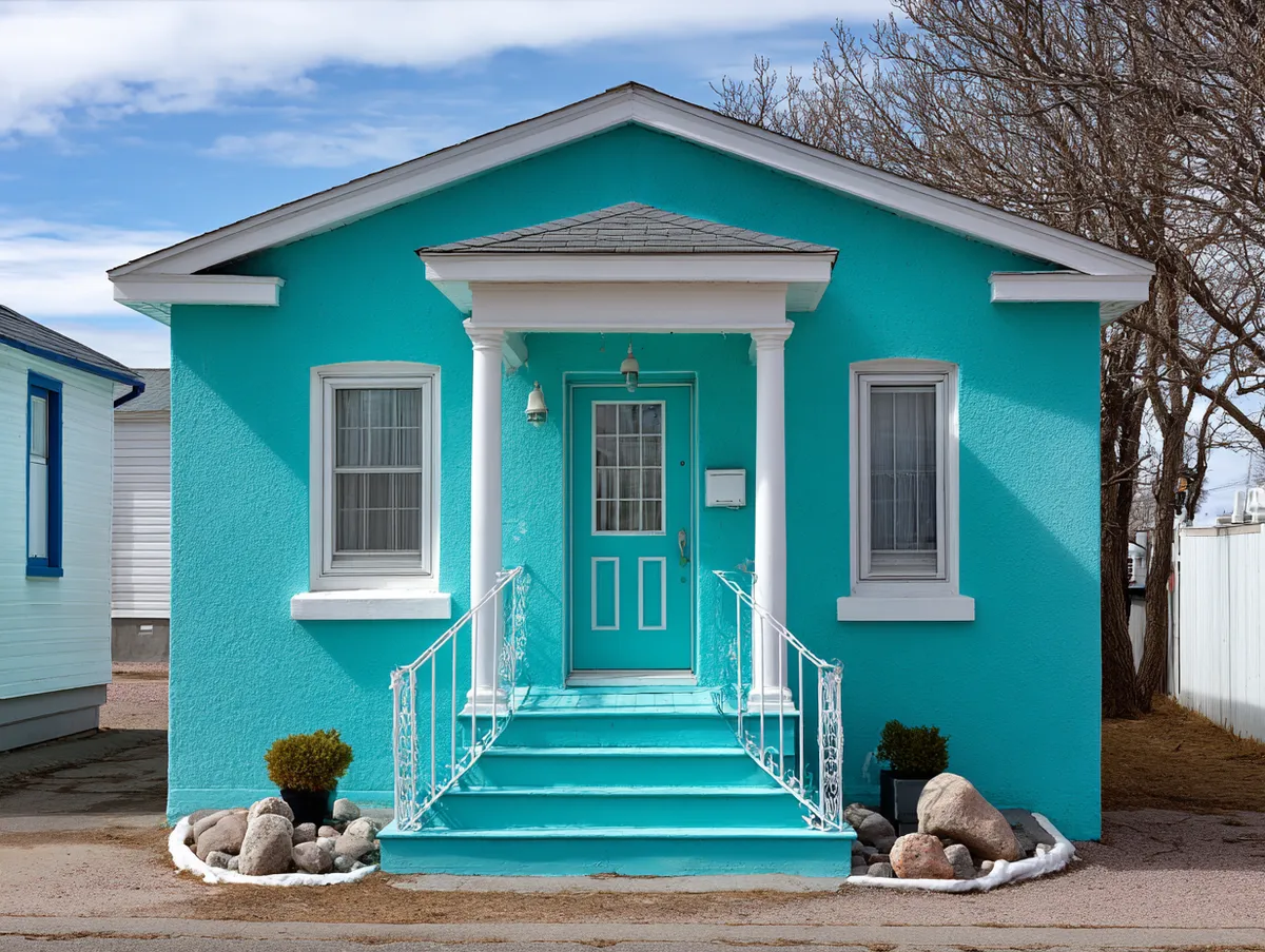


Maintenance is the honest conversation nobody wants to have before picking a vivid exterior. Bright, heavily pigmented colours fade faster on sun-facing elevations than neutrals do, and the fading is uneven — south and west walls go first while north-facing siding stays saturated. Sherwin-Williams Emerald Exterior at around $65–$80 per gallon holds saturated colour significantly longer than mid-range lines because of its acrylic resin formula, but even premium paint requires recoating every 4–7 years on bright-colour applications in direct sun. That’s a real budget consideration across a decade. What doesn’t work: choosing a bright colour in a medium-grade interior-exterior blend to save $15 per gallon. The colour will look faded within two summers and the siding will cost three times as much to maintain.
Does the brightness overwhelm the landscaping? It depends on saturation level. A true turquoise with an LRV around 40–50 reads as vivid but not aggressive; it gives greenery a clean backdrop the way a coloured mat frames a photograph. A neon or fluorescent version of the same hue fights the landscape for attention and usually loses. What you want is a colour that sunlight rewards — one that brightens in direct light and deepens in shade — rather than one that looks the same regardless of conditions. The sunlight interaction is what makes a bold small house look alive rather than painted.
Dark Exterior Colours Reframe a Small House as Architecture, Not Footprint
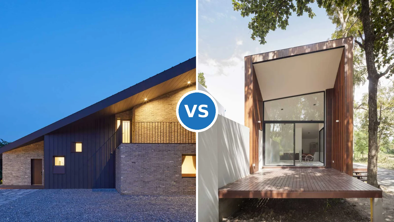
Dark exterior paint colours work differently on small houses than most people expect. Architects and colour consultants note that dark tones with low Light Reflectance Values — anything in the 0–40 LRV range — absorb rather than reflect light, which creates shadow and depth on the facade. That depth reads as mass. A deep navy or charcoal small house doesn’t look bigger in the way a light colour does; it looks more substantial, more finished, like a building that was designed rather than just constructed. The strategy is confidence rather than illusion, and it works particularly well on houses with strong architectural lines and good trim contrast.
Metallic hardware and accents become load-bearing design elements with dark exterior colours. Where a bright or neutral house might carry its own visual interest through the colour itself, a dark house needs detail to avoid going flat — matte black fixtures disappear, but brushed brass, aged bronze, or polished nickel hardware reads as intentional punctuation against a dark navy or charcoal field. The same logic applies to window trim: at least 3–4 shades lighter than the body colour, and never dark-on-dark. Sherwin-Williams Alabaster SW 7008 at around $65 per gallon in Emerald Exterior is the most reliable off-white trim pairing for deep exterior blues because its warm undertone prevents the clinical coldness that pure white creates.


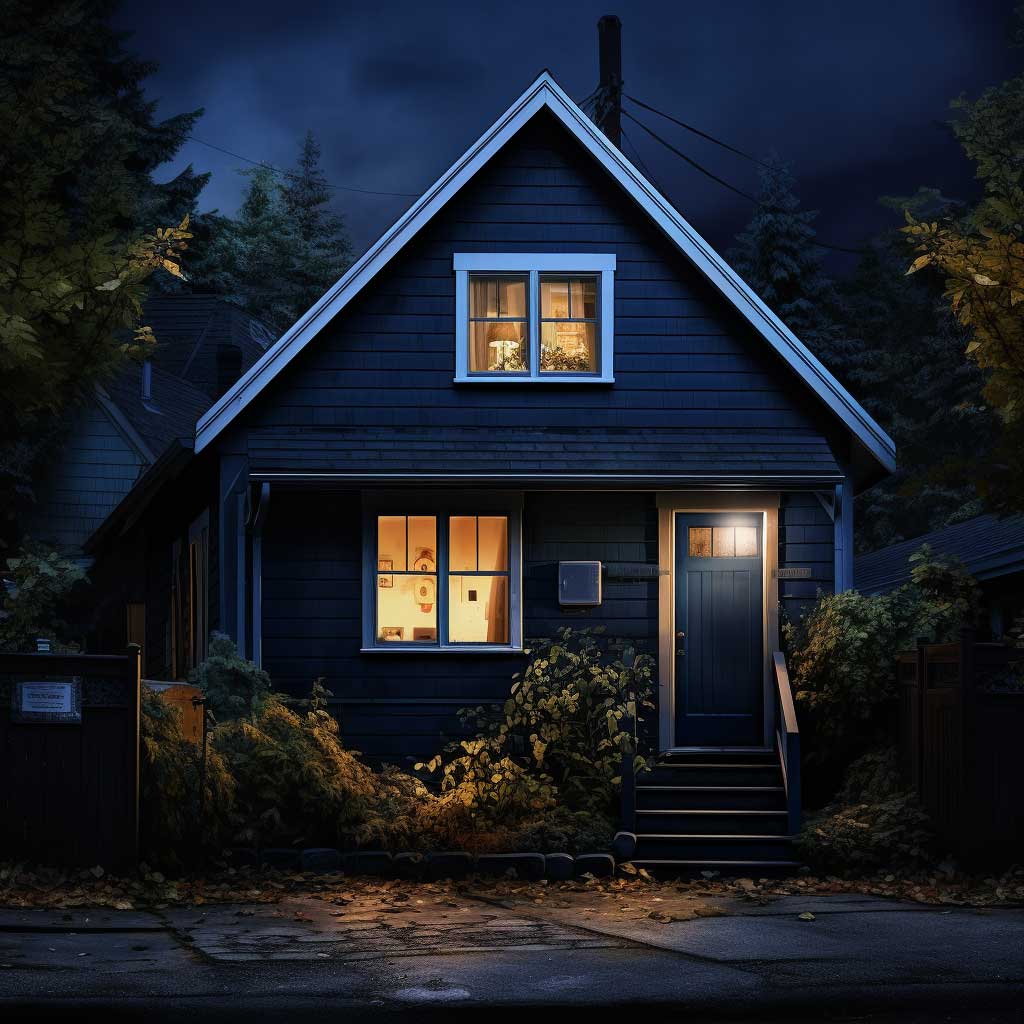


Texture becomes a major factor with dark exterior colours that most homeowners underestimate before the paint goes on. High-LRV colours obscure texture — dark ones reveal every board gap, every uneven lap, every imperfect trim joint. That’s actually the interesting part: a textured siding in deep charcoal has a dimensional quality under raking afternoon light that a smooth-painted light surface never achieves. But it also means dark paint is less forgiving of preparation shortcuts. Any surface imperfection that might disappear under a light neutral becomes clearly visible under a dark saturated tone. Prep accordingly, or the colour will highlight exactly what you were trying to hide.
The light behaviour shift across the day is worth understanding clearly before committing to a dark small-house exterior. Under direct midday sun, deep blues and navies can appear almost luminous — the pigment catches the light and appears to glow slightly, which is the effect that makes these colours so photogenic. By late afternoon in softer light, the same colour becomes more muted and moody. Under overcast skies, a dark exterior goes quiet and can feel heavy without strong accent lighting at the entry. Add porch lighting or path lighting when you go dark — a dark facade with no entry illumination looks closed rather than intentional after 4 PM in winter. For expanded context on how exterior colour combinations perform at different times of day, the breakdown at house exterior paint colour combinations covers pairing logic and contrast ratios in detail.
Don’t choose a dark exterior colour for a small house that sits in deep shade for most of the day. Dark paint on a north-facing or heavily tree-shaded facade goes flat — it absorbs the limited light available and the house looks like it hasn’t been painted at all. The visual-mass effect that makes dark colours work depends on light interaction: direct sun hitting a deep blue facade and creating that luminous quality is the payoff. Without it, you get a house that looks like a damp shadow. If your facade gets fewer than 4 hours of direct sun daily, stay in the medium-to-light LRV range — 45 and above. Dark colours also cost 10–20% more per gallon than standard whites at most major paint brands, because the pigment loading is higher. Factor that into a small-house project budget before you fall in love with a colour on a chip.
Neutral Exterior Paint Colours for Small Houses Hold Value Past the First Season
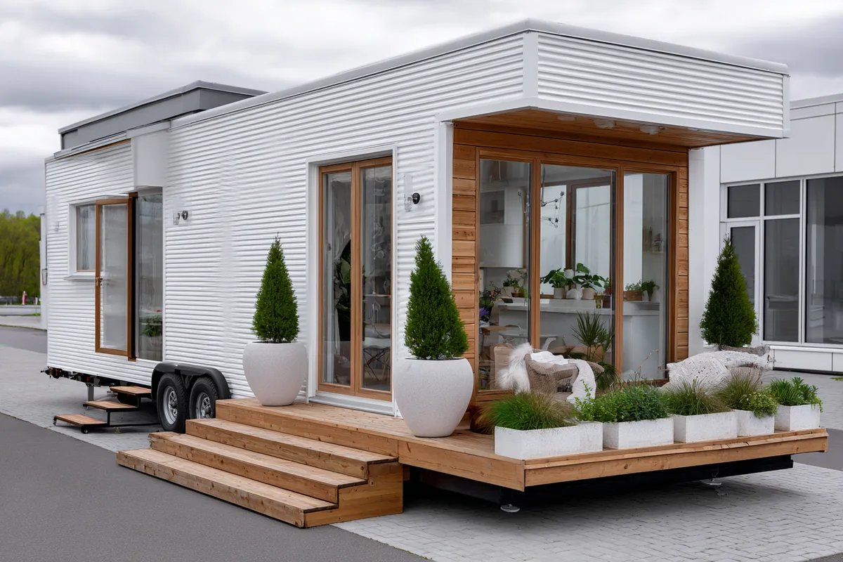
Neutral exterior paint colours for small houses — soft beige, warm greige, light gray — are the palette choice that real estate data consistently rewards. A Zillow analysis found that homes with light gray exteriors sold for $3,496 more than expected, and a broader survey by Opendoor showed gray and beige as the most popular exterior colours among buyers at 30% and 26% respectively. That’s not coincidence; neutral-painted exteriors signal maintenance and broad appeal simultaneously, which is exactly what buyers reward. For a small house, that dual signal matters more than on a larger property because the scale means every surface element carries proportionally more visual weight.
Soft beige is the most forgiving neutral for small houses that sit within heavy landscaping. The colour borrows warmth from the surrounding environment — mature trees, garden beds, stone paths — and blends the house into its context rather than asserting itself against it. Sherwin-Williams Accessible Beige SW 7036 has been one of the brand’s top-selling exterior neutrals for multiple years running, priced around $65–$80 per gallon in Emerald Exterior. Its warm gray undertone prevents the yellow shift that ruins weaker beiges in afternoon sun. What fails: any beige with a strong yellow or pink undertone. In certain afternoon light angles, yellow-beige reads as “needs a repaint” rather than “warm and welcoming.” Hold the chip against the actual wall outdoors at noon before committing — that’s the most useful 30-second test available.

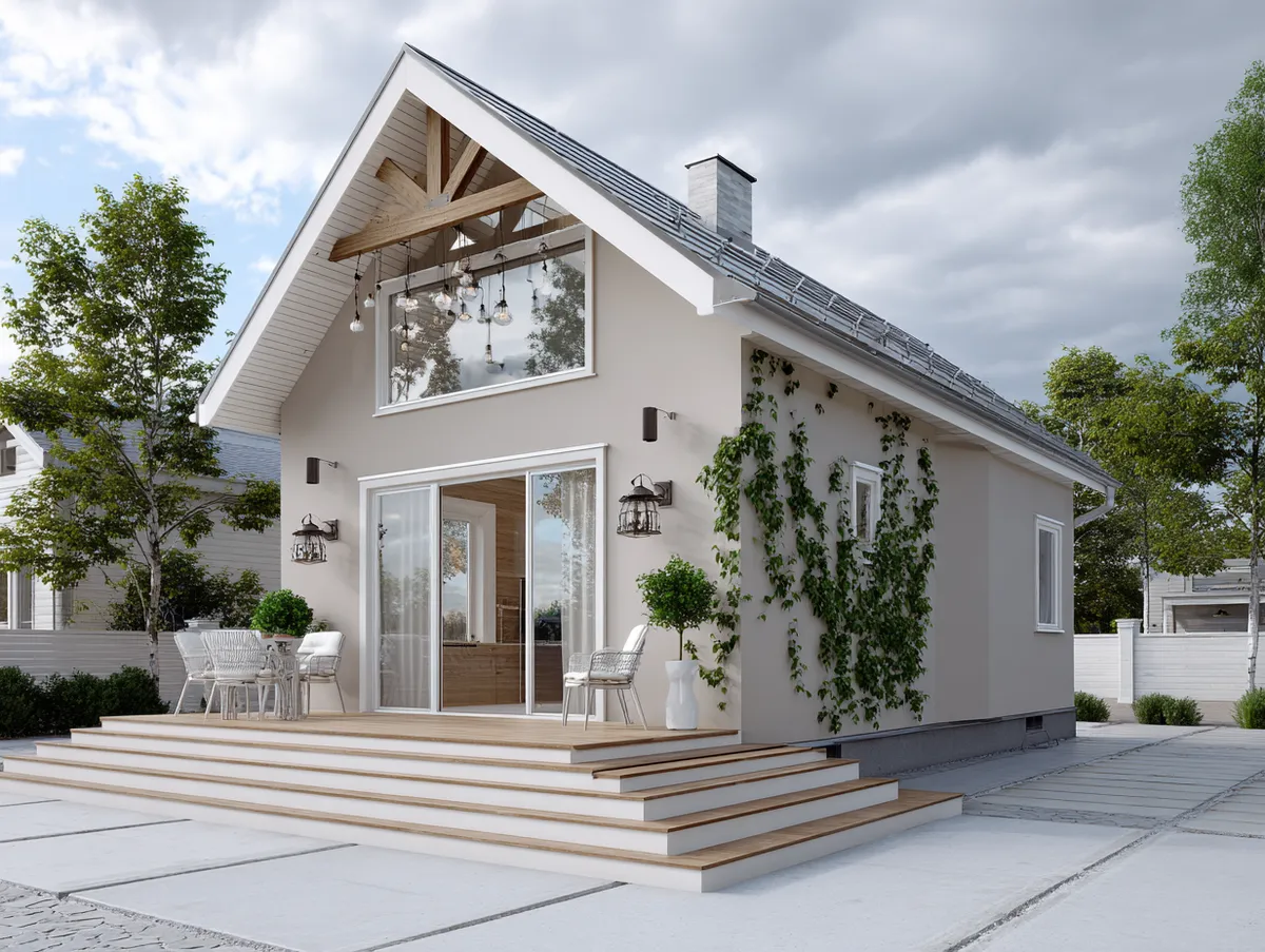
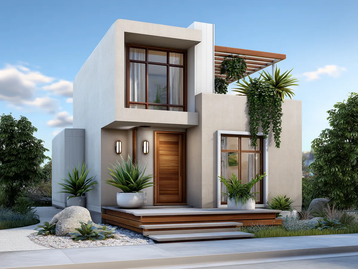

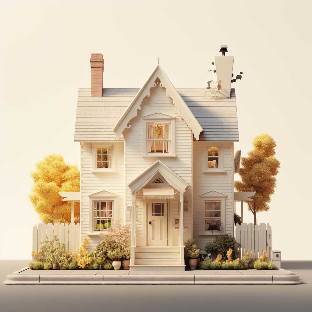


Wood accents do specific work in a neutral exterior palette that paint alone can’t accomplish — they add a layer of material richness that prevents beige or greige from reading as “unfinished.” A natural wood front door and porch railings against beige siding add warm grain and texture; the contrast isn’t colour-based, it’s material-based, which reads as more sophisticated than a contrasting paint colour. Think of it as the house using two different visual languages simultaneously. The wood accents also anchor the house to the ground plane, preventing the floaty quality that can make light-coloured small houses look like they’re sitting on the lot rather than belonging to it. Light exterior paint colours for small houses covers specific undertone warnings and brand picks for sky blue, beige, and light gray if you want to go deeper on the neutral direction.
Natural light transforms a neutral palette across the day in ways that surprise first-time neutral choosers. Under direct morning sun, beige develops a warm golden quality that makes the house look inviting and lived-in — this is the light your neighbours and visitors most often see when arriving. Under overcast sky, the same colour becomes cooler and more gray, which is why choosing a beige with a warm-gray undertone rather than a yellow undertone matters so much. The Sherwin-Williams Color Visualizer tool at sherwin-williams.com lets you upload your actual house photo and test neutrals against your specific roofline, trim, and surroundings — worth 20 minutes before spending on samples.
| Colour Strategy | Best Architecture | Key Risk | Repaint Cycle |
|---|---|---|---|
| Bright (turquoise, bold blue) | Cottage, bungalow, coastal | Uneven UV fade on sun-facing walls | Every 4–6 years |
| Dark (navy, charcoal, slate) | Geometric, craftsman, contemporary | Looks heavy without strong trim contrast and entry lighting | Every 4–7 years |
| Neutral (beige, greige, warm gray) | Most residential styles | Wrong undertone reads as faded or dingy | Every 5–8 years |
FINAL TAKE
Colour Does the Work Architecture Can’t Fix on a Budget
Bright hues demand attention before scale registers — use them when the house is architecturally strong and the trim is crisp. Dark colours add substance and depth, but they require more prep, better lighting, and stronger trim contrast to avoid going heavy.
Neutrals win on resale data and longevity, but the undertone decision is where most homeowners get it wrong — test on the actual wall at noon, not indoors under store lighting.
Save this post before your next trip to the paint counter.