Creating a cozy ambiance in your home is all about choosing the right room colour combination. Colours have the power to transform a space, evoke emotions, and set the mood. Whether you’re looking for a serene retreat or a vibrant gathering spot, the perfect palette can make all the difference. In this journey, we’ll explore a variety of colour combinations that can bring warmth, comfort, and style to your living spaces. Get ready to be inspired by a spectrum of hues that will help you find your ideal room colour combination.
Warm Earth Tones for Living Room Serenity


The living room, often the heart of the home, is a sanctuary where relaxation and socialization converge. The choice of a room colour combination here can significantly influence the ambiance of the space. Warm earth tones, encompassing shades of beige, brown, and soft terracotta, offer a palette that is both inviting and serene. This colour scheme is rooted in the natural world, drawing inspiration from the soil, clay, and sand, creating a sense of grounding and stability.
Incorporating warm earth tones into a living room sets a mood of comfort and tranquility. Beige and soft terracotta can create a backdrop that is soothing and unobtrusive, making the room feel open and airy. Brown, being a color associated with stability and structure, brings a sense of warmth and security. These colors work harmoniously to create a cohesive look that is both elegant and comforting.
The beauty of using earth tones lies in their versatility. They can be paired with a variety of textures and materials to enhance the room’s aesthetic. For instance, natural wood furniture, from oak to walnut, complements these colors perfectly, adding to the organic feel of the space. Textiles like wool or cotton in earthy tones add layers of warmth and coziness.


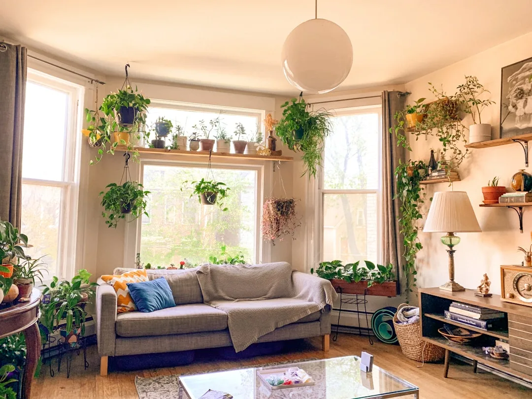
Adding green plants is an excellent way to bring a touch of vitality to an earth-toned living room. The greenery contrasts beautifully with the warm palette, injecting life and energy into the space. This not only enhances the visual appeal of the room but also contributes to the overall well-being by purifying the air and adding a sense of calm.
Lighting plays a critical role in showcasing these warm colors. Soft, diffused lighting can accentuate the coziness of the earth tones, creating a welcoming atmosphere. During the day, natural light brings out the subtleties of these hues, highlighting their natural beauty.
In summary, a living room adorned with warm earth tones offers a peaceful retreat, a place where one can unwind in the embrace of nature-inspired colors. This palette creates a space that is not just aesthetically pleasing but also emotionally comforting, embodying the essence of serenity and warmth.
Cool Blues and Greys for a Calming Bedroom


The bedroom, a personal haven for rest and rejuvenation, demands a color palette that promotes tranquility and relaxation. Cool blues and greys are an excellent choice for a bedroom’s room colour combination, bringing a sense of calm and serenity to the space. These colors evoke the tranquility of a dusky sky or a still ocean, creating an atmosphere conducive to relaxation and restful sleep.
Cool blues are known for their calming effects on the mind, making them ideal for a bedroom. Lighter shades of blue can make the room feel more spacious and airy, while deeper blues add a touch of sophistication and depth. Grey acts as a perfect complement to blue, providing a neutral backdrop that enhances the soothing quality of the room.
The versatility of blues and greys allows for a range of styling options. These colors can be used in various shades to create a layered look, adding visual interest to the room. Textiles like bed linens, curtains, and rugs in these hues can be mixed and matched to add texture and depth.


Accent pieces in white or silver can be introduced to add a touch of elegance and brightness to the room. These colors work well with metallic finishes, glass, and mirrored surfaces, adding a modern and sophisticated touch to the bedroom.
Lighting is crucial in a room with cool blues and greys. Soft, warm lighting can create a cozy and inviting atmosphere, balancing the coolness of the colors. During the daytime, natural light enhances the freshness of the blue and grey, making the room feel vibrant yet peaceful.
In essence, a bedroom with a color palette of cool blues and greys is like a breath of fresh air. It’s a tranquil oasis that promotes relaxation and peacefulness, making it the perfect sanctuary for unwinding after a long day.
Cheerful Yellows and Greens for Kitchen Vibrancy


The kitchen, often referred to as the heart of the home, is a space of energy and creativity. A room colour combination of cheerful yellows and fresh greens can infuse vibrancy and liveliness into this essential space. These colors, reminiscent of sunshine and nature, stimulate joy and enthusiasm, making the kitchen not just a place for cooking, but a lively area for gathering and socializing.
Yellow, with its sunny and bright disposition, has the power to uplift spirits and energize a space. It can make the kitchen feel warm and welcoming, stimulating appetites and encouraging conviviality. Green complements yellow by bringing in the freshness and vitality of nature. Together, these colors create a harmonious balance, with yellow adding warmth and green providing a soothing touch.
Integrating these colors into a kitchen can be done through paint, cabinetry, and accessories. Light wood cabinets can complement this palette, adding a natural and earthy feel to the space. White countertops and backsplashes can provide a neutral canvas, allowing the yellows and greens to stand out.


Decorative elements like vases, dishware, and kitchen linens in these hues can add splashes of color and personality to the kitchen. Plants and herbs, placed in strategic spots, can enhance the natural vibe of the space, making it feel more inviting and lively.
Lighting is key in a kitchen with yellows and greens. Natural light accentuates the brightness of these colors, making the space feel airy and open. In the evening, warm lighting can create a cozy and intimate ambiance, perfect for family dinners or entertaining guests.
In summary, a kitchen adorned with cheerful yellows and fresh greens is a space full of life and energy. This color combination creates a vibrant atmosphere that enhances the joy of cooking and the pleasure of gathering, making the kitchen a true centerpiece of the home.
Elegant Pastels for a Soft Nursery Ambiance


Designing a nursery is a unique opportunity to create a space filled with warmth, comfort, and gentle stimulation. An elegant room colour combination of soft pastels can provide the perfect ambiance for a nursery, offering a soothing and nurturing environment for both the baby and parents. Pastels, with their subdued and delicate hues, evoke a sense of calm and serenity, making them ideal for a space where new life begins and grows.
Soft pinks, baby blues, and gentle yellows are classic choices in a nursery’s color palette. These colors are traditionally associated with tranquility and softness, essential qualities in a space designed for rest and care. Pastels have a timeless charm and can be easily combined with various themes and decorative styles, whether classic, modern, or whimsical.
The subtlety of pastel colors also allows for versatility in design. They can be used as a base for more vibrant or contrasting colors, serving as a backdrop that is both elegant and unobtrusive. This flexibility is beneficial as the nursery evolves with the growing child, accommodating different tastes and needs over time.


Incorporating textures and patterns is an effective way to add depth and interest to a pastel-colored nursery. Soft furnishings like rugs, curtains, and bedding in complementary pastel shades can create a layered, cozy feel. Wall art, mobiles, and toys in brighter or contrasting colors can serve as focal points, stimulating the baby’s senses and adding personality to the room.
Lighting plays a crucial role in a nursery with a pastel color scheme. Soft, diffused light is ideal, creating a gentle and restful atmosphere. During the day, natural light enhances the softness of the pastels, making the room feel airy and peaceful.
In conclusion, a nursery designed with elegant pastels offers a delicate and soothing environment. This room colour combination is not just about creating a visually appealing space; it’s about fostering an atmosphere of gentleness, comfort, and love, essential ingredients for nurturing a new life.
Bold Reds and Oranges for an Energetic Dining Area


The dining area is a communal space where families gather and friends connect, often filled with conversation and laughter. A room colour combination of bold reds and oranges can infuse this space with energy and warmth, creating an inviting and dynamic environment for dining and socializing. These vibrant colors, reminiscent of spices and sunsets, stimulate the senses and enhance the overall dining experience.
Red, a color known for its stimulating properties, can create a sense of excitement and appetite in a dining area. It brings warmth and depth to the space, making it feel more intimate and cozy. Orange, with its cheerful and vibrant nature, complements red by adding a sense of playfulness and creativity. Together, these colors create a lively ambiance, perfect for a space dedicated to enjoyment and hospitality.
Incorporating reds and oranges into a dining area can be achieved through various design elements. Wall colors, table linens, and decorative accents like vases or artwork can all contribute to the color scheme. Dark wood furniture can provide a rich contrast to these bold hues, enhancing their vibrancy and creating a balanced look.

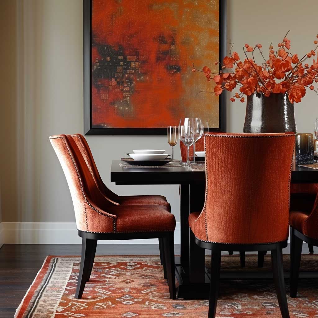
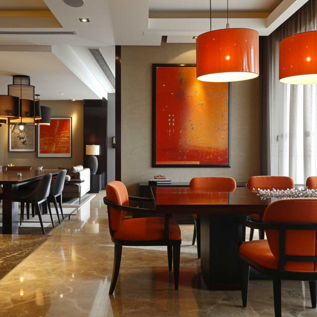

Lighting is particularly important in a dining area with such dynamic colors. Warm lighting can amplify the coziness of red and orange, creating a welcoming and convivial atmosphere. During the day, natural light can brighten the space, highlighting the richness of the colors and making the area feel lively and energetic.
In summary, a dining area with a room colour combination of bold reds and oranges is a space full of life and energy. This palette creates an environment that stimulates the senses, encourages conversation, and enhances the joy of shared meals, making it an ideal choice for a space where people come together to celebrate food and companionship.
Tranquil Blues and Whites for Bathroom Oasis


Creating a bathroom that serves as a personal retreat is essential in today’s fast-paced world. A room colour combination of tranquil blues and crisp whites can transform a bathroom into a serene oasis, reminiscent of a spa. This palette evokes feelings of calmness and purity, essential for a space dedicated to relaxation and rejuvenation.
The color blue, particularly in its lighter shades, is often associated with water and sky, elements that naturally induce a sense of tranquility and spaciousness. When used in a bathroom, blue can create an atmosphere that is both refreshing and calming. White complements blue beautifully by adding a sense of cleanliness and simplicity. Together, these colors form a harmonious balance, making the bathroom a haven for relaxation.
Integrating blues and whites into the bathroom can be done in various ways. Tiles are a popular choice; blue tiles can be used for accents or feature walls, while white tiles can dominate the space, keeping it bright and airy. Fixtures and fittings in white maintain the room’s fresh and uncluttered look, while blue accessories like towels and bath mats can add pops of color.


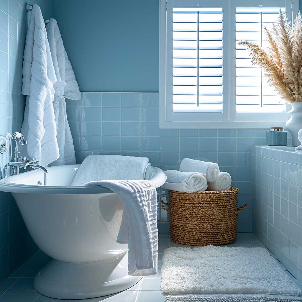
Textures play a significant role in enhancing this color scheme. Soft, fluffy towels and bathmats in shades of blue can add a touch of luxury and comfort. Natural materials like wood or stone can be incorporated to add warmth and contrast with the coolness of the blues and whites.
Lighting is key in a bathroom with a tranquil color palette. Soft, warm lighting can create a soothing and inviting atmosphere, enhancing the relaxing vibe. During the day, natural light can bring out the true beauty of the blues and whites, making the space feel vibrant and alive.
In conclusion, a bathroom with a room colour combination of tranquil blues and whites offers a peaceful escape from the outside world. This palette creates an environment that promotes relaxation and wellbeing, turning an ordinary bathroom into a spa-like sanctuary.
Rich Purples and Golds for a Luxurious Study


A study or home office is a space where creativity and productivity should be nurtured. A room colour combination of rich purples and golds can create an environment that is both luxurious and stimulating, perfect for a space dedicated to thought and work. This palette exudes opulence and sophistication, setting the tone for a room where big ideas and inspiration can flourish.
Purple has long been associated with royalty and luxury, owing to its depth and intensity. In a study, darker shades of purple can create a sense of richness and depth, fostering an environment that is conducive to concentration and contemplation. Gold accents add a layer of luxury and elegance, brightening the space with their shimmer and shine.
Incorporating this color scheme into a study involves thoughtful design choices. Walls painted in deep purple can serve as a dramatic backdrop, while gold accents can be introduced through light fixtures, picture frames, or decorative objects. Furniture in dark wood or leather can complement the richness of the purple, adding to the room’s sophisticated feel.


Textures and materials are crucial in creating a luxurious atmosphere. Velvet or silk in shades of purple can be used for upholstery or curtains, adding a touch of opulence. Gold finishes, whether in the form of metallic paint, gilded frames, or brass fittings, can add a sense of grandeur to the space.
Lighting plays a significant role in enhancing this color scheme. Warm, subdued lighting can accentuate the coziness of the purple and the shimmer of the gold, creating an inviting and inspiring atmosphere. During the day, natural light can bring out the different hues and textures, making the space feel lively and dynamic.
In summary, a study with a room colour combination of rich purples and golds is a space that inspires creativity and luxury. This palette creates an environment that is both elegant and stimulating, perfect for a space where intellect and imagination are at play.
Playful Pinks and Purples for a Fun Children’s Room


Designing a children’s room offers a unique opportunity to be creative and playful with color. A room colour combination of playful pinks and purples can create an enchanting and joyful space, perfect for nurturing a child’s imagination and growth. These colors, often associated with fun and fantasy, can transform a child’s room into a vibrant and engaging environment.
Pink, a color that conveys warmth and affection, is a popular choice for children’s rooms. It creates a friendly and nurturing atmosphere that can be calming and comforting. Purple, with its association with magic and mystery, adds an element of whimsy and creativity. Together, these colors can foster a sense of wonder and playfulness, essential qualities for a child’s development.
Integrating pinks and purples into a child’s room can be done through wall colors, bedding, and accessories. Wall murals or stickers in these hues can add a fun and dynamic element to the room. Furniture in neutral colors like white or light wood can balance the vibrancy of the pinks and purples, ensuring the room doesn’t feel overwhelming.


Texture and pattern play a significant role in enhancing the playful vibe of the room. Soft textiles in these colors, such as plush rugs or curtains, can add layers of comfort and coziness. Patterns with stars, hearts, or other whimsical shapes can be introduced in bedding or wall art, contributing to the room’s playful theme.
Lighting is important in a child’s room with a playful color palette. Bright, natural light during the day can make the room feel energetic and lively, while at night, softer lighting can create a cozy and soothing atmosphere, conducive to rest.
In conclusion, a children’s room with a room colour combination of playful pinks and purples is a space that encourages joy, creativity, and comfort. This palette creates an environment that is not just visually appealing but also emotionally supportive, making it a perfect haven for children to play, learn, and dream.
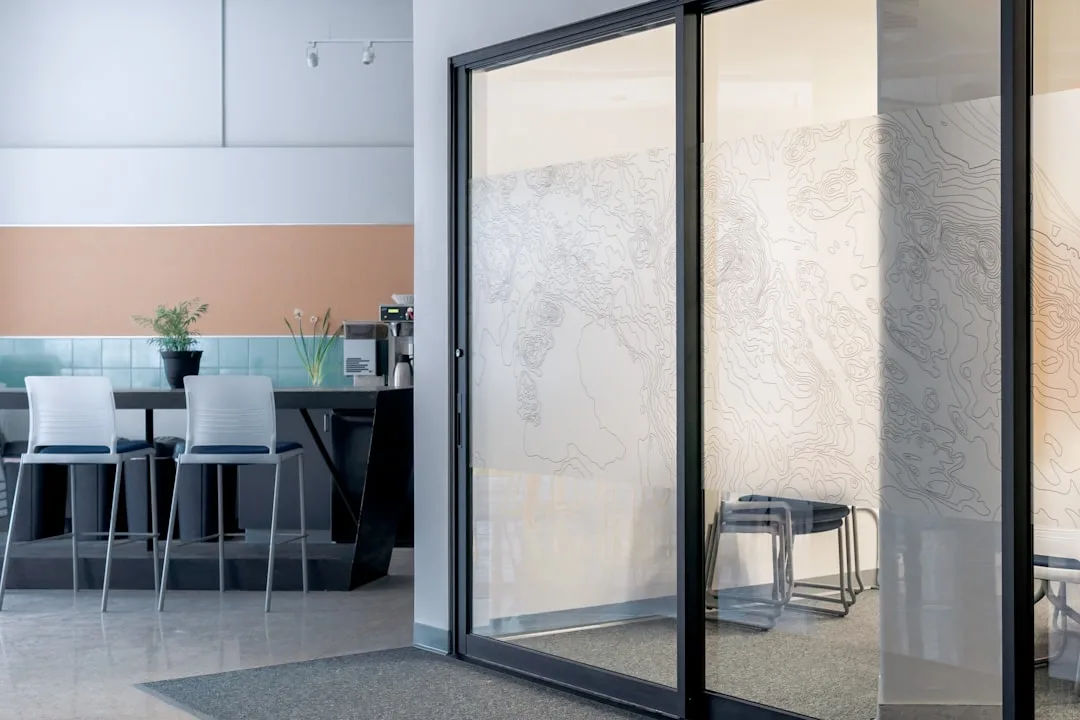
Sleek Monochromes for a Modern Home Office


In the world of home office design, creating a space that is both functional and stylish is key to productivity and inspiration. A room colour combination of sleek monochromes can provide a modern and sophisticated environment, ideal for a space dedicated to work and focus. Monochrome, characterized by the use of various shades of a single color, offers a clean and cohesive look that is both timeless and contemporary.
A monochrome palette, typically involving shades of black, white, and grey, creates a minimalist and uncluttered look. This simplicity allows for fewer distractions, helping to maintain focus and clarity of thought. Black adds a touch of elegance and strength, while white brings a sense of space and openness. Grey serves as a bridge between the two, providing balance and subtlety.
Integrating a monochrome color scheme into a home office involves careful selection of furniture and accessories. Sleek, modern furniture with clean lines complements the minimalist theme. Textures can be added through materials like metal, glass, or leather, providing depth and interest without deviating from the monochrome palette.


Accents and accessories play a crucial role in breaking the potential monotony of a monochrome office. A pop of color, whether in the form of artwork, a plant, or a decorative item, can add vibrancy to the space. Lighting, both natural and artificial, is also important, as it can highlight the different shades and textures, enhancing the overall aesthetic.
In conclusion, a home office with a room colour combination of sleek monochromes is a space that exudes sophistication and clarity. This palette creates an environment that is not only aesthetically pleasing but also conducive to productivity and creativity, making it an ideal choice for a modern home office.
Finding the perfect room colour combination is key to creating a space that resonates with your personal style and fulfills your comfort needs. From the tranquility of blues and greys to the warmth of earth tones, each colour palette offers a unique ambiance. Experiment with different hues and accents to discover the combination that best suits your space and lifestyle. Remember, the right colours can turn any room into a cozy haven.

Related Topics