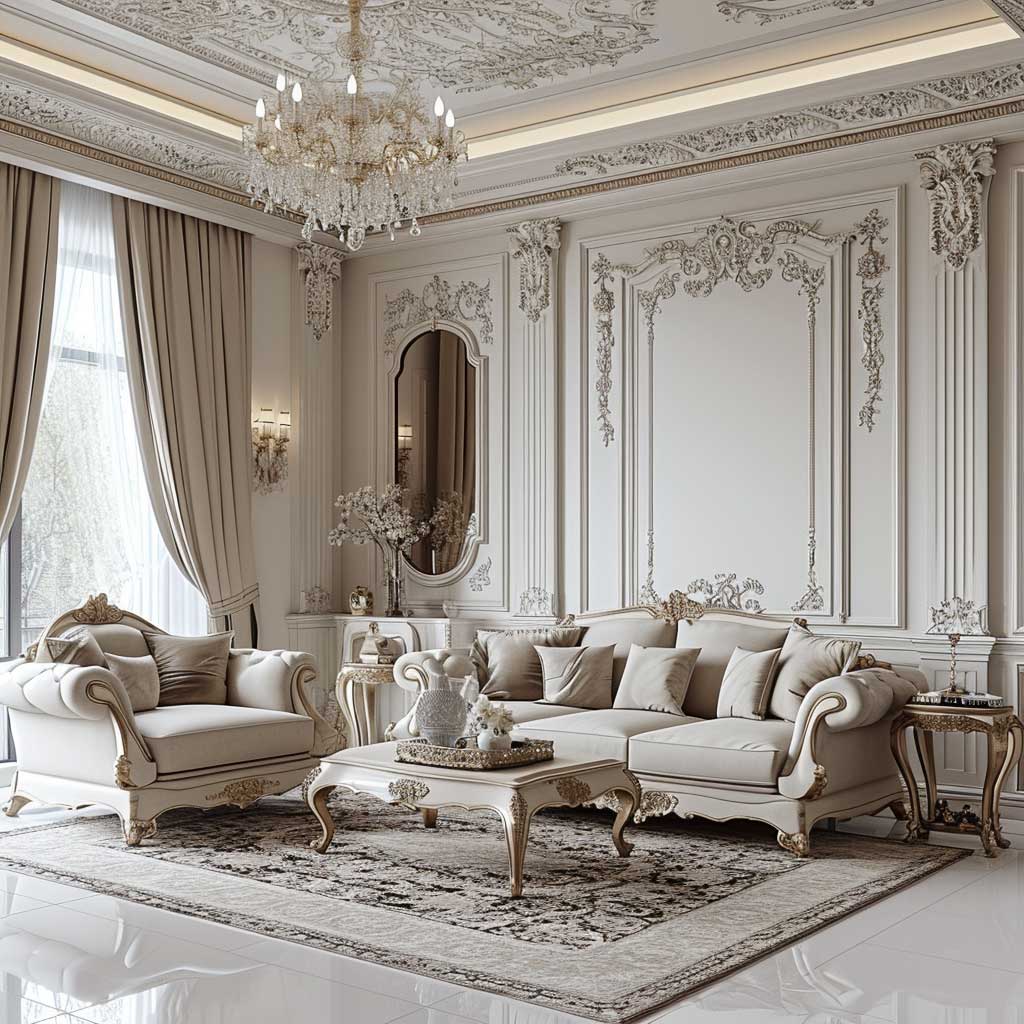
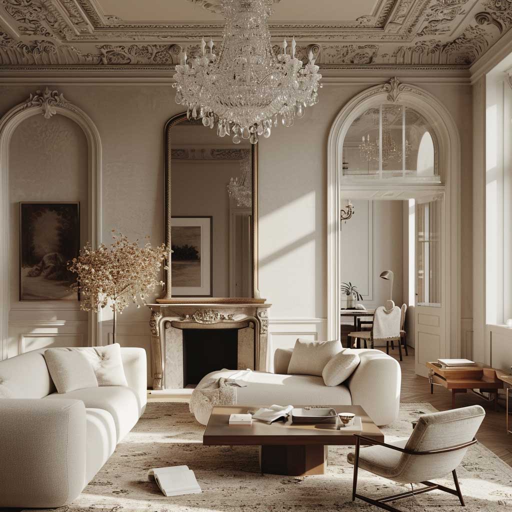
Minimalist baroque is the interior design approach that finally reconciles the two things most of us actually want from a room: calm and opulence. You get the grandeur of 17th-century European excess — carved frames, crystal chandeliers, gilded accents — without the visual overwhelm of a room that looks like it belongs to Louis XIV. I’ve spent hours in spaces that try this and fail because they tip too far in one direction. Get the ratio right and you end up with something that photographs better than any all-white room and feels twice as expensive as it cost.
The secret is restraint applied surgically. Pick three Baroque pieces — no more — and let the room breathe around them. Everything else stays lean and neutral. That one ornate mirror over a flat-front console does more work than twelve decorative objects ever will.
What this post covers:
- Why the living room is the best room to start with minimalist baroque
- How to carry Baroque grandeur into a bedroom without making it feel like a hotel lobby
- The one kitchen mistake that kills the whole look
- Material and colour combinations that actually hold together
- FAQ on neo baroque, baroque minimalism styling, and what to avoid
The Living Room Is Where Baroque Minimalism Earns Its Keep
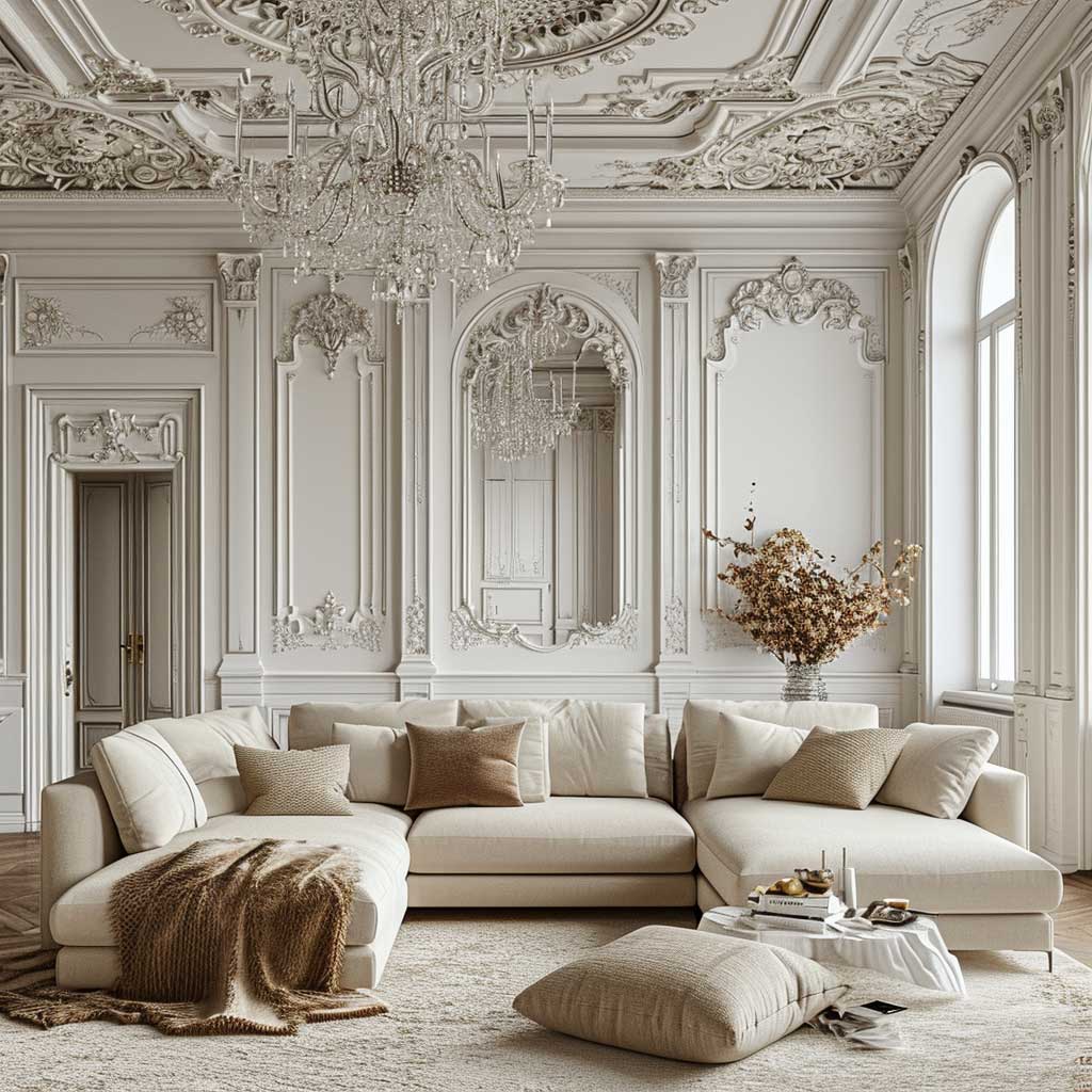
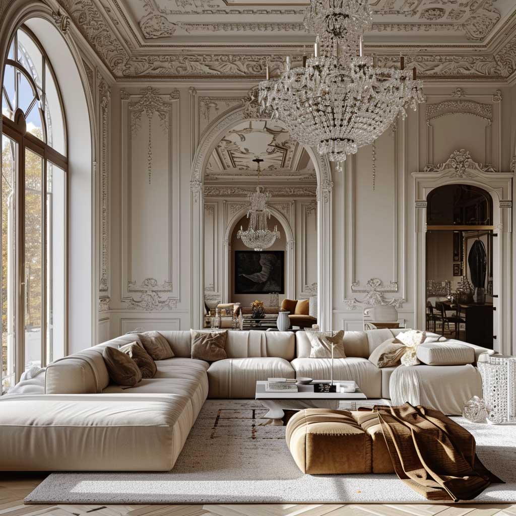
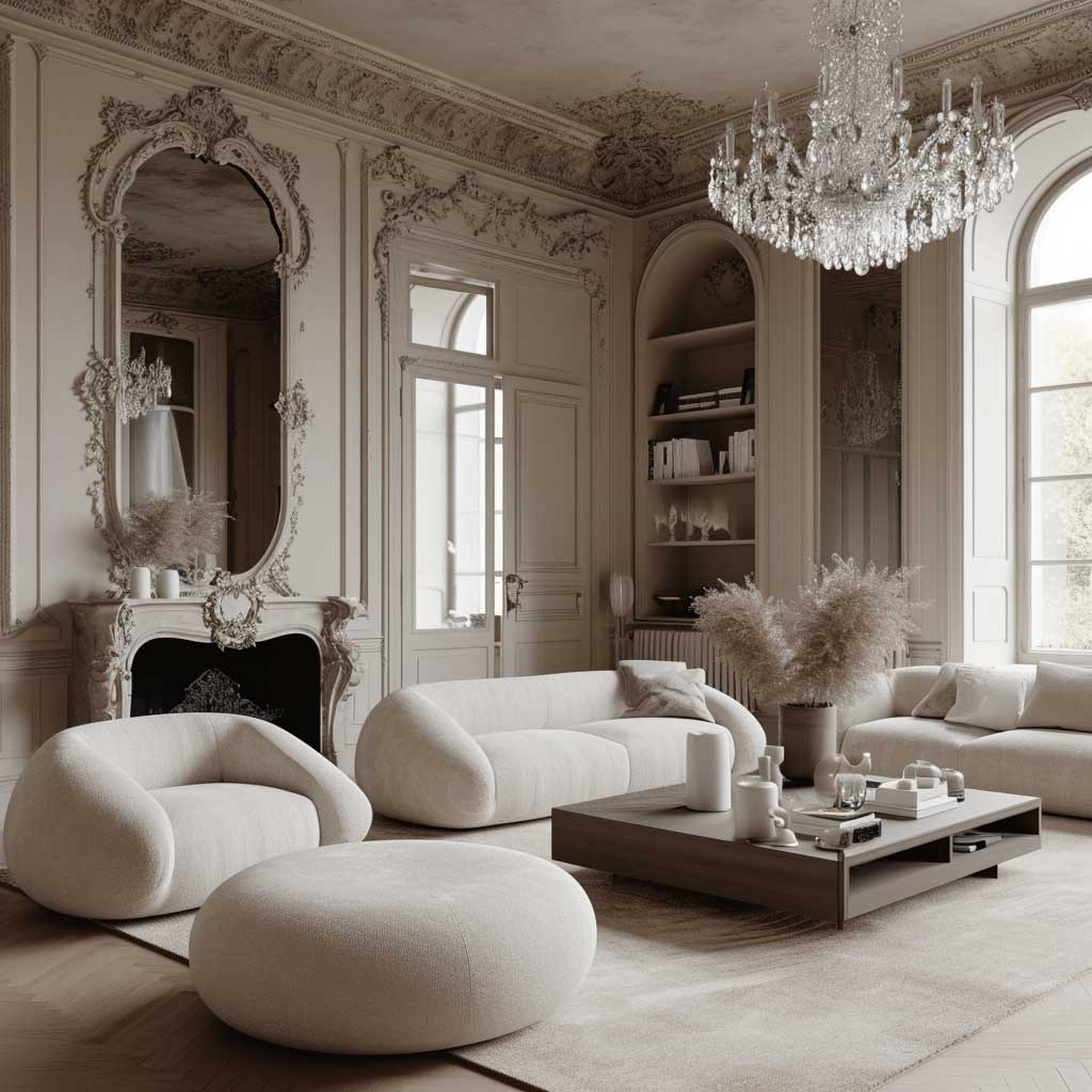
Start with a white or warm greige wall — not warm enough to read as beige, not cool enough to go grey. That middle-ground tone is your foundation, and it has to be right because everything Baroque you layer on top will fight a strong wall colour. My go-to is Farrow & Ball’s Pointing (No. 2003) at around $120 per 2.5L tin; it reads almost white but with enough warmth to make a gold chandelier look intentional rather than random.
The chandelier is non-negotiable. You need one centrepiece that has weight and drama, and the ceiling fixture is the right place for it because it doesn’t take up floor space. A Baroque-style crystal chandelier from brands like Schonbek or a vintage piece from 1stDibs ($400–$2,000 depending on size) does the job. A cheap chandelier with plastic crystals is worse than no chandelier at all — the shine reads false and the whole effect collapses.
Your sofa should be the opposite of the chandelier. Flat arms, tight back, no pattern. I pair a low-profile linen sofa — something in the CB2 Decker range, around $1,800 — with a single velvet cushion in deep burgundy or forest green. The velvet does the Baroque work. Six matching scatter cushions do not; they turn the sofa into a prop.
What breaks this look every time? Matching sets. A matching lamp, vase, and picture frame trio from the same collection signals mass retail, not curation. Buy things that don’t obviously belong together. A Baroque-framed mirror next to a flat-front console works precisely because the tension between them is the point — like a jazz musician playing against the beat.
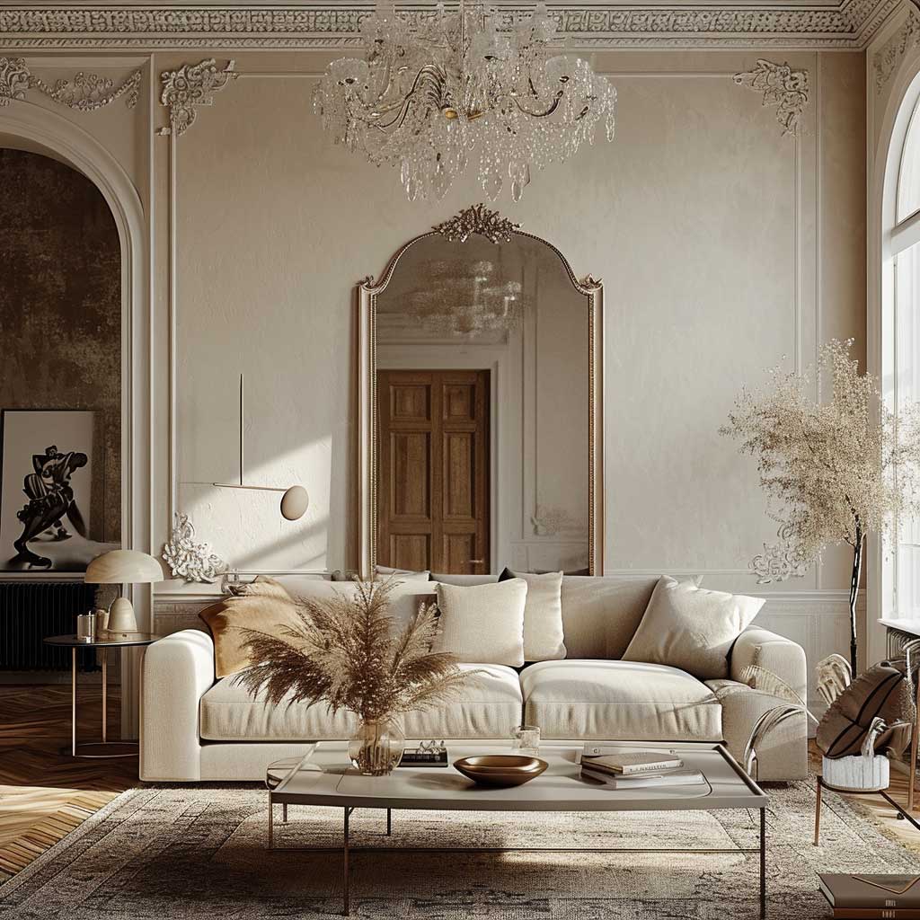
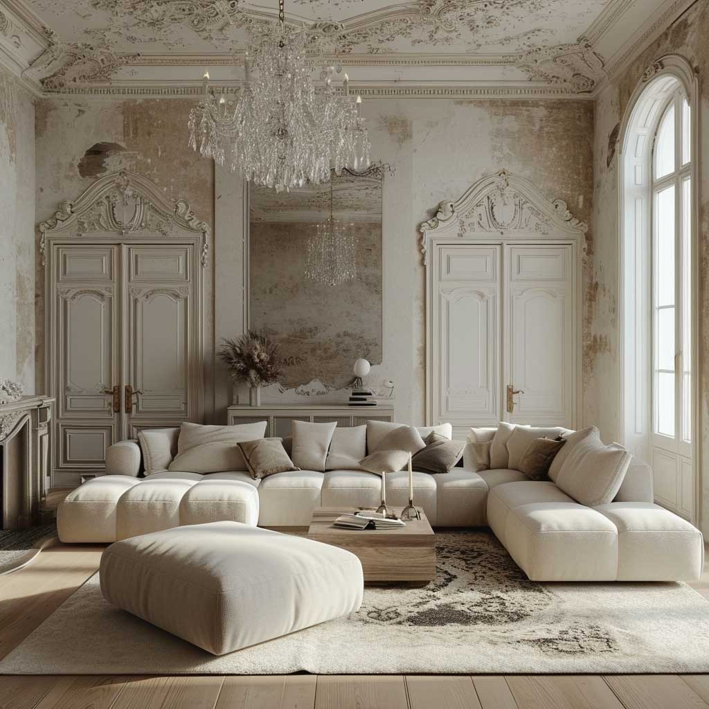
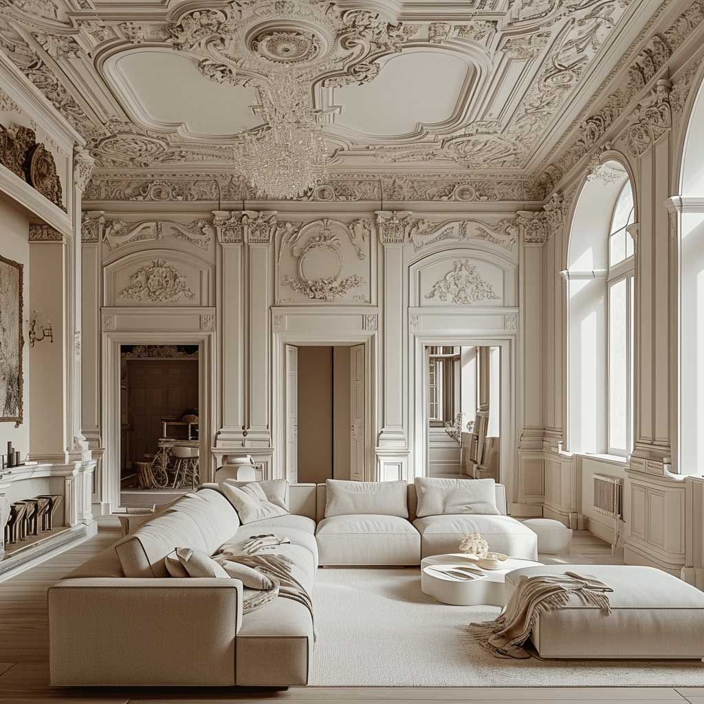
Rugs are your best texture play. A flat-weave rug looks right in a minimalist room but does nothing for the opulence side. A high-pile or bouclé rug in a neutral — not white, it’ll look grimy within a month — adds the tactile depth that makes the room feel considered rather than decorated. Rugs.com has reliable options from $300. Avoid graphic patterns; the Baroque pieces are already doing the patterning.
Art placement follows one rule here: one large piece on the wall opposite the main seating, full stop. A salon wall with fifteen prints kills the minimalist half of the equation. I stole this trick from a Paris apartment I visited — a single oversized oil-on-canvas in an ornate frame, no other wall art, and the room felt like a magazine cover.
Lighting layers matter more here than in a typical minimalist room. You need ambient light that doesn’t compete with the chandelier. Recessed spots on a dimmer set to 30% after dark make the chandelier look like it’s performing. At full brightness the room looks like a dentist’s office. Add one floor lamp — something with a simple linen shade, under $200 — near the reading chair. Task lighting without the drama.
A cohesive minimalist baroque living room is a space you can live in daily without fatigue. For more on creating calm interiors that still have presence, this breakdown of cozy minimalist living room approaches covers the neutral foundation work in useful detail.
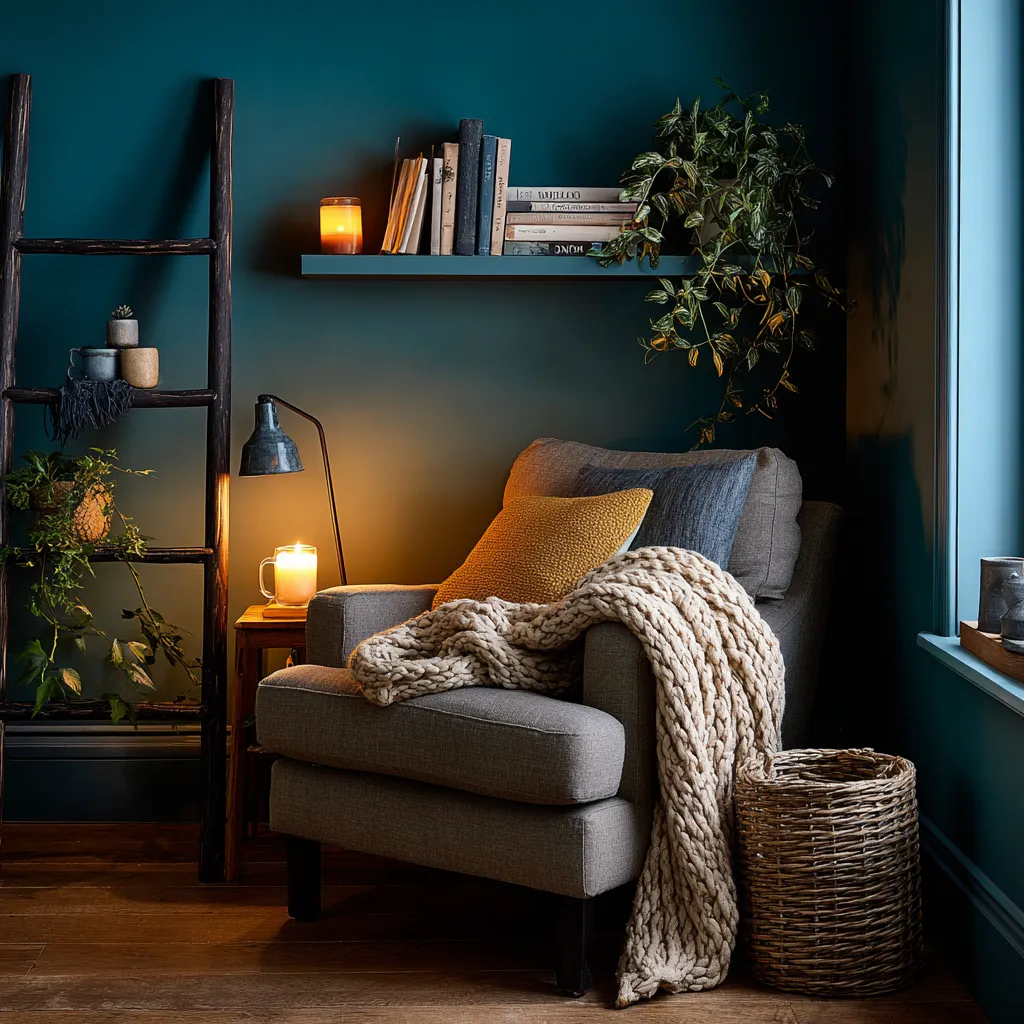
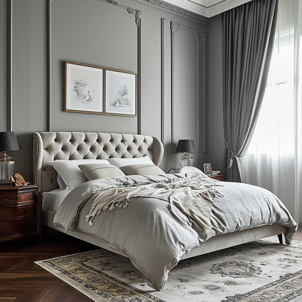
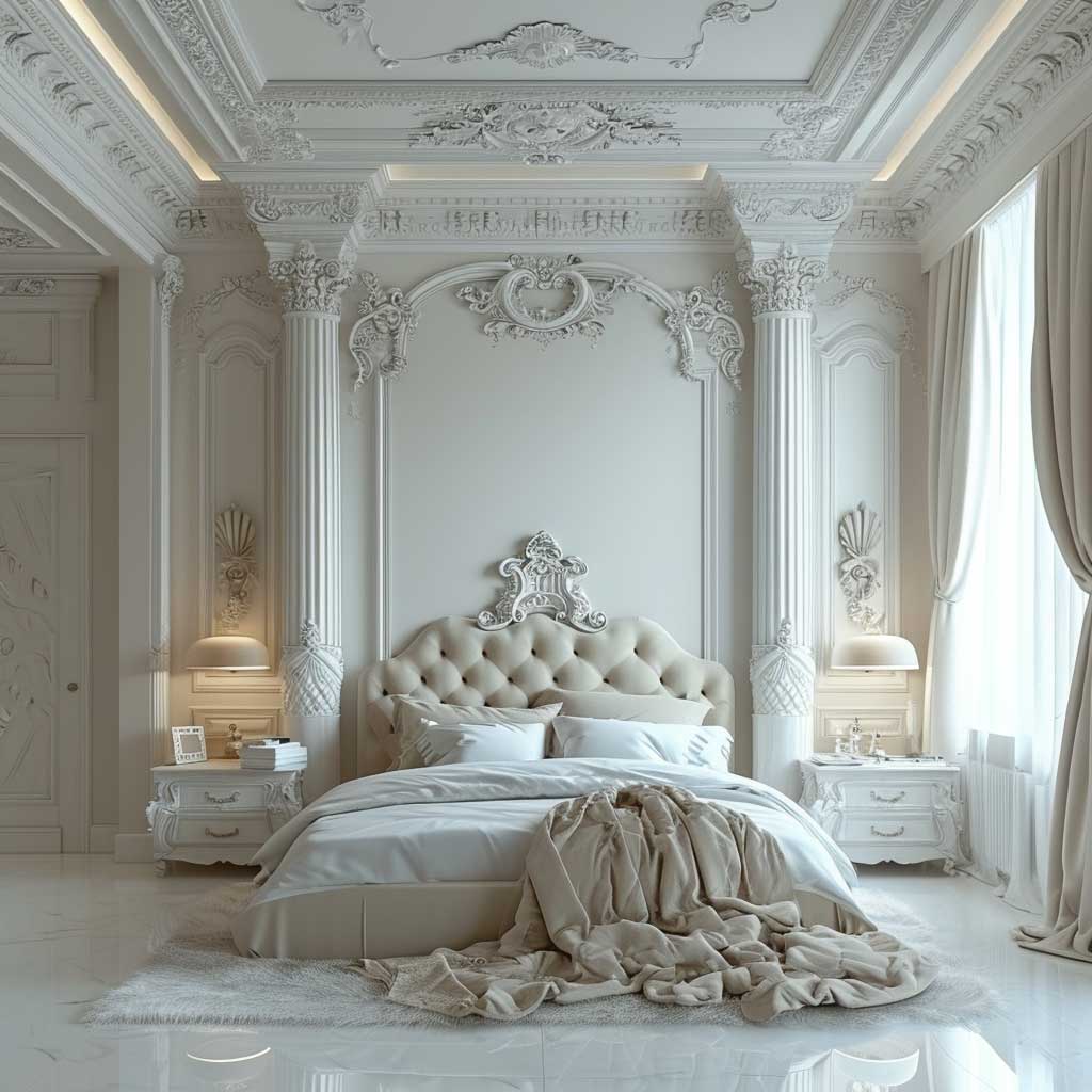
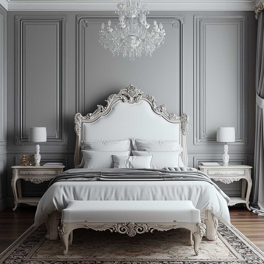
Baroque Grandeur in the Bedroom Lands Differently at Night
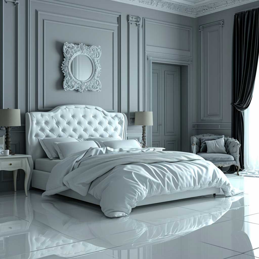

Baroque in a bedroom has one advantage the living room doesn’t: you experience it mostly in low light. A gilded wall sconce at 10pm looks dramatically different from the same sconce at noon, and the evening version is the one that justifies everything. Design the room for how it looks after dark. The drama is in the shadows, not the surfaces.
The bed frame itself should be completely plain — a platform frame in matte black or walnut, nothing higher than 50cm from the floor. Baroque headboards exist, and they are almost universally a disaster in this context. An ornate carved headboard paired with a minimal room looks like a costume, not a considered interior. I’ve seen this mistake in three different staged apartments and it kills the whole premise.
Your one Baroque piece in the bedroom should be either the mirror or the light fixture. Not both. A vintage gilded mirror — even a secondhand piece from a flea market or eBay under $150 — placed opposite the window doubles the natural light and gives the room its focal moment. Pair it with bedside lamps that are completely plain: a ceramic base with a white linen shade costs under $80 each at H&M Home and does exactly what it needs to do.
Textiles carry the opulence in a minimalist baroque bedroom. You need at minimum one material with sheen — brocade, silk, or high-thread-count satin in the bedding. Not synthetic satin from a fast-fashion brand; it photographs well but feels cheap and makes you sweat. A silk-cotton blend duvet cover from Bedfolk runs about $280 and holds its shape for years. The difference in feel is immediate.
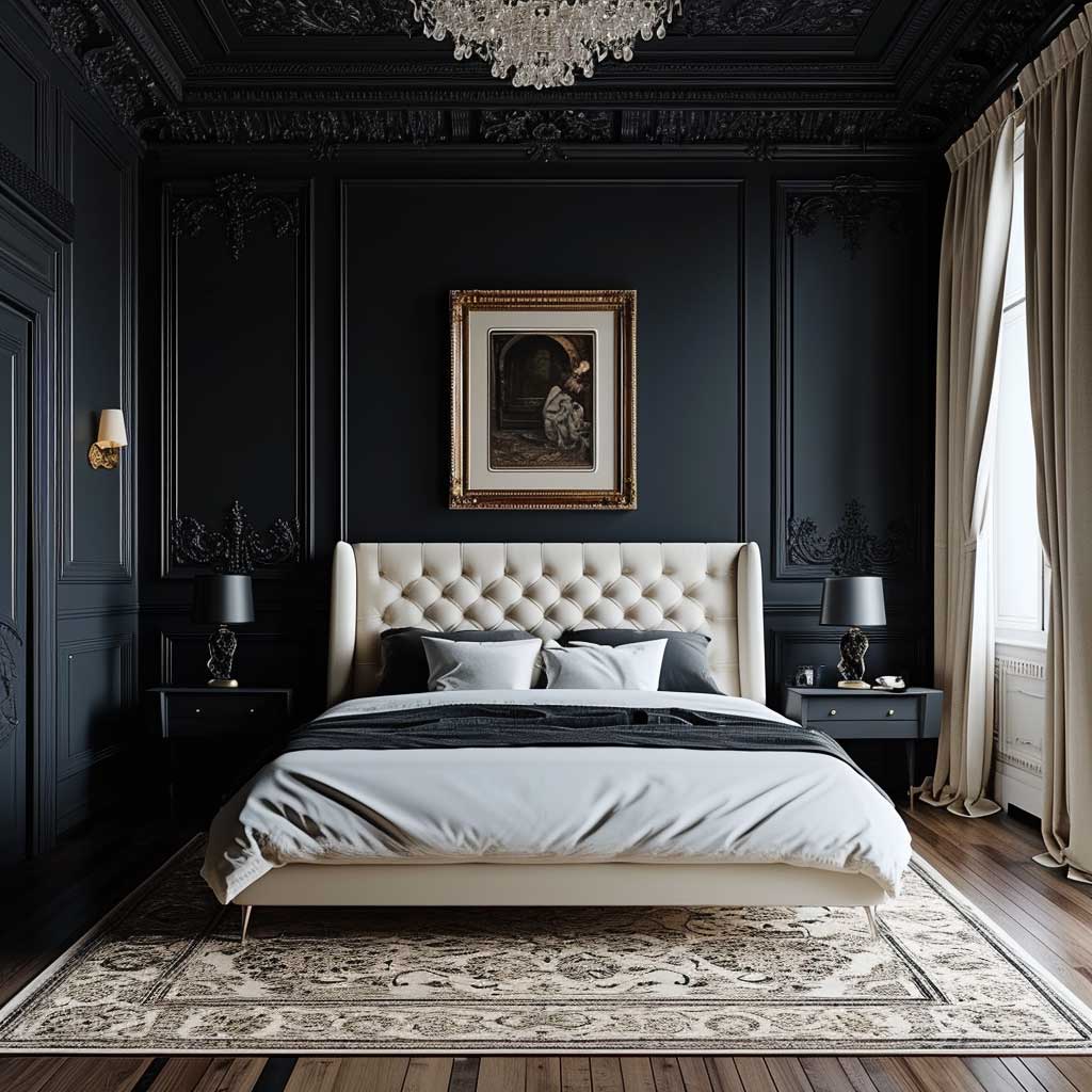
Colour in a minimalist baroque bedroom should be muted on the walls and concentrated in one accent. Dusk pink, pale sage, or dusty lilac walls all work. Soft sage with a single deep plum cushion is the combination I keep returning to — the plum reads as Baroque without requiring any actual ornamentation. Avoid grey in this style; it flattens every warm Baroque element and makes gold look yellow rather than rich.
Curtains should be floor-length. Full stop. Cafe-length curtains in a room aiming for any kind of grandeur look like a studio apartment trying to be a palace. Floor-length velvet drapes from IKEA’s MAJGULL range at around $60 per panel hang well and add exactly the weight the room needs. You don’t have to spend $400 per panel to get this right.
Clutter is the enemy and a flat surface left empty is a design decision. The bedside table should hold a lamp, one book, and nothing else. No charging cables on display, no skincare bottles, no decorative tray filled with seven small objects. I own two bedside tables and both have exactly this setup. The room reads more expensive because of what’s absent, not what’s present.
Don’t do this: Don’t mix multiple Baroque pieces in the same room thinking more ornate equals more luxurious. Two gilded mirrors, a carved headboard, an ornate chandelier, and damask wallpaper in a single bedroom isn’t minimalist baroque — it’s just baroque, and not well-executed baroque at that. The minimalist side of this style is what gives each ornate piece its power. Remove the restraint and you lose the drama. Pick one centrepiece per room and commit.
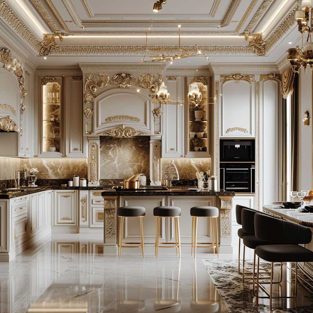
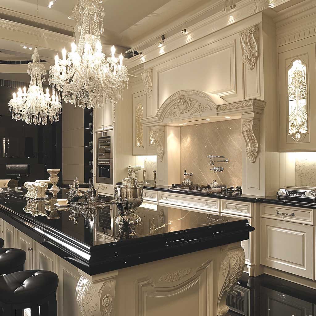
A Kitchen With Baroque Hardware Costs Nothing Extra to Pull Off
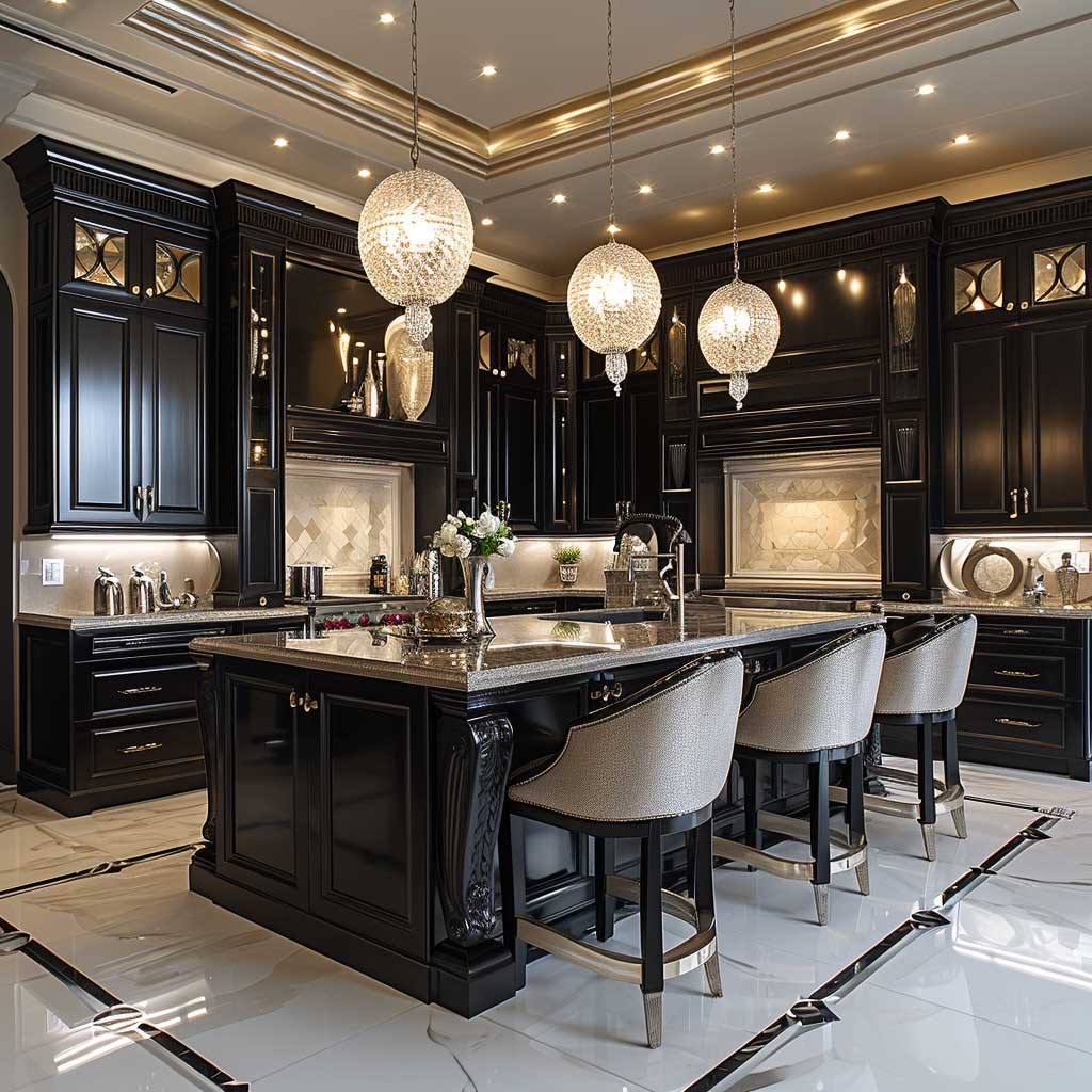
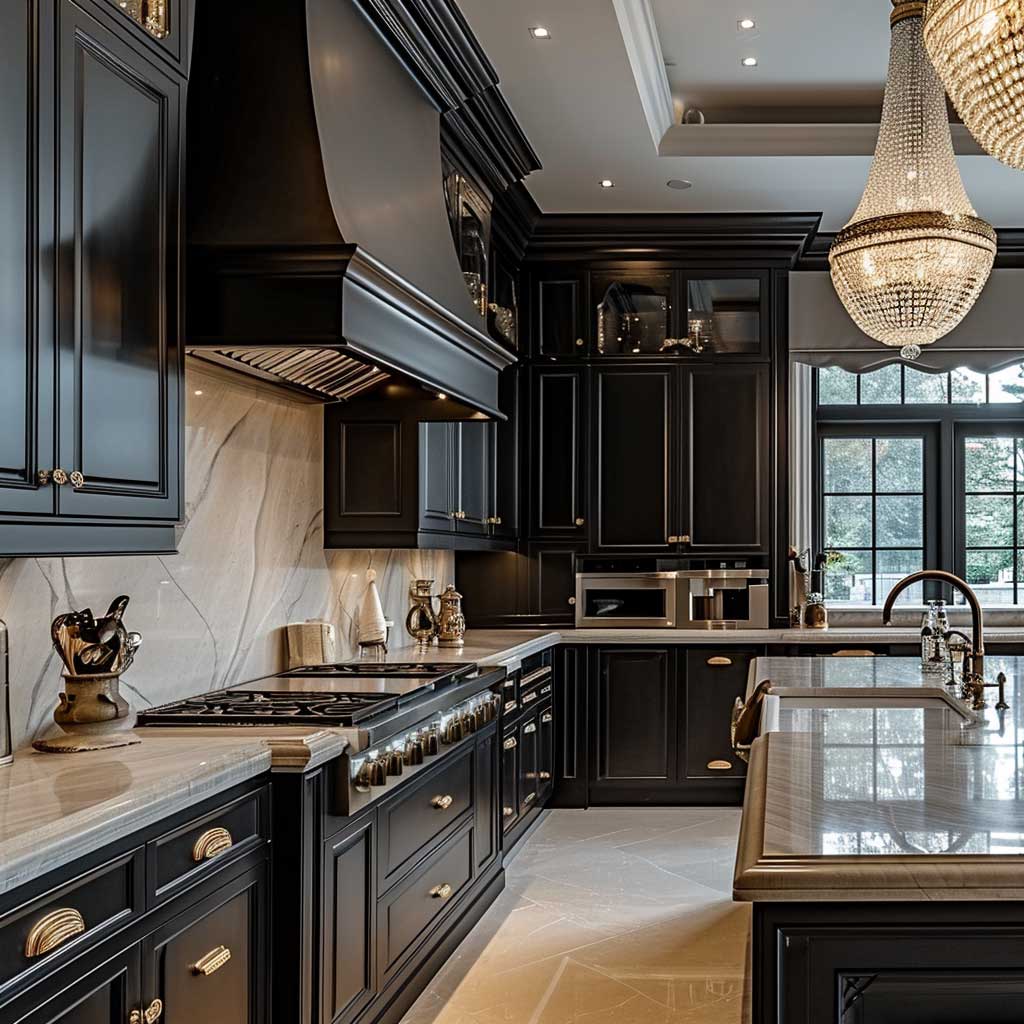

The kitchen gets Baroque through hardware first, everything else second. Flat-front cabinets in white, cream, or soft sage are your canvas. Swap the handles. Cup pulls and bar handles in antique brass or unlacquered brass — unlacquered tarnishes unevenly over time and looks genuinely aged rather than fake-aged — run about $8–$15 each from Rejuvenation or $4–$8 each from Etsy makers. Do the whole kitchen and you’ve spent $150 to $300 for a transformation that reads as a $10,000 renovation. That’s the entire logic of this style in one hardware swap.
The pendant lights over an island or dining table are the second Baroque move. An ornate crystal or glass pendant — something with visible craftsmanship in the fitting — from brands like Arteriors or CB2 runs $200–$600 per piece. You need two over an island; a single pendant looks incomplete and slightly sad. I stole this double-pendant approach from a kitchen renovation I photographed in Warsaw, and it works because it echoes the symmetry that is central to genuine Baroque design.
Countertops should be stone. Marble is the historical choice, but Calacatta marble at $80–$150 per square foot installed is a serious investment. Marble-look porcelain from brands like Florida Tile’s Berkshire collection gets you 90% of the visual for 30% of the cost. What you absolutely cannot do is pair ornate Baroque fixtures with laminate countertops — the material contradiction is too jarring and the whole look reads as unfinished.
A backsplash is where I’d spend the design energy. Plain subway tiles are fine behind a Baroque-hardware kitchen, but hand-painted encaustic tiles — Moroccan-style geometric or a damask pattern — push the whole room into a different category. Clé Tile sells handmade versions from $25–$45 per tile; you’ll need roughly 30–40 tiles for a standard backsplash. Yes, it’s a splurge. No, you won’t regret it. For a wider look at how classical elements translate into contemporary interiors, this feature on neo-classic industrial design covers the material logic in useful depth.


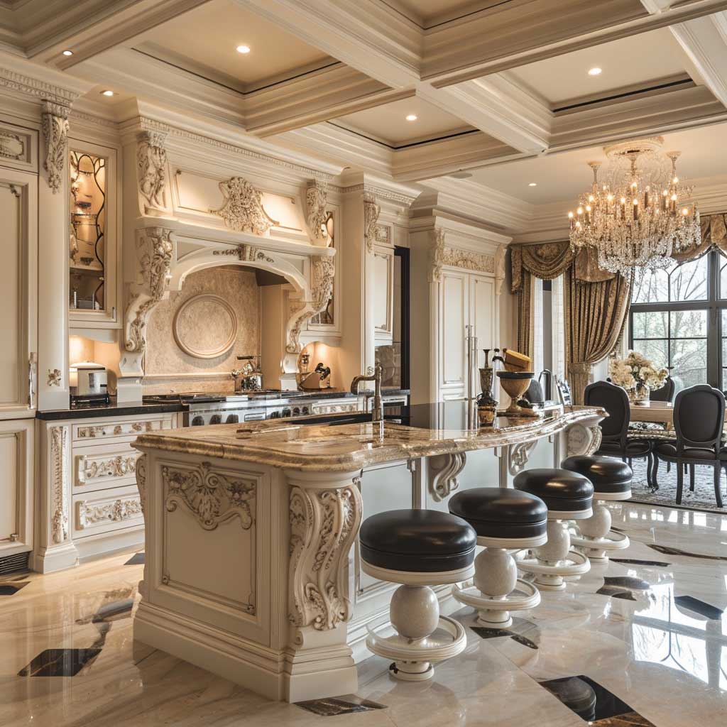
Bar stools are the one place kitchens let ornate furniture in. A curved, carved, or upholstered stool with a turned leg — something in the style of a Louis XVI dining chair — next to a flat-front island creates that Baroque-meets-minimal collision deliberately. Pottery Barn’s Toulouse counter stool at around $299 each is the mass-market version and it holds up. Avoid acrylic or ghost chairs in this setting; they read as a different decade entirely and fight the Baroque hardware.
Range hoods get overlooked. A flat stainless-steel box hood above ornate pendant lights and antique brass handles is a visual non-sequitur. A curved plaster hood or a decorative metal hood with raised detailing costs more — roughly $800–$2,500 installed — but it pulls the room together in a way that no other single change can replicate. Think of it as the ceiling fixture equivalent for the kitchen.
Keep the countertops clear. Two items maximum: a fruit bowl in ceramic or marble, and a single potted herb near the window. Every cutting board left out, every appliance on display, every stack of mail on the counter undoes everything the hardware and lighting worked to create. The discipline of a clear counter in a Baroque-inflected kitchen is what separates a photographable room from a good-looking-in-person room. You need both.
For those building a full room scheme rather than adding individual pieces, the approach used in modern baroque interior inspiration on ArtFasad walks through how to layer opulent details without losing coherence — worth reading alongside this kitchen section.
Save for later
Minimalist baroque is not a compromise. It’s the more interesting version of both styles.
Three Baroque pieces in a room with restrained everything else outperform thirty pieces in a maximalist room. The hierarchy matters more than the quantity.
Hardware, lighting, and one ornate mirror will take you further than any decorator’s mood board. Start there.
Save this post so you have a reference when you’re standing in a showroom wondering whether the brass handles are too much.
Related Topics