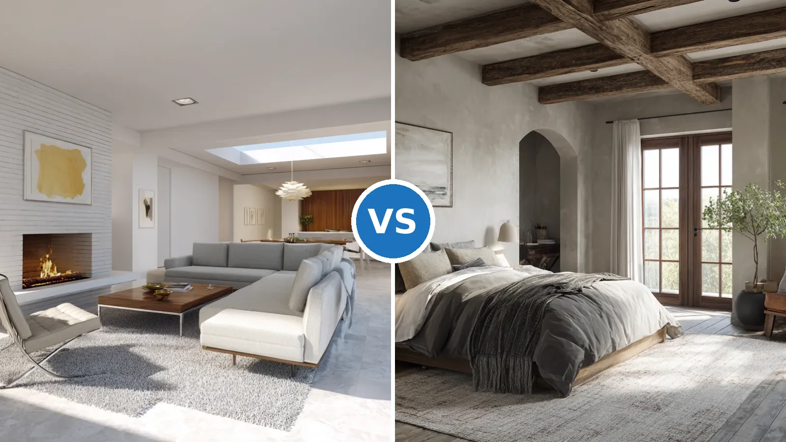
The japandi color palette sits at the intersection of two philosophies that seem identical from a distance — Japanese wabi-sabi and Scandinavian hygge — but pull in subtly different directions. Wabi-sabi asks you to accept imperfection and emptiness. Hygge asks for warmth and comfort. The palette is what holds those instincts together: muted, earthy, warm-toned neutrals layered with one dark anchor and wood that reads organic rather than polished.
Sherwin-Williams Shoji White (SW 7042) and Benjamin Moore White Dove are the two paint colors that stylists return to most often as a foundation — both cost $30–$80 per gallon depending on the product line and cover 350–400 square feet per gallon. What makes them work is their warm, gray-green or creamy undertone. A cool, blue-tinted white makes every wood surface look dusty and strips out the warmth the style depends on. The undertone is doing more structural work than the color itself.
Applying a japandi color scheme across a living room, bedroom, and dining area requires different calibrations for each space — the bedroom wants cocooning depth, the living room wants layered calm, the dining area wants that specific contrast of light and dark that makes a wooden table the centerpiece rather than just furniture. This article covers all three, room by room, with verified paint names, material choices, and the handful of mistakes that flatten the effect every time.
– The japandi color palette works on warm-undertone neutrals — off-white, oat, taupe, warm gray — anchored by one dark element (charcoal, smoked oak, matte black).
– Sherwin-Williams Shoji White and Benjamin Moore White Dove are the two most-recommended wall colors; both $30–$80/gallon.
– Living room: neutrals need a dark anchor or they read as unresolved, not calm.
– Bedroom: earthy tones (soft brown, muted terra cotta, deep walnut) plus 2700K bulbs create the cocooning depth the japandi bedroom color palette is known for.
– Dining area: light oak table, darker chair frames, matte travertine or ceramic textures — contrast is the move.
– Cool-toned whites, high-gloss finishes, and mixing warm- and cool-toned wood in the same room are the three most common palette failures.
Neutral Tones in the Living Room Collapse Without a Dark Anchor
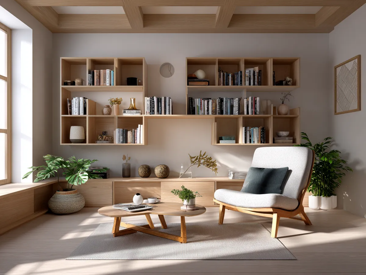
Soothing neutrals in a japandi living room — the warm whites, sandy beiges, and mushroom tones that form the palette’s foundation — lose their calm effect the moment they’re used without contrast. Pale walls and an oatmeal sofa read as unresolved rather than serene when there’s nothing for the eye to land on. The fix is straightforward: one dark, grounding element — a charcoal linen throw, a low bookshelf in smoked oak, a matte black ceramic vessel on the coffee table — gives the neutrals something to lean against. Without it, the room looks like it’s waiting for furniture that hasn’t arrived yet.
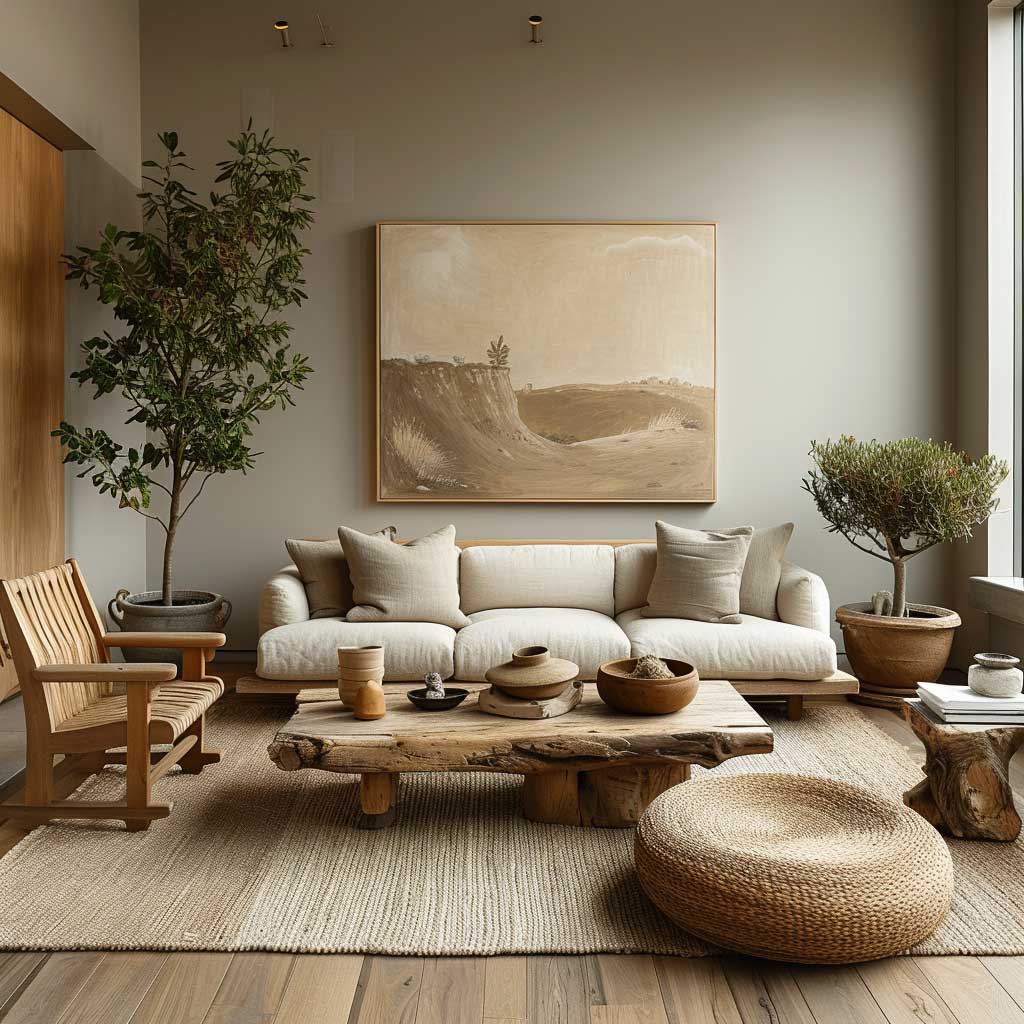
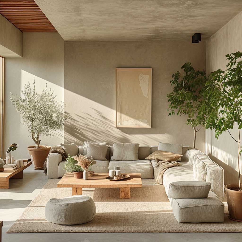
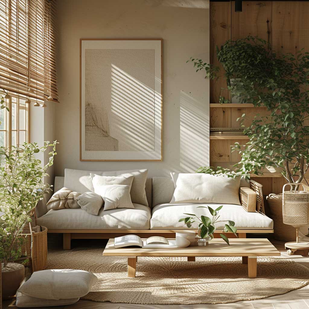
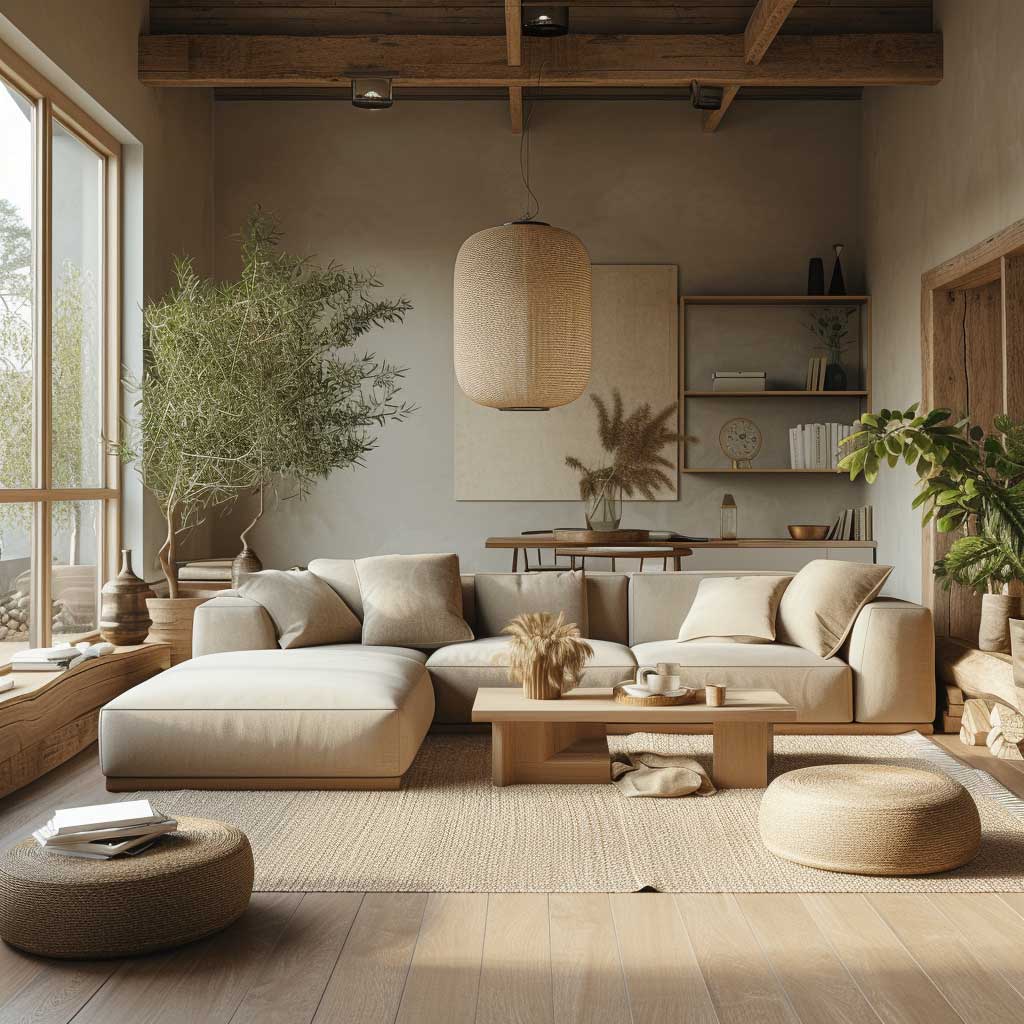
The specific warm whites that work here are easy to identify once you understand why they work. Sherwin-Williams Shoji White (SW 7042) has a gray-green undertone that stays calm under both natural and artificial light. Benjamin Moore White Dove reads creamy at noon and warm gray at dusk — both behaviors work in favor of the style. What fails: cool, blue-toned whites that make wood surfaces look dusty, and greige shades that trend yellow under warm LED bulbs. Interior stylists recommend testing a sample pot in situ for at least 48 hours before committing; the color reads differently in morning light, afternoon sun, and artificial evening light. Grab the sample before the paint.
Furniture in a japandi living room follows the 60/30/10 rule confirmed by interior designers: 60% light neutrals on walls and large upholstered pieces, 30% wood and natural textiles, 10% dark or earthy accent elements. A low-profile sofa in warm white or oat linen anchors the seating zone; a solid oak or ash coffee table at 90 x 45 cm provides the wood layer. The geometry of the coffee table matters — rectangular shapes maintain the clean lines the style requires. Round tables work in bohemian setups, not here. What not to do: mix warm-toned and cool-toned wood in the same room. A pale ash table and a walnut shelf in the same sightline fight each other continuously, and the visual tension reads as indecision rather than contrast.
Plants earn their place through restraint. One olive tree in an earthy ceramic pot, one snake plant on a low shelf — both provide greenery and air purification without the visual noise of a clustered plant display. Ferns, snake plants, and pothos thrive indoors with low to moderate light and minimal maintenance, making them natural candidates for a japandi living room. Think of each plant as a piece of furniture that requires a reason to occupy that specific spot. Three plants maximum in an average living room, and none of them should be trailing from a high surface into the sightline of the seating.
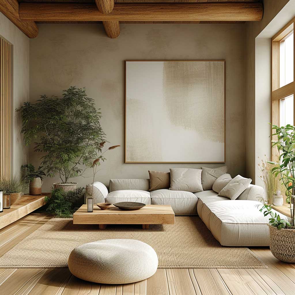
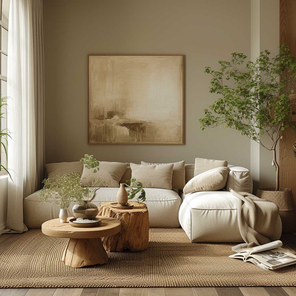
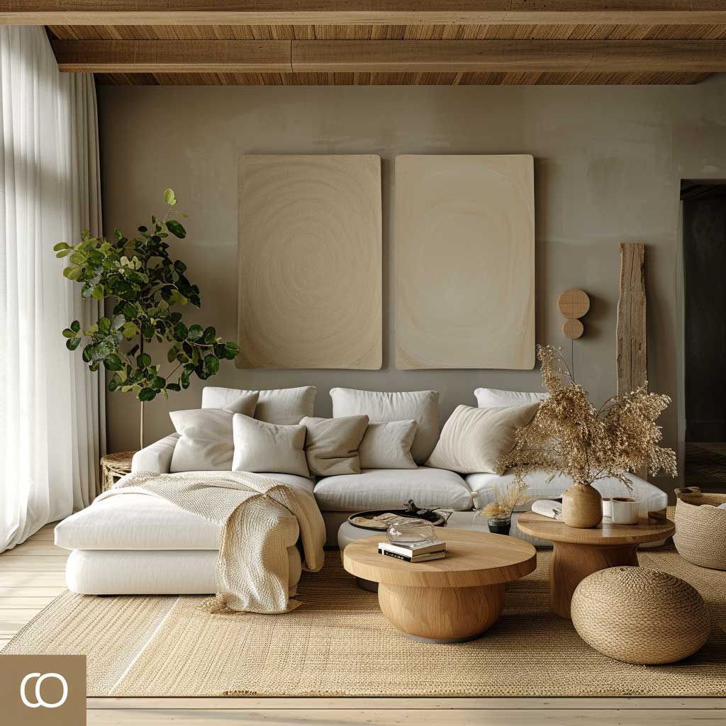
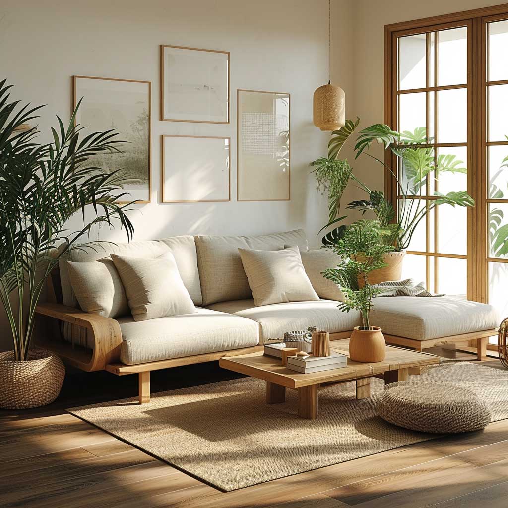
Lighting is where most japandi living rooms quietly fail. A single overhead fixture reads as a rental apartment regardless of the furniture beneath it. The approach that interior designers consistently recommend: layer a washi paper floor lamp ($65 at Muji), a small concrete table lamp on the shelf, and warm-spectrum LED bulbs at 2700K — not 3000K, which reads clinical in a muted room. The Japanese concept of layered light holds that shadows carry as much atmospheric weight as the illuminated surfaces; the room should shift mood as afternoon becomes evening rather than maintain a flat uniform brightness throughout. Curtains in undyed linen or raw cotton — never heavy polyester blackout panels — let daylight do the morning work, while the layered lamps handle dusk.
What makes a japandi living room feel resolved versus unfinished often comes down to one overlooked detail: the tonal range of the upholstery, rugs, and curtains. All soft surfaces should fall within two tonal steps of each other — warm white, warm gray, pale oat, or deep charcoal. A navy throw or a terracotta cushion breaks the temperature logic of the palette and pulls the eye toward the deviation rather than toward the whole. Rugs in natural jute, flatweave wool, or undyed cotton at approximately 200 x 290 cm anchor the seating zone without introducing pattern. One clear floor path of at least 80 cm between any two pieces of furniture completes the sense of ordered calm.
Choosing a cool, blue-toned white for japandi walls is the single most common palette mistake. It makes every wood surface read as dusty or gray-tinted and removes the warmth the style depends on. The same problem appears with high-gloss paint finishes — japandi surfaces absorb light, they don’t bounce it. Use matte or eggshell finish on walls, and test your paint in situ for 48 hours before committing. A white that looks warm in the store reads completely differently under the specific light conditions of your room.
Earthy Depth Makes a Japandi Bedroom Color Palette Work
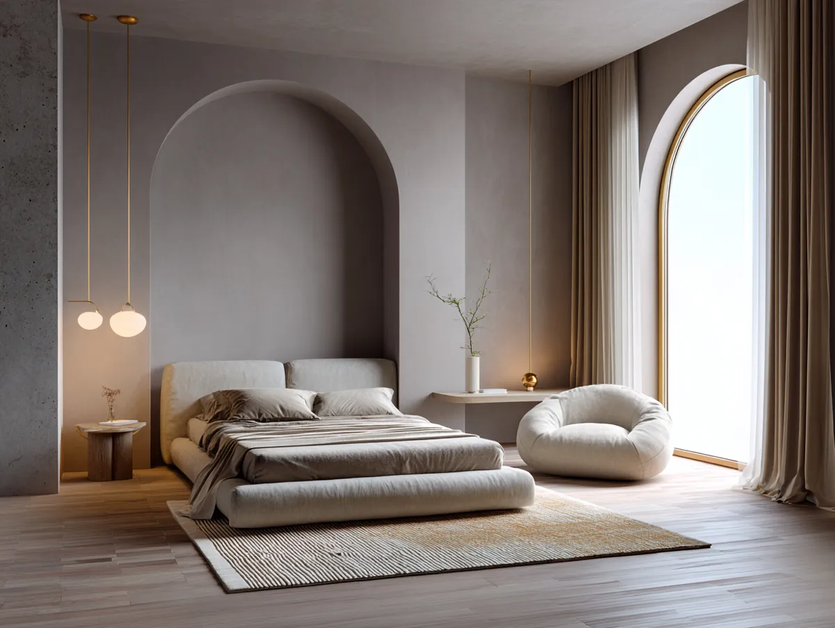
Japandi bedroom ideas that actually generate calm rely on a palette shift that most people miss: the bedroom wants more earthiness and depth than the living room, not the same neutral field applied to a different room. Soft browns, muted terra cotta, and deep walnut — anchored by ivory or warm white walls — create the cocooning quality the space needs for rest. Interior designers recommend Sherwin-Williams Cavern Clay (SW 7701) for a single accent wall or upholstered chair when the bedroom palette feels too cool; its clay undertone references Japanese ceramics and brings grounding warmth without overwhelming the neutral foundation. Benjamin Moore Saybrook Sage (HC-114) performs the same function in green, its gray undertone letting it act as a neutral.
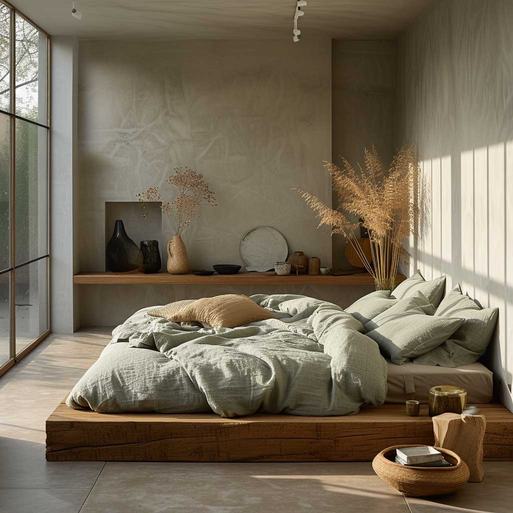
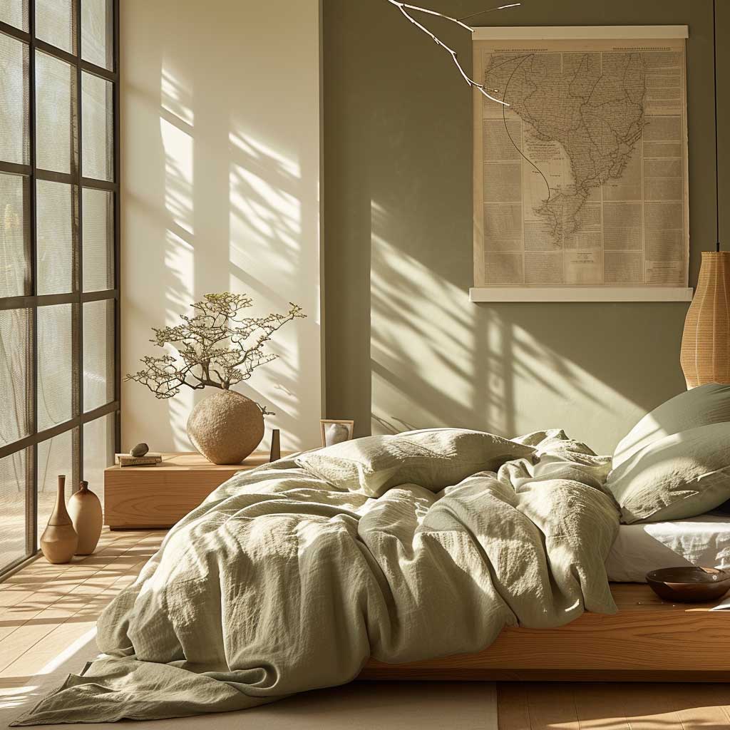
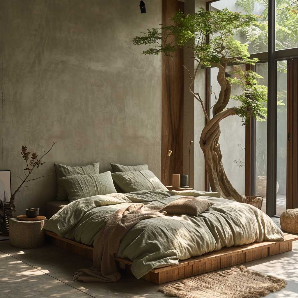
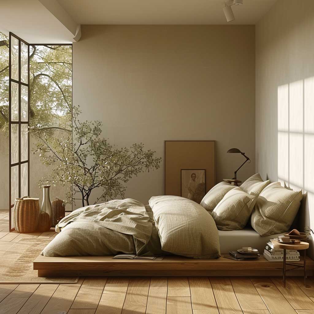
The furniture logic for a japandi bedroom is platform or low-profile beds in light, untreated wood — white oak, ash, or pale birch for a Scandinavian-leaning palette; darker walnut or smoked oak for a Japanese-leaning one. A deep walnut bed frame or a charcoal gray bedside table can balance out the lighter wall tones without competing with them. Linen bedding in earthy tones (undyed ivory, warm stone, or pale sage) completes the material layer. The trick here: linen bedding that’s been washed multiple times has exactly the slightly rumpled, lived-in texture that wabi-sabi celebrates — it genuinely looks better the more it’s used, which is the opposite of most interior choices.
Texture does the atmospheric work that additional color cannot. Wool throws, woven jute rugs, and linen curtains introduce a tactile dimension that the eye reads as warmth before the brain consciously registers the detail. These materials, chosen for their natural qualities and the visible evidence of their making, reinforce the connection to the physical world that Japandi design consistently prioritizes. What fails here: mixing synthetic fiber alternatives into the textile layer. They have no weight, no life, and no variation in how they catch light. The difference between a chunky-knit wool throw and a polyester alternative is obvious in person within the first week of living with both.
Dark Japandi in the bedroom — charcoal walls, smoked oak bed frame, slate linen — has become a recognized variation that uses the same palette logic but shifts the value range downward. The rule: every dark element needs a warm counterpart. Dark walls need warm wood. Dark floors need warm linen. The bulb temperature drops to 2700K or below; warmer bulbs pull out the amber undertones in walnut grain and prevent a charcoal room from reading as cold or clinical. Interior designers note that cool-undertone charcoal — the ones with blue rather than brown in their base — is the specific mistake that makes dark japandi bedrooms feel uncomfortable rather than enveloping. Ask to see the sample against your wood before buying a full gallon.
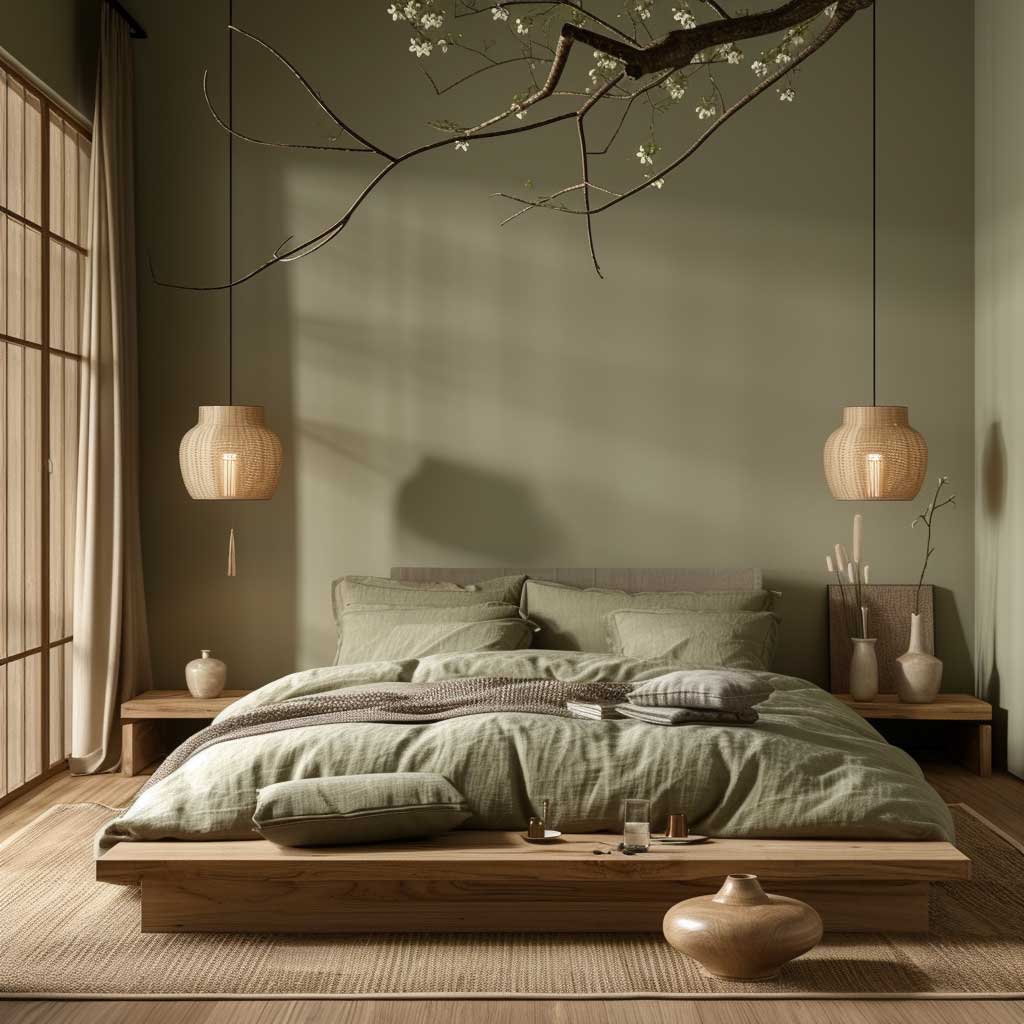
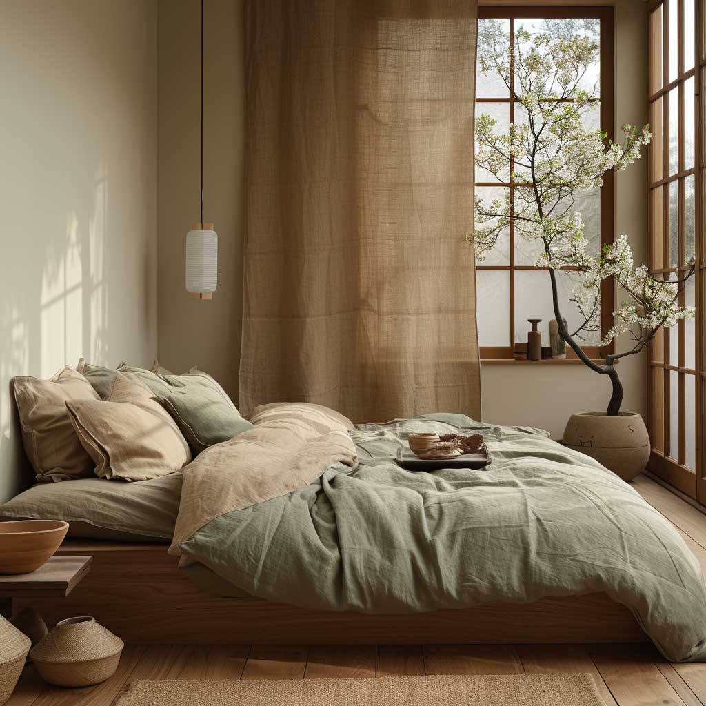
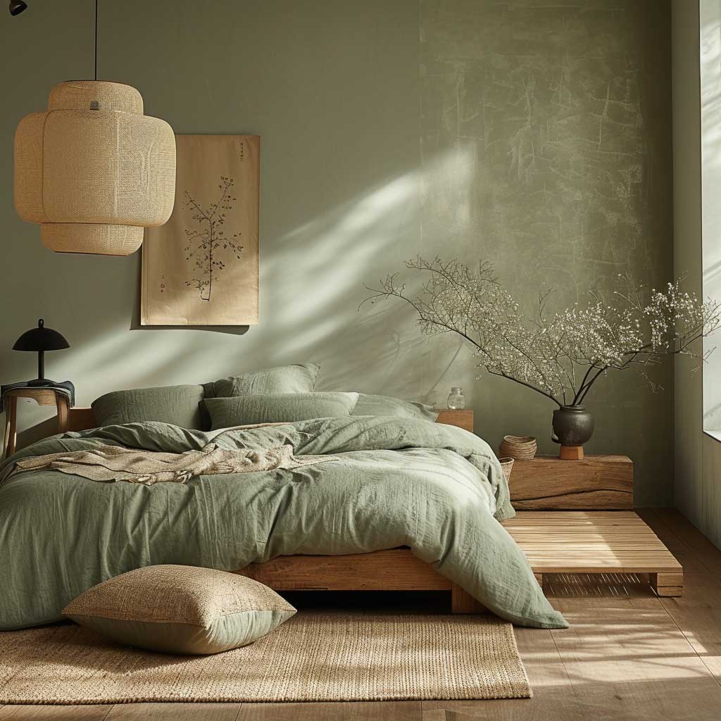
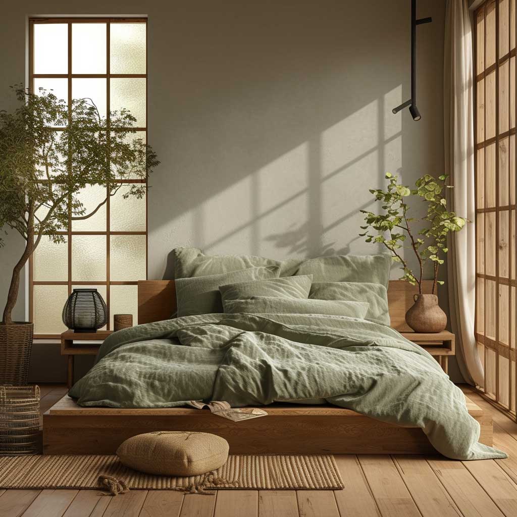
Greenery in a japandi bedroom earns its floor space the same way furniture does: by having a clear reason to be in that specific corner. A snake plant (which tolerates low light and requires watering every two to six weeks) in an earthy unglazed ceramic pot adds both a sculptural silhouette and air purification. A pothos in a hanging basket adds trailing texture from a high surface; the difference is that the pothos should be in a bottle vase on a low shelf, not dangling above the bed. Bringing the outdoors in is a japandi principle — but it applies to curated natural elements, not a cluster of small pots that reads as a windowsill collection. The room should feel like a mountain clearing, not a garden center.
Lighting in a japandi bedroom repeats the same layered logic as the living room but with a softer ceiling. Table lamps with fabric shades or wall-mounted sconces cast the diffused, directional light that makes a room feel intimate rather than staged. The placement matters: light sources at eye level when sitting or lying down create a sense of enclosure that overhead lighting cannot replicate. Pair the lamp placement with the earthy color palette and the room does something almost counterintuitive — it makes the walls feel closer in a way that reads as safe rather than cramped. You’ll notice the difference the first evening you spend in it with the overhead off.
For deeper research on japandi bedroom design principles and furniture selection, the dedicated article on japandi bedroom design for zen interiors covers the full furniture and material hierarchy in a room-by-room breakdown.
Light and Dark Together Make the Japandi Color Scheme Work in a Dining Area
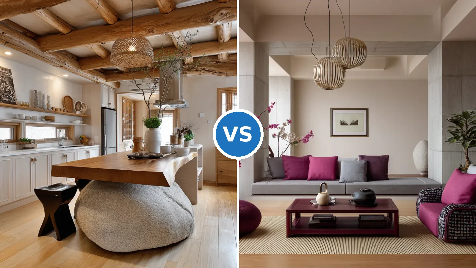
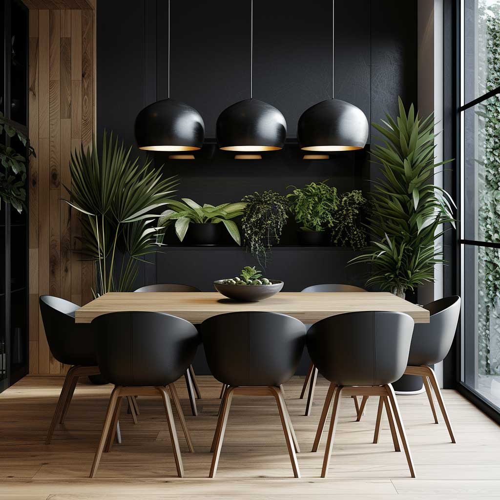
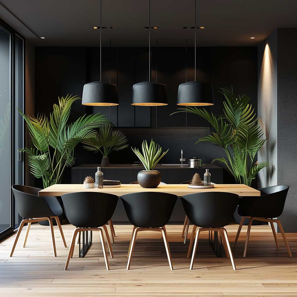
The japandi color scheme in a dining area works differently than in a living room or bedroom — here, the deliberate contrast between light and dark is not a supporting detail but the main visual event. Walls in warm neutrals (off-white or soft gray, around the $65–$75 per gallon range from Benjamin Moore or Sherwin-Williams) provide the backdrop. A large solid wood dining table in light oak or ash holds the center. Chairs in a darker hue — black metal frames, dark-stained oak, or a charcoal upholstered seat — provide the contrast that defines the composition. The light table against the dark chairs is the visual logic that makes the space feel considered rather than decorated.
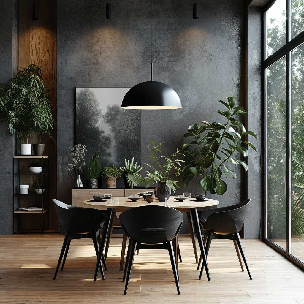
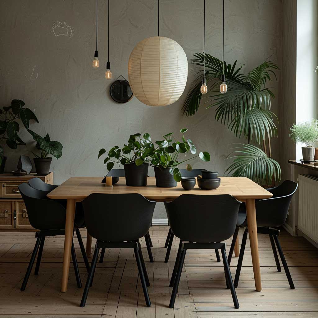
Material texture in the japandi dining area does the sensory work that color restraint cannot. Woven linen placemats, handmade ceramic tableware with visible glaze variation, and a single unglazed ceramic vase with a branch or dried botanical introduce the wabi-sabi layer that distinguishes japandi from plain minimalism. The irregularities in handmade ceramics — slight asymmetry, uneven glaze edges — are features rather than flaws, the visible evidence of the object’s making. A perfectly uniform, mass-produced ceramic set in the same color scheme reads as minimal; the handmade version reads as japandi. The distinction comes down to whether the object has evidence of a human hand in it.
What draws the japandi colour palette together in a dining context is the 60/30/10 logic applied to three dimensions rather than two. The walls and floor are the 60% — warm neutral, matte finish, absorbing light rather than reflecting it. The wood of the table and any open shelving is the 30% — natural grain, warm-toned, with a honed rather than glossy finish. The 10% dark anchor is the chair frames, a single matte black pendant light, or a dark ceramic piece on the table. Farrow & Ball paint for the accent wall sits in the $115–$125 per gallon range and delivers the depth of pigment that the 10% element often needs. The expense is worth it specifically for that single feature surface; the remaining walls don’t require it.
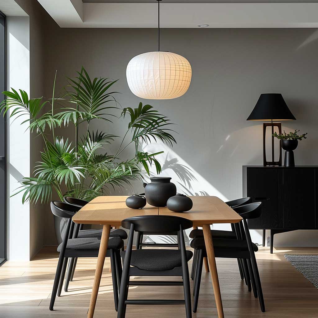
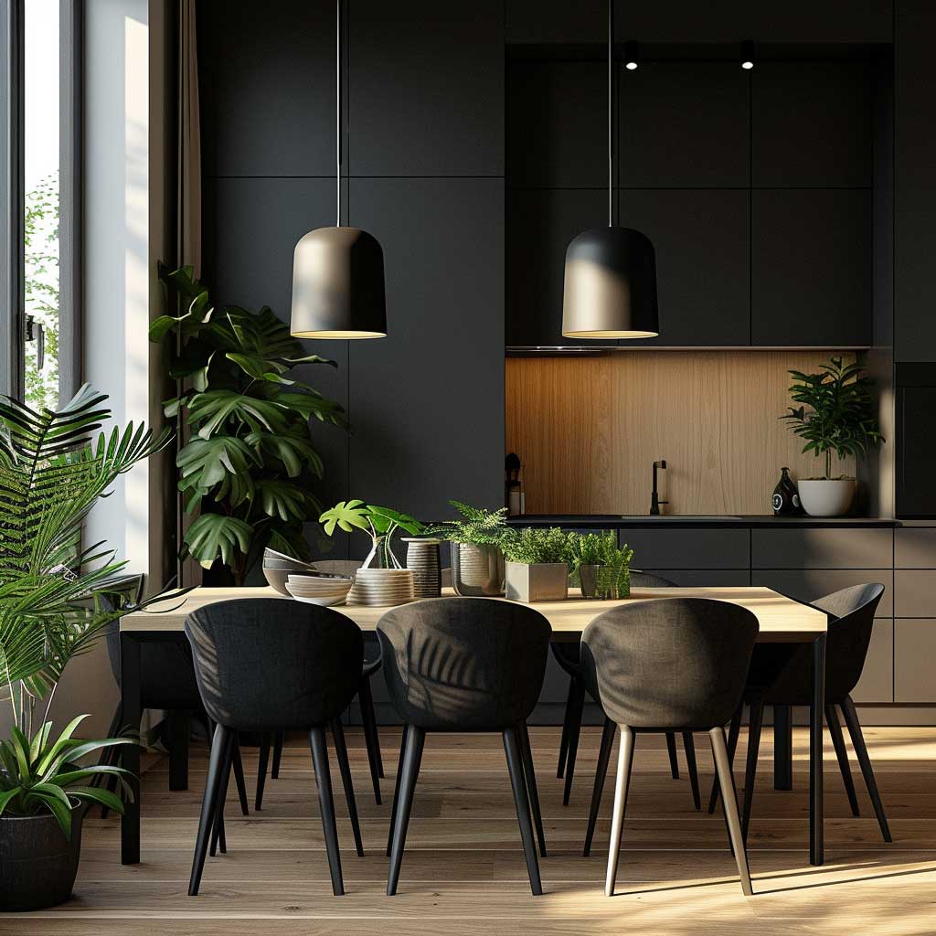
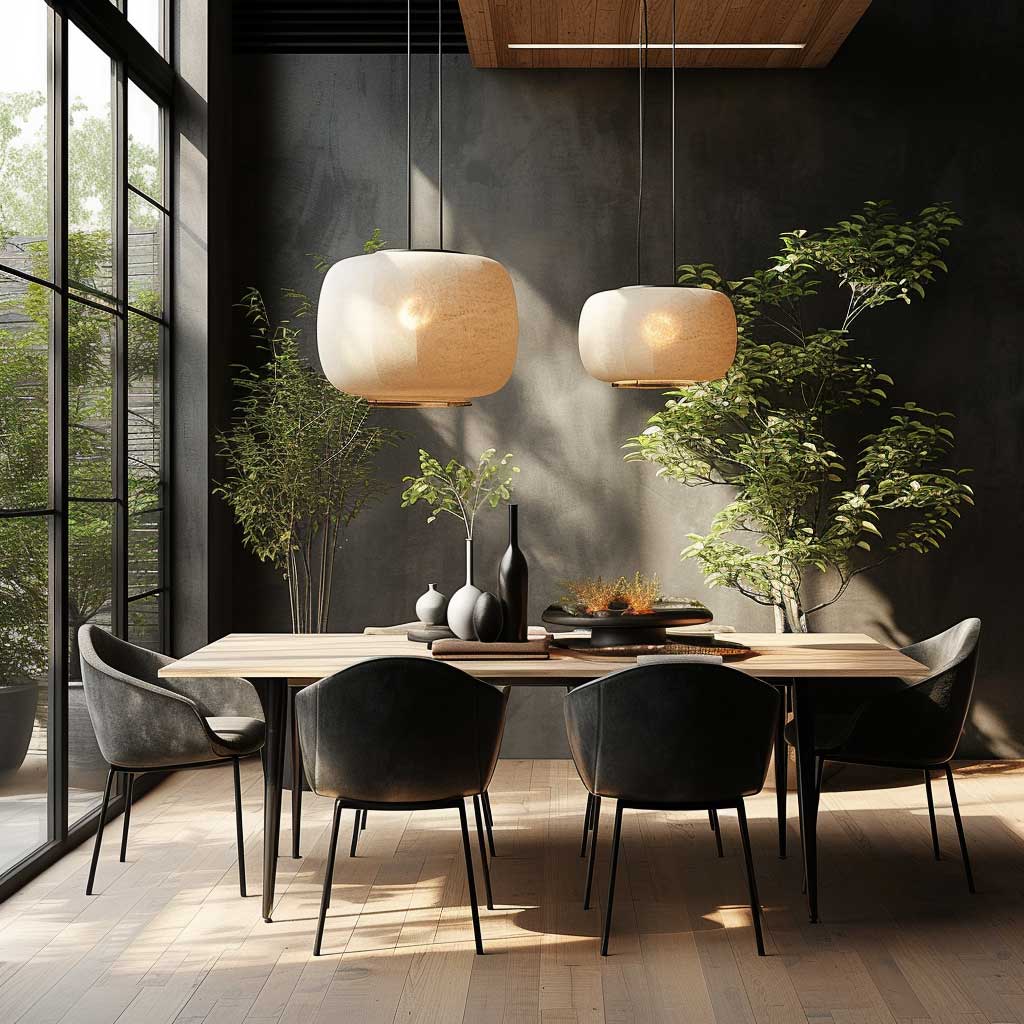
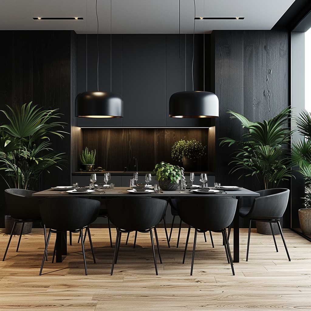
Lighting in a japandi dining area has a specific job: it needs to warm the wood surface of the table and create enough intimacy for the ritual of shared meals without spilling cold light across the wall. Pendant lights with organic shapes — paper, frosted glass, or woven bamboo materials — diffuse rather than direct their light, which reinforces the soft atmosphere the palette is building. Dimmable bulbs at 2700K allow the space to shift from functional daytime use to contemplative evening atmosphere without requiring different fixtures. A cluster of two pendant lights at different heights works better over an elongated dining table than a single centered fixture. According to Gira’s interior design reference on japandi, dark accents in furniture — like ebonized oak chairs — can enhance the perceived depth of a room when combined with warm wall tones, which is exactly the dynamic the dining area is built to demonstrate.
A single sculptural branch in a narrow vase on the dining table, or a single potted plant on a low sideboard, brings organic life into the space without adding visual noise. The selection logic is the same as the living room: architectural presence, single specimen, earthy vessel. What fails in a dining area specifically: a centerpiece arrangement with multiple small objects, seasonal decorative items, or anything that competes with the table as the room’s focal point. The table should be the first thing the eye lands on when entering the space; the decor should be invisible until someone sits down and notices it from close range.
| Room | Wall Color Approach | Wood Tone | Dark Anchor |
|---|---|---|---|
| Living Room | Warm white or soft gray (Shoji White, White Dove) | Pale oak or ash | Charcoal throw, matte black vessel |
| Bedroom | Ivory + optional earthy accent wall (Cavern Clay) | Walnut or pale oak | Smoked oak bedside, charcoal linen |
| Dining Area | Off-white or soft gray, possible Farrow & Ball feature wall | Light oak or ash table | Dark chair frames, matte black pendant |
The Bottom Line
The Japandi Color Palette Is a Temperature Decision Before It Is a Color Decision
Warm undertones — on walls, on wood, on textiles — hold the three rooms together. The living room needs one dark anchor. The bedroom needs earthy depth and 2700K light. The dining area uses contrast as its main compositional move.
Sherwin-Williams Shoji White or Benjamin Moore White Dove for the foundation; one verified paint color for the accent or anchor; natural wood, linen, and unglazed ceramics for the material layer.
Save this post before your next trip to the paint store.