A scandi style living room works because it refuses to try too hard. You get pale birch floors, a wall the colour of a Nordic winter sky, a sofa that looks like it was chosen by someone who read every furniture review published since 2010 — and the whole thing costs less effort than it appears. I’ve pulled apart dozens of these rooms and rebuilt them on paper, and the principle never changes: get the floor and the light right, and the rest of the room almost assembles itself.
Nordic homes developed this aesthetic out of necessity — long dark winters meant maximising daylight was not a stylistic preference but a survival instinct. What you end up with is a design philosophy built on pale surfaces, functional furniture, and a fierce intolerance for clutter. You’ll notice immediately that scandi decor living room photos all share one quality: there is nothing in the frame that shouldn’t be there.
- Why light wood floors do more work than any sofa or rug you could buy
- The neutral colour formula that makes scandi living room decor look expensive for very little money
- How to use plants, textiles, and lighting without overloading the room
- The minimalist design principle most people misread — and why empty space is load-bearing
- Specific brands and prices for furniture that actually holds up in real scandi interiors
Pale Wood Floors Pull the Whole Scandi Room Together

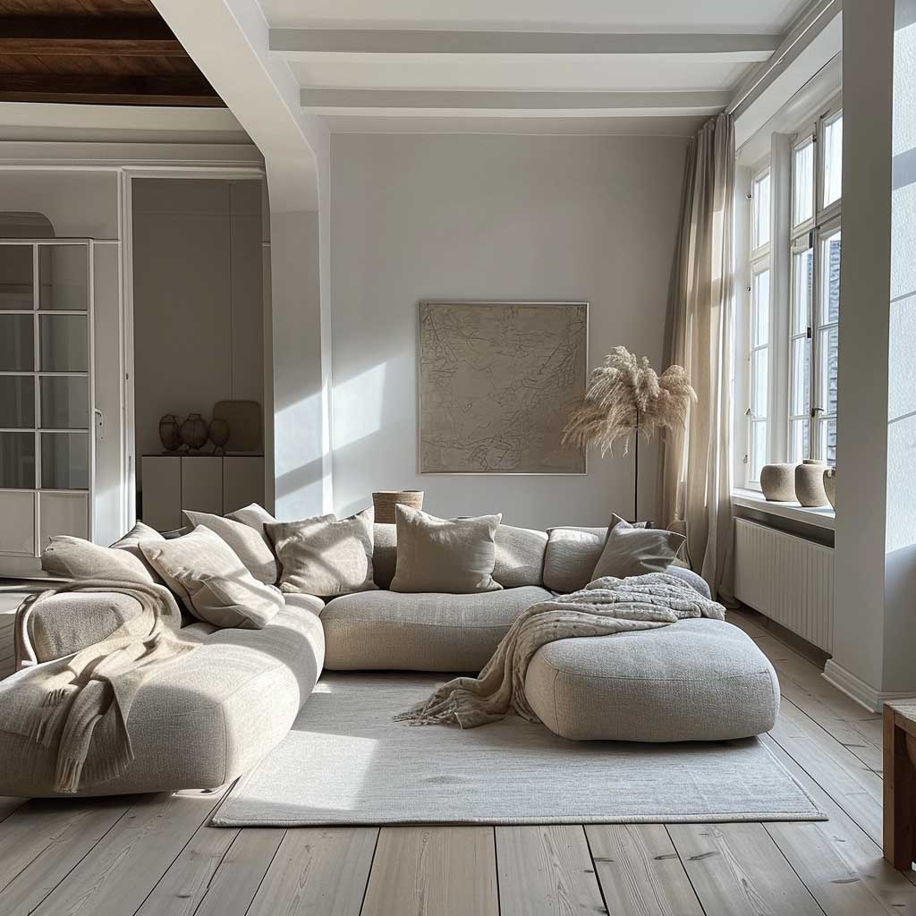

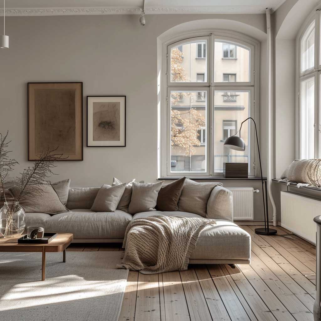
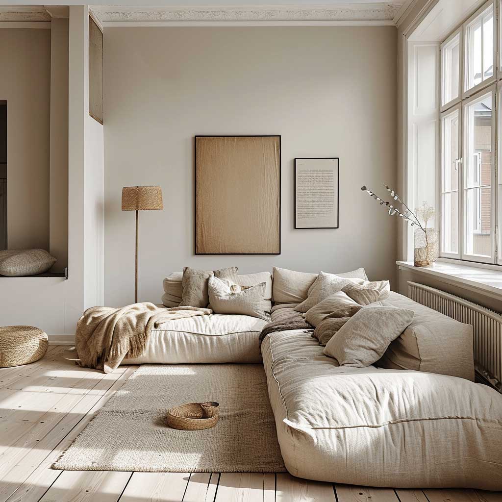
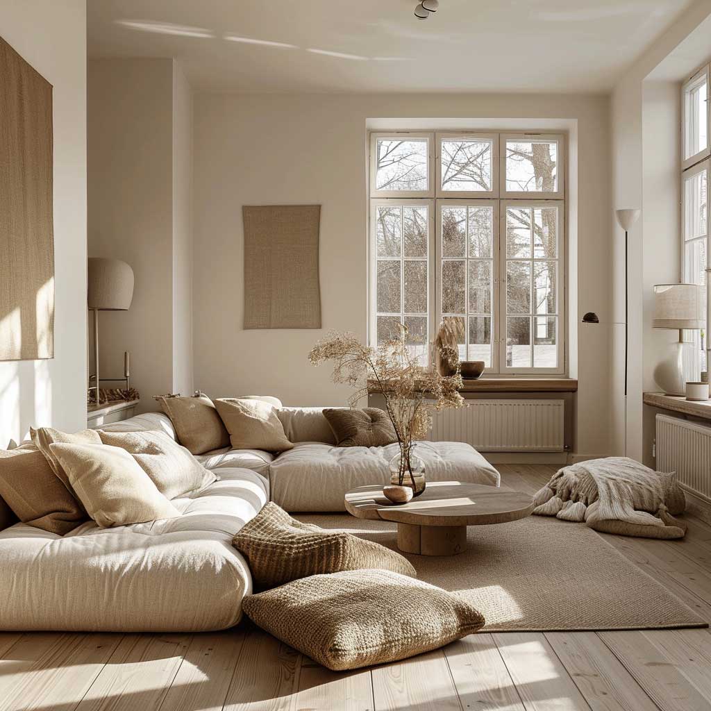
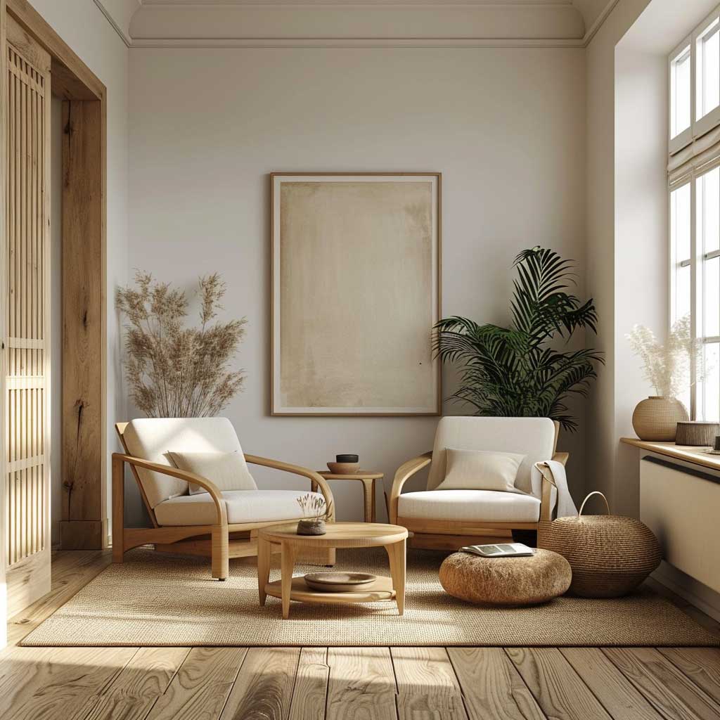
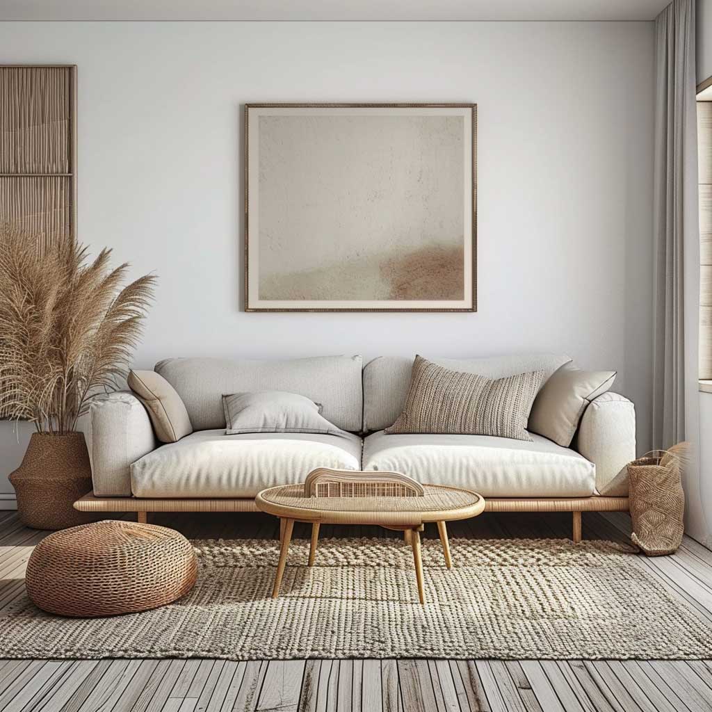
Ash, beech, and pine are the three woods I reach for when advising on a scandi interior design living room. They reflect light upward off the floor, which is exactly the opposite of what dark oak does. I own two ash-laminate floors from Pergo’s Original Excellence range — around $3.50 per square foot — and both of them have made rooms feel a full metre taller than they are. Pale wood flooring isn’t decorative; it’s architectural.
The natural grain is where the texture comes from in a scandi room. Resist the urge to cover it with a rug that’s too large. My go-to is a flat-weave in ivory or oatmeal, sized to sit under the front legs of the sofa only — a Beni Ourain-style from IKEA’s Stoense line at around $149 does this without overpowering the floor beneath it. What doesn’t work: a dark jute rug that cancels out everything the pale floor is doing. Seen it in three different apartments. Regretted it every time on their behalf.
Large windows are the other half of this equation. Sheer linen curtains are my preference — they diffuse rather than block, and they add a soft layer of texture without colour. Avoid heavy drapes in a scandi inspired living room at all costs; they eat the light you spent money on the floor to amplify. Floor-to-ceiling curtain rods, even on a standard 2.4m ceiling, make the room read taller. That’s a trick worth stealing.

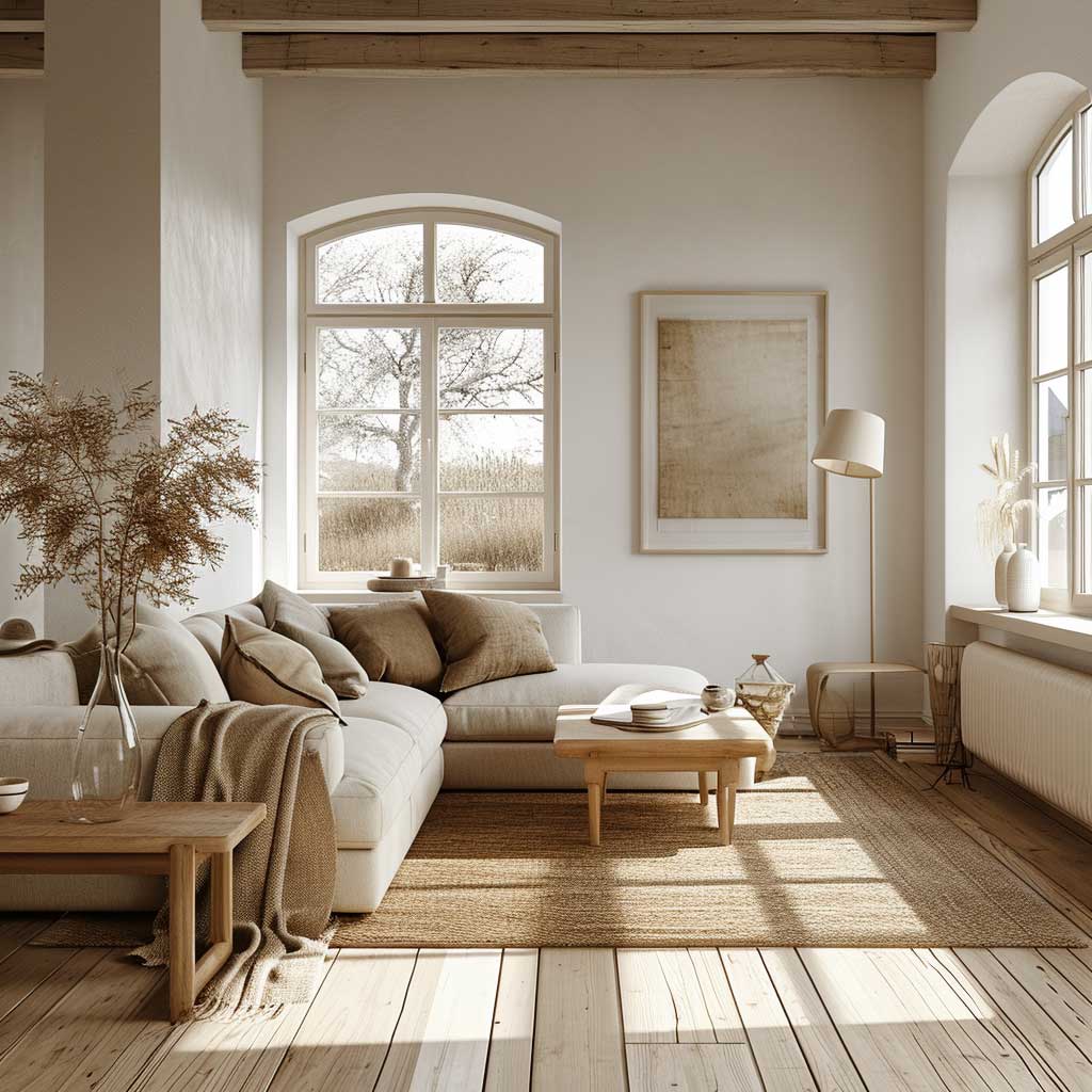
Furniture placement on a pale floor follows one rule: leave visible floor between every piece. You need to see the wood breathing between the sofa, the coffee table, and the wall unit. I stole this trick from a Copenhagen apartment feature in Elle Decoration Scandinavia — the moment a room feels crowded in a scandi context, it fails. Negative space on the floor isn’t emptiness; it’s structure.
Sofas for this type of floor: go light grey or stone. HAY’s Mags modular sofa in light grey costs around $2,200 and sits perfectly against pale wood without competing. IKEA’s Söderhamn at $799 is my budget pick — its low profile keeps it proportional to the floor rather than looming over it. Avoid anything in dark navy or forest green against ash floors; the contrast is too strong and drags the room away from its calm.
A coffee table in light oak or beech keeps the floor tone consistent without being monotonous. Glass tops work too — they make the floor visible even when something sits on it. What you don’t want is a dark walnut coffee table sitting on a pale floor like a bruise. Seen it framed as a contrast move in a lot of interior blogs. It always looks like an accident.
Neutral Walls in a Scandi Room Are Doing More Than You Think
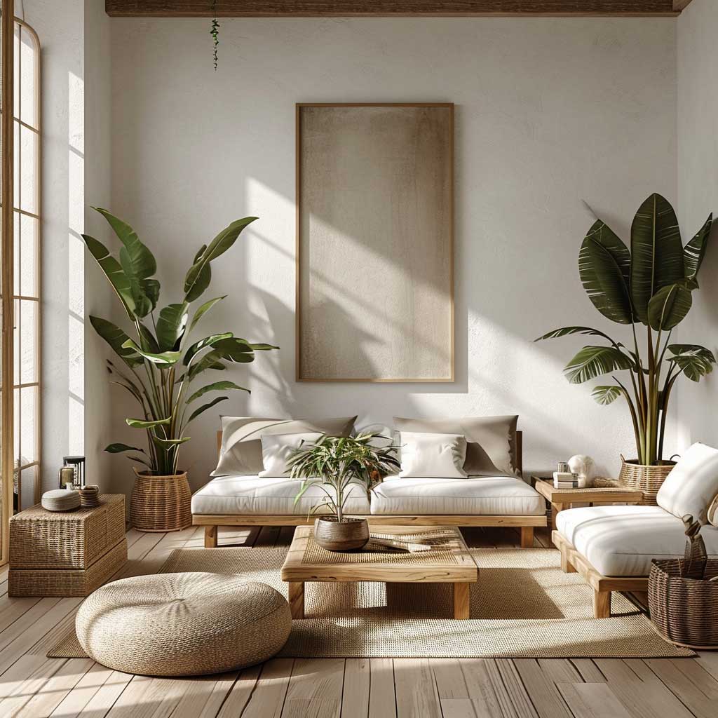
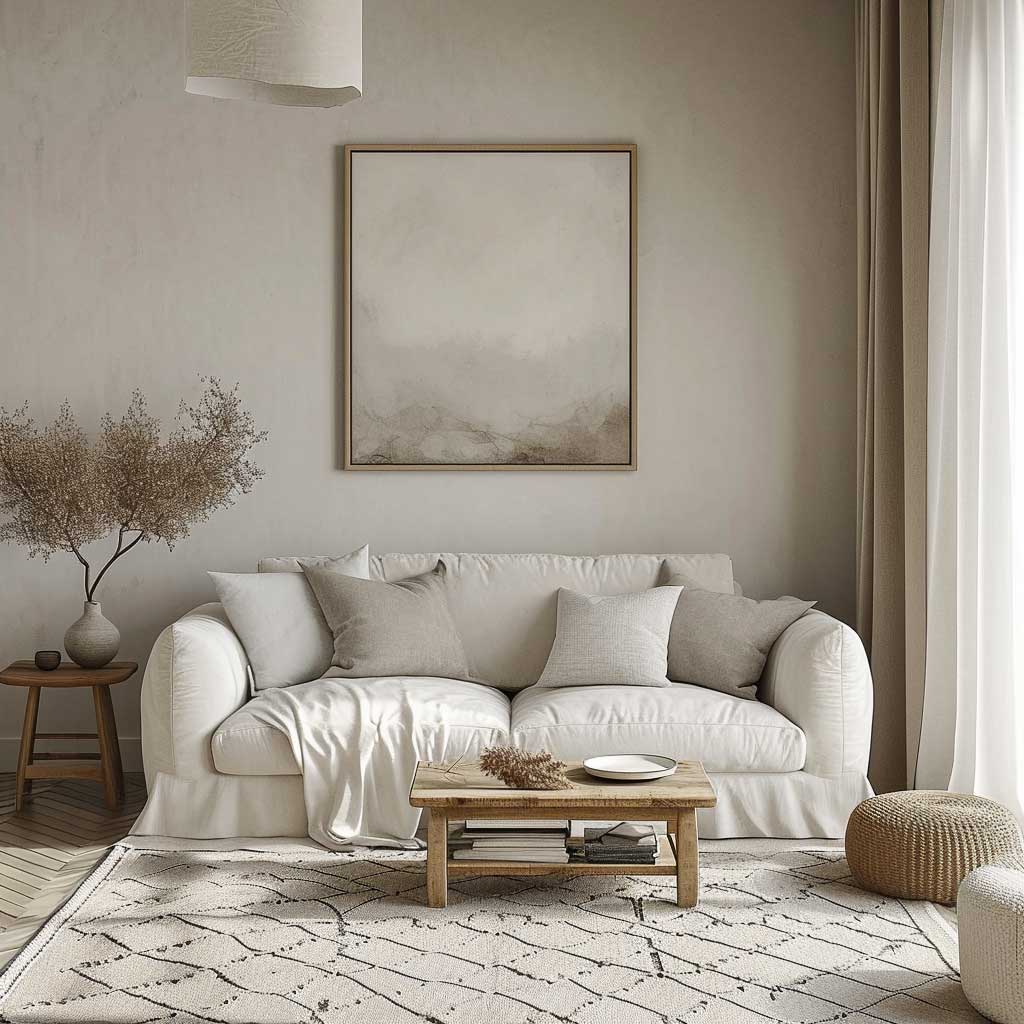
Off-white is not white. This distinction matters enormously in a scandi modern living room. Pure brilliant white walls read cold under artificial light, which is the opposite of what this style requires. My go-to is Farrow & Ball’s Strong White or Sherwin-Williams’ Alabaster (around $90 per gallon) — both have enough warmth to feel inhabited rather than clinical. You’ll notice that scandi rooms photographed in winter always look better than the cold-white versions in summer: the warmth in the paint is doing that.
Beige and greige tones are the underrated move for a scandi look living room. I’ve watched three different renovations use Greige by Benjamin Moore at $65 per gallon and produce rooms that looked like they had been art-directed. The colour disappears into the furniture and lets the textures run the show — which is precisely the point. Sage green is everywhere right now. Resist it in a scandi context; it pulls the room toward a completely different aesthetic that takes twice the effort to manage.
Matte paint finishes are non-negotiable for scandi living room decor. Sheen on the walls bounces light in ways that reveal every imperfection and give the room an unsettled quality. Matte diffuses. It makes the wall feel like part of the room rather than a reflective surface competing with the window. For a room that depends on light behaving in a specific way, finish is as important as colour. Most people skip this detail and then wonder why their scandi room looks slightly off in the evenings.
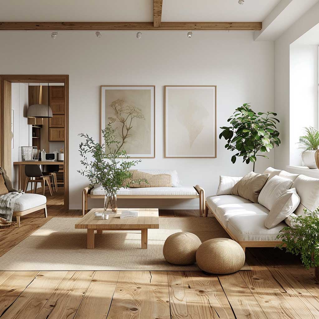
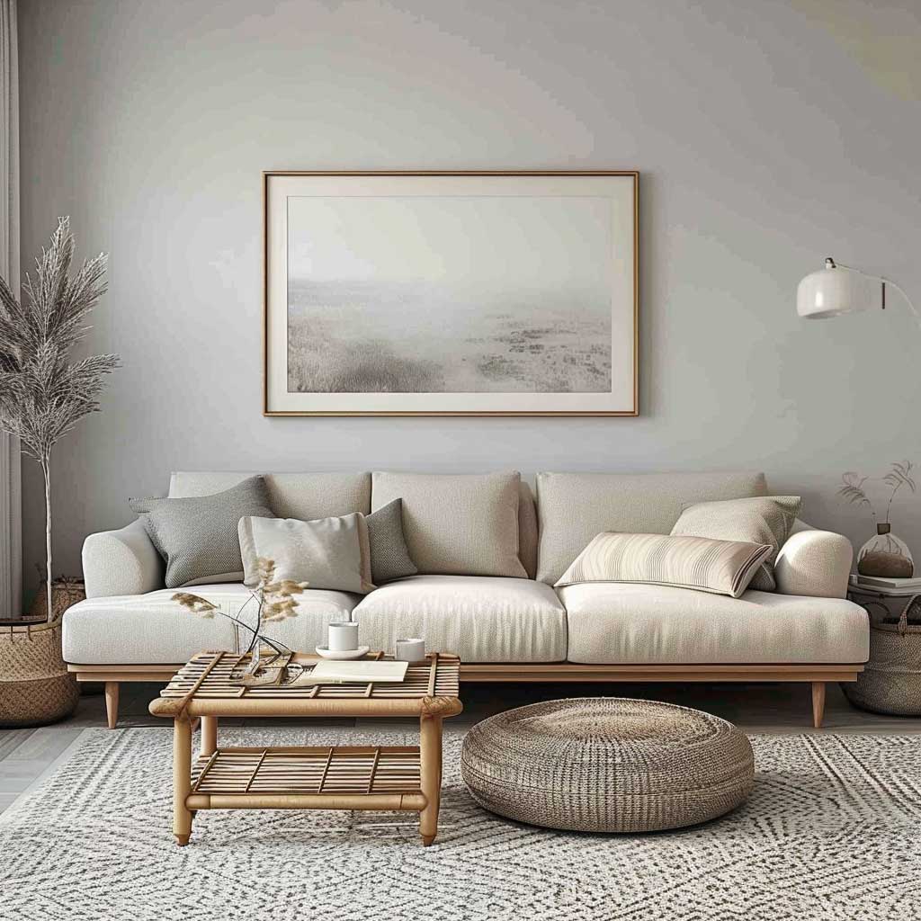
Art on neutral walls: one piece, not a gallery. Abstract works in charcoal or raw linen tones are my preference — something from Desenio’s print range (around $25–$45 per print) fits the aesthetic without requiring a Scandinavian mailing address. Avoid motivational text prints, botanical watercolours, and anything framed in dark wood. A single abstract piece in a slim black or natural oak frame is enough. The wall should feel considered, not decorated.
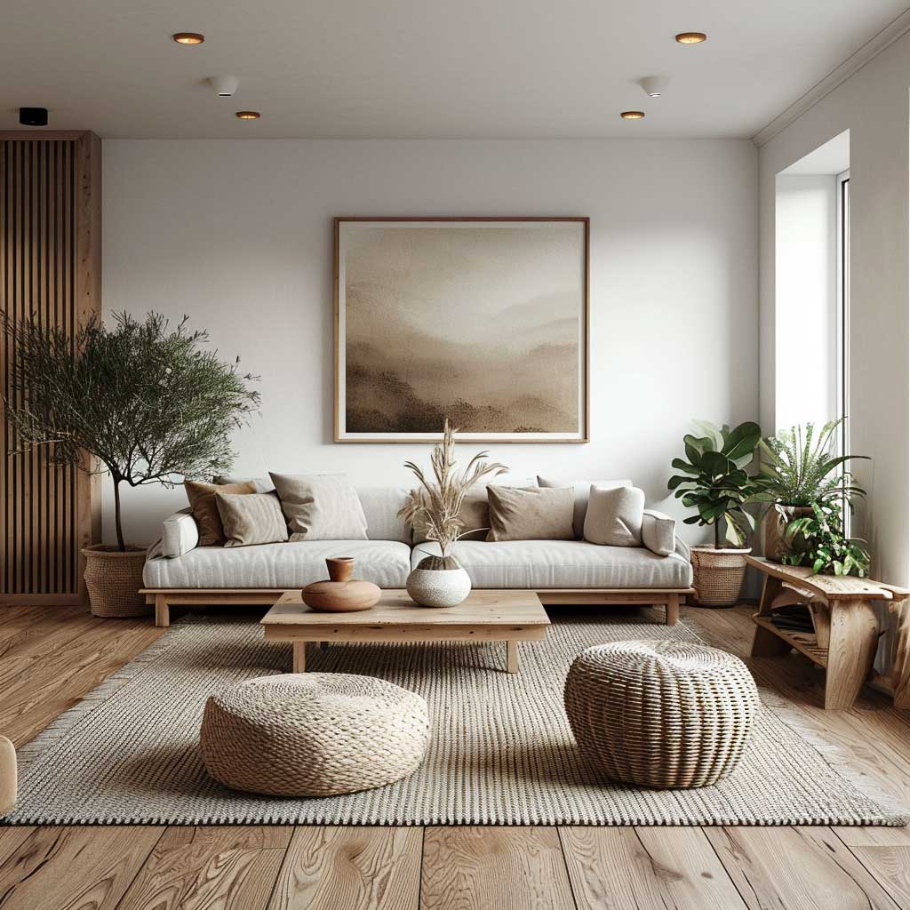
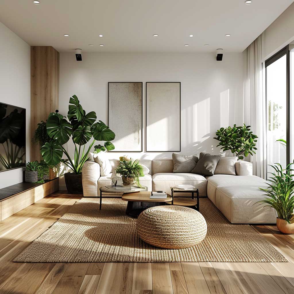
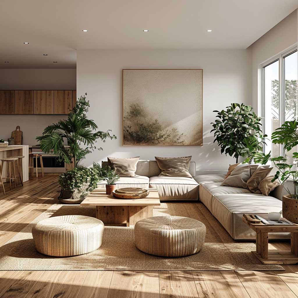
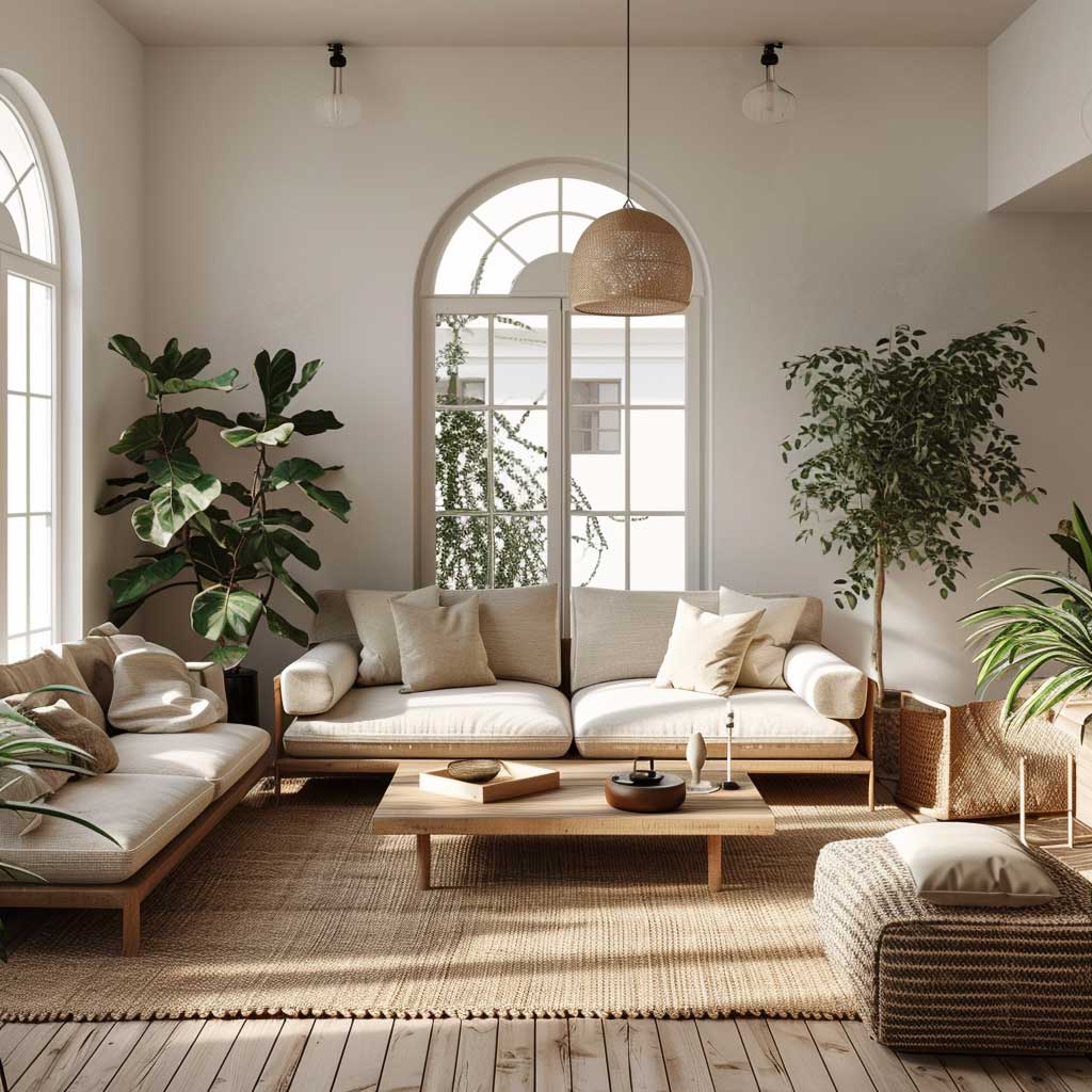
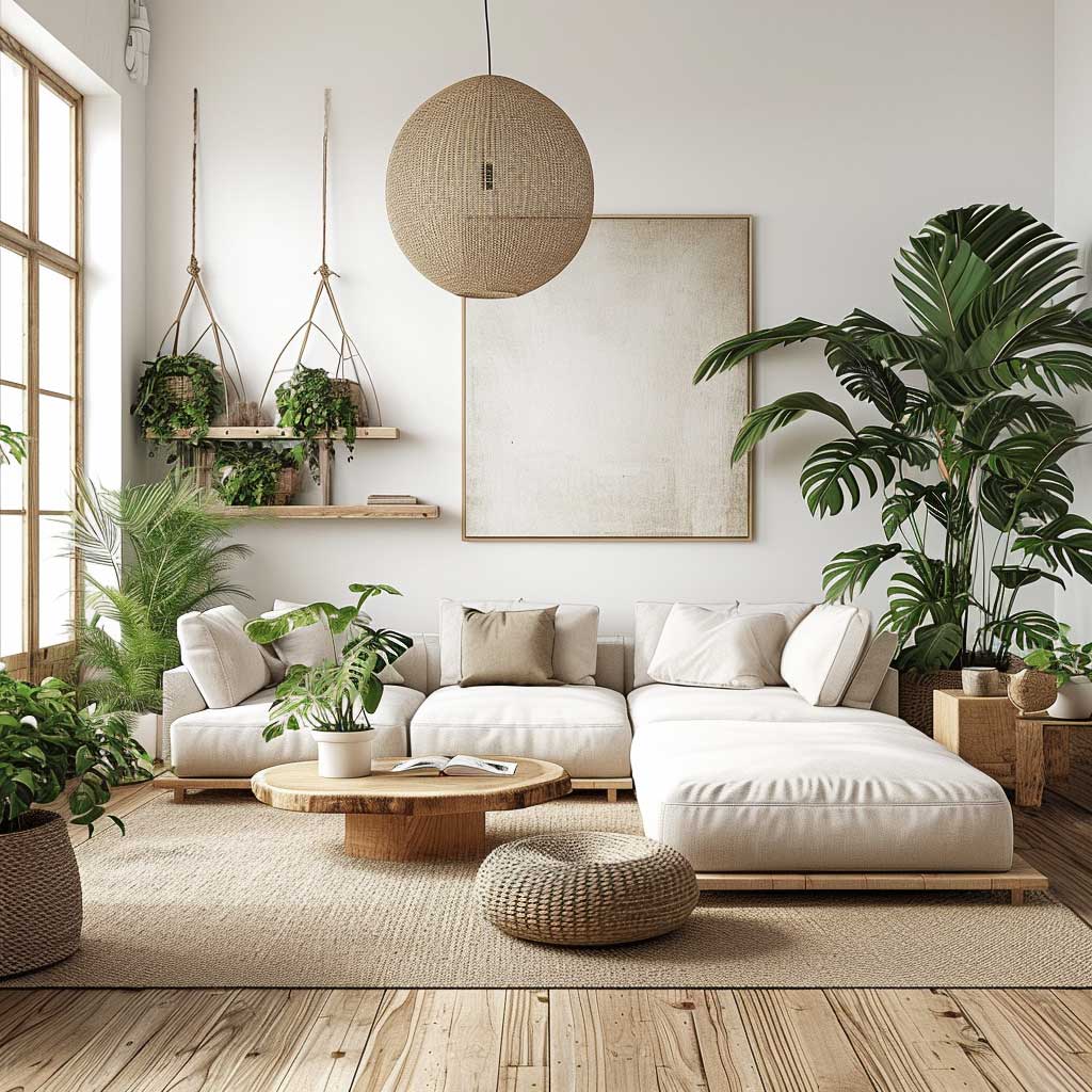
Plants against a neutral wall are not optional in a real scandi room — they are the punctuation. A tall Ficus lyrata (fiddle-leaf fig) in a plain terracotta pot at around $35 does what no cushion or throw can do: it introduces scale and organic irregularity. The rule I follow is one large plant per seating zone, no small-pot clusters. Clusters read as fussiness in a room trying very hard not to be fussy. Warm Scandinavian living room designs consistently use plant placement as the single most impactful styling decision — worth studying before you buy your sofa.
Greenery in a scandi interior works because white and pale grey walls act like a photographer’s backdrop — every organic shape pops against them. You don’t need a jungle. One statement plant and one smaller trailing variety (pothos or string-of-pearls on a shelf) is sufficient. Matching ceramic or terracotta pots only. Plastic nursery pots left in the room are the fastest way to ruin a scandi aesthetic you’ve spent months building.
Furniture in a Scandi Living Room Earns Its Place by Function First


HAY, Muuto, and Menu are the three brands I reference when someone asks what scandi furniture actually looks like in a real budget. HAY’s About a Chair (AAC) in a white shell runs around $420 per unit — it has the clean lines and functional geometry that define the aesthetic without the wait time of a custom piece. Muuto’s Outline sofa starts at $3,200 and is the most honest expression of Scandinavian seating I own. Both companies build furniture that serves the room rather than starring in it.
IKEA plays a legitimate role in this style if you choose carefully. The Lisabo side table in ash veneer at $79 and the Kallax shelf unit in white at $114 both hold up visually against higher-price pieces. What doesn’t hold up: the Hemnes range in dark stain, the entire BESTÅ system in any brown tone, and the Klippan sofa in any cover heavier than a light grey. IKEA designed those pieces for a different aesthetic. Using them in a scandi room is like trying to make a jazz trio work with a drum machine — theoretically fine, never quite right.
Storage in a scandi living room is invisible or sculptural. Flat-front cabinets in matte white with no visible handles are the invisible version — IKEA’s Besta system in white works here when styled correctly. The sculptural version is an open birch shelf unit where everything displayed has been edited ruthlessly: a few books spine-out, one ceramic object, a plant. Half-filled shelves with random accumulation are the equivalent of wearing a beautifully cut coat over a crumpled shirt. The coat does nothing if what’s underneath hasn’t been considered.
- Avoid gallery walls. One piece of art, maximum. A grid of mismatched frames is the opposite of scandi — it’s maximalism wearing a minimalist label.
- Don’t mix warm and cool wood tones. Dark walnut next to pale ash creates visual noise the neutral walls can’t absorb. Commit to one wood temperature per room.
- Skip the decorative cushion collection. Four cushions per sofa is the ceiling. More than that and the sofa becomes a storage problem. I’ve bought too many cushions I later binned.
- Resist feature walls in colour. Sage green or terracotta accent walls are everywhere in 2026 and they actively resist the scandi principle. The wall should disappear, not perform.
Lighting in a scandi room is a deliberate layering of warm sources. A pendant in brushed brass or matte black with a fabric shade — Le Klint’s Pendant 172 at around $340 is my go-to recommendation — anchors the ceiling. A floor lamp with a pivoting arm beside the reading chair handles the functional layer. Candles handle everything below that. What you absolutely do not need: recessed downlights at 4000K cool white, which turn a thoughtfully built scandi interior into a dental office corridor. Warm white bulbs at 2700K only.
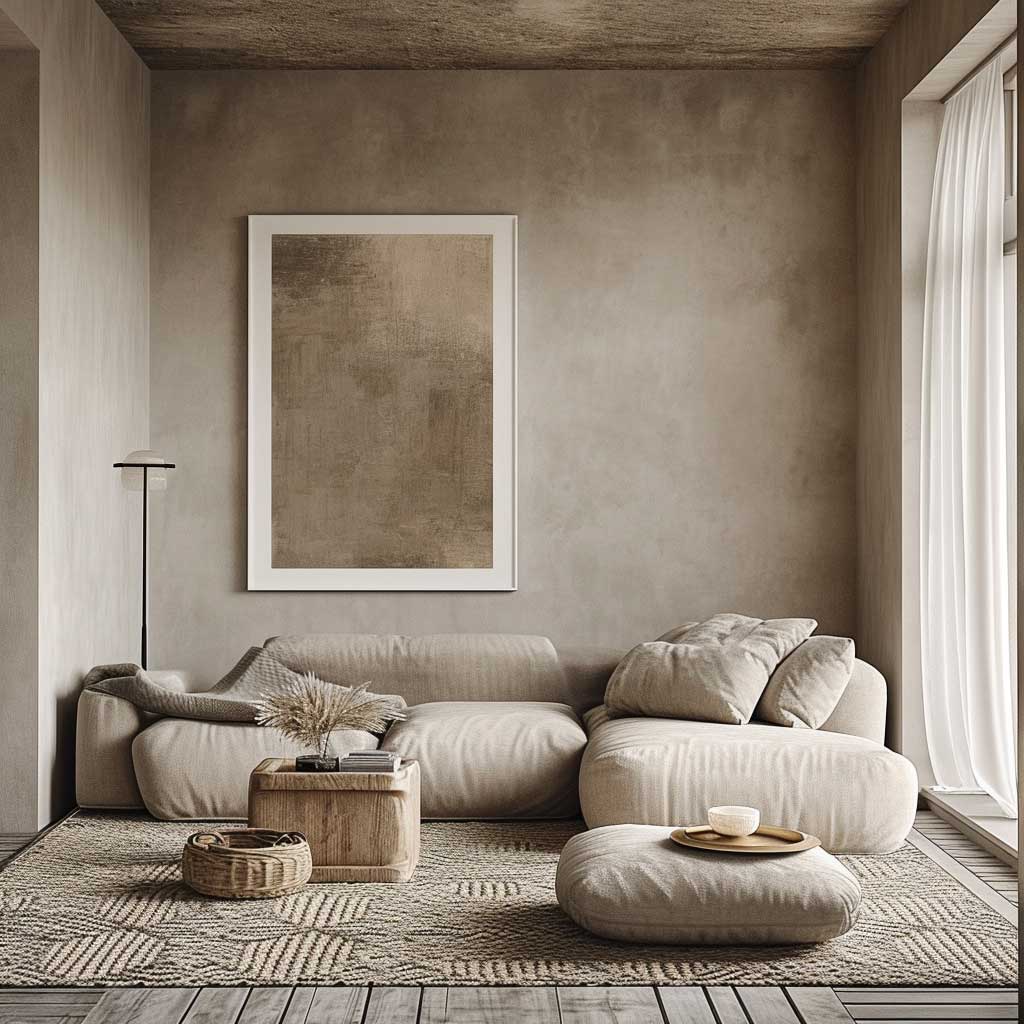
Textiles are how a scandi living room signals comfort without clutter. A chunky merino wool throw from Faribault Woolen Mill at around $195 folded over one arm of the sofa does more styling work than any cushion arrangement. Linen in warm white for curtains. Wool or cotton flatweave for the rug. The materials should all feel like they belong to the same family — natural fibres only, no synthetics that look like nature while feeling like a plastic bag. That distinction is detectable in person and in photographs.

Decorating rule for the scandi living room that I’ve never heard broken successfully: the objects on display should be editable. Every item you place should be something you could remove without the room feeling incomplete. If the room collapses without a particular decorative piece, there are too few pieces and too much reliance on any one of them. Cozy minimalist living room design explores this editorial approach in more depth — the rooms featured there apply the same ruthlessness to object selection and it shows.
A handcrafted ceramic vase, a single hardcover book open face-down on the coffee table, a small concrete tray holding a candle — those are the three objects that belong in a scandi living room. I’ve tested this formula in five different apartments with different owners. The rooms that received any more than three objects per surface started looking like display cases rather than places people actually sit in.
Final Take
A scandi living room is a decision made twice — once when you add something and once when you don’t.
The floor sets the light. The walls dissolve into it. The furniture serves both without drawing attention to itself. Most rooms fail at this because they treat the second decision — what not to add — as optional.
Pick your wood tone, commit to one wall colour in matte finish, and buy one piece of furniture that costs more than you planned. The rest is subtraction. Scandi interiors are not sparse because minimalism is the goal; they’re sparse because every object left behind was worth keeping.
Save this post before your next room change.
Related Topics


